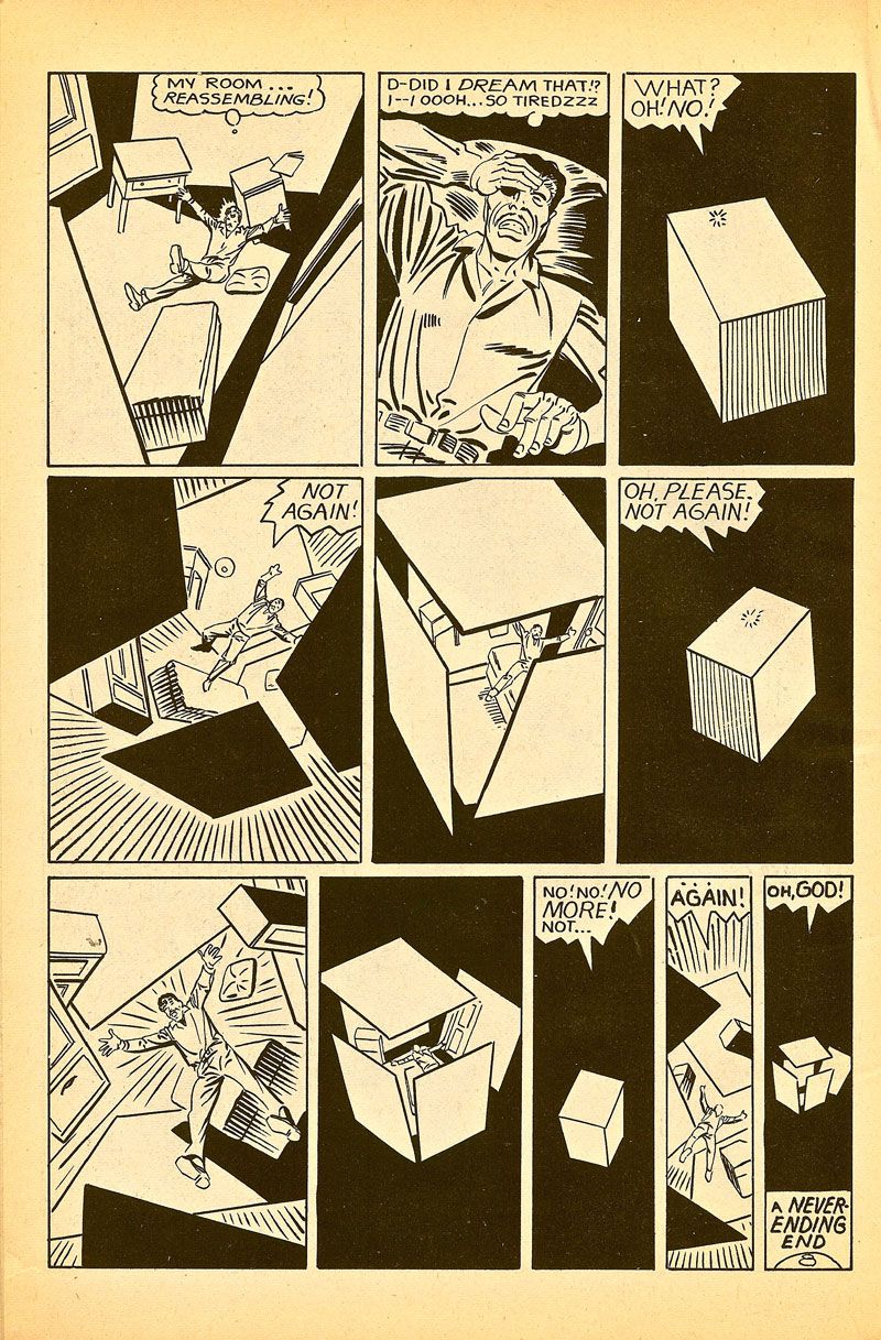
Ditko's World #1 (1986), page 19. Steve Ditko.
Few careers in comics are as full of bizarre happenings and unanswered questions as Steve Ditko's -- and yet it often seems to me that the crowning strangeness of Ditko's six decades (!) as a cartoonist is his popularity, the fact that even the most unadventurous of comics readers know his name and are at least familiar with his work in passing. Ditko's work is almost aggressively non-mainstream, and grows more so with every passing year. He happened to be in the right place at the right time once, when an angular, surrealistic strip with a near-pathological lead character and the unlikely name "Spider-Man" hit it big with a generation of comics readers on the lookout for something different. But even Ditko's most famous creation only really took off once he walked away from it, leaving John Romita to smooth the rough edges from a strip that Ditko lanced through with menacing shadows, an urban landscape on the brink of decay, and an attitude that danced between aspiration and hatred, pulling back the curtain on the dark side of youthful energy.
It might be going a bit far to call Ditko the first cartoonist to run from his mainstream success, but he certainly did it in a more uncompromising manner than anyone before had (with the possible exception of Jack Cole). Most journeyman artists of the mid-1960s, especially those with styles as idiosyncratic as Ditko's, would have given all they had to find themselves working on a book as successful as Spider-Man was at the time. But Ditko chafed at the humanist ideals Stan Lee overwrote his stories with, and struck out for better things he never found, moving through just about every company in the business of publishing comics, experimenting as a self-publisher before most action artists even understood that such a thing was possible, and by the time the page above was drawn, ending up in the role of elder statesman during the black-and-white alternative comics boom of the late 1980s.
The acerbic visual style and soldier-stiff insistence on total control evident in everything Ditko does makes him an odd fit indeed for the role of populist hero that he's been shoehorned into by Spider-Man's inexplicable continued popularity. Much easier to place him in is the narrative of the cartoonist's cartoonist, an artist of consummate skill, craft, and individual vision whose genius hits with those who appreciates such things but never with the wide audience it deserves. And indeed, after the random happenstance of a few years' collaborative superhero comics that kicked him into the limelight, Ditko never really did connect with a reader base of any significance. One of the reasons why can be seen above: while his '60s work had enough illustrative punch and dazzle about it to stand next to that of Jack Kirby, Ditko began working toward a new, harsher ideal almost immediately after he left Marvel, paring back his style and doing more and more work in black and white.
Later-period Ditko leaves pyrotechnic picture-making behind for a tightly gridded, simplified approach whose dominant goal is to communicate as much information with as little as possible. It's still eminently recognizable as Ditko's work, but the atmospherics and amped-up splashiness of his earlier work are gone, replaced by a cool, monochrome consistency. Ditko's modern comics read as fluidly and easily as type, usually getting across the bulk of what they're saying without relying on the words in the balloons. There's a reason for this shift: these days Ditko is almost exclusively engaged in making "message" comics about his Objectivist philosophy, which takes so much exposition to communicate the details of that the pictures need the design-heavy, streamlined style Ditko uses on them.
But when Ditko loosens up and sets his energies to more straightforward work (invariably genre-inflected), it's easy to see how pure and visceral the style he's been brought to by necessity can be. The page above communicates so much with so little: three of its panels are simply shots of a white cube set into black space, and three more pin tiny, helpless figures in vortexes of floating geometric shapes. And yet we get all we need to feel the page as it's intended: the single, chiaroscuro close-up shot in panel two provides a dominant emotional tone for the page, and from there forward we watch an archetypal human figure caught in a pattern of constant, traumatic geometric/environmental change. We too are drawn into a holding pattern by the perfect, almost yin-and-yang level of balance between black space and white space on the page, which brings a deep level of impact to these small, tightly gridded, highly abstract panels.
Ditko, for whom communicating abstractions is so important, here turns that skill to a classic "there's no way out" horror-story ending by tormenting his character with basic shape and line rather than anything more concrete. It's almost a cubist approach to horror, with the page's gradual fade from the strong whites of the first panel into black more responsible for the sinking feeling it puts across than anything else. It's this kind of thing, not sparkly heroic action, that Ditko always did best, using the most rudimentary forms available to create something that blends menace and complexity and cool detachment into something both beautiful and highly unsettling.


