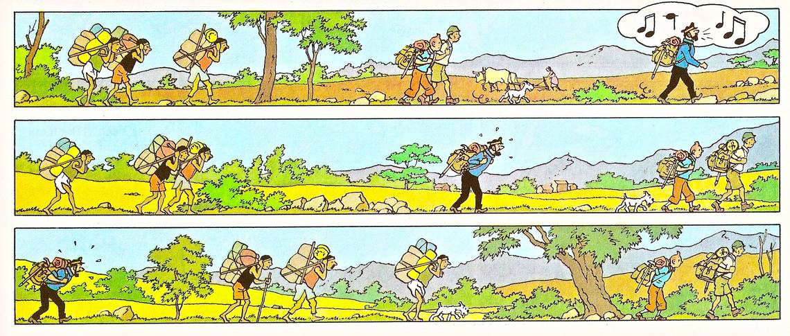
Tintin in Tibet (1959), page 15 panels 7-9. Herge.

Figuring out the density of a page of comics is one of the most important challenges that a cartoonist faces between idea and finished product, but it's also one that's frustratingly tricky to talk or even think about. How does one measure how much happens on a page other than pointing and saying "this much?" And how does a cartoonist decide on the optimum amount of story to convey with each canvas? I'd hazard a guess that most of the time for both reader and creator, these aren't conscious practices, and the varying densities of different cartoonists' approaches simply occur rather than being plotted out.
The vast majority of American comics on both sides of the mainstream/alternative divide stick to the rhythm of (roughly) six panels to a (roughly) three-tiered page, sequenced from character action to character action, with maybe three seconds of time depicted in-frame and five or so passing in each gutter. Japanese comics tend to move a little quicker: a few less panels per page, a bit less time taken up in each individual one. European comics, on the other hand, typically have much more density than their American counterparts, with more panels per tier, more tiers per page, and more story time taken up in each image. Some of the difference in density of information can be chalked up to the average size the comics are published at: in Japan, digest-size books are most commonly the final state of comics, so less is crammed onto the page than in American "comic-size" comics, which in turn can fit less than album-size European books.
But density isn't only a question of how many panels per page: it's at least as much about how much goes into each panel. Here it's more enlightening to look not at trim size, but the most influential cartoonists of the world's three major cartooning traditions. In Japan, Osamu Tezuka, with his pure cartooning and borderline ruthless, Disney-inspired simplification of forms is the "God of Manga". Here in America, the "King of Comics" is Jack Kirby, whose fully packed panels hint at the illustrative without ever quite bowing to realism or observational drawing. And in Europe, far and away the most widely read maker of comic art is Georges Remi, pen name Herge, creator of Tintin.
Herge's comics are about as dense as it gets before you notice: his pages stick to four tiers, usually subdivided like crazy, and his word balloons tend to be plentiful. Beyond this, his drawing is much more detailed that either Kirby or Tezuka. Though both of those artists could throw down with spreads of mind-blowingly intricate machinery or painterly landscape shots, in Herge the figures and faces are cartooned, and everything else, from architecture to natural environments to the details of props and the wrinkles of clothes is captured in meticulous, pinpoint linework. But Tintin comics somehow never feel overstuffed, and the sequence above is a perfect example of why. Though Herge drew with a documentarian's eye for detail, his eye for open space and flat color was second to none. Each crisply realistic outline frames a lineless space for the eye to rest in, turning every panel into a flickering alternation between work and pleasure, surely the optimum mode for comics to function in.
And Herge's understanding of space extends beyond what's inside the panels. This sequence takes full advantage of Western readers' prose-produced instinct to read in straight lines across a page, squashing three panels into the vertical space usually occupied by one. Of course, even though the lack of verticality in these panels feels natural enough when we do most of our reading across lines as tall as the ones you're looking at now, it makes the panels proportionally much longer, giving readers a vast expanse of space to read across. No small amount of story time passes in these panels, and what's more, that time is felt as the eye scans across Herge's long, multiple-focus scrolls. The terrain changes, travelers speed up and slow down, and the eye is forced to register these changes of position while the long, low panels push forward as inexorably as a moving walkway.
It's a challenging bit of comics, with both a brisk forward motion and changing compositions to give the reader pause built in. Indeed, the most noticeable bit of character movement is Captain Haddock's slow slip backward, which is pitched against the directionality of the rest of the sequence. These panels pitch and yaw on their slow march forward, which is perfect: Herge takes not only his characters, but the reader's eye on a journey as well, matching form to content in an inspired sequence that hits just the right point between density and the lack thereof. Whether that balance was thought out or simply occurred is something only Herge knows for sure, but either way it's a perfect example of comics that contain just enough.