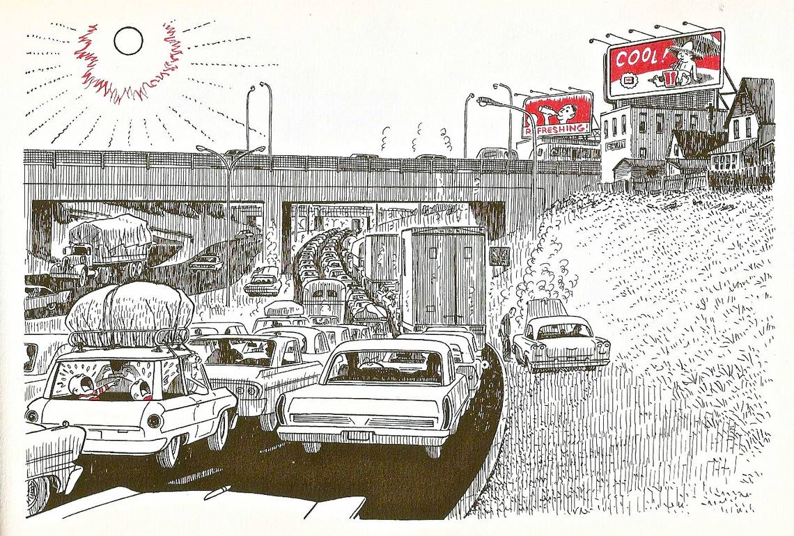

Nipper, June 20th 1964. Doug Wright.
Yes, yes, I can see perfectly well that this is only one panel. But sequence is just the same as anything else: one definition works fine until you run across something that contradicts it. To my eyes, the picture above is one such something. Today we're going to examine how an artist can build sequence into a single image, creating pictorial motion without having to subdivide the page with panel borders.
We've already seen how sequence is subjective. The information on any page of comics exists independent of order, and while most artists lay out their pages in a way that leaves little of that order to question, it's easy enough to skip around in the panels of comics your own way, randomizing the events or stitching new meanings into them. (What do you mean you've never tried that? You really should.) This is especially true of silent comics, where there are no strings of dialogue or narration to get in the way. Similarly, there's almost never one correct, proscribed way to read a single panel, a logic the reader is meant to follow to move through one picture. In multi-panel comics, the images are most often meant as quick hits of action or locale, with only a single stage of the events taking place communicated within them before the next one hits. When there is more than that going on, as in this single-frame strip by Doug Wright, the Charles Schulz of Canada, what the reader is dealing with is sequence.
Given its single-image nature, its funny-paper origins, and its general look and intent, it's tempting to classify this strip as something slightly outside the generally accepted sphere of comics -- a gag cartoon. That's a classification that works well enough, but I don't think its success as a gag can really be said to preclude its existence as comics. Beside the fact that Nipper was almost always a straightahead, multi-paneled comic strip, the way this image moves the eye through different chunks of pictorial information to tell a larger story is comics pure and simple. Draw a cross over it to create a four-panel grid and it's not even a discussion. But without those panel borders, it's especially interesting to look at how clearly and surely Wright sequences the elements of his picture.
We begin, as usual, in the upper left corner. Wright isn't confounding readers' expectations of comics quite yet -- the red blaze and radiating lines around the sun, not to mention its simple, wide-open shape, draw the eye quite effectively. From there it's a smooth, straight line to the next bit of information, the billboards at top right. There are a few things in place to make sure we follow this path correctly: first, the bright red of the soda ads rhymes perfectly with the red of the sun's rays. Second, the highway overpass beneath the sun acts almost as a panel border in and of itself, a straight line that cuts off the bottom of the page while pointing over in the right direction. Third, the long stretch of white space along the middle of the page's top third is the path of least resistance for the eye (which is naturally lazy, moving more hurriedly over bright spaces than dark). It practically begs the reader to hop over it and right into the information that bookends it.
From there, having read all the way across the page, the comics reader's impulse is to return to the left side and begin again. Wright neatly pre-empts that by placing such a (literal!) traffic jam of visual input at the lower left of the page that the eye doesn't even make the attempt to go there. Instead we follow the path of least resistance once more, down the strip of white slope that leads to the broken down car which is causing the densely packed, vigorously hatched traffic jam that provides the image's main focus. Here again, the eye follows the quick and easy path provided by the white cluster of car-tops at bottom center to the punchline, the bits of red spotted on the crying boys, and then their miserable parents. The final step is a completion of the circular motion the page describes, as we follow the boys' pointing fingers back to the soda ads that are so cruelly beckoning them.
Wright solves the problem of the "throwaway" gag cartoon that can be digested in a matter of seconds by dividing his strip into specific units that go down one by one, and then creating a sequence that gently but insistently pushes the audience into reading his comic again once they've finished it. From our return to the soda ads, it's only natural to go through the whole thing one more time, now perhaps with more of an eye for Wright's expert balance of detail and simplicity, his skill with the play of light, the perfect smoothness of his forms. By making a single panel work as "comics" in and of itself, Wright not only confounds a few generally accepted definitions, but creates a way of reading that goes against the line-over-line grain of most comics sequencing. It's a beautiful, innovative bit of storytelling, a reminder that, like the picture that's worth a thousand words, there's plenty to be gotten out of one image before any more are added on.