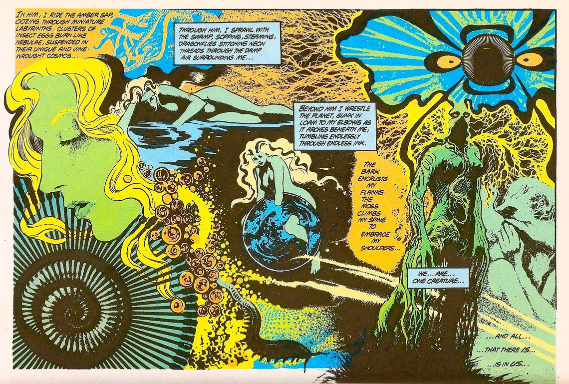
Saga of the Swamp Thing #34 (1985), page 17. Steve Bissette.

The grid, in one form or another, is such a ubiquity in comics art that it's hard to think of logic to apply or standard rules to serve as guidelines for breaking out of it. Even when panels of the strangest shapes are used, even when the lines they follow are counter-intuitive and asymmetrical, the basic look of the comics page is a rectangle filled up with smaller pictures that have been neatly arranged to fit inside it like puzzle pieces. Pulling the grid off the page is like pulling the cloth off a table -- the space is large, and bare, and it can be daunting to figure out how to go about setting it. The great comics artists have worked in grids, period. One has to go far afield, typically to the medium's forgotten psychedelicists, names like Greg Irons or Philippe Druillet or Alex Nino, before encountering comics art that attempts to make grid-less pages work as anything more than cheap novelty. Without a grid, the artist is truly alone -- no automatic compositional axis to base the page around, no storytelling rhythm in place, and few canonical works to draw inspiration from.
Steve Bissette went "off the grid" at an almost feverish rate in his mid-'80s work with Alan Moore on Swamp Thing. Though Moore's scripts have drawn (at least) hundreds of times as many praise, Bissette's artwork isn't just the aspect of the comics that's aged best -- it's what makes them work at all. This page is a prime example of why: Moore's captions are poesy rather than narration, verse and not prose. They swirl around in blatant disregard of the idea that an artist must put direct action of some sort or other on the page, calling up flashes of color and shadowy half-forms instead. Gridding a sequence in which "clusters of insect eggs burn like nebulae, suspended in their unique and vine-wrought cosmos," and things only go on like that too, would border on the ridiculous. These words are not intended to produce an exact counterpoint in the art. They're flights of fancy. Bissette understands this, and does the same thing: this page is anything but literal, vague in its depiction of both progression through time and movement through space. Instead, it gives us multiple, somewhat interconnected views into one scene, leaving plenty of space for Moore's image-rich writing. Rather than simply act as an echo to the words, Bissette finds their purpose and creates a complementary piece of art.
It's a fascinating bit of collaboration-in-comics, with neither writer nor artist much bothered with "telling the story", which is usually held up as the ultimate concern of divided-labor comic books. Rather than put any specific information across, the aim is to immerse readers in the sensual experience of comics, words and pictures intertwined. The grid, which divides story into bite-size chunks for readers to consume one by one, disappears, and twisting blacks and radiant color roar off the page to encompass the reader as fully as possible. Bissette's composition is designed to be more than readers can take in all at once: you need to live on the page for a few moments to understand its content. That, of course, is the point. Rather than seeing a sequence of characters moving and speaking and living -- the "illusion of life" summoned up by the grid -- readers are forced instead to see the same colors and patterns as the characters themselves to. To feel the story more deeply. If "literary comics" don't necessitate the muralist Bissette approach, one has to wonder if they don't at least invite it. When the words strive to move beyond the typical way of comics, maybe the pictures should too.
But for all the artistic experimentation here, Bissette's page is still a strikingly readable, comprehensible page of comics. Its flow is absolutely beautiful, zooming out and then back in on a single mutating human figure, tracing a lazy diagonal from top left to bottom right. Beginning to end, without the pattern of doubling back that gridded pages force the eye into. The top right and bottom left corners, free of readable information, strike up a harmonic motif with one another, lines stretching outward from the shell and the flower before being cut off by the line of the "action". These op-art flourishes bind the page with an 'X' shape, its axis hovering directly over the center image. That picture of a girl immersed in a planet is bathed in blacks that draw the eye to it before anything else, the whole page proceeding from it in all directions. Bissette creates something that has as much of painting's rhythm and logic as that of gridded comics. It's not the typical page's directionality -- but comics are pictures, and don't always need to be read like books.
What Bissette accomplishes here is what his collaborator Moore is often credited with. It's a link between the comics of yesterday and today, a page that takes the amplitude and techniques of Jim Steranko and Jack Kirby's psychedelic montages as its starting point, while anticipating the free expression of the hardcore, pictorial logic-driven art-comix to come. It may not look much like "comics" as they're typically thought of, but it's a flag planted for the medium in much wilder territory than it usually dares to explore.