
Every day this year, I will be examining the artwork on a single comic book story. Today's artist is Gray Morrow, and the story is "Water Hole!" from Blazing Combat #3, which was published by Warren and is cover dated April 1966. This scan is from Blazing Combat, a trade collecting all four issues, which was published by Fantagraphics in 2009 and is well worth your ducats. Enjoy!
One of the problems I encounter with this series is that I really don't have a lot of comics from the 1940s, 1950s, and 1960s - even my cache of 1970s comics isn't that large, although I've gotten better over the years. Therefore, when I want to look at the development of classic artists from this time period, I don't have a lot of their work. But I do have some, so I'm trying to just bite the bullet and showcase some artists from this time and not worry too much if I don't have a comprehensive cross-section of their work. Take Gray Morrow - I love his work, but I only just discovered him a few years ago, because I suck. Since then, I've picked up some of his work, but not anywhere near a good amount. But I have some of his artwork, and I'm going to check it out! Morrow began working in comics a decade earlier than this issue, in 1956, but this is the earliest - well, second-earliest, as he had a story published in issue #1 of this series - artwork of his that I own. So here we go! (All artwork here is © 2014 J. Michael Catron, by the way!)

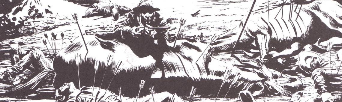
Here's the gorgeous splash page (with the title removed). It's 1885, and the U.S. Cavalry is pursuing the Apache across the Southwest. They're "dangerous when pursued, deadly when attacking," as this trooper is about to learn. Look at this beautiful rugged artwork. Morrow uses a thick brush, it appears, for the background, giving us mesas and rocks with scored lines, making the landscape hellish and rough. Directly behind the trooper, we see the titular water hole, which Morrow defines by thinner lines on the right side. In the foreground, we see the soldier hiding behind the dead horse. Morrow uses heavy blacks to shadow his face and hood his eyes, so the fact that he's a "young" trooper immediately becomes ironic, as he's seen far more than a "young" person should have seen. He's framed by Apache arrows sticking from the horse, and the horse itself is framed by the corpses of both cavalry officers and Apache warriors. Look at how Morrow shows where the light is falling - it's behind the soldier, which accounts for his shadowed face but also allows the stark shadows of the arrows bleeding down the sides of the dead horses. Morrow uses a brush exclusively, as he has gotten rid of almost all the holding lines in this panel, which turns everything - the live soldier, the dead horses, and the human corpses - into a part of the forbidding landscape. This is an amazing panel.

In a flashback, we see how everyone got dead, and Morrow uses the space on the page very well (the story is only 5 pages long). He leads our eyes over the page well, and despite the cramped panel layouts, we still get the sense from Panels 1 and 2 of the wide-open space of the Southwest before the walls close in on the bottom of the page. Once again, Morrow uses short, rough brush strokes for the scenery, with the mesas in Panel 2 looming menacingly over the lighter brushes showing the dust kicked up by the Indians. As we get closer, he uses finer line work combined with heavy inks to add the weight of years to the various characters. The transition from Panel 4 to Panel 5 is well done for such a small space - the word balloons intrude on Panel 3, linking it to that, as the two men from Panel 1 realize there are only two Apache riding toward them. The man on the right turns toward the reader to warn his comrades to look behind them, and that face leads us to Panel 5, where Morrow manages to squeeze in two Indians ambushing two troopers. It's nicely done, especially because of the space constraints.

Archie Goodwin, who wrote this sucker, lets us know that "the long afternoon" is moving "slowly into evening," which Morrow helps illustrate by once again dropping the holding lines in Panel 1 and making the shadows on the rock heavier and larger - it's really well done. The layout of the top three panels is nice, too - the horse crashes in and the Apache dispatches two troopers and drags our eye to the next panel. The two fighters in Panel 2 form an awkward parentheses, and the Indian's knife is almost hidden as it enters the trooper's gut, but the motion of the stab leads us to Panel 3. From the top of that panel, the arrows arc downward into the back of the soldier, and that leads us to the other dude watching him die. This kind of composition is basic, but it's very important. In Panel 4, the survivor at the beginning is speaking, and Morrow again does a wonderful job almost melding him with the rock. In the foreground, he shades the face of the grizzled veteran so that his eyes are particularly haunted, and of course in the next panel the veteran dies. Notice again the almost brutal brush strokes in Panels 4 and 5, as Morrow graphically illustrates the harsh reality of combat that Goodwin is writing about.
I wish I had some earlier Morrow, because at this point in his career, he was already in solid command of his skills (he was probably 31 when he drew this). Such is life, though! Tomorrow I'll check out some art from a few years later, when he helped create an enduring swamp monster. Wait, wasn't that Bernie Wrightson? Hey, speaking of Wrightson, you can find him and other artists in the archives!