Knowledge Waits is a feature where I just share some bit of comic book history that interests me.
Recently, when we were putting together the 100 Comic Book Pages That Shaped Comic Book History list for Vulture, the awesome comic book artist Klaus Janson suggested a page from X-Men #56. It ultimately did not make the cut for the list, but I thought that it was an interesting enough story that I figured I'd share it here (with permission from Vulture and Klaus, of course).
Let's set the scene.
For years, there were two different ways that comic books were colored. Comic book covers were colored in one way and comic book pages were colored in a different way. Both were done with CMYK printing, which stands for cyan, magenta, yellow and black inks (I am sure that there is some really good reason why black's last initial is used while the first initial is used for the other colors, but damned if I know why that was the case). The idea is that you would mix those colors up and it could create nearly any color that you could imagine. However, comic book covers were printed separately and were done with the best color printing that you could get, so they had access to a whole different selection of colors that you had inside the actual comic book.
Part of this was graduation. Comic book covers were printed with all sorts of different percentages, so you could create whatever tone that you wanted.
Inside the comic, however, you were generally held to the following three percentages - 25%, 50% and 100%. A 25% blue (cyaN) would be basically sky blue and a 100% blue would be the blue in Superman's costume. Famously, flesh was 25% yellow and 25% red (magenta).

It's funny. I just grabbed the first cover I could find on Google Images that had a light blue background and Superman on it, to show you the basic idea, but this cover actually demonstrated the point that I was telling you earlier about tone. See how the colors are nicely toned on the cover? That would not happen in the comic itself. There wouldn't be a graduation like that in the interior of the comic. It would be a more distinct change from blue to yellow in the sky.
What's even more hilarious is that I picked that cover to show the whole 25% blue for sky and 100% blue for Superman's costume, and yet since I picked a cover instead of interior page, it's clear that the percentages are different (and thus, the blues are not as distinct from another, so they probably AREN'T 25% and 100%). Here's an interior Superman page, then, to demonstrate the difference better...

Anyhow, it was possible to do 75%, as well, but comic book companies did not do it for two major reasons. The first is that it would require an additional color acetate. When comic books were printed back in the day, the way that it worked is that each percentage (25% yellow, 50% yellow, 100% yellow, 25% cyan, 50% cyan, 100% cyan, 25% magenta, 50% magenta and 100% magenta - plus just plain black - there was no need for 25% or 50% for black as the other colors would be used to lighten black, so if you wanted to have gray, you would mix, say, yellow with black or whatever) was given its own acetate. A color separator would mix the colors as needed and then each acetate would be laid over the comic book page to create the full color of the comic book page when all the acetates were used. So if you had only one acetate on, you would only get a little bit of the color. Two acetates, a little more color, and so on and so forth.
Adding a 75% acetate would mean adding three more acetates. Which cost money. Money that comic book companies preferred not to spend for a couple of reasons, the most notable one being that in the old dot printing process used for comic book printing, the bleed through on the old, cheap paper that comics used was such that if you printed a dot at a 75% percentage, it would often bleed on the cheap paper to the point where it looked like 100% anyways (imagine putting a marker dot on a piece of loose-leaf. Now imagine making that same marker dot on a tissue. The marker dot is going to bleed out and get bigger on the tissue, right? Old comic book paper was more akin to tissue than to loose-leaf). So what was the point? However, if you DID use a 75% color, you could create graduations and open up your color palette a lot (something like twice as many colors). That led to the other reason why comic book companies didn't bother with the extra acetate. Most comic book companies felt that the colors that they DID use achieved their purpose well enough in their minds. For instance, of the 64 possible colors that they had, they only used probably 35 or so of them anyways on any sort of a regular basis (probably even less), so what good was adding another 60 colors that they weren't going to use? It was just easier to go with the tried and true colors. When easier mixes with cheaper, that's the direction companies are going to go in.
This, then, of course, leads us to Neal Adams' debut on X-Men...
Page 2: [valnet-url-page page=2 paginated=0 text='Adams%20Takes%20Over!']
Neal Adams was already a bit of a star in comics when he decided to start to work for Marvel Comics while still continuing to work at DC Comics. This was not a normal thing at the time, but Adams was a big enough name that he got away with it. There was nothing in it for DC to piss off one of their top artists and he didn't stop working for DC, after all, he just began working for Marvel, as well.
He chose to work on X-Men. He colored his first issues himself (I believe his inker, Tom Palmer, would also do some coloring during the run). He wanted to have access to the 75% shade. Marvel wasn't thrilled, but they allowed him to do so.
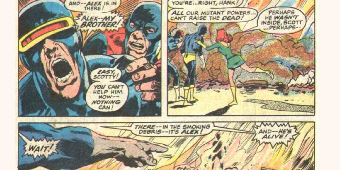
Check out the difference that it makes. Look at this page from the issue before...

See how the red in the sky is just cut and dry?
Now see how the colors in the sky are graduated in this page...

It's like the sky on the previously shown Superman cover!
Adams opened up the color shades a lot with this move...


Naturally, other comic book artists soon followed suit when they could.
In the early 1970s, Murphy Anderson opened up Visual Concepts, which did color separations and included a standard 70% tone. Still, it would not be until the paper in comics improved that 70/75% tone became a widespread thing in comics, but a huge step was taken by Adams on that issue of X-Men so many decades ago.
Thanks to Klaus Janson for the great information!