Arguably, the X-Men are responsible for the blockbuster superhero movie boom that the film industry has been experiencing for the better part of 20 years. Their very first film, X-Men, released all the way back in 2000, brought fans a then unprecedented look at some of their favorite heroes and villains on the silver screen. Of course at the time, costuming wasn’t quite built to adapt the fantastical outfits of the comics to the real world while maintaining what made them iconic and cool, and so fans often had to settle for some fairly drastic changes.
It gets worse then, when we have to look at some of the jaw-droppingly awesome concept art that’s meant to inspire the looks of these characters on the big screen. Generally, the concept art breathes life into classic comic book designs in a way that the X-Films just fail to do. Of course, that’s not always the case -- sometimes the transition to real life is a boon to a design that would be otherwise impossible to take seriously. And this time CBR has compiled them both, bringing you eight X-Men from the big screen that looked much better as concept art, and seven more that looked absolutely terrible.
15 BETTER: WOLVERINE

Only Wolverine could somehow manage to find his way onto this list not once, but twice. Guess that’s the way of things when you become the face of the entire franchise. Though several attempts were made to place the bestial berserker into some form of a costume over the course of Hugh Jackman’s time as the character, one by one all of them failed miserably or resulted in tiny teases at what fans have been clamoring for since day one.
But by the time we got Days of Future Past, everyone almost got their wish, as Wolverine suited up properly for the first time ever. There’s not even much of a difference between the suit we got, and the one in the concept art…only the concept provides us with some neat looking colors reminiscent of the Ultimate X-Men outfit that the film version is unfortunately missing out on.
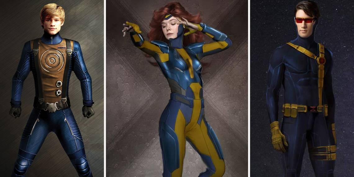
14 WORSE: HAVOK

Y’know, crazy as it sounds, maybe the Summers brothers are just all cursed to look hilariously goofy. It’s certainly not the actors’ fault -- James Marsden, Tye Sheridan, and Lucas Till could all easily be described as heartthrobs in real life. But there’s something about the unique designs necessary to portray both Summers’ powers that just winds up looking…silly.
Take this X-Men: First Class design for Havok, which is meant to pull both from Havok’s powers as well as the classic design of X-Men outfits, but still comes off looking like an overdesigned mess of an outfit. The version from First Class certainly is a faithful translation that manages to tone down some of the absurdity, but in truth neither of these outfits looks all that good.
13 BETTER: STORM

Storm has simultaneously some of the most iconic and coolest costume designs of all the X-Men, so it’s frustrating that all this time the films have managed to always place her in some generic team uniforms or equally pedestrian outfits when she should always come off like the sky goddess she is.
X-Men: Apocalypse struggled to change all of that though, giving Storm her own uniform as a member of one of the antagonists bodyguards. Still, when you realize what we could have gotten it still feels like we lost out. Go ahead and take in this concept art from Phillip Boutte Jr. and Louise Migenbach though, and realize Storm could just as easily have spent the entire last movie dressed like a punk rock goddess. Depressed yet?
12 WORSE: MYSTIQUE

Whether it’s Rebecca Romijn or Jennifer Lawrence, the X-Men’s premiere shapeshifter has managed to be one of the most important characters across two completely separate trilogies, so it’s pretty fortunate that they made her look not only comics accurate but kept it fairly consistent, right? Well yes, but did you know that almost wasn’t the case?
As you can see above, they came very close to mucking up one of the most important characters to the whole series by giving her a distinctly less human appearance, aping something far more reptilian in appearance even though there wasn’t really a need or a reference to it before. In a series where comics accurate characters are rare, thankfully smarter heads prevailed and they stuck to the design we’ve come to love in the films.
11 BETTER: APOCALYPSE

Apocalypse’s design for his first feature film appearance caused quite a stir in superhero fandom communities across the internet when they first showed him off. Comparisons to the 1995 Mighty Morphin’ Power Rangers: The Movie villain Ivan Ooze abound to this day, even. He started out as an inexplicable shade of purple before finally being appearing as the more recognizable shade of navy blue we all know the megalomaniac for. Unfortunately, it was far too late to change his actual design, which eschewed the usual technologically advanced look for one far more mystical in nature.
Honestly, it’s probably fairly accurate for what a former ruler over Egypt would’ve looked like, but that’s not what really fans came to see. And his look in the films is made all the more baffling when they had this far more comics-accurate look the entire time.
10 WORSE: DEADPOOL

This one’s cheating a bit, since they actually did get Deadpool wrong in his first appearance in X-Men Origins: Wolverine back in 2009. Despite being known as “The Merc with a Mouth” for who knows how long even by the time that film came out, someone got the bright idea to sew his mouth closed. (Honestly, it’s probably a fairly logical decision in-universe, but that’s certainly not what fans came to see when they heard Deadpool was in the movie.)
Still, there are a ton of concept art designs of everyone’s favorite fourth-wall breaking mercenary from the film that all look positively terrible, ranging from a mouthless monstrosity to this dime-store knock off above. Fortunately, when Ryan Reynolds finally got to play the character in a solo feature, they nailed the assassin’s signature look perfectly.
9 BETTER: JEAN GREY

When Jim Lee took on the X-Men in the early '90s, the artistic virtuoso gave the team one of its most iconic makeovers ever, giving them all the costumes they would eventually come to be most known for due to the 1992 Fox Kids cartoon, X-Men: The Animated Series. Though realistically the suit itself was a bit over the top (and definitely overly form-fitting), when it was re-imagined by artist Alan Villanueva for Sophie Turner in X-Men: Apocalypse, things…changed.
The form-fitting designed was swapped for something that looked a lot more like body armor, yet retained unique, comic book-y feel suited for some of the most popular superheroes in comics. It’s just too bad we lost that look in order to take on a more generic black body armor in the film.
8 WORSE: JUBILEE

When X-Men: Apocalypse finally gave the mutants their '80s period piece, Xavier’s School for Gifted Students was finally granted one of their best and “brightest” (get it?) in the form of Lana Condor’s Jubilation Lee. Her look was perfect, right down to the oversized hoop earrings and so-loud-it's-blinding signature yellow overcoat.
But did you know they thought about putting the teen in Days of Future Past? She would’ve been one of the last X-Men, staving off the utter extinction of mutantkind by battling against the Sentinel threat. Fortunately this idea was ditched fairly early on, because one of the last things we need is a character like Jubilee dragged into a dystopian future and given drab post-apocalyptic wear. You don’t bring in one of the most colorful characters in the series only to shove her into a bunch of earth tones.
7 BETTER: X-23

Dafne Keen was a standout performer that’s a large part of why Logan felt like such an amazing film, managing to perfectly convey the rage that a diminutive version of Logan should have. But did you know that we could have had an older, more comics accurate version of the clone we’ve all come to know and love? That’s right, initially a teenaged version of X-23 was considered but was eventually nixed by director James Manigold, who claimed he didn’t want to make the movie feel “like a CW show”.
The movie was a massive success so it’s hard to say he was wrong, yet at the same time the mind can’t help wondering just how cool it would have been to have a version of X-23 that was much closer to being an adult, even if she would’ve been an emo goth girl.
6 WORSE: SENTINELS

This possibly could’ve been a worse and better at the same time. As some of the oldest foes the X-Men have ever had, the Sentinels have been everything from a minor thorn in the team’s side up to their greatest enemies, responsible for wiping them out in some of the alternate futures the comic is so well-known for.
And in X-Men: Days of Future Past, the Sentinels got to be both -- existing in the past as comical looking giants with massive fans taking the place of their usual chestpieces, while in the future as monolithic shapeshifters capable of adapting to any power homo superior could throw at them. And while the Sentinel concept art certainly looks cool, it doesn’t quite portray the sheer terror that the ones from the actual film manage to give off quite convincingly.
5 BETTER: CYCLOPS

Scott Summers has always had a bit of trouble when it comes to being translated off the page and onto the big screen. Whether it’s a question of casting or just general suit (and visor) design, somehow the actor playing him always winds up looking like a giant dork. So then maybe it’s not fair to blame Tye Sheridan for not looking as awesome as these inspired Cyclops concept art designs, which draw on both Cyclops’ classic '90s look right down to the signature cross sash with a giant X communicator.
Well, it certainly isn’t fair…but that’s still not going to stop us for blaming the film for not just putting Sheridan in the more comics accurate suit we saw him in at the end of X-Men: Apocalypse from the beginning of the film.
4 WORSE: JUGGERNAUT

Okay, so Vinnie Jones’ performance as the Juggernaut in X3: The Last Stand wasn’t the best, and arguably it was one of the first times an internet meme was brought directly before mainstream audiences. And his costume isn’t nearly as cool-looking as the classic red original designed by Jack Kirby, but at least it tries -- they did their best to replicate the helmet and parts of the outfit, as well as the overall intimidation factor of the unstoppable Juggernaut with a 2006 era budget and special effects.
Could it have been better? Sure. But it’s still leaps and bounds more impressive than the concept art for the Juggernaut, which for once doesn’t even try to attempt being comic book accurate. This version of the unstoppable avatar of Cyttorak would’ve resembled a hobo more than anything else, and thank goodness we were saved from it.
3 BETTER: EMMA FROST

By far, Emma Frost is one of the best and most complex characters the X-Men franchise has to offer, and yet unfortunately she’s been absent from the vast majority of their films. But in 2011, January Jones finally gave us a real life face to match to the White Queen in X-Men: First Class. And although unfortunately her portrayal left something to be desired, what was particularly lacking was Emma Frost’s diamond mode.
Normally portrayed as a shinier version of Colossus, in First Class she wound up looking like an actual diamond ring, and seeming far less like the invulnerable butt-kicker she normally does. It wasn’t a particularly inspired portrayal, especially when compared next to some of the concept art for her, which takes some liberties with how she looks in the source material to emphasize the White Queen’s beauty instead.
2 WORSE: WOLVERINE

From the very beginning one of the major complaints nearly every X-Men fan has had has been the series’ unwillingness to place Logan in any sort of costume resembling his duds from the source material. Whether it’s the brightly colored blue and yellow or the more realistic muted brown and yellow, Hugh Jackman avoided wearing any variation of Wolverine’s classic outfit for nearly two decades straight, from the dawn of the superhero era in 2000 all the way up to his breathtakingly good performance in 2017’s Logan.
And to be honest, when you look at outfits like this one it’s not hard to see why. Sure, in terms of pure concept art it looks amazing, but can you see it translating to screen while retaining Logan’s serious, berserker nature? Yeah, probably not, right?
1 BETTER: ICEMAN

Despite being one of the founding members of the X-Men and being in four of the six main X-Men movies, Iceman has never played a particularly strong role in any of those films. It’s a shame too, considering as an elemental and Omega-level mutant he’s easily one of the most powerful members of their arsenal. But it also probably doesn’t help that the character’s never exactly looked cool on the big screen.
Maybe it has something to do with how much work it is to make ice textures look good using CGI, but there’s no question that Bobby Drake always looks cooler in his concept art versus the actual films. Even his appearance in Days of Future Past looks more like someone’s ice sculpture rather than an awesome ice elemental superhero that’s a member of the Resistance protecting his mutant people.