Audiences have been amazed and entertained by video games since the industry’s inception, but it’s fascinating to see how the medium grows more mainstream with each passing gaming generation. There are now so many factors to consider when checking out a new video game, not to mention plenty of resources to get information and opinions from.
A title’s box art is still an important marketing element, but there used to be a time when a game’s box was the primary look into its virtual world. Some box art for games is truly gorgeous and perfectly reflects the title’s story and themes. However, there are also some highly regrettable box art decisions that range from confusing to just unpleasant.
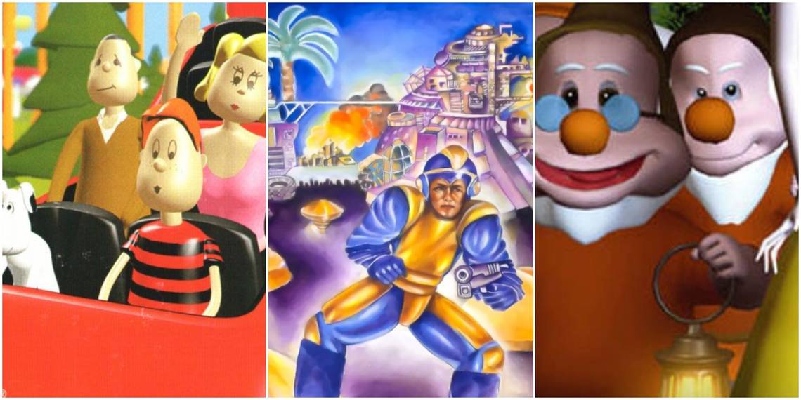
10 Mega Man’s Gaming Debut Is As A Bulky, Beleaguered Warrior

Capcom’s Mega Man has become one of the developer’s most celebrated gaming mascots, and the franchise has experienced colossal success across multiple home console and handheld platforms. Mega Man’s legacy is undeniable at this point, which makes it such a shock that the original game’s North American box art is such a dreadful, ugly misfire.
The cute and stylized look for Capcom’s Blue Bomber has become iconic, but the original Mega Man’s box art leans into a photo-realistic approach to its hero, and it’s not pretty.
9 Karnaaj Rally For The Game Boy Advance Is A Car Crash On Every Level

Jaleco’s Karnaaj Rally, an aggressive and destructive racing title for Nintendo’s Game Boy Advance, has a lot going against it between its incomprehensible spelling of “carnage” and the embarrassingly “hip” model that adorns the cover (and pushes the vehicle into the background).
The biggest tragedy with the Game Boy Advance's Karnaaj Rally is that there's allegedly a decent handheld racing game that's hidden underneath the obscene packaging. However, the energy that the game's box art gives off pushed many to not even bother consulting the game's reviews.
8 Snow White And The Seven Clever Boys Features Box Art That Could Be Cursed

Phoenix Games is a now-bankrupt game developer that turned into a running joke in the community due to their lackluster titles, some of which give shovelware a bad name. Phoenix Games are full of clunky gaming experiences that feel more like beta tech demos than finished products.
The box art for these games is just as disappointing, many of which make their kid-friendly fairy tale adventures look more like survival horror games. Snow White and the 7 Clever Boys for the PlayStation 2 is the most haunting of Phoenix Games' box art, and all of its friendly figures look like they're up to something malevolent.
7 Russell Grant's Astrology Is Not A Joke And Begs For Attention

The touch-screen mechanics and portable nature of the Nintendo DS resulted in a wealth of bargain bin experiments that cater more to casual gamers than the hardcore crowd. There are some entertaining DS titles that focus on specific niches, like Brain Age, and a title focused on astrology isn’t an inherently bad idea.
However, Russell Grant’s Astrology puts its titular figure front and center. In the end, Russell Grant’s Astrology is a perplexing monument to vanity. If acclaimed developers like Shigeru Miyamoto or Hideo Kojima aren’t plastering their faces on their games’ box art, then Russell Grant shouldn’t get a free pass.
6 Theme Park Uses Lifeless Models To Sell This Labor Of Joy

The formerly-niche genre of simulation games has become a mainstream success, and there are more creative applications of this idea than ever before. Theme parks have received lots of representation with sims, and Theme Park for the Sega Saturn and PlayStation brings this excitement to home consoles.
There’s a satisfying game within Theme Park, but the game’s box art is beyond lazy with its bland 3D representation of a family having “fun” on a rollercoaster. This cover completely undersells the game, but what’s so confusing is that Theme Park’s Japanese box art is beautiful and uses an attractive 2D art style. They never should have turned to something different.
5 Chuckie Egg II’s Box Art Turns Its Hero Into A Survival Horror Monster

To be fair, a lot of video game box art from the 1980s consists of confusing oddities that take many liberties. Chuckie Egg II for the Atari ST is a deeply troubling cover since it alienates the game's target demographic through a nightmarish visual. The human affectations applied to the titular Chuckie Egg are aesthetically unpleasant and won't push anyone to seek out the original Chuckie Egg.
The game's box art rendition of its protagonist doesn't look anything like its video game counterpart. It actually bears more of a resemblance to a monster that would be encountered in Silent Hill or Elden Ring's The Lands Between.
4 Big Mountain 2000 For The Nintendo 64 Picks An Awkward Art Style

The Nintendo 64 has sublime snowboarding titles like 1080 Snowboarding and Snowboard Kids, which means that it’s extremely unlikely that fans of the sport would resort to playing Big Mountain 2000 in the first place. Big Mountain 2000 fails to do anything new with snowboarding mechanics, but the title’s gaudy clip-art-esque box art is also a serious distraction.
The cartoon style clashes with the game’s presentation and feels like it’s pulled out of a point-and-click adventure from the early 1990s. Big Mountain 2000 was released in Japan as Snow Speeder nearly two years before the North American port. The Japanese art is also a mess, but not as egregiously so.
3 Ninja Golf Is A Ridiculous Parody That Asks To Be Taken Seriously

Ninja were rampant in the gaming industry during the 1980s. Golf games were also easy to pull off with early gaming hardware, but that doesn't mean that these two worlds should crossover. Ninja Golf is exactly what it sounds like, but it's hard to not laugh at the box art for the Atari 7800 sports game.
It's very funny that the box art for Ninja Golf shows that the sport occurs at night, which makes sense for a ninja, but is wildly unproductive for golf. This box art is ridiculous, but so is the actual gameplay behind Ninja Golf, which attempts to combine these disparate elements.
2 Palamedes Is An NES Puzzle Game With Nightmarish Box Art

The lack of story that's present in certain early puzzle titles means that the box art needs to take some creative liberties to give the game some personality. Palamedes is a puzzle game for the original Nintendo Entertainment System that embraces dice and chance-based exercises in its gameplay. Palamedes' box art deserves credit for the lively image that it creates.
Unfortunately, it's a visual that's likely to frighten away potential audiences. The anthropomorphic dice on the box art are oddly eerie in their own way, but the expressively creepy face on the human, who is presumably the audience surrogate, is worse than any jump scare.
1 Forsaken 64 Turns To High Fashion Instead Of Accurate Gameplay Representation

There is a lack of mature games on the Nintendo 64, which helped games like Forsaken 64 stand out from the crowd. The adult first-person shooter was a fairly obscure Nintendo 64 release, but the game’s confusing box art likely didn’t help boost its sales.
A level of self-seriousness entered the video game industry during its fifth and sixth generations, which was frequently reflected through marketing. Forsaken 64 adopts an artistic box art design that’s not ugly, but feels more like a Calvin Klein magazine ad. The model and her unsubtle Forsaken tattoo are indulgent, not exciting.