One of the defining traits of a comic book character is their costume. Since the beginning, comics were known for having outlandish characters with bright, colorful costumes that would stand out from the rest of the page. This iconic outfits would become staples of each character. Because of this, there's a certain expectation when adapting them to a live-action format to then give them an accurate costume that pays respect to their origins. Marvel was known for bucking a lot of the standard trends when it came to superhero costume design. An outfit like Spider-Man's was unheard of at the time, and it only got wilder from there. Regardless of whether they ripped off DC or not with some of their characters, there's no denying that they have some impressive costumes that have made their mark on the industry.
Because of how memorable these costumes are, one would think it would be easy to adapt them for a movie or TV show. Unfortunately, that isn't always the case. Sometimes, a director believes that a comic book outfit wouldn't look good on the big screen or tries to go with their own adaptation. Whatever the case, audiences have had to sit through a lot of poorly-adapted costumes for heroes and villains. Marvel now has a solid grasp on how to adapt a comic book costume for live-action, but that hasn't stopped us from forgetting the 25 worst Marvel character costume adaptations of all-time. We're taking a sorry trip down memory lane.
25 IRON FIST
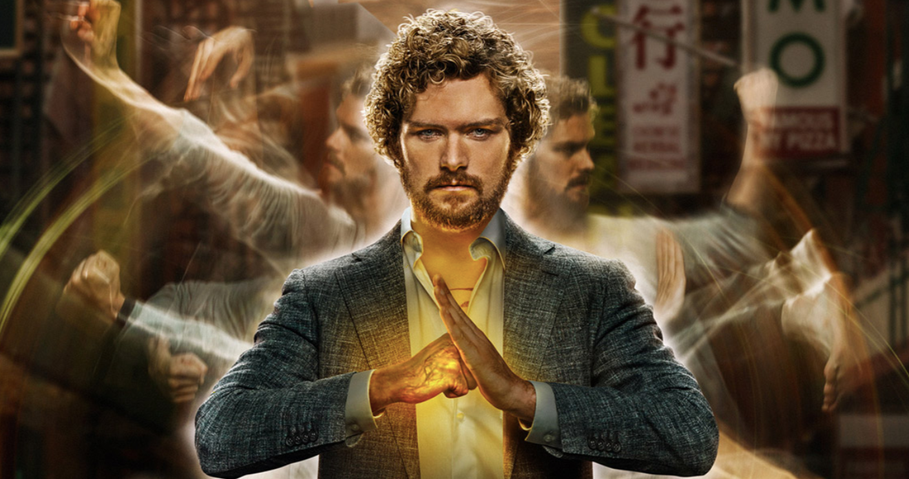
With the Marvel Netflix shows containing their own universe, it wasn't long before Iron Fist was brought into the mix. The character was known for his green outfit and yellow bandana to signify his mastery of martial arts. Unfortunately, the show creators have yet to use the costume, instead giving Iron Fist street clothes.
He still has the dragon tattoo on his chest, but that's all any comic book fan would recognize from the design. It's a poor shadow of a greater costume.
24 GREEN GOBLIN
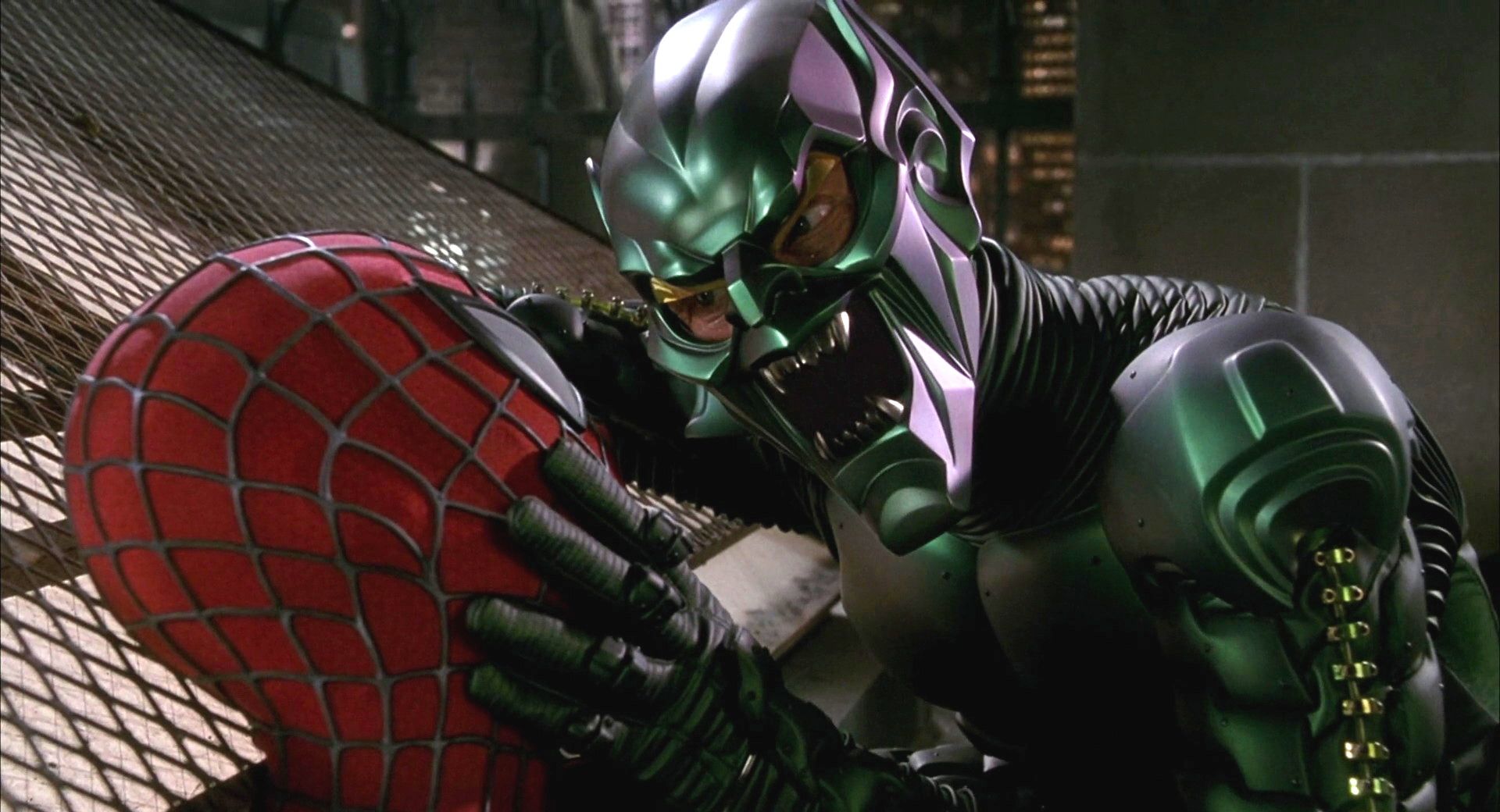
Spider-Man was one of the first films to begin the trend of superheroes in pop culture. It did a lot of things right and became one of the most beloved comic book movies. One thing that they could've done better is Green Goblin's costume.
This villain looks more like a product of the '90s and has little to do with his original version apart from his color. It's a shame that no movie has adapted the original Goblin costume.
23 THE THING (2015)
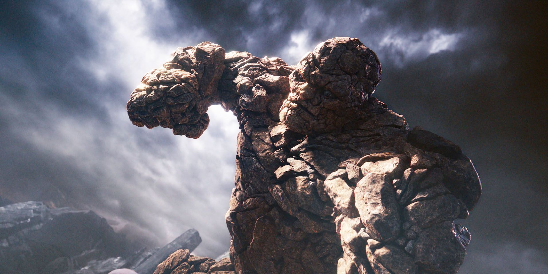
All live-action versions of the Thing had a chance to be on this list, but we have to give it the one seen in 2015's Fantastic Four movie. With the advancement in technology, Thing was created using CGI, so you'd think that he would look better. You would be wrong.
Taking away the trademark blue shorts and making his face nearly indistinguishable, the Thing was a painful attempt at modernizing a classic character. It was arguably worse than the 2005 version that was just one big ugly suit.
22 X-MEN
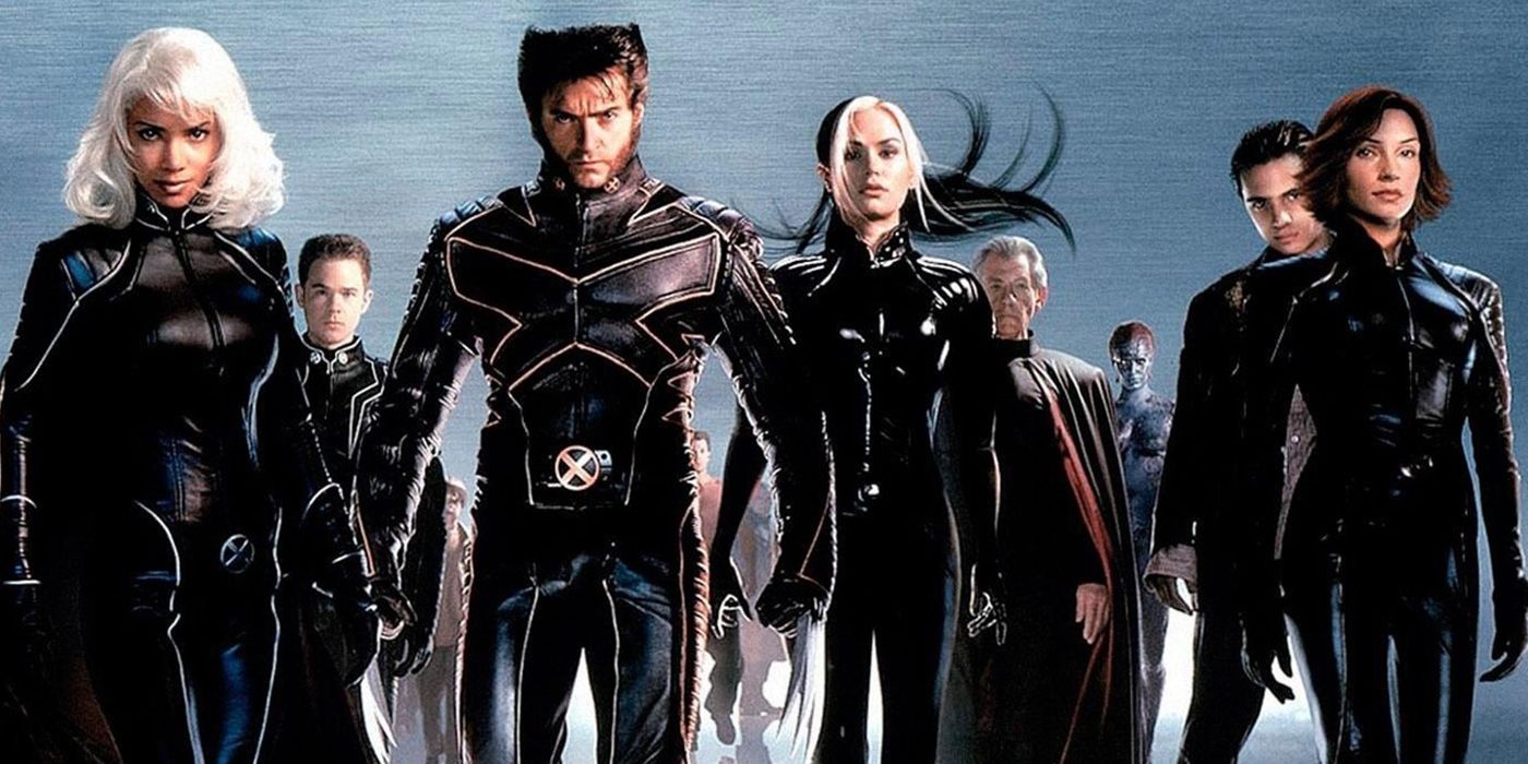
When the X-Men were first introduced on the big screen, it makes sense that FOX would hesitate to give them their colorful uniforms. However, the culture is past that point and wouldn't be phased by seeing a green Rogue or a blue Cyclops.
Unfortunately, FOX has never quite taken notice and kept the X-Men wearing identical uniforms. It wouldn't be so bad if the uniforms weren't all black with little detail. It was painful to look at back in the early '00s and it's painful to look at now.
21 WOLVERINE
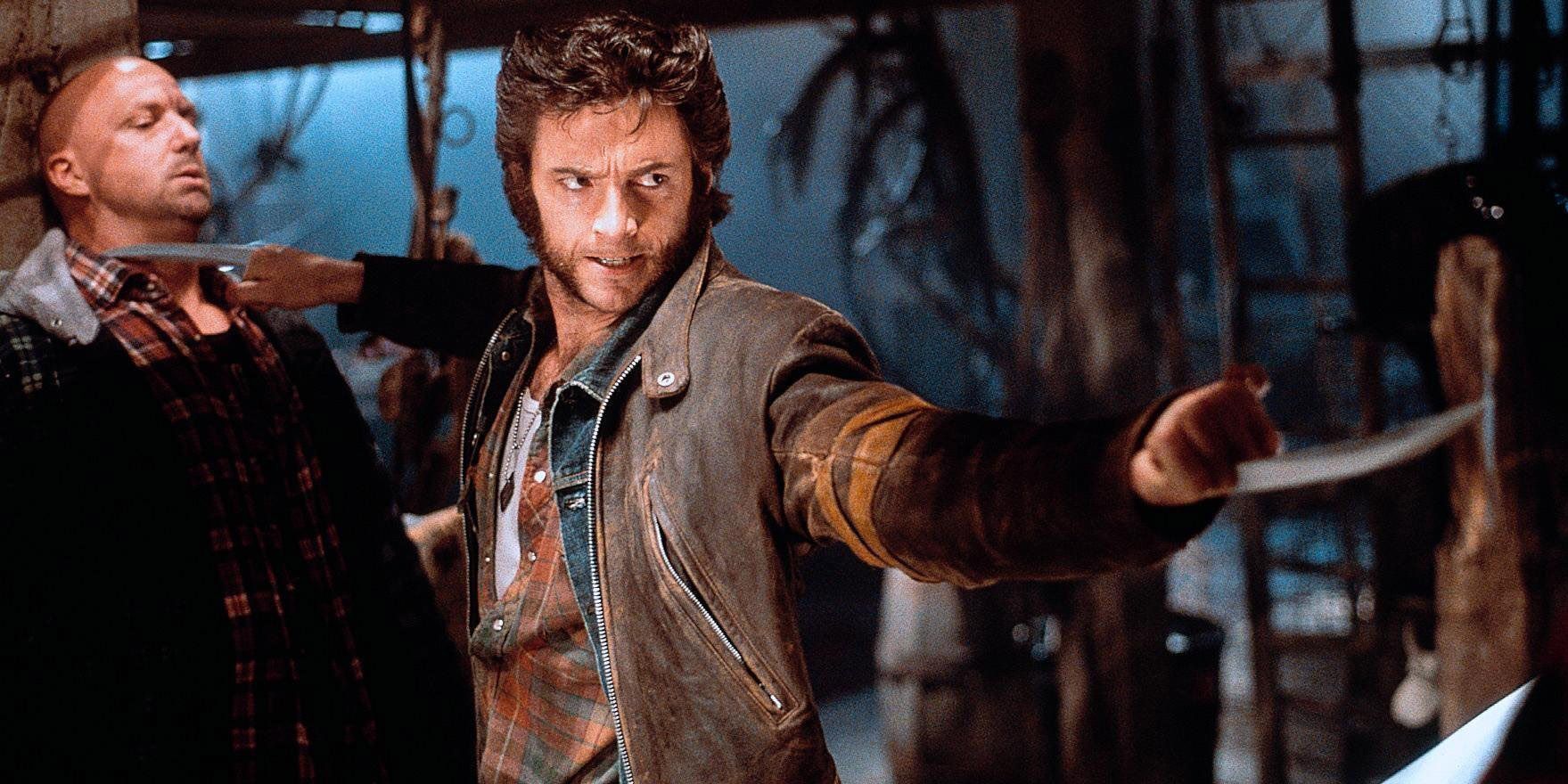
Just about everything with the live-action Wolverine character is perfection -- the casting, attitude, and direction are all spot-on. The only place where FOX could've done better is in the costume department. Wolverine never wore a superhero costume other than the X-Men uniform.
Considering that he has such an iconic look in the comics, it's a shame that it was never adapted in live-action. They even almost teased it in The Wolverine but decided not to go through with it, which is just sad.
20 DEADPOOL (2009)
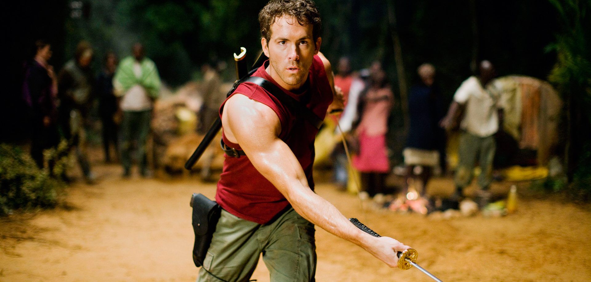
Anyone who loves Deadpool has probably heard of X-Men Origins: Wolverine. This dumpster fire of a movie has an entire army's worth of problems, the biggest one being how they adapted Deadpool. Instead of making the character somewhat recognizable in attitude or in appearance, they sewed his mouth shut and gave him weird eyes.
He didn't wear his red suit and was covered in weird markings from head to toe. It was a massive slap in the face for anyone who loved the character. It's a good thing FOX righted that wrong later.
19 APOCALYPSE
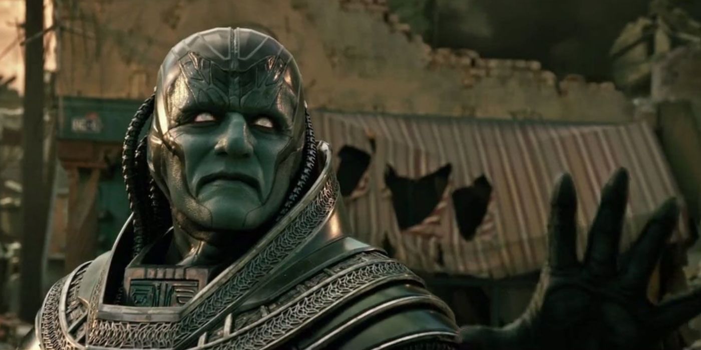
Apocalypse is one of the biggest threats the X-Men ever faced. Being the first mutant, he had access to all sorts of powers that likened him to a god. He could change his size, was always imposing, and struck fear whenever he appeared in the pages. It would've been a fairly easy character to adapt for X-Men: Apocalypse.
Instead, we got Oscar Isaac in weird paint and an alien costume. Apocalypse is supposed to be menacing and chew up the scenery, but the live-action version left much to be desired. He's more laughable than scary.
18 BLACK BOLT
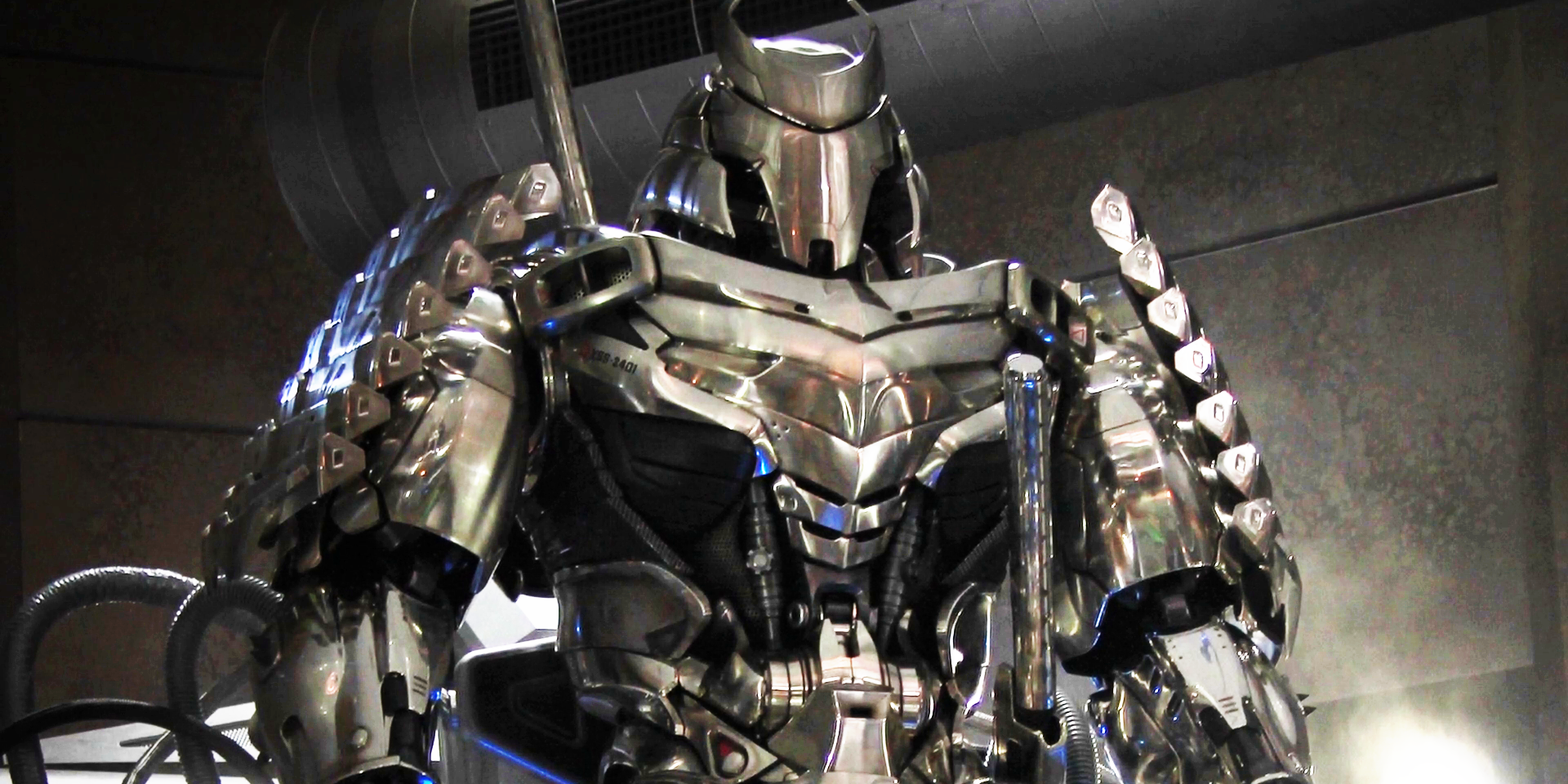
Black Bolt is the King of Attilan and the leader of the Inhumans. Having one of the strongest powers in the Marvel Universe, he had a striking black and white costume to go along with it. Going into the Inhumans TV series, Marvel threw that out the window in favor of something that better showed the character's face.
Apart from the lightning bolts, there is nothing recognizable about this adaptation -- it makes Black Bolt look like just another Marvel character. Considering how big he is in the comics, it's a huge crime against the King.
17 MORDO
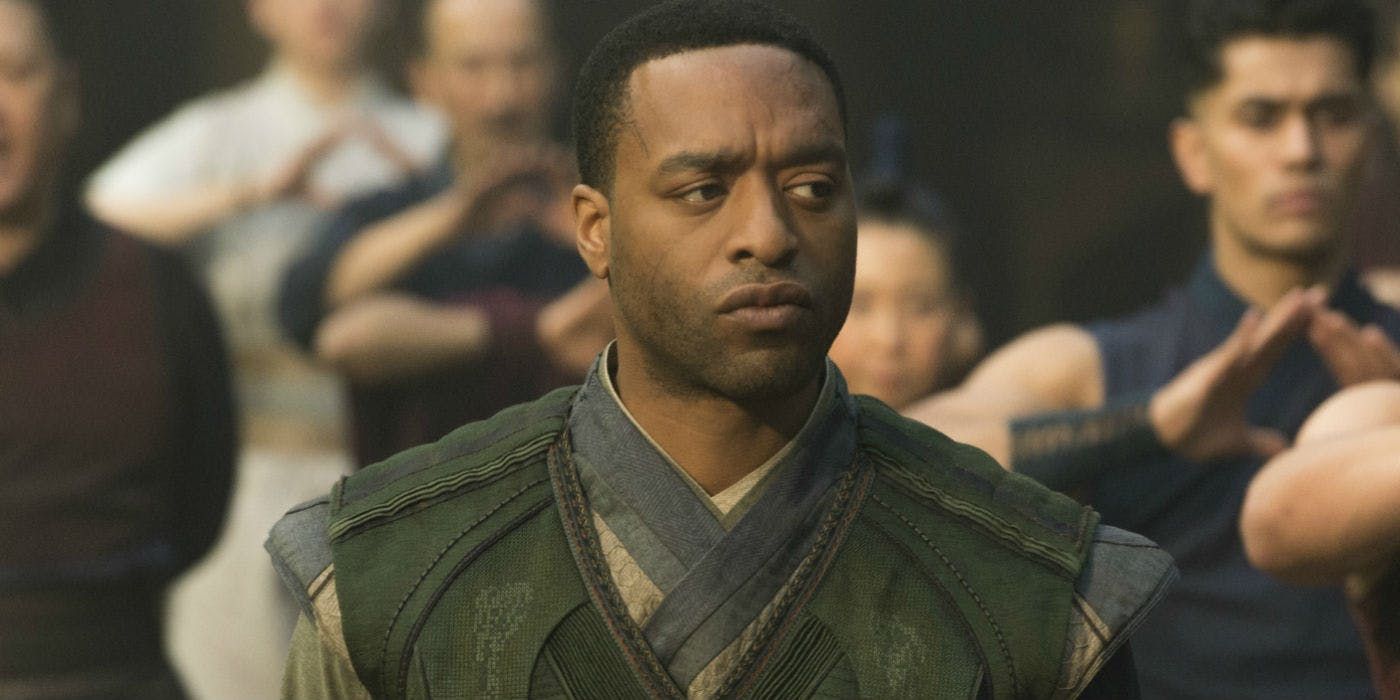
Most of the MCU costume designs have been spot-on. They were different enough that they weren't one-to-one adaptations from the comics yet similar enough they were recognizable. However, Mordo was unlucky enough to not get the same treatment.
In Doctor Strange, there wasn't anything about his look that stood out. Sure, he had a little bit of green on, but considering how, in the comics, he was a mirrored version of Strange, it seems like a missed opportunity. There's still time to rectify that mistake, though.
16 CAPTAIN AMERICA (1979)
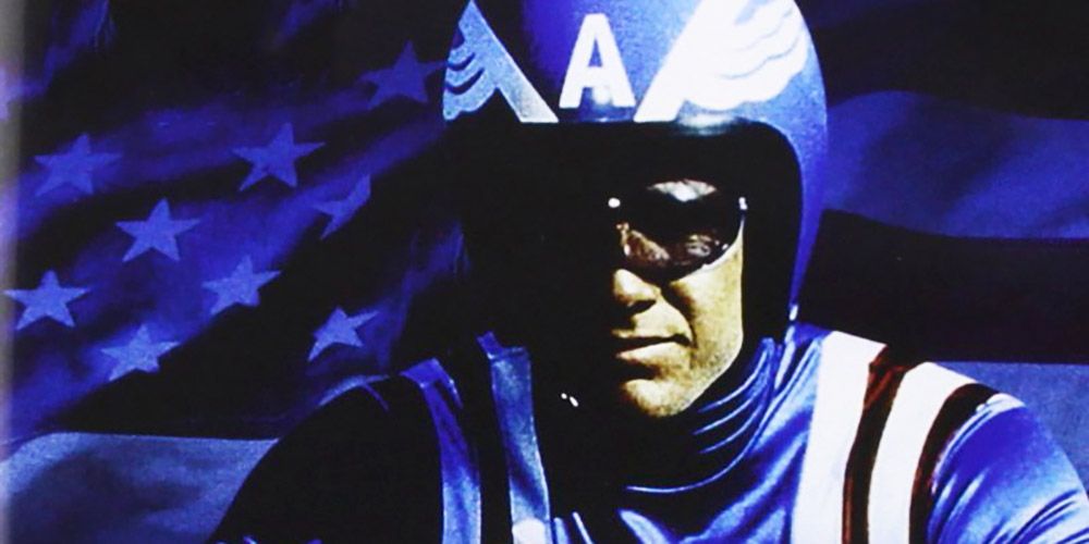
Captain America has gone through several adaptations on the big screen. While any one of them before Chris Evans' version could've made the list, we had to give it to the 1979 iteration of the character. The biggest mistake in adapting Captain America was giving him a painted motorcycle helmet and a ridiculous visor.
He looks more like a stuntman than the Star Spangled Avenger. Making matters worse is the fact that the movie also leaves much to be desired. At least Marvel is getting his design correct in the MCU.
15 RHINO
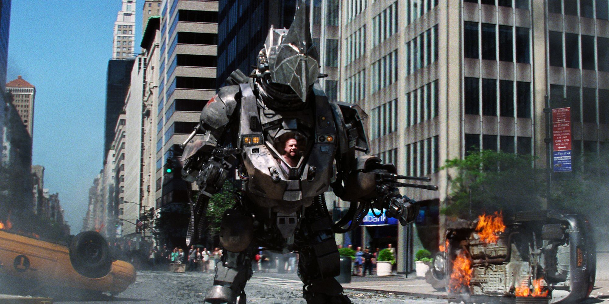
Rhino finally made his big screen debut in The Amazing Spider-Man 2. Comic readers may know him as a half-man, half-rhino hybrid. He's big and dumb, but he packs a serious punch. In the movie, though, his original look was thrown out the door. Instead, Sony gave him a massive suit that was given to him by Oscorp.
It's not nearly as striking as one might expect, and it blends in with a lot of big robot villains seen in movies. As if that weren't bad enough, there were no outstanding villain designs in that film.
14 DAREDEVIL (2003)
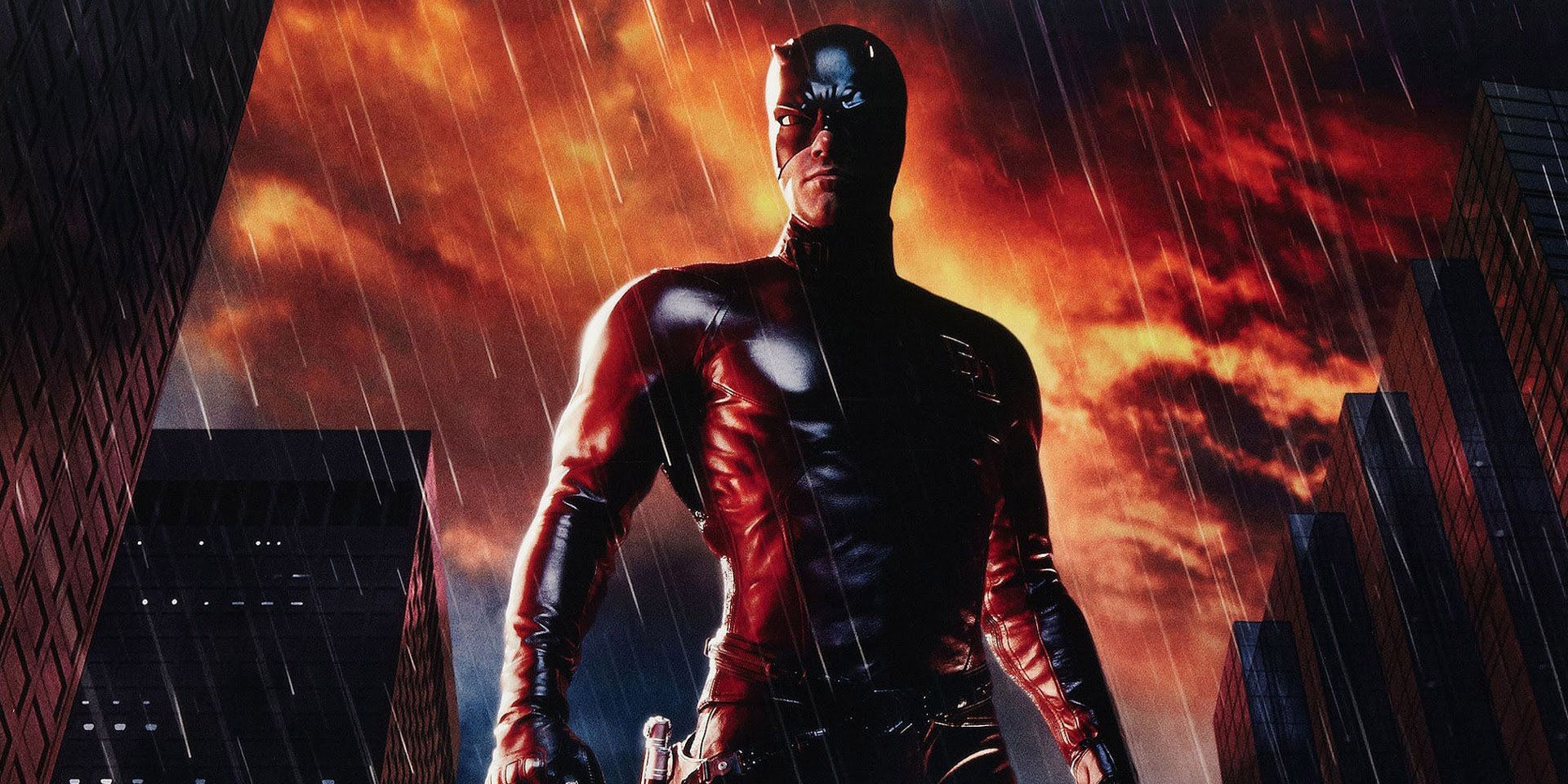
When Ben Affleck was cast as the Man Without Fear in 2003, it left a lot of people scratching their heads. Surely that would turn out poorly, right? It turns out that the skeptics were on the money with their predictions, as Daredevil wasn't a great film. Part of that was how they adapted Matt Murdock's costume.
They almost perfectly replicated it in a skin-tight leather suit. The problem is, that look doesn't really work in a movie. It sticks out like a sore thumb and is a marker of over-the-top superhero movies of the early '00s.
13 QUICKSILVER (MCU)
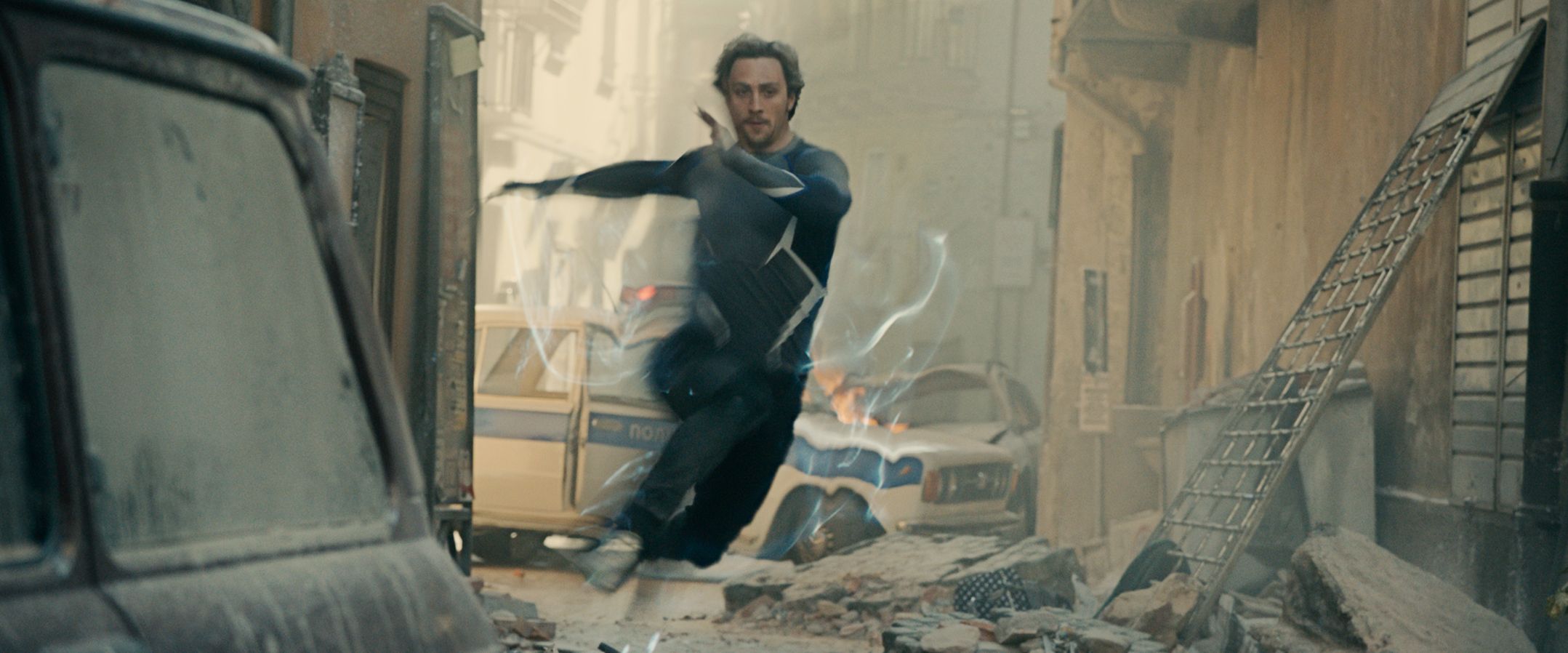
When FOX and Marvel announced that they would both be using the Quicksilver character, many assumed that Marvel would top FOX. However, many people were surprised to know that wasn't the case. Introduced in Avengers: Age of Ultron, this version of Quicksilver was wearing athletic pants, an Under Armor T-shirt, and some snazzy sneakers.
Apart from his clearly fake white hair, there wasn't anything memorable about his design. FOX definitely tried something more daring with their version.
12 HULK (2003)
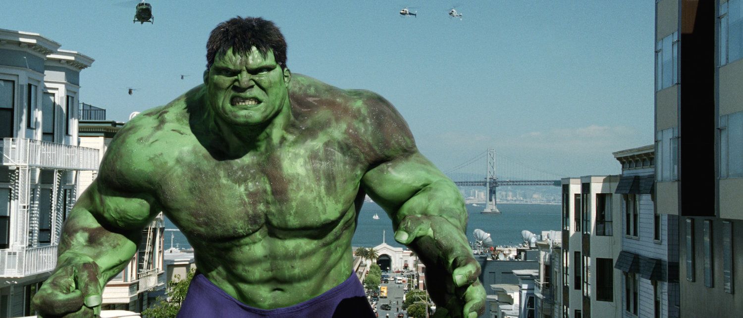
The Hulk has been the subject of several adaptations for a while. In 2003, he was given a feature-length film under the direction of Ang Lee. Unfortunately, the Hulk movie was an overstuffed mess. One of the biggest issues is how the Hulk looked.
Being the first iteration of Banner's alter ego as an entirely-CGI character, it looked awful. Considering how many shots there are of the Hulk in the movie, it gets more distracting the longer the movie goes on.
11 BULLSEYE
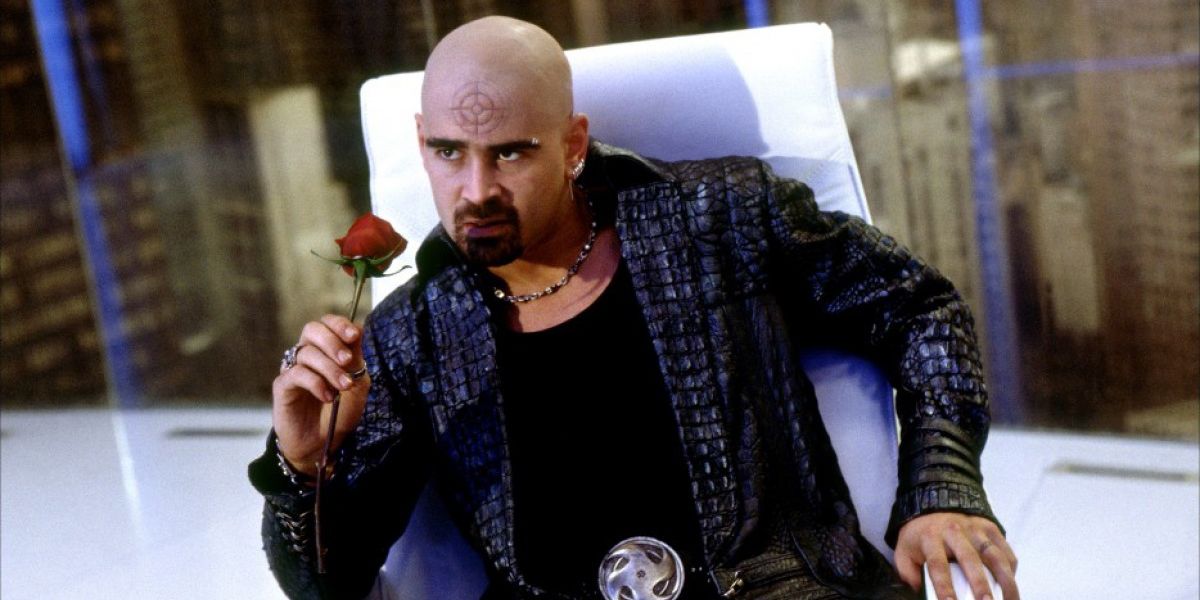
The 2003 Daredevil movie pulled out all the stops in terms of iconic characters. Not only did it feature Kingpin, Matt Murdock's archnemesis, but it also brought in Bullseye, another iconic villain. Where Bullseye looked like a skilled and psychotic assassin in the comics, the movie version just looked like something you'd find on a TV show.
The bullseye symbol was engraved in his forehead and he just wore a leather jacket to look cooler. It didn't help that the performance was extremely over-the-top as well.
10 DOCTOR STRANGE (1978)
What a lot of people don't know is that there was an attempt at bringing Doctor Strange to the small screen in 1978, and there's a reason for that. The Dr. Strange TV movie was a proposal to start a new TV series, but it fell through. One of the reasons is how dumb the character looked.
If the creators thought that the comic version was too campy, they didn't do the design any better. Gone is his cape and, instead, he is given a shiny necklace and an afro. He looks like someone who should be roller skating rather than protecting dimensions.
9 DOCTOR DOOM (2015)
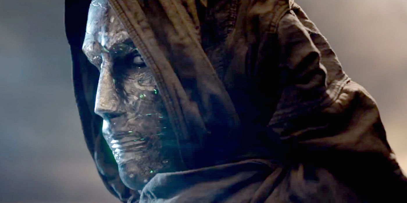
Doctor Doom hasn't seen the justice he deserves. Being one of the greatest comic book villains of all time, it's a tragedy that he hasn't been fantastic on the big screen. Both versions of him in live-action haven't been great, but we have to tip our hats to the 2015 iteration.
This version of Doctor Doom looked like a bootleg version of the real character. He had a weird suit over his body and the cloak was nothing more than rags. All of the costumes were bad in that film, but Doctor Doom's arguably took the cake.
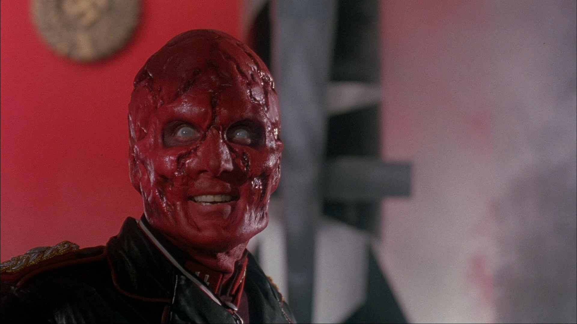
8 RED SKULL (1990)
Hugo Weaving's portrayal of the Red Skull was decent in Captain America: The First Avenger. The design was also spot-on, looking like a perfect combination of a supervillain and a Nazi extremist. However, there was a time when Marvel didn't quite adapt that character well.
In the 1990 Captain America movie, the Red Skull was the bad guy. The big difference was that, this time around, he looked like a goofy Power Ranger villain. Just gazing at one picture can stir up a mass of laughter. It doesn't compare to the MCU iteration.
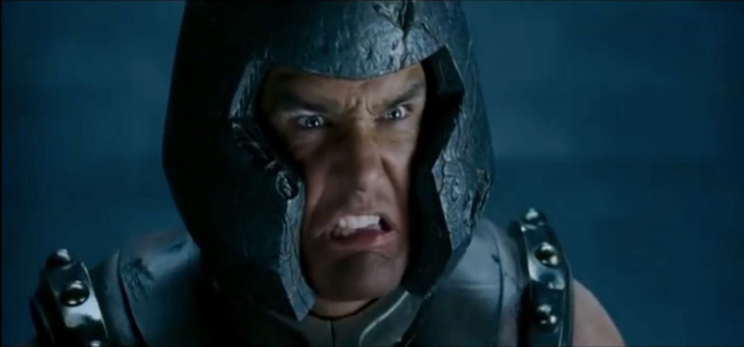
7 JUGGERNAUT (2006)
The Juggernaut is a classic X-Men villain, having a bulky yet effective design. He is a mutant who can crash through just about anything and has super strength. Bringing him into X-Men: The Last Stand should've been a straightforward process, then.
However, FOX was still stuck on changing the comic book costumes, and their version of the Juggernaut was fairly awful. Wearing an even goofier helmet than the comics and having no shirt, it looked ridiculous. It's almost appropriate that the character ended up becoming a meme.
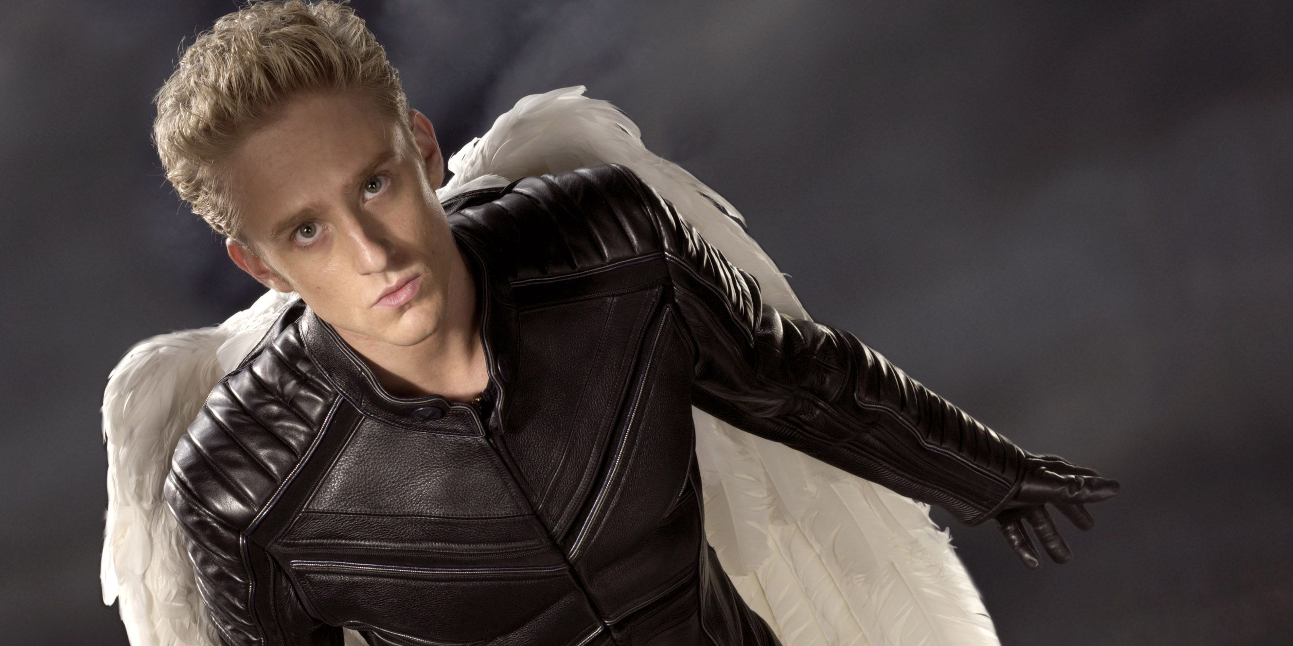
6 ANGEL (2006)
Angel has always been an interesting character. Mostly known for being one of the Four Horsemen of Apocalypse and turning into the Archangel, he's had a simple and impressive design that made him stand out from the rest of the cast.
However, leave it to X-Men: The Last Stand to throw that all by the wayside. Angel was just a teenage heartthrob who wasn't wearing a shirt and had horribly fake angel wings on his back. His design was improved in X-Men: Apocalypse, but the character needed a lot of work then as well.

