
I had killed a man. I had killed a man to get a woman. I had put myself in her power, so there was one person in the world that could point the finger at me and I would have to die. I had done all that for her, and I never wanted to see her again as long as I lived.
That's all it takes, one drop of fear, to curdle love into hate. (James M. Cain, from Double Indemnity)
"It hurts to set you free but you'll never follow me"


Pretty Deadly #1-5 by Jordie Bellaire (colorist), Clayton Cowles (letterer), Kelly Sue DeConnick (writer), Emma Ríos (artist), and Sigrid Ellis (editor). $3.50 (each), FC, Image.


I have argued in the past that "pretension" shouldn't be the bad word we've made it out to be, to very little avail. I don't have any problem with "pretentious" comics or books or movies or music, because I think artists should strive to deliver art that attempts to challenge us. I mean, what's the use of art otherwise? So when I call Pretty Deadly "pretentious," you may read that as a negative, but I don't ... necessarily.

Where "pretentious" becomes a bad word is where any other descriptor becomes a bad word - when that's all the artist is trying to be, without thought to the skill and care that comes from creating a work of art. Where "pretension" becomes the point, where the artist strives so hard to be relevant that the emotional core of the work doesn't exist or is obliterated.
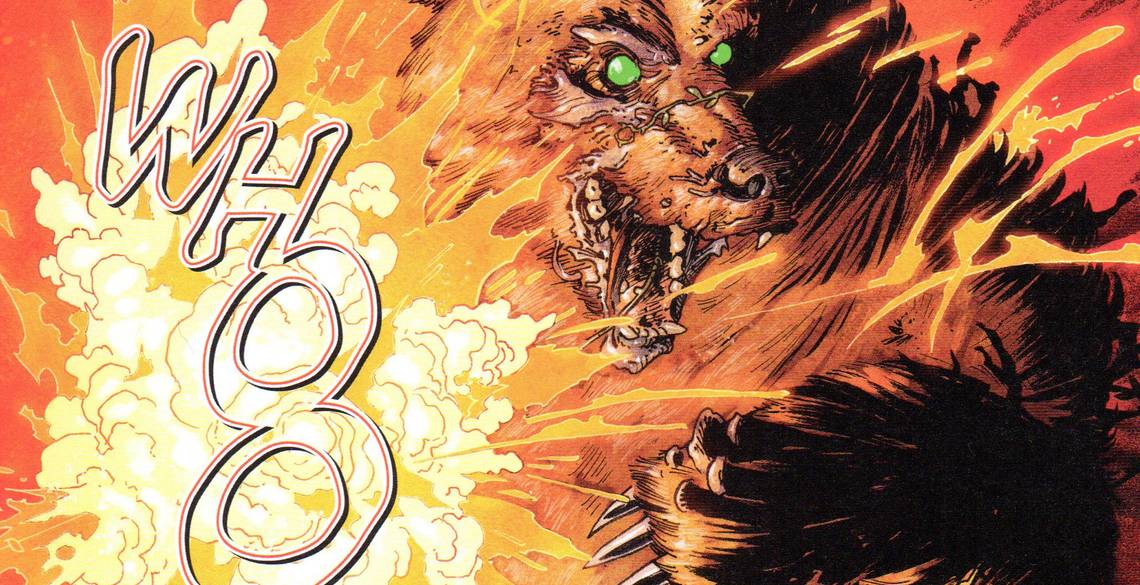
DeConnick, Ríos, Bellaire, and Cowles are trying to do something different, and for the most part, they succeed. Pretty Deadly is a moody "weird" Western, with a bunch of characters wandering around a hellish, Biblical landscape fighting against Death. Deconnick creates a myth of a man, a woman he imprisons in a tower, Death falling in love with her, the baby born of their union, and the man's quest for redemption, which doesn't go well. The main character is a girl named Sissy, who has her own unusual backstory. There's a woman who turns into butterflies, there's a butterfly who chats with the skeleton of a rabbit, and there's a man who may or may not be a coyote. Yeah, it's a strange comic.
Pretty Deadly is the kind of comic that gets more interesting when you think about it, because while it has a bunch of flaws, DeConnick manages to tell a standard story in an unusual way, which mitigates some of those flaws. DeConnick is committed to the relationship between Fox and Sissy, for instance - the old man looks after the young girl, and it's the crux of the whole arc (these five issues form the first arc of the series, although it seems like they could easily be the complete series if the creators were unable to return to the book). It's a foreshadowing kind of relationship, and at moments it's beautifully written, but as Fox and Sissy are somewhat archetypal, their relationship is a bit formulaic. In the same way, Death's love story with the woman feels too mythic. Myths are often too epic for us to care too deeply about the characters - they exist to create stories about how the world works, not so that we want to know more about them. DeConnick has succeeded to a degree in creating myths in a new setting, but because she starts with the mythic aspects and not the character aspects, the book feels a bit stilted. Its formalism is part of its power, but it also creates a barrier between the reader and the characters. Sissy and Fox and Alice and Ginny are constructs meant to get us to a point, and DeConnick gets to that point, but for me, at least, the final issue, which should be more emotionally effective, doesn't work as well as it should.

I can admire the way DeConnick sets everything up and then goes through the paces of reaching a point, and I like the fact that she's trying to make this an epic, but epics are only impressive if the characters are interesting, and ultimately, DeConnick's characters are types, not people. It makes the book frustrating.
In much the same way, Ríos's art functions like that. It's technically impressive, and Ríos draws very nice fight scenes, and she uses some very cool layouts, especially when the main characters go down to Death's domain. In a few places, it's a bit confusing, but not too much, and the good far outweighs the bad. She and Bellaire make the world in which Sissy and the rest live an eerie, uncomfortable, harsh place. I'm not as enamored of Bellaire's coloring as some people are - she's good at it, but she tends to use simple color complements a bit too much - but she works well with Ríos. There's a coolness to the artwork that matches the coolness of the script, almost as if the characters - except for Sissy - know they're playing parts on a stage, so they're not as invested in the material as you might expect. It's an odd experience looking at the book, just like it is reading the book.
What tips it for me toward the negative part of the ledger is the same thing that rankles me about Saga, and it's purely a petty thing: I don't like the back matter. In the first two issues, DeConnick describes the way the book came to be, and if the book is pretentious is a slightly good way, the back matter is pretentious in a bad way. The struggles of a writer trying to write a comic is not terribly interesting - I don't love the back matter in Casanova, which is written by DeConnick's husband, and from the way she writes about her process, their household sounds like a wildly dramatic place. The back matter changes focus in the next 3 issues, but for some reason, it rubs me the wrong way. I don't know why. I wish I could articulate it better, but I can't. Maybe the trade won't have all that stuff.
The trade of Pretty Deadly has arrived in stores, and it's the kind of comic that you should try, because the creative team is trying something different. They don't quite succeed, but as I've often said, I'll take an ambitious book that might fall a bit short over yet another well done boring superhero comic. But that's just me.
Rating: ★ ★ ★ ★ ★ ★ ½ ☆ ☆ ☆

Secret #1-7 by Ryan Bodenheim (artist), Michael Garland (colorist), Jonathan Hickman (writer), and Rus Wooton (letterer). $3.50 (each), FC, Image.


Jonathan Hickman's long-, long-delayed spy comic could have been brilliant, but for two facts: Hickman flubs the landing, and the MacGuffin at the beginning turns out to make no sense.

Therefore, it's a stylish thriller that looks great but doesn't hold together on further inspection. It also took two years for 7 issues to come out, so there's that, too.
Let's review: Grant Miller works for a security firm, and in the first issue, he takes on a new client. It turns out that the new client needs security because one of Grant's co-workers terrorized him - in other words, Grant's company - Steadfast Security - drove the client into his very arms. Why? Ah, that's the mystery, isn't it? Meanwhile, one of Grant's oldest friends, Thomas Moore, is killed in the beginning of the book, but not before giving up a word - "Kodiak" - that apparently means something to the man who killed him. Grant's boss - Miles Steadman - tells him to keep working with the new client while he figures out what's going on with Moore's death, but it becomes clear that Miles knows more than he's telling. I don't want to give away more than that, because while Hickman doesn't quite hit the landing, he has an intriguing set-up and a pretty decent through-line. He stretches back to the Cold War and asks questions about patriotism and loyalty and how countries treated the men (it was almost always men) who sacrificed for those governments. For a while, at least, Secret is a pretty good meditation on the corrosive wielding of power, especially when Grant decides to investigate what's going on and has to confront those questions within himself. There are, unfortunately, some giant plot holes that Hickman leaves in the narrative, but I can't write about them without giving away the entire thing.

That wouldn't be very nice of me, would it? It's too bad, because like a lot of his creator-owned stuff, Hickman has some very interesting ideas, and he's not afraid to explore them.
The good things about the series almost make up for the flaws. Bodenheim's art is wonderful - it has a nice solid feel to it, with Bodenheim using heavy lines to add weight to the everything, and while he doesn't need to draw action too often, he's pretty good at it. Garland's unusual color choices make the art bolder - he often uses grays and browns as a base, but then layers bright colors on top of it, either singling out specific things within a panel or simply switching to a color palette that suffuses the entire scene. It's really a tremendous idea, and gives the book, with its grounded line work and its peculiar colors, a very unique look.
Ultimately, Secret is disappointing, but it's the kind of disappointing that, like Pretty Deadly, is disappointing because the writer reaches for something and doesn't quite get there. That's not the worst kind of disappointing, at least for me.
Rating: ★ ★ ★ ★ ★ ★ ½ ☆ ☆ ☆

Trillium #1-8 by Jeff Lemire (writer/artist/colorist), José Villarrubia (colorist), Carlos M. Mangual (letterer), Sara Miller (assistant editor), and Mark Doyle (editor). $2.99 (each), FC, DC/Vertigo.


The final of the three rather ambitious mini-series/arcs that ended in April is Jeff Lemire's cross-time, cross-space love story, Trillium, which is by far the best of the three and probably Lemire's best work since Essex County, in which shadow he's still creating (which is unfortunate, because he's a good creator, but he's still never approached that early masterpiece). Trillium is as much a formalistic triumph as it is a great comic, as Lemire uses the fact that readers can, in fact, turn comics upside down and read them backwards to create a disorienting voyage through two periods, mimicking the way his two main characters must feel.

Nika and William, finding each other across the gulf of space and centuries, realize that they're meant for each other even as they have to figure out a way to save the human race from a sentient virus. Lemire cheats - it seems - a bit with the resolution to the big plot, but he doesn't cheat with the way he brings these two together across the gap that lies between them. Trillium is always willing to upend our expectations, so Lemire destroys the universe halfway through the series, for instance, which doesn't end the entire thing right there.
The difference between the cheat in Trillium and the plot holes in Secret or the attempted loopiness of Pretty Deadly is that Lemire pulls off his twists far more elegantly than DeConnick does and the plot isn't as essential to his story as it is in Hickman's book. While DeConnick is trying through prose to create a moodiness and atmosphere - and succeeds to a degree, as I noted - Lemire tones down the purple prose and instead fools around with the visual storytelling, which in a comic works better than amping up the prose. DeConnick isn't the artist, so of course she won't do what Lemire does, but as beautiful as Ríos's art is, she doesn't challenge the reader quite as much as Lemire does (and the times when she does are breathtaking, which makes me hope that she'll continue to do stuff like it in the future). Lemire tells two stories by making readers flip over the book and read from the back as well as the front until his two characters meet in the middle (issue #1); makes the two characters talk to each other in different languages and shows only one side of the conversation at any point (issue #2); makes us turn the book upside down when he switches between the two characters, who have returned to their own eras (issues #3, 6, and 7); and splits the page into a top level and bottom level, so that we read across the top to the end of the issue, then flip it over and read the bottom level back to the first page (issue #5).

These are just tricks, of course, but they create a visual confusion that mirrors the befuddlement that Nika and William, the star-crossed lovers, feel. The artwork is beautiful, as well. Lemire's typically scratchy pencil work is excellent, and he creates a stark futuristic world, a dazzling alternative universe, and a mysterious jungle world. What really makes the book shine is his and Villarrubia's coloring. I don't know who does what, but the way the book is painted softens Lemire's harsh lines a bit, while turning backgrounds lush when William is hacking his way through the jungle or mystical when Nika is looking into space. Lemire or Villarrubia uses thick brush strokes on the black hole that Nika sees in issue #7, making it look more imposing and setting up issue #8 nicely. The painting makes Atabithi more like a desert, with windswept hoodoos and dusty skies, blending slowly into the deep blue of space, while it turns the Amazon jungle into a riot of green. It's an absolutely gorgeous book, and the fact that Lemire has fun with the way the book is presented makes it more interesting.
The love story between Nika and William takes center stage, even though the larger plot is fascinating. Nika is trying to save humanity, while William is just trying to save himself, but Lemire makes the point that even before they meet, the tragedies that have affected their lives mean that they have far more invested in saving humanity and coming together than most people.

Nika's childhood traumas push her onward, even as they threaten to cripple her, while William's experiences in the Great War drive him but also nag at him, as he can't be sure he's completely sane. Lemire doesn't fool around with that - there's never any doubt that Nika and William are actually experiencing what they think they are - but it's there, as we see that William spent some time in a sanitarium, so his brother, Clayton, might be expected to disbelieve his stories. Nika needs to save humanity because she wasn't able to save her parents, while William needs to be sane because the war drove him to places no sane man would want to go. As Lemire points out, both Nika and William are broken, but together, they're whole. It makes their decision at the end of the series more comprehensible, and Lemire and Villarrubia illustrate it beautifully.
Trillium is a very strong comic, even with the cheating, and it's nice that Lemire is still interested in doing these kinds of comics even as his writing star continues to rise at DC. I'm curious to see how the collected edition of the series works, but it's something you should definitely be looking for when it comes out.
Rating: ★ ★ ★ ★ ★ ★ ★ ★ ½ ☆
A bold new era?

Detective Comics #30 ("Icarus Part One") by Brian Buccellato (storyteller), Jared K. Fletcher (letterer), Francis Manapul (storyteller), Darren Shan (assistant editor), and Mark Doyle (editor). $3.99, 22 pgs, FC, DC. Batman created by Bill Finger and Bob Kane. Alfred Pennyworth created by Bill Finger, Bob Kane, and Jerry Robinson. The Squid created by Gerry Conway and Don Newton.
Manapul is one of the few artists toiling away for DC these days whose art doesn't slot easily into the house style preferred by the editorial overlords, so it's not a surprise that 'Tec #30 looks fantastic, especially as Buccellato colors it much more brightly than we usually see a Batman comic colored - it's certainly not an exceptionally bright book, but it's not drenched in that murk that Batman colorists love to indulge in. We can see Batman clearly throughout, in other words, even when he's busting into dark corners to rescue some kids who are being used as drug runners. Manapul draws Batman very fluidly, as he moves cleanly across the page and takes care of business, striking from any angle and staying one step ahead of the bad guys. Granted, he only fights some street thugs in this issue, but Manapul does a wonderful job showing him pursuing and then dispatching the fleeing punks. Buccellato uses brushes to give Gotham a slightly softer look than we usually see, even though the city remains forbidding and sinister. The scene where the Squid dumps one of his victims into his pet squid's tank is tremendous - it's a splash page, but Manapul still breaks the panel borders, and Buccellato gives it some gorgeous purples, greens, and blues. Even some of the smaller panels, like the flash of Batman leaping across an alley, is done very well, as Manapul blurs him nicely as he moves so quickly over the gap.
As far as the story goes ... well, the art's nice, isn't it? Detective has been pretty clearly relegated to the secondary title in the Bat-verse, at least as long as Snyder is doing whatever the hell he's doing in Batman, so it's hard to put any stamp on the comic. Part of the reason that John Layman's run was pretty good was because he didn't try to put his stamp on the book - he understood he was a caretaker, and he simply tried to write solid stories. Buccellato and Manapul also don't seem to want to rock Snyder's boat, but they still bring in some elements that seem destined to upend the status quo, at least temporarily. The problem is that the elements are ones we've seen far too many times before. Bruce is going to develop the east end waterfront? Sheesh, how many times has he done that? And why does it always seem to be the east end? Writers always seem to bring up the fact that he's going to develop a part of the city (usually the waterfront!), but maybe he just never gets around to it. Oh, wait, there's yet another new drug in town? John Stewart calls Arizona "the meth lab of democracy," but someone should call Gotham "the meth lab of illegal drugs," because someone's always bringing new drugs in there and unleashing them on an unsuspecting population. You'd think they'd pick a city without a Batman, but I guess that would be too easy. Hey, is that a new love interest for Bruce Wayne? Well, no, as Buccellato and Manapul fridge her pretty quickly, but still - yet another woman to appeal to Bruce's human side, one who gets dispatched a bit more quickly than all the rest of them (to be fair, she might not be dead quite yet). I guess the only thing of mild interest is that Bruce is keeping Damian's death a secret. I'm sure that's not because DC is bringing him back in the near future at all.
Anyway, this is a remarkably pretty comic, and it's nice that Manapul and Buccellato have such a good working relationship that they've moved between books together. As writers, they're pretty good artists, is all I can say. Maybe this will work better in trade, and I was planning on getting it in that format anyway, and I just wanted to see how they started. Weakly, as it turns out. But I'm sure it will get better, right?
One totally Airwolf panel:

Rating: ★ ★ ★ ★ ★ ★ ☆ ☆ ☆ ☆
"We only have fourteen hours to save the Earth!"

Flash Gordon #1 ("The Man From Earth") by Jordie Bellaire (colorist), Simon Bowland (letterer), Jeff Parker (writer), Evan Shaner (artist), and Nate Cosby (editor). $3.99, 21 pgs, FC, Dynamite. Flash Gordon created by Alex Raymond.
The appeal of Flash Gordon has always been lost on me - I still haven't seen the infamous movie all the way through (although I've seen plenty of it), I've never read the original strips, and I don't think I've ever dipped into the comics. Flash has been more of a cultural touchstone with me, something I know about but never really cared about. Yet people keep reviving him, and when you get four creators that I like on one book, that's not a bad way to entice me to read your comic. But it's a strange animal, because it seems like it doesn't do what Flash Gordon was created to do. Based on what I know about the original strips, it seems fairly obvious that Alex Raymond was tapping into the anti-Asian feelings of the 1930s - Ming is clearly Asian, and it's probably not a coincidence that an American and a Russian are fighting him. By 1934, Japan had already defeated Russia (30 years earlier, true, but it was still a shocking event) and invaded Manchuria in 1931, and the "Yellow Peril" was growing, with anti-Asian stereotypes beginning to show up more and more in popular culture. Flash, the blond, polo-playing Yalie, embodies the rugged northern European archetype, fighting against the sinister Ming. It's all very obvious.
So what happens when that paradigm changes? As campy as the movie was, by 1980 Max von Sydow's portrayal of Ming felt a bit racist, and in 2014, Evan Shaner goes out of his way to "de-Asianize" Ming in this issue - he still has the forked beard and Fu Manchu mustache, but he has no other stereotypical "Asian" features. He's just a douchebag. Flash is still blond and ruggedly handsome, but in keeping with the trend, he's kind of the doofus of the group - the man-child who acts solely on impulse, loves extreme sports (although he bungee jumps with the harness around his torso, unlike this awesome dude, who had it around his ankles like a manly man!), and is good at anything physical but never seems to think too much about it (this is based on one issue; Flash could have hidden depths in later issues!). Without the not-so-subtle racism and implications about real-world politics, the protagonist and antagonist become even more uninteresting, and I'm wondering if Flash has any place in a world that's moved on without him.
That's not to say this is a bad comic. Parker is a fine writer, and he smartly gives us a brief prologue before moving the action to Mongo, foregoing a tedious "How Flash, Zarkov, and Dale got to another planet" explanation that isn't all that pertinent and will probably be filled in as we go along. Shaner's art is quite good - it has a nice Chris Sprouse/Chris Samnee vibe, and Shaner is fluid enough that his action scenes work well. Bellaire does her thing, and it's perfectly fine. Bowland does some cool stuff with italics as the spaceship in which our heroes flee Mongo moves through dimensions. There's a lot to like about the book, but it's hard to muster up enthusiasm about yet another hero who needs to grow up, a duplicitous ally, an increasingly dull female archetype (I like that the pendulum has swung toward Strong Female Characters™, but Dale is kind of stereotypical so far), and a sinister super-villain. As much as I have become more and more interested in creative teams rather than blindly following a character and this team is a good one, it does help that the characters stand out somehow. After one issue, they don't really. It's entertaining, an interesting start, but there's nothing that screams that it's going to be anything other than a typical action-adventure. Sure, that's fun and all, but I'm not sure if it's fun enough.
Yeah, I waffle. What do you want from me?!?!?!?
One totally Airwolf panel:

Rating: ★ ★ ★ ★ ★ ★ ½ ☆ ☆ ☆
"Dragonsbane" was the name of my prog band in college

Rogues! The Cold Ship #1 (of 5) by Lolita Aldea (artist), Malaka Studio (letterer), Sandra Molina (colorist), El Torres (writer), and Richard Boom (editor). $3.99, 22 pgs, FC, Amigo Comics.
I keep buying Amigo's comics, even though they've had some issues with scheduling, because El Torres is a good writer and they are putting out some good comics (I'm waiting for a trade of Lunita, one of their books that Torres doesn't write). Plus, I like Rogues!, Torres's quasi-parody of barbarian comics. So while the scheduling is still a bit wonky, I'll keep buying Amigo's books, especially Rogues!
Torres begins a new arc with this issue, and he gets a bit more serious than in the first volume. We don't know much about the origins of Bram and the Weasel, his protagonists, but this arc promises some answers about the former, as the cold ship of the title shows up in the harbor of Gerada, their current base, and the captain demands to see Bram. Bram, it seems, was supposed to kill a dragon in the far north, but for some reason he didn't go with the others, so he became an "oathbreaker." Now the captain - Hakon, who, along with his crew, is "deathless" - has shown up demanding that Bram honor his oath. Weasel, naturally, goes with him (after fighting for the right to do so). It's your basic set-up issue - we see Bram and the Weasel in action on a caper, and then the main plot kicks in - but that's fine, because we already know a little about these characters, so the promise of learning more about their origins is a good way to start a new arc. Torres is smart enough to keep some of the tone light even though this appears to be a bit more "serious" than the previous arc - Bram and Weasel bicker as usual, a bureaucrat tries to collect customs duties from the undead Vikings, and the lord of Gerada covers his ass by using legalese language to state the Bram is leaving of his own free will. Torres has a breezy style of writing, so that it feels like the banter between the two main characters flows easily (I'm sure it doesn't, but it seems that way) and we get exposition that doesn't feel too heavy-handed. So it's a nice precursor issue.
Aldea's artwork, however, is staggering. She has a crisp, detailed line that brings Gerada to vivid life, even though it's a dark comic (which doesn't mean it's poorly colored, just that it takes place in low light at night). She has a slightly cartoony style that helps her storytelling, as she's able to do quite a bit with large, expressive eyes and rubbery mouths. Her depiction of Hakon, with his almost wooden skin, is tremendous. He wears a beautifully worked helmet, a chain mail collar, a flowing fur cloak, a giant belt, and wonderfully banged-up knee plates, showing what kinds of struggles he's been through. She does a good job contrasting the toughness of the undead Vikings, Bram, and Weasel with the somewhat pampered townspeople. She's good at action scenes, too, which is always nice. Rogues! is a book that doesn't take itself too seriously, and Aldea is good at doing very nicely with reactions and other facial expressions without being too subtle about it. She walks a fine line, as the story is a bit more serious, but she manages to keep the tone light while making sure we understand that bad things are coming. In that, she's in tune with Torres's script.
I've been enjoying Rogues! during its run (although I'm hoping Torres gets the original story he did with Juan José Ryp out soon!), and I'm glad it's back. I'm also glad to see two artists on the book - Diego Galindo and now Aldea - with whom I wasn't familiar, but who both have done very good work on the comic. It's always neat to come across new (to me, that is) talent!
One totally Airwolf panel:

Rating: ★ ★ ★ ★ ★ ★ ★ ½ ☆ ☆
For those of you who think colorists aren't really doing much on comics, I present Owen Gieni


Manifest Destiny #6 by Pat Brosseau (letterer), Chris Dingess (writer), OWEN GIENI (colorist), Matthew Roberts (artist), and Sean Mackiewicz (editor). $2.99, 20 pgs, FC, Image/Skybound.
Shutter #1 by Ed Brisson (letterer), Leila del Luca (artist), OWEN GIENI (colorist), and Joe Keatinge (writer). $-.--, 26 pgs, FC, Image. (Seriously, there's no price on my copy of this comic. There were something like 67 covers and only one had a price on it. Was it $3.50? That sounds about right.)
Matthew Roberts and Leila del Luca are both good artists with different styles. But when they reach the coloring stage, it's amazing how much of a distinctive stamp Owen Gieni puts on their work, so that you can tell immediately it's Gieni coloring it.


Luna has a bit of a harder edge to her art, and a bit more of a cartoonish style, but it's pretty neat how Gieni can make them look so similar. Gieni is a good colorist, and it's clear that he's shaping the uncolored work a bit, but I'm not sure how much. I just find it interesting that people don't pay attention to inkers and colorists when they have such an impact on how a book looks. Yes, raw pencils are often quite neat to see, but a comic that has been drawn from a script, inked, and then colored is such a different animal from the actual script. Man, comics are awesome, aren't they?
Both of these are good comics. Manifest Destiny continues to be very impressive, and while Shutter #1 is an odd duck in that Keatinge doesn't really explain very much, it's an intriguing start. Check them out!
Rating (Manifest Destiny): ★ ★ ★ ★ ★ ★ ★ ½ ☆ ☆
Rating (Shutter): ★ ★ ★ ★ ★ ★ ½ ☆ ☆ ☆
As long as it's not written by Peter Milligan, I'll give it a try!

Elektra #1 (Bloodlines Part One) by W. Haden Blackman (writer), Clayton Cowles (letterer), Marco D'Alfonso (colorist), Mike del Mundo (artist/colorist), Devin Lewis (assistant editor), and Sana Amanat (editor). $3.99, 20 pgs, FC, Marvel. Elektra created by Frank Miller. Bullseye created by Marv Wolfman and John Romita Sr.
Marvel is trying another series with Elektra, because why not, and they got Mike del Mundo to draw at least one issue of it, because I imagine he's already behind on the book. Okay, I shouldn't say that, because maybe del Mundo is an incredibly fast artist, but I wouldn't bet on it. Anyway, it's a good thing they put del Mundo on this comic, because Blackman's script is painfully dull. It's boilerplate comics all the way, which is too bad. I mean, anyone who picks up this comic has to know a bit about Elektra, don't they? Just a little? Even if it's just because Jennifer Garner played her in a movie? Yet Blackman spends the first five (utterly gorgeous) pages with Elektra narrating about her life in the most ponderous way possible. "I am not a dancer, or an artist, or a hero," she thinks as she dispatches a bunch of ninjas (Blackman and del Mundo adhere to the Inverse Ninja Rule, it seems), "I am no longer a daughter or a lover ... victim or student or slave. I am, and will always be ...someone's assassin." Gah, we get it, Elektra. Dial it down a bit. Then we get a conversation with a woman named the Matchmaker, who doles out contracts and puts Elektra on the trail of an old, legendary assassin who's suddenly turned up in New Zealand. Then we get another assassin named Bloody Lips who kills his way through a bunch of S.H.I.E.L.D. agents so he can find Bullseye, who somehow knows where the old assassin - his name is, yes, Cape Crow - can be found. More incredibly ponderous narration ensues as Bloody Lips rips through the good guys. Then Elektra jumps out of an airplane and paraglides toward Monster Island. Is that near New Zealand? Anyway, the end.
For a book in which at least 15 people are killed, usually brutally, this is a deadly dull comic. This is partly because of del Mundo's elegant, graceful art, which is stunning to look at but a bit cool in tone, leaving us on the outside looking in, but it's mostly because Blackman's script never uses one word where five will do. Bloody Lips's narration brings the entire book to a halt, which is too bad as del Mundo shows his attack in a series of double-page spreads that give us what he's doing in the present across the bottom while his memories flash over him along the tops of the pages. It's really well done, but then we get Bloody Lips pontificating about his relationship with the "serpent," the voice in his head that tells him to kill, and how the modern world sucks. The only thing we learn from it is that Bloody Lips eats parts of his victims, which allows him to access their thoughts and apparently their voices, as he uses one of the S.H.I.E.L.D. agent's voice to enter Bullseye's prison. But did we need all that exposition to get there?
For all of the tone of the art keeping readers at a slight distance, del Mundo's art is phenomenal. The first few pages show Elektra dancing, using red streamers that match her ridiculous costume that gradually turn into streams of blood spurting from the ninja that attacks her. The sequence with Bloody Lips, in which we see his unusual visual - he wears a loincloth and a lion (?) mask and nothing else - is amazing, too. He tears through a swamp, dispatching S.H.I.E.L.D. agents, while the branches of what appear to be mangroves (although the city in the background on the first page appears to be Sydney, and I don't believe there are mangrove swamps near Sydney) form the panels that show his past. Del Mundo and D'Alfonso paint the book wonderfully, too, giving it a dream-like quality which helps make the violence both more brutal and more diaphanous, almost. It's an odd combination.
I had hopes for Elektra because I've been wanting to see how del Mundo could do on actual serial storytelling. I still might get the trade, because presumably Blackman will come to a point eventually, but this first issue is a bit of a disappointment. It's another one of these impressive Marvel books in which they hire idiosyncratic creators and let them do their thing, however, which means it's at least interesting. I just wish it were a bit, you know, better.
One totally Airwolf panel:

Rating: ★ ★ ★ ★ ★ ½ ☆ ☆ ☆ ☆
Bring me the head of Alfredo Garcia!

The Superior Foes of Spider-Man volume 1: Getting the Band Back Together by Joe Caramagna (letterer), Steve Lieber (artist), Rachelle Rosenberg (colorist), Nick Spencer (writer), Sarah Brunstad (assistant editor), and Jennifer Grünwald (collection editor). $16.99, 120 pgs, FC, Marvel.
I like Nick Spencer as a writer, but he appears to have one fatal flaw: He never knows when to end something. It's weakened Morning Glories, which started out slowly, fired up after about issue #6 to be one extremely strong comic for the next year or so, and then settled into a frustrating "lather/rinse/repeat" cycle of shocking revelations, shocking deaths, and calm moments, with Spencer showing no inclination to ever really finish anything. But he has good ideas, and he does good character work, and Superior Foes of Spider-Man is getting a lot of accolades, and I like Steve Lieber, so getting the trade was a no-brainer. But does Spencer's fatal flaw creep in?!?!?!?
Superior Foes is the kind of book that should work perfectly in a shared universe, and the fact that it doesn't sell very well depresses me greatly. Every so often, a creator will have the idea to do a book like this, and usually it's quite good and it doesn't sell, and I get depressed again. In a shared universe, not every book has to focus on a small group of heroes beating the crap out of bad guys all the time, yet that's really the only thing that sells.

The quirky books occasionally sell well, but more than likely, they struggle along for a while and then die, leaving behind anywhere from 6 to 20 issues or so. That's too bad, because the fact that Spencer can use characters from a shared universe and fill in their back stories and tell these kinds of stories - stories that you know happen in a universe full of superpowered beings, but because Spider-Man isn't paying attention don't get told. I mean, why wouldn't Boomerang come up with this complicated scheme to steal something (what it is is part of the fun) and double-cross his buddies, who also have no problem double-crossing him, and why wouldn't the Chameleon be involved, and why wouldn't the original Beetle (Mach VII) be a parole officer? All of this story makes perfect "sense" in the Marvel Universe, and it's wildly entertaining. But it doesn't involve Spider-Man or the Avengers or the X-Men, so the greater reading public largely doesn't care. What's up with that?
Spencer does good work digging into the psyches of these villains, especially Boomerang, who's the main protagonist. What's neat about the way he tells the story is that Boomerang is, of course, a bad guy, so he's pretty much the ultimate unreliable narrator.

He tells us things that Lieber draws the "real" way, so we know he's lying right at that moment, and then he tells us stuff that he later admits was a lie. It lets Spencer have some fun with the writing, because he can write pretty much anything and it doesn't matter. He relies on Lieber to tell the "truth" about what's happening, while Boomerang has a good old time leading us down the garden path. It also makes the few "honest" moments - Boomerang goes on a date at one point, and it starts out snarky and ends sweetly - hit harder, because we recognize how hard it is for Boomerang to be an actual human. It's a tried-and-true method that Spencer is using, but that's because when it's done well, it's a nice contrast to the insanity of the rest of the plot. Spencer does it well, so it works. Plus, the book is just damned funny. Not a page goes by without some laugh-out-loud moment, and even the machinations of the plot (and the MacGuffin(s)) are clever. Spencer gets the voices of the various characters down very well, as they do sound like D-grade villains with inferiority complexes who are trying to hide their insecurities.
Leiber is a good artist for the book, because while he's not the best artist for action, as his occasionally stiff posing shows, he's very good at character interactions, and this book is built on that. Lieber doesn't have to do a lot of action, and what he does isn't bad, but he does have to make sure the characters are responding to Spencer's whip-smart dialogue, and he nails it. He's a smart cartoonist, too, so we get storytelling in the book that expands beyond just the script, from the icons he (or possibly Caramagna) uses in some of the thought balloons, to the shift to a more cartoony style in some panels, expressing Boomerang's fantasies. There's a madcap quality to the art - Speed Demon's puffs of smoke when he disappears (with a hilarious "pew" sound effect) and his windmilling leg when he's wearing roller blades are only some of the examples of Lieber's sense of humor coming through in the art.

The book is dense, too, so even though each issue is only 20 pages, Spencer and Lieber use those pages well, with not a lot of superfluous full-page spreads (they use a few, and they're odd, but they're rare), so the book becomes a more immersive and pleasant reading experience because it doesn't take three minutes to read a single issue. Spencer's script is packed with fun stuff, but Lieber matches him with some nice flair in the art, as well.
There is, unfortunately, one problem with this volume, and it ties into Spencer's fatal flaw: The story doesn't actually end. It's not even that the main story ends but because Spencer had introduced some other plot elements, that kind of picks up at the end of issue #6 and teases the next volume. That would be okay. No, this volume simply ends in the middle of the original storyline - yes, Boomerang has achieved what he set out to do, but he still hasn't squared things away with Chameleon, and several other plot threads that have been running the whole time don't get resolved. Why Marvel decided to release this as a trade when it's obvious that Spencer is nowhere near finishing any plot he started makes me think that the Marvel editors didn't actually read the book and just decided to put out a six-issue trade like they do for everything else. It's very frustrating. The book's sales are in the toilet, the latest Previews implies that it's ending sooner rather than later, and I imagine Spencer will be forced to, you know, wrap shit up. Marvel will probably release a nice 15-issue hardcover of the entire series, and it will be awesome. It's just very weird that Marvel released this as a trade. It's a good trade, but it's truncated. Dang it!
Why don't more people like comics like this? I mean, does everyone really just want heroes punching bad guys? Where's the fun in that?
Rating: ★ ★ ★ ★ ★ ★ ★ ★ ½ ☆
Who needs dialogue?

Marvel Knights: Spider-Man - Fight Night by Clayton Cowles (letterer), Matt Kindt (writer), Marco Rudy (artist), Val Staples (colorist), and Alex Starbuck (collection editor). $16.99, 100 pgs, FC, Marvel.
I'm not sure if we can count Marco Rudy as a superstar yet, but his work on this series should make us consider it. Rudy has been expanding his repertoire for a few years now, and while some of his work on this comic is a bit impenetrable, especially in the final issue, the majority of the artwork on this series is magnificent. It's almost indescribable, actually. He uses shattered page layouts exclusively, with Spidey moving through a topsy-turvy world that reflects the series' plot (about which more below). He almost never uses regular panels, as they leap from the borders, slash through the main action, bend around Spider-Man and the villains he fights, and almost pull us across the pages. When Spidey fights Venom and Carnage, their licorice limbs form the panel borders, twisting and turning over the pages. Later, Rudy uses gears as panel borders, as Spidey moves through a submarine looking for yet another villain. Various villains smash through the panels, attacking our hero from all angles, while on another page, a spider web becomes the panel border, which isn't original but is still pretty cool. Meanwhile, Rudy uses all kinds of styles to draw the pages, and there's really no rhyme or reason as to why he does it one way or the other. This might make someone far cleverer than I have a conniption fit, because why the fuck is Rudy doing it this way right at this moment and not at this other moment, but luckily I'm not that clever, and I just like to look at the many different ways he draws things. He uses straight pencils, sure, but also a lot of paint, and at certain points, the book could easily have been done by David Mack. At other places, he just uses black-and-white short brush strokes, as if this is a Daredevil comic painstakingly drawn by Bernie Wrightson. He uses watercolors in some places, thick inks in others, lots of negative space, and what looks like charcoal in some places. For some panel borders, he uses lettering, because why not? In some panels, he uses gouache for a nice, hazy effect, while right next to it he might ink buildings very precisely, locking them into sharp focus. He throws a Gustav Klimt homage in, because why not? Staples somehow keeps up with him without (presumably) going insane, and the book is colored amazingly, except for a very unfortunate fight at the end, which is drawn less well than the rest of the book and colored with almost neon blue and red, obscuring quite a bit of what's happening. It's only three big images, but it's a centerpiece of the book, and it's too bad Rudy and Staples weren't quite as good at that part as they are on the rest of the book.
Matt Kindt's story, unfortunately, is pretty dumb. I've avoided buying Kindt's DCnU work, because the very little I've read doesn't crackle with the same kind of energy his writing has when he's drawing the books, and this book doesn't make me want to read stuff that Kindt doesn't draw. It's very weird, because Kindt's plots are so good when he's drawing his own work, but this one just sits there, mocking the reader with its ridiculousness. Peter Parker shows up for a photography gig at a weird house, where he finds Madame Web and a bunch of robots that look like little girls. On Page 4 of this story, one of the robots explodes, and Peter is thrown into a scenario where he has to fight 99 villains (and no, I didn't count them). He ends up in a plane, a submarine, a desert island, Malta, and back in New York, with nothing ever making much sense, including the reason behind the 99 villains fighting him. It's shockingly lousy, and sounds like an idea in search of a story and not finding it. There's no rhyme or reason to the story, and there's absolutely no attempt to make us invested in the story - it's just a series of fights between Peter and whatever villain he happens across. Peter narrates a lot, but it's very boilerplate narration, as if Kindt cut and pasted various caption boxes from Peter's history and just dropped them in - it's everything we expect Peter to think. I get that these Marvel Knights series are supposed to be designed for creators to just go a bit crazy without worrying about tying everything into the "big story" - this series is pretty clearly way out of regular continuity - but in that case, you'd think Kindt wouldn't care about how nuts he went with Peter. Rudy and Staples hold up their end of the bargain, but Kindt seems to be happy to get out of the way and let them have their fun. It makes the book, weirdly enough with the spectacular art, kind of boring.
I'll just show you some pages, and you can decide if that's enough to make you want to get the trade or not. It really is a nice-looking comic.


Rating: ★ ★ ★ ★ ★ ★ ☆ ☆ ☆ ☆
Well, that was a good idea

Europe's Last Summer: Who Started the Great War in 1914? by David Fromkin. 349 pgs, Vintage Books, 2004.
Years ago, I read Fromkin's A Peace to End All Peace, which was a tremendous book about the breakup of the Ottoman Empire at the end of the Great War and the way the Powers basically fucked it all up. So I was interested to read his account of how the war actually started, because it's one of those questions that leads historians to endlessly speculate. Unlike, say, World War Two, the beginning of the First World War is shrouded in a bit of mystery, because, as Fromkin points out, so many key players at the time destroyed their records. That's just not very cricket.
This book is bizarre, though. For the first half to two-thirds of it, it reads like a primer that an intelligent high schooler could read. The chapters are very short, Fromkin doesn't use endnotes, and everything is written in an odd, conversational tone that is also vaguely ... condescending, maybe? It's hard to put into words, but it doesn't read like a scholarly work at all, and while Fromkin is a popular historian and therefore I expected it to be a bit more, well, popular, it seems like he's skimming over quite a bit about the build-up to the war. He breezes through the annexation of Bosnia-Hercegovina by Austria in 1908, the Moroccan crises of 1905 and 1911, the arms race between Germany and Britain, the Russo-Japanese war of 1905 and the subsequent revolution in St. Petersburg, and the two Balkan Wars of 1912-1913 really quickly, and while he hits all the high points, it feels somewhat shallow. Someone who already knows about all these things might keep up with him, but if someone didn't know about the events of the first decade of the 20th century, this would offer only a brief primer of all that was going on. That's why it feels like it could be written for an intelligent high schooler - Fromkin certainly doesn't dumb down his language or the way the events unfold, but he does skim over a lot. It's weird.
When he gets the to the week leading up to the declarations of war, he slows down a bit, but even then, he doesn't delve too much into exactly what was going on, seemingly preferring to avoid the tangle of diplomatic cables and conversations that went on among the governmental heads of Europe during that fateful time. He adds Austria's ultimatum to Serbia and Serbia's response in an appendix, but neglects to even go over the salient points of either, preferring instead to note that Serbia basically accepted the ultimatum and trusting the readers to wade through the turgid legalistic writing of both documents to nut out what exactly they say. He writes almost in "real time," separating the chapters into days of the end of July/the beginning of August and zips from capital to capital, keeping up with the developments. It's an unusual way to do it, but for that period of time, it's effective.
Fromkin eventually points out that earlier historians of the war were caught up in the idea that events overtook the rulers of the countries and that no one really wanted war, but the tangle of alliances meant that once Archduke Ferdinand was killed, things took on a sinister momentum that ended with millions dead. Fromkin isn't the first to explode that myth, but he does a nice job showing how it's apocryphal, as he uses research done over the past 50 years to show that certain members of the governments of Austria and Germany certainly did want war, and they used the opportunity of the assassination in Sarajevo as an excuse. With regard to Austria, the government became worried after the Second Balkan War that Serbia would become more and more aggressive in the Balkans, and they were looking for a way to go to war with the upstart country. They had war plans even before Franz Ferdinand was killed, so the assassination didn't give them a reason to go to war, it gave them an excuse. In Germany, Helmuth von Moltke, the chief of the general staff, was looking for a reason to attack Russia. He believed that Germany was growing weaker (while the other European countries believed it was growing stronger), and he thought they needed to strike Russia and/or France within a few years before the balance of power shifted back to them. So people in both governments wanted war, but Fromkin, in a rather piercing insight I haven't seen before (although, obviously, I'm not a World War I scholar, so I doubt if it's original to him), makes it clear that at the beginning of the war, there were in reality TWO wars - Austria's against Serbia (which Austria lost in humiliating fashion) and Germany's against the two Powers on its borders. Austria wanted nothing to do with Germany's ambitions, so Germany had to have Austria as the "injured" party so that Germany's defensive alliance could be used as a pretext for the Germans to start their own war. I don't know if this insight is Fromkin's, but it's something that should be noted when discussing the war.
This isn't a great book, but it's very readable and not too long, and Fromkin boils down the complexities fairly well. It gets much better toward the end, and when Fromkin begins to analyze rather than narrate, he shows that he knows what he's talking about. He makes the point that some people could have stopped the war, but the forces for war were so strong they would have needed more help or - in the case of the wishy-washy Kaiser Wilhelm - a stronger personality to stand for peace. If you're not inclined to dive into a more comprehensive history of the antecedents of the war, this is a fascinating, fairly quick read. The style is weird, but the scholarship, as far as I can tell, is solid.
Rating: ★ ★ ★ ★ ★ ★ ★ ☆ ☆ ☆
Five too many?

The Six Messiahs by Mark Frost. 404 pgs, William Morrow and Company, Inc., 1995.
As a quasi-writer myself, I'm fascinated by how books get published - so much goes into them beyond the quality of the actual writing that it almost seems like the quality really doesn't matter. I thought of this while reading The Six Messiahs, because while it's mildly entertaining, it's pretty much a terrible book, at least from the actual writing standpoint. Frost wrote for Hill Street Blues and co-created Twin Peaks, so by the time his first novel came out (this is his second), he probably had plenty of contacts to help him grease the wheels, because if some editor had read this cold, I very much doubt it would have been published. It's just that amateurish.
I hate to be the snooty "guy who's never been published but still thinks he knows what's good" guy, but this is really terrible writing. Frost uses sentence fragments about half the time, and while this kind of book - basically a potboiler - features fragments quite often to heighten the tension the author is creating, Frost goes overboard with it. Perhaps more annoying is the way Frost shifts points of view almost randomly - in the middle of writing about, say, the main character (who happens to be Arthur Conan Doyle), he'll suddenly jump into another character's head abruptly, even in the middle of a paragraph. Frost is writing a book that is purely plot, so I understand in some ways that he wants to give us exactly what's happening in every character's thoughts so that they can move the plot along, but it's still very frustrating. It's as if Frost can't be bothered to set up a point-of-view shift, whether because he doesn't care or because he's not any good at it. Frost obviously had an idea for a book, wanted to put Arthur Conan Doyle in it (Doyle appeared in his first book, The List of Seven, and this book is a nominal sequel to that book, although I haven't read that one and it doesn't seem to be important to reading this one), and wanted to get through the plot as quickly as possible. I have read two books that are as poorly-written as this one: The Client by John Grisham and The Da Vinci Code by Dan Brown. If you've read either of those, you'll get the idea of how this one was written. If that's your thing, more power to you.
Frost's plot is ... decent, I guess. Doyle, having killed of Sherlock Holmes (which everyone needles him about, which is apparently a reference to fans bugging Frost about the fate of Twin Peaks around the time he was writing this book), goes on an American tour and happens upon an evil scheme, as one does in these books. Someone is stealing famous religious texts from around the world, and one happens to be on the ship that he's taking to New York. On that voyage, he meets Jack Sparks, with whom he teamed up in The List of Seven, when they fought against Jack's brother Alexander. Jack and Alexander plummeted off the Reichenbach Falls, and Doyle, naturally, used that for Holmes's demise. Jack is still alive, though (as is Alexander), but he's a shell of his former self. Over the course of the book, Doyle tries to get through to Jack, while various characters are drawn to a religious settlement in Arizona where Alexander, who has been reborn as a charismatic preacher, is building a black castle for nefarious means.
Frost moves the pieces around the board so that the book moves quickly, as we meet the various "messiahs" who share the dream of the black castle and find themselves needing to go to the desert and Doyle tries to puzzle out what Alexander is doing. Frost doesn't deign to explain Alexander's supernatural powers all that well, but he has them, which helps with his control of the community he's building. If you've ever read a book like this, you can figure out pretty early on what Alexander is trying to do, and it's just a matter of how Doyle and Jack and the other good guys will stop him and who will die along the way. As I noted, it's entertaining, although it's nothing we haven't read before. To show how much Frost cares only about the plot, the book ends extremely abruptly as soon as the plot is resolved - it's almost funny how quickly Frost drops the mic and heads for the exit.
I really can't recommend the book - I got it for $2 at the VNSA book sale a few years ago, and I probably overpaid for it. It was fun to read and instantly forgettable. If someone gives it to you, it's a pleasant way to pass a little bit of time, but that's about it.
First four paragraphs:
The scorpion sat motionless on the back of the gambler's hand. A tremor racked its ribbed, leathery torso, but the insect's aggressive instincts were overruled by a superior force its simple nervous system had no capacity to question.
It only knew: Not yet.
The gambler felt the same power pin him to the ground like a mantle of flat rocks. Spread-eagled, muscles and bones fused. His eyes could still move, wild and wide, and he could see the scorpion but not the humpbacked Preacher Man, pacing behind him, boots crunching in the crusty dirt. Terror sang in the gambler, caterwauling loud as that Eye-talian opera he's seen in St. Louis. His thoughts melted like spring snow before they could form, the mind he'd labored so hard to educate useless to him now as a dry well.
The Preacher Man came into view, stopped, spat a hot splash of tobacco juice across the gambler's rigid face, and smiled down at the hapless dandy in his vest and spats, pegged taut as a tent in the dust.
Rating: ★ ★ ★ ★ ☆ ☆ ☆ ☆ ☆ ☆
Where is Monte Cristo, anyway?

Revenge by Stephen Fry. 316 pgs, Random House, Inc., 2000.
This novel was originally published as The Stars' Tennis Balls. It doesn't make as much sense, but it's still a better title.
Stephen Fry set out to write a modern retelling of The Count of Monte Cristo, and he succeeded, to the point where he even used anagrams to name his characters (when Ned Maddstone - an anagram of Edmond Dantès - returns home for his revenge, his new name - Simon Cotter - is an anagram of Monte Cristo). The book is a nice, breezy read (with some good, gruesome violence at certain points), but it lacks the emotional depth that you want from a truly great work of art. Fry seems to become more and more impatient as the book moves along, so that by the end, he's speeding through the pages as if he can't wait for things to end. It's bizarre.
The book is divided into three sections, naturally. Ned Maddstone is framed for a crime, sent away for 20 years, and returns to exact his revenge. In the first section, Fry does a nice job with the characters and takes his time with the plot. He spends a good amount of time with the love story of Ned and Portia, the secret hatred Ashley Barson-Garland, Rufus Cade, and Gordon Fendeman harbor for him, and the complicated scheme that Oliver Delft comes up with to make sure Ned goes away for a long time. It's a twisty kind of plot, but it brings together coincidence, good (or bad, depending on which character you're talking about) timing, and old-fashioned bad luck to create a scenario where it's conceivable that Ned, a good 17-year-old who never got in any trouble, could disappear without being found for two decades. Then Fry sends him to an island in the Baltic Sea (or possibly the North Sea, but more likely the Baltic), where he hits bottom before meeting a man who helps bring him back. This section is fine, but not quite as good as the first section, as Ned seems to recover from his ordeal and become almost superhuman a little easier than we might expect. Yes, he has 20 years to do so, but Fry speeds through some of the sections, even though the relationship between Ned and Babe, his mentor, is done quite well. Finally, Ned escapes the island and takes his revenge, and Fry zips through that section fairly quickly. Ned's revenge takes, as far as I can tell, about a year to come to fruition, yet it feels like it all happens within a few weeks of his reappearance, and that's too bad. I've never read The Count of Monte Cristo (yes, I know I'm terrible), but apparently Dumas did spend a lot of time showing how revenge tends to affect the person seeking it, and while Fry does bring that idea in at the end, it feels a bit tacked on. By the time the book ends, the reader's affiliation with Ned hasn't exactly been shattered, but the way the revenge turns him into someone different isn't as affecting as it might have been, because it's been so long since Fry spent any time with Ned as an actual human rather than an instrument of vengeance. It's too bad, because the final images of the book are supposed to be emotionally wrenching, but they're not as much as they could have been.
I don't know why Fry tried to get through the book so quickly. His writing style is lively and clever, and there's a nice perverse sense of humor running through the book, which comes out really well in the way he gets his revenge. The book could easily have been 100 pages longer and still worked, and it might have made Ned's ultimate fate a bit more powerful. As it stands, Revenge is a solid thriller, but it's not a great book. It could have been, but Fry decided against it. It's too bad.
First two paragraphs:
It all began sometime in the last century, in an age when lovers wrote letters to each other sealed up in envelopes. Sometimes they used colored inks to show their love, or they perfumed their writing paper with scent.
Darling Ned -- I'm sorry about the smell. I hope you've opened this somewhere private, all on your own. You'll get teased to distraction otherwise. It's called Rive Gauche, so I'm feeling like Simone de Beauvoir and I hope you're feeling like Jean-Paul Sartre. Actually I hope you aren't because I think he was pretty horrid to her. I'm writing this upstairs after a row with Pete and Hillary. Ha, ha, ha! Pete and Hillary, Pete and Hillary, Pete and Hillary. You hate it when I call them that, don't you? I love you so much. If you saw my diary you'd die. I wrote a whole two pages this morning. I drew up a list of everything that's wonderful and glorious about you and one day when we're together forever I might let you look at it and you'll die again.
Rating: ★ ★ ★ ★ ★ ★ ½ ☆ ☆ ☆
**********
So, it's been a fun month, right? Man, there's some weird shit in the water or something. I haven't submitted a picture to We Are Comics yet, and I might or might not. I should, though. We'll see. If I remember. I don't have much to say about the whole Janelle Asselin thing, because I'm not terribly surprised by it, and I don't know why anyone is. It's disgusting and sad and makes me wonder what those people are like in real life, because I'm honestly very curious about how they interact with women in the actual world. I suspect they wouldn't dare say anything even remotely like what they say on-line, but I'd really like to know. As you might recall, I have one major rule in life - don't be a dick, which covers pretty much everything. It's insane to think that Asselin can't critique a cover in a professional manner and not only have anonymous mouth-breathers go nuts, but Brett Booth as well, and if DC didn't smack him down, they're really missing the boat. (I've been the subject of some attacks by creators, and people in positions of power have come to my defense, even in the case of the Infamous Tom Beland Review, in which I was probably more personal than I should have been - I don't think I was overly rude, but I was more personal than I should have been - and certainly far more personal than Asselin was, because she wasn't personal at all.) One thing I think people have difficulty with - at least I do - is that I don't think I've ever seen this kind of behavior taking place. It's easy to call it out when it's on-line, but as I noted, I bet a lot of these people don't dare do this stuff in real life. You can say that I'm naïve and that I'm willfully closing my eyes, and that's fine, but I don't think it's correct. I've been to plenty of conventions and I've never seen women being treated poorly. I've probably seen T-shirts like the one with the "I hate fangirls" sentiment, but I honestly don't know - if you've ever been to a comics convention, you'll know that picking out individual clothing is a fool's errand unless you're on a mission to take pictures of cosplayers or something like that. I can even honestly say I've never experienced troglodyte attitudes toward women in comic book stores - the one I shop at now has a small female clientele, but whenever a woman comes in the shop, the employees and owner are perfectly nice to then and helpful when they ask questions. I've been noticing this more over the past few years because of columns like Kelly's, which has made me think about these things more often, but even after that, I haven't noticed any examples of the guys at my store being douchebags to women, even after the women have left the store (the worst it gets is if the woman is attractive, which might elicit a comment from someone, but usually everyone in there is too busy getting comics to even notice if a woman is in the shop). Obviously, if I or anyone sees this kind of behavior, we should step in and call it out, but again, for me, at least, it's mostly confined to on-line behavior, and calling people out doesn't have the same effect because so many people are anonymous.
I do like that people are speaking out even more against this kind of behavior, even though it's still a baby-step kind of thing, which is depressing. Up on the Mothership, Jonah is cracking the whip about forum behavior, which is pretty neat, although it's sad that he needs to do this. I think it's a good thing that more and more people are calling others out for their horrible behavior, but we do have to be careful. The dude who owns my comic book store is quite conservative, and I tend not to get into discussions with him about politics because they tend to escalate. Robot 6 posted Greg Rucka's quote about the T-shirt kerfuffle, and my retailer commented that with all the things going on in America (in his case, he means Obama destroying it), the shirt isn't that upsetting. He was a bit rude, but not to anyone in particular. The very next commenter called him a condescending prick. I happen to disagree with my retailer, because this is part of a bigger cultural problem, but to jump his shit by calling him a condescending prick doesn't seem terribly helpful. You can argue with him - and I did, a bit, when I saw him this week - but part of the reason political discourse in this country is going down the toilet is because everyone tends to jump to insults. It's exhausting, and it's one reason why I tend to stay out of political arguments. I make my point and shut the hell up.
I thought of this over the weekend, when Donald Sterling's idiotic racism became known to the greater public. Anyone with any tiny bit of knowledge of the NBA has known for a long time that Sterling is a scumbag, so the fact that this came out shouldn't really shock anyone. I have no problem with the commissioner lowering the boom on Sterling, even though the NBA could have easily done something like this to him years ago and, in fact, is filled with scumbag owners who aren't stupid enough to get caught ranting to their mistresses. The problem with it is that this is easy to fix. There's so much more racism and sexism in the NBA (and everywhere else) that this is like putting a band-aid on cancer. I certainly don't agree with the crazy people who claim that Sterling's First Amendment rights have been violated - when will so-called lovers of the Constitution actually read it? - but I'm curious how much the NBA will now police what their members say, or if this is a one-time deal. There are so many horrible human beings owning basketball teams, so it's interesting that the fact that Sterling has actually done racist things in the past (but they didn't have anything to do with the NBA!) didn't get him banned, but when he says something racist, he did get banned. But like the comics community, the fact that so many people reacted so strongly to Sterling's idiocy is heartening. Even idiots who haven't read the First Amendment but were still claiming his rights were violated weren't trying to defend what he said, just that he had a right to say it (which, of course, he did, and the government didn't punish him in the least for it).
Anyway, as with so many of these situations, I can't really say anything. I'm a white, middle-class, American, heterosexual male, which means I'm the least-discriminated-against person in history. I can say that something like that T-shirt is just a joke, but I'm not the one who's the target of it, and even if I saw the "male" version, I can shrug it off because I haven't had years and years of people treating me like shit. I try never to "mansplain" or ... I don't know what the racial equivalent of it is - "racesplain?" ... because I understand that I really don't have a leg to stand on. I try to treat everyone as adults, and while I might not always succeed, I still try. Whenever someone like Kelly or David Brothers writes about their experiences as a woman or a black man, I read it and learn but rarely comment, because what the hell am I going to say? "You're taking it all too seriously?" When Janelle Asselin, not to mention Kelly herself, gets rape threats, I don't think they should be treating things lightly. Sheesh, people suck sometimes.
Man, I can go on a lot, can't I? Moving on to other things, every year I write about my daughter's progress on the anniversary of her accident, and I did it again this year, if you're interested. She's made a lot of progress, although some things still frustrate us. Her doctor just prescribed valium for her to relax her, so we'll see how that goes (I haven't picked it up from the pharmacy yet). Ah, parenthood. It's always something fun!
I had a very busy month - my parents were in town for a while, and I was doing a lot of stuff at my daughter's school - so I didn't get a chance to listen to the songs the commenters suggested last time. I will definitely do it in May and write about the songs in next month's post. I'm still looking for songs, too, if you feel like suggesting some. Tell me three (3) songs and, if possible, link to a YouTube recording (or wherever you can find it) of the song. I always like expanding my musical library! If you suggested some last month, feel free to suggest some more!
Finally, I didn't write about any comics that came out today, because I just didn't feel like it. I will point out that in any particular month of comics, the best sequence in any comics looks kind of like this:

Mainly because when you turn the page, you just know you're getting a two-page spread of Poyo on some incredible mission, and Layman and Guillory always make it the most awesome thing ever. I actually got giddy when I saw this in today's issue of Chew. The page turn did not disappoint.
Well, that was a long post, wasn't it? Have a nice rest of the week! Remember to get your free comics this Saturday!