Out of the seven days of creation, four were successful and three were unsuccessful. Only one day held sway and made this world a successful world. That was the seventh day, the day of rest, when the Creator did nothing. (Milorad Pavić, from Landscape Painted with Tea)


Avengers Academy #39 (of 39) ("Commencement") by Christos Gage (writer), Tom Grummett (penciler), Cory Hamscher (inker), Chris Sotomayor (colorist), and Joe Caramagna (letterer). $2.99, 20 pgs, FC, Marvel.
The final issue of AA is fairly similar to the previous ones: It's good, not great, and it allows Gage to comment on a lot of interesting things about the Marvel U. and our own U. - the proliferation of celebrity culture is as great in the Marvel U. as it is in ours, so when Striker goes on a date with some random dude who asked him to the prom, of course it's a photo op (and of course Striker handles it well - he's an Avenger!). Gage also has some fun with the issue, because it's a love fest - everyone's hooking up with someone else, man! (See below) The Academy kids finally confront Hank Pym and the rest of the teachers with the fact that they know the Avengers trained them because they thought that the kids would turn out bad, but Gage abandoned that storyline a long time ago, and Pym and the rest brush it aside nicely. Basically, this is a wrap-up issue that doesn't need to destroy anything, because Gage, as I've pointed out for a while, is writing the anti-superhero comic. While Bendis wraps up his run on Avengers by bringing back every character he's ever killed off and putting every toy back in its wrapping, Gage has the freedom to do some different things - not a lot of freedom, because some of these characters are already locked into Avengers Arena - but he does the illusion of change well, and that's all we can ask for with mainstream superhero comics. I mean, Maddie is reset to a degree, but she's learned so much about how to take care of herself that the final pages of this series show how different her life is going to be. Meanwhile, Gage at least hints at the idea that these kids will one day take over for the Avengers, even though we know it's not going to happen. In a superhero universe where Kitty Pryde can inexplicably age about 12 years since her introduction but absolutely no one around her has ever gotten any older (except, it seems, Marc Spector?), the idea that these kids will one day be the Avengers while Hank Pym and his generation retire and telling kids to get off their lawns is laughable. But Gage is able to pretend well, and that's all that matters for this final issue.
Anyway, Avengers Academy was never quite the best comic out there, but it was far more interesting than a lot of people gave it credit for. I'll be interested to give it a re-read.
Rating: ★ ★ ★ ★ ★ ★ ★ ½ ☆ ☆
One totally Airwolf panel:

Colder #1 (of 5) by Paul Tobin (writer), Juan Ferreyra (artist), and Nate Piekos (letterer). $3.99, 22 pgs, FC, Dark Horse.
Well, dang, that's a freaky cover. But very neat-o!
As you might recall, I'm a huge fan of Juan Ferreyra and wish he got more high-profile work now that Rex Mundi is over. He's been off the radar for a little while, but now he has this new five-issue mini-series out, and hot damn! does it look good. I mean, I figured it would, but hot damn! Ferreyra gives us a creepy "villain" named Nimble Jack, who doesn't look too bad in that panel below but is - trust me - very creepy. As usual with Ferreyra, his details are wonderful, his people are interesting and different so they look like, you know, real people, and his colors are phenomenal. Ferreyra makes Jack insane just from his facial expressions as he moves through the world (people can't see him) and in the way he moves - almost like a spider. His lead female, Reece, is attractive but not ridiculously so, and Ferreyra does a really nice job when she's attacked by two muggers (who seem a bit more organized than regular muggers), because the scene begins with her hair in a bun, in a professional look, and he remembers to show the bun coming apart as her world goes a bit crazy. It's those kind of details that make his art so fun to look at. Plus, he uses "special effects" very well - they never overwhelm the art but enhance it very nicely.
Tobin's story begins in 1941 at an insane asylum, where a fire starts mysteriously and Jack shows up, telling a comatose patient - Declan - that he's going to get colder. What this means is that his body temperature starts dropping. Jack also speaks of being "hungry," and it appears he eats madness - the panel below is when he convinces a prisoner in jail to commit suicide - although it could be despair, I suppose. Anyway, 70 years later, Reece, a nurse, is taking care of Declan, who hasn't aged a day. His skin is blue-ish, he never speaks, and Reece can't find out anything about his past. Tobin presumably has the muggers show up so a policewoman can escort Reece home and Reece can explain Declan's deal to her ... and us, in the process. But the muggers still seem awfully well-organized, and I imagine they'll be back again. Jack shows up in Reece's apartment and begins talking to Declan, so there's that. Then the books ends with a surprise ... well, it's a surprise to Reece, but we know the book is about Declan and his condition, so it's not too big a surprise to the reader. But still.
It's a pretty keen book, and the first issue gets us nicely into the story, although we still don't know too much about the plot. That's okay, though, because it's an intriguing set-up. And, of course, the book is absolutely beautiful. That's always nice!
Rating: ★ ★ ★ ★ ★ ★ ★ ½ ☆ ☆
One totally Airwolf panel:

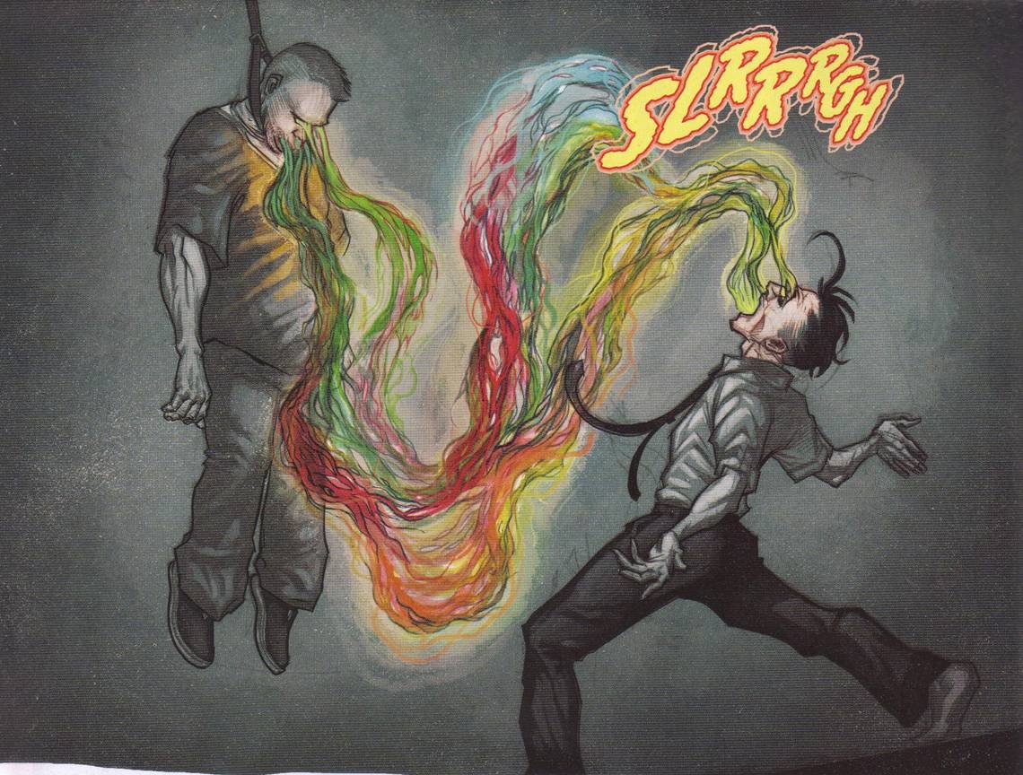
Deadpool #1 ("In Wade We Trust") by Gerry Duggan (writer), Brian Posehn (writer), Tony Moore (artist), Val Staples (colorist), and Joe Sabino (letterer). $2.99, 20 pgs, FC, Marvel NOW!
The first of two Marvel NOW! books this week is Deadpool, and I really can't imagine how Duggan and Posehn are going to keep this up. In case you didn't know, the first arc - at least - is about Deadpool hunting down and killing undead presidents, and I really hope that's only the first arc, because you can't sustain a series with that. But I must admit - this first issue is frickin' hilarious. Some crazy necromancer wearing a S.H.I.E.L.D. shirt, a kilt, and with an American flag painted on his face decides to bring back every dead president because he's upset about the direction in which the country is headed, but unfortunately, the presidents decide to destroy the country instead of saving it. Somehow he manages to raise every president, and Duggan and Posehn wisely don't get into that too much. At the beginning, he raises Harry S Truman just as Captain America tries to stop him, and of course a newspaper photographer takes a picture of Cap decapitating Truman with his shield. So S.H.I.E.L.D. tasks an agent to stop the dead presidents off the books, so to speak, and when she heads to New York to figure out how to stop an undead Franklin Delano Roosevelt, she finds out that Deadpool is already in the city, stopping that monster that Geof Darrow draws so nicely on the cover (although what it's doing spitting out - or swallowing - cats and dogs is beyond me), and she decides that Deadpool is the perfect person to kill undead presidents. So it's on!
Is this somewhat tasteless? A little bit, but it's really not too bad. Yes, Deadpool makes wheelchair jokes about FDR, but he's Deadpool - that's kind of what he does. Duggan and Posehn do a nice job keeping the story moving quickly, and the double-page spread of all the presidents hanging out at Independence Hall is pretty funny (and it's fun to try to identify all the presidents; I'm not very good at it, unfortunately - without looking anyone up, I know Nixon, Grant, Taft, Reagan, LBJ, Kennedy, Jackson, Washington, and Lincoln, but that's about it). I mean, it's a Deadpool comic - the whole point is to make it as ridiculous as possible and hope that it's funny. Luckily, Duggan and Posehn are up to the task on this issue, at least. They also kill a very good writer in Marvel's stable during the issue, which is also quite humorous.
Tony Moore is a fine, fine artist, so he does a nice job. As I've mentioned before, his cartoony style helps take silliness and make it "realistic" because if everything is cartoonish, then the goofy stuff will fit right in. The battle between Deadpool and FDR is really nicely done, and Moore does a good job with the various presidents. Of course, Moore seems to be very slow, so I imagine that this book will have a guest artist soon enough, which is too bad. Moore is a good choice for this comic, and if Duggan and Posehn are only doing one arc with this plot, it would be nice if Moore could actually finish it.
I haven't read a ton of Deadpool solo issues, but I think this is the best one I've ever read, and that includes the one where he goes back in time and gets dropped into that 1960s Amazing Spider-Man issue. If this is just a short arc and Moore stays on the book for the entire arc, I can easily see picking this sucker up in trade. For someone who thinks the entire idea of Deadpool is stupid, I call that progress!
Rating: ★ ★ ★ ★ ★ ★ ★ ★ ☆ ☆
One totally Airwolf panel:

Detective Comics #14 ("Unnatural Selection"/"Seeds and Dirt") by John Layman (writer), Jason Fabok (artist, "Selection"), Andy Clarke (artist, "Seeds"), Jeromy Cox (colorist, "Selection"), Blond (colorist, "Seeds"), and Dezi Sienty (letterer). $3.99, 28 pgs, FC, DC.
Layman's second issue of 'Tec is as good as the first, which is nice. We ended on a cliffhanger, and Layman resolves that by having the Penguin rescue Bruce Wayne, so that his ultimate plan - to be loved by the populace (which, to be honest, is a bit lame - hasn't Oswald read his Machiavelli?) - comes to fruition. But then Layman quickly moves on to Poison Ivy's scheme, which involves destroying polluting companies that all happen to be owned by Oswald Cobblepot, so Bruce knows he probably should stop her before the Penguin decides to, you know, kill her. Damian, douchey as ever, thinks saving Ivy is, well, stupid, but that's because he hasn't hit puberty yet and hasn't seen her in that skin-tight outfit. Yowza! Batman heads off, figuring out a new way to resist Ivy, but his new way means that he doesn't realize that it's a trap until it's too late (I wish I had made that image, but I stole it from here). Sucks to be you, Batman!
Layman is doing a nice job with this comic so far, and I like how he (and DC) is giving the reader good value by tying the back-up stories into the main arc, but because they're back-up stories, Fabok doesn't have to draw them. This back-up story (which is "to be continued") explains why a certain character shows up at the end of this issue, and we've already seen how the Penguin's right-hand man was able to rise through the ranks. If DC is going to charge 4 dollars for their single issues, I'm glad they make good use of the 28 pages. And I imagine Layman had to read up on what Ivy is doing and why he can use her as a bad guy, because I'm fairly certain he hasn't been reading Birds of Prey. But hey! DC using footnotes is always all right with me.
Fabok continues to impress me, which is still surprising, because I've become less of a fan of his kind of style over the years. Fabok's quite precise, which I've always liked (even as it's fallen slightly out of fashion), and I guess I just like that he's aping Gary Frank, who I like. I think I mentioned last time that his biggest problem seems to be facial expressions, which is kind of a weakness when you're drawing Layman's scripts, as he enjoys doing things where facial changes can tell us a lot, but it's a Batman comic, so it's not like that's going to be the main focus anyway. Andy Clarke's slightly more quirky style fits well in the book because it's not a total shift so tonally, it works, but it's different enough to give us a different interpretation of the material. I'll have to see if Fabok is able to keep this up - this kind of detailed art tends to get sloppy quickly if the artist gets slow, and I don't know who DC has lined up as a fill-in - but so far, I like the artwork. I didn't think I would.
I buy this, obviously, because I really like Layman's writing, but I wasn't sure if it would translate well to the DCnU. After two issues, it's working well. I'm keen to see where it goes from here!
Rating: ★ ★ ★ ★ ★ ★ ★ ★ ☆ ☆
One totally Airwolf panel:

Iron Man #1 ("Believe 1 of 5: Demons and Genies") by Kieron Gillen (writer), Greg Land (penciler), Jay Leisten (inker), Guru eFX (colorist), and Joe Caramagna (letterer). $3.99, 20 pgs, FC, Marvel NOW!
Look, I like Kieron Gillen. I think he's a very good, if not great, writer, and the times I've met him in person he's been very friendly, very willing to chat, and very funny. He has paid his dues with comics from Marvel that were pretty good but were cancelled quickly because his name wasn't big enough, and now he's gotten his chance to work on the big guns at Marvel, and I suppose his work on the X-Men was successful enough that Marvel let him have a crack at Iron Man. Good for him, say I. He deserves it.
But for some reason, Marvel keeps sticking him with Greg Land. Now, I'm sure Gillen wouldn't say anything negative about Greg Land even if he hates Land's art (and I have no idea how he feels about Land's art), not only because that would be kind of a dick move but also because you don't bite the hand that feeds you. I'm cool with that. I just cannot read a good deal of Gillen's work for Marvel simply because Greg Land draws it. I mean, the guy's art is so bad that I can barely read the words on the page. The fact that of the two Marvel NOW! books that Gillen is writing (I think it's only two), Iron Man has a much bigger chance to succeed that Young Avengers, which will feature Gillen writing and the sublime Jamie McKelvie on art and which will be, guaranteed, 1000 times better than Iron Man (SCIENCE!) is just depressing. You know how you don't like some artwork, but you know why others do like it? Sometimes it's just a matter of taste. BUT I CANNOT UNDERSTAND ANYONE WHO LIKES GREG LAND'S ARTWORK. It's like telling me you enjoy punching yourself in the groin repeatedly. It's like telling me you really, really love Vegemite. It's like telling me you think Franklin Pierce is the best U.S. president. It's like telling me you roam the desert on weekends eating lizard shit. It's like telling me you like putting cats in your pants. I literally have no way to communicate with you. You might as well be speaking Hiri Motu.
You might think that Greg Land would be a good fit on Iron Man, because the dude wears armor all the time. Well, okay. The first two pages of this comic, in which Tony hovers over New York in his armor, don't make my eyes bleed. The coloring is nice. But even at the end, when Tony reappears in the armor, he's still fighting people who are not in armor, so we have to see Greg Land's people, and he's fighting, so there's action, and that's just no good. The perfect Greg Land comic would be Iron Man posing for 20 pages with no one else in the picture. Maybe then I wouldn't get a twitch in my face when I read a Greg Land comic.
It's really a bizarre experience reading a Greg Land comic. You spend so much time trying to figure out which Internet image he stole, and then you start looking at the way the figures don't fit in with the background (like the first panel in Buenos Aires, where the woman on the cell phone looks like she is standing in a club but she's in the middle of the street), and then you start to notice how the words don't always fit the facial expressions because Land isn't actually drawing the facial expressions, he just trying to find images on the Internet that fit the words, and then you notice that Tony kind of looks like Kevin Bacon in one panel and then you start to wonder if he looks like Kevin Bacon in every panel or if Land is using different male celebrities to get all the various poses in which Tony appears ... and then you wake up digging your brain out through your nose with a spoon. Yeah, it's no fun.
Gillen's story, unfortunately, is kind of dull, too. Gillen followed Fraction on Uncanny X-Men, and now he's following him on Iron Man, and this feels weirdly like Fraction's first issue on Invincible Iron Man. Of course, it's following Warren Ellis, too, as Gillen uses Extremis as his first plot, but the way the plot plays out plus the similarity of the godawful Land art to the godawful Larroca art is enough to make this feel like Invincible Iron Man #1. The Gillen wit is a little bit in evidence, but this issue is more just pure plotting, and while Gillen can come up with some nice plots, they're not his strongest suit, so it feels a bit like Gillen-lite. Of course, all this means is that it's just a middle-of-the-road comic from the writing standpoint, which means it reads like Shakespeare had a love child with Elizabeth Bishop compared to the artwork. But it's still not great.
I rarely get to rant about the fact that Greg Land has a job in the Big Two when so many (read: 99%) of artists who don't have jobs at the Big Two are better than he is, but that's because I avoid books with his artwork like the plague. I hoped against hope that maybe he would try drawing this like he used to draw DC comics back in the 1990s, because those were pretty good. Yeah, it was a small, small hope, but you never know. Obviously, I read this because I'm reading all the Marvel NOW! books, but I'm glad I don't even have to consider whether or not I should get the trade. I can just go back to ignoring Greg Land comics and live a happy, fulfilling life. Sorry, KG!
Rating: ★ ½ ☆ ☆ ☆ ☆ ☆ ☆ ☆ ☆
One totally Airwolf panel:

Legends of the Dark Knight #2 ("Crisis in Identity") by B. Clay Moore (writer), Ben Templesmith (artist), and Saida Temofonte (letterer). $3.99, 30 pgs, FC, DC.
DC's digital comic mixes it up for the second issue, with one story comprising the entire issue instead of three stories, like the first issue did. I have to say - I LOVE this business model. Put the stories up on-line, let people who dig that read them (and I think they're cheaper than regular comics, right?), and then publish them for the dinosaurs like me. And, of course, let the creators do whatever the hell they want. Last issue we had two stories starring Full-On Dickhead Batman, and this time around, we get a Joker story in which the Joker is insane but not just out slaughtering people, which is refreshing. He actually has a plan - it's a diabolical plan and it gets people killed, but it's a plan.
So the Joker is grumpy that Killer Croc is lurking around and taking business away from the real villains, i.e. the Joker. So he kidnaps the Mad Hatter and forces him to hypnotize regular citizens into believing they're Batman and sending them down into the sewers to stop Croc, where they inevitably get killed (see below). It's a ridiculous plan, sure, but it's the Joker, so of course it's ridiculous. But it's still clever, and it doesn't involve the Joker butchering hundreds of school children or whatever the hell else he does these days. Moore gives us a Joker who's obviously crazy but who still thinks things through, and I like that Joker. Even when he kills a person, it's ridiculous but in-character. And, of course, because he's kidnapping prominent Gothamites, eventually he's going to kidnap Bruce Wayne and convince that sniveling punk that he's Batman. I wonder how that will go?
Templesmith does his Templesmith thing, and I love it, although it's not for everyone, I suppose. I think he would do wonders on a Batman book, but I suppose he's not interested or DC's not interested in giving it to him, and that's okay. He draws a great Joker, which isn't surprising. I don't know - it's Templesmith. What are you going to say about it?
I know DC is publishing at least a few more of these, and I will keep my eye out for them and the talent involved. But they're 2-for-2 so far!
Rating: ★ ★ ★ ★ ★ ★ ★ ½ ☆ ☆
One totally Airwolf panel:

The Manhattan Projects #7 ("Above and Beyond") by Jonathan Hickman (writer), Nick Pitarra (artist), Jordie Bellaire (colorist), and Rus Wooton (letterer). $3.50, 20 pgs, FC, Image.
I worry a little about Jonathan Hickman. This is, I believe, the second time he's had to write a letter to the fans in the back of one of his Image books about why his Image books are so late. The Manhattan Projects is actually not that late, but it's a bit off schedule, but it's nowhere near as bad as Secret, which Hickman addresses. He also mentions Feel Better Now (originally scheduled for autumn 2011, but now coming out in March 2013), in case you were wondering. I mention this only because I have to assume it's Hickman's fault that his books are so late - the artwork is good on both Image books, but it doesn't look too intricate, so unless Pitarra and Bodenheim actually can't work on the books, I assume it's Hickman (let's not forget S.H.I.E.L.D., which technically hasn't ended but which seems to be at least somewhat Dustin Weaver's issue). Why is this a problem? Well, if Hickman writes full script (and I assume he does), he's writing those two books plus, what?, two Marvel comics? Three? That's a lot of comics in a month. Now, maybe Hickman can knock out a script during the time he's taking his morning shit, but I've written scripts before, and they're not that easy to bang out. Especially if you're dealing with big, complicated ideas and you're plotting long-term, which it seems that Hickman is doing. It's great that Hickman is writing for Marvel and still wanting to write these comics for Image, but maybe he should realize that they're simply not going to come out on time and he should get more in the can before releasing things. The Manhattan Projects is an ongoing, and we've seen that other creative teams build in breaks so that the artists can catch up, but if this is on Hickman, maybe he needs to build in breaks to catch up on scripts. If the thing is a mini-series, maybe don't solicit it until it's completely finished. I don't know, but it's a shame that these cool comics might be losing readers because Hickman bit off more than he can chew. Feel Better Now has been expanded from its original length and it's a complete work (and Hickman is doing the art, so he doesn't have to pay anyone to work on it, obviously), so its delay isn't as important, but these other comics - I wish they would find a bigger audience, but the fact that they come out so infrequently probably means that people drift away far more easily. If it's Hickman's fault, perhaps he needs to think about reining it in a bit on the comics. You don't need to write 10 comics a month, sir!
Anyway, The Manhattan Projects continues to be very good. Just look at that awesome panel down below!
Rating: ★ ★ ★ ★ ★ ★ ★ ★ ☆ ☆
One totally Airwolf panel:

Mars Attacks #5 by John Layman (writer), John McCrea (artist), and Andrew Elder (colorist). $3.99, 22 pgs, FC, IDW.
The first arc of Mars Attacks ends a bit weakly, unfortunately. It's still a wacky, violent comic, but the general's big plot to "save" the Martian invasion (by destroying the Earth) shows up kind of abruptly and ends just as abruptly. The three humans who we've seen over the past few issues do their part saving the world, but it seems ... a bit easy for them? The Martians are defeated, of course, so it's not like everything is super at the end of this issue, but it does seem to get cleaned up a bit easily. It's like one of those movies - you know, like The Avengers - where getting the team together is so much fun that the actual threat they have to face is a bit disappointing. The issues before this were non-stop action and fun, with each situation somehow topping the previous one in insanity, but when it comes time to pull it all together, it's not quite as much fun. Layman sets up his next arc (I think he's writing one more arc) fairly well, and perhaps this will feel better as the fifth chapter in a 10-issue run, but as the end of the first arc, it's not quite as good as the previous issues.
McCrea is still having a blast, though, and it shows. So there's that.
Rating: ★ ★ ★ ★ ★ ★ ☆ ☆ ☆ ☆
One totally Airwolf panel:

Stumptown: The Caser of the Baby in the Velvet Case #3 (of 5) by Greg Rucka (writer), Matthew Southworth (artist/colorist), and Rico Renzi (colorist). $3.99, 24 pgs, FC, Oni Press.
Things happen. Dex gets angry at the Feds, the Feds get angry at Dex, the skinheads show up again, lesbians are angry at each other. You know, things happen.
But let's talk about the artwork for a bit. You'll notice that both Renzi and Southworth are credited with the coloring, and I wish I knew more about how things get colored - as I assume it's all digital, I'm going to say what programs the colorists use and what tools in those programs they use, and how they wash the pencils and all that. I've met Southworth a few times in person and I'm a friend of his on Facebook, and I should ask him, because I'm not a huge fan of the coloring in this book. Of course, just saying that might get me punched (or the digital equivalent), but it's not like it's terrible coloring, I just don't like it all that much in the context of this comic. As I've noticed with regard to this series as opposed to the first one, it seems that Southworth's pencil work has become a bit less jagged (that's not an insult - I don't mind the jaggedness), and it looks like the colors are a bit softer. In this issue, some of the coloring looks really soft, and the reason I don't love it is because it clashes a bit with the tone of the comic. Rucka's story isn't all doom-'n'-gloom, of course, but it's still a "Rockford Files"-style private eye story, and the coloring - especially the shadows on faces - make it look far too ... soft. Some of the outdoor scenes look too suffused with nostalgic sunlight - as when Dex confronts the Feds - again clashing with the tone and with Portland itself, which is not often suffused with nostalgic sunlight. There's a large shot of Dex running through Union Station which is, frankly, gorgeous, because Union Station does have that "old-school" vibe that the coloring helps bring out, but it feels like it should stand in more contrast with what's going on around it instead of fitting in so well. This story is, it seems, taking place during the summer (or at least the spring), but the outdoors are too brown, which feels like it's part of the "softening" of the entire book - the brown makes things feel a bit hazy and indistinct. This coloring actually reminds me of Steven Griffin's on Hawaiian Dick, but that look was to evoke a feeling for the 1950s and even then, the colors were "soft" but bright. With this coloring, we're losing a bit more of Southworth's crisp lines, and I just don't think it's a good fit. Feel free to disagree!
Now, it's still a good read, and Southworth is still doing a very good job with the way the characters interact with each other - the coloring doesn't affect that. Mim's shift from sadness to glee when she's thinking about the fight with her girlfriend to when Dex tells her about her guitar is very nice. I just don't think the coloring is as good as it could be. Oh well.
Rating: ★ ★ ★ ★ ★ ★ ★ ½ ☆ ☆
One totally Airwolf panel:

Thought Bubble: The Leeds Comics Art Festival Anthology 2012. "Underpants" by Lucia Rose Harris (writer), Tony Harris (artist), and JG Roshell (letterer); "To Swap or Not To Swap" by Pete Doree (writer) and Sean Phillips (artist); "Puffy" by Skottie Young (writer/artist); "A Significant Portraiture" by Gail Simone (writer), Tula Lotay (artist), John Paul Bove (colorist), and JG Roshell (letterer); "Elephantmen and Strontium Dog" by Richard Starkings (writer) and Boo Cook (artist); "Due Returns" by Matthew Sheret (writer) and Kristyna Baczynski (artist); "Soul Food" by Emma Vieceli (writer/artist); "I'm Through" by Ivan Brandon (writer), Leigh Gallagher (artist), and Simon Bowland (letterer); "Love and Let Die" by Clark Burscough (writer), Richard Hughes (artist), and Adam Cadwell (colorist); "Dad's Ear" by Steve Reynolds (writer/artist); "The Clicking Machine" by Martin Simpson (writer/artist); "Exasperated" by Ben Haith (writer/artist); "Half Past Danger" by Stephen Mooney (writer/artist) and Jordie Bellaire (colorist); "Just One Example of How My Life as a Comic Book Artist Has Been Awesome" by Dave Johnson (writer/artist); "The Immortality Drive" by Lee Barnett (writer) and Ollie Redding (artist); "Soon" by Warren Ellis (writer), Tula Lotay (artist), Ollie Redding (colorist), and JG Roshell (letterer); "Get Me Off this Freaking Moor" by Kate Beaton (writer/artist); "Transreality" by Chris Lackey (writer/artist); "Charley Loves Robots" by JG Roshell (writer/letterer) and Gabriel Bautista (artist/colorist); "Cheat Wyrm" by Fiona Staples (writer/artist). $3.99, 30 pgs, FC, Image.
This is an odd little anthology, designed like a newspaper (a small, hip, weekly kind of newspaper, not one of those soulless corporate ones who never report the real news, man!) that you unfold and read. It helps that it's printed on rough, (probably) recycled paper that feels newspapery-ish without the ink coming off on your hands. Anyway, it's an anthology about the Leeds Comics Art Festival, which begins on Sunday, and it looked kind of cool, so I bought it.
As I like tangents, I should mention here that I've never been to Leeds, but I thought about studying at the University of Leeds once when I still considered getting my doctorate (which foundered on the shores of my language ignorance; I needed to know both French and German if I wanted to pursue my doctorate, and that wasn't happening), because Ian Wood, probably the foremost Merovingian scholar in the world today, teaches there. Plus, by the time I got my Master's, I was almost 30 and had been married for some years. I'm sure my wife would have followed me to north-central England, but I doubt if we would have been able to have a family so early, and she's older than I am, so it wasn't prudent to wait. Ah, the choices we make in life! I suppose I should have learned French and German years before - it might have made the choice more interesting. Wait, are we talking about comics?
This is a pretty cool comic, actually. None of the stories are all that long, and some are even shorter than a page, but the talent is pretty keen. It's nice to see Tony Harris drawing something, and Gail Simone's one-page story about a Victorian lady entering a Victorian comic book store is pretty funny (see below). Baczynski's Chris Ware-esque art is beautiful, and "Due Returns" is a charming story, although I'm not quite sure what happens at the end of it, and Emma Vieceli's gorgeous artwork is always nice to see even in on only one page. "Love and Let Die" is a hilarious take on a Bond villain, and Dave Johnson's account of his first meeting with Bob Layton is pretty funny. Ellis writes a charming ode to the future, like most of his work, but it's a much more beautiful future than he usually gives us (thanks to Lotay's marvelous art), and of course Kate Beaton brings the funny (her strip is a reprint, I'm pretty sure). There are also some nice entries from competitors that make it clear that even if DC and Marvel are busy circling the drain, young people still love making comics and they have plenty of talent! Overall, this is a fairly slight anthology mainly because of the space, but it's still well worth a look. It's always fun to see creators doing some new and interesting things!
Rating: ★ ★ ★ ★ ★ ★ ★ ☆ ☆ ☆
One totally Airwolf panel:

Westward #2 (of 10) ("Adjustment Period") by Ken Krekeler (writer/artist). $2.99, 32 pgs, FC, Kinetic Press.
The second issue of Westward isn't quite as good as the first, mainly because Krekeler has some 'splainin' to do, so he needs to slow down just a bit, but it's still very good. The big surprise of the first issue is explained, as we learn that Victor is not Victor, but a robot/android/clone of the original that had ten years to assimilate all the parts that went into its construction, which accounts for "Victor's" coma. In this issue, "Victor" reveals to the world that he is, in fact, not Victor, and things go a bit nuts. We also learn that Harold West, Victor's father, wanted to create these androids and Victor, due to his horrible and fatal accident, was the perfect prototype, but Harold West died before he could write very much down, so no one knows quite how he did it. Victor, therefore, is unique.
It's an interesting world-building issue to a degree, although I suppose the "world" is just Victor and how he has changed. Krekeler is still flashing back to Victor's life before the accident, and his character arc in the flashback is as important as how "Victor" is starting to learn what he - it? - is. Of course, Victor had enemies, and one of them has been waiting for ten years for him to wake up, although I'm not sure what's going to happen with that, because why would you want revenge on an android that happens to share someone's face? But we'll find out eventually, I assume. I also have a feeling I can figure out something about the plot, but I hope I'm wrong. We'll see.
Krekeler's art continues to be very nice, with his use of models and photographs integrated quite well into the steampunk world he has imagined. Unlike a certain Mr. Land, he uses models to get poses and shading right, but draws them into the book, so they look much more natural than whatever Land is doing. Plus, you can tell he's having fun with the machinery, which is good, because if you're doing a steampunk comic and you don't like drawing machinery, you're a foolish, foolish person.
Krekeler was running a Kickstarter to get issue #3 done, and I really hope he's able to do the entire series. I'm really enjoying it, and if you can find it anywhere, you should pick it up. If you can't, you can order it on-line!
Rating: ★ ★ ★ ★ ★ ★ ★ ★ ☆ ☆
One totally Airwolf panel:

X-Factor #246 ("Short Story") by Peter David (writer), Paul Davidson (artist), Rachelle Rosenberg (colorist), Cory Petit (letterer). $2.99, 20 pgs, FC, Marvel.
After the traumatic events of X-Factor sort-of falling apart, David throws us a curve by giving us a story about Pip, who claims to be the real heart of X-Factor. What happens when someone figures that out? Oh, no good can come of it!
It's a pretty decent story, as Pip pays some dude to mug a hot woman so he can save her and then, of course, have sex with her. Pip is ethically challenged, in other words. But David points out that someone has to take paying jobs for X-Factor to stay in business, because they keep going off and doing things that are not related to paying jobs in the slightest. He also takes care of some large threats that no one else knows about because Pip has, after all, been around quite a lot and has picked up some nice tricks. David, however, always has something up his sleeve, as Pip learns at the end of the issue. Weirdly enough, it appears that this issue isn't even "to be continued" - isn't that just like Peter David, ending on a cliffhanger and then moving on, only returning to the traumatic event several issues later? That's why he knows how to write a serial publication!
Davidson's art is fine, although I don't think he gets the final page too well. He's trying to get Pip and the bad guy into the panel, and it's really awkward. I don't want to give too much away, but it's a really poorly laid-out page. Oh well.
It appears that in the Brave New Marvel Universe (which is totally not brand new at all, no sir!), X-Factor will be the only monthly book I know I'm buying in single issues. I still have to make a month-by-month decision about Hawkeye, but I know I'm getting X-Factor. That's really weird. As recently as, what, five years ago, I was buying quite a bit of DC and Marvel in single issues. They've made it so very easy to drop books or wait for the trade, though, so who am I to not take advantage of it? It's just weird.
Rating: ★ ★ ★ ★ ★ ★ ★ ☆ ☆ ☆
One totally Airwolf panel:

B.P.R.D.: Plague of Frogs volume 4 by Mike Mignola (writer), John Arcudi (writer), Guy Davis (artist), Dave Stewart (colorist), and Clem Robins (letterer). $34.99, 402 pgs, FC, Dark Horse.
Well, I guess I'm kind of getting caught up with B.P.R.D. now that Dark Horse is bringing these giant chunks of the comic out. This, of course, looks superb. I can't wait to dig in!
Blacklung by Chris Wright (writer/artist). $24.99, 118 pgs, BW, Fantagraphics.
In this book, a teacher is shanghaied by pirates, and the captain orders him to write his (the captain's) memoirs. Sounds keen. This is new, but apparently it's been in the works for a while. Good to see it's finally in print!
The Annotated Sandman volume 2 by Leslie Klinger (ed.). $49.99, 519 pgs, BW, DC/Vertigo.
As you might recall from the first volume, this is far too large to fit on my scanner, so I asked my groovy assistant to hold it while I took a picture of it:

You may be distracted by how awesome my assistant is. Don't forget, though - this project is awesomesauce, and you should totes pick it up!
Spaceman: The Deluxe Edition by Brian Azzarello (writer), Eduardo Risso (artist), Patricia Mulvihill (colorist), Giulia Brusco (colorist), and Clem Robins (letterer). $24.99, 193 pgs, FC, DC/Vertigo.
I want to point out once again that DC has no idea how to price their trade paperbacks, and that's just fine with me. This is nine issues at three dollars a pop, giving us $27 (or $26.91, if you want to get technical) for you to buy it in single issues. Yet DC charges $25 for a very nice hardcover collection, and presumably the softcover trade will be even less. Hey, if it works for DC, that's cool, but this is the second straight Vertigo trade I bought that was priced very weirdly, after the third volume of American Vampire collected 12 issues but cost 17 dollars. I can live with it, though - it's not like you need to read this right on release, unless you really want to discuss it on-line. And who wants to do that?
**********
So we had an election, and even if you hated both the presidential candidates, I hope you voted anyway. Local elections are often far more important than the national one, because the politicians are much more beholden to their constituents and they can focus on more local issues, so even if you left the presidential part of the ballot blank (which you're allowed to do), I'm sure there were plenty of local issues for you to vote on. The election wasn't as close as most people not named Nate Silver thought it would be, and I'm very curious to see what the Republicans do over the next four years. Some of them are realizing that they might need to tack to the center, while the talking head blowhards - you know, the ones who don't actually have to work in Congress - think Romney wasn't conservative enough. I think if the Republicans had tried to make Romney more conservative or ran a more conservative candidate, Obama would have won in a historic landslide, but that's just me. It seems like they've really misread the country, and already people like Rush Limbaugh (yes, I know he's not an elected official, but he's still popular among conservatives) are insulting the groups they should be trying to court even as he's wondering how to court them. Here's a clue: Don't call all Hispanics illegal immigrants and say that all women have abortions every time they get pregnant. You just sound like an idiot. I'm fascinated by the next four years, because the age of white male dominance in the electorate is over, and I wonder if the Republicans will realize that. I think they have to.
Speaking of the election, I don't like Schadenfreude too much, but I can't stop laughing at White People Mourning Romney. I'd probably laugh as much if the people were mourning Obama, actually. I just don't know why people get so worked up about an election. Hey, conservatives - I'll write the same thing I wrote to liberals in 2004: If you hate Obama, I can tell you the exact date he won't be in office anymore. That's one of the great things about the United States. I knew exactly when in 2009 George Bush was going to leave office, and you know when Obama will. Deal with it.
Anyway, let's move on from that! In honor of 50 years of James Bond, here are several Bond Girl .gifs. No Michelle Yeoh, though. For shame!
I have no iPod songs this week, because this is already quite late and it takes a while to track down all the links. I'm late with this this week for a few reasons. First: on Wednesday I met Layne, who comments here occasionally and was a long-time reader of my old, personal blog. He was in town from Winnipeg, so I met him and we had lunch. I probably talked way too much (I tend to do that, in case you hadn't figured it out yet), but I, at least, had a very cool time (I won't speak for him). Then my daughter came home from school early, so I had to take care of her. Then, yesterday (Thursday), she had a doctor's appointment downtown, so that took a while. Then, today (Friday), she had another doctor's appointment (my daughter has a lot of doctor's appointments), and I like to eat lunch with my wife on Friday (she takes the day off), so basically, real life kept intruding on my writing. I was joking around with my wife earlier today that I was letting down my readers, but she was unimpressed. She's so cruel!!!! So this is late. Sorry!
However, I can still fire up some Totally Random Lyrics! I forgot them last week, and no one got the ones from two weeks ago - they were from "Powderworks" by Midnight Oil. Let's check out some cheery ones, shall we?
"And I picked on the whims of a thousand or more,
Still pursuing the path that's been buried for years,
All the dead wood from jungles and cities on fire,
Can't replace or relate, can't release or repair,
Take my hand and I'll show you what was and will be."
I'll give you a hint: I don't like this band. Oh, I may have just given it away!!!!
Have a wonderful weekend, everyone. Be excellent to each other!