"Italians have made the family an extremist group. The family is the instrument of revenge." (Don DeLillo, from The Names)


You'll notice something different this week. I started adding editors to the credits at the beginning of the year, but now I've added something else. I've been meaning to do it for a while (and some other reviewers do it, too, so it's not terribly original), but I kept forgetting. Still, I think it's important.
Bigfoot: Sword of the Earthman #2 ("Soldiers at the Heart of the Sun") by Josh S. Henaman (writer), Andy Taylor (artist), and Thomas Bonvillain (colorist). $3.99, 24 pgs, FC, Brew House Comics.
Josh Henaman sent me this issue after I reviewed issue #1, and I'd like to thank him for it. It's not out until next week, but I figure I can review it now and if you want to check it out next week, you can!
I liked the first issue, although I did have some problems with it. One of the problems I had was that Henaman began the book in media res, which wasn't awful, but it was a bit odd. He does it again in this issue, but it feels a bit more ... natural, I guess? The backstory he provides in this issue is more scene-setting, whereas in the first issue, it felt like we were missing a pretty neat part of the action. In this issue, however, it feels a bit more like just background information, as we find out what Bigfoot and Castor, the book's narrator, are doing right now. That information is perfectly fine as a text piece on the inside front cover.
So in this issue, Bigfoot and Castor have been pressganged into guarding a beacon that lures the creepy insect-monsters to it, burning them up and keeping them away from the rest of Mars. A queen's soldier shows up, almost dead, and says they were trying to destroy the hive but only succeeded in waking the insect-monsters up and pissing them off. It turns out that the insects have changed somehow, and they're not as mindless as they used to be. Bigfoot and Castor decide to join the expedition to get revenge, mainly because the soldier said something about a legendary jewel that Castor thinks they can steal. This turns out to be not a terribly good idea.
This is a bit better than issue #1, mainly because Henaman is able to put aside some of the obvious world-building and just tell a story. We learn a bit about the world through the actual story instead of it being shoehorned in, and while Henaman did a decent job with that in the first issue, it flows a bit better in issue #2. It's an exciting issue, but there's also some interesting stuff to learn about the world that Bigfoot is living in. Castor continues to be a cool character, cowardly and greedy and oddly loyal to Bigfoot - it's basically just because Castor knows that Bigfoot will protect him. And Bigfoot, silent as ever, is still very interesting. He just does his thing, man!
Taylor's art is still good, especially when he's doing the characters in close-up. When he's showing the characters very close up, his details are very well done and interesting. He gets a bit sketchy when he goes to longer shots, and while that's logical, it would be nice if there were some more details in the artwork when the shot is from further away. He does some very good work with the inking, and the final page of the issue is excellent - very creepy and ominous.
As with all these kinds of comics that rely on a high concept, the initial idea only takes you so far, and Henaman is doing a good job making the odd couple of Bigfoot and Castor, so it makes it a lot more fun to read. It's a pretty neat comic, so look for it in the world of cyberspace if you can't find it at a comics shoppe!
Rating: ★ ★ ★ ★ ★ ★ ½ ☆ ☆ ☆
One totally Airwolf page:

Nice work on the shadows here - in Panel 2, it's dramatic, and in Panel 3, it helps highlight Bigfoot and the soldier in the foreground. Taylor links Panel 1 and 4 well here, going from a head shot to a more extreme close-up of the soldier's bloody mouth. The perspective in Panel 3 is nice - Bigfoot holding the soldier obviously dominates the scene, and the men in the back provide anonymous exposition - it's not important who they are. Bonvillain has a tough time coloring this book, because so much of it is earth tones, but he does a nice job making the blood stand out on the page, highlighting the violence that's been done to the soldier.
Colder #4 (of 5) by Paul Tobin (writer), Juan Ferreyra (artist), Eduardo Ferreyra (color assistant), Laura Binaghi (color assistant), Nate Piekos (letterer), Shantel LaRocque (assistant editor), Scott Allie (editor), and Daniel Chabon (editor). $3.99, 22 pgs, FC, Dark Horse.
Declan manages to get Reece back, but maybe that was exactly what Jack wanted him to do ...? I don't know - there's not much else to say about this issue. Reece has been taken to the weird world where the insane go, and Declan rescues her, setting up a (presumably) final showdown with Nimble Jack. It's very exciting!
And do I really have to rave about Juan Ferreyra anymore than I already have? Even if Tobin's story wasn't all that good (and it is good), this comic might be worth it just for Ferreyra's artwork. On the first two pages, he shows a woman checking out her teeth in a mirror at a pharmacy. Ferreyra, without Tobin making it explicit, shows us the insanity of everyday life, as the woman's obsession with her teeth is downright creepy even if she's not technically "insane." When Declan shows up behind her in line, we get three panels of her thinking that Declan is the crazy one (not an unreasonable assumption), and Ferreyra does it all through her varying facial expressions. When Declan meets the crazy man that he uses to get into the other, "insane" world, the transition from our world to the other one is stunning, as Ferreyra shifts subtly from one to the other by showing a reflection in a puddle of Declan and the man in the real world, but the puddle is in the "other" world. His design work continues to be amazing, as he gives us a giant of bone and muscle and the weird-ass dogs (see below). His brief fight with Jack is laid out wonderfully, too, as angles and perspectives change almost randomly, as the world is so weird. It's an amazing-looking comic, and it's great that Ferreyra gets to draw such a cool story.
Rating: ★ ★ ★ ★ ★ ★ ★ ½ ☆ ☆
One totally Airwolf page:

Just check out the way Ferreyra curves the hallway in Panels 1 and 4. It adds such a sense of vertigo to the page, which is good as it's taking place in the "other" world where insanity runs rampant. Note, too, how he softens the lines in Panel 3 to give the impression that we're viewing the dogs through the glass. The final panel is the first time we see that the dogs have hands for hind legs, and it's a great reveal - again, things are askew in this world, so of course they wouldn't be real dogs. What can you say about Ferreyra's astonishing art, really?
Detective Comics #17 ("The Pursuit of Happiness"/"Doctor's Orders") by John Layman (writer), Jason Fabok (artist, "Pursuit"), Andy Clarke (artist, "Orders"), Jeromy Cox (colorist, "Pursuit"), Blond (colorist, "Orders"), Jared K. Fletcher (letterer, "Pursuit"), Taylor Esposito (letterer, "Orders"), Katie Kubert (associate editor), and Mike Marts (editor). $3.99, 28 pgs, FC, DC. Batman and James Gordon created by Bob Kane and Bill Finger. Harvey Bullock created by Archie Goodwin.
Layman finishes his two-part "Death of the Family" tie-in arc (at least it seems like it's over) with the reveal of the Merrymaker's identity and a clever way to break his power. Layman's been writing some solid Batman stories - there's nothing revolutionary about them, but they're good, somewhat clever, reliable stories. It might sound like damning with faint praise, but I don't mean it to - there's something to be said for simply telling good stories, because so many superhero comics these days try so hard to be something completely different, and not everyone can pull that off. Plus, Layman does some good work linking the main story to the back-up stories, which is kind of nice. In the main story, Batman tends to kick ass and take names, while in the back-up stories, Layman digs into some of the other characters and their motivations. This one is a bit creepier than most, as Layman does a nice job with the Joker-as-charismatic-cult-figure that seems to be in the zeitgeist these days (if The Mentalist and Kevin Bacon's new television show is to be believed*). It's really a nice blend of action and character work, and it makes good use of DC's back-up format. That's why I don't mind paying 4 bucks for the comic - it does feel like you get your money's worth.
Obviously, I wish that Layman didn't have to get involved in the Joker crossover, but when you're writing for the Big Two, it's just something you have to deal with, I guess. Next issue, it seems like he gets back to his story, but then, of course, the following issue is the big "#900," so that has to be special too! So many events!!!! Still, Detective is a good, entertaining superhero book. How nice.
(* The Following is kind of a dumb show, but it's entertaining enough. Emma, the crazy nanny, is a total cutie, and it's always nice to see Mr. Bacon, but we were watching this past week's episode, and when they told Agent Reilly to take the one chick home, my wife and I said, "Oh, that poor black dude. He's so dead." He should have said something: "Come on, I'm the black guy! Don't put me in a position to get killed! You know I will be!!!!" Poor that guy.)
Rating: ★ ★ ★ ★ ★ ★ ★ ☆ ☆ ☆
One totally Airwolf page:

Fabok obviously loves Ass-Kicking Batman, and he gets to draw him taking down three bad guys and then posing bad-assedly. The flow of the page is pretty good, with everything moving from the left to the right and downward, with Batman himself shifting slowly from the upper left (in Panel 1) to the bottom right (in Panel 3). If you're going to show Batman fighting, you need to make sure he's not looking at all the people he's beating up, and so he takes out two of the three bad guys without looking at them, because he's Batman. Fabok still has trouble with facial expressions, as we can see on the page - that's about all Batman's mouth moves in this issue. He's humorless, is what I'm saying. But Fabok is still doing a decent job, which is nice.
The Fearless Defenders #1 by Cullen Bunn (writer), Will Sliney (artist), Veronica Gandini (colorist), Clayton Cowles (letterer), and Ellie Pyle (editor). $2.99, 20 pgs, FC, Marvel NOW! Valkyrie created by Roy Thomas and John Buscema. Misty Knight created by Tony Isabella and Arvell Jones. Morgan Le Fay created by Stan Lee and Joe Maneely.
It's another Marvel NOW! book! Yippee! And it's $2.99! Has Marvel learned its lesson from its last ill-fated attempt to slap "Defenders" on a comic book series and expect it to sell? We shall see!
Cullen Bunn, like so many of his brethren, was lured by the siren song of Big Two Money after making his mark in independent comics, and I promptly lost interest in his work for Marvel. It's not that I don't like Bunn - The Damned is quite good, and The Sixth Gun is one of the best comics on the market right now, and I'm eagerly awaiting its spin-off series and Helheim, because they both sound great, plus Bunn is a perfectly nice fellow - it's just that I wasn't interested in reading a Fear Itself spin-off or any of the other minor series Bunn was writing while he toiled in the Marvel salt mines. But now he's moving up the hierarchy, so he gets his own mid-level ongoing, starring characters people like but also might not be inclined to follow in their own book. But if Bunn gets 12-15 issues out of this, maybe Marvel will let him move up from the C-level to B-level, and he can write a minor X-book or a minor Avengers book. Exciting!
Yes, I'm cynical. That's the way it works, right? I mean, this is a book starring Valkyrie, Misty Knight, and Dani Moonstar (eventually; she doesn't appear in this issue). Marvel seems to think "Defenders" is a viable title even though a Defenders series hasn't lasted long since the 1970s, when Marvel published half as many titles as they do now (N.B.: This is just a guess, but it's probably not too far off). This might last a while, but it can't last too long, can it? The only Misty Knight comic anyone really wants to read is my Misty Knight/Jean Grey comic set in the 1970s, when they were roommates in New York. YOU KNOW YOU'D READ THAT, BITCHES!!!!! But hey - it's a pretty good comic. That has to count for something, right? (Please hold in your laughter. Thanks.)
Yes, Bunn brings us Misty trying to thwart the theft of a weird, Viking-like artifact that looks like a corpse (and probably is). It turns out she's working for Annabelle Riggs, an archaeologist, who's excavating a Viking grave site in New Hampshire. She finds a small artifact that calls up a bunch of Viking zombies (Vombies?), which isn't good. Valkyrie shows up, she and Misty kick ass, and the three of them (Dr. Riggs invites herself along) decide to find out what the heck is going on. Onward!
It's a decent beginning, as Bunn handles the "non-team" aspect of the Defenders brand well, and they have a clear mission. Some of it's a bit silly (I'll get to that!), but as far as first issues go, it gets the job done. What you might not know about the two characters is provided, and there's plenty of action. Bunn doesn't try to do too much, which is fine with me. It's obviously written for the trade, but that's the way it is with comics these days, right? So the fact that Dani Moonstar doesn't show up doesn't mean anything, because she's going to show up next issue.
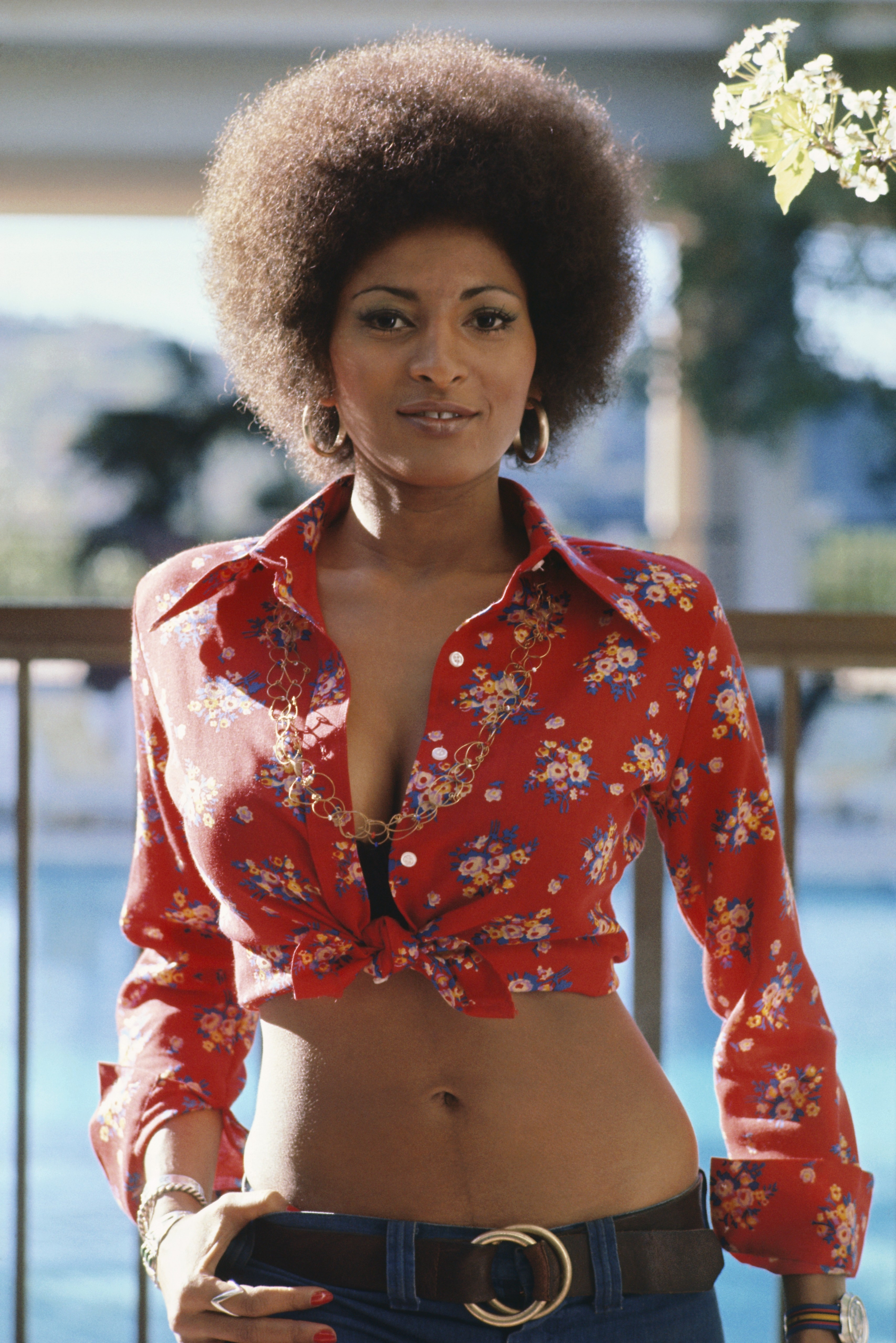
I mentioned back when I was reading Steed and Mrs. Peel that I didn't think Sliney was quite ready for the big time yet, and he doesn't really put my doubts to rest in this issue, although being paired with a good colorist helps smooth out some of his rough edges. He's still much better at static images, and you can see some of the stiffness still in his action scenes, which Gandini's slick coloring can't quite hide. Misty poses far too often, but I always get the sense that writers and artists, for some reason, like showing Misty posing for no reason. Does she remind them of Pam Grier so much that they just can't help it? But the art isn't as awkward as I thought it would be (and I think Sliney has potential - it's not like I hate his art - but I don't think he's quite there yet), which is nice.
And then there's the kiss. Oh yes. In the middle of battling Vombies™, Valkyrie saves Dr. Riggs's life. Then, still while battling Vombies™, they kiss. Fuck the heck? In the kiss panel (no "AR," Marvel? come on!), the narrative caption says "Dr. Annabelle Riggs. Likes girls." Now, presumably, Bunn is not referring to Lena Dunham's delightful yet hate-watched HBO comedy series, but actual women (Heaven forfend we call them women, though). But ... does Annabelle kiss Valkyrie, or vice versa? Riggs is talking as if she's smitten with Valkyrie (you'd be too if confronted with conical metal breasts, amirite?), but it seems like Valkyrie initiates the kiss. Of course, in the next panel, Valkyrie says "Now is not the time," so I guess we're supposed to assume that Riggs started it (look - comics have reduced me to a 7-year-old). So why is Valkyrie leaning into Annabelle? Is this just a screw-up by Sliney? Or by Bunn, who didn't make it clear? Anyway, all that aside, has this ever happened to you? One thing I hate about comics is that people often act, not like real people, but like caricatures of people. Have you ever been smitten by someone you just met and simply grabbed them and kissed them? Of course you haven't, because you're not a psychopath. Yet we're supposed to believe that Riggs would just grab Valkyrie - in the middle of a fight that could kill either or both of them, mind you - and mack her? I really hope Bunn explains that the music that called up the Vombies™ also affected Annabelle's reason somehow, because I don't care if you like girls, boys, or horses, it's kind of weird to make out with someone who has 7 words to you in your life, all of them about your well-being after you were almost killed. Or is that just me?
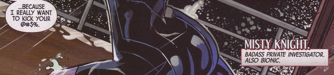
Finally, because I love shit like this, here's part of a page:

Marvel allows the word "ass" appear as part of "badass," but if Misty is going to kick someone's ass, it needs to be grawlixed. Really, Marvel? Plus, these two instances of the word "ass" form a perfect frame of this:

Coincidence? I THINK NOT!!!!
Rating: ★ ★ ★ ★ ★ ★ ½ ☆ ☆ ☆
One totally Airwolf page:

Notice that final panel, which shows that Sliney still has some stiffness in his action scenes even though he's getting better. The pose is awkward, but the punk's face is nicely drawn, and Sliney's layout of the panel leads us to the next page well (which is a Dr. Pepper advert, but won't be in the trade). There's a good flow to the page, as Sliney choreographs it well, although there does seem to be one punk whose ass Misty fails to kick. If you've seen some of Sliney's art from 2012, you can see that Gandini does help quite a bit, smoothing out his rough edges and making things flow a bit better. Overall, though, a pretty good advance in his work.
Legends of the Dark Knight #5 ("A Slam Bradley Mystery ...") by Joshua Hale Fialkov (writer), Phil Hester (artist), Eric Gapstur (inker), Jim Charalampidis (colorist), Saida Temofonte (letterer), Kristy Quinn (associate editor), and Ben Abernathy (editor). $3.99, 30 pgs, FC, DC. Slam Bradley created by Malcolm Wheeler-Nicholson, Jerry Siegel, and Joe Shuster. Roman Sionis/Black Mask created by Doug Moench and Tom Mandrake.
I've always had a soft spot for Slam Bradley. He just seems like a good character - a schlub P.I. in Gotham, always getting thwarted in some way by the pesky Batman, but always soldiering on. Obviously, Ed Brubaker liked him too, as Bradley was a part of Brubaker's Catwoman run back in the day, and Will Pfeifer kept him around later in that series, but I'm not sure if he's around in the DCnU. Luckily, DC is letting creators have some fun in LotDK, so Fialkov, who also likes schlub private investigators, gives us a Slam Bradley story!
This is, unfortunately, a bit of a truncated story. Sure, it's 30 pages long, but Fialkov takes a while to set the whole thing up, so the resolution comes a bit quickly. Basically, it's a frame job by Black Mask, and it's a pretty good one, but it all gets resolved basically because Batman is, well, Batman. That's fine, but the frame is so nicely put together that it's a bit disappointing that it sorts itself out because Batman is a fascist (okay, that's a bit strong, but he implies that he's spying on everyone, even you - yes, you, right there, salivating over that issue of Cosmo in the doctor's office! - Batman knows, you pervert!). Still, it's a fun Slam Bradley story, and who doesn't like a fun Slam Bradley story? I'm also a bit disappointed by the cameo at the end, because I still can't believe DC didn't run with Paul Dini's idea. It was so awesome!
Anyway, I've always liked Hester's art, and he doesn't draw a ton of stuff anymore, so it's nice to see it here. One thing he does really well in this issue is use negative space really well - there's a lot of white space in this book, highlighting the drawings and creating a nice mood for the book. Hester lays out pages very well, too - he uses panels, naturally, but he also ditches them at some interesting spots. It's never hard to read, which is nice, but it is somewhat unusual. Gapstur inks the book nicely, too, with a lot of black making the book murkier, even though Charalampidis's colors don't let the book get too dark. It's a pretty neat-looking comic, all in all.
If you've missed Slam Bradley, check this out. If you haven't missed Slam Bradley, you're dead to me!!!!
Rating: ★ ★ ★ ★ ★ ★ ★ ☆ ☆ ☆
One totally Airwolf page:

Nice use of negative space in Panel 1, framing Bradley as he contemplates throwing himself out of the window. Let's just call it a Jesus metaphor - if you've ever taken a college-level literature course, you know every-fucking-thing is a Jesus metaphor, so Bradley haloed by a broken window as he prepares to "martyr" himself? JESUS METAPHOR!!!! The way Hester lays the next two panels out is nicely done - he goes against the grain in Panel 2, moving us from right to left, but our eyes go from Bradley's legs straight down to Batman, who moves our gaze down and to the right to follow Bradley's fall. The perspective is nice, too - Batman is nowhere near grabbing Bradley, but Hester puts his hand thisclose to Bradley's body, implying that he just missed him. Pretty neat.
Remember the Jesus Metaphor, everyone. Billy Budd? JESUS METAPHOR! Wuthering Heights? JESUS METAPHOR! Heart of Darkness? JESUS METAPHOR!!!!!!
The Massive #8 ("Subcontinental Part 2 of 3: Schism") by Brian Wood (writer), Garry Brown (artist), Dave Stewart (colorist), Jared K. Fletcher (letterer), Jim Gibbons (assistant editor), and Sierra Hahn (editor). $3.50, 22 pgs, FC, Dark Horse.
I finally picked up my copy of The Massive, two weeks late. Better late than never!
Unlike another creator-owned series that's been getting some love but which I haven't really gotten into (cough *Saga* cough), The Massive has been getting better and, more importantly, more consistent (Saga has moments of brilliance, but it's all over the map). Wood seems to have stopped - for now - the omniscient narration that has been getting in the way of the story in The Massive, and so we just get a thriller set on a giant floating platform, where the people who run it are distrustful of outsiders and so think Callum and his little gang are up to no good. They might be right about some of the crew and wrong about others, which is what makes this issue so interesting. What is Mary really doing? What are Mag, Georg, and Ryan doing? What is Lars doing? It's all very exciting!
Plus, Wood lets the characters tell us about the "crash" without being too obnoxious about it, which helps with the world-building but doesn't interfere with the story. That's partly why the omniscient narration in the first few issues was so frustrating (and why it's frustrating in Mara, too) - Wood is pretty darned good at creating worlds without it, so it's kind of weird that he was doing it so frequently. In this arc (so far), he's eased back on it (in this issue, in fact, it's completely absent), and I don't think it's a coincidence that these two issues of The Massive have been the best so far. Let's hope it continues!
Rating: ★ ★ ★ ★ ★ ★ ★ ½ ☆ ☆
One totally Airwolf page:

Brown slowly pulls back in this chase to show how big Moksha Station is, and it's pretty keen. Mary runs up the steps, and she's still big, scale-wise, and then in Panel 2, we pull back a bit more, and she gets smaller. The bad guys point her out just to add some tension to the scene, and then the big panel gives us Mary leaping into the ocean, while the station dwarfs her, making her jump seem both more impressive and more desperate. Stewart's outdoor coloring on this issue is very murky, mainly because there's a storm raging, but it lets the small touch of color of Mary's shirt stand out just enough. The splash seems small, doesn't it? She's not a pebble!
Red Team #1 ("The First-Timers") by Garth Ennis (writer), Craig Cermak (artist), Adriano Lucas (colorist), and Rob Steen (letterer). $3.99, 22 pgs, FC, Dynamite Entertainment.
As many long-time readers know, around 1999 I was totally in the bag for Garth Ennis. The dude wrote a great run on Hellblazer, became a sensation with Preacher (it's pretty good, but a bit overrated), and killed it on Hitman, one of the best comics ever. EVER! That's three really impressive comic runs, the latter two coming out at pretty much the same time. Then he went to Marvel and wrote Fury, another insane comic, but it was about this time that I started to cleave* from all things Ennis. I tried - I really did - to get into his work on The Punisher, but it just wasn't for me. One of the problems I started to have with Ennis was, like Stephen King (among others), he got too big for editing. He sold well, so no one dared tell him to tone it down a bit. His best work - which remains Hitman - was set in the DCU, so he couldn't have people felching corpses while they shouted "CUNTY CUNTY CUNTY CUNT!", which seems to be something Ennis really likes to write. As he got more powerful, he was able to indulge that kind of crap, and even though a lot of people still thought it was great, I didn't. One of the reasons I have never read The Boys is because the DC issues were so awful, so full of hatred and misogyny and cynicism, that I really didn't care if the book got better as it went along. And so I stopped reading a lot of Ennis comics. He could still write good stuff - 303 is a good comic, and his "Battlefields" comics for Dynamite are pretty good - but my love for his work was over. So sad!
Recently, however, Ennis has been writing stuff that's actually less horrific, and I've been trying it out. His arc on The Shadow was pretty good, but I assumed that was because it's a licensed character and having Lamont Cranston skull-fuck a Japanese general while Margo Lane mounts him from behind while wearing a strap-on might not go down all that well with Condé Nast, which owns the character. But now we get Red Team, which is all Ennis. The last time I read an Ennis-created character, I got two issues into Jennifer Blood and could not stand it (to the extent that I don't care if Al Ewing has made it a decent comic), but I really want to read an Ennis comic that thrills me like so many have in the past, so I figured I'd give Red Team a look.
It's a surprisingly dull first issue, although it's not terrible and the concept does have potential. Basically, there's an elite squad of New York police officers who decide, after a drug dealer they've been trying to bring down for a couple of years escapes again, to murder him. So they do. One of them, Eddie Mellinger, tells the story to an unseen inquisitor after, presumably, it's all gone to shit, and he goes over how they decided to do it and how it all played out. That's it. There's very little cursing and no bloodshed, even though they do kill the dude. It's odd. Ennis doesn't do anything odd with the storytelling, and while it is dull, it's also ominous in a good way - we know it's all going to go to shit, but it's the kind of story where you just want to find out how it does. Plus, because it's Ennis, you're pretty confident it's going to go pear-shaped in the most horrible manner imaginable. It's strange.
Cermak does yeomanlike work with the art. It's not great, but he and Lucas do a pretty good job with it - the coloring is slick, sure, but Cermak's pencil work is clear, and Eddie's face as he's interrogated is done well. Lucas contrasts the interrogation scenes well with the flashback sequences - the interrogation room is lit by that sickly blue fluorescent lighting we all hate, while the scenes with the team in action is colored with more earth tones. It's nothing that's going to make you faint because it's so awesome, but it gets the job done.
It's a very weird book. Even when he's not grossing everyone out, Ennis is usually more florid. This is just a simple story told simply. I'm not sure if Ennis is going to launch it and then hand it off to someone else, like he's been doing with Dynamite books for a while, but this is a 7-issue arc, and I'm kind of curious. I'll give it one more issue, and I hope it's not as boring as this issue was.
* "cleave" is a contranym. Or it's amphibolous. Or it's enantiodromic. I love words.
Rating: ★ ★ ★ ★ ★ ½ ☆ ☆ ☆ ☆
One totally Airwolf page:

This is fairly typical of the book. Kind of boring, but not egregious. Just competent. I do like the "worst possible thing," though.
Snapshot #1 (of 4) by Andy Diggle (writer), Jock (artist), and Clem Robins (letterer). $2.99, 28 pgs, BW, Image.
Diggle and Jock return with a story about a dude who finds a cell phone and sees what appears to be photographs of a dead body on it. He calls the cops, but a dude shows up and tries to kill him. He escapes, but when he manages to get to the cops, the dude who appears dead in the photos shows up to claim the phone, with a lame explanation about why he seems dead. So Jake - the star of the comic is named Jake - decides to visit the guy at his apartment to get to the bottom of things, but he finds the dude ... dead? What the heck? And then the first dude - who tried to kill Jake - shows up. And then the book gets weird!
It's a fun first issue - real "NOTHING IS WHAT IT SEEMS!" shit, but still. Diggle and Jock have a pretty good track record together, and Jock's art in black and white is pretty darned cool, so, you know. I can't really say much more about this - the creators are well known, you know kind of what you're going to get, and there are a lot of twists and turns. It's a cool comic.
Except for pages 3-6. Oh, how I hate pages 3-6. On the first two pages, Jake finds the phone, and then goes to his job at a comic book shop. There, Diggle decides to indulge in every single fucking cliché about comic book store employees and customers. It's breathtaking, actually. First, Labor Day - or any other holiday - hasn't pushed new comics day back in, what, two years? - so that's kind of annoying. Then Steve, the customer, calls his wife a "girl-thing" and complains that she wants to "drag" him to some kind of "anti-whatever" march. Steve, of course, is too cool to be marching to end "bad stuff." He says, without irony apparently, "My apartment's ripe with the pungent tang of Sharpie-wielding hispter." Then a customer walks in, and Steve calls him a "civilian." I don't know what's going on with the customer - is he relevant to the story, or does he exist so Jake and Steve can make fun of him and drive him from the store? Sure, the dude was in the wrong store, but really, douchebags? Then, of course, Steve gets a phone call from his wife, and he's totally emasculated. Because his misogyny retreats when he's confronted with the actual person he's ranting about! Christ. Those four pages almost made me hate the entire book. I still don't like either character, but at least Diggle's plot is interesting enough to keep me interested. I really don't know why he's so snarky in those pages. It's weird.
Rating: ★ ★ ★ ★ ★ ★ ★ ☆ ☆ ☆
One totally Airwolf page:

I picked this page mainly because I like the way Jock inks Jake in the final panel, as he sees what's on the phone. It's a good use of blacks to highlight his eyes, which widen as he realizes the shit he's stumbled onto. This is why I have a rule: Never pick crap up if you see it on the ground! No good can come it. Seriously.
Think Tank #5 ("Genetics Part 1") by Matt Hawkins (writer/editor), Rahsan Ekedal (artist), Troy Peteri (letterer), and Bryan Rountree (editor). $3.99, 23 pgs, BW, Image/Top Cow.
Think Tank is a little late coming back, as Hawkins writes in the back of the book that this was originally planned as a 4-issue mini-series, but when they were able to move beyond that, he was going to have David running around in the "wild" (after his escape in issue #4) having all sorts of science-y adventures, but then he decided that David back at the lab was interesting, so he reworked his story. So at the beginning of this issue, David is back where he started, and the arc will be about why he's back there instead of running around in the wild. It's not a bad choice, actually - Hawkins is obviously interested in the technology the military is developing, which would feel forced into the comic if David didn't have access to it all the time. It will be, I hope, interesting to see what's going on, because in this issue, he's embracing his job more eagerly than before, coming up with a weapon that will break down genetic code, a genocidal plan that horrifies even his hawkish nemesis, Colonel Harrison. What's going on?
Meanwhile, there's his squeeze, Mirra, who we learned at the end of the first arc is working for the general who runs David's facility. David isn't too happy with her, but Mirra realizes she may have made a big mistake by working for General Clarkson. Hawkins fills in her backstory a bit, which is nice, and he flashes back to when they were on the lam, which presumably will continue throughout this arc. It's all very mysterious but intriguing.
The one problem I had with the recap at the beginning of the book is that Hawkins adds something that I didn't really get from the first arc. He writes that "General Diana Clarkson oversees David's lab; she sent Colonel Harrison to monitor his activities. Clarkson is David's mental equal, but he underestimates her because she is a woman." First of all, I thought the point of David is that no one is his mental equal. But okay. I did not get that David underestimated her because she's a woman; it seems like David underestimates others because he's way smarter than they are. Clarkson mentions this character flaw in the book, too, and I just didn't get it from the first arc. It feels shoehorned in, and it honestly feels like Hawkins thought of it after the fact and is trying to fit it in somehow. I'm not sure why.
Anyway, this continues to be a pretty good comic. I'm glad it got more issues, and maybe Hawkins and Ekedal will get to put it out for as long as they want to!
Rating: ★ ★ ★ ★ ★ ★ ★ ½ ☆ ☆
One totally Airwolf page:

Mirra comes clean, and Ekedal does a nice job with it. She looks pained as she kisses him, because she knows she's about to break his heart, and Ekedal really does a great job with her "sad face" in Panel 4 - she can't even look at him. He does a really nice job with Mirra's wet curls, too - I imagine that's harder to get right than I might think. Layout-wise, the page is nothing special, but Ekedal does a very good job with the conflicting emotions that Mirra is feeling at this moment.
The Tower Chronicles: Geisthawk volume 3 (of 4) by Matt Wagner (writer), Simon Bisley (artist), Rodney Ramos (inker), Ryan Brown (colorist), Sean Konot (letterer), Greg Tumbarello (assistant editor), and Bob Schreck (editor). $7.99, 68 pgs, FC, Legendary Comics.
Wagner and Bisley's insane comic book continues, as we learn even more about John Tower's long history, plus a little more about the vast organization that he's fighting against, and Wagner still finds time to throw in a bunch of monsters for Tower to kill, because why not? We learn a bit more about his ultimate goal - it involves a lost love, because of course it does - and Wagner has fun putting him on a pirate ship in the 17th century and dealing with the Medicis in the 15th. Oh, and Bisley gets to draw a redheaded succubus with giant tits, because why not? As Legendary is creating comics that they want to turn into movies, I imagine they're hoping they can offer Christina Hendricks more money than she could ever spend just so she'll appear naked in the film version of this comic. Seriously, the succubus's tits are bigger than her head. Bisley had way too much fun drawing that panel.
This is trash, of course, but it's really fun and well-made trash, as Wagner and Bisley are such good comics creators. It's absolutely ridiculous and derivative, but it's also wildly entertaining. I wouldn't want to see this as a movie, because they'd get someone like that guy or this guy or even that guy to play Tower, and that would just be boring. Some things just work as comics, but they don't as movies. This seems like one of those projects. As a comic, this is insane. As a movie, it would be Abraham Lincoln: Vampire Hunter. And no one wants to see that.
Rating: ★ ★ ★ ★ ★ ★ ½ ☆ ☆ ☆
One totally Airwolf page:

I'll bet Bisley has a grand old time drawing monsters, and when the succubus turns into this thing, I bet he had fun designing it. We get a good sense of her face in Panel 1, and then we see the spidery body as she crawls down the side of the ship. He doesn't forget the webs trailing from her body, which is smart.
Wasteland #43 ("The Memory of Trees") by Antony Johnston (writer), Russel Roehling (artist), Douglas E. Sherwood (letterer), and James Lucas Jones (editor). $3.99, 23 pgs, BW, Oni Press.
The first 11 pages of this 23-page comic (22 pages of comics stuff, 1 page of text) are wordless. There are, in fact, no reason for words, and it's a testament to Johnston's confidence in the ability of Roehling to tell the story that he lets his relatively inexperienced artist cut loose. There's nothing really amazing in the story, but Roehling gets to draw a lot of different environments as Michael walks across the desert and finds skeletons and rats until he stumbles across a giant tree and a vast woodland, tended by an old man. They're well done pages - Roehling doesn't have to do too much with page and panel layouts, but he does a very good job showing Michael's amazement by what he finds. When the old man starts talking, it's a natural place for the talking to begin, and then Johnston gives us more information and introduces a third character (one we've seen before), but it's nice that Johnston is smart enough to know when to let his artist tell the story.
There is a mystery about the tree, as you can see below. As usual, Johnston takes his time with the book, adding some crucial details to which I'm sure he'll return, but not rushing anything. As he's reached this point in his epic, he can afford to do that - he's earned the trust. So while we don't find out what's going on in this issue, I know it will come back around. That's nice to know.
Abi is back next issue, and I'm sure it will be a fine issue. That's just the way it is with Wasteland!
Rating: ★ ★ ★ ★ ★ ★ ★ ½ ☆ ☆
One totally Airwolf page:

The shading is very nice on this, as he's "seeing" something in the tree's "memory" (note the name of the issue). It's a nice contrast, as Roehling's "present" artwork is crisper and inked more finely, while the inks in the vision are a bit looser. Also, note that the two final panels are linked even though they show two separate places near the tree. The old man is threatening the newcomers, but he's not that close to that dude - Roehling's layout makes it seem like he is, though. It's one of those nice tricks that we only see in comics.
X-Factor #251 ("Hell on Earth War Part Two") by Peter David (writer), Leonard Kirk (artist), Jay Leisten (inker), Matt Milla (colorist), Cory Petit (letterer), Jennifer M. Smith (assistant editor), Daniel Ketchum (editor), and Nick Lowe (group editor). $2.99, 20 pgs, FC, Marvel. Jamie Madrox created by Len Wein, Chris Claremont, and John Buscema. Layla Miller created by Brian Michael Bendis and Oliver Coipel. Lorna Dane/Polaris created by Arnold Drake, Don Heck, Werner Roth, and Jim Steranko. Monet St. Croix created by Scott Lobdell and Chris Bachalo. Julio Richter/Rictor created by Louise Simonson and Walt Simonson. Shatterstar created by Fabian Nicieza and Rob Liefeld. Armando Muñoz/Darwin created by Ed Brubaker and Pete Woods. Rahne Sinclair/Wolfsbane created by Chris Claremont and Bob McLeod. Guido Carosella/Strong Guy created by Chris Claremont and Bill Sienkiewicz. Mephisto created by Stan Lee and John Buscema. Pluto and Hela created by Stan Lee and Jack Kirby. Satannish created by Roy Thomas and Gene Colan. Asmodeus created by Michael Fleisher and Don Perlin. Satana created by Roy Thomas and John Romita, Sr.
More fighting. You know how it is! I hate to say it, but the reason for this war is absolutely idiotic. You see, the reason all the Hell Lords are after Tier (Rahne's wolf kid) is because ... man, it's just so dumb. Apparently all the Hell Lords were fighting so much over the Earth that "God" (yes, there's a God-with-a-capital-G in the Marvel U.) told them to knock it off. He told the Hell Lords they needed to chill until the seven billionth individual was born on Earth, and whichever Hell Lord killed said seven billionth individual would be the winner. And guess what? Tier just happens to be that seven billionth individual. Jeebus. Now let's just consider that for a moment. First of all, there seems to be a possible misinterpretation of that rule. "God" ("a higher power," according to David, so maybe not God) said that "when the seven billionth person walked the earth." Isn't it possible that seven billion people have already been born? "God" didn't say they had to be alive all at the same time, after all. Yes, the Hell Lords interpreted that as when the living population of the world reached 7,000,000,000, they could kill that seven billionth person. But that's not necessarily true. Second, what? If "God" can compel the Hell Lords to obey that command, he could certainly compel them to just, you know, stop fighting. And the seven billionth person just happens to be Rahne's kid? I mean, in the same way that someone has to win the lottery, someone has to be the seven billionth person, but isn't that handy that it's Rahne's kid? Man. I am a fan of Peter David, as you know, but this just strains credulity. Tier has been alive for a while, too - why weren't the Hell Lords there at his birth? It would have been pretty easy to kill him then. Were their accountants slow in tallying up the population? You know every Hell has accountants, right?
Anyway, this is a dumb issue. The only thing that's interesting is the revelation about Monet, but that is almost an afterthought that will, naturally, come into play later. Otherwise, while there's a lot of exciting fighting in this issue, I just can't get over the reason for the war. Blech.
Rating: ★ ★ ★ ★ ½ ☆ ☆ ☆ ☆ ☆
One totally Airwolf page:

There's not much to say about this page except that it's nicely done. Mephisto bats Rahne aside and grabs Tier, and while the transition from Panel 1 to 2 is somewhat odd (how did Rahne get back to that spot in Panel 2, and why did she change so quickly from wolf form to half-wolf form?), it's not too egregious. I dig the Kirby Krackle behind Mephisto in Panel 3 as he summons a big-ass ax from the ether, and then we get the phallic blade ripping out of his chest. It's very interesting - notice that in a comic like Deadpool, the blood is red, while in this panel, it's black. One might think that Mephisto has black blood - it's certainly possible - but it's well known that Marvel (and DC) often colors blood black to lessen its impact and make it more palatable to hand-wringing parents (like me). Is it okay on Deadpool because that's a humorous comic and nobody takes the blood seriously? Beats me. I just find it interesting that their policies aren't consistent over their line. I know, shocking, right?
Young Romance #1. "Think it Through" by Ann Nocenti (writer), Emanuela Lupacchino (artist), Jaime Mendoza (inker), Gabe Eltaeb (colorist), Carlos M. Mangual (letterer), Darren Shan (assistant editor), and Eddie Berganza (editor); "The Lighthouse" by Cecil Castellucci (writer), Inaki Miranda (artist), Eva de la Cruz (colorist), Taylor Esposito (letterer), Gregory Lockard (assistant editor), and Shelly Bond (editor); "Dreamer" by Ray Fawkes (writer), Julius Gopez (artist), Nathan Eyring (colorist), Taylor Esposito (letterer), Darren Shan (assistant editor), and Eddie Berganza (editor); "Seoul Brothers" by Peter Milligan (writer), Simon Bisley (artist), Brian Buccellato (colorist), Sal Cipriano (letterer), Gregory Lockard (assistant editor), and Shelly Bond (editor); "Another Saturday Night" by Kyle Higgins (writer), Sanford Greene (artist), Andrew Dalhouse (colorist), Carlos M. Mangual (letterer), Gregory Lockard (assistant editor), and Shelly Bond (editor); "Truth or Dare" by Andy Diggle (writer), Robson Rocha (artist), Julio Ferreira (inker), Marcelo Maiolo (colorist), Dezi Sienty (letterer), Darren Shan (assistant editor), and Eddie Berganza (editor). $7.99, 60 pgs, FC, DC. Catwoman created by Bob Kane and Bill Finger. Aquaman created by Paul Norris and Mort Weisinger. Mera created by Jack Miller and Nick Cardy. Barbara Gordon created by Gardner Fox and Carmine Infantino. Apollo and Midnighter created by Warren Ellis and Bryan Hitch. Nightwing (not Dick Grayson) created by Marv Wolfman and George Pérez. Superman created by Jerry Siegel and Joe Shuster. Wonder Woman created by William Moulton Marston.
Oh, I so wanted to like this. I bought it on a whim despite that horrible Rocafort cover (and I don't hate Rocafort as much as some), mainly because I flipped through it and liked the talent on it. It's not the worst comic in the world, certainly, but it's just kind of dull. Such is life. Let's run down the stories, shall we?
Nocenti retcons Catwoman and Batman's first meeting, in which Batman stops her and a friend from stealing from poor people and actually implies - almost flat-out states, in fact - that she should steal from the rich. Man, Bats. It's nicely drawn by Lupacchino, but like so many stories about superheroes set in the past, Batman seems ageless while Selina seems significantly younger. That's always weird.
Castellucci and Miranda's Aquaman and Mera story is not bad, although once again, some of it doesn't make sense. Arthur and Mera are reinforcing his lighthouse against a hurricane when Mera finds a bunch of letters detailing an 1860s romance that was ... taboo! Actually, it was just that the girl's father didn't like sailors, but still - taboo! He died, it's all very sad, and Castellucci links it to the present by having Mera vanish into the ocean while she's trying to control the water. This is the part that doesn't make sense - maybe Mera can't stem the hurricane, but did Arthur really think she was dead? Still, it's sweet.
Batgirl thwarts a thief who started breaking into a car in the hopes that she would show up. You see, he kissed her not long ago, and he dug it, and he wanted to kiss her again, so he lured her out. Of course, she needs to beat up some punks who think he's being too nice to the enemy, but that's the way it is. And of course she kisses him. It's another sweet but silly story. Ricky should count himself lucky that Batman didn't show up and break his spine in twain.
Milligan and Bisley's story about Apollo and the Midnighter is probably the best one in the book, partly due to Bisley's nice, scratchy artwork, but also due to the fact that it's a story about love that cannot be! Apparently they're into each other, but they think they can't be together because their jobs are too dangerous or something. That seems dumb, but whatever. Milligan has some nice biting wit in the story, including the ending, which is pretty good.
In the Nightwing story, Dick meets a girl while they're both fighting dudes, and she and Mr. Grayson hit it off. Higgins has been writing Nightwing since it started, right? I don't know if Ursa is a recurring character - Dick doesn't know her name, but it seems like she might be someone Higgins has written before. Anyway, they have a pseudo-date, but then Nightwing - of course - gets his heart broken. Oh, so sad! Sanford Greene's art (see below) is quite nice.
Finally, Superman and Wonder Woman go on a date that, it turns out, is a trap. Eros wants her lasso, and he uses the sirens to turn Superman against Wonder Woman - temporarily, of course. True love wins out! It's another slight story, but that's okay. Robson's art is typical 2013 DC artwork, and I'm totally obsessed with Diana's fake-looking breasts in that one panel. Why do they look so fake?!?!?
It's clear that a lot of these writers just aren't used to writing such short stories - there's not a lot of punch to any of them, because the writers seem to be wasting time. Maybe that's why Milligan's is decent - he cut his teeth writing short stories, so he knows how to pack in the content in a little space. None of the stories are terrible, they're just a bit bland. But it's nice to see some good artists drawing them!
In the middle of the comic are little Valentine cards that you can rip out and give to your special someone. Mike Sterling's favorite is, of course, this one:

Poor Swampy! I do like that DC has some fun with itself:

And I would think that if someone gave you Captain Marvel's, you should feel more terror than love:

Rating: ★ ★ ★ ★ ★ ★ ☆ ☆ ☆ ☆
One totally Airwolf page:

I don't have a lot to say about this page - it's just a nice, exciting page showing two people having fun. Nightwing and Ursa are surfing across the rooftops of Gotham, and Greene's nice page design gives us a feeling of constant motion from left to right and downward. His fluid style works well, keeping everything kinetic.
Gantz volume 26 by Hiroya Oku (writer/artist). $13.99, 199 pgs, BW, Dark Horse.
Oh, Gantz. You're just so ... Gantz-y.
King Conan: The Phoenix on the Sword by Timothy Truman (writer), Tomás Giorello (artist), José Villarrubia (colorist), Richard Starkings (letterer), Jimmy Betancourt (letterer), Everett Patterson (associate editor), Patrick Thorpe (assistant editor), and Philip R. Simon (editor). $14.99, 111 pgs FC, Dark Horse. Conan created by Robert E. Howard.
I enjoyed the Truman/Giorello Conan series, so I figured I'd give this book a look. Dark Horse has been really doing well with Conan - I know a lot of people were jazzed by Brian Wood writing the new series, but it's been good since Busiek and Nord launched it several years back. And I just keep buying the trades!
Rex Mundi Omnibus volume 2 by Arvid Nelson (writer), Juan Ferreyra (artist), Jim Di Bartolo (artist), Guy Davis (artist), Dave Stewart (colorist), Shantal LaRocque (assistant editor), Scott Allie (editor), and Daniel Chabon (editor). $24.99, a buttload of pages, FC, Dark Horse.
This is bizarre. Nelson changed a crucial panel in the Omnibus that changes almost the entire meaning of the entire epic. Why would he do that? It's very weird. People who've never read the original might not notice anything askew, but it really does, retroactively, shift the way we view the story. That's really strange. Why, Mr. Nelson, WHY????
**********
You'll notice I don't have a lot of links here anymore, because I'm doing a link-post on Sundays (and I don't have a lot so far this week; is it a slow news cycle?), but I discovered something the other day that I thought I'd share with you, because it's been under our noses for months and I, for one, didn't know about it: CBR Ink. Yes, there's another blog on CBR, much like us, Robot 6, and Spinoff Online. This is all about comic book tattoos that people get. It's insane. How did I not know about this blog? Why didn't Our Dread Lord and Master have a big to-do when it started up? These questions need answering, people! Anyway: CBR Ink. It's been in the world since August, and if you didn't know about until now, think of how sad your life has been for the past few months because you didn't know it existed.
All right, let's move on to The Ten Most Recent Songs on My iPod (Which Is Always on Shuffle). I took last week off because I was adding some tunes, and we'll see what we can see!
1. "The Humpty Dance" - Digital Underground (1990) "No two people will do it the same; ya got it down when ya appear to be in pain"
2. "Shattered" - Rolling Stones (1978) "Pride and joy and greed and sex, that's what makes our town the best"
3. "Politik" - Coldplay (2002) "Look at earth from outer space, everyone must find a place"
4. "She's Got a Way" - Billy Joel (1971) "Everywhere she goes, a million dreams of love surround her"
5. "Rich Woman" - Robert Plant and Alison Krauss (2007) "She give me a Cadillac, a diamond ring; she told me daddy don't you worry bout a thing"1
6. "Little Red Corvette" - Prince (1982) "I guess I should've known by the way you parked your car sideways that it wouldn't last"2
7. "Cuban Pete" - Jim Carrey (1994) "He's a really modest guy, although he's the hottest guy, in Havana, in Havana"
8. "Jesus Christ Pose" - Soundgarden (1991) "But you're staring at me again like I'm driving the nails"
9. "Push" - Prince (and the New Power Generation) (1991) "Maybe the cartridge you was playin' don't fit in your video game"
10. "Hotel Yorba" - White Stripes (2001) "It might sound silly for me to think childish thoughts like these, but I'm so tired of acting tough and I'm gonna do what I please"
1 Raising Sand is an interesting album. It's one of those collaborations that just doesn't seem to make sense, but when you hear Plant and Krauss singing together, you wonder why it didn't happen sooner. Too bad they never made the teased follow-up.
2 What does that mean? I have never understood that lyric. Is it some early 1980s slang that I just didn't get? I must know!!!!
Sorry this is a bit late. I do try to get these up on Thursday nights, but I got a lot of comics this week, and real-life stuff got in the way, and on Friday mornings, I don't want to post because Brian's Legends DOMINATE THE WORLD! But now they're up, and I hope you enjoyed the read. I always try to entertain!
Have a good weekend, everyone. I hope, if you're in the Northeast, your weather isn't too awful. Sometimes I don't miss bad winters!