
George looked at his granddaughter's empty suit. He thought of Job. Satan lacked imagination. To crack a man's faith, one need not resort to burning his flesh, ruining his finances, or any such obvious afflictions. One need only take a man's species away from him. (James Morrow, This Is The Way The World Ends)


Lots of books this week, so strap in! I thought about skipping the week of 27 February, but I wanted to write about some of the books, so this is even later than you might have expected. Sorry! Of course, for this first book, I'm going to SPOIL things rotten, but if you don't know what happened yet, well, you might want to get out of that cave you're living in. Just sayin'.
Batman, Incorporated #8 ("The Boy Wonder Returns") by Grant "Sidekicks in refrigerators, yo!" Morrison (writer), Chris Burnham (artist), Jason Masters (inexplicable artist for 4 pages), Nathan Fairbairn (colorist), Taylor Esposito (letterer), Rickey Purdin (associate editor), and Mike Marts (editor). $2.99, 22 pgs, FC, DC. Batman and James Gordon created by Bob Kane and ABSOLUTELY NO ONE ELSE, CERTAINLY NOT BILL FINGER. Nightwing (not Dick Grayson) created by Marv Wolfman and George Pérez. Damian Wayne created by Grant Morrison and Andy Kubert, but possibly Mike W. Barr and Jerry Bingham. Talia al Ghul created by Denny O'Neil and Bob Brown.
I'm really torn about this issue. I've long been ranting about the Blood-'N'-Guts mentality abroad in DC Land, and this is just another example of it. The God of All Comics puts his 10-year-old creation, Damian Wayne, in a terrible situation and, after letting Chris Burnham draw a beautiful page of 10-year-old Damian Wayne getting beaten to within an inch of his life, skewers him on a sword. 10-year-old Damian Wayne's own mother, Talia al Ghul, sets him up to get beaten within an inch of his life and then skewered on a sword. G-Mozz, I'm sure, meant it to be disturbing, and it is. But it's still torture porn, as lovingly as it's done. What is the point of showing 10-year-old Damian Wayne skewered on a sword like a piece of meat? If we're to believe that this is Morrison's long-form look at the degradation of the nuclear family ... well, I don't buy that, but does he need to take the metaphorical and make it literal? Are comic book readers that stupid? If he wants to show that the kids pay when Mom and Dad fight, Damian is already pretty screwed up, and we know that. So I'm not buying it. I've written before about how I don't like Morrison's characterization of Talia, because she's so damned evil it's just dumb, and she doesn't seem to have any motivation beyond being evil. Even Ra's at his evillest wasn't as cruel as Talia - he gave Talia dozens of chances even though she kept screwing up his plans, and she betrayed him far more deeply than Damian ever did to her. And when Ra's did attempt to destroy Talia, she was a grown woman, not a 10-year-old. I don't want to hear anything about a Lazarus Pit and how Damian is probably coming back and how IPs never stay dead, because I'm not talking about the future, I'm talking about this very issue. Can anyone tell me what the point of this issue is? The reason I call it "torture porn" is because it seems, to me, that Morrison is simply writing this entire issue - this entire past few issues, in fact - to reach a point where 10-year-old Damian Wayne gets beaten to within an inch of his life and then skewered on a sword. It also turns a fascinating character - 10-year-old Damian Wayne - into a "Sidekick in a Refrigerator." The point of WiR is not that women get killed, but that they are created to be killed, and they're killed solely to provoke an emotional response in the (usually male) main character. What, ultimately, was the point of 10-year-old Damian Wayne? He never added much to the Bat-mythos except snottiness (which was part of his charm, frankly) and, because his creator offed him, it feels like he fits the definition perfectly - he was created lo those many years ago so that the GoAC could skewer him on a sword and show how that made Batman and the rest of the Bat-family feel. It lets Bruce shed a tear in Detective Comics #18 (which is down below, even though it came out the following week) and feel bad that his poor son is dead. With those two pages, Morrison ruins years of work on the character, as he created him as a jerk and made him endearing. Again, I get that everyone in mainstream superhero comics has an out, and I hate that we're all so cynical that we think it's okay for a 10-year-old to get snapped in half, choked, thrown head-first into a wall, and skewered on a sword simply because we don't believe that it will last. Fuck DC and Marvel for doing this to us.
On the other hand, Morrison is such a good writer that he makes 10-year-old Damian's last stand so compelling, and those two pages where he and Dick talk briefly before going Butch and Sundance on the bad guys (see below) are brilliant. This is what DC should have done with the Bat-family, instead of wrecking the character because Bruce Wayne always comes back: Kept Dick as Batman and made Damian Robin permanently. The Dick/Damian interregnum in the middle of Morrison's Batman run is superb, and this calls back to it and reminds us why Morrison is such a good writer. But, because Bruce Wayne has to be fucking Batman until the sun goes nova, 10-year-old Damian gets sacrificed. God, fuck DC and Marvel.
Rating: Fuck it, I don't know. It's probably about 7-7½ stars, based on the solid script for about half the book, Burnham's amazing art, and the wonky 4 pages that he doesn't draw. But then I think about the ending and I get really mad, so who the fuck knows?
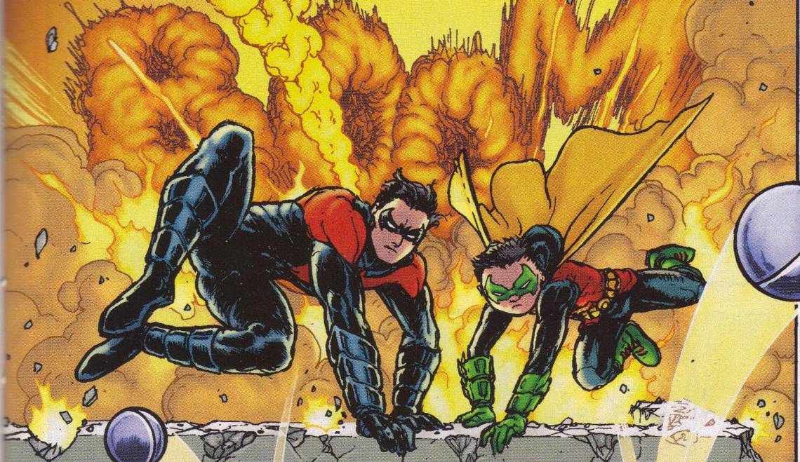
One totally Airwolf page:

Burnham does the sound effects as part of the explosion in Panel 1, which is always cool to see. It's a cool 3-D effect, too, with 10-year-old Damian's smoke bomb bouncing toward Panel 2, linking it to the smoke that billows up in that panel. Morrison's only words on the page - in Panel 2 - are part of the joy of this page, as Dick and Damian just enjoy meting out justice to the punks. Burnham's goofy Panel 3 leads to that very cool Panel 4, where the bad guys come flying out of the smoke. Ellie, who's very important in this issue (and in future issues?) finishes out the panel, as she watches her heroes in action. This is a wonderful page, making the awful fate in store for 10-year-old Damian even worse.
Colder #5 (of 5) by Paul Tobin (writer), Juan Ferreyra (artist/colorist), Eduardo Ferreyra (color assistant), Laura Binaghi (color assistant), Nate Piekos (letterer), Shantel LaRocque (assistant editor), Scott Allie (editor), and Daniel Chabon (editor). $3.99, 26 pgs, FC, Dark Horse.
Colder has been good all along, and Tobin does a nice job sticking the landing, which is harder than it sounds, and this is one of the best horror comics I've read in a long time. Tobin continues to hint at a lot of the more disturbing things on the fringes, and the book ends on a satisfying, humorous, and even ambiguous note. I won't get too much into the only disappointing thing about the series, because I wonder if Tobin has another mini-series up his sleeve - there's one page where Nimble Jack implies that Declan is so tempting because of who Declan is, but Tobin doesn't go into it too much. It feels important, though, so I wonder if Tobin has any plans to return to these characters. Even if he doesn't, he gives us just enough to show why Jack would be so concerned with Declan. But still - this is a good showdown, with Declan showing us something we haven't seen yet, and Jack surprising us yet again. Reece doesn't get much to do, unfortunately, but that's probably not too surprising.
Obviously, if Tobin has any plans to return to the characters, he needs to rope Ferreyra, because he's so good at making this book come alive. There are some seriously messed-up pages in this book, but Ferreyra is also good enough to sell the softer moments. There's a nice 2-page spread where Jack and Declan walk through Declan's memories, and it's not revolutionary, but it's something that most artists wouldn't think of. Ferreyra's lines look a bit angular and edgy in this issue, and while it doesn't look rushed, I wonder if he did it to contrast to the quieter moments between Declan and Reece. If you've never seen Ferreyra's artwork, you need to get this trade and marvel at it. Of course, you should all be aware of Ferreyra, because you've all bought Rex Mundi, right? RIGHT?
Anyway, buy the trade. This is an excellent comic.
Rating: ★ ★ ★ ★ ★ ★ ★ ★ ½ ☆
One totally Airwolf page:

One thing Ferreyra has done in this series is effortlessly make impossible things seem perfectly plausible. His precision in the first two panels make the images horrific but also realistic, so that Declan's face in Panel 2 seems more like a mask, so of course Jack can stretch it like that! The lighting in that panel is amazing, too. The bottom panel is the first in a flashback, and not how Ferreyra softens his lines and the coloring to shift the tone from the first two panels. Really nice work here, don'tcha think?
Detective Comics #18 ("Return to Roost"/"A Cut Above") by John Layman (writer), Jason Fabok (artist, "Roost"), Henrik Jonsson (penciller, "Cut"), Sandu Florea (inker, "Cut"), Jeromy Cox (colorist, "Roost"), Blond (colorist, "Cut"), Jared K. Fletcher (letterer, "Roost"), Taylor Esposito (letterer, "Cut"), Katie Kubert (associate editor), and Mike Marts (editor). $3.99, 28 pgs, FC, DC. Batman created by NO ONE ELSE BUT BOB KANE. The Penguin and the Joker created by Bob Kane and Bill Finger, but everyone knows Finger didn't really do shit. Mr. Zsasz created by Alan Grant and Norm Breyfogle. Anya Volkova created by Scott Snyder, James Tynion IV, and Guillem March.
Layman shoehorns Bruce's reaction to 10-year-old Damian's death into this issue, as we get a page-and-a-half of Bruce standing at Damian's grave and crying a single tear (like the Crying Indian) and then, with seemingly no break, Bruce and Alfred are back in the cave talking about Mr. Zsasz. It's a weird segue in the middle of the issue, and it's obvious that the whole "Requiem" thing on the cover was dictated by DC Editorial, because the issue has absolutely nothing to do with 10-year-old Damian's death - he isn't an integral part of this comic, after all.
Ogilvy is still moving in on the Penguin, and this issue is mainly about how the Penguin gets his comeuppance. Like the rest of Layman's run, it's constructed very well - Layman is a good comics writer because he's able to make single issues work as single issues but also as part of the greater whole. So while Ogilvy has been taking over Cobblepot's operation for a while, if you just happened to pick this issue up without reading the others, you'll figure that out easily and also get a nice story about one man's fall from grace due to his overweening hubris. Cobblepot has been "legitimate" for so long that he can't comprehend that he might get caught doing something illegal, and Layman does a nice job showing that Batman will use any illegality, no matter how seemingly insignificant, to put the Penguin away. I should point out that there are three panels of Batman using violence in this issue - two when he takes out some thugs, and one when he punches Cobblepot. He doesn't need to use violence, because he's Motherfucking Batman. It's just another subtle way that Layman is trying to make this book different from the rest of the DCnU - it's dark because of the inks and the colors, but it's not completely devoid of hope that Batman can use his brains to solve problems. It's also interesting that he doesn't do anything about Ogilvy - again, he's not ready to move on "Emperor Penguin" yet, so what would be the point? Layman also brings in Mr. Zsasz, who has somehow lasted all these years even though his schtick is really dull. I don't know if his back story is an invention of this issue, but Layman links him to Cobblepot, which makes his employment by Ogilvy a nice twist. As I noted, Layman does a fine job breaking down Cobblepot - there's even a wickedly funny panel in the book that I doubt would exist in real life but drives home the point that Ogilvy has replaced Cobblepot. It's kind of depressing that so many writers have done such good work evolving certain characters over the years - Paul Dini making Edward Nigma a consulting detective (still an absolutely brilliant move), Morrison making a new Batman-and-Robin team, Layman replacing the Penguin - and DC refuses to let them stick. Maybe Ogilvy will manage to stick around?
Fabok continues to do solid work, although I do wish the book wasn't quite so dark. The inks are really overwhelming, and Cox's palette is limited and dull - Cox is a pretty good colorist, but he does like to make everything dark. One thing that really bothered me about the art is Penguin's monocle. It's really big, and it seems like Fabok isn't sure how to make it work with Cobblepot's face. This has always been a problem with the Penguin - how does his monocle stay glued to his face? - but it's exacerbated by Fabok's "realistic" style, because it really does look out of place. I know Fabok draws the book digitally, and I kept wondering if he drew Cobblepot's face and then simply drew a monocle over the initial drawing. It doesn't look like Cobblepot is using any muscles to hold it in place - it often looks like it's just floating in front of his eye. When it's as big as it is in the issue, it becomes distracting. I've been picking on Fabok's facial expressions, but I don't have too many problems with them in this issue, mainly because everyone scowls a lot, and Fabok seems to do scowls well. It's just that monocle. Hilariously enough, Fabok draws it over Cobblepot's left eye. In the back-up story, Jonsson draws it over Cobblepot's right eye. And, to be fair, Jonsson doesn't do very much with either Cobblepot or Ogilvy holding it on their faces, either. Maybe it's just really difficult to do, man!
Anyway, Layman and Fabok continue to do solid work on Detective. Next month is issue #900, and it will be interesting to see what Layman does with it. From what he's told me, it sounds like it might actually be worth the 8 bucks. We'll see!
Rating: ★ ★ ★ ★ ★ ★ ★ ☆ ☆ ☆
One totally Airwolf page:

There's nothing really spectacular about this page, just solid storytelling. You can see the black-drenched artwork, which I think works against it a bit. Like a lot of digital art, this works better on screen, but when DC prints it on the glossy paper they use, it becomes much darker. Hasn't anyone figured this out yet?
Glory #33 ("War Torn Part Three: Grand Guignol") by Joe Keatinge (writer), Ross Campbell (artist), Owen Gieni (colorist), Charis Solis (colorist), and Ed Brisson (letterer). $3.99, 28 pgs, FC, Image. Glory and, I assume, every single other character crammed into this issue created by Rob Liefeld.
Keatinge and I had an interesting conversation at ECCC, one that I figure is probably between us (I doubt if Keatinge would mind if I wrote about it, but I don't feel like it), and it's part of why I like going to cons, because I really enjoy it when comics creators are willing to challenge me as much as I challenge them. This has nothing to do with this issue of Glory, but I just wanted to point out that I respect Keatinge more than I already did even if I don't completely agree with him. That's what makes life fascinating!
One thing I like about this run of Glory is that Keatinge takes something that should have been so very SPOILERY and forces it to be non-spoilery at all. If you've been paying attention, you know how this issue is going to end, but good writers don't care about simply using shock value to make their stories note-worthy - in fact, I would argue that shock value is the final refuge of the creatively bankrupt (oh yes I would!). I'm not going to spoil what happens in this issue, but it didn't surprise me in the least. But that didn't matter, because most of this issue is such a gut-punch that by the time you reach the inevitable conclusion, you've been run through the wringer so much that it's almost a relief to get there. The entire issue is a big fight, as Glory leads her friends and, it seems, every character Rob Liefeld ever created into battle, and bad things happen almost immediately. Campbell absolutely kills on this issue, giving us horrific scenes of slaughter and a hauntingly beautiful yet still horrifying final few pages. Gieni and Solis, meanwhile, temper the brightness of earlier issues just enough to imply that things are much more disturbing than they were when the series started, even though the tone has always been a bit dark. This is just a tremendous issue in a superb run, and I can't wait to see how Keatinge and Campbell bring it all to a close.
Image would be daft not to produce a 12-issue monster hardcover of this run. They're not daft, are they?
Rating: ★ ★ ★ ★ ★ ★ ★ ★ ★ ☆
One totally Airwolf page:

This is just one of the many brilliant pages in this issue. The point of view in Panel 1 is nicely done, giving us a sense of how close to death everyone is, and Campbell manages to make Henry's monstrous face in Panel 3 look both enraged, sad, and even a bit puzzled. Obviously, things are about to get worse, but Panel 3 is a nice moment before even more shit hits the fan.
Guardians of the Galaxy #.1 by Brian Michael Bendis (writer), Steve McNiven (penciler), John Dell (inker), Justin Ponsor (colorist), Cory Petit (letterer), Sana Amanat (associate editor), and Stephen Wacker (editor). $3.99, 31* pgs, FC, Marvel NOW! Peter Quill created by Steve Englehart and Steve Gan. The Badoon created by Stan Lee and John Buscema. Tony Stark created by Stan Lee, Larry Lieber, and Jack Kirby. Gamora created by Jim Starlin. Rocket Raccoon created by Bill Mantlo and Keith Giffen. Groot created by Stan Lee, Jack Kirby, and Dick Ayers. Drax created by Mike Friedrich and Jim Starlin.
* That's counting the first three pages, which shouldn't count but do.
Boy howdy, this is a pretty lousy comic, and while it's a ".1" issue and is therefore necessarily full of exposition crap, that doesn't mean we shouldn't judge it like a regular issue. Didn't a very short version of this run somewhere? I know I read some of it before, and I'm too lazy to look it up. Anyway, for some reason, Bendis decided to waste what little time he has with McNiven (come on, we know that McNiven will only draw 4 issues in a row - MAX, if he's had a year to get them in the can - and maybe - MAYBE - 7 of the first 15 issues before he leaves) with an expanded origin story for Peter Quill, which is insulting in its condescension and craftsmanship. Let's count the ways this sucks, 'k?
"30 years ago" a spaceship crashes on Earth. A woman named Meredith, who lives in an isolated house, is the only witness, and she saves the pilot, an alien named J'son, and nurses him back to health. Luckily, J'son is super-dreamy, so after a page of bonding (I can almost hear the musical montage with "I Melt With You" playing in the background), they get it on. Naturally, J'son needs to leave the very next day (because of course he does), giving Meredith the lame excuse of "there is a war." At least Bendis acknowledges that this is a douchey thing to do, but it's still a douchey thing to do. Meredith, of course, is pregnant (in pop culture, having sex one time almost always leads to pregnancy, especially if something is keeping the lovers apart or if the participants haven't had sex for a long time - when you haven't had sex for a long time, your fecundity goes through the roof, which is what SCIENCE tells us!), and after we skip forward a decade, the clichés really crank up!
So now we're in 1992 or so ("20 years ago" in Marvel parlance, because God fucking forbid we peg a date to a time in the past). Peter Quill is a comics-reading 10-year-old (I'm sure someone has figured out what issue he's reading - it's Marvel Comics Presents, but I can't see which issue it is, nor do I care all that much) who likes to whine. He's kind of a dick, but he's 10 - what are you going to do? Anyway, a week after Sam Alexander gets bullied in a school playground and gets in trouble for standing up to the bully, Peter Quill ... gets bullied in a playground and gets in trouble for standing up to the bully. Really, Bendis? I get that every single comics writer ever was bullied in school and now that they're awesome comic book writers and the people who bullied them are working at Taco Bell means that every single comic book writer feels the need to put a scene like this in their comics, but didn't Bendis stop for just one second and think, "Do I REALLY want to put such a hackneyed scene in this comic? Dare I? Hell, yes, I dare - no one can stop the Bendis!" (I like to think that Bendis refers to himself in the third person.) Then, of course, Meredith gets refrigerated, as the Badoom show up and blast her. Meredith is probably the epitome of the Women in Refrigerator - she not only exists to give the hero a reason to be full of rage, she exists only to give birth to said hero and then be killed by cowards, so not only does Peter Quill owe his existence to her, his entire raison d'etre focuses on her murder and the douchebag father who obliquely caused it. Dang, Bendis, well played. Then, of course, Peter Quill finds the awesome gun that J'son left for him, and on the final three pages, we find out that he's been narrating this entire thing to Tony Stark as an explanation for why he's ... guarding the galaxy? Even though all he cares about is protecting Earth? I'm not sure how that works.
This has been getting some good reviews, and I don't get it. This is a 3-page recap stretched into 30 pages, and it's mostly pretty dull. We don't really learn anything about any characters, because they're such stereotypes that they're not actually characters yet. I know this is Bendis's thing - I saw that Age of Ultron begins in media res, which is pretty stunning for a Bendis book - but there's absolutely no reason for this book to exist. What's the point of Coogan, the bully? We know Peter Quill is a hero, so who cares that he stood up to a bully? I don't know if we knew anything about his mom prior to this issue, but why does Bendis have to specifically fridge her? I mean, if he's just using the template of other writers, couldn't he have just ignored the fact that she's a WiR because he has to know that's what she is, right? I mean, this is a book with Rocket Raccoon and Groot and Drax and Gamora, and Bendis focuses on the absolutely dullest character. Well, except for Tony Stark. I know there's a reason for Iron Man to be there, but that doesn't make it any less dumb.
McNiven's art is nice, though. I tend not to buy McNiven's comics, because he's usually working on Big Marvel Events, but I don't know if his art has gotten less slick gradually or if this is a new look, perhaps helped by Dell's inks. It's still that hyper-realistic style, but a bit rougher than it's been in the past. Too bad it's in the service of a really dull issue.
Four bucks for what could have easily been 3 or 4 pages of story. Good call, Marvel! I'm sure it will sell like gangbusters. Blech.
Rating: ★ ★ ★ ☆ ☆ ☆ ☆ ☆ ☆ ☆
One totally Airwolf page:

Meredith's charred corpse lies on the floor in Panel 1, which is a fine way to begin this page, right? I just like the way McNiven moves us across the page - there's a decent sense of movement and tension, although Peter's expression in Panel 3 is just weird. He's just seen his mom's corpse, of course, and he realizes the Badoon are going to kill him next, but that seems like an exaggerated reaction to it, like a goofy double-take face. Still, it's a pretty good page. Bendis should have let McNiven draw more action, because the very brief action scene in this comic is well done.
Hawkguy #8 ("My Bad Penny") by Matt Fraction (writer), David Aja (artist), Annie Wu (pin-up artist), Matt Hollingsworth (colorist), Chris Eliopoulos (letterer), Sama Amanat (associate editor), and Stephen Wacker (editor). $2.99, 20 pgs, FC, Marvel. Clint Barton created by Stan Lee and Don Heck. Kate Bishop created by Allan Heinberg and Jim Cheung. Natasha Romanoff created by Stan Lee, Don Rico, and Don Heck. Bobbi Morse created by Len Wein and Neal Adams. Jessica Drew created by Archie Goodwin and Marie Severin. Wilson Fisk created by Stan Lee and John Romita Sr. Leland Owlsley created by Stan Lee and Joe Orlando. Hammerhead created by Gerry Conway and John Romita Sr. Typhoid Mary created by Ann Nocenti and John Romita Jr.
Damn it, Hawkguy! Issue #6 was so good, and while I didn't love issue #7, it was kind of crammed in to help raise money for the hurricane, so I let it go (and it wasn't bad, but I just didn't love it). But now here's issue #8, with Aja doing his thing, and some brilliant pin-ups by Annie Wu that hearken back to 1950s romance comics, and ... it's not so great. Again, as with all of these issues, there's plenty of good stuff in it, and the artwork is of course tremendous, and Fraction actually uses Wu's pin-ups in a clever way, but ... it's just missing something. Clint is dumber than usual in this issue, and I just can't behind the idea of him as "idiot frat boy" that Fraction is going for - it just feels like he's too clueless, and shouldn't he have learned some things in his 50 years of existence? I'm glad that Fraction has tried to give him a discernible personality that's not like any other superhero, but it's fine line to walk between "lovably goofy" and "downright stupid," and in this series, Fraction doesn't always walk that line perfectly. In this issue, Clint falls into the latter category, and it weakens the issue. I mean, Penny wants Clint to steal the contents of a safe that's inside the Track Suit Mafia's strip club, and when he logically asks "What's in the safe?", she says "Ask me no questions, I'll tell you no lies." Ignoring the fact that people don't talk like that, Clint still goes along with the heist even though he explains what a bad idea it is. Really, Clint? Think with your dick much?
I guess issue #9 will tell the same story from a different perspective, so maybe it will make more sense, but I just don't know about this comic. This and Saga piss me off so much, because Fraction and Vaughan can be so, so good and it pains me when they're not. I mean, Kate Bishop is visible in two panels in this entire issue and she kicks so much ass that it's just not funny. How can Fraction make her 24 words so good yet everything else is so ... blah? Man.
Rating: ★ ★ ★ ★ ★ ★ ☆ ☆ ☆ ☆
One totally Airwolf page:

Look how brilliantly Fraction and Aja set up this page. Obviously Clint and Penny are in the back seat of a car, but we don't know if it's a taxi or what until the bottom row. If they were in a taxi, Penny's clothes change might be odd but not out of place in a New York cab, while their conversation would either be ignored by the driver or unheard because of the glass partition. Then, in the bottom row, Fraction drops Kate into the book, and the previous panels become even funnier and more uncomfortable. Plus, Aja draws her with such contempt on her face in both the panels in which she appears, while Clint looks like a chastised teenager when he's standing outside the car. Notice, too, that there's no reason why Penny takes off her coat. But it makes the gag better, so I can forgive it. This is a superb page, and a very good way to make a conversation in comics work instead of just having two characters talk to each other.
Helheim #1 by Cullen Bunn (writer), Joëlle Jones (artist), Nick Filardi (colorist), Ed Brisson (letterer), and Charlie Chu (editor). $3.99, 24 pgs, FC, Oni Press.
I've been jazzed about Helheim since I first heard about it, and while it's not the perfect comic book, it's a pretty darned good first issue. Unlike, say, Bendis, Bunn uses his space carefully, so that we not only get quite a bit of information about the principal characters, but also a ton of action. Plus, the central premise of the book is explained on the last few pages, and while it's not the deepest premise in the world - Frankenstein monsters + Vikings - it will certainly do, amirite?
The book is set in A.D. 580, which is deep enough in the pre-Viking days (the "Viking era" technically begins in A.D. 793) that Bunn can play fast and loose with history without upsetting the apple cart too much - we know very little about Scandinavian history in the 6th century, so who's to say there weren't witches stitching dead Norse warriors into super-warriors? It could have totally happened!!!! We get a main character, Rikard, whose clan is fleeing from freaky evil-looking dudes toward their settlement. Rikard sees a weird vision of himself, but that's just a teaser for later. We find out that their enemies steal the bodies of those they kill, or at least Rikard's people think they do, and that they're under the rule of a "witch." Rikard is shacked up with Bera, and the moment I saw her, I thought of Pop Culture Rule #1, but Bunn puts an interesting spin on that by the end of the issue. Meanwhile, the skeletons of the evil dudes they've just killed rip out of the corpses' bodies and start fighting. Oh dear. I'm not sure if I want to give away the ending, but involves stitching dead Norse warriors into super-warriors. You might be able to guess the rest, especially if you've read anything about the series.
I'm always amazed to read a lot of independent work from creators almost simultaneously with their mainstream superhero work. Bunn is writing Fearless Defenders, of course, and he must have had Vikings rising from the dead on the brain, because the first issue of that book brought up zombie Vikings, or Vombies™. That book was okay, but Helheim is just ... better. Bunn doesn't need to use established characters, so he can do things with the characters in this book that he can't do with Marvel characters, and the script of this book just feels more confident than Fearless Defenders, as if Bunn just doesn't care. Some writers can do magnificent work within the confines of corporate comics, but it's really fascinating to see writers who write both kinds of books, because the creator-owned stuff is, almost without exception, better. If you're going to read an undead Viking story written by Cullen Bunn, the only thing Fearless Defenders has over this comic is a lesbian kiss.
This is due, of course, partly to Jones, who should be a far bigger superstar artist than she is. I joked with Bunn in Seattle that Jones is the only reason to get this comic, but she is, frankly, a very good reason to get it (especially if you're not familiar with Bunn's work). She has a beautiful, idiosyncratic style that works in many different genres, and while she, like so many artists, isn't perfect with action, she's pretty good at it. Her characters are well defined, she gets a lot of their personality in their facial expressions and their body language, and her design work is very good. As with most artists, the characters look a little too clean for a historical setting, but Jones puts them in appropriate and distinctive clothing and hair styles. She's exceptionally good at the horror aspects of the book, too, which is, you know, helpful. Filardi's coloring is done well, too, as the dark blues of the night slowly give way to yellow flame and then red as the book becomes more bloody, until we reach the completely reddish last page, indicating the horror turn the book has taken. It's nice and subtle and logical, but it helps shift the tone of the book well.
I don't know how objective I can be about this book - Bunn is writing one of the best books on the market right now (The Sixth Gun), the idea sounds great, and I'm totally in the bag for Jones's art. But still - I think it's definitely worth a look, if you're looking for a nice horror comic with Vikings. And you are, aren't you?
Rating: ★ ★ ★ ★ ★ ★ ★ ½ ☆ ☆
One totally Airwolf page:

I like that middle panel, because Jones manages to cram in the idea that the skeletons are kind of forming out of the smoke and lining up. It's less concrete and a bit more abstract, as she tries to get a lot of information into that narrow panel. I also like how the characters are lined up in Panel 3 - it's pretty much in order of importance in this issue, which is kind of clever.
Journey into Mystery #649 ("Stronger Than Monsters Part 4 of 5") by Kathryn Immonen (writer), Valerio Schiti (artist), Jordie Bellaire (colorist), Clayton Cowles (letterer), Jacob Thomas (associate editor), and Lauren Sankovitch (editor). $2.99, 20 pgs, FC, Marvel. Sif, Rorgg, Gomdulla, Spragg, Gigantus, and Heimdall created by Stan Lee and Jack Kirby. Otto Octavius created by Stan Lee and Steve Ditko. Monica Rambeau created by Roger Stern and John Romita Jr. Patsy Walker created by Ruth Atkinson. Namor created by Bill Everett.
There's a lot to like about the latest issue of JiM, which isn't surprising because it's been good for the first three issues of the arc, so why not for this one? The first page, in fact, is quite cool, because Immonen is depicting a man about to commit suicide, but she does it rather subtly. Suicide is certainly a serious subject, but the fact that the dude picks the absolute wrong time to jump off a building, given that Sif, her warrior band, and Spider-Ock are right outside the building fighting Rorgg, King of the Spider-Men, is pretty funny. Immonen subtly makes the point that you never really know what's going to happen in New York, and weird stuff always gets in the way of life ... or the ending of it, as the case might be.
Anyway, this is another cleverly written, beautifully drawn chapter in Sif's journey. Immonen makes me fall in love with Spider-Ock just a little, and I hope that Slott is writing him as well in his own book, and then she drags a bunch of monsters out of Marvel obscurity so they can threaten humanity. Immonen writes the second-best Monica Rambeau ever, even though she's only on one page, and she implies that Patsy Walker enjoys orgies, which is ... weird? The page with a monster threatening Tokyo is obvious but still funny, and the ending seems to point to something far more sinister going on in Asgard than we've seen. I don't know - this is just a cool-ass book, and Schiti is absolutely killing it. He gets to draw a lot more slaughter, but a lot of this issue is banter, so Schiti's reaction shots help drive the humor, and he nails those, too. It's just a really enjoyable comic, and I'm looking forward to seeing how Immonen wraps it all up.
Rating: ★ ★ ★ ★ ★ ★ ★ ★ ☆ ☆
One totally Airwolf page:

The final panel of this well structured page is brilliant. Schiti draws a leer through Spider-Ock's mask that we can totally see, and Sif's disgusted reaction to his advances is priceless. Little things like this make comics excellent. Yay, comics!
Legends of the Dark Knight #6. "Gotham Spirit" by Jeff Parker (writer), Gabriel Hardman (artist), Elizabeth Breitweiser (colorist), Saida Temofonte (letterer), Kristy Quinn (associate editor), and Ben Abernathy (editor); "Untitled Batman Versus a Motherfucking Dragon Story" by Michael Avon Oeming (writer/artist), Nick Filardi (colorist), Saida Temofonte (letterer), and Alex Antone (editor); "Look Inside" by Rob Williams (writer), Juan Jose Ryp (artist), David Lopez (colorist), Santi Casas (colorist), Saida Temofonte (letterer), Kristy Quinn (associate editor), and Ben Abernathy (editor). $3.99, 30 pgs, FC, DC. BOB KANE CREATED BATMAN, PEOPLE! ACCEPT IT! AND HE CREATED THE PENGUIN, TOO, WITH ABSOLUTELY NO HELP! Killer Croc created by Gerry Conway and Gene Colan.
Man, DC. These digital-first stories are just so, so good (mostly), and yet I have to imagine that they're not selling because they don't "count." Jeebus, I hate that that's the first criterion of most superheroes-only fans - "DOES THIS FUCKING COUNT?" I made the mistake of looking at the comments for CBR's review of the latest issue of 'Tec (see my review above!) and a lot of commenters were trying to figure when it takes place in relation to the other Bat-titles. I mean, they really cared about it. Now, I mentioned that the scene with Bruce at Damian's grave was jammed in where it didn't belong, and that's fine, but then I just moved on. I don't give a shit if it takes place before or after Batman, Incorporated #9, and neither should anyone else. I just want to read a good Batman comic. Continuity is so fucked that it doesn't really matter when 'Tec #18 takes place. But if it didn't reflect what's happening in other Bat-titles, it might not count, so then we'd have to ignore it. Who cares whether it's any good, right?
Which is how we get back to LotDK. I mean, Parker's story is nothing special - Batman foils some liquor store robbers - but it shows some nice things, like Gotham's citizens standing up for themselves (the title has a double meaning, yo!) and it's never a bad thing to see Hardman drawing Batman. There's one panel in this that doesn't make a lick of sense, but otherwise, it's superb. It reminds me of Lee Weeks a bit, and he's another artist who should draw a whole shitload more of Batman. Oeming then draws Batman fighting a dragon. WHY THE FUCK NOT? As usual, it's a story I like because it's not just Batman beating the shit out of someone, it's Batman trying to take down the dragon without killing it and Killer Croc showing up to prove, once again, that he's a far more interesting character than some writers realize. Finally, Rob Williams gives us a bit of an obvious story about a creepy hitman and his freaky van, but it's still very solid. The hitman is pretty awesome, and Ryp doesn't draw Batman as well as the other two dudes, but he does creepy shit really well, so there's that. These "Legends" don't need to be canonical, they just need to be awesome, and they have been, for the most part. But they don't count. So they don't sell as well. Sometimes I hate comics fans.
Rating: ★ ★ ★ ★ ★ ★ ★ ½ ☆ ☆
One totally Airwolf page:

Batman dropping onto the roof of a car and crushing is iconic and even clichéd, but that's mostly because it gets a "FUCK YEAH!" whenever it happens, so Hardman goes whole hog with this. Parker's script doesn't mention why Batman happens to be out in the daytime, and the art doesn't really show that it's daytime - maybe it's twilight? It's an odd moment in an otherwise solid little story.
Lost Vegas #1 (of 4) ("First Hand: Stays in Vegas") by Jim McCann (writer), Janet Lee (artist), Chris Sotomayor (colorist), Dave Lanphear (letterer), and Rob Levin (editor). $3.50, 24 pgs, FC, Image.
McCann and Lee are presumably working hard on the sequel to The Return of the Dapper Men, but for now, they check in with this mini-series, which Lee gets to draw instead of creating by gluing shit to a wooden board (her original art for Dapper Men is really, really cool, but it's awfully cumbersome). So we get a story about Roland, an inveterate gambler who can't pay his debts, so he has to work them off in indentured servitude on "Lost Vegas," a giant gambling spaceship.
It's not a bad beginning, although that's due mostly to Lee's inventive artwork. McCann sets up a lot, so it's very much a "by-the-numbers" kind of book - we're introduced to Roland, who's taken away by some shadowy dudes and forced to work. Five years later, he's finally been able to plan an escape, and he needs some help to do it. McCann lays out some of the plan, introduces a potential problem, and ends the issue with Roland getting tumbled by the "bad guys." It's interesting, certainly, but nothing spectacular. It's enough to draw us into the story, and McCann obviously hopes that the strange setting and the promise of hijinks will be enough to get people to come back. It will for me, but then again, I have to pre-order comics, so I trusted this based on the creators' previous work. Whether it works for you ... well, that's up to you, isn't it?
Lee's artwork is tremendous, which helps when you're trying to sell this weird world. There's a "Fifth Element" element to it, as it's on board a pleasure spaceship with a lot of weird creatures, but Lee's style helps make the artifice even more artificial, not a bad thing in a comic where the bad guys use some sort of technology to make everyone look the same. She uses the space really well - some of the book is deliberately cramped, which helps create the sense of everyone packed into Lost Vegas's version of steerage and contrasts nicely with the expanses of the main rooms, where Lee gets to open up a bit. There's a two-page spread of an acrobat performing, and it's breathtaking. There's a lot of cool design work, too, as Lee keeps most of the aliens bipedal but mixes it up enough to make things weird. Sotomayor makes the whole thing pop, too, with a lot of powerful colors and shiny special effects. It's a very good-looking comic, and it makes the fact that McCann is simply putting his pieces in place a bit easier to take.
I don't know what's going to happen in Lost Vegas, but I like these kinds of stories, and Lee's artwork is really good. It's a no-brainer for me, at least!
Rating: ★ ★ ★ ★ ★ ★ ★ ½ ☆ ☆
One totally Airwolf page:

I like this page because it gives you an example of the kind of creature design Lee has done for this book. I just dig the various species hanging out on the fringes while Bisa punches Roland. Roland's facial expression is pretty well done, too - he looks awfully puzzled, which I imagine how a lot of people who get sucker-punched look.
Mara #3 (of 6) by Brian Wood (writer), Ming Doyle (artist), and Jordie Bellaire (colorist). $2.99, 20 pgs, FC, Image.
Mara has become a difficult book to write about when the single issues come out, because it's so very much written for the trade that while each single issue moves the plot along, there's a plot only gradually taking shape. So in this issue, Mara explores the limits of her power a bit, people continue to react negatively, and by the end of it all, the real plot comes into focus as the military comes to call. Wood's an interesting writer, and Doyle is still doing fine, but that's about all I want to write about this.
Rating: ★ ★ ★ ★ ★ ★ ½ ☆ ☆ ☆
One totally Airwolf page:

Doyle and Bellaire do a nice job in Panel 1, as the studio audience is in the dark in an earlier panel, but the muzzle flash lights them up eerily and makes the ones on the periphery almost ghostly. Doyle does a nice job in Panels 2 and 3, too, as our sense of time is elongated by the fact that she uses two panels for Mara to notice the shot and stand up - Mara is seeing the world in slow motion these days, so of course that's how she'll perceive the bullet. The final panel is nice, too - we've already seen it from the front, so Doyle reverses it to hide the damage, knowing we don't need to see it again. Seeing only a bit of the blood is effective.
The Massive #9 ("Subcontinental Part Three: Sub") by Brian Wood (writer), Garry Brown (artist), Dave Stewart (colorist), Jared K. Fletcher (letterer), Jim Gibbons (assistant editor), and Sierra Hahn (editor). $3.50, 22 pgs, FC, Dark Horse.
Meanwhile, Wood continues to do a pretty decent job with The Massive, although I'm sure he'll be happy to know I have a bit of a problem with the way this issue ends. Much like Mara, he's telling a long story, but because The Massive is going to take longer, he can take some time to get to it. So he gives us some more back story about a different character - Georg - and introduces some plot points that I imagine will take some time to play out. For the end of a brief arc, it feels a bit anticlimactic, but the nice thing about Wood is that he does this quite often and well - he confounds our expectations, usually in good ways. Of course Callum and his crew aren't going to stay on Moksha Station, but the way Wood gets them off the platform is interesting and not what we think will happen.
Of course, Wood kind of stumbles at the end. I guess he feels he needs to give us some closure, but he returns to his heavy-handed omniscient narration, and I don't think he needs to let us know what he does. I mean, it closes a loophole, I suppose, but he could have let us know the facts in a different way, even several issues from now. The final narrative box is kind of obvious, too, and is something that could show up again, so ... I don't know, it just seems like Wood doesn't always trust his audience to make the leaps he makes for them. It's weird.
Anyway, I still don't love The Massive, but it's pretty good. I don't have any reason to stop reading it, and it's intriguing enough for me to want to find out what's going to happen. That might be a weak endorsement, but there it is. I mean, I can barely get through some comics, but The Massive keeps me on my toes, and that's pretty neat.
Rating: ★ ★ ★ ★ ★ ★ ★ ☆ ☆ ☆
One totally Airwolf page:

Nice work by both Brown and Stewart on this page. Lars is trying to make a nice homemade weapon, but he's out of time. Brown leads us nicely from the "bad guys" moving in and Lars deciding it's "now or never" and chucking his jugs. Stewart, meanwhile, uses his greens and blues well to give the impression of the storm and making Lars look a bit sickly, heightening the idea that he's outmatched even though he has his secret weapon. Nice work all around!
The Rocketeer: Hollywood Horror #1 (of 4) by Roger Langridge (writer), J. Bone (artist), Jordie Bellaire (colorist), Tom B. Long (letterer), and Scott Dunbier (editor). $3.99, 22 pgs, FC, IDW. The Rocketeer created by Dave Stevens.
Much like DC's digital-first Batman (and soon Superman) stories, IDW has taken an "all-star" approach to their license of the Rocketeer, as they started with the anthology and then put Waid and Samnee on a mini-series. Now that that's done, we get Langridge and Bone, and that's just fine. The Rocketeer could use some forward momentum, but it's not completely essential, and if IDW wants to go this route, that's fine. Langridge and Bone are, after all, pretty danged good at what they do.
As this is a set-up issue, we're introduced to the principals - a friend of Betty's, a reporter (named Dahlia, probably because of the Black Dahlia) goes to dig up some dirt on a missing scientist as a cult leader. Of course they're connected, and of course Dahlia gets in way over her head. Meanwhile, the people from whom Cliff took the rocket device want it back, and they're willing to do nasty things to get it. Betty decides to help Dahlia on her own because Cliff thinks women shouldn't be taking risks, and a husband-and-wife detective team (who are in NO WAY modeled on William Powell and Myrna Loy) are also trying to find the missing scientist, and they turn to Peevy, who happens to know the dude. Oh, and Cliff loses his wallet. It's totally important!
I'm sure that Langridge is going for some kind of Lovecraftian thing here, and that's fine, even though I'm not a huge fan of Lovecraftian stuff. But there's a lot going on, and Bone's art is nice to see, and this is a good beginning to the mini-series. It's the Rocketeer - it will probably be entertaining, you know?
Rating: ★ ★ ★ ★ ★ ★ ★ ☆ ☆ ☆
One totally Airwolf page:

I love the old-school jagged lines to show a phone conversation; we don't see that anymore because land lines are so archaic (see: This past week's episode of "Cougar Town," where bad news traveled by land line). But Bone and Bellaire do a nice job with the contrast of Betty's cheery light panels and Dahlia's dark ones, and Bone makes sure to back Dahlia into a corner when the tentacle reaches for her, which is probably not hard to figure out for an artist but still works really well. This is just good, old-fashioned comic book storytelling, and it's good to see.
Sex #1 ("The Summer of Hard") by Joe Casey (writer), Piotr Kowalski (artist), Brad Simpson (colorist), and Rus Wooton (letterer). $2.99, 22 pgs, FC, Image.
Casey's latest shows up, with its provocative and joke-making title, and the results are ... a bit boring, to be frank. It's definitely a set-up issue, and I'm certainly going to keep buying it, but unlike the last time Casey started a series (Butcher Baker, that is), he takes his time a bit. He introduces us to Simon Cooke, a former superhero in Saturn City, who returns to town after an absence to run his company after he promised not to do any superheroing. There's a senior citizen bad guy who's plotting something, as well. The final part of the book is where it earns its title, as Cooke goes to a live sex show but doesn't seem all that interested in the shenanigans. This leads to the owner of the establishment making herself known, and it's not surprising that Cooke knows her - she's probably an ex-lover, but is she an ex-hero or ex-villain, as well? We shall see!
There's nothing really wrong with Sex #1, unlike that Guardians of the Galaxy issue above. Casey sets up the players and shows us quite a bit about Simon Cooke without it feeling too ponderous. If you're interested in looking at drawings of two women having sex, well, there's certainly that, too. I imagine (hope?) the somewhat enervating sex scene is part of Casey's master plan - if Butcher Baker was about a virile superhero enjoying lots of sex, Sex could certainly be its opposite number, a story about a superhero who no longer enjoys it. We'll see.
Kowalski has been working in Europe for a while, but I've only seen one of his comics, and his art is pretty good. Here he does a solid job, although the script doesn't require too many gymnastics from him, even in the sex scene. The real star of the artwork in this issue, at least, is Simpson, who saturates the pages with almost overwhelming primary colors, giving Saturn City's night life an obnoxious, lurid tone. That's the point, of course, as Cooke's daytime is cool and blue while the night is bright red and yellow. Simpson uses this palette well during the sex scene, as the women are hot red and yellow while Cooke is blue, indicating his distance from the heat of sex. It's not subtle, but it is effective, and it makes the book really pop well.
Obviously, I'm a fan of Casey's, so I'm going to keep buying this. And again, this isn't really a bad issue, but it is strangely low-key. Casey is always interesting, though, so I'm looking forward to what exactly he's doing with this comic. That, and his back matter/letters pages are always entertaining!
Rating: ★ ★ ★ ★ ★ ★ ☆ ☆ ☆ ☆
One totally Airwolf page:

This is a nice example of Simpson's coloring. The first two panels take place in the kitchen, so they're dully colored with sickly green. Then we move into the club, and the assault on the senses begins. It's a really nice mix of hots and cools, with the Alpha Brothers in blue and purple while the rest of the club is in red. Notice the lettering, too - Wooton is decent enough, but I'm not a fan of the colors highlighting certain words. It draws too much attention to the artifice, which I suppose could be the point. I still don't love it. I'll blame Sonia for the idea!!!!
Snapshot #2 (of 4) by Andy Diggle (writer), Jock (artist), and Clem Robins (letterer). $2.99, 27 pgs, BW, Image.
Diggle's story doesn't really make a lick of sense ... or, actually, it does, but the bad guys' plot seems so ridiculously complicated that it doesn't make a lick of sense, but it's entertaining enough, as we learn more about why people are trying to kill Jake. He also meets a cute hipster girl who's also tangentially involved in the plot, so that's nice for him. Diggle doesn't do anything unique with the story, but he moves us along pretty well. Meanwhile, Jock does his thing - like Diggle, you pretty much know what you're going to get from him, and if it's your thing, you'll think this looks pretty good. His work looks better in black and white, so that's a bonus.
Snapshot is just an entertaining thriller by two good creators. It doesn't really need to be anything more than that, I guess.
Rating: ★ ★ ★ ★ ★ ★ ½ ☆ ☆ ☆
One totally Airwolf page:

As far as "realism" goes, this is pretty neat. I suspect that the car would not actually flip over if it hit those concrete pylons, but I'll allow it. The fact that Jake doesn't crash works, too, because he doesn't jump so high or far that it becomes unrealistic. It's just a nice page!
Witch Doctor: Mal Practice #4 (of 6) by Brandon Seifert (writer/letterer), Lukas Ketner (artist), Andy Troy (colorist), and Sean Mackiewicz (editor). $2.99, 22 pgs, FC, Image/Skybound.
Things start to come together a bit in this issue, as Morrow wakes up, Eric owes someone a favor, the bad guys are shown to be a bit more sinister than we thought, Penny shows up again, and the doc decides to do some metaphysical surgery on himself, which leads to the dragon. Inside his lung. Yeah, it's just that kind of comic book.
As usual, this is very well done. Seifert balances the humor and the action and the horror well, and Ketner is good with the creepy aspects of the book, which is a plus (as a lot of it is creepy). He doesn't just make the book horrific - he makes it creepy with a slight sense of humor, which fits well with Seifert's writing. He and Troy really bring Seifert's scripts to life well, as the art is quasi-realistic and very detailed, so the fact that Morrow is wearing a leather helmet with crystals sticking out of it doesn't look too out of place.
We're right in the middle of the story, so it's kind of hard to really write too much about this - Seifert makes sure that plenty happens in each issue, which is nice, but it's also advancing things toward the conclusion - and so I'll just say that Witch Doctor continues to be a very good comic. I know, shocking!
Rating: ★ ★ ★ ★ ★ ★ ★ ½ ☆ ☆
One totally Airwolf page:

There's a lot going on here - Penny has just spoken for the first time in a while, and the two women are freaking out a bit. Seifert explains a bit about Penny, which is handy, and Ketner does a good job not showing all the violence but making sure we know how awful it is. I like how Seifert anticipates the clichéd responses that bad guys have and how Penny brushes them aside. And the final panel is chilling. Ketner's inks are nice, too, with regard both to the lighting on Penny's face and how the darkness makes her look sick and powerless even though we know she's probably going to follow through on her threat. Nicely done!
Young Avengers #2 ("DYS") by Kieron Gillen (writer), Jamie McKelvie (artist), Mike Norton (artist), Matthew Wilson (colorist), Clayton Cowles (letterer), Jake Thomas (assistant editor), and Lauren Sankovitch (editor). $2.99, 20 pgs, FC, Marvel.
Gillen focuses on Billy, Teddy, and Loki in this issue, which some people don't like but I don't really mind - the team really isn't a team yet, so instead of wasting time "gathering the team" - we know how deadly dull that can be - Gillen simply throws us into the plot and, presumably, trusts that the team will come together in time. He does, after all, mention that Kate seems to be having some problems with aliens, and I really don't mind a writer going ambitious when it comes to plotting. If Gillen can keep all these balls in the air, the book will be better for it. I just hope readers let him.
Anyway, Teddy and Billy figure out pretty quickly that Teddy's "mom" isn't really Teddy's mom, but it doesn't help them. They try to flee to the Avengers (Uncanny version), but the thing's spell is apparently quite powerful, so Wanda simply gives the boys back to "Mom." Loki decides to help, but neither Billy or Teddy completely trusts him - probably a good idea (I've often mentioned that no one should ever trust Loki, yet people still do, and it's nice that Billy thinks Loki might be up to something). So they end up in Asgard, where there's a cliffhanger.
This issue doesn't crackle quite as much as the first one, mainly because Gillen remains better at dialogue and character development than he does plotting, but that doesn't mean it's a bad comic. There's plenty of excellent dialogue, and the plot is a bit better than I thought it might be at the end of issue #1. I still don't love it, but I can live with it. What makes it work is that Billy and Teddy aren't idiots. What I mean by that is that even though they acted a bit dumb at the end of issue #1, they realize their mistake and don't continue to act like idiots in this issue - it's perfectly logical that they would go to the Avengers, and even though they need Loki, they don't trust him. Gillen does a good job as well with not spelling everything out and trusting McKelvie - it's a product of their long colloboration, true, but more writers should trust their artists. Not everything needs to be spelled out!
McKelvie, meanwhile, is wonderful on this book, which isn't surprising. The way "Mom" ruffles Billy's hair is both hilarious and slightly creepy, and the panel where Teddy realizes something is terribly wrong is excellent - McKelvie places Teddy and his "mom" on opposite sides of the room, as far from each other as they can be, and we can feel the gulf between his expectations and reality. The two-page sequence where Billy and Teddy are trapped inside the panels is well done, giving us a nice feeling of being trapped outside of reality, which is why it makes sense that Loki can free them. McKelvie keeps getting better, which is pretty cool. This is a gorgeous comic book, and it's great that these creators (I'm counting Norton and Wilson, too) can work together so well.
Rating: ★ ★ ★ ★ ★ ★ ★ ½ ☆ ☆
One totally Airwolf page:

This page shows Gillen's good dialogue, as Loki gets all the good lines. I like the exchange between Billy and the waitron in Panel 2, because why wouldn't the dude try to get some extra cash money? The final two panels are an easy joke, but I still laughed. I also like how McKelvie changes Teddy in between panels. As Gillen writes in his notes for the issue, Teddy is essentially naked all the time. Wouldn't you be, if you could shapeshift?
All Star Western volume 2: War of Lords and Owls by Jimmy Palmiotti (writer), Justin Gray (writer), Moritat (artist), Patrick Scherberger (penciller, "Nighthawk & Cinnamon"), Dan Green (inker, "Nighthawk & Cinnamon"), Terry Austin (inker, "Nighthawk & Cinnamon"), José Luís Garcia-López (artist, "Bat Lash"), Scott Kolins (artist, "Dr. Terrence Thirteen"), Gabriel Bautista (colorist), Mike Atiyeh (colorist), Patricia Mulvihill (colorist, "Bat Lash"), Rob Leigh (letterer), and Rowena Yow (editor). $16.99, 166 pgs, FC, DC.
This is, I should point out, the first time I've bought a second volume of any DCnU book. It's the only one so far of the originals that have come out in softcover that I've cared to continue with. This means something ...
Archer & Armstrong volume 1: The Michelangelo Code by Fred van Lente (writer), Clayton Henry (artist), Pere Pérez (artist), Matt Milla (colorist), Dave Lanphear (letterer), Josh Johns (assistant editor), Jody LeHeup (editor), and Warren Simons (executive editor). $9.99, 109 pgs, FC, Valiant.
I'm trying all of these nuValiant books, damn it!!!!
Babble by Lee Robson (writer), Bryan Coyle (artist), Eddie Deighton (letterer/editor), Benjamin Shahrabani (editor), and Jon Sloan (editor). $16.99, 124 pgs, FC, Com.X.
I've been looking forward to this comic for a while, and now it's here! Maybe someday I'll get to read it! I think I linked to this already, but here's Colin Smith interviewing the creators. It's a good interview!
Ditko Monsters: Gorgo! by Joe Gill (writer), Steve Ditko (artist), and Craig Yoe (editor). $34.99, 237 pgs, FC, IDW/Yoe Books.
Yeah, it's Ditko. What more needs to be said?
The Last Call volume 2 by Vasilis Lolos (writer/artist) and James Lucas Jones (editor). $12.99, 162 pgs, BW, Oni Press.
I love Lolos's chutzpah. I know he's had a LOT of issues in his life that delayed this book several years, and then he goes and puts "to be continued" at the end of it. I really hope his personal life has been sorted out - it sounds like he hasn't been having much fun recently.
Messages in a Bottle: Comic Book Stories by B. Krigstein by Bernard Krigstein (writer/artist) and Greg Sadowski (editor). $35.00, 272 pgs, FC, Fantagraphics.
It's Krigstein. What more needs to be said?
Nemo: Heart of Ice by Some Cranky Northamptonian (writer), Kevin O'Neill (artist), Ben Dimagmaliw (colorist), and Todd Klein (letterer). $14.95, 52 pgs, FC, Top Shelf/Knockabout.
I've actually bought the LoEG books since The Black Dossier a lot for the artwork. Moore is going too far up his own bunghole on a good portion of them, but O'Neill's art is abso-freakin'-lutely brilliant. I keep hoping the story will sync up with the art again, but who knows?
The Shade by James Robinson (writer), Cully Hamner (artist), Javier Pulido (artist), Frazer Irving (artist/colorist), Darwyn Cooke (artist), J. Bone (artist), Jill Thompson (artist), Gene Ha (artist), Dave McCaig (colorist), Hilary Sycamore (colorist), Dave Stewart (colorist), Trish Mulvihill (colorist), Art Lyon (colorist), Todd Klein (letterer), and Rowena Yow (editor). $19.99, 245 pgs, FC, DC.
I know this was touch-and-go for a while, because I guess sales of the single issues weren't that great and Robinson was afraid it would get cancelled, but now it's here in trade, and it can go right next to my Starman Omnibus collection. True, it's not a hardcover, but such is life, right?
Spider-Man: The Death of Jean DeWolff by Peter David (writer), Rick Buckler (penciler), Sal Buscema (penciler), Brett Breeding (inker), Vince Colletta (inker), Josef Rubinstein (inker), Kyle Baker (inker), Pat Redding (inker), Bob Sharen (colorist), George Roussos (colorist), Nel Yomtov (colorist), Janet Jackson (colorist), Phil Felix (letterer), Rick Parker (letterer), Nelson Ribeiro (collection editor). $19.99, 167 pgs, FC, Marvel.
I had a really beat-up trade of this for a while, but it didn't include Spectacular Spider-Man #134-136, which I guess is a sequel? but this trade does. So there.
**********
As I noted above, this post is exceptionally late, and I thank you for your patience. The past two weeks have been huge in terms of single issues - 8 one week, 9 the next - and there were a lot of books I really wanted to write about, whether because they featured the death of a 10-year-old or because they were new titles. Plus, the convention was right in the middle of it, and I wanted to get that post up before I dove into these. I'm sure I'll be back to a normal posting day - Thursday or, at the very latest, Friday - this week, but it is Spring Break, so who knows if that will screw up my schedule at all. Anyway, thanks for waiting.
The only non-comics thing I have this week is that I shaved my beard. On Monday night/Tuesday morning, I couldn't sleep. Whichever side I slept on, the part of my face that wasn't on the pillow itched. I had reached the point where I needed to decide if I wanted to start grooming the beard, and whether I wanted to make that commitment. I decided I didn't want to. If it hadn't itched so much, I would have kept it, but I didn't want to take the time to trim it, oil it, and keep it all nice and pretty. So I shaved it. At two in the morning, mind you. It took me about 70-75 minutes, but it's gone. I don't know - it was fun, and if I grow one again, I'll probably make sure to trim it a bit better before it gets too crazy. But for a first attempt, I think it was pretty groovy. My mom was very happy I shaved it - she thinks beards are "creepy." Here's the last day with the beard and the first day without:


No iPod this week, so I'll just say have a nice day, and enjoy Daylight Saving Time, the biggest scam ever perpetrated on the American people! Arizona doesn't do DST, which is fine with me, because I like being 3 hours behind the East Coast instead of being only 2 hours like we are during the winter. That's just how I feel, man!