And now let us believe in the long year that is given to us, new, untouched, full of things that have never been. (Rainier Maria Rilke)
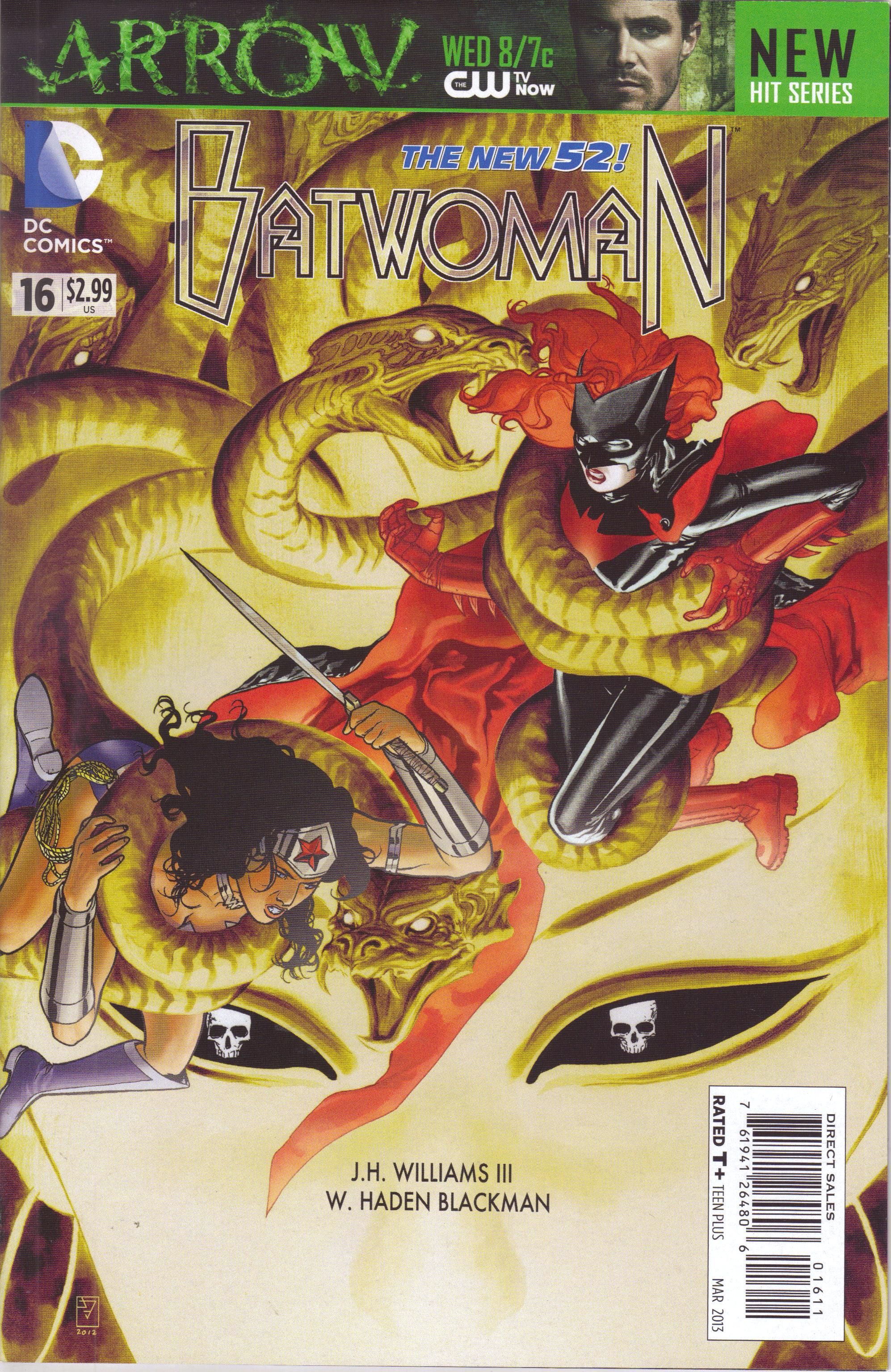
Batwoman #16 ("World's Finest Part Four: Serpent's Homeland") by J. H. Williams III (writer/artist), W. Haden Blackman (writer), Dave Stewart (colorist), Todd Klein (letterer), Rickey Purdin (assistant editor), Harvey Richards (associate editor), and Mike Marts (editor). $2.99, 20 pgs, FC, DC.
We've reached the penultimate chapter of Williams and Blackman's massive 17-issue epic, and DC nicely allowed Williams to go absolutely nuts with the art on this issue. There's Page 1, then 3 double-page spreads, then two pages laid out in a fairly standard way, then 5 double-page spreads (the last one is a bit more conventional, but still) and then the final page of the issue. So 16 of the issue's 20 pages are double-page spreads (and DC stuck all the ads at the end, which they should do for all their comics), and they're packed with beautiful artwork and amazing details and impressive layouts and even interesting lettering. It is, of course, a giant fight comic, but Williams and Blackman still manage to get some nice character details about the various people involved in the fighting, plus a brief about the ultimate villain, Ceto, whom Medusa is trying to bring out of the ocean to destroy Gotham. As with most superhero comics, it strains credulity a bit that no other superheroes notice that one of the country's great cities is being destroyed, but that's the way it is, isn't it?
I know that some people have dropped this because, let's face it, 17 issues is a long time to follow a story, and some people were buying it just for the artwork and couldn't get on board with Amy Reeder or Trevor McCarthy, but I'm really curious about the sales of this book. Without making a big deal about it (like announcing that your comic is going to star only females!), this book is completely dominated by women. There's Kate, of course, but there's Maggie, Wonder Woman, Cameron Chase, and Bette, while the villains are females too. Sure, Director Bones and that dude with the hook hand show up in this issue, but they're sideshows. Williams and Blackman manage to get a bit of romantic longing into the book, as Kate originally heads over to Maggie, who tells her to take off and help others (of course, because Maggie doesn't know about Kate's secret). They also check in on Chase, who's freaking out but still fighting, and even Medusa, who explains why she's trying to raise Ceto, which doesn't make it right but at least provides some depth to her backstory. One of the problems with putting females in superhero books is that there were so few of them that they had to be the exemplar for every woman, and in recent years, that's begun to change. All of these women are different characters with different motivations, and the fact that they're women is important but not the only thing about them. The idea of motherhood, for instance, is a crucial part of this entire story arc, so Williams and Blackman bring that in, but there's a lot of other things going on, too. I've written before that Williams and Blackman have gotten better with the writing aspect of this book as it's gone along, and it's nice to see that they're pulling things together well as we reach the end.
I'm still not sure if I'm going to keep buying the book past issue #17 - I don't know if Williams is going to be back on art after he finishes with Sandman - but the finale of this arc seems like it's going to be something, so we'll have to see after that, don't we?
Rating: ★ ★ ★ ★ ★ ★ ★ ½ ☆ ☆
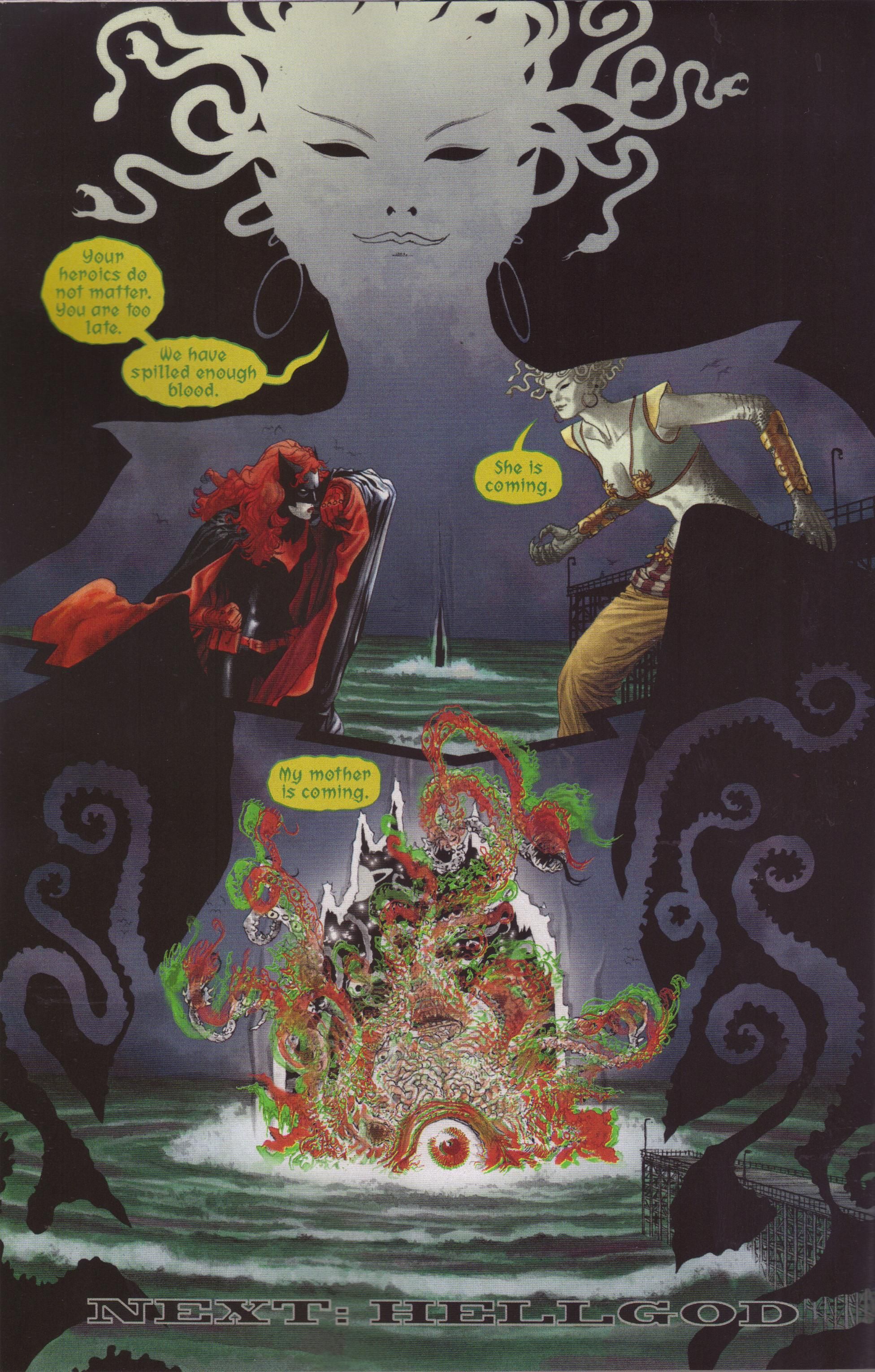
One totally Airwolf page:
This is the final page of the issue, but I hope you don't think that Medusa wouldn't succeed in summoning Ceto, do you? So many of the others are double-page spreads, and they'd have be shrunk to fit in this post, but I do like this page a lot. Using Medusa as a frame for the scene is smart, and Williams shifts from her to the tentacled monster to give the impression that Ceto and Medusa are one, not just mother and daughter. It's a nicely balanced page, too, as Medusa's head, Batwoman, Ceto, and Medusa-inside-the-frame form a nice diamond, while Williams turns the symbolism on its head, as it appears Ceto, Medusa's mother, is rising into her womb instead of the other way around, which makes sense as Medusa is "giving birth" to her mother, if we consider resurrecting her as a "rebirth." Notice that Williams seems to make Ceto look "3-D" - the greens and reds are echoes of each other - and I wonder if that's to make it appear as if she's from a different reality than ours. We'll see next issue, won't we?
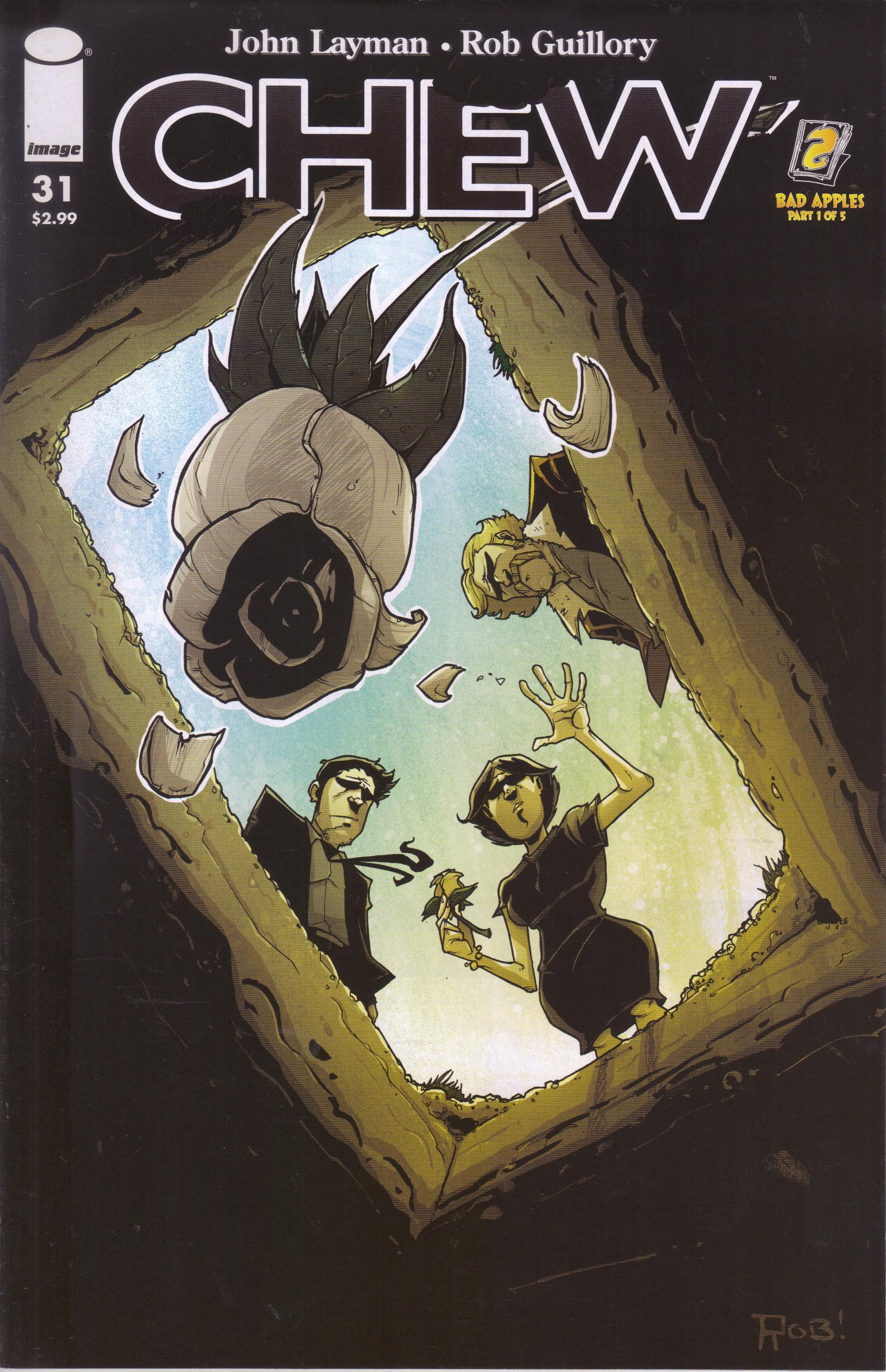
Chew #31 ("Bad Apples Part 1 of 5") by John Layman (writer/letterer), Rob Guillory (artist/colorist), and Taylor Wells (color assistant). $2.99, 20 pgs, FC, Image.
So last issue, I mentioned that something awful happened. I still won't spoil it, but you see from this cover that someone is being buried. Oh dear. That can't be good.
But let's move on. Tony has been reinstated to the FDA, but we're not sure why. But it does lead to a new case, which has all the hallmarks of a classic Chew case - something horrible is happening to people (see below) and it has to do with food, and Tony and Colby track down what's going on, and it turns out it's connected to one of the larger plotlines that has been weaving through the book. In other words, Layman decides to calm down a bit after the intensity of the previous two arcs and regroup - he gives us some of the fallout from issue #30 in the first few pages, and it's clear that Tony is slightly more ... focused in this issue, but it also seems that Layman wanted to show us a good old-fashioned case, too. That's fine, though - one of the great things about Chew is that it can go from the absurd to the deadly serious very quickly, and it always feels tonally "correct." It's not surprising that Tony is a bit more focused in this issue, so even the absurdity of the case can't quite wipe the past away. It's a nice balance.
Guillory does his usual superb job with the art - the first few pages are necessarily muted, and he does a marvelous job with the facial expressions of the characters, which is always crucial in this comic but particularly so in this issue. The absurd part of the case is wonderful, and we also get the "vision" artwork when Tony is reading something, which is also very cool. Plus, there's always the Easter eggs, which are fun.
We're into the second half of the run, and I'm sure there will be plenty of consequences for things that Layman has been setting up for three years. I can't wait!
Rating: ★ ★ ★ ★ ★ ★ ★ ★ ☆ ☆
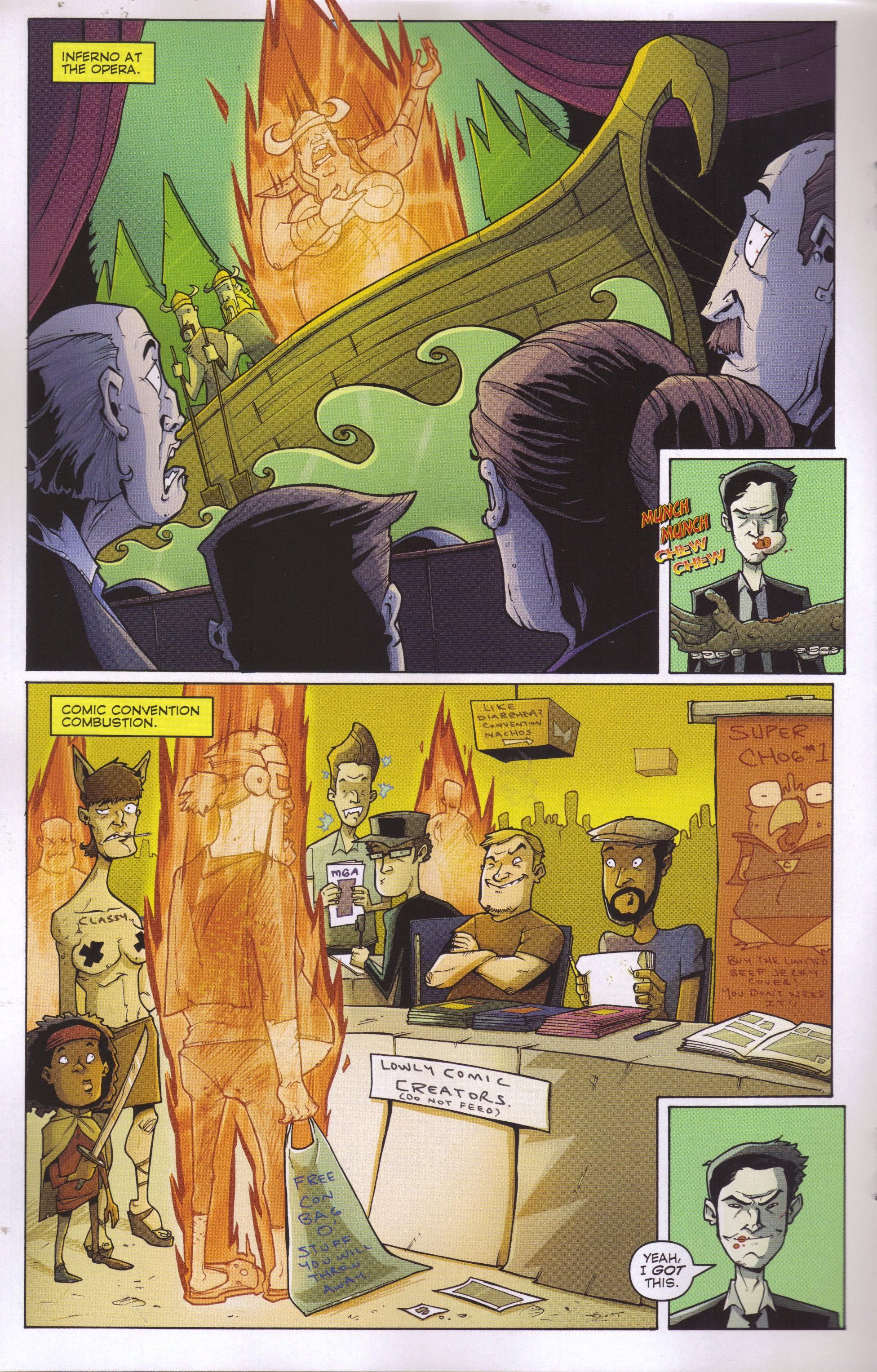
One totally Airwolf page:
Guillory and Layman use the "Viking" opera cliché, but that's okay because it's so goofy. Meanwhile, Guillory nails the convention experience, although he makes Layman far more attractive than he really is. Although Layman probably would act that way if someone burst into flames right in front of him - he's kind of a bastard like that.
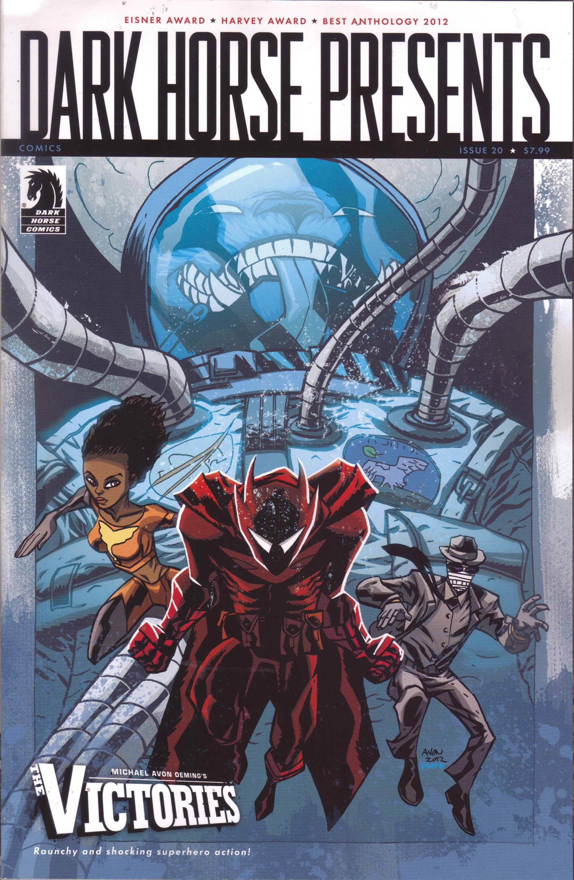
Dark Horse Presents #20. "The Victories: Babalon Working Chapter 1" by Michael Avon Oeming (writer/artist), Nick Filardi (colorist), and Aaron Walker (letterer); "Alabaster: Boxcar Tales Chapter 3" by Caitlín R. Kiernan (writer), Steve Lieber (artist/letterer), and Rachelle Rosenberg (colorist); "Journeyman Chapter 1" by Geoffrey Thorne (writer) and Todd Harris (artist); "Gamma Chapter 3" by Ulises Farina (writer/artist/letterer) and Erick Freitas (writer); "The White Suits Chapter 3" by Frank J. Barbiere (writer/letterer) and Toby Cypress (artist); "Station to Station Chapter 2" by Gabriel Hardman (writer/artist/letterer) and Corinna Bechko (writer); "Captain Midnight Chapter 3" by Joshua Williamson (writer), Pere Pérez (artist), Ego (colorist), and Nate Piekos (letterer); "Resident Alien: The Suicide Blonde Chapter 3" by Peter Hogan (writer) and Steve Parkhouse (artist/letterer); "X: The Pigs Part Two: Pointy Sticks") by Duane Swierczynski (writer), Eric Nguyen (artist), Michelle Madsen (colorist), and Richard Starkings (letterer); "Finder: Third World Chapter 17" by Carla Speed McNeil (writer/artist/letterer), Jenn Manley Lee (colorist), and Bill Mudron (colorist). $7.99, 80 pgs, FC, Dark Horse.
As I've mentioned before, I'm not sure if I like what Dark Horse is doing with this comic, even though the quality is always high. They seem to switch too easily between running a serial in this title and then transferring it to a regular book or vice versa, far more often than they did when they first launched the book. I mean, Howard Chaykin's story and Neal Adams's story, whatever you thought of their quality, ran entirely in DHP. Some serials are still doing that - McNeil's "Finder" story keeps trucking along, showing up in 17 of the 20 issues so far, and it's quite good - but they seem to be doing shorter stories that they then package as a "zero" issue before the inevitable launch of a mini-series, which is kind of annoying. Then, occasionally, something that began as a mini-series shows up in DHP, and that's also annoying. I didn't buy Michael Avon Oeming's The Victories, because it sounded like just another superhero book, but now here it is in DHP. I don't care all that much - it's not a bad little story, and it's obvious you don't need to read the mini-series to know what's going on, but I wonder why Dark Horse is doing it. I mean, if you're already picking something up by Dark Horse (that's not a strictly licensed book), you're probably paying a bit more attention to who's writing and drawing the story, so it's not like you're going to get DHP only because Oeming's superhero story continues here, is it? I've mentioned this before, but it's still worth pointing out: in this issue, we get The Victories, which began in a separate mini-series; Alabaster, which began in DHP, went off a was a mini-series, and now is back; and Resident Alien, which is the same as Alabaster. Meanwhile, Gamma promises that it's "The End For Now," the Captain Midnight story continues in a free comic on FCBD (which is fine, of course, as it's free, but still); and I can't imagine that Dark Horse is prepping some of the others, like X, for a new mini-series or series. Again, that's fine, especially if it helps them sell more books, but I get bugged by the switching back and forth - as I mentioned, I haven't gotten Resident Alien in trade yet, and now there's a sequel back in DHP. If they move it out of the anthology into mini-series, that's cool - but don't bring it back, man!
Anyway, they're all pretty good stories, which isn't surprising. It's always nice to see Cypress's chaotic artwork, and for me, "Journeyman" is the most interesting, because I've been waiting for Thorne and Harris to follow up their excellent Prodigal: Egg of First Light mini-series from a few years ago. Parkhouse's art looks ... better, which is odd because he's a good artist and he's been doing this for a long time, so why would it suddenly look better? I can't explain it - it looks a bit more detailed, and the colors look better. Maybe he figured something out in the coloring process. And "Finder" moves along, with McNeil's oddball science fiction sensibilities continuing to make it a wonderfully strange journey. So, yeah. A good comic. Yet I still find something to complain about!
Rating: ★ ★ ★ ★ ★ ★ ★ ½ ☆ ☆
One totally Airwolf page:
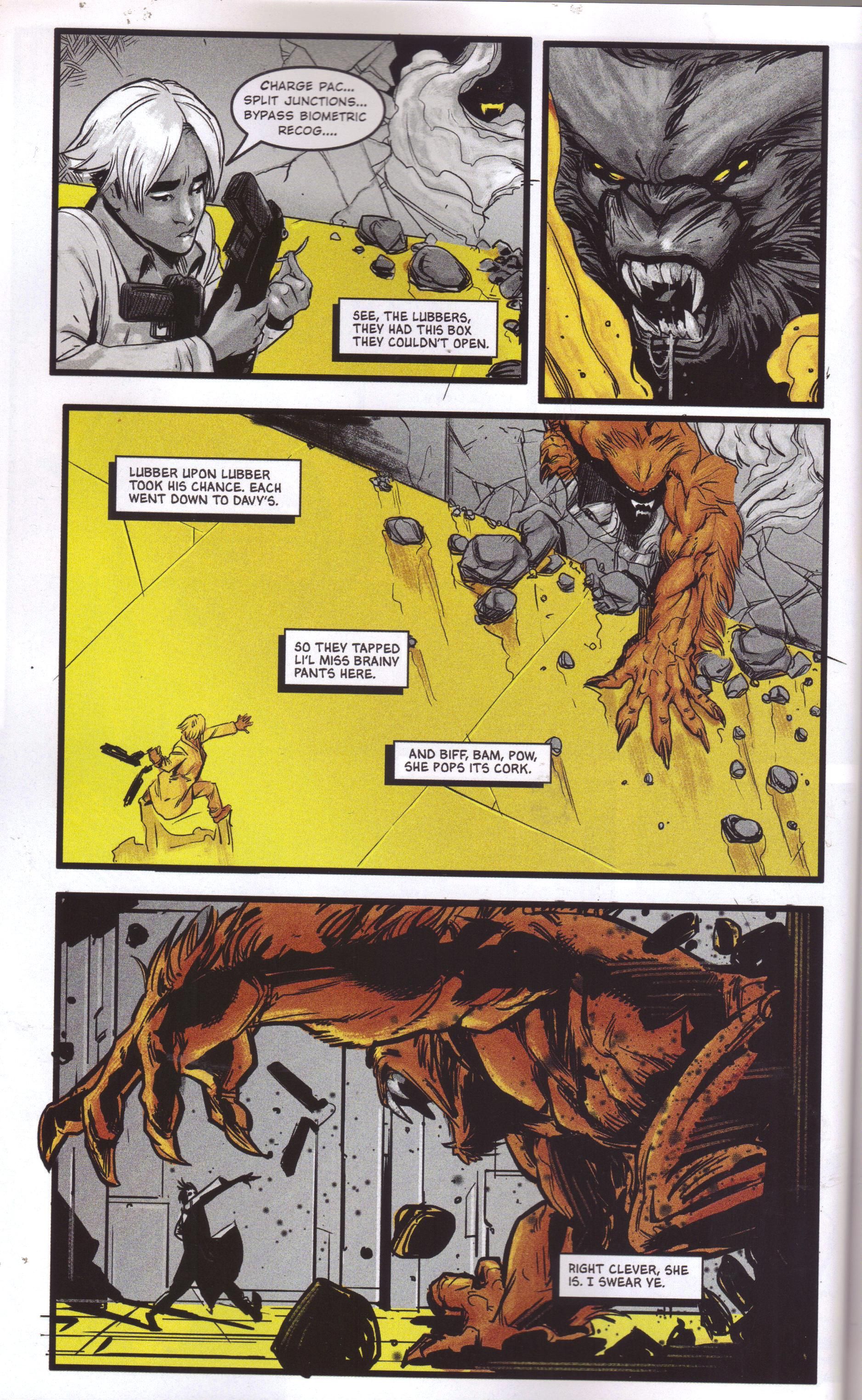
This is from "Journeyman," and let's just ignore the narration for now - we meet the person who's talking on the last page of the story, but we still don't know much about what's going on. Harris does a nice job with the scene - we get close-ups of the young lady and then the monster, a wide shot of the situation, and then the final panel that shrinks the woman and makes the monster larger to emphasize the threat but also clearly shows the weapon that the woman is throwing. The coloring is interesting, too - as you might recall, I'm a fan of different kinds of coloring, so the way Harris emphasizes the monster while turning the woman gray is fascinating - the monster is primal, while she's part of the bland world. The yellow and red in Panel 2 are in nice opposition, too. The chapter is basically a chase, and Harris does a good job keeping it exciting.
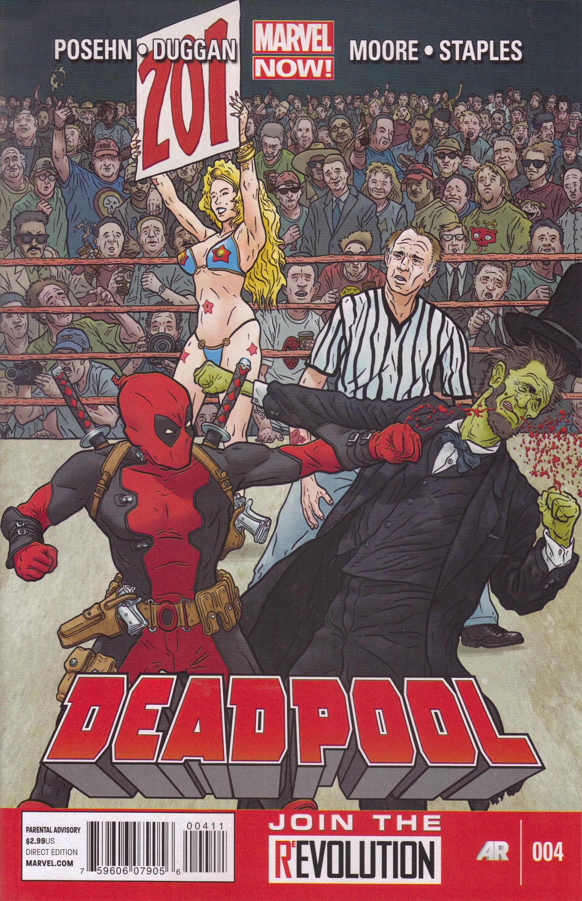
Deadpool #4 ("The Quick and the Dead and the Really Dead") by Brian Posehn (writer), Gerry Duggan (writer), Tony Moore (artist), Val Staples (colorist), Joe Sabino (letterer), and Jordan D. White (editor). $2.99, 20 pgs, FC, Marvel.
It's interesting that for some of its line (not as much now that Marvel NOW! has begun, it's true, but still), Marvel tries to ship twice a month, yet they gave Deadpool some extra time between issues #3 and 4, presumably because Tony Moore is slow. I don't know how much lead time he had, but obviously it wasn't enough. Still, if he can draw issues #5 and 6 in a reasonable amount of time, it will be a nice arc, and Mike Hawthorne, who's coming onto the book next, will have some more time to get ahead! Everybody wins!
Anyway, Deadpool continues to be a ridiculously insane book, an absolute pleasure to read even though it's about as deep as a kiddie pool. I actually had to restrain myself from getting angry at Posehn and Duggan for treating James Polk, a very good (if pro-slavery) president, with such disdain, before I remembered that it's freakin' Deadpool. So on Page 1, we get a Simpsons joke (a rather clever and fairly subtle one), and then we get the people who actually support the Zombie Presidents, and then we get a suicide joke (because it's Deadpool!), and then Posehn, Duggan, and Moore slaughter some random characters just for fun, and somehow William Howard Taft flies in in his bathtub. How does that work? And Moore homages the cover of Superman vs. Muhammad Ali, because of course he does. It's hilarious, it's vulgar, it's insulting to Canadians, and it's gory. Just what you want from your comics!
There's a reason why Marvel tends to be better than DC right now, and Deadpool is an example of it. I can't even imagine DC publishing something like this right now - they have in the past, sure (Lobo, anyone?), but right now, DC seems locked into a rigid form for their comics, with no room for craziness or individuality. It's too bad. As I've been writing, I have no idea if Posehn and Duggan can sustain this kind of craziness (Hawthorne is a pretty good choice to follow Moore, though), but right now, this is a wonderful comic book.
Rating: ★ ★ ★ ★ ★ ★ ★ ★ ☆ ☆
One totally Airwolf page:
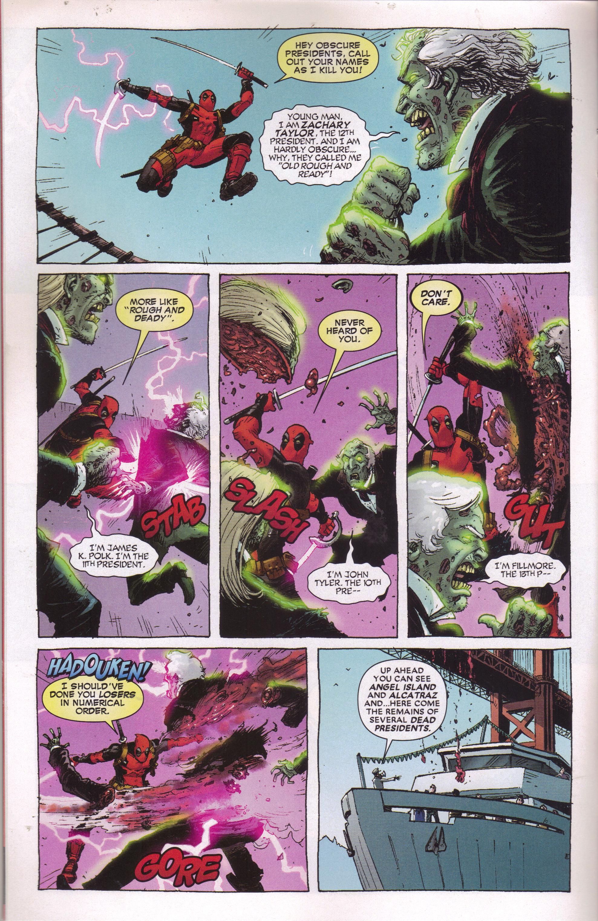
Moore shows why he's such a good artist, especially of action scenes, which aren't that easy. There's a nice fluidity to this page, which makes it easy to zip through. Unlike a lot of DC comics, the gore is more hilarious than disturbing - it's a fine line, of course, but Moore and the writers fall on the "good" side of it. Part of the humor of the book comes from the fact that the "regular" folk living in the Marvel U. take it all in stride - the final panel on the page is hilarious because the tour guide just eases right into talking about the dead presidents raining down on the group.
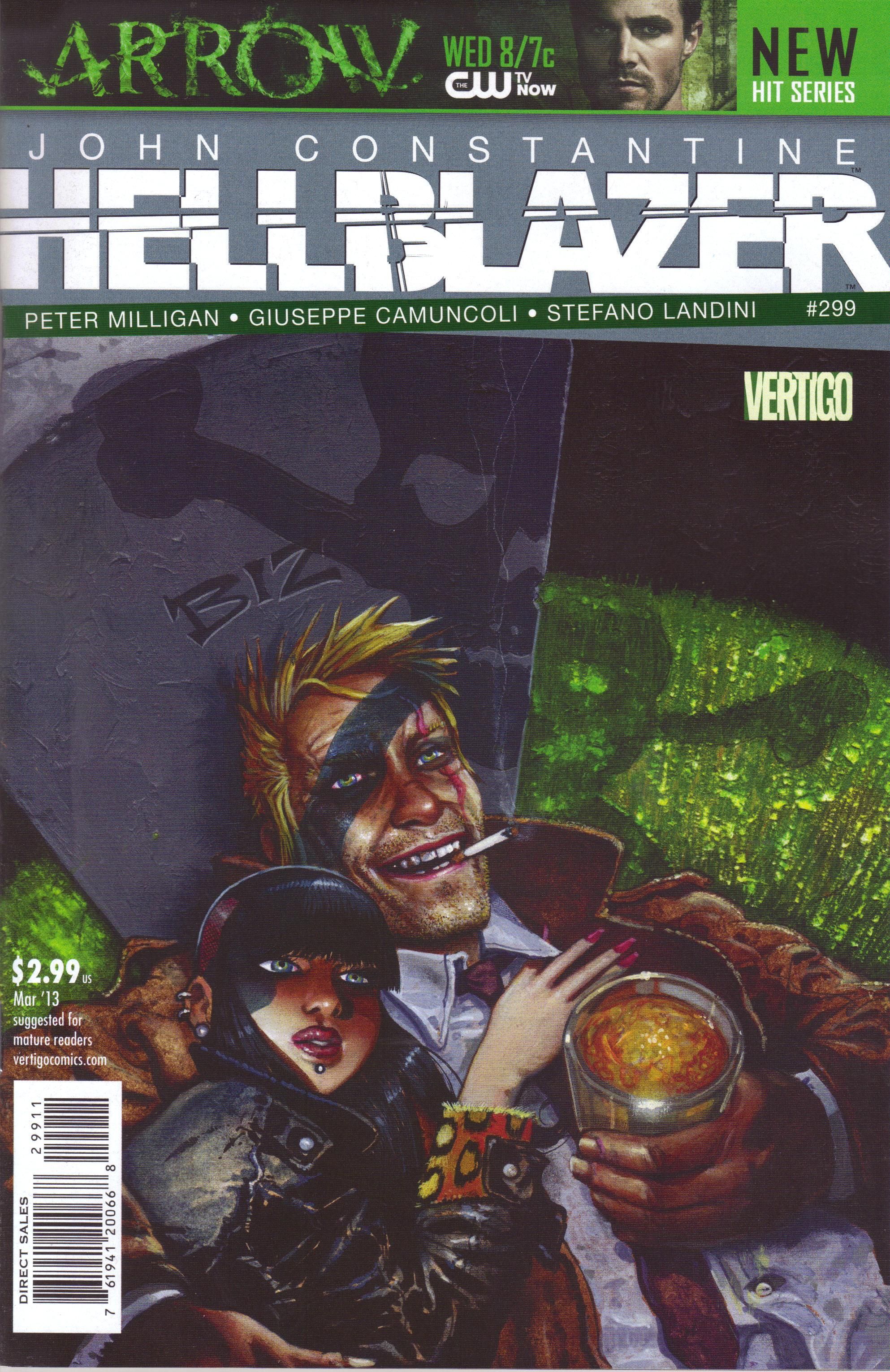
Hellblazer #299 ("Death and Cigarettes Part Two: Post Mortem") by Peter Milligan (writer), Giuseppe Camuncoli (layouter), Stefano Landini (finisher), Brian Buccellato (colorist), Sal Cipriano (letterer), Gregory Lockard (assistant editor), and Shelly Bond (editor). $2.99, 20 pgs, FC, DC/Vertigo.
I'm not going to spoil the ending of this comic, but given that it's the penultimate issue and John was killed last issue, perhaps you can figure it out. Prior to that, this is all Epiphany's issue, as she's given an opportunity to take revenge on John's killer (see below), she contemplates suicide so she can join him, she sees a creepy demon that wants to claim John, she gets help from a friend of John's to fight off said demon (a friend who does not like Epiphany in the least), she talks to John's nephew, whose life has been quickly ruined now that he knows he's a Constantine (man, Milligan is ruthless there), and she attends the funeral. As I love Epiphany and think it's sad that she'll be ceasing to exist after next issue, I appreciated this portrait of her, because it just re-affirms her awesomeness. I was a bit disappointed what she did on Page 16 (come on, Milligan, not that!), but other than that, this is a good issue to set up the final one. I don't know how Milligan will send the series out, but I'm looking forward to it.
Rating: ★ ★ ★ ★ ★ ★ ★ ☆ ☆ ☆
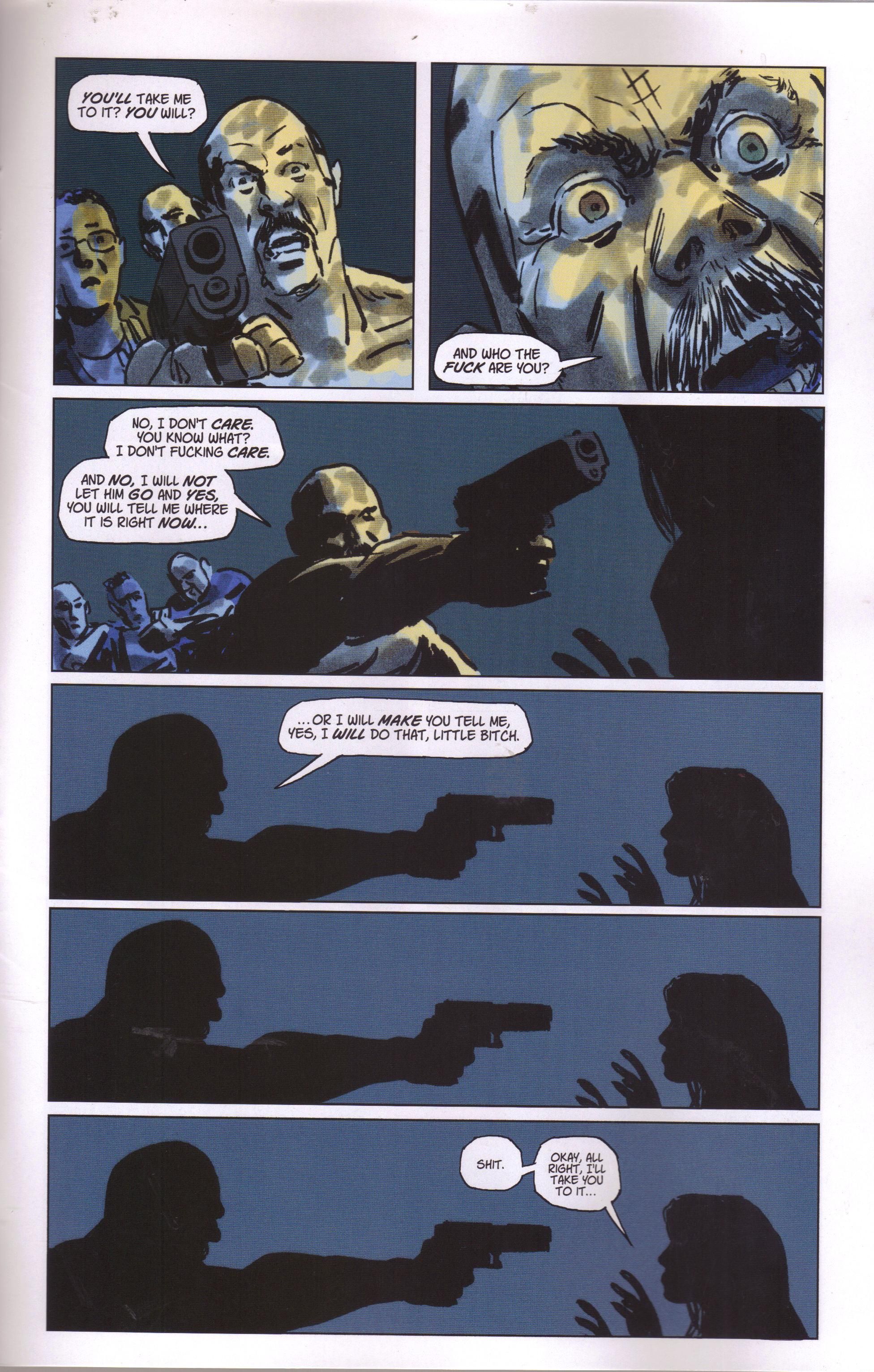
One totally Airwolf page:
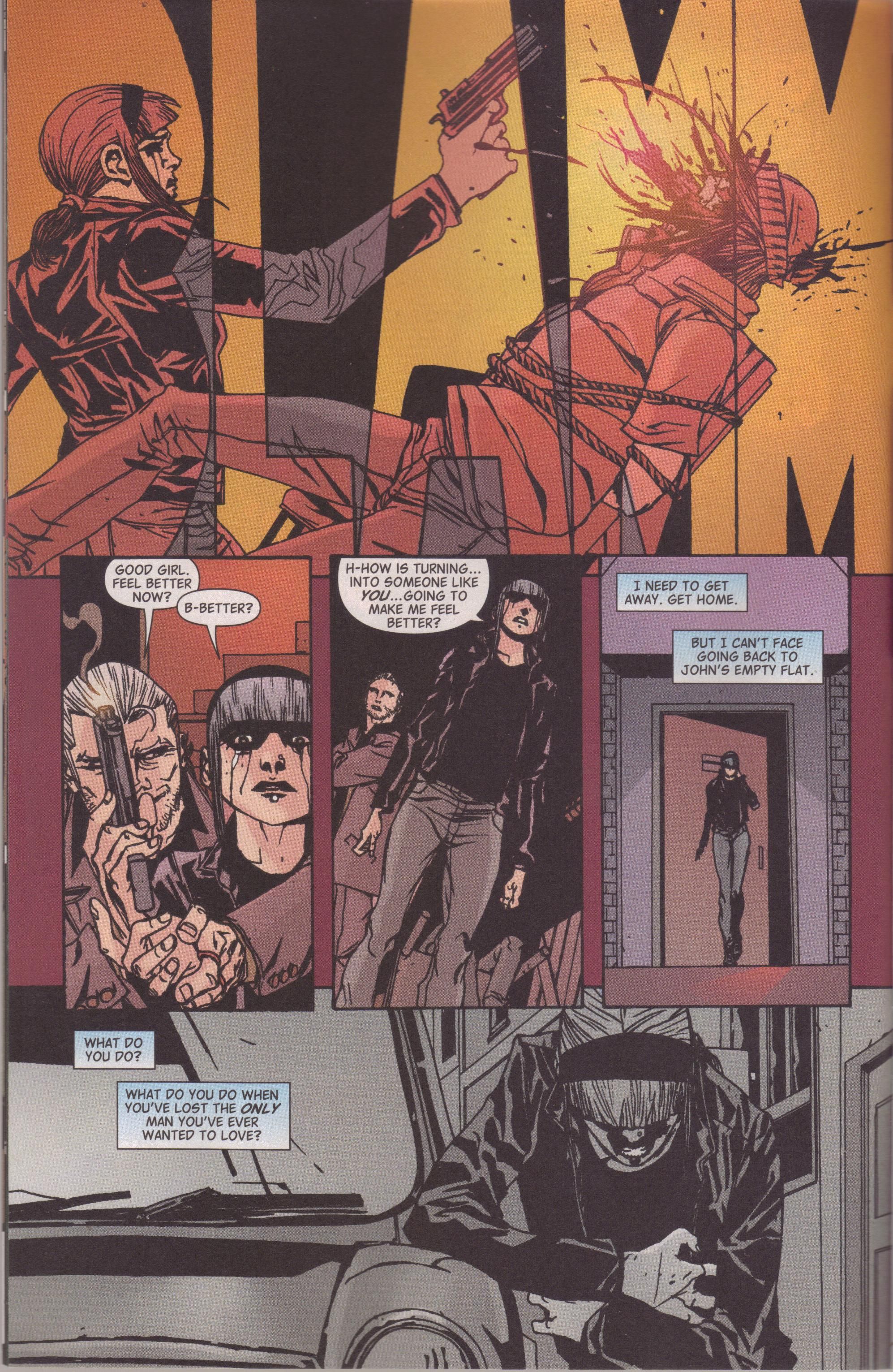
I've tried to give Camuncoli and Landini their due on this book, but maybe I haven't been as much as I should. They kill it on this page, though - look at the sad rage on Epiphany's face as she shoots the dude, then the vacant look in her eyes when Terry asks her if she's better. Finally, the last panel shows the toll John's death has taken on her. It's a wonderful page just for that, and that first panel is tremendous.
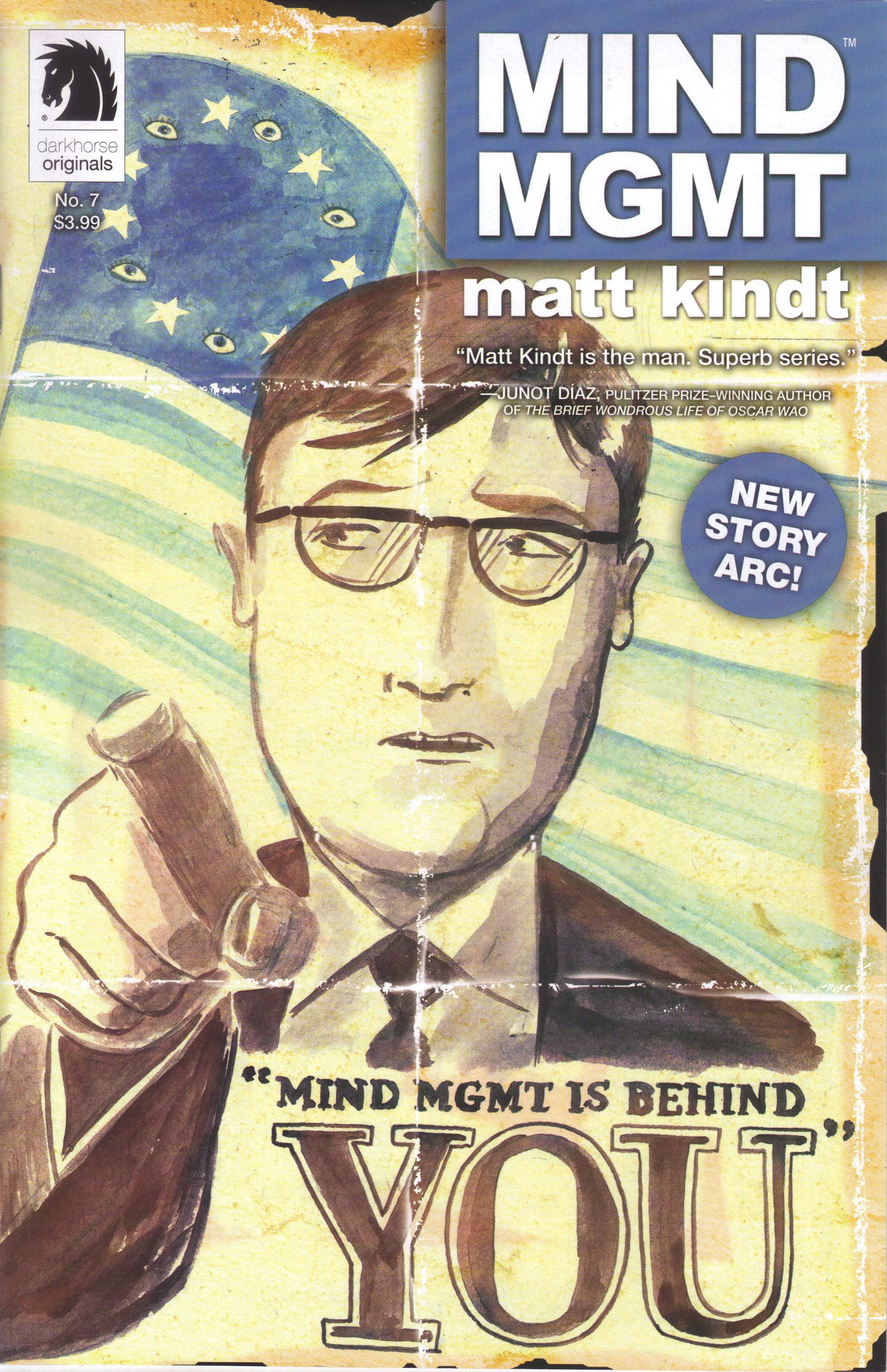
Mind Mgmt #7 ("The Futurist Chapter 1") by Matt Kindt (writer/artist/letterer), Ian Tucker (assistant editor), and Brendan Wright (editor). $3.99, 24 pgs, FC, Dark Horse.
Kindt begins his second arc on Mind Mgmt, and for as good as the first arc was, this might be the best issue so far. Meru is back where she started, but something is bugging her. She gets mail - on a Sunday - and that spurs her into action. She tracks the message she received to a guy named Brinks, and then the craziness starts all over again, as Henry Lyme shows up, rescues her from an assassin, and explains that someone is trying to reconstitute Mind Management. So that seems to be the focus of the series going forward.
Part of the goodness of the issue stems from Meru's relentless pursuit of the truth and the way Kindt shows that it might even be part of a mental breakdown, but we're not sure. At some point she gets a gun and she doesn't know how. She's also calmer and more focused than she was in the first arc - she's obviously been through a traumatic event, and even if she doesn't remember it, it's changed her so that Lyme trusts her now. There's a lot more - it seems - clever stuff in the artwork, from the way Kindt just draws the story to the images he sprinkles in throughout the issue. And the margin, which last arc was taken up with instructions for Mind Management agents, is now telling a story, while down at the bottom, we get instructions on creating an assassination letter. Plus, the main story ends with a surprisingly compelling line, which makes us wonder exactly who Meru really is. All in all, it's a very good issue, building on the first arc but an intriguing story in its own right. I always like it when books improve as they move forward, and Mind Mgmt, which started pretty well, is getting better. That's pretty swell.
Rating: ★ ★ ★ ★ ★ ★ ★ ★ ½ ☆
One totally Airwolf page:
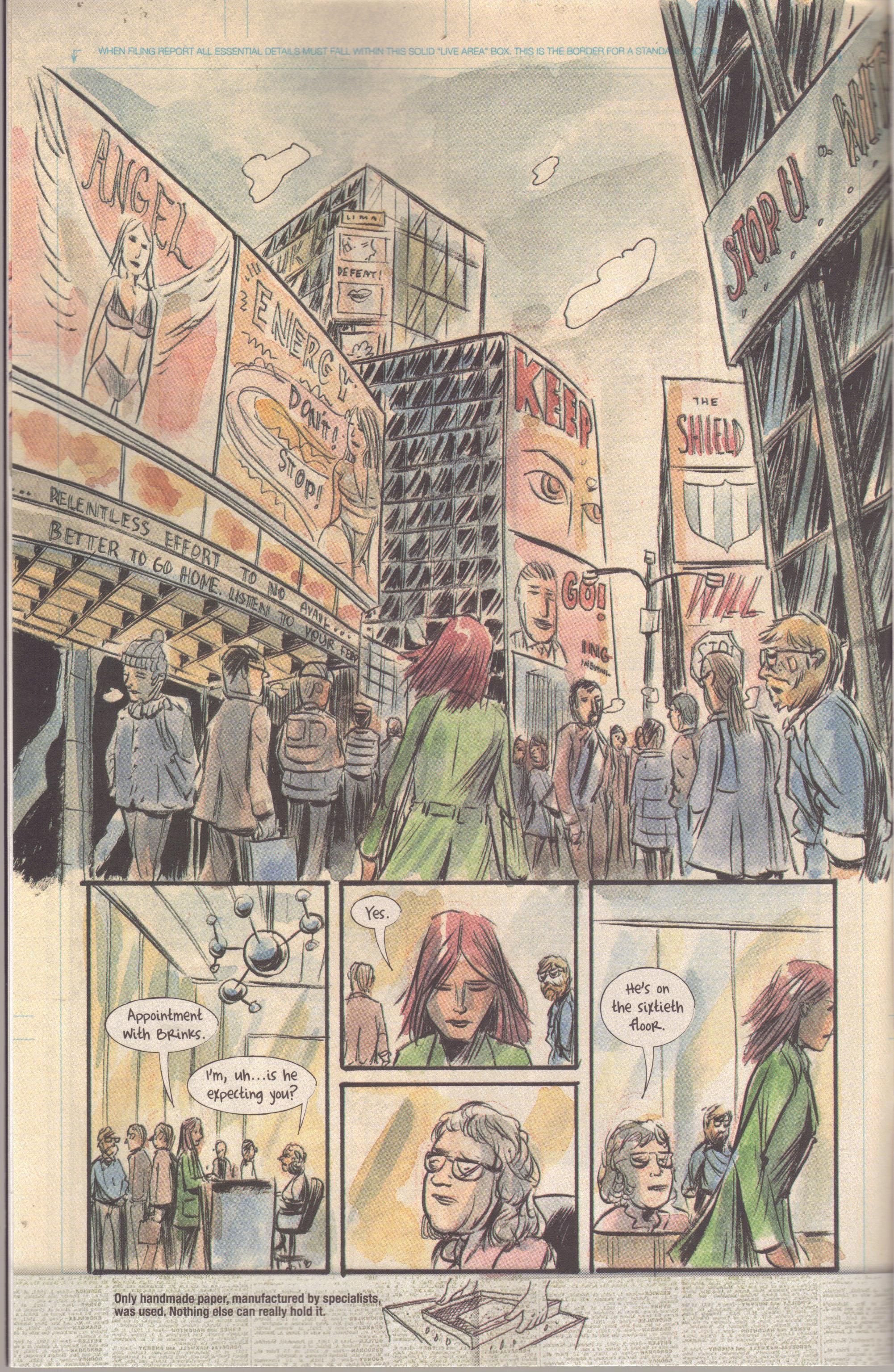
I love the not-really-subliminal advertising in the first panel, as the world seems to have taken an interest in thwarting Meru as she seeks out Brinks. I also like how Kindt doesn't make it too obvious that she's a lot tougher than she was in the first arc, as she simply answers the receptionist's question but the receptionist has no recourse to stop her. The first panel extends past the borders, so Kindt skips the story running up the side of the page, but we see at the bottom the instructions. It's just an example of how immersive the book can be.
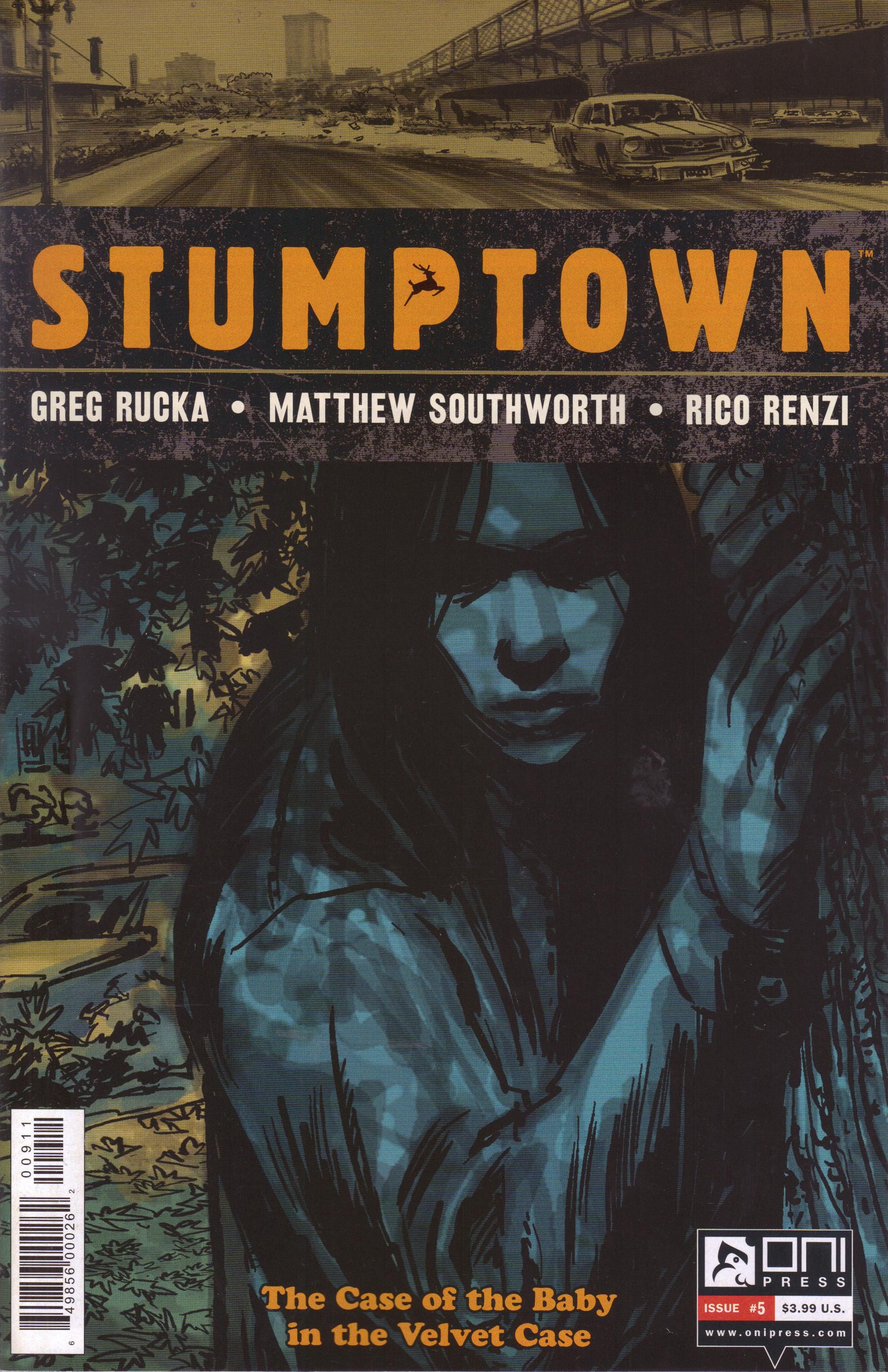
Stumptown: The Case of the Baby in the Velvet Case #5 (of 5) by Greg Rucka (writer), Matthew Southworth (artist/colorist), Rico Renzi (colorist), and James Lucas Jones (editor). $3.99, 30 pgs, FC, Oni Press.
The second volume of Stumptown comes to an end, and Rucka wraps it up pretty nicely while both hearkening back to the first volume and setting up a third volume. Handy, that. I figured it would be hard to top last issue's car chase, and while this issue isn't quite as exciting as that one, but he does a nice job showing how Dex puzzles out the mystery. Rucka writes in this issue that he's not good at writing puzzles, and that for him, the journey a P.I. takes to figure something out is the interesting part, not the solution. Dex isn't smarter than everyone around her, but she is dogged and thinks of things others might miss, and that's how she figures this out. One of the reasons I like Stumptown is because Rucka doesn't write Dex as some super-woman - she does her job, screws up at times, and doesn't try to solve everything herself. She figures this mystery out but knows when to call in others to help. It might make the resolution of the mysteries not as compelling as some, but as Rucka points out, the fun of Stumptown is following along as she puts the pieces together, even if they don't always fit. And then, just for fun, Rucka messes with her at the end. Man, that's just mean.
Meanwhile, it's colorist appreciation day on Twitter, apparently. I'm not really sure who, while reading comics in this day and age, doesn't understand the importance of colorists, but there you have it. It's important because of the way that Southworth and Renzi have been experimenting with the coloring process on this book. I'm still not in love with it, although I think it works a bit better in this issue than the previous ones, especially at the end when the "watercolors" - I can't find the comment Southworth left on my Facebook page about the process, but it doesn't involve actual watercolors - become more prominent and the computer effects fit well with the rest of the artwork. It's still too "soft," but in this issue, that doesn't matter as much. One thing this process does is make the book look a bit more ... sleazy, I suppose, which might not be the best word to use because it sounds bad. I don't mean it that way, honestly - I think the coloring makes Portland look a bit more like a crappy place full of crappy people, which isn't a bad thing when you're writing detective fiction. It also makes the book look a bit more nostalgic - the earth tones seem to add to that more than they have in the past, and the "softness" of the colors helps create that feeling. While I can't really love the new colors, I think I see what Southworth and Renzi are going for. I don't know - I assume Southworth will be at ECCC and we can discuss it and he can punch me in the brain for being a Philistine.
I'm sure that there will be a giant hardcover of this story coming out soon - Oni did one for the first story - so if you missed it, you can pick it up then. It's a pretty darned cool comic.
Rating: ★ ★ ★ ★ ★ ★ ★ ☆ ☆ ☆
One totally Airwolf page:
Notice the dappled shadows on the bad dude's face in Panels 1 and 2. The new coloring process does this quite well - he's in the woods, so of course he'd have shadows on him, but the light isn't very strong, so the shadows would be faded. Meanwhile, Southworth plunges the confrontation into blackness, which somehow adds to the tension. Why is that? Beats me, but it works.
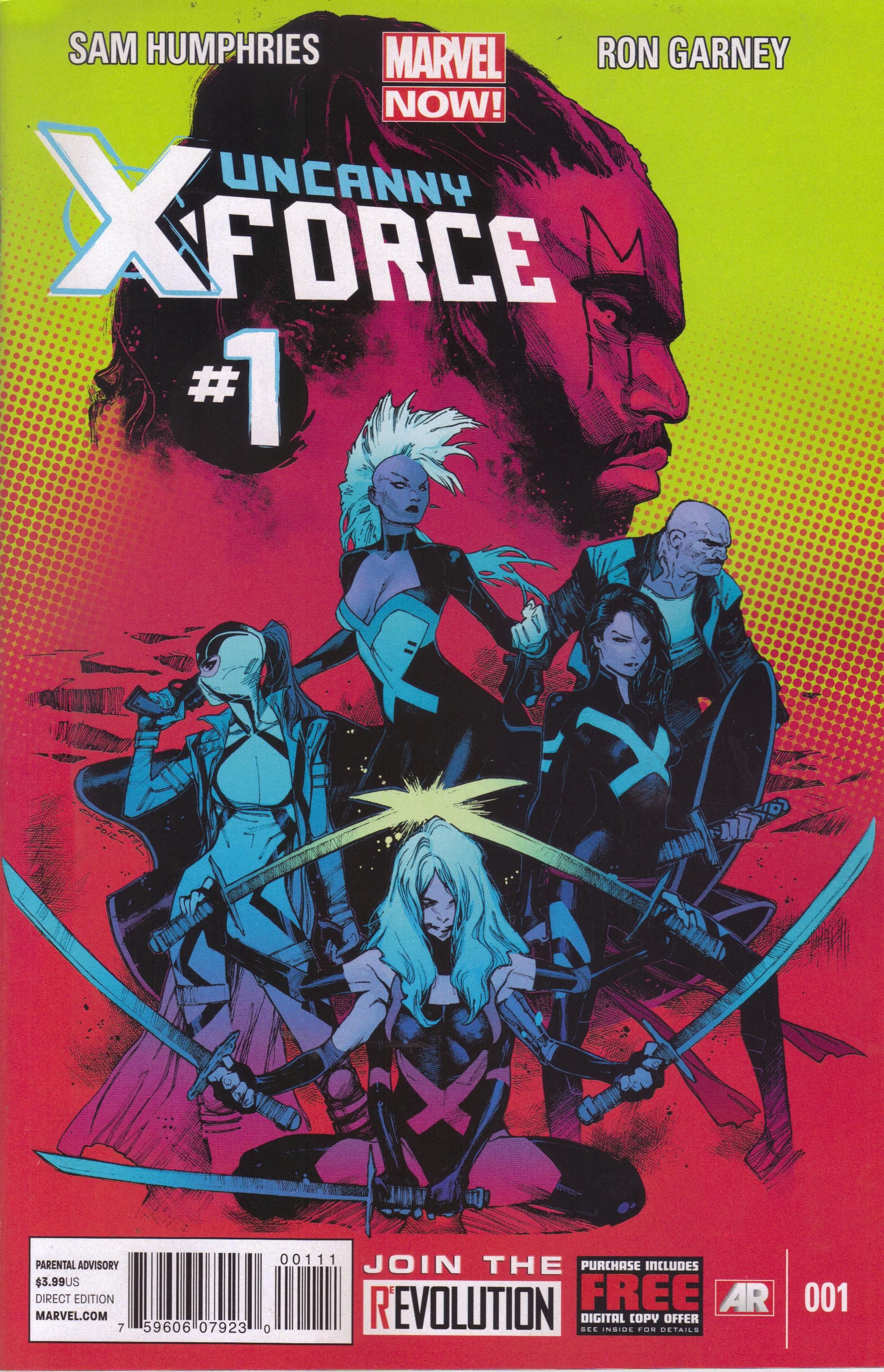
Uncanny X-Force #1 ("Let it Bleed") by Sam Humphries (writer), Ron Garney (penciler), Danny Miki (inker), Marte Garcia (colorist), Israel Gonzalez (colorist), Cory Petit (letterer), Jordan D. White (associate editor), and Nick Lowe (editor). $3.99, 20 pgs, FC, Marvel NOW!
Oh, look - there's a new X-Force comic. I'll get to that soon enough.
First, I want to talk about Storm's haircut. She is, of course, rocking the mohawk again, and many people across yonder Internet have chimed in with "Yay, the mohawk is back! How awesome is that?" Well, it's not awesome, and I'm going to explain why (you just knew I would, didn't you?). Originally, Storm showed up with the mohawk in Uncanny X-Men #173 (1983) after a series of troubling events that cracked her "ice goddess" façade (including stabbing Callisto in the heart) and caused her to question herself far more than she ever had. When she went to Japan for Logan's wedding, she met Yukio, the slightly crazed woman who dug Wolverine, and became friends with her. After a wild night in Tokyo, Storm showed up with the 'hawk (which was intended as a joke, according to Paul Smith, who drew it). It was such an Eighties thing, and it symbolized that Claremont was making Storm grow up a bit - remember, the first time we saw her, she was naked and being worshiped as a goddess, and over the course of his work with her, Claremont turned her from that naïve girl to a tough leader. When she lost her powers a few issues later, it was even more of a change - suddenly she wasn't even a "mutant" anymore, and her struggle toward maturation had alienated Kitty Pryde, her "little sister" on the team. Change was hard and occasionally traumatic, Claremont was saying, but it's something everyone has to go through. Even though Ororo was a bit older (she was 25 in the mid-1970s, and presumably Claremont saw her as about the same age or a year or two older by 1983), she still hadn't "grown up," and the mohawk represented a rebellious phase that a lot of people go through when they grow up. It was cool, sure, but it was also representative of something else, and it worked really well.
So let's flash-forward to 2013. Mainstream superhero comics are STEEPED in nostalgia - even the best ones look to the past more often than is probably healthy. The people who write comics these days grew up in the 1970s, 1980s, and 1990s. I don't know how old Sam Humphries is, but in pictures, he doesn't look much older than 35, if that. So let's presume that if he was reading comics when he was growing up, he was reading them in the middle of the Claremontian Golden Age, which means he probably thought the mohawk was motherfucking bad-ass. I'm assuming a lot, of course, but I don't think I'm too far off. Garney is older - he was born in 1962 - but that means he was already 21 when Storm got the mohawk, and I assume he was already working on art then, and if he was into comics, I think it's safe to say he knew about the haircut. I don't know if it was Humphries or Garney who thought about bringing the mohawk back, but given the state of the comics culture these days, where the Cult of the Writer overwhelms all, I'm going to assume it's Humphries. So, that's a LOT of assumptions, I get it. What does it all mean?
Well, in this issue Storm just shows up with the mohawk. She only interacts with Psylocke, and Betsy doesn't comment on it. There's some omniscient narration that seems to imply that she's devastated by the end of her marriage, but is that really it? Ororo did not have the mohawk in All-New X-Men #1, which occurred after Black Panther dumped her. I didn't read very much about her marriage, but from what I can tell, Marvel pretty much ignored it, didn't they? They tried to shoehorn in this great romance, but did anyone buy it? If the readers didn't, I guess you could still argue that Storm was gutted by it, but that doesn't "feel" right, does it? Anyway, say she's upset by the end of her marriage. Okay. She wants to change her image. Would she really go back to a look she's already done? Wouldn't she think, "Well, I've already done the mohawk - what can I do now?" Doing something shocking the first time is shocking, but doing the same thing again is ... well, conventional. Because nobody comments on the new haircut, we don't know what anyone thinks of it, but she did know Betsy back when she had it the first time, so wouldn't Betsy say something like "So, you're going with the mohawk again? What's the deal with that?"
The issue here is that Storm's mohawk, which meant something once, has become just another "kewl" thing. It's meaningless except to appeal to a nostalgic streak the cool people like to claim they don't have but everyone possesses. I really, really hope that Humphries thought something more than "Shit, Storm looked bad-ass with that mohawk. Let's bring that fucker back!" If he didn't, then this is a disservice to Claremont and the readers, because it does nothing for the character. The fact that corporate IPs don't have singular visions behind them anymore means that the characters can be wildly different from title to title, and while that's not too big a deal, it does mean that when Storm does something like this, it's not because Humphries has been building up to it and it's a crucial move in her development as a character. Humphries hasn't been writing Storm, so he's cobbling together emotional beats from a bunch of other comics and hoping her haircut makes sense. Unfortunately, it only makes sense if you view it as a "kewl" move because Ororo looks awesome with the haircut. It doesn't actually mean anything.
So what, right? Fuck you, old man, right? But here's the thing: Do we read superhero comics just to see gorgeous people beat the shit out of each other? If so, then none of this matters. People are going to read Uncanny X-Force because they think Spiral is fucking cool and Psylocke is fucking cool and Storm's mohawk is fucking cool. Maybe I'm completely off-base. I don't read superhero comics just for that anymore, because I've seen it all before. I love the action, sure, but the best superhero comics I've ever read care as much about the characters as they do the action. Unfortunately, almost every superhero comic today cares more about looking cool than anything else. It's too bad.
But what about this issue? Well, it's fine, I guess. Garney is talented, certainly, and the artists - Garney, Miki, Garcia, and Gonzalez - make this book look nice and slick and professional. There are a couple of pages - Betsy's flashback to the school, Puck's explanation of what's going on in Los Angeles - that are clever, but otherwise, it's just a nice-looking comic. The story is perfectly fine - Betsy and Ororo go to L.A. to check out something weird that Puck alerted Logan about, and they find out it's Spiral doing something nefarious - but while the dialogue is okay, only Puck actually sounds like Puck, and when Betsy sees Spiral, she acts like an idiot. I mean, she's been a freakin' superhero for 30 years, yet she acts like an idiot. I love Psylocke quite a bit, but it's been years since it seems like she's been written well. I could forgive her tough-chick attitude in this issue if she weren't such an idiot. Come on, Betsy! Humphries does update us on Fantomex, but I haven't read the last few trades of Remender's Uncanny X-Force, so I assume what has happened to Fantomex happens in the final story arc, which makes me really apprehensive about the final arc because it seems like what happened to Fantomex is utterly stupid. Man, parse that sentence, mofos! Although we do get a nice, creepy final page, so ... yay?
Anyway, I didn't have ridiculously high hopes for this comic, and it's certainly not terrible. I'm just sad that I can't dive into superhero comics and turn my brain off as I do anymore. I kind of wish I could - this book would certainly be more enjoyable!
Rating: ★ ★ ★ ★ ★ ½ ☆ ☆ ☆ ☆
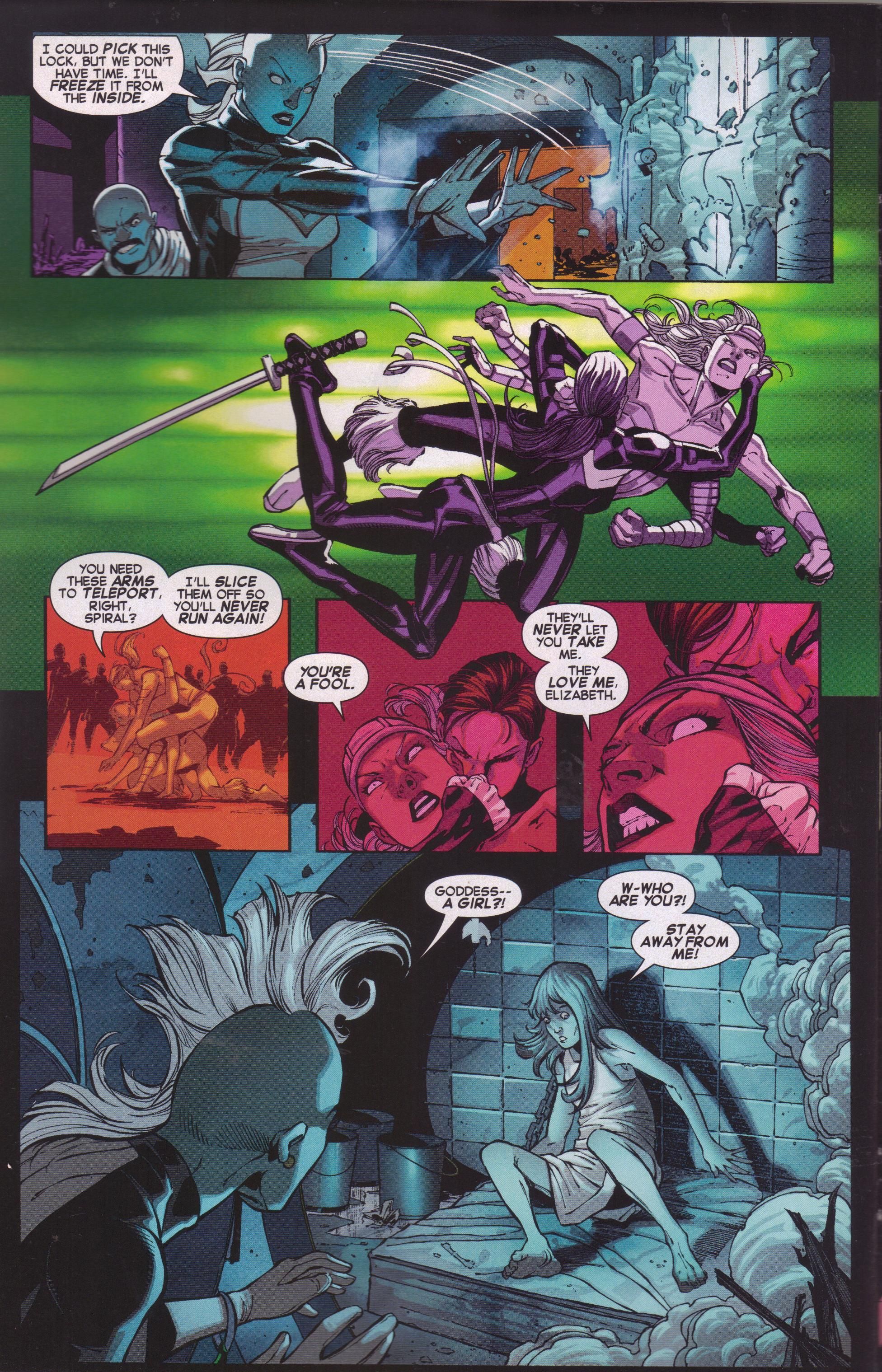
One totally Airwolf page:
Does Storm need to alakazam her hands like that to freeze something? And what the heck it happening in Panel 2? I do like the actual pencil work even if I don't get Panel 2, and the coloring on this page is very nice. Psylocke and Spiral are fighting inside a club, so that explains the harsh red lighting, but it also helps imply the hatred they have for each other.
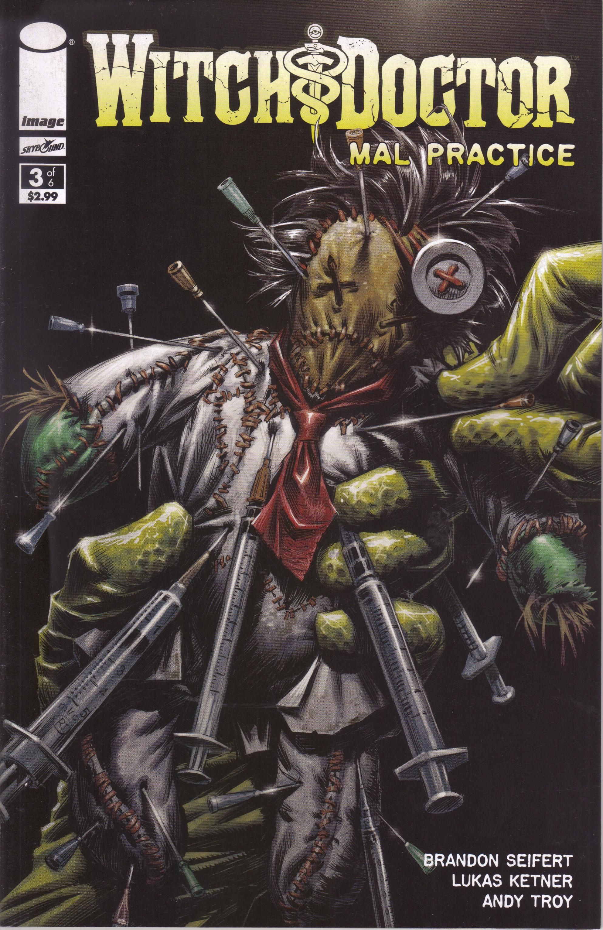
Witch Doctor: Mal Practice #3 (of 6) by Brandon Seifert (writer/letterer), Lukas Ketner (artist), Andy Troy (colorist), and Sean Mackiewicz (editor). $2.99, 22 pgs, FC, Image/Skybound.
Seifert continues to explain what's going on, as Dr. Morrow meets the people who infected him, and it goes a bit sideways. It turns out they were misinformed about certain things, but then, so was he. So things get really bad very quickly, and the issue ends with nothing looking good for our friends in the supernatural medical field. I can't really say too much about what happens - it's the middle of the mini-series, so we've established that Morrow is sick and the bad guys want something from him in exchange for the cure, but there are still mysteries a-comin', including what the heck happens to Morrow in this issue. This continues to be a very cool series, and Ketner is really good in this issue, as he has to draw some weird-ass things and does so quite nicely. You know you want to check this out!
Rating: ★ ★ ★ ★ ★ ★ ★ ½ ☆ ☆
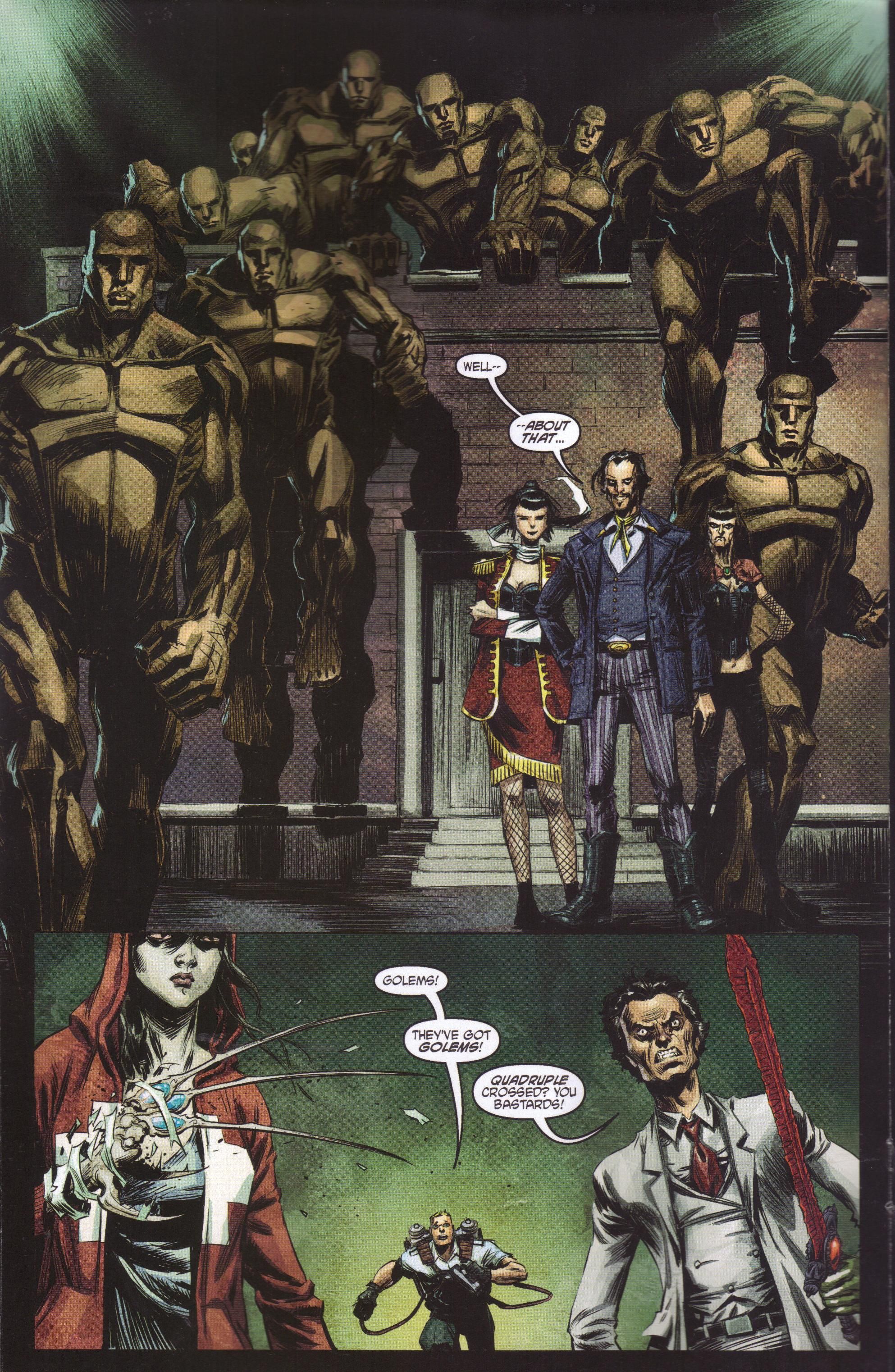
One totally Airwolf page:
One thing that Ketner does well is design cool clothes for the characters. Everyone on this page is wearing something different and interesting, and it fits what we know about them. The main bad dude - Peter Tiberius Nostrum - is a dandy, the evil chick on the left wears an odd military-like uniform. Her "twin" on the right is aged and worn, but she wears "sexier" clothes to cling to her past beauty. Morrow is dressed well, as usual, and Penny wears a hoodie because she's sullen. It's nicely done by Ketner. Meanwhile, Morrow's rage at being "quadruple crossed" is captured well, too.
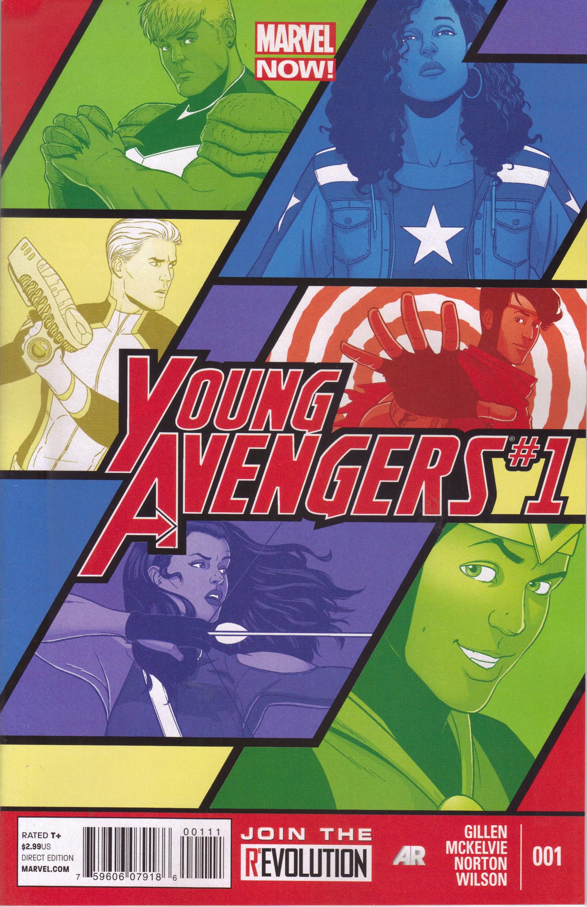
Young Avengers #1 ("Style > Substance") by Kieron Gillen (writer), Jamie McKelvie (artist), Mike Norton (artist), Matthew Wilson (colorist), Clayton Cowles (letterer), Jake Thomas (editor), and Lauren Sankovitch (editor). $2.99, 20 pgs, FC, Marvel NOW!
Speaking of books for which I had high hopes, Gillen and McKelvie together again on a Marvel book that can't have too much pressure on it as it stars several non-A-list characters is at the top of my list. I mean, McKelvie won't be able to keep up a monthly schedule, but maybe Marvel will simply allow them to do their thing and not worry about the schedule too much. That's not too much to ask, is it?
But before we get to the book, another rant! This book, you'll notice, is $2.99. Uncanny X-Force is $3.99. How does Marvel determine their prices, is what I'd like to know. Bear with me, okay? The main Avengers books are 4 bucks. The main X-books are 4 bucks. I get that. I don't like it, but I get it - people will lap up the Avengers and X-Men even if Bendis wrote 20 pages about the bowel movement he had this morning. Iron Man is 4 bucks. Okay - maybe people think that Robert Downey Jr. will show up at their house if they buy it? So is Uncanny X-Force a "main" X-title these days? I just ask because Marvel obviously doesn't do this for creators, because Gillen has been writing for them for a longer time, and presumably his name on a book moves a bit more than Humphries' does. So is this book 3 bucks because it's not a "main" Avengers title but Uncanny X-Force is a "main" X-title? That doesn't seem to make sense. Does anyone consider Marvel's pricing policies, or do they have a big dart board in Axel Alonso's office with all their books, and the darts are labelled "$2.99" and "$3.99" and they just start chucking blindfolded? I'm just wondering.
Anyway, Young Avengers. Oh, for 17 pages it's so, so good, and then ... oh dear. It certainly doesn't get bad, not at all, but it becomes a bit less ... excellent, I guess. I mean, we begin with Kate Bishop waking up after banging Noh-Varr (go, Kate!) and watching him dance to the Ronettes, and then there's a Skrull attack that McKelvie draws over two pages with a bunch of small panels that capture every crucial moment. It's really cool. Then Wiccan and Hulkling have a heart-to-heart (Teddy has been running around playing superhero, and Billy is upset about it because they agreed they wouldn't), and it's excellent. Then Loki sort-of fights Miss America, and Billy does something stupid, and McKelvie again uses two pages with a lot of panels to zip around. But then we find out what Billy was doing, and ... oh dear.
I won't give it away, but the book becomes a dumb superhero comic for a few pages, and my heart broke a little. This gets back to the stewardship of characters - Gillen writes on the "letters page" that YA is about being 18 (whereas Heinberg and Cheung's iteration was about being 16), but Billy doesn't seem like the same character. He seems, for lack of a better word, dumber. I get that we do stupid crap when we're teenagers, and Billy was desperate to do something nice for Teddy, but it gets back to the fact that Gillen can't write these characters as "normal" teenagers, because they're not. When the Young Avengers first showed up, they were fanboys (and fangirls, but the original ones were all male). They knew quite a bit about superheroes, and so Billy should have known that what he does in this issue might be a really bad idea. Again, I get that he's upset and he wants to help Teddy, but that's why the fact that this is the first issue works against Gillen - if we've read the old series, it seems strange that Billy would act this way, and if we haven't, we might wonder why he would be so dramatic in such a short time. Gillen hasn't made these characters his own, in other words - obviously, Loki is probably the best-written one in terms of personality, because Gillen has been writing him for a while. For the others, he skims the surface, using the events that bring the team together to highlight their personalities, and it works pretty well. I just don't buy Billy's actions, though. Now, that's not to say the ending isn't effective - it's pretty danged creepy - but I don't quite buy how we got there.
Still, it's a gorgeous book that feels far more hopeful than most comics - Gillen and McKelvie make comics that feel joyful, which we really do need more of in mainstream superhero books, and this is a comic I knew I'd be buying in single issues from the moment it was announced, so I'm pretty sure I won't have many problems with it very often. These creators - I didn't get a chance to write about Wilson, but he's excellent as usual - know what they're doing, so a little stumble in the first issue isn't a deal-breaker for me. It might not even be one for you. I'm just silly, probably.
Rating: ★ ★ ★ ★ ★ ★ ★ ★ ☆ ☆
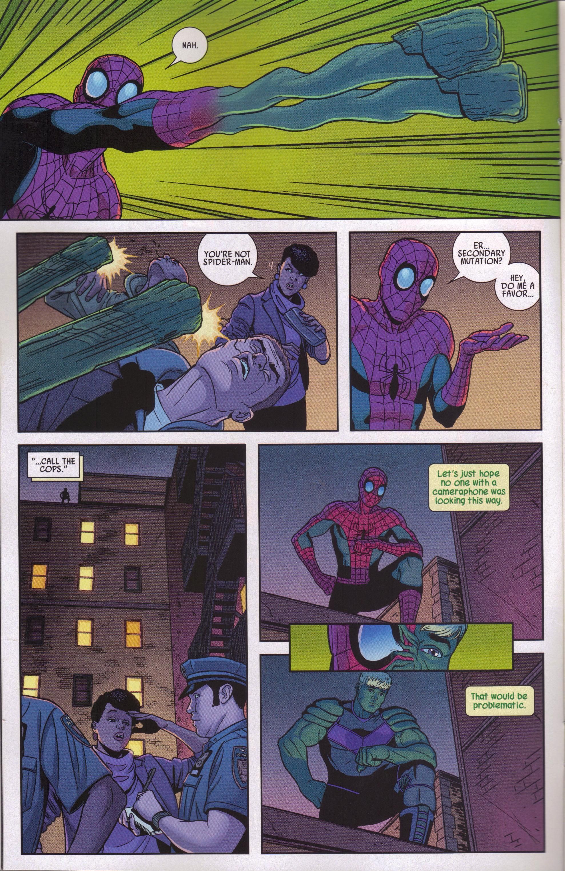
One totally Airwolf page:
Look at Panels 2 and 3 and marvel at McKelvie's workmanship. The woman in Panel 2 is a jaded New Yorker - even as she is saved from being mugged, she cocks an eyebrow at Teddy because she knows that Spider-Man can't do that with his arms. And even though Teddy is "masked," his shrug in Panel 3 is tremendous. This is part of why McKelvie is so good - he can express so much in a few lines, and it's really cool. Even the fact that he draws "Spider-Man's" outfit just a bit differently because Teddy isn't sure exactly what it should look like is very keen.
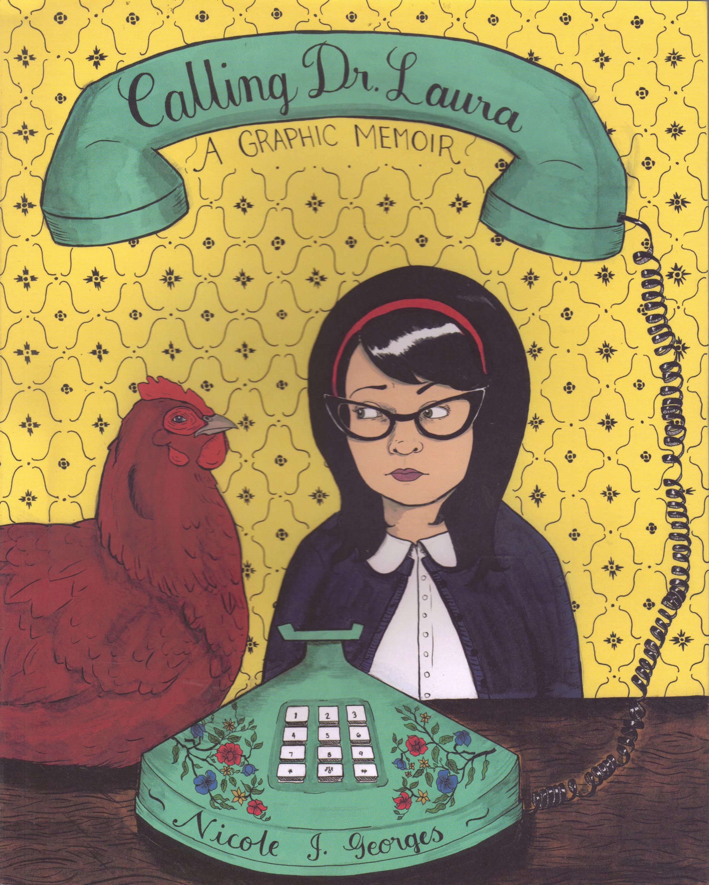
Calling Dr. Laura: A Graphic Memoir by Nicole J. Georges (writer/artist). $16.95, 260 pgs, BW, Mariner Books.
The author found out that her father, whom she thought was dead, is alive, and it freaks her out a bit. So she calls Dr. Laura Schlessinger, and hilarity ensues? I don't know, but the premise of the book sounded intriguing, so I picked this up. Come on, she's suspicious of a chicken on the cover. Chickens - MAN'S GREATEST ENEMY!!!!
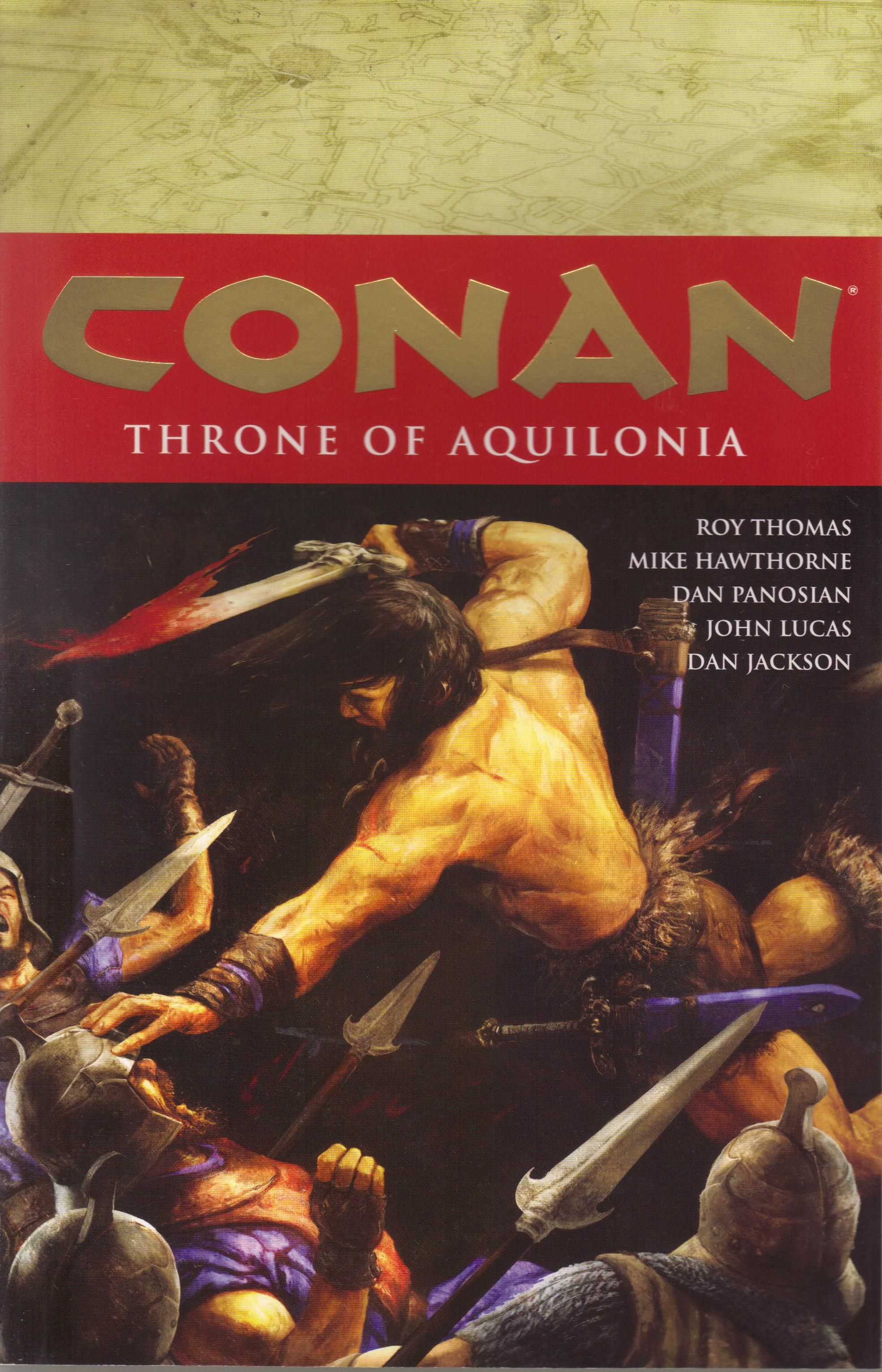
Conan: Throne of Aquilonia by Roy Thomas (writer), Mike Hawthorne (penciler), Dan Panosian (artist), John Lucas (inker), Dan Jackson (colorist), Richard Starkings (letterer), Jimmy Betancourt (letterer), Brendan Wright (assistant editor), and Dave Marshall (editor). $19.99, 132 pgs, FC, Dark Horse.
This is the last Conan volume before the Brian Wood reboot, right? I'm just checking.
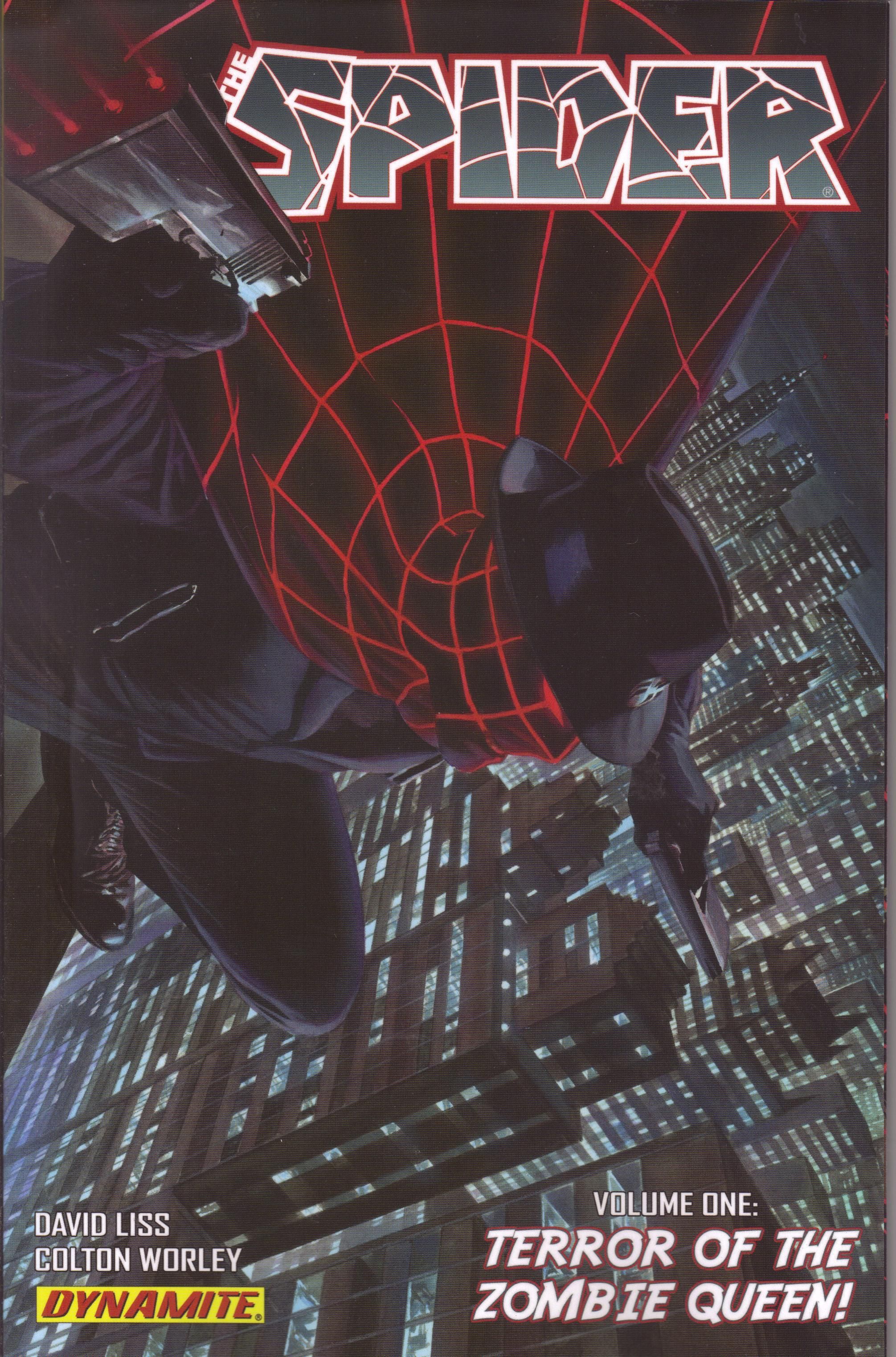
The Spider volume 1: Terror of the Zombie Queen! by David Liss (writer), Colton Worley (artist), and Simon Bowland (letterer). $19.99, 132 pgs, FC, Dynamite Entertainment.
Travis Pelkie AND Greg Hatcher dig this comic, for what that's worth. I thought the art was a little less computer-generated, but it still looks pretty keen.
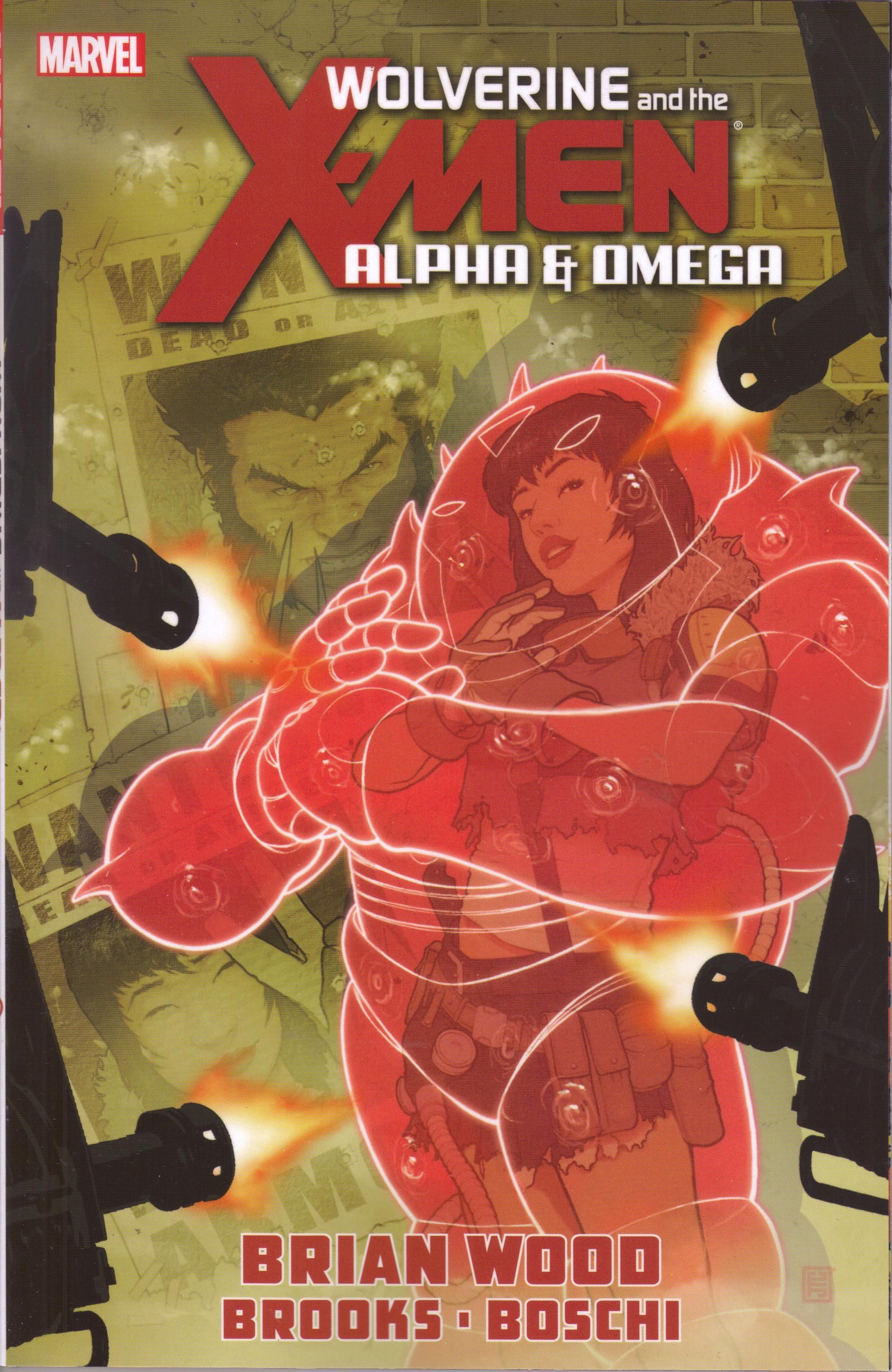
Wolverine and the X-Men: Alpha and Omega by Brian Wood (writer), Roland Boschi (artist), Dan Brown (artist), Mark Brooks (artist), Andrew Currie (artist), Jay Leisten (artist), Norman Lee (artist), Ronda Pattison (artist), Walden Wong (artist), Andres Mossa (artist), Cam Smith (artist), Joe Sabino (letterer), Sebastian Griner (assistant editor), Jeanine Schaefer (editor), and Nick Lowe (editor). $19.99, 100 pgs, FC, Marvel.
You'll notice that this is the only Brian Wood comic I bought this week. For some reason, my store didn't have The Massive #8, so I assume I'll get it next week. You'll also notice that both the Conan book and The Spider book are 132 pages for 20 bucks, while this is 100 pages for 20 bucks. Curious, that. And also - this came out after Aaron launched Wolverine and the X-Men, didn't it? I'm just wondering why it's a separate mini-series when it seems like it would have fit in nicely to that series. Oh, wait - Marvel couldn't have charged even more money if they made it part of the regular series. I get it!
**********
It's been a few weeks, and the beard is progressing. It's still fairly itchy, but I notice it at night. I still haven't decided if I'm going to groom it or let it go nuts, but it's not long enough yet that I have to worry about that. I've still been taking photographs, of course, and making .gifs out of them! The first one is the original - it covers 1-10 January. The second covers 11-20 January, and the first in the sequence is the photo where I'm wearing an orange shirt and it doesn't look too washed out. There's another one where I'm wearing an orange suit but the lighting is much brighter. The third covers 21-24 January. In order: I'm wearing a dark gray T-shirt, then a black polo shirt, a muted green shirt, and a somewhat light blue shirt. Just in case you care. Obviously, once I have a good amount of facial hair things aren't going to change from day-to-day too often, but there you have. The next update might be in two weeks, or I might wait three weeks or a month. Who knows? Also, I apologize that some of them are blurry. My 7-year-old has been taking most of the pictures, and she's not quite as skilled at taking pictures as you would expect a 7-year-old to be. I mean, really!
Here we go with the Ten Most Recent Songs on My iPod (Which Is Always on Shuffle):
1. "I Hear a Symphony" - Supremes (1965) "You bring much joy within, don't let this feeling end, let it go on and on and on, now, baby, baby, baby"
2. "I'd Die Without You" - P.M. Dawn (1992) "Is it my turn to hold you by your hands, tell you I love you and you not hear me"
3. "The Luckiest Guy on the Lower East Side" - Magnetic Fields (1999) "I know Professor Blumen makes you feel like a woman, but when the wind is in your hair you laugh like a little girl"
4. "Lake Charles" - Lucinda Williams (1998) "Did you run about as far as you could go down the Louisiana highway across Lake Ponchartrain"
5. "The Devil Is Singing our Song" - James Gang (1973) "Every time I see you it costs me another heartache, but it 's just too late for us, I have to move along"
6. "Kiss with a Fist" - Florence + the Machine (2009) "Broke your jaw once before, spilt your blood upon the floor; you broke my leg in return so let's sit back and watch the bed burn"
7. "On the Turning Away" - Pink Floyd (1987) "We could find that we're all alone in the dream of the proud"
8. "Angeleyes" - ABBA (1979) "Sometimes when I'm lonely I sit and think about him and it hurts to remember all the good times"
9. "I Left My Wallet in El Segundo" - A Tribe Called Quest (1990) "It was a nice little pub in the middle of nowhere - anywhere would have been better"
10. "Jane Says" - Jane's Addiction (1988) "She gets mad, starts to cry; she takes a swing but she can't hit"
More fun music than you can handle!
I hope everyone has a nice day, and remember - I'm on Twitter these days. Yes, I'm shamelessly asking you to follow me. But I'll follow you in exchange! I'm swell like that! In the meantime, be excellent to each other!


