But the Gospels actually taught this:
"Before you kill someone, make absolutely sure he isn't well connected." (Kurt Vonnegut, from Slaughterhouse-5)
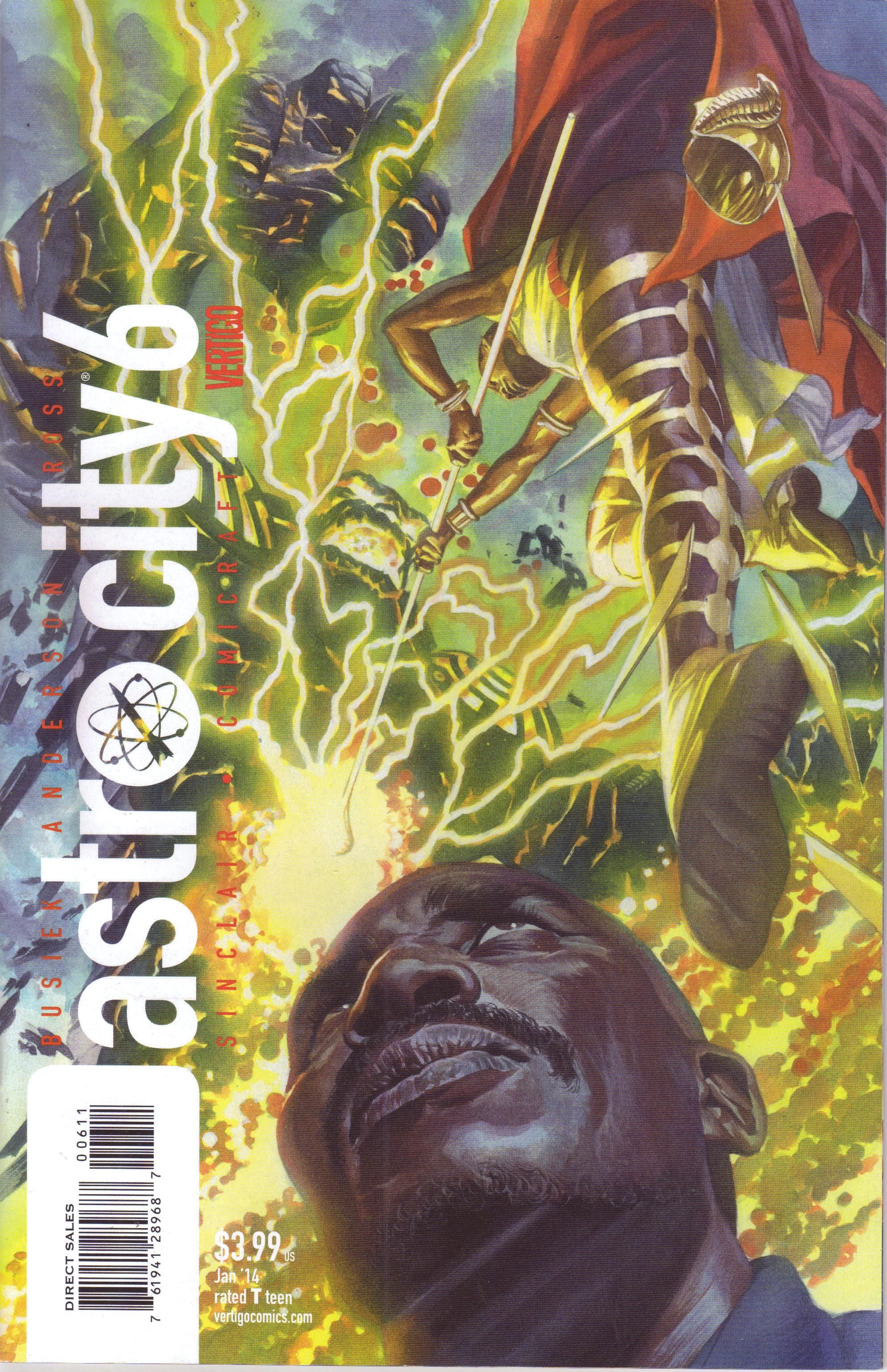
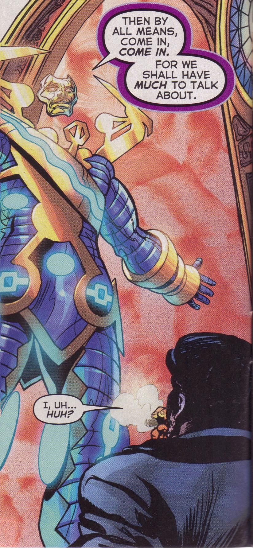
Astro City #6 ("Through Open Doors Part Two") by Brent Anderson (artist), Jimmy Betancourt (letterer), Kurt Busiek (writer), John Roshell (letterer), Alex Sinclair (colorist), Jessica Chen (assistant editor), Kristy Quinn (editor), and Shelly Bond (executive editor). $3.99, 24 pgs, FC, DC/Vertigo.
I've been reading Astro City almost since it began (I missed the original mini-series when it came out and had to get the trade), and it's odd how little one can write about it. This is not a bad thing, at least I don't think it is. It's the same creative team (Sinclair, I believe, has even been the colorist forever) doing their thing, and both Busiek and Anderson know exactly how to make a good comic. Even during "The Dark Age," when I know a lot of people dropped the book, I found each issue very interesting, sometimes not even for how the plot played out but just how Busiek fit things into his bigger tapestry. This is a book that hasn't really changed all that much in almost 20 years, but that's because it was so good to begin with. There are still "regular" humans interacting with the strange and bizarre creatures around Astro City, there are still moral choices that people have to make, there are still unusual circumstances that shed new light on the choices and the people themselves. Anderson's line has gotten a bit thicker in some places, but I think digital inking (if that's what it is) has helped make his line thinner in other places, providing a nice contrast. Some advances in technology have allowed some upgrades, artistically - when the Ore-Master blasts off after his creation, Sinclair uses digital paints to create a wonderful flaming backwash as he flies away - but this is still a fairly old-school kind of comic. Some issues are slightly better than others, some are slightly worse, but there's very little fluctuation in quality. It's impressive when you really stop to think about it. I know some people aren't reading Astro City any more, and that's too bad. It's as good as it's ever been, however you want to interpret that.
Rating: ★ ★ ★ ★ ★ ★ ★ ½ ☆ ☆
One totally Airwolf panel:
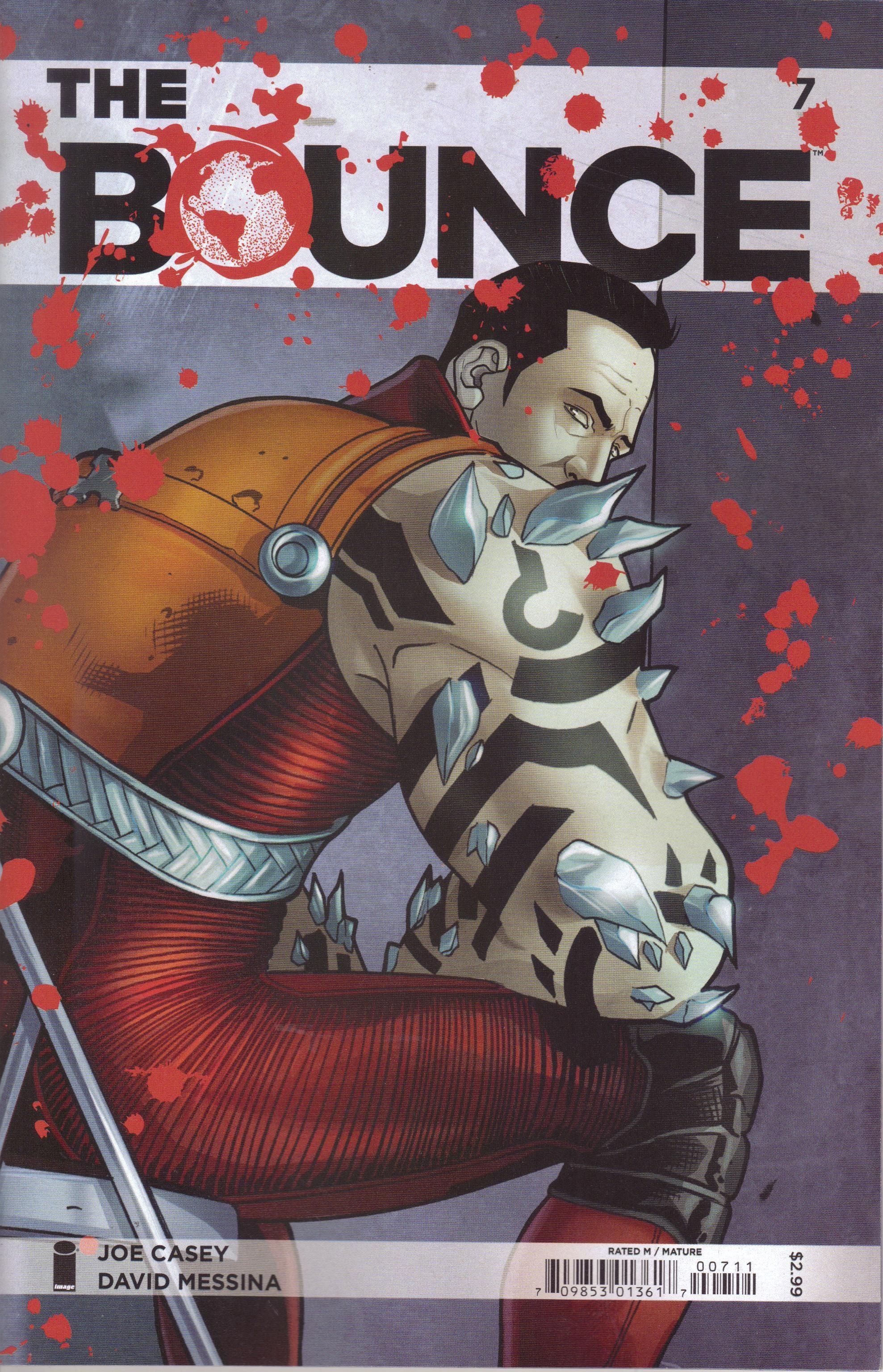
The Bounce #7 by Joe Casey (writer), Gaetano Carlucci (inker), Sonia Harris (graphic designer/story consultant), Fabiola Ienne (color assistant), David Messina (penciler), Giovanni Niro (colorist), and Rus Wooton (letterer). $2.99, 20 pgs, FC, Image.
This is kind of a bridge issue of The Bounce, as Casey follows up on a cliffhanger from last issue, in which the Vamp had our hero at her mercy. She almost kills him, but of course doesn't (he's the hero, after all), and then we check in with her origin and some of the aftermath of her attack before we come around to another cliffhanger. As this is the seventh issue and so far, it's been a pretty intriguing comic (not the greatest comic, but still intriguing), I can deal with a somewhat meandering issue. Casey's mind works in weird ways, so the Vamp's origin was twisted in just the right way, while the glimpse we get of the Darling's past and how he became involved in the project was also appreciated. I also like that Casey is slowly making Jasper more interesting and likable. I don't have too much of a problem with heroes being kind of jerks, but usually that means they're not terribly nuanced, and that's the way Jasper was for the first few issues. He's still brash, but he's beginning to learn a bit more about what's going on in his life, so he can't be as snotty as he was. It's always nice to see characters change gradually, not because the writer just wants them to change, but because things are happening to them that force them to change.
Messina's art still isn't my favorite, but it's decent enough. I do think that Niro (and possibly Ienne) does a wonderful job with Jasper after his encounter with the Vamp. He makes Jasper an ashen gray that slowly fades as Jasper regains his strength, and it's wonderfully done. It's the kind of thing that you can do well with digital coloring, because you can blend the gray with the more tan of his skin and give us someone who's slowly recovering. With more basic, old-school coloring, the delineation between the gray and Jasper's regular skin color would have been too abrupt. This isn't a problem for Niro, and it works well.
The Bounce is getting better, which is always nice. It's not quite as good as Casey's best work, but what he does well is create these weird worlds that I want to know more about. Right now, I'm still curious about Jasper's world, so I'm still reading. That's not a bad thing.
Rating: ★ ★ ★ ★ ★ ★ ½ ☆ ☆ ☆
One totally Airwolf panel:
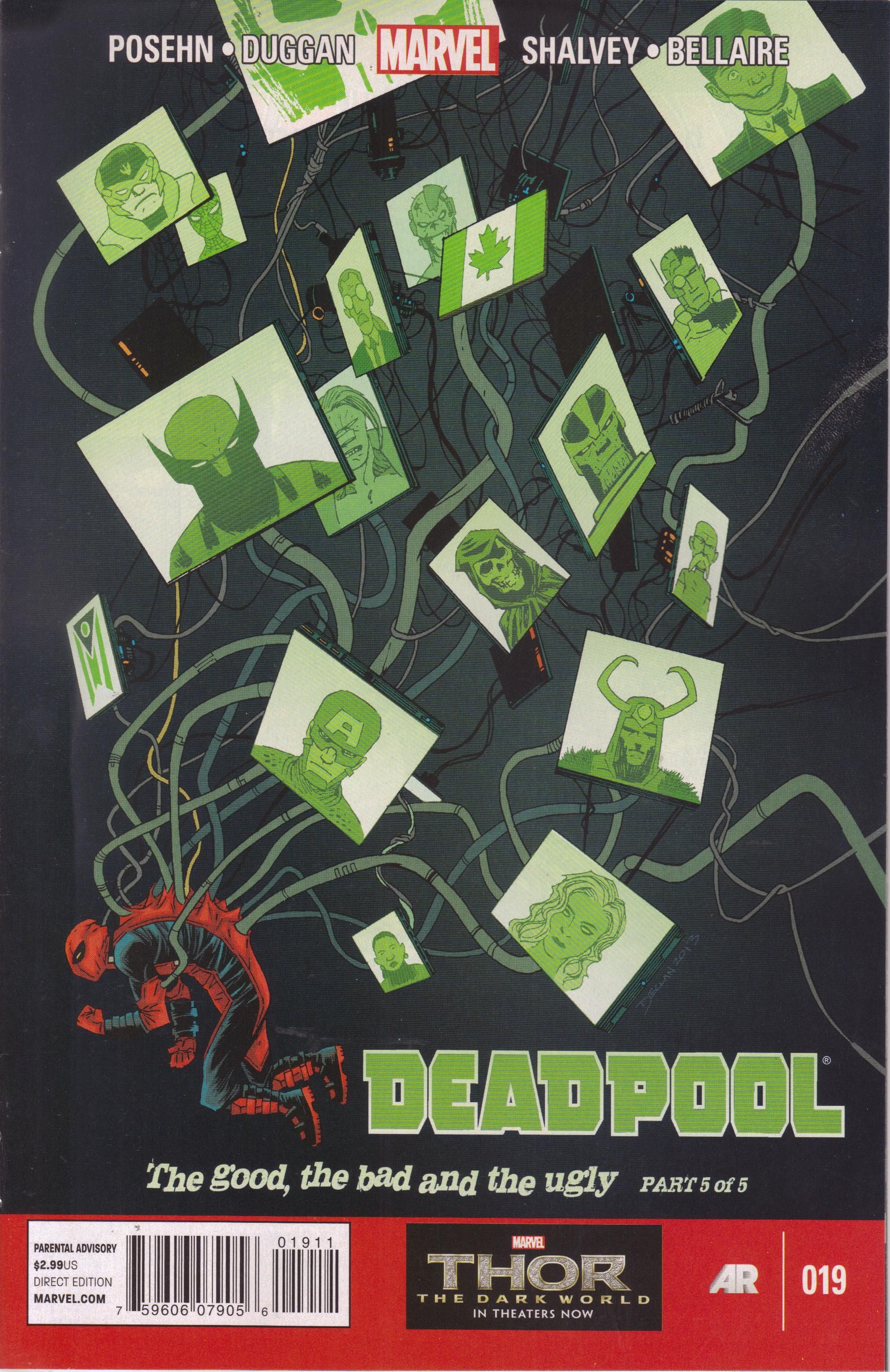
Deadpool #19 ("The Good, the Bad & the Ugly* Part Five") by Jordie Bellaire (colorist), Gerry Duggan (writer), Brian Posehn (writer), Joe Sabino (letterer), Declan Shalvey (artist), and Jordan D. White (editor). $2.99, 20 pgs, FC, Marvel. Deadpool created by Fabian Nicieza and Rob Liefeld. Wolverine created by Roy Thomas, Len Wein, and John Romita Sr. and yes I know Claremont, Cockrum, and Byrne made him the dude he is today but let's just let that go, okay? Captain America created by Joe Simon and Jack Kirby. Can we agree on that? * No Oxford comma in the title? For shame!
I haven't been as impressed with "The Good, the Bad & the Ugly" as I was with the first few arcs of Deadpool, and it's mainly because I can read a horribly depressing superhero arc anywhere, and there's a reason I don't do that very much anymore. Now, it's not a bad arc by any means, but the tone of the book changed so fast I almost got whiplash. I'm not sure if it's the best thing to do - Deadpool has always been a bit of a joke character, and by taking that to a logical extreme, Posehn and Duggan risk turning him into the crappy version we saw in Remender's Uncanny X-Force. I don't mean they can't tackle "serious" topics - as serious as superhero comics can be, that is - but if you make it as bleak as this arc was, how to do you bring it back around to Deadpool as a less-than-serious hero? We shall see, I suppose, because I do still like the comic and think the writers have done a very good job making Wade less of a ridiculous character and at least a bit more human, but I'm a bit worried.
The use of humor - mostly the gallows variety - in this issue and the arc in general was handled pretty well, as Posehn and Duggan have, over the course of this series so far, done enough to make everyone a bit more human, even the goofiest characters. In this issue, it's the North Korean soldiers (see below), who are smart enough to realize when they're hopelessly outmatched against Deadpool, Wolverine, and Captain America. Too often in fiction, creators decide on a tone - bleak, say - and nothing can interfere with that tone, even if it's a situation where humor would be used. Duggan and Posehn are too smart for that, and it's nice to see. This is why I'm still getting the book and don't absolutely hate this arc. It's a fascinating story and it changes Deadpool (for how long after this series ends, we'll see), but again, I wonder if it's a good way to go. I mean, he's a disfigured mercenary with a healing factor who often breaks the fourth wall and now has the consciousness of a S.H.I.E.L.D. agent trapped in his head with him. "Realism" in that context is harder to pull off than it might seem.
Still, Shalvey's art is nice, and the arc worked in a vacuum, so there's that. I'm curious to see where they go from here.
Rating: ★ ★ ★ ★ ★ ★ ★ ☆ ☆ ☆
One totally Airwolf panel:
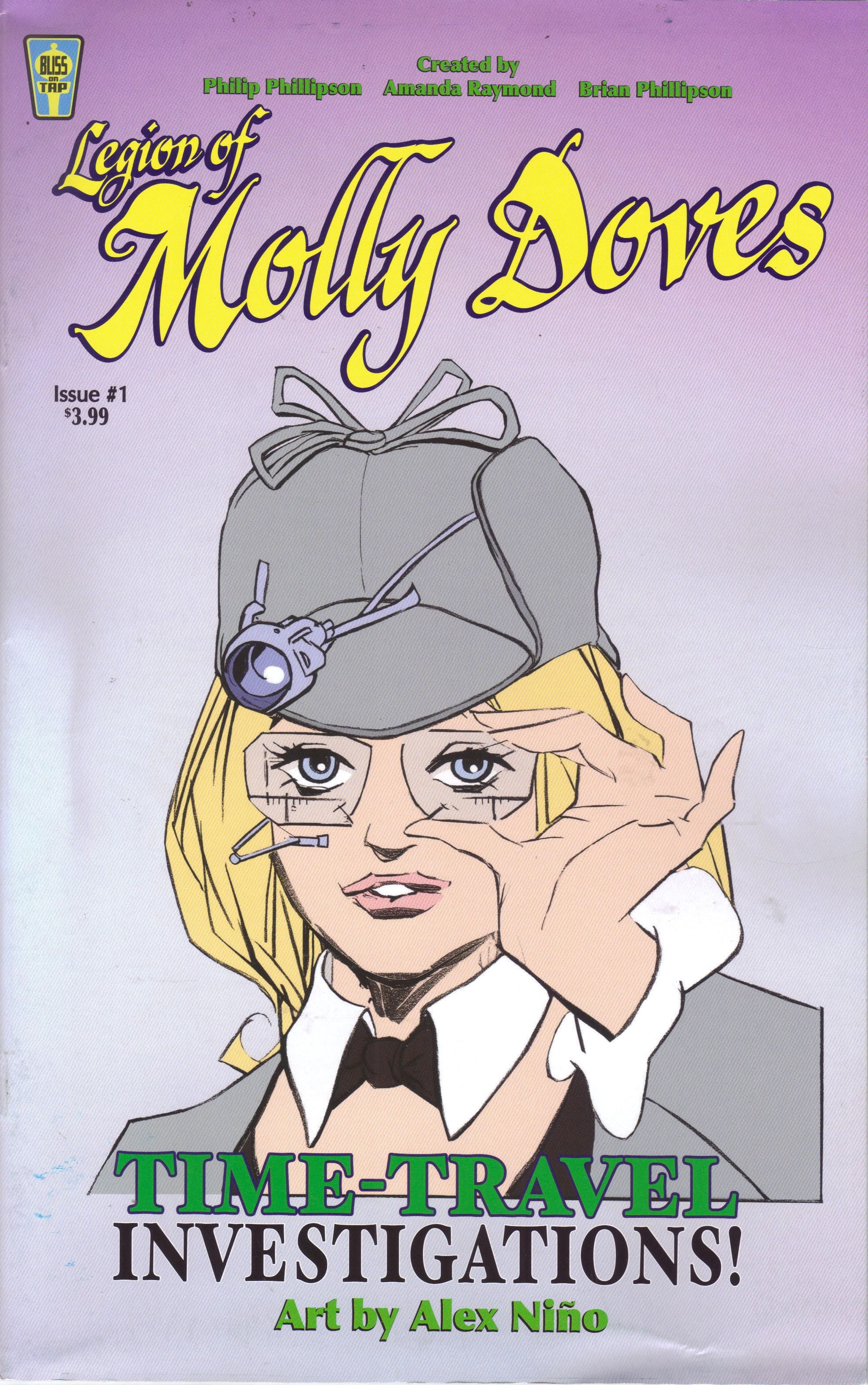
Legion of Molly Doves #1 by Kurt Hathaway (letterer), Alex Niño (penciler/inker), Brian Phillipson (writer), Philip Phillipson (storier/breakdowner/art director/colorist), and Amanda Raymond (writer/designer). $3.99, 27 pgs, FC, Bliss on Tap Publishing.
I thought about pre-ordering this when it was offered in Previews, but I decided not to. Then my retailer ordered one copy, probably thinking that I'd be the kind of person to read this. So I looked at it at the store, and I got a bigger discount than usual (I don't know if you can tell, but it's a bit damaged), and I thought that would be a good deal. So I ended up getting it anyway!
It's a time-travel story, which is why I was a bit gun-shy. In the 23rd century, Julius Faraday and James Dove created a time machine. Dove's wife/Faraday's daughter, Maggie, became the first human to use it even though James thought it was too dangerous. With her father's blessing, Maggie went through the machine and went mad. A second attempt caused a horrible accident that killed hundreds of people. Now, James and Maggie's daughter, Molly, is the top student at the Time Travel Academy, which James founded before Maggie's voyage so that students could learn how to handle time travel. That's where we begin.
We learn all that from a text piece on the inside front cover, and then writers Phillipson and Raymond (who's getting into the spirit of things at conventions) spend a bunch of the issue introducing Molly until at last, something happens. There's 8 pages of Molly talking to students at the Academy, 7 pages of Molly finding out that someone else has used the time machine and bad things have happened, and finally, Molly going into the time machine, losing something valuable, and coming back to find out something very bad has happened in her present. There's a lot of information in this issue, but it's not structured very well. By the time something exciting happens, the book is really dragging. There's always a fine line to walk for creators when you set something in a different time or place - how much information do you dump on the reader so that you can get to the story, or do you forego it and fill it in later? Phillipson and Raymond seem to dump just a bit too much. In the text piece, we find out about Molly's mother. Then, in the actual comic, Molly talks about her mother and experiences a little of what her mother did. That might have been fine - it tells us that Molly's mother is not around and that something affected her mind, but without the text piece, there's still some mystery about it. Meanwhile, the rivalry between Julius Faraday and James Dove seems far too intense in this comic, even with the text piece telling us why it's intense. They show up and start yelling at each other, and it feels forced because the writers want to reach a certain place in the narrative. The pacing of the story is all out of joint, making for a disjointed reading experience. The idea of the book is fine, and the implication that Molly will experience many different versions of herself is interesting, but it feels like this is a comic that needs to start in media res and disorient us a bit before going back and filling in the spaces. The straight-forward way the writers tell us this tale doesn't really work.
I suppose a big draw for this comic is Niño's artwork. As I'm still far behind on reading comics from the 1970s (I've gotten better, I swear!), I'm not as familiar with Niño's work as some people, but I know he hasn't been doing much in the past 15 years or so. The art on this comic is pretty good, although some of it is sloppy, and I don't think it's deliberate. He's not as good with the humans as he is with the surroundings - Molly looks okay, but her grandfather's face is remarkably grotesque, and the little girl, Emma, is basically a cartoon. Niño's machinery is well done, and when Molly goes into the past, he gives us some bizarre lowlifes, and the scene where Molly falls through the time stream is very cool. I assume Niño and not Phillipson did the shading, which is a solid charcoal style that adds good texture to everything. I know he preceded John Watkiss, but the art reminds me a lot of Watkiss, which isn't a bad thing, but I do wish some of it wasn't as sloppy.
It would be nice if this were a better comic, because there are some intriguing things in it. I'm not sure if the writers just weren't confident enough to throw us into the deep end or if they thought we really needed the primer on Molly's world, but it does drag the book down a little. The comic is more interesting right now for its potential, unfortunately, but maybe that will change.
Rating: ★ ★ ★ ★ ★ ½ ☆ ☆ ☆ ☆
One totally Airwolf panel:
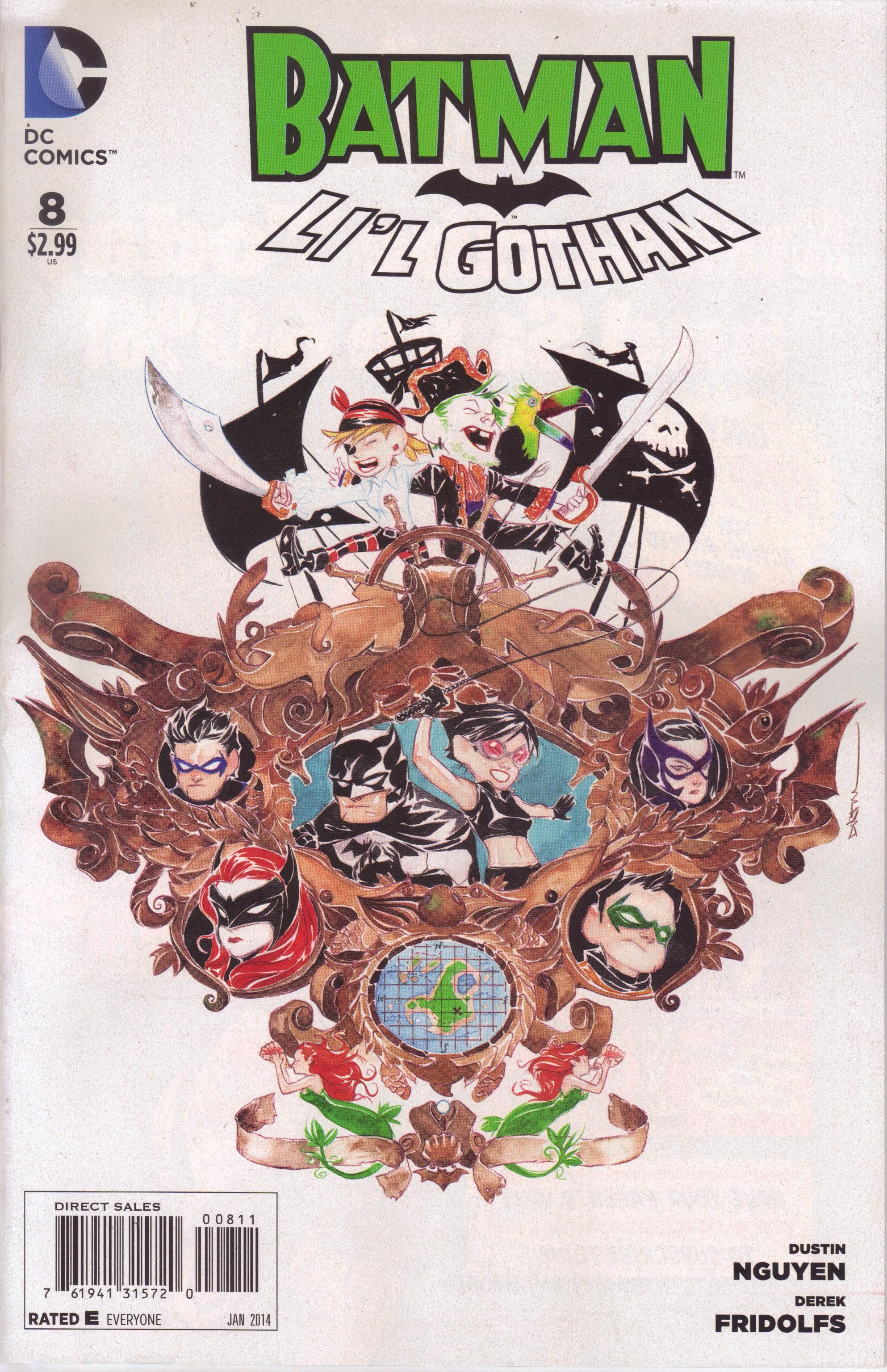
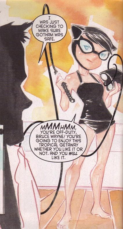
Li'l Gotham #8 ("Tropical Get Away!"/"Bird Watching!") by Derek Fridolfs (writer), Dustin Nguyen (writer/artist), Saida Temofonte (letterer), Jessica Chen (assistant editor), and Kristy Quinn (editor). Batman, Selina Kyle, and the Penguin created by Bill Finger and Bob Kane. Alfred Pennyworth, the Joker, and Dick Grayson created by Bill Finger, Jerry Robinson, and Bob Kane. Damian Wayne created by Mike W. Barr, Grant Morrison, and Andy Kubert. Harley Quinn created by Paul Dini and Bruce Timm. Hawk and Dove created by Steve Ditko and Steve Skeates. Barbara Gordon created by Gardner Fox and Carmine Infantino. Helena Bertinelli created by Joey Cavalieri and Joe Staton. This Lady Blackhawk probably created by Jack Schiff and Dick Dillin. Black Canary created by Robert Kanigher and Carmine Infantino. Katana created by Mike W. Barr and Jim Aparo. Deathstroke created by Marv Wolfman and George Pérez. Peyton Riley created by Paul Dini and Don Kramer. Magpie created by John Byrne. Great White Shark created by Dan Slott and Ryan Sook.
Whenever an issue of Li'l Gotham comes out, I tell myself I'm not going to buy it. And then I end up buying it anyway. Dang it!!! Why, you say, would I not buy it? Isn't it just super-charming? Doesn't Nguyen do an excellent job with the artwork? Well, yes, of course he does, and yes, it is super-charming. But one story is just like all the rest, and therefore, you don't really need to buy all that many issues. I would definitely encourage you to buy at least one issue of Li'l Gotham, but you can pretty much pick one at random, because they're all pretty much the same. Take this issue, for instance. Bruce and Selina go on vacation, but a pirate who looks like the Joker grabs them when they try to find his treasure and plans to make them walk the plank. He's also grabbed the actual Joker and Harley Quinn, who are also on vacation. While Bruce and Selina are away, the Gotham heroes - Damian, Dick, the Birds of Prey, with Hawk and Dove thrown in - break up a supervillain scheme. Every Li'l Gotham story has a lot of clever little jokes (like Bruce's regret as he walks the plank) and Nguyen's sketchy, painted artwork is stunning, but again, it's the same thing every issue. Still, this one features Selina in skimpy clothing, so there's that.
Rating: ★ ★ ★ ★ ★ ★ ★ ☆ ☆ ☆
One totally Airwolf panel:
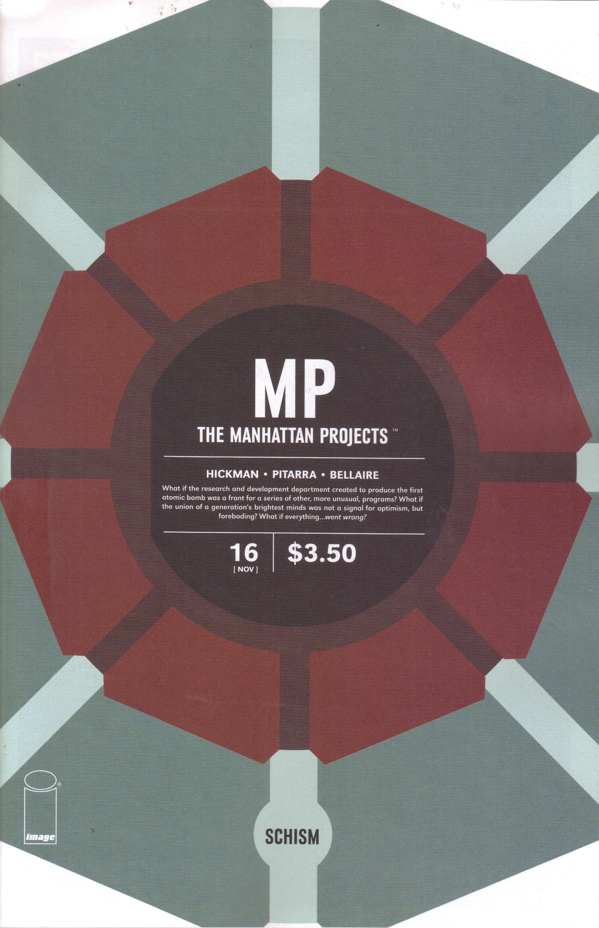
The Manhattan Projects #16 ("Schism") by Jordie Bellaire (colorist), Jonathan Hickman (writer), Nick Pitarra (artist), and Rus Wooton (letterer). $3.50, 20 pgs, FC, Image.
With all the new stuff coming out from Image these days (they have like 75 new titles a month, I think), it's easy to forget some of the longer-running series like Morning Glories (first issue: 11 August 2010) from last week and even a relative newcomer like The Manhattan Projects (first issue: 7 March 2012). People like shiny things, so new comics often get a ton of press while older warhorses get ignored. That's why I'm here to beat the drums, people! I like a brandy-new #1 as much as the next person, but we shouldn't forget that The Manhattan Projects continues to be one weird, glorious trip through alternate American history. As we have seen, Oppenheimer has made his move and imprisoned all the other scientists. So in this issue he tortures them. Oh dear. Luckily, Einstein knows something he doesn't, and Hickman does a very nice job slowly revealing what is coming, building tension well throughout the entire issue.
Another thing that is present in MP that's missing from most of Hickman's other stuff (even the excellent East of West) is a sense of humor, as he likes to drop goofy things into this narrative, perhaps acknowledging the inherent silliness of the whole exercise. Harry Truman and his odd headdress shows up briefly in this issue, and Einstein's dry wit is a nice tonic to Oppenheimer's megalomania (which is also rather humorous). General Groves's idea to get them out of their cell is disgusting but also very funny, and the way Pitarra draws all of the characters - not quite as caricatures, but still a bit exaggerated - helps create this absurd feeling. Hickman has found that tonal balance I was writing about up above with regard to Deadpool - there's a lot of goofy stuff going on in this series, but when it gets brutal, it feels brutal. It's one of the reasons why it's so much fun to read.
Don't forget the older Image series! Just because it's shiny doesn't mean it's necessarily better!
Rating: ★ ★ ★ ★ ★ ★ ★ ½ ☆ ☆
One totally Airwolf panel:
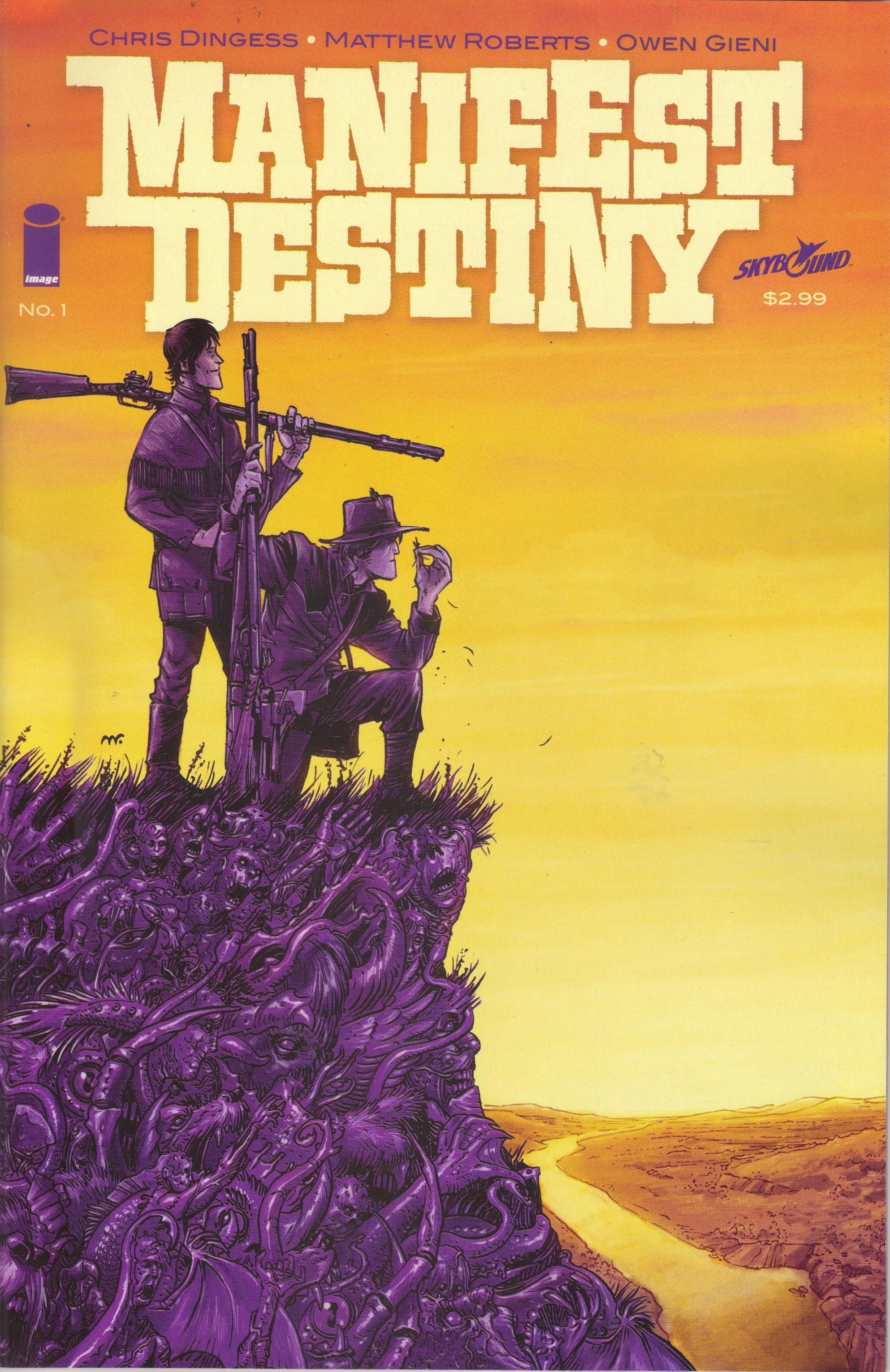
Manifest Destiny #1 by Pat Brosseau (letterer), Chris Dingess (writer), Owen Gieni (colorist), Matthew Roberts (artist), and Sean Mackiewicz (editor). $2.99, 22 pgs, FC, Image/Skybound.
Speaking of shiny things, here's the first of two #1 issues I bought this week. I was very excited about the other one and actually wasn't going to get this one, simply based on the description - Lewis and Clark's real purpose on their expedition was to root out various monsters in the American West. YAWN. However, my evil retailer, who might have a vested interest in selling more comics, said he read it and really liked it, so I picked it up and checked it out. The art was very nice, so I decided to buy it. It was totally worth it.
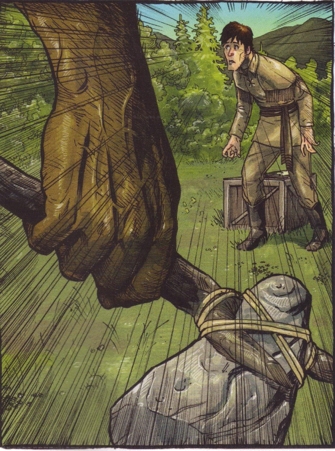
So yes, the basic premise is that Lewis and Clark were sent by Thomas Jefferson to find monsters in the West and destroy them before settlers from the East can move in. Dingess gets this out of the way early, as Lewis is writing in one of his two journals - the "classified" one - and explaining that so far they haven't found any monsters, or indeed any people, for a week. Now, granted, at this point the expedition had only been exploring for 9 days, but still - Lewis doesn't seem to think much of their secret purpose. A journal is a good way to info-dump, so we learn that the expedition has a secret mission and also that the crew has both volunteers and mercenaries and/or convicts, who have been conscripted into the group to deal with the nastier things they might find. Dingess also does a nice job in a few pages of giving us a good sketch of the two main characters - Lewis is more bookish, while Clark likes shooting down birds and administers corporal punishment with vigor. Unlike Legion of Molly Doves, Dingess manages to introduce the two characters quickly and effectively. It's certainly possible that he can do this because readers have a vague knowledge of the Lewis and Clark expedition (with the state of schooling these days, I can't be certain, but I like to think that comics readers are generally smarter than the average population, so I'm going to assume most people reading this have a basic knowledge of the expedition). But he does a nice job setting things up, and then he can get to the weird story. The expedition comes across a giant arch that looks suspiciously like the one in St. Louis, except that it's constructed (grown?) out of trees and branches. Then, of course, a monster attacks. Of course it does! More interesting than that, however, is the way Jensen, one of the unsavory members of the expedition, figures something out about what's going on and uses it to his advantage. So we have a good presentation of the two main characters, the introduction of an evil dude, and a cool-ass action scene. Score!
I haven't heard of Dingess, and I haven't heard of Roberts, either, but the art is really good. Roberts has a nice, detailed style that helps set this firmly in the time period, and he's quite good at the expansive nature shots that is required to make the expedition feel more isolated. His characters are slightly cartoony but versatile enough to look evil when they should and terrified when they should. There's a tremendous page where Jensen explains what he's learned and we see different members of the expedition on the left sides of the panels and their secrets on the right, and it's very well done. The monster attack is excellently done, as Roberts keeps the monster half out of the frame for the entire scene until the very end. This builds excitement about what it looks like, of course, but it also speeds the book up, as the monster seems to be rushing through the panels. Meanwhile, Gieni, who's a pretty good colorist, does an amazing job on this comic. On the aforementioned page with the members' secrets, the right sides of the panel are in black and white and red, highlighting the violent aspects of it and making sure we know these are memories. When Lewis sees the monster, Gieni backlights it gloriously, and the streaming sunlight that comes through makes everything feel fluid. This is a beautiful comic book, and it will be very cool to see what's coming in later issues.
I'm very glad I picked this comic up. In an autumn of very high-profile Image launches, this might get lost in the mix. Don't let it! It's a very good start.
Rating: ★ ★ ★ ★ ★ ★ ★ ★ ½ ☆
One totally Airwolf panel:
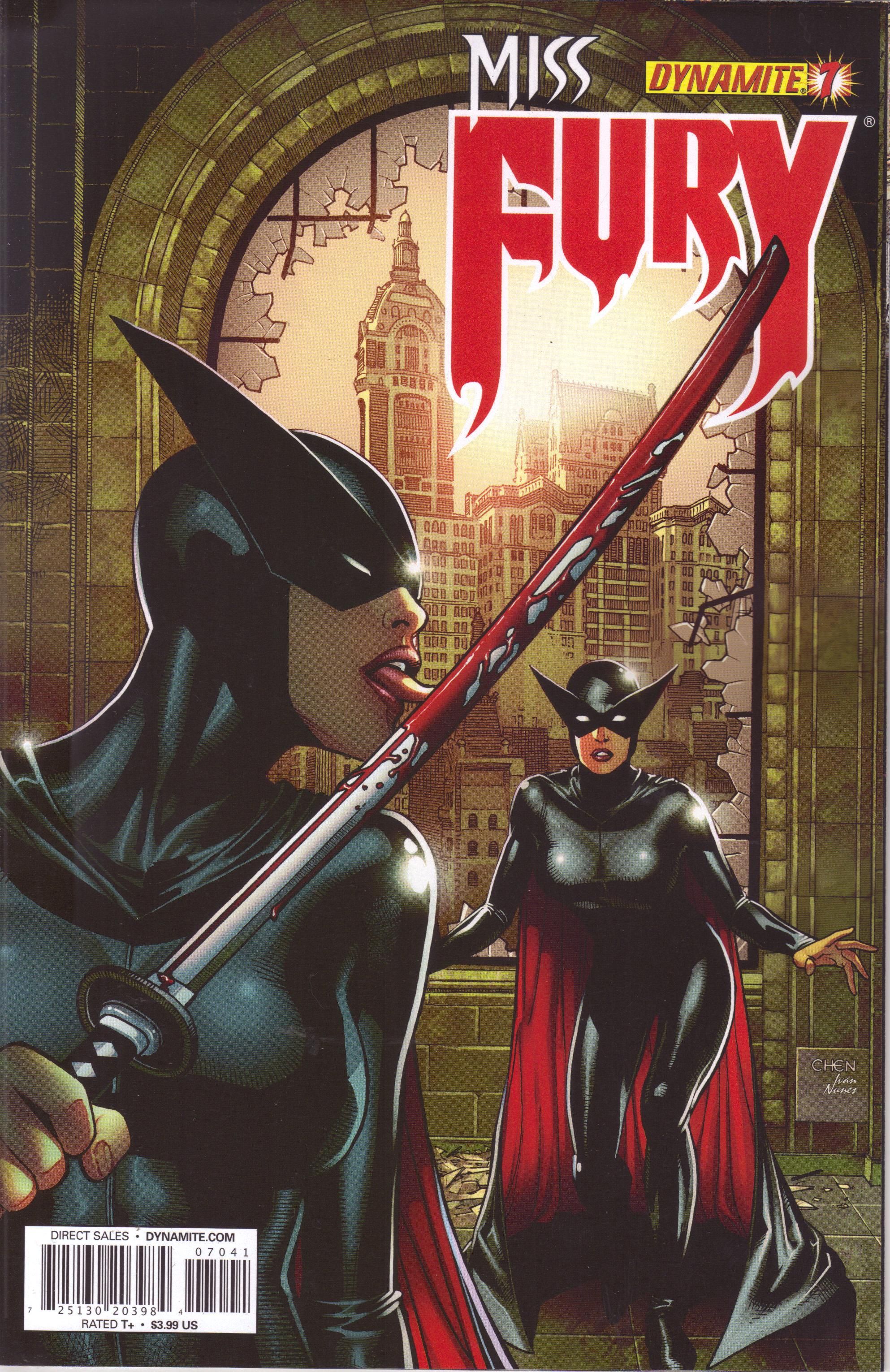
Miss Fury #7 by Simon Bowland (letterer), Jack Herbert (artist), Ivan Nunes (colorist), and Rob Williams (writer). $3.99, 20 pgs, FC, Dynamite Entertainment. Miss Fury created by Tarpé Mills.
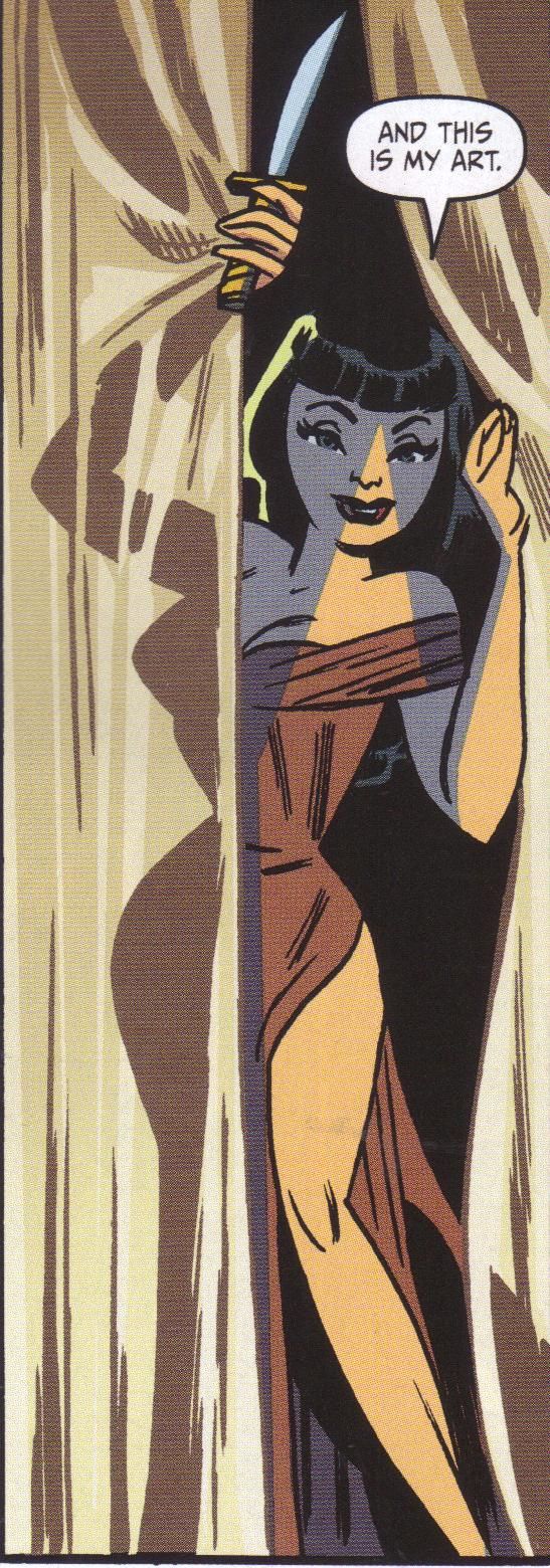
Part of the reason I like Miss Fury is because Herbert is a pretty good artist, so when he wasn't on the book for the past ... two? issues, I was a bit worried that he wasn't coming back. But he's back for issue #7, and Williams continues with whatever the hell he's writing, so this is not exactly a very good comic, but it's kind of nuts. Marla Drake has been traveling through time, because why not, and in this issue, she ends up in an alternate timeline (hence the second Miss Fury on the cover), where her doppelgänger is, well, a bit cray-cray (she really does lick the blood off the blade of her sword, as the cover shows). She's much more ruthless than "our" Marla, so this issue is even more blood-soaked than previous ones, and she's also more sexually adventurous than "our" Marla, which is saying something. Plus, she knows "our" Marla is watching her, and she digs it. Yes, it's just wacky. But Williams does bring up some disturbing sexual tension in the book, which is kind of cool. Herbert does a good job with the artwork - despite the presence of the digital sheen that bugs me about a lot of Dynamite books, you can tell he has a good design sense and tells the story quite well. He's not a great artist, but he's solid, and he gives Williams's nutty story some needed gravitas.
I'm still not sure how long I'm going to buy Miss Fury, but whenever I think I might drop it, I check out an issue and dive back in. I'm rarely disappointed, but it's not like it's a great comic. It's fun and weird and occasionally creepy, and that's good enough for now.
Rating: ★ ★ ★ ★ ★ ★ ½ ☆ ☆ ☆
One totally Airwolf panel:
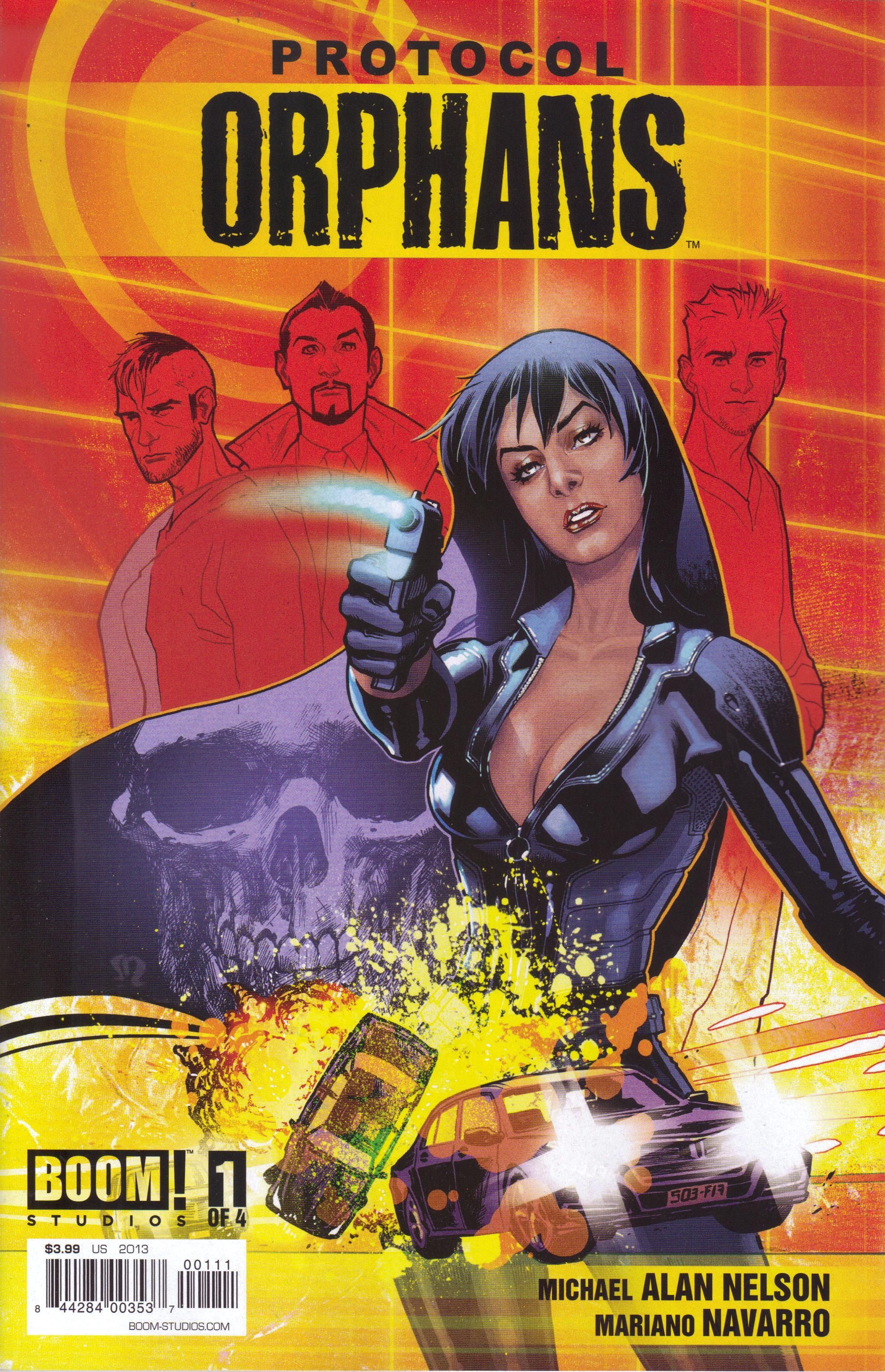
Protocol: Orphans #1 (of 4) by Deron Bennett (letterer), Gabriel Cassata (colorist), Michael Alan Nelson (writer), Mariano Navarro (artist), Alex Galer (assistant editor), and Eric Harburn (editor). $3.99, 22 pgs, FC, Boom! Studios. Protocol: Orphans created by Peter Facinelli (yes, him and Rob Defranco.
Back in January, Boom! solicited a book called Orphans, which was written by Michael Alan Nelson and drawn by Scott Godlewski. I don't buy many Boom! books in single issues anymore because I don't think they're worth 4 dollars, but I decided to pre-order it. I like Godlewski's art quite a bit, and the few times I've met him, he seems like a stand-up guy, and Nelson is usually a pretty good writer. The book, however, never came out. Boom! did solicit the entire series, but it never shipped. I wondered what had happened to it, but it didn't really bother me.
Then, this week, it showed up. It had been renamed and it has a different artist, but here it is. I considered skipping it, because I figured it would come out in a trade, but I flipped through it, and while I don't think it looks quite as good as if Godlewski drew it, Navarro's art is very solid. I forgot that it was created by Facinelli and is therefore probably something he'd like to turn into a movie starring himself (that kind of thing upsets me for some reason - it's a comic, not a screenplay!), but as I noted, Nelson is usually dependable, so it doesn't bother me too much. Facinelli doesn't have anything to do with the writing, so there's that.
So what's this about? Basically, this is a spy comic. A group of agents infiltrate a bad guy's corporate headquarters to find out where he's hidden a bomb, and then they have to go defuse it. The hook is that they work for a man they call "Dad," and apparently he has collected them all from orphanages. They're not all kids, but they have been trained as spies since they were kids. We don't know anything about the organization they work for, but that's an interesting hook. So is the way the issue plays out. I don't want to spoil anything, but someone does end up dead, which isn't surprising in itself, but why this character ends up dead is a mystery that presumably will play out in the upcoming issues. Part of the unfortunate thing about the issue is that Nelson telegraphs something pretty crucial that, I believe, will explain everything, and it's not terribly clever. I could be wrong, though, and even if I'm right, it should still be entertaining.
Navarro has a fluid, cartoony style, which is good because the book has a lot of action in it, and Navarro does a very good job with it. For some reason, the female character on the cover, whose name is Lisa, takes her clothes off early in the book (seriously, I have no idea why she needs to do it), but, you know, it's all about the cheesecake, I guess. He keeps things moving - a lot of the book could easily bog down because Nelson does use a lot of dialogue to introduce the characters and tell us what's going on, but Navarro is able to zip along so that it doesn't. The characters are distinctive enough that even though there are several of them, it's easy to tell them apart. Nelson does some character work, but he leaves a lot of it to Navarro, so we see that Lisa is cool and confident, Damon is a bit goofy, Parish is a bad-ass - it's nice work in not a lot of space.
I like spy comics, so I'm pre-disposed to like this, but it is a pretty entertaining comic. Read it before Facinelli gets his hands on it and casts himself as Damon and Zoë Saldana or Thandie Newton as Lisa! (Because he totes would, even though they're both too old for the role. Heck, he's too old for the role unless he casts himself as "Dad," but I doubt if he will. But hey, he's dating Sif, so good for him!)
Rating: ★ ★ ★ ★ ★ ★ ½ ☆ ☆ ☆
One totally Airwolf panel:
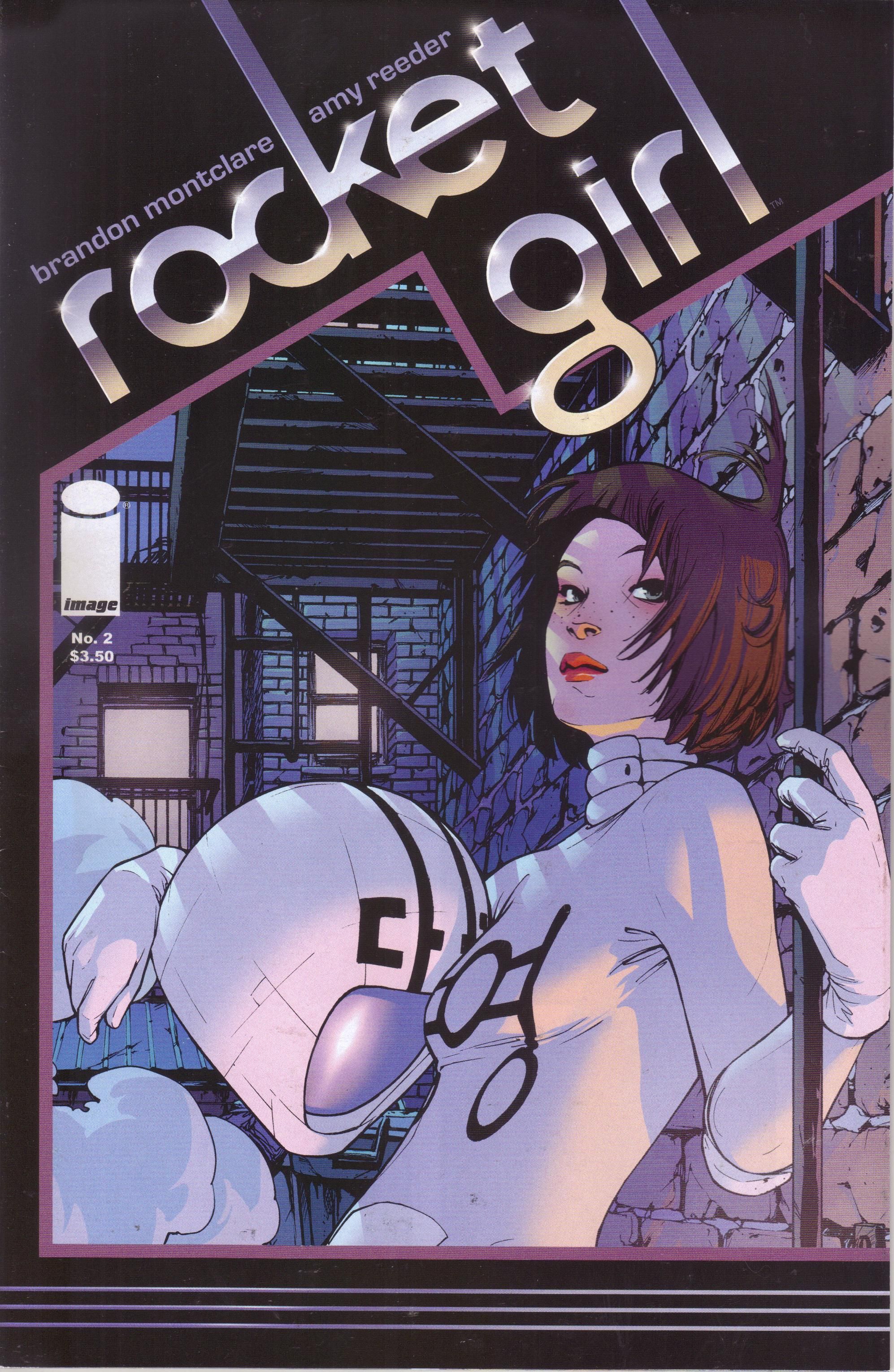
Rocket Girl #2 ("Objects in Motion Tend to Stay in Motion ...") by Brandon Montclare (writer) and Amy Reeder (artist). $3.50, 20 pgs, FC, Image.
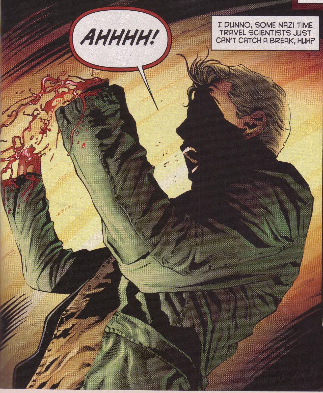
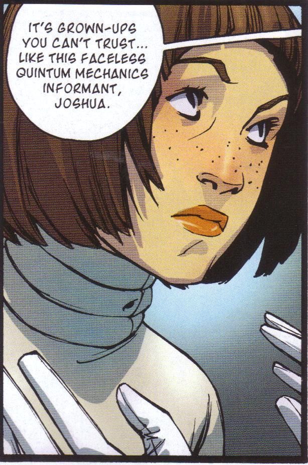
At the back of this comic, we get two pages with various pull quotes from both reviewers and comics professionals raving about the book. I certainly would love to add my voice to the chorus, but I really can't. Rocket Girl isn't a bad comic, but there's something missing from it after two issues, and it's hard to pin down what it is. Reeder's art is, not surprisingly, superb. Her body language, especially with the two characters from 1986 - Annie and Ryder - and their interactions with Dayoung (DaYoung?), the titular character. There's a nice dynamic with all three of those people, because Annie and Ryder can't figure out what's up with Dayoung, and Dayoung is extremely self-assured even though she really has no idea what she's doing in 1986. There are some very nice comedic scenes in the comic, and it's largely due to Reeder's artwork. There's a brilliant double-page spread early in the book where Reeder gives us a nice overview of New York in 1986, as Dayoung tries to process what's going on. Reeder gets the fact that Dayoung is a teenager down pretty well, as she's a bit more awkward than we might expect from a veteran police officer, but when we remember how young she is, it makes more sense. Occasionally Reeder's people overreact to things, but I tend to put that down to her background in manga. The art is definitely not a reason to dislike the book, and it's nice that Reeder is getting a higher profile for her work, because she's a cool person.
I like the idea behind the book. Basically, in a futuristic-looking 2013, the police are teenagers and grown-ups are somewhat shady. A company is doing some nefarious things, so Dayoung goes back in time to 1986 because that's when the company - Quintum Mechanics - began doing nefarious things. One thing that's quite cool about this is that Dayoung is knowingly destroying her timeline, but she thinks that what she's doing is so important it needs to be done. The scientists at Quintum - whom she thinks are criminals - are pretty goofy, which is a nice touch. In this issue, we get a bit more of Dayoung's "past" - i.e., her life in 2013 - and she argues with Annie and Ryder, two of the Quintum scientists. Meanwhile, her appearance in issue #1 has set the whole city abuzz, but there's still a cop on her trail. It's not a bad set-up, but it lacks spark. It's kind of a mess. The pacing is jerky, as we go from Annie telling Dayoung to calm down because she's in an unusual situation to Dayoung facing down punks trying to rob a grocery store. Annie says she just wanted a Tab, which is fine, but Dayoung seems terrible at stopping the bad guys, who are, after all, just some punks. Meanwhile, the owner of the store seems like a jerk, which might be a comment on New Yorkers and their attitude, but which is jarring. In 2013, Dayoung is a jerk to her partner, LaShawn, but more than that, their dialogue sounds extremely stilted, as if it's just trying to reach a point. And how do we reach the final page? There seems to be things missing from the script, and even though readers often have to make narrative leaps, the ones in this comic don't seem to make much sense.
I don't think I'm ready to give up on Rocket Girl quite yet, but recently I've been thinking about being much less patient with comics, and this could be on the block. In the new year, I often reassess which comics I'm buying, so maybe next month will be the final issue I get unless it's really amazing. We'll see. Right now, it's not quite doing it for me.
Rating: ★ ★ ★ ★ ★ ★ ☆ ☆ ☆ ☆
One totally Airwolf panel:
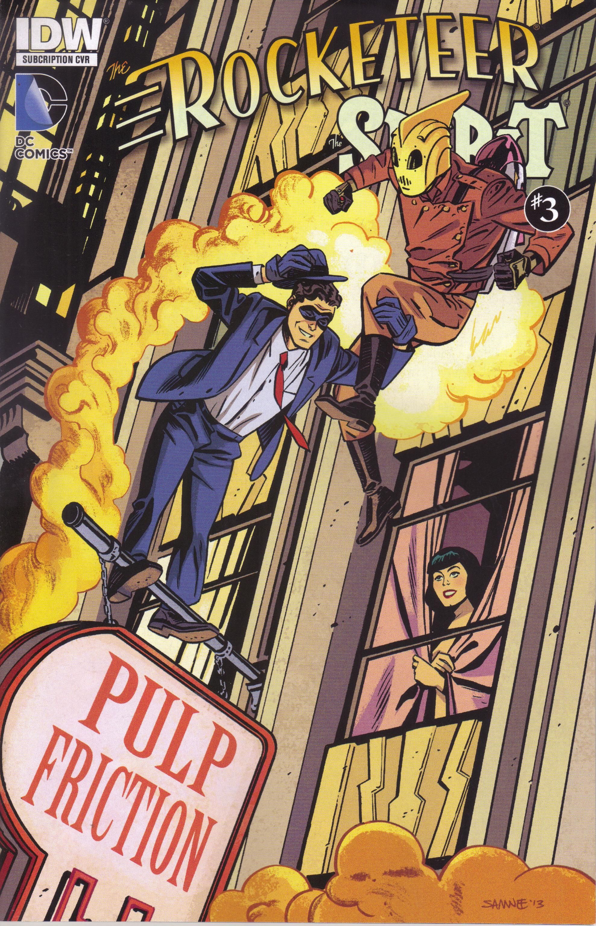
The Rocketeer/The Spirit: Pulp Friction #3 (of 4) by J. Bone (artist), Ron Fajardo (colorist), Tom B. Long (letterer), Mark Waid (writer), and Scott Dunbier (editor). $3.99, 20 pgs, FC, IDW. The Rocketeer created by Dave Stevens. The Spirit created by Will Eisner.
I wonder if Mark Waid should stop writing Rocketeer stories. This isn't as good as his previous tale, and it verges into the absolutely silly that makes it really, really hard to suspend disbelief. I mean, the Spirit more than the Rocketeer has a slight element of weirdness to it, but both characters are still more grounded in reality than most costumed crime-fighters. When the central premise of your plot is lifted from Charlie and the Chocolate Factory, perhaps you should rethink things. Even Cliff's reactions to Denny Colt are a bit too bizarre. Bone's art is always a pleasure to see, and the story isn't terrible, but it's just going places that make no sense, even in the context of the Rocketeer and the Spirit. I like Waid a lot, but this one is just misfiring. Oh well.
Rating: ★ ★ ★ ★ ★ ☆ ☆ ☆ ☆ ☆
One totally Airwolf panel:
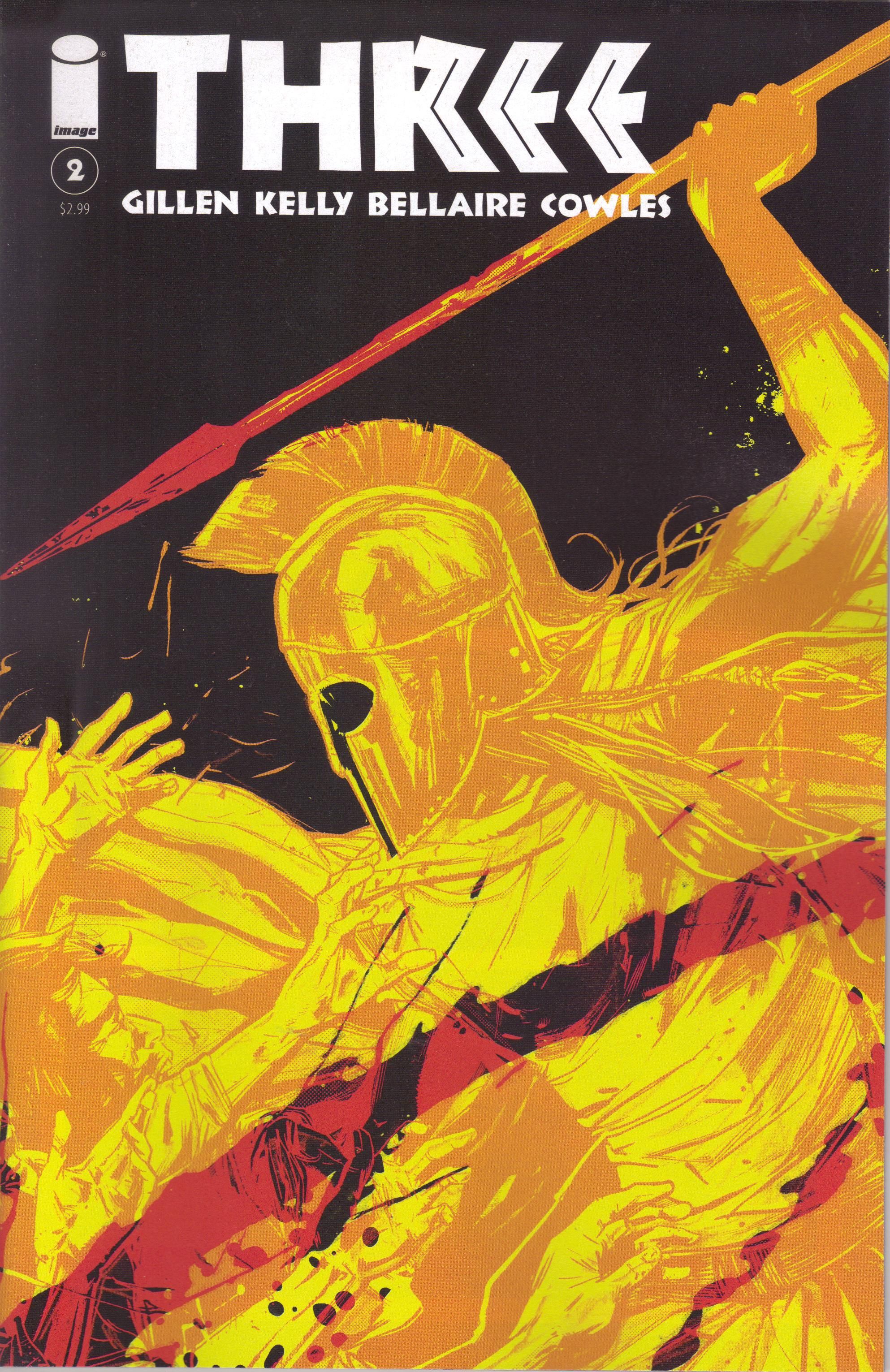
Three #2 by Jordie Bellaire (colorist), Clayton Cowles (letterer), Kieron Gillen (writer), Ryan Kelly (artist), and Professor Stephen Hodgkinson (historical consultant). $2.99, 24 pgs, FC, Image.
Here's another high-profile (I guess?) Image book that ships its second issue, and it's certainly better than the first one. Three #1 was a bit of a mess, mainly because Gillen introduced a lot of characters who seemed important, only to kill them off fairly quickly. It jerked along a bit oddly, too, without flowing terribly smoothly. It did set up the situation, though, so there's that. First issues are odd ducks, especially ones that deal with an actual historical event, as Three does. Even this second issue, in which Gillen is able to get a bit more into the heart of the story, is a bit uneven. If you're not a fan of Gillen, I would imagine you might give this less of a chance. I'm a fan of Gillen, Kelly, and historical adventure, so I'm on board for a while until things get sorted.
The problem with this issue is that Gillen still needs to explain Sparta to the readers. Sparta is such an alien culture to modern people that Gillen can't just chuck us in and expect us to swim. Readers can understand the basics about Athens (or at least the democracy of Athens, which wasn't as long-standing as we might think), and the concept of absolute-ish monarchy is pretty simple, too. But how do we deal with Sparta during this time period? They were ruled by two kings from separate dynasties, but this diarchy wasn't the only power, as they also had a council of five ephors who shared power with the kings but were only elected for a one-year term and could not serve twice. So who really held power? Plus, while most Greek city-states used slaves, the helots seem to be a bit different, as the institution seems much more developed in Sparta and so therefore had more complex nuances. This is stuff that is difficult to explain in dry history texts, yet Gillen attempts to do it in a comic book. He does a decent job, but it's still complicated, so the issue does grind to a crawl on pages 12-22, after the exciting and violent beginning in which our three rebels take care of the uppity Spartans who were treating them poorly. It's really one of those things where you know Gillen has to get to it, and it's very difficult to figure out a way to explain all that needs to be explained without slamming on the brakes. As I noted, I'm a big fan of Gillen's work, and I'm very interested in history, so I'm willing to read through Kleomenes's meeting with the ephors, but I'm not sure if it's the best idea. Maybe Gillen just wanted to get it out of the way so that he could get to the real story.
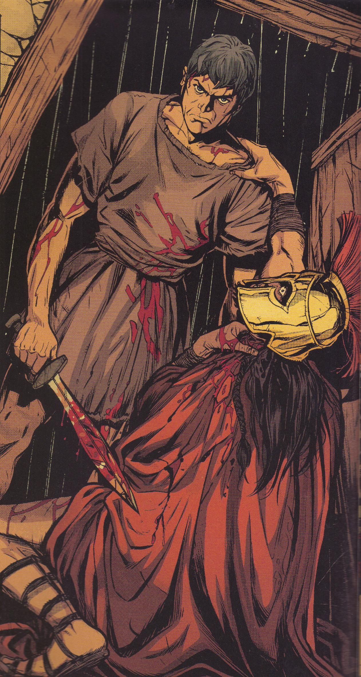
Kelly does his typically wonderful job on the pencils, as Klaros decides he's sick of being treated like an animal and, instead of running from the slaughter that began in issue #1, decides instead to pick up a sword and do something about it. There are some very good, tense moments on the first 11 pages, and Kelly does an excellent job leading us where he wants to go and pacing the fight very nicely. He's handicapped a bit in the second half of the issue because he's stuck drawing men who all pretty much look alike, but he does draw the Spartan statues very well, remembering that they would not look like gray stone as they do today. Bellaire relies a bit too much on the blue/orange complement in the first half of the book, but the way she colors the flashbacks in the second half, especially the judicious use of blood drops, is pretty clever.
Three has stumbled just a bit out of the gate because of its subject matter and the necessity of grounding it in historical reality. That doesn't bother me too much, but I do hope that Gillen can work out the kinks enough to make this a better comic. I'm confident he can, but that's just because I dig Gillen's writing!
Rating: ★ ★ ★ ★ ★ ★ ½ ☆ ☆ ☆
One totally Airwolf panel:
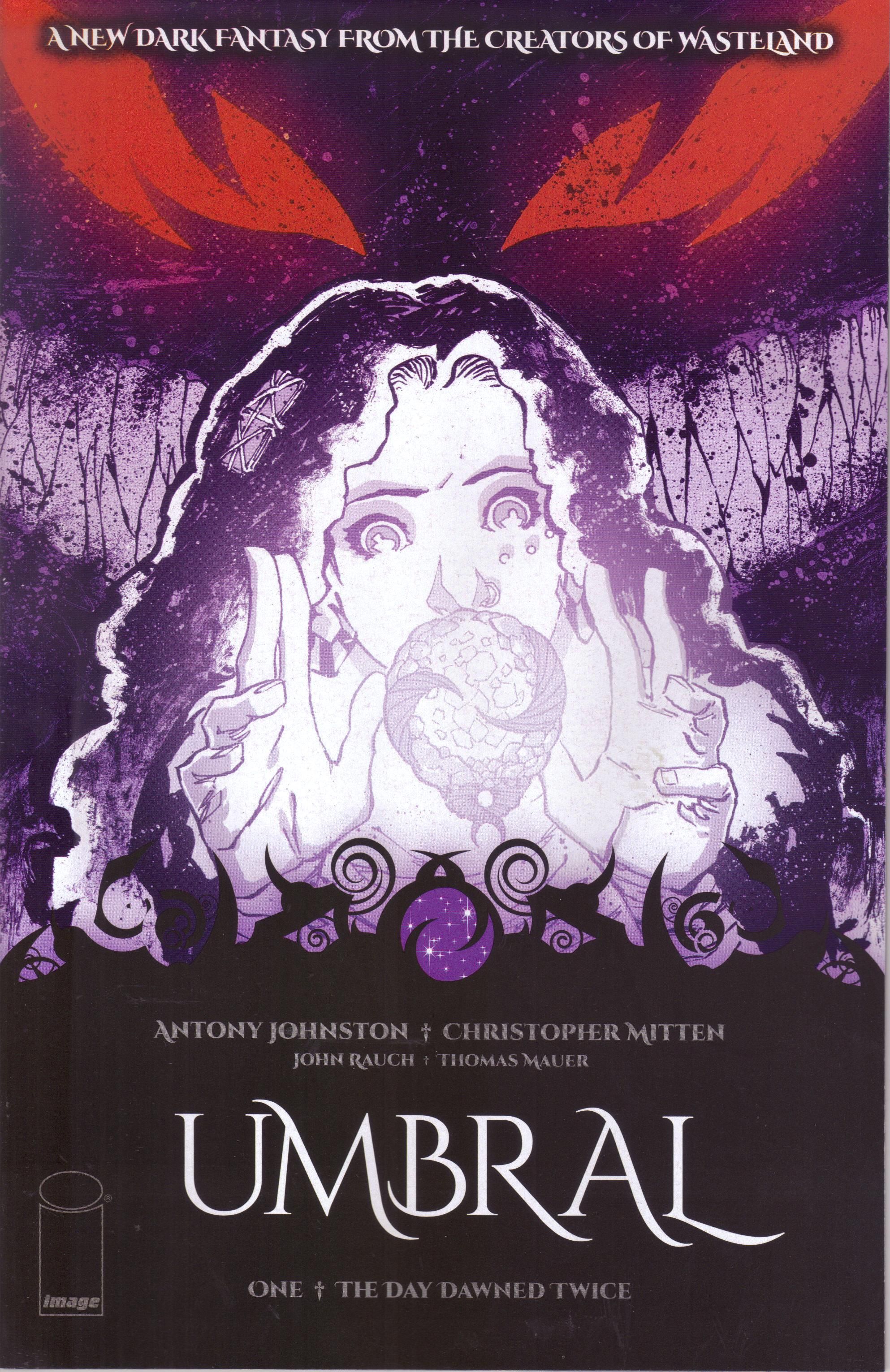
Umbral #1 ("The Day Dawned Twice" or possibly "Out of the Shadows"*) by Antony Johnston (writer), Thomas Mauer (letterer), Christopher Mitten (artist), and John Rauch (painter). $2.99, 31 pgs, FC, Image. * The cover gives the first title, but the title page inside gives the second one. What's up with that, Johnston? Sheesh.
Writers are weird. At the back of this book, Antony Johnston has a text piece about being a kid and thinking that monsters lurked in bedroom. I know that's a cliché of fiction, but did that kind of thing really happen to too many people? My wife talks about her bedroom as being haunted when she was a kid, so maybe I'm just too normal, because I don't remember ever being scared of sleeping in my bed. As far back as I can remember, going to sleep was a perfectly normal thing, and I usually slept right through the night. I was never terrified of noises or shadows or things moving. I don't know why. I don't like scary things these days, and maybe my un-scary upbringing is why I don't like reading scary books or seeing scary movies today, but I'm not like Johnston at all. Maybe that's why he writes cool comic books and I just ramble on with my opinions on a blog. How dare my parents live in regular houses that didn't creak at night!
That's really neither here nor there, of course. I just thought it was interesting, because Johnston mentions in the text piece that Christopher Mitten, his partner in crime on this book, showed him a drawing of a weird, shadowy monster, and Johnston began thinking of his childhood and all the monsters that lurked in the shadows. So he and Mitten teamed up for the second time and cranked out Umbral, a cool word that sounds better than "shade," which is basically what "umbral" means. Unlike Manifest Destiny, I was seriously looking forward to this comic because Johnston is a pretty good writer and Mitten is a fantastic artist and the last time they teamed up, they gave us Wasteland, which (although Mitten isn't drawing it anymore) continues to be an excellent series. However, like Manifest Destiny, this is a kick-ass first issue - it hits the ground running and drags you along for the ride. It's fairly bleak, but because the main character is well done, it doesn't feel as depressing as it might.
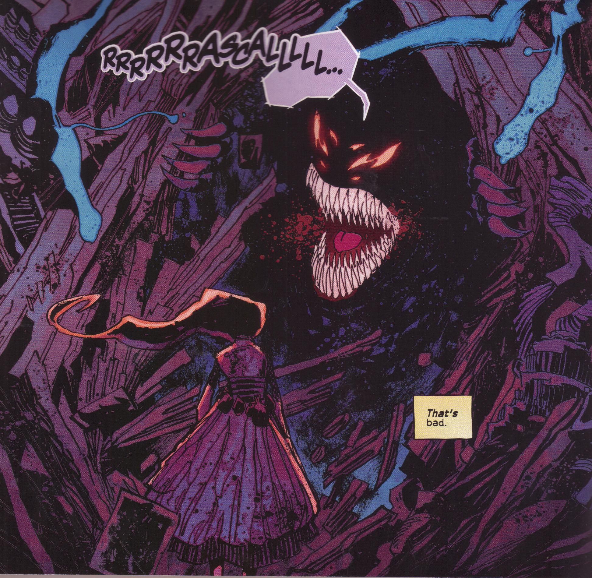
Johnston and Mitten start with a girl named Rascal running from something awful, and then back up a bit to show how she got there. She lives in a fantasy world (we're thoughtfully given a map) ruled by a charming king and queen, and she's friends with their son. Unfortunately, nothing good happens to any of the royalty, so perhaps we shouldn't get too attached to them. Apparently some weird shadow creatures called, yes, the Umbral are trying to do something weird, and Rascal manages to snatch something they need to complete the ritual. You don't need to know all the particulars - there's magic, and the Umbral are coming to do nasty things, and Rascal holds the key to stopping them. You know, like so many other fantasy stories.
So why is this so good? Well, Johnston does a very nice job with Rascal herself - she's obviously spunky because that's the way heroines are, but it's also clear that she's kind of out of her element, and her nervousness adds a good touch of reality to the book. The royal family are well done, too, although they don't get as much time as Rascal does. In only a few pages, Johnston makes the king and queen feel like real people, and the prince, Arthir, is a good companion for Rascal - he's not comfortable with being a prince, but he's certainly brave and protective. The story feels familiar, sure, but it's told well, and if Johnston does as good a job with the other characters as he does in this issue, it will go a long way to making the story work.
Mitten, meanwhile, is brilliant, and he's ably helped by Rauch, who does a magnificent job on the colors. I don't know if Mitten's lines have ever been this strong - he has always been able to be sketchy but still create a nice portrait of events, and in a book like Wasteland, that sketchiness served him very well, as the book is set in a desert. Here, however, his lines are more solid and they feel more confident - the kingdom of Fendin is a typical fantasy realm, which means it's ancient and proud and full of solid marble/limestone buildings, so Mitten makes it feel more solid. However, he's still able to draw terrifying monsters, as he does on a few pages here, and when Rascal goes to a seedier part of town, the art gets a bit rougher. Rauch, too, is amazing - the catacombs where Arthir and Rascal go early in the issue is creepy partly because of the blues Rauch uses, while the glowing colors he uses for the magical elements of the book help set them apart quite well. Umbral is a tremendous-looking book, and it's another reason why comics are a good place for fantasy, as the art can elevate a story that has to contain certain elements. Both the fact that Mitten is drawing this and Johnston is very good creating believable characters help make the familiar parts of the story less egregious.
I'm really glad that Johnston and Mitten are teaming up again, and I hope Umbral turns into another great comic like their last collaboration. I would argue that it's off to a better start (Wasteland took a few issues to find its footing), but we'll have to see what happens going forward. Still, this is a very strong debut.
Rating: ★ ★ ★ ★ ★ ★ ★ ★ ½ ☆
One totally Airwolf panel:
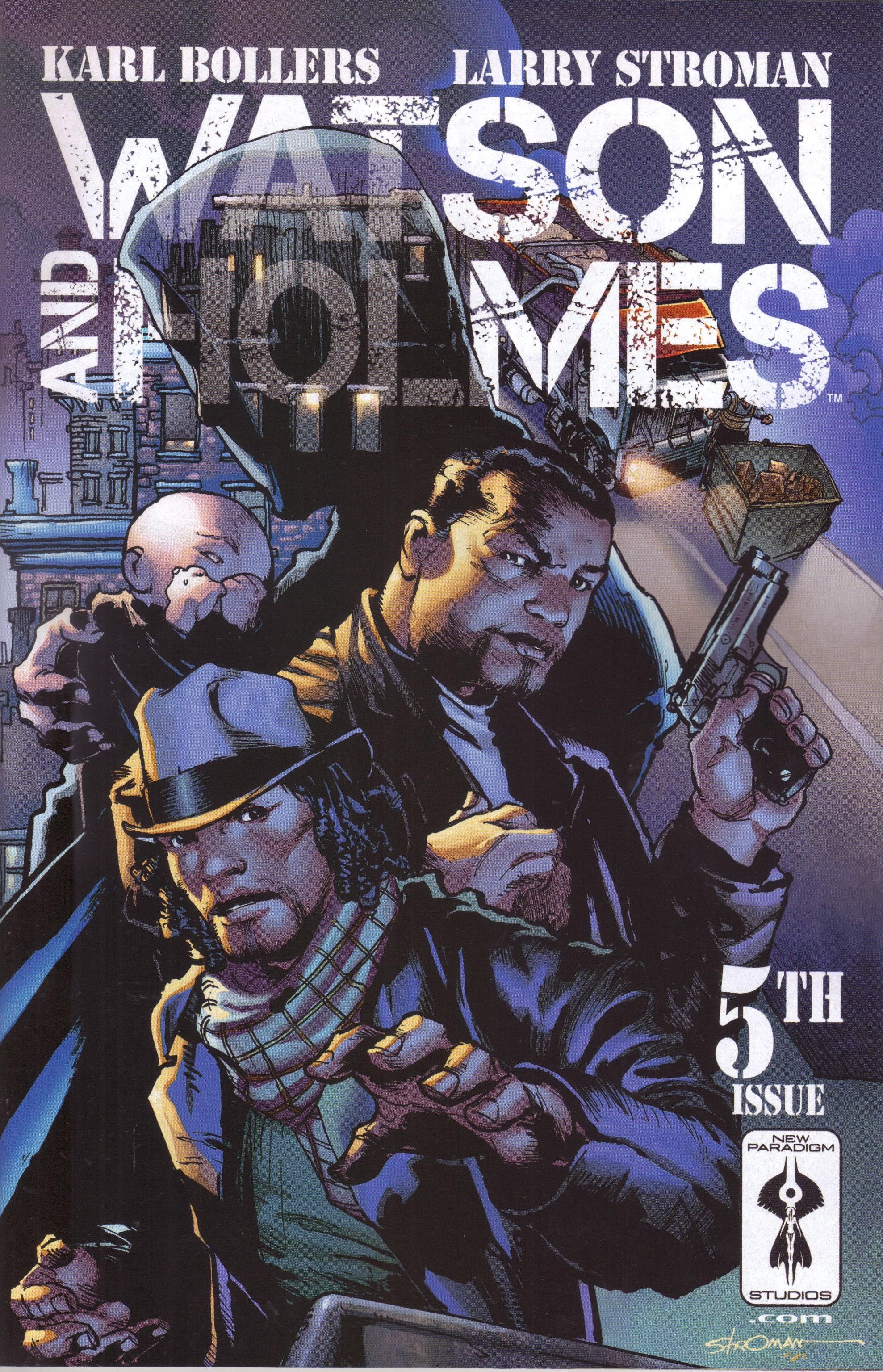
Watson and Holmes #5 by Karl Bollers (writer), Jay David Ramos (colorist), Wilson Ramos, Jr. (letterer), Larry Stroman (artist), Archie van Buren (colorist), Zack Rosenberg (assistant editor), and Justin F. Gabre (senior editor). $3.99, 24 pgs, FC, New Paradigm Studios.
The first arc of Watson and Holmes ended oddly, with more of a cliffhanger than you'd expect, and it was kind of annoying. So in this issue, we get a one-and-done, but I'm still wondering how much the book will hold together as a grand narrative even as Bollers tells smaller stories. We shall see.
Everyone's pal Travis Pelkie mentioned that he was going to stop buying this book because the price went up to 4 dollars, and I find it humorous that the indicia still claims it's $2.99. I can't fault Travis; spending money on comics has become a more messy consideration than it used to be, but I give more leeway to independent books than I do to Marvel and DC having the gall to charge me 4 bucks, so I'll roll with Watson and Holmes for a while. It's a good comic at 3 dollars, and I want to see if it's a good enough comic at 4 dollars.
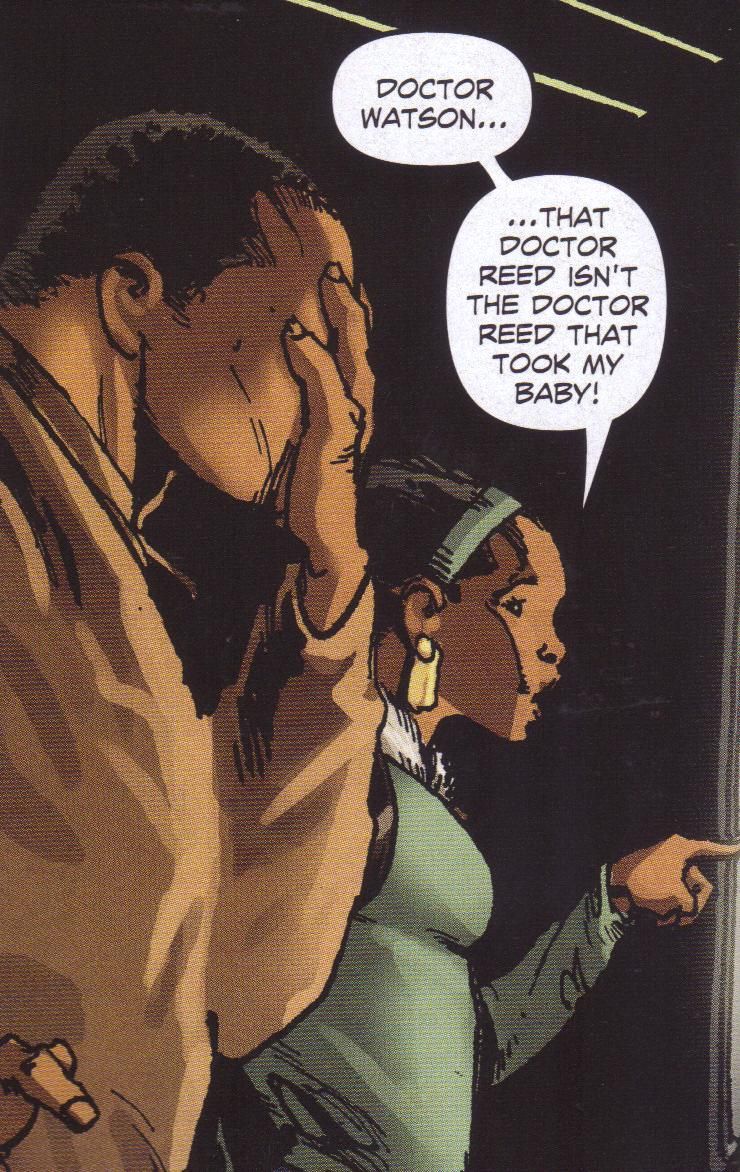
This is a pretty good issue, although it has the problem that all single-issue mysteries has - it's too easy. One of the problems I have with Mike Barr's Maze Agency is that every issue is a new mystery that gets solved in that issue, and I think it would have been better to do two-issue mysteries. Single-issue mysteries seem to move too quickly - the writer needs to set up the mystery, present clues, and then wrap things up, and things go too fast. In this issue, for instance, several infants go missing and then end up, unharmed, left in dumpsters around New York. The first two pages of the issue are set-up and don't have much to do with the mystery, and Watson hangs out with his son for four pages in the middle of the issue. That means Bollers has 18 pages to set up the whole mystery, have Holmes investigate it, and wrap it up. It's not a bad story, but the point of the crimes get a bit lost because it has to be done so quickly. Bollers, I think, doesn't want to make any sort of racial statement too obvious in this book, but if you're going to create a crime that has a racial element, you shouldn't bury it so much. If this story were two issues long, we could get a bit more with Watson and his son (and his ex-wife, who also shows up briefly) and we could also get a bit more about the racial part of the story, which is important. It's just too quick to encompass all of it.
After Rick Leonardi drew the first arc, Stroman steps in for this issue. Stroman's work isn't as strong as it was 20 years ago, and I think (without really looking too hard) it's because of a lack of crispness in his more recent work, which might be the inking or might not. His more abstract faces tend to work better when they're crisper, and they also work better when he's drawing superheroes, which isn't the case here. He actually does nice work with Holmes and Watson, but he's not quite as good with the women, who look like blank slates. Part of the problem with the speed of the issue is that Bollers has a lot to cram in, so Stroman has to fit a lot onto each page, and the layouts aren't particularly well done. His use of space is odd and doesn't always work. The book feels too claustrophobic, even during a scene at a park, which ought to be more wide open. Again, I think this is a function of the script having too much in it for one issue, but I can't be sure. It's too bad - Stroman isn't the best artist, but he does have an interesting style that can work in certain situations, and this isn't really it.
I still like what Bollers is doing with the comic - taking Holmes and Watson and putting them in Harlem is a very cool idea - so I'm sticking around for now. I admit the new price has me rethinking things, but right now, it's a decent enough comic that I don't mind the extra dollar. We'll see if that changes going forward.
Rating: ★ ★ ★ ★ ★ ★ ½ ☆ ☆ ☆
One totally Airwolf panel:
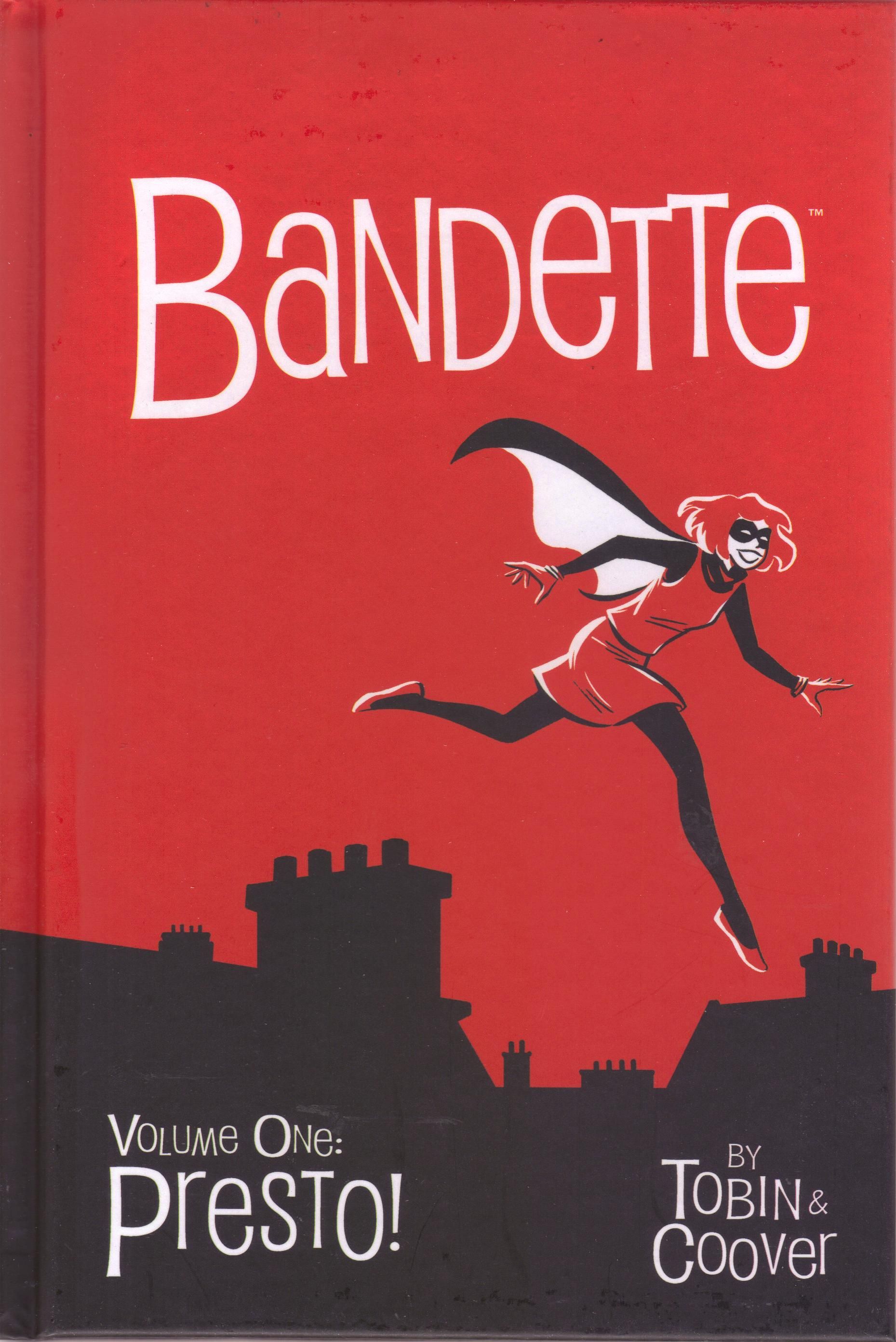
Bandette volume 1: Presto! by Colleen Coover (artist) and Paul Tobin (writer). $14.99, 142 pgs, FC, Dark Horse.
Man, this looks gorgeous. The coloring is stunning.
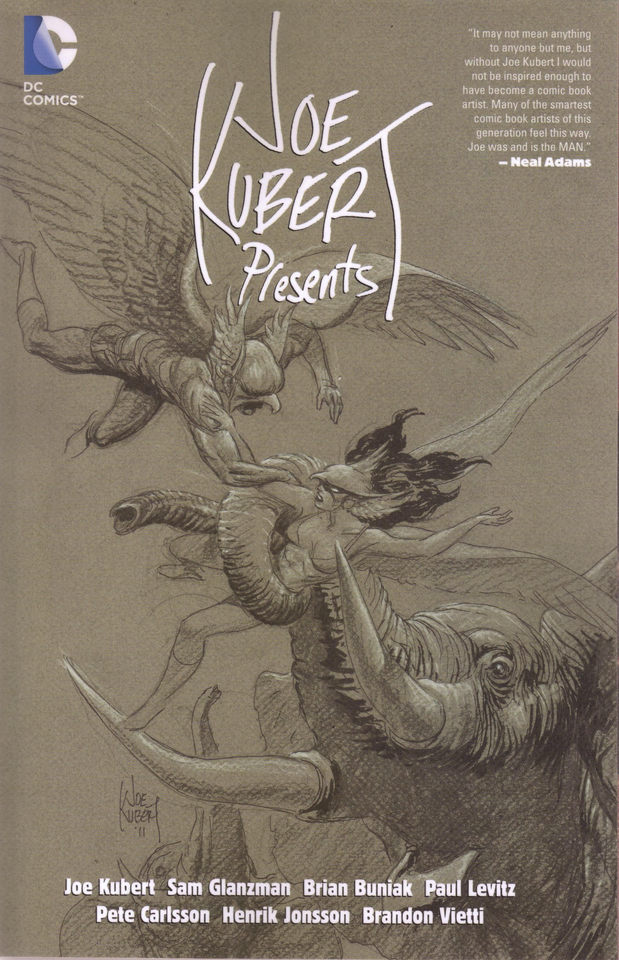
Joe Kubert Presents by Brian Buniak (writer/artist), Pete Carlsson (writer/colorist/letterer), Sam Glanzman (writer/artist), Henrik Jonsson (artist), Adam Kubert (letterer), Joe Kubert (writer/artist/colorist/letterer), Paul Levitz (writer), Joe Panico (colorist), Brandon Vietti (writer/artist), Jason Wright (colorist), and Scott Hybakken (editor). $19.99, 304 pgs, FC, DC.
I always have to mention DC's trade policy, because it's so excellent even if they take forever to come out. This is a six-issue mini-series of extra-sized issues that sold for, I think, 4 or 5 dollars a pop (were they $4.99? I seem to think they were). You can get it for 20 dollars, which is just slightly over 3 dollars an issue. DC's publishing philosophy might be wacky right now, but their trade paperback policy (not what they choose to collect, because that's a bit wonky) is quite nice.
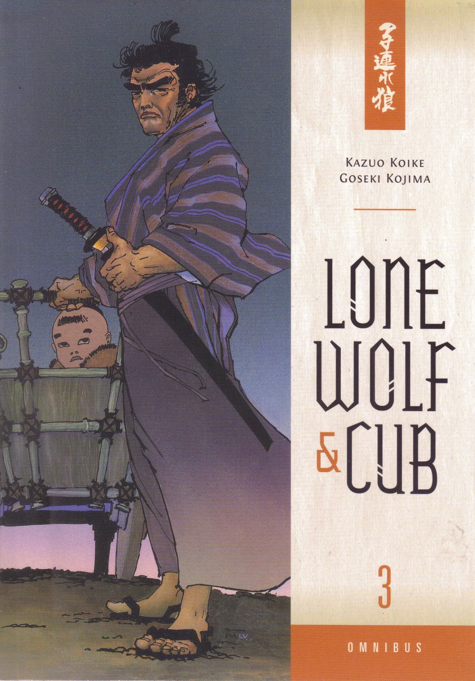
Lone Wolf & Cub Omnibus volume 3 by Kazuo Koike (writer), Goseki Kojima (artist), Dana Lewis (translator), Digital Chameleon (letterer), and Chris Warner (editor). $19.99, 715 pgs, BW, Dark Horse.
I should probably start reading the first volume of this, right?
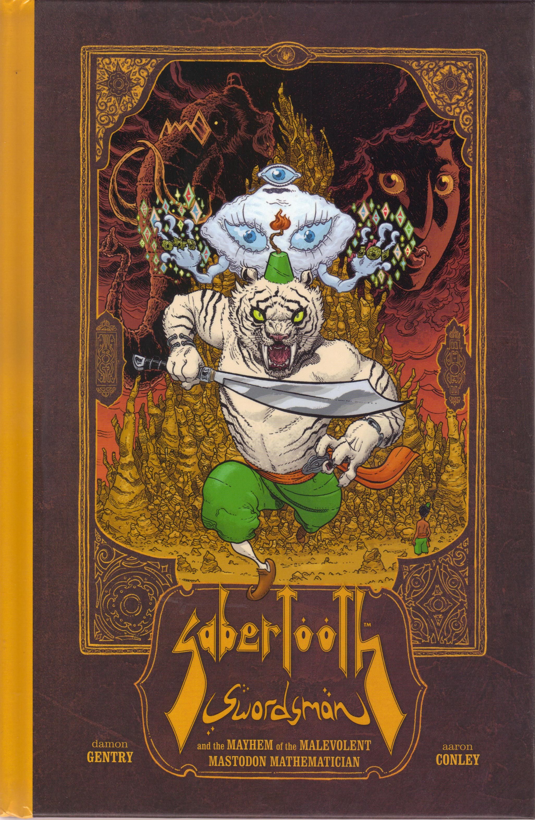
Sabertooth Swordsman and the Mayhem of the Malevolent Mastodon Mathematician by Aaron Conley (artist), Damon Gentry (writer), and Brendan Wright (editor). $17.99, 109 pgs, FC, Dark Horse.
On the back of this very nice hardcover edition, the ubiquitous Chris Sims has a pull quote which reads, "There are a lot of comics out there that try to get the feeling of video games down onto the page, and very, very few of them ever manage to do it this well." This quote and the fact that the creators of this book felt it was neat enough to put on the back of the comic annoyed me more than I thought it would. I like Sims; his writing is often clever and he's a very jovial guy in person. But why is this a good thing? Why would anyone want to get the "feeling of video games" into their comics? Can't you just, I don't know, play fucking video games if you like them so much? I have never been interested in video games, even when I was 10 years old and Atari was the shit, so I don't really understand the obsession some people have with them, but that's cool - we all have obsessions. I do know that I don't want my comics to feel like video games, I want them to feel like motherfucking comics. This is a stunning looking book, and I'm anxious to read it, but the fact that someone thought it felt like a video game and someone else thought that was a great way to describe the book lessens my confidence in it. Which kind of sucks, but that's the way it is.
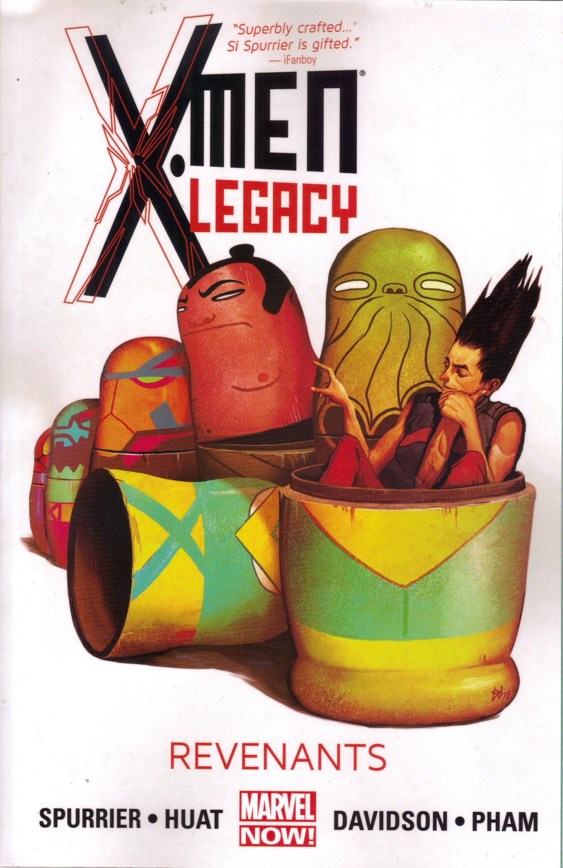
X-Men Legacy volume 3: Revenants by Paul Davidson (artist), Chris Eliopoulos (letterer), Tan Eng Huat (penciler), Jay Leisten (inker), Cory Petit (letterer), Khoi Pham (artist), Rachelle Rosenberg (colorist), Simon Spurrier (writer), José Villarrubia (colorist), Craig Yeung (inker), Alex Starbuck (assistant editor), Nelson Ribiero (assistant editor), and Cory Levine (editor). $15.99, 120 pgs, FC, Marvel.
This book is ending, right? Is Marvel just going to relaunch it with a different creative team? That seems to be their MO these days, doesn't it?
**********
I don't have too much to rant about this week, although there's that comics controversy going on - you know, that thing - and I'm very interested in what certain people have to say about it. But this is not the place for negativity, this is the place for ... a Top Ten List! Yes, it's my ten favorite Roman emperors! Be aware: this is not who I consider the "best" Roman emperors, because some of my favorites were kind of horrible. These are just the most interesting, to me. Second, this does not include Byzantine emperors, who considered themselves Roman emperors long after their empire no longer extended anywhere near Rome and long after it became a Greek empire. Just so you know. Here they are, in chronological order:
1. Augustus, r. 27 BCE-14 CE. Yes, it might be a boring choice, but Octavian really is fascinating, because of his accomplishments and because he managed to turn the Romans into an imperial state rather than a republican one. As "imperial" as the Romans had become by the first century BCE, they still paid lip service to republicanism, but Augustus was able to change that without destroying the institutions the Romans loved. Plus, he was able to end the civil wars of the years preceding his accession, and Rome was probably never as peaceful as it was during his reign. He's just an interesting ruler.
2. Vespasian, r. 69-79. Not much is known about Vespasian's rule, but I still he's an interesting guy. He was a great general, he managed to quell the civil unrest in the empire during the "Year of Four Emperors" (of which he was the last), and he built the Colosseum. He was also the Roman who suppressed the first Jewish revolt, which might not make him a nice guy, but does make him fascinating to read about.
3. Domitian, r. 81-96. Vespasian's second son had a terrible reputation for a long time, but most historians don't think he was as awful as contemporary writers claimed. He conquered Dacia, which is why Romanian is a Romance language today, and he was emperor when Revelations was written, which makes the historical background of that book far more interesting. He didn't like the Senate, which is why senators writing right after his death painted him with a tarred brush. He was assassinated, because he was a Roman emperor. Those dudes usually didn't end well.
4. Trajan, r. 98-117. Trajan is probably the greatest Roman emperor, and if not, he's second to Augustus. He was a dazzling military leader, extending Rome's borders to their greatest extent, and he seems like a good ruler, too. He built a lot of cool monuments, and while Domitian set the stage for the great Roman century, Trajan secured it so that subsequent emperors could worry about philosophy.
a. Didius Julianus, r. 28 Mar. - 1 June 193. Julianus isn't really that interesting an emperor, as he only lasted for two months. He did buy the empire at auction, though, so that's pretty neat.
5. Septimius Severus, r. 193-211. You could make the case that Severus was the last good emperor until Constantine almost 100 years after him, and certainly the last good one until Diocletian in 285. I'm always bummed that Severus doesn't get more credit - after the fucked-up reign of Joaquin Phoenix and the mess following his assassination, Severus managed to stabilize Rome once again. He was an able military commander and the first African to be emperor (well, he was born in Africa - he was still a Roman). He persecuted Christians, sure, but everyone was doing it, you know. He did debase the coinage, which is never a smart thing, and the Roman economy suffered for it. Hey, we can't all be perfect, right?
6. Decius, r. 249-251. In the middle of the terrible third century (between Severus's death in 211 and Diocletian's accession in 285, Rome went through 27 emperors, with only two ruling longer than six years), Decius stands out for his terribleness, mainly because he really like killing Christians. Okay, so that's a bit extreme (he just wanted to make sure people loyally sacrificed to the state, which of course Christians didn't do), but he became notorious for his persecutions. He's much more interesting because of the Christian reaction to him in the subsequent centuries than for anything he actually did.
7. Diocletian, r. 284-305. Speaking of killing Christians, Diocletian really liked killing Christians, and his name is pretty much synonymous with persecution. Diocletian was far more interesting than just that, though, as he was able to end the anarchy of the third century and stabilize the empire once more. Diocletian hated Rome, preferring to spend his time in his native Dalmatia, and he recognized that the empire was too unwieldy to rule alone, so he created co-emperors, with three other rulers in charge of sections of the empire. This, of course, eventually led to its dismemberment, but it probably would have happened anyway, and Diocletian's idea may have staved it off longer. He is also, notably, one of the few (the only?) emperor to retire, as he became ill and decided he couldn't go on. He chucked it all and moved back to Split, Croatia (then called Spalatum), to sit by the sea and dream about killing Christians, presumably.
8. Constantine, r. 306-337. Obviously. Let's move on!
9. Julian, r. 360-363. I always liked Julian; he was the last non-Christian Roman emperor, and he tried desperately to stem the tide of Christianity sweeping the empire, believing that only by returning to the ancient rites could Rome be great again. He'd find common cause with a lot of people in our country today, except for that whole non-Christian thing. He might have been able to do it, too, as he seems to have been a fairly decent ruler. Unfortunately for the pagans, he was wounded in Persia and died at the age of 31/32. And thus a great historical counterfactual was born!
10. Valens, r. 364-378. And then there's Valens, who also seems to be a fairly good emperor. Unfortunately for him, he was also fighting the tide of history - not the Christians, but the inexorable forces of decadence in a society and the vigorous new society of the Goths. At the battle of Adrianople in 378, Valens was killed when his army was overwhelmed by the Goths, which really ended any dominance Roman arms had (even if it had been decaying for years). The Goths flooded into the empire, and while the Romans held on for another century, this was really the end of the Western part of the empire. Valens, like some other emperors, is more fascinating based on what happened to him than for anything he did, but still.
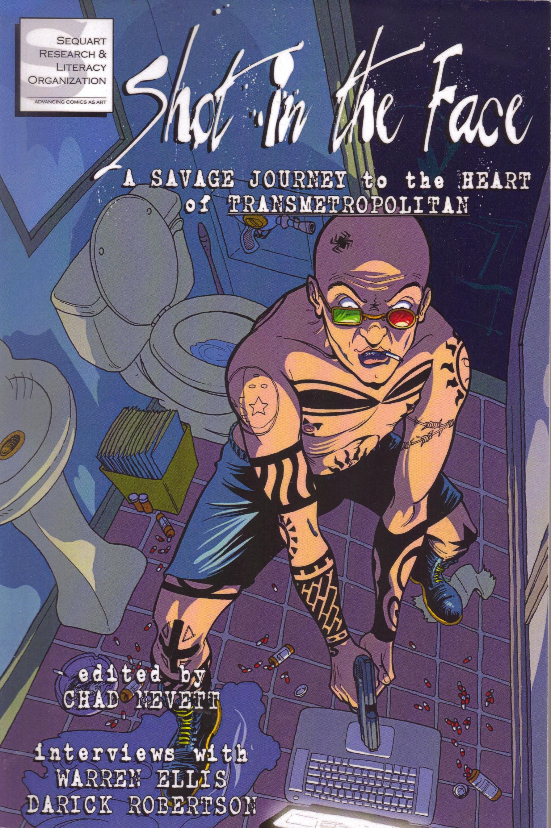
I forgot to mention this last week, but if Brian can do it, so can I! If you're at all interested, you can buy the book to which I contributed an essay:
Yes, it's a book about Transmetropolitan, and it's full of cool thoughts about the series. I haven't read the whole thing yet (I have a lot to read!), but I have read some of it, and it's pretty neat. If the thought of my essay doesn't dissuade you, you can find it on Amazon and for the Kindle. I'm sure you can find it elsewhere, too.
I hope everyone has a nice day and week. Remember: the Eagles could end the weekend in sole possession of first place in the NFC lEast, and all would be right in the world. Let's all hope for that!

