
Sipping drinks on the porch in the sunset, Farsheed Shomloo, an immigration lawyer, pointed to a book on the patio table and told Jim, "You should read this new book about Iran, it's really interesting." Jim replied:
"I don't want to read it. I know the outcome already. In Iran, there is beautiful poetry and everything turns out a disaster. Here the poetry is not so beautiful, but people are free to discover the best in themselves; that's why America has happy endings. Here it's a negative system: there is no entrenched despotism, no will to dominate. We immigrants can remake the whole country if we want to. It's ours for the taking, as if there is a perpetual clean slate where nobody is ever owed anything. I'll tell you, the Iranian revolution was a disaster for Iran and a success for America, because it brought a lot of talented, ambitious Iranians here. Every time there is a disaster in the Third World, it's a good thing for America, since the best of the middle class finds its way here." (Robert Kaplan, from An Empire Wilderness)


There's a bit of nekkidness below, in case you're reading this at work. If you are, what's up with that? Don't they give you enough to do? Maybe you should head down to the mail room and help poor Lou. The dude just had his hip replaced, and here you are, sitting in your cushy cubicle while he tries to lift big packages! Come on, man!
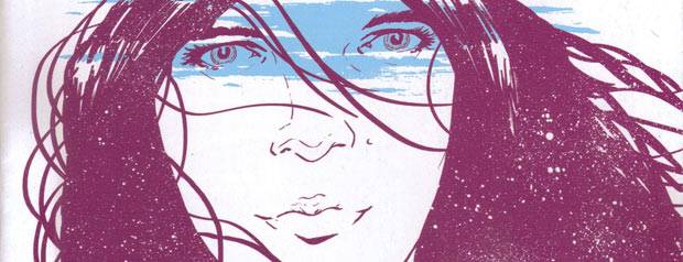
Change #3 (of 4) ("Heart Skipped a Beat") by Ales Kot (writer), Morgan Jeske (artist), Sloane Leong (colorist), and Ed Brisson (letterer). $2.99, 24 pgs, FC, Image.
This is the fourth comic book written by Ales Kot that I've read, and after the first three, I wasn't sure why people were slobbering all over him and DC was throwing assignments at him. It's not that his work was bad - I hated Wild Children, but I appreciated that he was trying something weird - and the first two issues of Change have been pretty good. Issue #3 of this mini-series, however, is very good. It balances the weirdness of Kot's ideas with very solid character work, and it continues to tease the mystery of the one guy - the guy with the black hair who seemed, early on, to represent Kot himself - until we get some stunning revelations at the end about that dude. Plus, Kot throws a surprise at us early in the book that shows he's perfectly willing to do some shocking - but perfectly logical - things in his narrative. Wallace is still looking for his wife, while the black-haired dude is trying to figure out what's going on in his life. Both of these men are having some trouble with reality, so when they are inexorably brought together, it's an interesting clash of world views. Kot packs a lot into each page, but for the first time, I felt he was really in complete command of the narrative, as even the weirdest stuff fits well into the overall plot. The problem I always have with "weird for the sake of weirdness" stories is that the character development often gets left behind (this is a problem I have with some of the God of All Comics' more bizarre stuff), but after seeding this for two issues, Kot does a nice job with Wallace pining for his wife and the other dude trying to figure out why his world seems to be so fluid. It's a good balance that I hope is the same in issue #4.
Kot makes Jeske draw a lot, and he and Leong do a very fine job with it all. Not only is Kot cramming a lot into this, the artists are doing a very nice job getting a lot of visual information into the book without being confusing. It's a strange-looking book, which is the point, but Jeske does a good job making it legible even when he's trying to try some odder things, like showing the black-haired dude through a peephole or the depths of Wallace's mind. There are some beautiful images of what looks like a flashback (time is a bit frangible in Change) where Jeske smudges things deliberately to make the memories a bit looser, and Leong uses some wonderful colors to shift our perceptions from "reality" to the odder stuff. It's a weirdly beautiful book - I'm not sure if we can call Jeske's art "beautiful" like we would call, say, Alan Davis's art beautiful, but the way he and Leong create this world is extremely haunting and lovely.
Kot is the new writer on Suicide Squad, and it seems like a lot of people are very excited about it. Kot's a new writer, so he doesn't have the juice of someone like Geoff Johns or Grant Morrison or Scott Snyder or even people like Jeff Lemire or John Layman, so I very much doubt if DC will allow him to write like this book when he gets on Suicide Squad. If there's something we've learned since September 2011, it's that DC Editorial is very, very particular about keeping their books on track, and if you're excited about Kot writing Suicide Squad, I'll just warn you that you shouldn't expect too much. I won't be reading the book, but I would be pleasantly stunned if DC allows Kot to do anything like this book on one of their mainstream superhero comics. This is why it's weird that DC goes trolling for writers with a unique "voice," because it's been pretty clear since the reboot that they're just not interested in unique voices. Is that starting to change? DC's books aren't doing anywhere close to as well as they were early on in the reboot, and maybe the cabal that runs the company is getting desperate. We'll see.
In the meantime, Change #3 is really, really good. I do hope that the finale will live up to it!
Rating: ★ ★ ★ ★ ★ ★ ★ ★ ½ ☆
One totally Airwolf page:

This is some really nice panel-to-panel storytelling by Jeske. Obviously, the first four are one panel simply chopped up, but whenever an artist does that, it adds a strange staccato vibe to what should be a fairly banal image, and the sound effects help with that as well. The shadowy smiling figure at the end of the first row haunts the entire page, obviously. We get the close-ups in the second row, and then the cutting between the dude getting out of bed and the dark figure approaching him in the third row. This is a standard horror trope, of course, but it's effectively done here, as Jeske manages to convey a sense of speed as the page moves along. Plus, there's a nice clue on the page, which, if you've read the issue, you'll understand at the end. Leong's colors imply blood, and Kot's script allows Jeske to imply the horror that comes after the page without showing us anything. It's a good design - one of many in this issue.
Crawling Sky #2 (of 5) by Joe R. Lansdale (writer), Keith Lansdale (writer), and Brian Denham (artist). $3.99, 22 pgs, BW, Antarctic Press.
There's nothing terribly unique about Crawling Sky, but sometimes you just want to read a horror story set in the Old West, and Joe Lansdale is your man in Havana for that. Plus, as I mentioned last time, I like Brian Denham's art, and it's annoying to me that he doesn't get more work with the big boys.
This second issue, however, is a bit padded. It ends with the monster, which is nice, but it meanders to get there. The reverend - whose name is Mercer, as we find out in this issue - and Norville return to Norville's cabin, where they try to figure out what the heck is going on. Mercer has some knowledge about what killed Norville's wife, and he finds a book of spells (that he seemed to know would be in the cabin) that tells him what happened. It's your basic demon-summoning story, which never ends well (see below), and he tells Norville it's their responsibility to fix things. So they prepare until nighttime, when the monster comes out of the well. Dum-dum-DUMMMMMM!
It's not that it's a terrible issue, but this is definitely showing that the series was adapted from a short story, because if this were all prose, it wouldn't be that bad, but it's just not exciting enough for a visual medium like comics. Denham does what he can - his art is as good as ever - but there's a lot of preparation, and while it's probably important, it's not that interesting. There are a couple of nice pages - a priest who used the book finds out that he probably should have left well enough alone, and after Mercer tells Norville that the book is bound in human skin, Denham does a nice job drawing Norville rubbing his hands on his clothes because he's freaked out about it - but it's too bad that the pacing of the series means that we need to wait until the last page to get the monster. Oh well - it's the consequence of "writing for the trade," and I suppose next issue will be a bit more exciting. I mean, it's MONSTER TIME!!!!
Rating: ★ ★ ★ ★ ★ ★ ½ ☆ ☆ ☆
One totally Airwolf page:

There's some really nice inking from Denham on this page. The sunlight in the first panel throws a lot of the room into heavy shadow, implying the darkness that is coming for that poor dude. In Panel 2, there's more thick brush strokes on the guy's back as he calls up whatever he's calling up, and the forest in the background is also heavily inked. Denham does a fine job with the shadow of the creature in Panel 3, as he understands that on grass, it would look less defined, and of course, the negative space in Panel 4 shows the dude's suicide. It's a very nice vignette, and Denham's use of lots of black helps make it more tragic.
Elephantmen #46 ("Sleeping Partners Part Five: The Kalpa of Decrease") by Richard Starkings (writer), Shaky Kane (artist), and Rob Steen (colorist). $3.99, 25 pgs, FC, Image.
Kane returns to Elephantmen to illustrate a typically weird story in which Starkings returns to the F.C.N. virus that has caused so much grief in this series. The virus was part of the reason why the elephantmen were dispatched to Europe in the first place, and it showed up in earlier issues of the series on a beach in Santa Monica. Starkings ties this issue back into that one, as Hip and Miki investigate a missing person report and find Harry Hazard, a dude who happened to be on the beach when the virus struck but survived, as he was buried up to his neck in the sand and had a bucket over his head (which was a prank his oversexed girlfriend was playing on him). He survived, but became irradiated and, it seems, able to pass the infection through his body, which creates spores that infect the people around him. This allows Kane to draw his usual wacky pages of creepiness, including Harry's feverish sex dreams. There's also a tremendous double-page spread where Harry believes he's become all-powerful, with Kane drawing the characters in the book as cartoons, gaping in awe at Harry's divinity. Luckily for Hip and Miki, things don't quite get too out of hand, but Starkings does tie this all back into his larger theme, which is that Mappo, the corporation that created the elephantmen, is just the tip of the iceberg. While the story is partly an exercise to let Kane go nuts, like the last time he drew the book, Starkings does manage to coax it into his greater narrative, which is nice. Kane's pop-art is always fun to see, but it's always good that Starkings doesn't deviate too far from the story he's trying to tell.
It's not surprising the book is visually striking, and it's just another example of Elephantmen doing its cool thing while being one of the best books on the comics scene. I always forget to ask Starkings if he has an end game in mind, but when the individual issues are usually so good, I don't suppose it matters all that much. I just don't want this comic to turn into Fables. That would suck.
Rating: ★ ★ ★ ★ ★ ★ ★ ★ ☆ ☆
One totally Airwolf page:

Kane nails the creepy vibe on this page, both with the way Harry kills the landlord and the way Vanessa thinks it's groovy. The final row is just disturbing, as Vanessa is transfixed by Harry's power and Starkings/Kane infantilizes her by making her suck on Harry's fingers. Kane is good at this sort of cheery-yet-uncomfortable art style, which is probably why Starkings wanted him for this issue!
Fatale #12 ("A Lovely Sort of Death") by Ed Brubaker (writer), Sean Phillips (artist), and Elizabeth Breitweiser (colorist). $3.50, 26 pgs, FC, Image.
Brubillips tells another one-issue story, this time introducing a new "femme fatale" named Mathilda, implying that whatever is going on in the main story, it's been going on far longer than Josephine has been alive. I'm a bit worried about this - we've seen so very many stories about vast conspiracies and/or dark forces that have been manipulating humanity for centuries that it's become a cliché, and I don't want to see this book turn into something boring like that. On the other hand, when they're well done (and it's Brubaker and Phillips, so, yeah), they can be pretty darned entertaining tales, so I'm keeping my fingers crossed.
The story begins in 1286 in southern France, and Brubaker ties it very obliquely into the Albigensian Crusade, which didn't officially end until 1244 - the old soldier in the book implies that he was in the siege of Montségur that ended the conflict, and he is tied somehow to a mysterious "order" that is religious but perhaps not completely orthodox. It's a clever story - Mathilda is burned at the stake in the beginning of the book, but she doesn't die, due to her nature as a femme fatale, and when Ganix finds her, he helps her recover. He is captured by the members of his "order," and while Mathilda knows it's a trap, she goes to rescue him anyway, which is a pretty big mistake. Brubaker does a nice job keeping the twists coming, and there's a nice level of irony in the ending. Phillips gets to draw some monsters, too, which is unusual in this book, where Brubaker has kept them hidden more often than not. I suppose he figures that in a more mystical era, monsters can move about and not freak too many people out, although they stick to the deep forests. But it's still interesting to see the difference in the way Brubaker approaches the horror aspects when the book is set in the 13th century.
You'll notice that Bettie Breitweiser is the new colorist on the book, as Dave Stewart, according to Brubaker, had a "scheduling snafu" (man, those hurt in some sensitive areas!) and couldn't continue on the series. That's fine - Stewart is one of the best colorists around, but Breitweiser is pretty damned good, too - and it's interesting to note some differences in the artwork. The color palette remains similar, but there are some panels that are clearly more "Breitweiserian" - the deer Mathilda sees in the forest are far more rendered than Stewart would make them, and the smoke on the final page is rougher than we usually see from Stewart but fits Breitweiser's sensibilities a bit more. It's an interesting contrast - Brubaker and Phillips have worked with, unless I missed someone, only Val Staples and Dave Stewart on their more personal projects, beginning with Criminal, so it's interesting to see a new colorist's take on Phillips's art.
Anyway, it's fun seeing Brubaker write different takes on this weird universe he's created, and next time out, he scratches an itch for a Western. As I noted, I'm a bit apprehensive about the all-encompassing nature of this monster thing, but I'm certainly willing to go along with it, because these two dudes have earned it.
(By the way, Megan Abbott's essay about The Lonely Doll is terrifying. Kids' books are freaky, man. Especially vintage ones. Damn.)
Rating: ★ ★ ★ ★ ★ ★ ★ ½ ☆ ☆
One totally Airwolf page:

This is just solid storytelling by Brubillips. The prose is concise and pointed, with the final two statements summing up Mathilda's fall from grace, as she uses her powers completely for herself and doesn't give a damn. Meanwhile, the artwork is dynamic and fluid, and while I'm never quite sure if chain mail is as shitty as a lot of artists make it seem, it's still a powerful page.
The Manhattan Projects #9 ("Brave New World") by Jonathan Hickman (writer), Nick Pitarra (artist), Jordie Bellaire (colorist), and Rus Wooton (letterer). $3.50, 20 pgs, FC, Image.
Hickman pulls everything together and sets the stage for future issues of The Manhattan Projects, although he has to skip some pretty important history - i.e., Eisenhower's presidency - to do so. After our scientists turned the tables on the weird cabal that tried to rein them in last issue, in this issue they take some revenge. So that's all it is, but because this is The Manhattan Projects, they take their revenge in the most brutal and SCIENCE! ways possible. We do find out who all those dudes in the cabal are, and then the various scientists go about killing them, ending with Oppenheimer's rather choice way to get rid of President Truman. Then, suddenly, Kennedy is in office - I guess Kennedy, with his Cuban orgies and predilection for blondes, is much more fun to satirize than boring old Ike - and the scientists have a blank check to do whatever they want (as Kennedy says, "Sure ... why not?").
There's not much else to say about the issue. It's a lot of fun, but Hickman is more concerned with wrapping things up than pushing things forward, so he does that inventively. Pitarra and Bellaire kick ass, but that's to be expected. I keep enjoying the comic. Huzzah!
Rating: ★ ★ ★ ★ ★ ★ ★ ½ ☆ ☆
One totally Airwolf page:

I like this page for a few reasons. First, I love the way Pitarra shows Laika facing down the cat and the extremely worried look on the cat's face. Second, I like Gagarin's line "Tell him science is happening!" Third, I like that Bellaire colors such a dramatic scene pink. Because why the hell not?
Mars Attacks #7 by John Layman (writer), John McCrea (artist), Andrew Elder (colorist), and Denton J. Tipton (editor). $3.99, 22 pgs, FC, IDW. Mars Attacks created by Len Brown, Woody Gelman, Wally Wood, Bob Powell, and Norman Saunders.
Layman indulges his love of 1970s clichés in this issue, as he tells a story of a mob snitch who is being chased by a bunch of Mafia enforcers, all of whom look like they stepped out of 1970s movies. That's okay, though - as I've noted before, I don't mind clichés when they're played to the hilt, and Layman and McCrea certainly do that nicely. Meanwhile, the kid who invented the Martian translator is still hanging around, and he meets the snitch - Ray the Rat - and tells him that they have a chance to fight the Martians together. Again, we get a standard cliché - the kid trusting the absolute wrong person - but when it's played somewhat tongue-in-cheek like this - as this entire series has - I can't dislike it too much. Layman isn't going for high literature here, or even something with hidden depth like Chew. He's going for gonzo action, and for the most part in this series, he's delivered. McCrea is having a blast, and the art is superb. Mars Attacks is simply fun comics. It doesn't take itself too seriously, and that's why Layman can get away with some shortcuts.
Rating: ★ ★ ★ ★ ★ ★ ★ ☆ ☆ ☆
One totally Airwolf page:

As usual, someone dies a horrible death in Mars Attacks, because that's just the way it is! Poor Johanssen - we hardly knew ye!
Morning Glories #24 by Nick Spencer (writer), Joe Eisma (artist), Alex Sollazzo (colorist), and Johnny Lowe (letterer). $3.99, 44 pgs, FC, Image.
A few weeks ago, Spencer stopped by to let me know that Morning Glories is on schedule, which was nice of him, because it's been a while since issue #23 came out (November? October?). But now we get a giant-sized issue #24, in which we get a lot of backstory on Ike, who killed his father and is a bit surprised to find that he's alive and being held in a dungeon somewhere in the academy. They're trying really hard to kill Abraham, Ike's father (yes, there's quite a bit about the Biblical Abraham and Isaac, in case you're wondering), and they can't quite do it, so they have to get Ike to do it ... again. Spencer zips back and forth between the present - Ike is trying to resist killing her father again, but they threaten Jade, and the question is if he'll let them kill a fellow student just so he can ignore their demands; while we see why Ike might want to kill his father in the first place, as Spencer checks in on him periodically as he's growing up. It gets us back to the core group, and it seems a bit more focused than recent issues have been - Spencer refers to the other events happening around campus, but he's telling a story about Ike, damn it, so he's going to stick to it! As usual with Morning Glories, there's a nice twist at the end, and Spencer sets things up pretty well for the finale of "season one," which comes in issue #25.
I assume the book is a bit late because, like that chick in this week's episode of The Following, Eisma managed to break loose of the drawing desk that Spencer keeps him chained to and make a run for it. Once again, he tasted fresh air and freedom! and he was damned if he was going to go back! But like that hapless chick, poor Eisma was hunted down like a dog, dragged back to the cellar, and his ration of Ramen noodles and hamster sweat (which is what he survives on while he's drawing so many pages of MG) was cut even further until he cranked out 44 (!) pages for this issue. Dang, poor Eisma.
(I know this is the second week in a row I've mentioned Kevin Bacon's new show, but it's just so wacky. Plus, since he's doing a television show now, which means there can be guest stars and a bigger cast, can you imagine how many new people will have much smaller degrees of Kevin Bacon? The possibilities are staggering!)
Rating: ★ ★ ★ ★ ★ ★ ★ ☆ ☆ ☆
One totally Airwolf page:

Eisma leads the reader pretty well on this page. Abraham opens his eyes, and that's the first thing we see. Then we follow his gaze up Ike's arm, and Ike's hand is positioned directly above his head in Panel 2, leading us there nicely. The knife points directly to Ike in Panel 3, leading us there. The second panel is well done, as things are often blurry when we just wake up, and we're seeing Abraham's point of view, so it's a bit fuzzy. Eisma uses the gutter well, as we imagine Ike pulling the knife out of his father between Panels 3 and 4 and swinging it around to stab him again, this time coming up from the bottom. Eisma demands that we do a lot of the work just so he can draw two panels of Ike stabbing his father, but we dig the gore, man, so Eisma gives it to us!
Mouse Guard: The Black Axe #6 (of 6) by David Petersen (writer/artist). $3.50, 23 pgs, FC, Archaia.
Could this be the final single issue that Archaia ever publishes? Since their implosion a few years back, they've been remodeling to release only really nice hardcovers instead of single issues, and several of their series from before the implosion (Miranda Mercury, Killing Pickman, et al.) were released that way. Mouse Guard, however, is their signature book, and Petersen takes so very long with each issue that it's lasted well past the point where they've switched over to complete collections. So now The Black Axe is done, and if Petersen is planning on more Mouse Guard, will Archaia simply release them in hardcovers and not single issues? These things keep me up at night. But wait! you say (oh yes you do!). Isn't The Secret History still coming out in single issues? Well, theoretically, yes. But remember what the great philosopher Homer Simpson said: "In theory, communism works." I could check the last time an issue of The Secret History shipped, but it would take a while, wouldn't it? So maybe Archaia will still publish that in single issues, because they're so damned close to the end, but I'm not holding my breath. Meanwhile, let's perhaps say farewell to the single issue from Archaia with Mouse Guard: The Black Axe #6.
...
...
All right, are we done? Good. What can I say about this issue? Petersen wraps up the story perfectly well, and it's a gorgeous comic. It will probably read better in the fancy hardcover, but that's neither here nor there. If you're not already reading Mouse Guard, the 18th issue (plus the anthology) isn't the place to start. But it's very good. I mean, duh.
Rating: ★ ★ ★ ★ ★ ★ ★ ½ ☆ ☆
One totally Airwolf page:

I love when Petersen creates art that looks like a tapestry, because he's quite good at it. That second panel is very nicely done, as Farrer carries the axe on his back, beginning a long tradition. Notice, too, that it's easy to read - it's very clear that we're supposed to go down from Panel 1 and then over to the vertical panel on the right side of the page. Petersen places the narrative boxes well to lead us, plus he puts the archivist on the left side of Panel 1 to keep us anchored there until we read his word balloon and then move down. It's not surprising it's a beautiful page, but technically, it's done very well, too.
The Order of Dagonet #3 by Jeremy Whitley (writer) and Jason Strutz (artist/letterer). $3.99, 22 pgs, FC, Action Lab.
I'm still not sure how I feel about The Order of Dagonet - the writing is pretty good, and the basic idea - that the U.K. needs saving by a bunch of celebrities - is fun enough, and while the art is a bit rough, it has its charms. But it's not that funny, and the coloring in this issue was pretty weak - after some nice work in that regard in the first two issues, this one is really bland, with that light brown you see on the cover and on the page below dominating, making it actually hard to read in places, as the word balloons are colored in the same way. In this issue, our knights end up in Wales (which allows Whitley to make more Welsh jokes) while Ian McClellan and Elton John (not really, but yes, really) end up hanging out with a bunch of centaurs. Merlin shows up in Wales and is a bit peeved that the knights haven't gotten on with it yet, and at the end of the issue, he decides to get tough and tell them, honestly, it's time to kick some ass. Or arse, if we're talking about people in Britain.
It's certainly not a bad comic book, but it feels like it could be better and Whitley and Strutz just can't quite get there. Some of the jokes land well, but some don't, and in a humorous book, that can be deadly. But it's not just that the jokes occasionally don't work - there's a je ne sais quoi that's keeping me from enjoying the book completely. Issue #4 hasn't been solicited yet (I don't think), and I'll have to think about continuing with it. We'll see, won't we?
Rating: ★ ★ ★ ★ ★ ½ ☆ ☆ ☆ ☆
One totally Airwolf panel:

You see the coloring problems on this page. Everything kind of blends together, and while the lettering in different colors does help, the brown lettering of the humans - as opposed to Merlin and the fairies - becomes harder to read when there's so much of it. Strutz's storytelling is perfectly fine, and the juxtaposition of Merlin and Bella in the final three panels is nicely done. I know why the page is colored this way - they're in a pub, and there's supposed to be a warm glow over the whole scene, but it doesn't work as well as planned, unfortunately.
Secret Avengers #1 ("Budapest") by Nick Spencer (writer), Luke Ross (artist), Matthew Wilson (colorist), Clayton Cowles (letterer), Jacob Thomas (associate editor), Lauren Sankovitch (editor), and Tom Brevoort (editor). $3.99, 21 pgs, FC, Marvel NOW! Clint Barton/Hawkeye created by Stan Lee and Don Heck. Natasha Romanoff/Black Widow created by Stan Lee, Don Rico, and Don Heck. Agent Coulson created by Marc Fergus, Hawk Ostby, Art Marcum, and Matt Holloway. Maria Hill created by Brian Michael Bendis and David Finch. Not Nick Fury created by Matt Fraction, Chris Yost, Scott Eaton, Cullen Bunn, and Paul Neary.
Two new Marvel NOW! books came out this week, with Spencer giving us a new iteration of Secret Avengers and Bendis ... well, we'll get to Bendis. Anyway, what's going on with this comic?
I'm sure you know the hook by now - missions so motherfucking secret not even the people on the missions know what they are! Boo-yeah! It's just so COMICS! it might work, and this first issue does, at least, give us a complete story even though Spencer seeds it with future plot points. I mean, it's still FOUR GODDAMNED DOLLARS, but that's not Spencer's fault, is it? Or is it ...?
So in this issue, Hawkeye (not Hawkguy - that's when he's off-duty) is captured by some bad guys and has to be rescued by the Black Widow. The bad guys don't believe that he doesn't know what he's doing in Hungary, so they torture the shit out of him. Wow, it's refreshing to see bad guys torturing people in a comic instead of, you know, Captain America doing it. Then we flash back to find out what the hell is going on. Agent Coulson tries to recruit Clint and Natasha for the brand-spanking-new Secret Avengers, and they tell him no. He convinces them, though (I'll get back to that) and tells them that he implanted "a stream of nanoparticles" in their bloodstream so that, if anything happens to them while they're on the mission, the particles will wipe their memory. That's why Hawkeye couldn't remember anything - if they're captured, the particles take over. So Maria Hill and Not Nick Fury tell them about these evil Hungarians who have a teleport system, and off they go to thwart the nefarious doings of said Magyars. Those Magyars - they don't speak an Indo-European language, so we can't trust 'em, amirite? The real point of the issue is to show us the big twist at the end, which isn't bad, and to tease the reason Coulson is able to recruit Natasha and Clint.
It's not bad, but it's a bit silly in places. First, is Daisy Johnson being the director of S.H.I.E.L.D. a thing now? Isn't she, like, younger than stuff I've found in my refrigerator occasionally? I know the Marvel U. is supposed to be a meritocracy, but how the heck did that happen? When the heck did that happen? Who decided that? It's just weird, especially as Maria Hill is "acting director." So what does Daisy do? Anyway, I don't care that much, because it's only on the title page and doesn't have much impact on the book, but I just thought it was strange.
I didn't really dig the way Coulson gets Clint and Natasha on board. I'm probably in the minority on this, but I'll explain how it happens and you can decide for yourself: Coulson says that there's a mission they would both be very interested in, and if they join the group, they'll be able to undertake that mission in the near future. They scoff at his claims, and then, as he begins to tell them what it is, there's a big red panel that reads "Redacted." We turn the page and they're both on board. Why don't I like this? Well, it's a bit of a cheat. Spencer obviously enjoys mysteries, as Morning Glories is nothing but mysteries, but why that feels better is because it seems as if we're discovering what's going on along with the characters, or at least the character who's the focus of that issue. Sure, there are plenty of people who know more than we do in the series, but take this past issue - we follow right along with Ike as he figures things out, and we already know he killed his father, so when it happens, it's not a big shock. Here, however, Spencer throws it in our face that he and the rest of the characters share a secret that we aren't privy to, and it feels ... I don't know, insulting somehow. In a lot of comics, we know there's a secret agenda, and that's fine, but the main characters might not know it, and they - and the audience - have to follow the trail to figure things out. Ironically, Spencer reveals something later to the reader that not every character knows, which is pretty cool - he didn't have to do it, so this somewhat obnoxious "Redacted" to flaunt the fact that Clint and Natasha have an agenda is weird. Like I said, though, it's probably just me. You may think it's awesome.
I do have a question about Hawkeye's Bond question. Is this the Marvel Universe Bond, where it's obvious that each actor is a new person who takes the name of Bond? I've thought for years that "James Bond" should just be a cover identity, and each actor is obviously a different person (which is the basis of Kiss Kiss Bang Bang, the late, lamented CrossGen series). Hawkeye points out what would be the only problem, I think, with that scenario - Roger Moore visits Diana Rigg's grave in For Your Eyes Only, but Diana Rigg married George Lazenby, not Roger Moore. Clint points this out, but it makes perfect sense if Roger Moore and George Lazenby are, in fact, the same person. So why is Spencer implying that they're not the same person (as cool as that would be)? Did I miss something? Is the Marvel Universe James Bond film franchise smarter than our world's?
I didn't write anything about Luke Ross's artwork yet, because I suck, but it's not bad. Ross has gotten a bit more "solid" over the years - his line work is stronger and more confident, and I imagine not having Frank D'Armata bludgeon his pencils is refreshing for him, because Wilson is a much better colorist than D'Armata is. Ross is still more of a solid draftsman than a true stylist, but the art on this book is perfectly fine. Kelly Thompson, I imagine, tore the book into tiny, tiny shreds because Natasha is inexplicably unzipped throughout (including when she's diving downward through the air, so the fact that her boobs stay inside her catsuit is pretty impressive), but that's the only odd thing about the art.
So it's a pretty decent comic. There's no way it's worth 4 bucks, of course, but I can't think of any 20-page comics from Marvel or DC that are worth 4 bucks, so that's not surprising. If you don't mind spending that much money for a single issue, this is pretty good.
Rating: ★ ★ ★ ★ ★ ★ ½ ☆ ☆ ☆
One totally Airwolf page:

The torture methods of the Marvel U. are pretty harsh, yo. That second panel bothers me - I know that the brown on Clint's head is a gloved hand holding his head back so he can swallow that thing, but it looks like weird, curly brown hair to me, and I can't stop seeing it that way! Grrrr!!!!
Uncanny X-Men #1 ("The New Revolution") by Brian Michael Bendis (writer), Chris Bachalo (penciler/colorist), Tim Townsend (inker), Jaime Mendoza (inker), Al Vey (inker), Joe Caramagna (letterer), Jordan D. White (associate editor), and Nick Lowe (editor). $3.99, 21 pgs, FC, Marvel NOW! Scott Summers/Cyclops and Magneto created by Stan Lee and Jack Kirby. Emma Frost created by Chris Claremont and John Byrne. Illyana Rasputin/Magik created by Chris Claremont and Dave Cockrum. Eva Bell and Christopher Muse created by Brian Michael Bendis and Stuart Immonen.
And then there's Bendis. Oh, Bendis. At the back of the book, Nick Lowe writes that All-New X-Men and Uncanny X-Men will be "cleverly intermingling in a giant Bendis-tapestry." Sigh. Really, Bendis? Lowe insists that you don't need to read both of them to get what's going on, but, honestly, that's only because I imagine Bendis will devote pages and pages of each issue to having two characters endlessly explain what's going on. Is it true that All-New X-Men has gone through, what, 6-7 issues already and there really isn't a plot? While I think the idea of a "giant Bendis-tapestry" is a perfectly fine idea, the fact that Marvel wants me to pay 16 dollars a month to get said tapestry is a bit much, don't you think? Yes, I hate harping on price, but Jeebus, Marvel - 4 dollars for a comic that comes out twice a month, plus 4 dollars for another comic that also comes out twice a month? How can the quality not suffer? Look at Chris Bachalo. It's a fairly common assumption that as Bachalo gets rushed, the number of inkers on his books increases. That might be apocryphal - I don't know - but this is issue #1 and he's already using three (3) (!!!) inkers. Fuck the heck, Marvel? And some of the inking is pretty bad, so already the art looks rushed. IT'S ISSUE NUMBER ONE!!!!!! How in the name of all that's holy can the art look rushed on motherfucking issue #1? Bachalo's storytelling, which varies from really strong to indecipherable, is perfectly fine on this book, but his colors on the San Diego section aren't quite as good as some other artists who color their own work (e.g., Francavilla and Ferreyra). But Bachalo gives the book a big, action-movie feel, and the double-page spreads we get in this book feel more epic, unlike some of the ones we've seen on DC books (I'm still pissed about the double-page spread of giant fucking holes in the ground in Earth 2 #1).
Meanwhile, Bendis does his Bendisey thing. Maria Hill meets a mysterious dude who tells her what Cyclops is doing, and then, at the end, Bendis reveals who it is (I mean, it could only be one of two people, so it's not that mysterious). Bendis, as usual, uses 15 words when 5 will do, and the issue is basically about Cyclops recruiting a mutant who ... causes bouncy balls to appear out of thin air? Really? Man, if you thought Kylun had a lame mutant power (he didn't, but you might have thought he did), get a load of ... the Ball Boy! Anyway, Sentinels attack, Cyclops has lost control of his power, Magneto has lost a lot of his power, blah blah blah. Maria claims S.H.I.E.L.D. didn't use Sentinels to attack Cyclops, and Mystery Dude tells her that he'll help her destroy his reputation rather than kill him (which would martyr him), and everyone goes home. Yay!
It's not a terrible issue, of course - it's Bendis and Bachalo, after all. It's just ... off, somehow. Maria Hill, the "acting director" of the most powerful intelligence agency on the planet, didn't know that Sentinels attacked San Diego yesterday? Man, information technology in the Marvel U. sucks. The Sentinels, which look like almost every Sentinel ever, are "the new kind"? Really? I hate to bring up the God of All Comics twice in a post when he didn't actually have any issues come out, but remember when Morrison's Sentinels actually were a "new kind"? How are these Sentinels any different from any other Sentinel? I know, it's a minor point, but it bugged me. Whatever. Like a lot of Bendis superhero books, I think the problem is that everyone talks the same way, so that everyone seems like the same, smart-ass, wise-cracking Bendis character. I'm certainly not as crazy as some people who think that every character should sound the way their creators wrote them, but whenever I pick up a Bendis superhero book these days, I just feel like everyone is speaking in the same voice. I know that's not a unique concern, but I see why people say that about his comics. There's nothing really bad about Uncanny X-Men, but it's just ... Bendisey. A decade ago, that was cool. Now, it's kind of dull.
Rating: ★ ★ ★ ★ ★ ★ ☆ ☆ ☆ ☆
One totally Airwolf page:

Bachalo's design is fun, because we're in the middle of a big fight and everything should feel a bit tilted and weird. Note the preponderance of orange and purple - this is the dominant color palette for the entire San Diego section, and it doesn't work too well. Bachalo's storytelling, though, is clear, which is always a plus.
The Adventures of Superhero Girl by Faith Erin Hicks (writer/artist), Cris Peter (colorist), Jemiah Jefferson (assistant editor), and Rachel Edidin (editor). $16.99, 106 pgs, FC, Dark Horse.
I haven't even read this, and it's awesome. That's how much I trust Hicks!
An Enchantment by Christian Durieux (writer/artist). $19.99, 66 pgs, FC, NBM.
I've said it before and I'll say it again - these graphic novels published in conjunction with the Louvre are pretty darned keen. I hope this one is, too.
The Manara Library volume 4 by Milo Manara (writer/artist), Kim Thompson (translator), Tom Orzechowski (letterer), Lois Buhalis (letterer), Diana Schutz (collection editor), Dave Marshall (consulting editor), and Brendan Wright (associate editor). $59.99, 218 pgs, BW, Dark Horse.
I asked my retailer if I really wanted to know what was going on with that woman below the edge of the cover, and he said "I already know what's going on," since, you see, it's Manara. I flipped through the book and it turns out that there's nothing going on - she's leaning against a wall crying because she's all alone and lost. Yet she still looks orgasmic. Well done, Signor Manara! Still, I dig these collections. Yes, they're extremely pricey, but the kids don't need to eat, do they?
**********
It's really cold in AZ these days. Well, by really cold I mean in the 50s (Fahrenheit, that is) during the day. I mean, why the hell do we endure the shitty, shitty summers if we can't sit around in February with our front doors open enjoying the 70-degree temperatures? I've actually had to extend my sock-wearing season past January, which kind of pisses me off. Come on, Arizona! You have one thing going for you, and you're blowing it!!!!
You've noticed, I hope, some of the tweaks to the blog. I can't say I love them (blue links are weirder than red, it seems), but I still miss the first template we used lo those many years ago, mainly because if I was signed in, I could edit things just by clicking on the "edit" button on the post rather than going through the back door and trying to find the post in our archives. Plus, I miss the fact that the blockquotes looked like a word balloon. That was fun. But someone tweaked the design, and that's cool, except, once again, we got a tweak in the design and tags still don't show up. Robot 6, I should point out, did not get tweaked. Why not? I think it's because they're scared of losing their tags, and whoever tweaked the design can't guarantee that they wouldn't lose the tags. TAGS RULE, MAN! Why Jonah wants us to remain tagless is a source of great mystery to me. IT KEEPS ME UP AT NIGHT!!!!! That's why I'm so grumpy when I write my reviews, don't you know.
Let's check out the Ten Most Recent Songs on My iPod (Which Is Always on Shuffle):
1. "Winds of March" - Journey (1978) "I covered you with joy to make your lifetime big and bright"
2. "Siva" - Smashing Pumpkins (1991) "Way down deep within my heart lies a soul that's torn apart"1
3. "Got the Time" - Anthrax (1990) "If I tell ya what I'm doing today will you shut up and get out of my way"2
4. "Cathedral Wall" - Marillion (1998) "And, one day, you'll give up and I will love you, but I won't know you anymore"
5. "Your Own Special Way" - Genesis (1976)3 "Won't you come out whoever you are, you've followed me quite long enough"
6. "She's Gone Away" - King's X (2000) "My house is full of things but it's just an empty home"
7. "I'm Finding it Harder to Be a Gentleman" - White Stripes (2001) "If i could find emotion to stimulate devotion, well then you'd see"
8. "Don't Change" - INXS (1982) "I found a love I had lost; it was gone for too long"
9. "It Ain't Over 'Til it's Over" - Lenny Kravitz (1991) "How many times did we give up, but we always worked things out"4
10. "Boat on a River" - Styx (1979)
1 I bought this in the summer of 1991 in New Hope, Pennsylvania. It was one of those random CDs I occasionally buy where I have no clue about the band or the music. Sometimes this policy works very well, like with this one. Sometimes ... not so much. But it's still fun to do. This kind of thing is a bit lost anymore, in an age when you can find so much on-line, but it was always fun to just rummage through the racks in record stores. Yeah, I'm old.
2 Joe Jackson cover FTMFW!
3 I've pointed this out before, but Wind & Wuthering was the second full-length, all-new album that Genesis released in 1976. True, most of the recording for A Trick of the Tail was in 1975, but they both came out in 1976. In an age when bands take years to record one album, this is pretty impressive.
4 I love Mama Said, but it's breathtaking how many clichés Lenny packs into the lyrics. This song is one long cliché, and it comes on the album right after "Stand By My Woman," which is another long cliché, and right before "More Than Anything in this World" and "What Goes Around Comes Around." Holy crap, Lenny was firing on all cylinders with these lyrics!
I hope everyone has a nice day, and I'll have to watch Zero Hour before my link post on Sunday so I can see if it truly is the worst television show in the history of television. It's sounds insanely awesome, if you ask me. I mean, I've seen some bad television shows in my time. I once watched an episode of Small Wonder, for crying out loud!