Under the jump: A buttload of comics, and probably the only thing anyone will want to talk about is a certain artist butchering a decent script. What about the gun-toting bear, people? What about him?????
Buck Rogers #1 ("Future Shock Part One: One Giant Leap ...") by Scott Beatty (writer), Carlos Rafael (illustrator), Carlos Lopez (colorist), and Simon Bowland (letterer). $3.50, 22 pgs, FC, Dynamite Entertainment.

I love that goofy ray gun on the cover. It's so 1930s.
I was impressed with the short zero issue of this series that actually began at the ending, which means now we go back to the beginning and see how Anthony "Buck" Rogers ended up in the future. Beatty seems to take some time finding his footing, as we begin in what's clearly the future, and then Buck has a flashback to his time period (the "present," although it's clearly more scientifically advanced than we are, so maybe the near future?), and then it gets a bit tricky. Buck lands his experimental, gravity-driven spacecraft (Beatty does a nice job skimming the science so that it sounds good but doesn't require too much thought), gets clonked on the head when he refuses to let the military seize it, and then he's back in the future for the rest of the issue. Obviously, we're missing something here, and I can only assume Beatty is going to get back to how he actually got to said future. It's a bit strange, but once we get back into the future and Buck gets rescued by Colonel Deering, the book gets much better. And then, of course, there's the bear with the big laser cannon:
Yes, it's just that awesome.
All in all, this is an intriguing set-up, much as the zero issue was an intriguing tease to how Buck got into the situation. Rafael's clean lines are a bit of the Dynamite house style, which is fine, as it fits the futuristic tone of the comic well. And I assume John Cassaday designed the black uniforms with the glowing lines on them, and bravo, as they're nifty and sleek and a certain colonel looks pretty danged good in one.
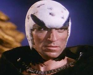
Dynamite has done a good job picking up these old public domain characters, and it's nice to see that they seem to be keeping that tradition alive. Of course, this series brings up the possibility that Beatty will bring back Hawk:

And isn't that what we really all want to see?
Channel Evil #1 (of 4) ("Don't Touch That Dial!") by Alan Grant (writer), Shane Oakley (artist), Suzanne O'Brien (ink assistant), and Jamie Grant (letterer). $3.99, 20 pgs, BW, Renegade Arts Entertainment.

Channel Evil, I fear, will be one of those comics that I'll have to find on-line if I want to keep reading it, because I can't imagine Previews will carry it. Alan Grant obviously isn't a big enough name in comics these days to sell books. He's the reason I ordered this, because I love his Batman work from twenty years ago, but as it turns out, this comic is much better for the art than the story. That's not to say Grant's story is lousy, because it isn't. An attack talk show host in Blackpool goes to see a woman who channels an ancient spirit, so of course he has to get her on his show. When he does, however, it appears that a malevolent spirit possesses him, which freaks him out. He tries to forget it, but that night he dreams of a horrible crime that occurs at the same time, which provides an appropriate "dum-dum-dummmmmm!" ending. It's a nifty little horror comic, with an intriguing set-up, and Grant makes Jez Manson (the talk show host) appropriately smarmy (he gets a sexy actress to fart on-screen, thereby possibly ruining her chances of moving up in the world), which is nice to see.
Oakley's art, however, is what makes the issue. He has a bit of Darwyn Cooke in him, with a very retro-mod feel that works well with the book's black-and-white aesthetic, as Oakley draws some remarkable panels using shadows to suggest shapes rather than drawing them. He has a severe angular style on some pages, which makes the crime at the end, for instance, seem both dream-like (as Manson is, technically, dreaming it) and horrific (which it is). It's a dynamic look for the book, which is good, as there's very little action. Oakley takes Grant's script and makes it more exciting than it is (again, it's not bad, but it's not exciting, exactly), which is a neat trick.
I haven't seen a second issue solicited, which bums me out. You can read the first issue for free at Renegade's web site (follow the link!), and I assume I'm going to have to mail-order the rest of the series. But it's a neat comic, so I don't mind!
Fables #85 ("The Great Fables Crossover Part 7 of 9: A Pair of Jacks") by Bill Willingham (writer), Matthew Sturges (writer), Tony Akins (penciller), Andrew Pepoy (inker), Dan Green (inker), Lee Loughridge (colorist), and Todd Klein (letterer). $2.99, 22 pgs, FC, DC/Vertigo.

Yawn. Another issue focusing mainly on Jack, which means I spent the entire issue wishing someone would punch him in the neck. Even though his ruse of being Boy Blue is broken in this issue, he's still a jerk. I was hoping Bigby's kids would be the only ones to see through him, but even they fall for his schtick. Oh well. Next issue Fables will be rid of him and we can get back to the good stories. I can wait.
Hotwire: Requiem for the Dead #3 (of 4) ("Deep Blue") by Steve Pugh (writer/artist/letterer) and Warren Ellis (crazy idea guy). $2.99, 22 pgs, FC, Radical Comics.

Gianluca Glazer, Radical's director of marketing, sent this and another comic down below to me recently (well, I think he sent them), and I'd like to thank him for it. As always, Radical doesn't always put out good comics, but they put out nice diverse books, which is keen.
Of course, this is one of their good comics, as Pugh keeps kicking the kraziness up a notch on every page. I don't want to give too much away, because Pugh is having a lot of fun with this and it's nice to just go along with the ride, but when we get to the ghost with a million tiny razors suspended in his magnetic field, you know you're in batshit insane genius territory. The ghosts are an Ellisian touch, and I'm not sure if he or Pugh came up with them, but the visuals are all Pugh and all brilliant. It's one of those books that is so nice to look at, and the fact that the story is wildly entertaining is almost secondary. Still, the shit has hit the fan by the end of this issue, and I'm very keen to see what happens next.
The Life and Times of Savior 28 #3 ("The Whole World is Watching") by J. M. DeMatteis (writer), Mike Cavallaro (artist), Andrew Covalt (colorist), and Neil Uyetake (letterer). $3.99, 22 pgs, FC, IDW.

By killing the main character in the first issue, DeMatteis allows us to view all his actions prior to his death (as the book has done, filling in his life) and the actions of his killer through an interesting prism, in that we're watching all the ways he pissed off the wrong people. This way of telling a story has been done before, of course, but that doesn't mean it's not effective - we know that Savior 28 gets killed, so that allows DeMatteis to delve into his motives and actions without the audience always worrying what's going to happen to him. He gets killed, people!
In this issue, we see how Savior 28 tried to bring peace to the world and how difficult it was. What's fascinating about this issue, in particular, is that DeMatteis explodes the myth that people generally want peace - we may say we want it, but what we really want is to be entertained, and as long as Savior 28 is that, the people in this comic don't really care what words come out of his mouth. In this way, this becomes a critique as much of modern society as it has been of the political machinery that doesn't want peace because there's no money in it. In each issue, DeMatteis adds another layer to the story, which is always appreciated.
Cavallaro's been doing a good job with the art, and the splash page where Savior 28 snaps is stunning, as Cavallaro makes our hero crazed and, seemingly, bigger than when he's calm. I imagine this was a conscious choice, and it's very neat.
Anyway, I know this is 4 bucks, but with Marvel and DC creeping toward that price for all their books, there's no reason to shun this!
Overlook #3 (of 3) by Joshua Williamson (writer) and Alejandro Aragon (artist). $3.50, 22 pgs, BW, Image/Shadowline.

Overlook, unfortunately, isn't really that good, mainly because Williamson never rises above the clichés of the modern, Tarantino-esque noir genre - there's a Mexican standoff in this book, and a woman gets shot in the head - but it's not a total failure. Mickey Nicholson, our main character, has a couple of nice moments that make him more than a stock character, and Aragon's art is very nice, as it's been throughout. He does all he can to lift the script from mediocrity, and although he doesn't quite succeed, he still gives the comic book a lot of verve, and the fact that Williamson doesn't completely screw things up means that this is at least entertaining, even though it doesn't really earn the emotional moments that Williamson is going for (the aforementioned shooting in the head, for instance). I'd like to see Aragon doing something else, and I hope he gets the chance.
Sherlock Holmes #2 (of 5) ("The Trial of Sherlock Holmes Part Two: A Locked Room") by Leah Moore and John Reppion (writers), Aaron Campbell (artist), Tony Aviña (colorist), and Simon Bowland (letterer). $3.50, 22 pgs, FC, Dynamite Entertainment.

It's very difficult to judge this book two issues in. The set-up has been set up, with Holmes, at the end of last issue, standing over a body with a smoking gun in his hand, and so now Watson and Lestrade have to solve the mystery even though they've been officially warned off of it. Holmes, of course, has ideas of his own, and the end of this issue finds him back on the streets, ready to work. There's more evidence against Holmes, and the visit from the diplomat to consider, plus that bomb from issue #1. That's the problem with trying to judge this - what's important and what's not, which things are clues and which are red herrings? The mystery is certainly intriguing, and Campbell's art is nice, but it's hard to really say whether it's good or not, as this, like some mini-series, is very much a series of chapters and not mini-stories in their own right. This doesn't stand alone at all, so it's premature to say it's working or not. Such is the pattern these days with many comics.
Shrapnel: Aristeia Rising #5 (of 5) by M. Zachary Sherman (writer), Bagus Hutomo (artist), Leos "Okita" Ng (colorist), and Sean Konot (letterer). $2.99, 42 pgs, FC, Radical Comics.

As I've pointed out before, you may or may not like Radical's offerings, but every once in a while, we get a comic like this, which features 42 pages of story for 3 dollars. That's value!
I haven't read all of this mini-series, because the fine folk at Radical didn't send me an issue (and, unlike Hotwire, I wouldn't buy this on my own), but the gist of it is easy to get: freedom fighters on Venus fighting invaders from Earth. Damn those Earthpeople! This has been a fairly simplistic five-issue series in that it's basically a lot of shooting by people dressed in very similar suits of armor, making it very difficult to determine who's shooting at whom. We can always track our heroine, Samantha, but otherwise, it's tough to tell the good guys from the bad guys. In earlier issues, Sam had some issues with an incident in her past, but I must have missed her getting over that, because it's not mentioned in this issue, as Sherman concentrates on the ass-kicking.
Hutomo and Okita's art is problematic, as it's been throughout the series, not because it's awful, but because the colors are so very murky, so it's even more difficult to figure out what's happening. Lots of people are getting killed, I get that, and I don't mind the battle scenes being a mess of confusion, as I imagine that's what battle is like. But the scenes where Sam infiltrates an enemy spaceship and seizes it are tough to figure out, too, and that's frustrating. This comic has a real video game feel to it (at least how I imagine video games to look, as I don't play them), and it's an interesting experiment to see if the art can reflect the kinetic nature of video games and even movies, but the problem is, of course, that we're dealing with static images, so when they look like still photos from a movie, they don't work all that well. There has to be a difference between the way movies look and the way comics look, because they're different media. Someone forgot that here.
But it was still very cool of Radical to send it to me!
Soul Kiss #5 (of 5) ("Erase/Replace") by Steven T. Seagle (writer) and Marco Cinello (artist). $3.50, 24 pgs, FC, Image.

I'm not terribly sure why every chapter of Soul Kiss was named after a song on the latest Foo Fighters album, but I'm sure there's a pertinent reason for it.
As I've mentioned before, I want to like Soul Kiss a lot, but now that's it's over, I can't really say that I did. Ultimately, Lili's predicament and subsequent solution doesn't grab me, as her deal with the devil, which stemmed from a very serious situation (an attempted rape), becomes a bit corny over the course of the series, and then, when Seagle tries to re-establish some seriousness in this issue, Lili's problem with Damon seems small and not worth it. There's a strange tonal problem with the entire book - it's unclear what, exactly, Seagle is going for here. Damon's "crime" does not seem to fit any punishment Lili or the devil can mete out, and Lili eventually gets a pass for her actions, too, which makes this terribly inconsequential. I certainly don't mind inconsequential entertainment, but when it's set up as a girl making a deal with the devil so he saves her from rape, it seems like it ought to be.
The revelation of the series, as I've said all along, is Cinello's art. He has a very nice blend of whimsy and horror - the full-page scene of Damon in hell is beautifully icky - and his Satan is both scary and officious, which is neat. I haven't seen Cinello's work before, but it's a nice style that seems very versatile.
It's unfortunate this series doesn't quite work. Seagle is a good writer, and some of that is in evidence in this series, but it doesn't hold together as a whole. It's too bad.
Storming Paradise #6 (of 6) by Chuck Dixon (writer), Rick Burchett (penciller), Jackson Guice (inker), Wildstorm FX (colorist), and Patrick Brosseau (letterer). $2.99, 22 pgs, FC, DC/Wildstorm.

Here's yet another concluding issue of a mini-series, and I really don't have a lot to say about it. Storming Paradise started strong, but when it took months for issue #5 to come out, and Guice stopped drawing it (Burchett is fine, but he's not quite as good as Guice, even though Guice inks him), and it seems like Dixon simply stopped writing it at the end of a convenient sixth issue rather than at the end of the story. I'm sure he plotted out the whole thing before he started, but it feels like this is simply a series of vignettes about the American invasion of Japan, with no central narrative holding it together. The best part of the series has been the tale of the Japanese-American soldier being used as a translator, as he experiences racism from his own ranks and a peculiar guilt over fighting in his ancestral home, and that story plays out in this issue, but it's weakened by the other main story, which is about the Japanese and Germans trying to detonate an atomic bomb near the American fleet. Dixon wraps up the subplots he introduced in this series, but then he leaves things hanging, which would be fine if, for instance, the story had been solely about Jimmy, the translator, and once his story resolved, the point is that the war has really just begun. But the series began with the Americans not being able to use the atomic bomb, prompting the invasion of Japan, and it ends with another atomic bomb detonation and the invasion still going on. What has been accomplished? Nothing, it seems. It's a frustrating ending to a frustrating series, mainly because of the way it's presented. Actual war, of course, rarely ends cleanly, even if peace treaties are signed. That's fine if Dixon wants to show that this invasion will go on seemingly endlessly, perhaps comparing it to another invasion that seems endless (I don't have any idea if Dixon had Iraq in mind when he started this series, but I'll draw the comparisons anyway). However, that's not the way the series is presented. As a six-issue, relatively mainstream comic book, it's presented as something that will resolve, and Dixon messes that up. You can argue that it's not presented that way, but if Dixon wanted to make this about the consequences of a long-term invasion and how hard it will be to sustain, he doesn't do a very good job of it. A mini-series that is solely about the invasion of Japan and what the Americans find there would have to be much longer and, to be successful, at least take it to the bloody end. Dixon doesn't do that here, but he doesn't concentrate enough on individual soldiers' stories to make it worthwhile in that regard, either.
Dixon can write very good war series. Two of his recent ones, The Iron Ghost and Team Zero, spring to mind. Storming Paradise loses its focus, which is why it's far less successful. It's too bad.
Uncanny X-Men #511 by Matt Fraction (writer), Greg Land (penciler), Terry Dodson (penciler), Jay Leisten (inker), Rachel Dodson (inker), Justin Ponsor (colorist), and Joe Caramagna (letterer). $2.99, 26 pgs, FC, Marvel.

Yes, it's another issue of the most vexatious series out there! What will tie Greg in knots this time?
As you recall, I didn't have that much of a problem with Greg Land's art last issue. I thought the fight between the X-Men and the Sisterhood was well done, and even though I still don't want to read a Land book, I didn't hate the art. Well, that was a minor blip, apparently, as he's back to the creepy porn tracings this time around, and the action panels are poorly put together, as if the figures are simply placed in them with no regard to how they relate to the other figures in the same panel. Psylocke's battle on the psychic plane is nicely done, however, even though Betsy herself doesn't look Asian in the least. (As an aside, whenever my wife and I see someone like Betsy, whose body is supposed to be Japanese but looks like any other Caucasian nude model, we think "That guy's not Chinese." This is in reference to an old Margaret Cho bit, in which she talks about watching Kung Fu when she was growing up and thinking that about David Carradine. That's exactly what I thought when I saw how Land drew Psylocke.) I've reached a point with Land that I grit my teeth and deal with it, especially if the writing is decent. Luckily, most of the time Land draws books that I don't care about, but in the case of Uncanny X-Men, it's annoying because of Fraction.
Of course, the writing on this book has been wildly uneven, but this issue is actually fairly well done. It still reads a bit like fanfiction, as Fraction has brought back Psylocke and Dazzler (which I applaud, of course, as I love them both) for no good reason, really, except that he likes them and wants to write them. That's fine, but I don't like when mutants simply show up in books because they felt like stopping by. This is part of the problem I mentioned about last issue - Fraction doesn't have any set team in mind, simply cherry-picking mutants that he wants to use, like Domino in this story. What was she doing there, except to give Fraction a chance to bend some odds, like he does in this issue? Will we see her again? Probably not. That's lazy storytelling, because there's always a mutant lying around that can counter any threat you can come up with. If Domino isn't in this story, Maddie wins. But that's the only reason Domino is there.
But I said this was a fairly well done issue, didn't I? Well, yes, mainly because of the resurrection of Psylocke. Her confrontation with Alison is handled nicely (although Dazzler claims she can hear people falling in love and getting their hearts broken, meaning she has damned good hearing; plus, as she's a singer who was once associated with disco, I wish she had quoted ABBA when she was talking about the city being a symphony), as is the battle on the psychic plane. Even Scott's final chat with Maddie is done well. As usual with this book, pieces of the brilliant Fraction peek through, but it doesn't come through enough. Oh, and writers really need to stop making Scott comment on anyone else's romantic peccadilloes. He's pissed about Logan keeping a lock of Jean's hair? Really, Scott? Maybe you shouldn't abandon one wife and then cheat on another if you want to act all high-and-mighty. Seriously, X-writers - stop reminding us that Scott's a dick.
Next issue is the one in which Beast and his X-club decide to visit the San Francisco earthquake (presumably; I think the text said they were going back to 1906), and I'll pick that one up, but then we get the Avengers crossover, and I think I really have to skip that. It's still nice to see Betsy and Alison back, though, isn't it?
The Unknown #2 (of 4) by Mark Waid (writer), Minck Oosterveer (artist), Fellipe Martins (colorist), and Marshall Dillon (letterer). $3.99, 22 pgs, FC, Boom! Studios.

Waid continues with the mystery of the stolen casket, and Catherine philosophizes about the weight of the soul, which she thinks is ridiculous. She and Doyle track the box onto a train, where the book takes a very weird turn. Waid does a good job getting across some crucial information and then letting Oosterveer cut loose, which he does when a weird "Asian golem with needles for fingers" (to quote Doyle) attacks the two. The scene where the golem chases them through a passenger car is absolutely terrifying, and Oosterveer does a marvelous job with it. He also does a fine job with Catherine's visions, blending them easily into the rest of the book. And finally, the book ends with a nice twist.
As with Sherlock Holmes, it's difficult to gauge the mystery, but so far, both writer and artist have done a fine job with the setting and the intrigue. The ending might eventually miss the mark, but the first two issues have been quite a nice read.
Unthinkable #2 (of 5) by Mark Sable (writer), Julian Totino Tedesco (artist), Juan Manuel Tumburús (colorist), and Ed Dukeshire (letterer). $3.99, 22 pgs, FC, Boom! Studios.

The first issue of this series covered about a decade, and it felt rushed. Now, one would think that Sable, having exposited enough, would slow down a bit, but this book still feels rushed. It's very weird. Alan Ripley and his think tank gang decide to try to stop what's happening (which is, if you recall, based on scenarios they came up with), but forces keep trying to stop them. I haven't read a lot by Sable, but he seems to have an issue with slowing down - it feels like he's in a hurry to get to the cool parts, so he doesn't completely explain the slow parts. Ripley, for instance, walks into his father's private military complex and just walks off with weapons for their operation. His father knows he's doing it, but doesn't stop him. Then his dad gets angry that Ripley used his weapons to blow shit up. Well, why didn't he stop him in the first place? Ripley didn't lie to him and say they were using it for something else, he simply took them. Then there's a double-cross that is squelched immediately, robbing it of any tension. We fly along through the issue, with events barely registering, and it's a shame, because the plot is certainly intriguing, and Tedesco's art is quite good. Sable, however, never stops for breath, and it makes the book seem more shallow than it should be. It's a five-issue series, so it would seem that Sable wouldn't need to hurtle through it, but we'll see what he has in store for us in the next three. I'm not willing to give up on the book, but I hope it gets better.
The Unwritten #2 ("Tommy Taylor and the Bogus Identity Chapter Two") by Mike Carey (writer), Peter Gross (artist), Chris Chuckry (colorist), Jeanne McGee (colorist), and Todd Klein (letterer). $2.99, 22 pgs, FC, DC/Vertigo.

Carey follows up the strong first issue with a good second issue, as Tom begins his quest to discover his roots while some creepy dude tracks him. The creepy dude does creepy things to things which is quite ingenious, given what Carey is writing about. Meanwhile, there's a new Tommy Taylor book! Oooh! Carey does a very good job bringing the fiction into the real, as when Tom descends a flight of stairs (yes, it's quite a spooky scene, despite the description). There's also an effective scene when Tom has a flashback to an event with his father, which shows that this going to be something a bit more horrifying than we thought.
Gross is, naturally, very good, especially on the second page, when the fictional Tommy opens a door that he doesn't want to open, and Gross gives us a splash page that's beautiful but scary. Gross is rarely flashy, but he makes everything believable, from the odd world Tommy glimpses to the horrible flashback Tom has. Gross knows what he's doing, and it's nice to see him working on a book with Carey again, as they obviously have a nice synergy.
I usually give new books that I get a few issues, and so far, this is looking like a winner. Which means, of course, that it won't last a year! Darn. Maybe I'll be wrong!
The Veil #1 ("Vile") by El Torres (writer) and Gabriel Hernandez (artist). $3.99, 22 pgs, FC, IDW.

I picked this up on a lark because I liked Hernandez's art, and I'm glad I did. It's a cool comic. We're introduced to Chris Luna, a private investigator whose clients are, well, dead. They tell her what they know about who killed them, and she solves the crimes that might otherwise go unsolved. She receives a letter from Maine (where she grew up) that her Aunt Emma has died and left her the house in which she lived. The town council wants to buy the property, so Chris heads back to her home town to make sure she gets paid well. There we learn that she was in a train crash years earlier which left her with the ability to talk to the dead. Then she visits the house, sees her aunt, and realizes she'd been murdered. It looks like she has a case!
It sounds like a standard horror comic, and it is, to a point, but El Torres makes it work, and Hernandez does a fantastic job making it even better. One of the reasons I like horror comics a lot more than horror movies is because of comics' static nature (yes, this is the second time in this post I'm going to compare movies to comics). Movies seem to have taken the easy way out by having things just jump out or making certain nightmarish images flash across the screen. It's shock value, but it's not really horror, is it? Comics are different, as we can study the images much better, so they have to be more effective. Hernandez does a fine job with those images that, in a movie, would flash across the screen and simply surprise us. In this book, we look at each image and see what Hernandez is doing and how it ties into the rest of the book. His dead people, as well, work nicely, as he makes them surreal even in the context of the book, which doesn't feature "realistic" art for the most part. It's a solid story made better by the art.
Who doesn't love well done horror comics? Give it a try!
X-Factor #44 ("Dirty, Sexy Monet") by Peter David (writer), Marco Santucci (artist), Valentine de Landro (penciler), Pat Davidson (inker), Craig Yeung (inker), Patrick Pizzalunga (inker), Jeromy Cox (colorist), and Cory Petit (letterer). $2.99, 22 pgs, FC, Marvel.

Yes, that's really the title of the story in the issue. Luckily, it's the only awful pun in the book (although Jamie does say that there's no crying in noir, which is humorous). David keeps the future story cooking, as Jamie visits someone in Detroit who can help him solve the mystery. But the bulk of the issue is taken up with the present mystery, as Monet and Darwin decide to take over guard duties from Longshot (which leads to an odd admission from everyone's favorite extra-dimensional lucky dude which I've never heard of before - I wonder if David made it up), which leads to an interesting cliffhanger. David, of course, pulls the rug out from under the readership once again, as the ending is very weird and comes out of nowhere (at least I think it does). Maybe I missed a clue or two (and no, the word Monet said last issue doesn't count). But it's a yet another nifty issue, proving once again that David really is a master at the 22-page format.
Of course, I wonder about Siryn's theology. I don't think Jesus works quite the way she thinks he does. Or maybe he does. Can you say he doesn't?
Damn, that's a lot of comics. Fire it up, people! But first: totally random lyrics!
"And if you make me your religion
I'll give you all the room you need
I'll be the drawing of your breath
I'll be the cup if you should bleed
I'll be the sky above the Ganges
I'll be the vast and stormy sea
I'll be the lights that guide you inland
I'll be the visions you will see"
Dang, I love that song. But what song is it?