If you’re a habitual reader of superhero comic books, or, worse still, a writer whose primary focus is the comic book medium and industry, chances are you’ve been thinking about DC Comics pretty much constantly this summer. It’s been hard not to, given the ambitious, controversial scope of the publisher’s upcoming relaunch, and the way they’ve managed to keep the conversation going by carefully doling out information about it at their own pace.
And, when you think about DC Comics these days, chances are you’re thinking of Jim Lee’s versions of the characters.
Beyond his current role as the company’s co-publisher, Lee’s become the company’s defining artist (ironically, perhaps, without actually working on a regular comic book series for quite some time). He’s the guy who draws the public face of the company’s stars.
Click on dccomics.com, and you’ll see Lee’s Justice League as the banner. Click to the company's The Source blog, and you’ll see a Lee-drawn Trinity as the banner. Lee designed all of the characters for the publisher’s DC Universe Online video game. Lee redesigned much of the DC Universe for their upcoming relaunch (and quite radically so compared to the more modest DCUO designs). It was Lee who drew the company’s Google doodle a while back, and a great deal of DC-branded merchandise, from tennis shoes and to action figures, features Lee versions of the characters.
The pervasiveness of his visual influence extends to many of the artists chosen to work on the characters’ comic books, and the style in which they’re depicted—DC is too big a publisher to really have a house style, but there’s a loose majority style in which Lee’s influence is rather apparent.
So with visions of a high-collared Justice League dancing in my head as they usually do (Confession: I think about the Justice League the way some people you might encounter on a big-city street think about the CIA and mind control), I was at my local library the other day and noticed a big, huge, atlas-sized tome sitting on a cart, awaiting to be filed back where it belonged.
The cover featured a dramatically-lit Trinity, an outcropping of rock hiding their feet, standing above giant gold letters reading “ICONS” and “Jim Lee.” Picking it up—with an “Oof!” and the thought, I really need to start working out again—I saw that it was actually Icons: The DC Comics and Wildstorm art of Jim Lee.
Naturally I brought it home to pore over, thinking it might be some sort of Rosetta Stone to how Lee went from the guy who made Jeph Loeb’s totally random "Hush" story arc into something readable to becoming the guy who will define DC Comics for a generation (if the relaunch works out as they seem to hope it will, otherwise he might become known as the guy who made DC’s superheroes look silly for a few years in the 20-teens).
If nothing else, the book was about the size and weight of the Rosetta Stone.
I should note that this is not the Jim Lee book I would most want to read. The introduction gives a brief overview of his career, which I found fascinating enough to want to read more about it (Did you know he was studying to become a doctor, which might explain why his sense of anatomy is so much better than some of his early nineties superstar peers? Did you know he only gave himself one year to break into the comics industry, before returning to medicine? That’s crazy, but he did it!). And throughout there are quotes on various subjects from him regarding his technique and his thoughts on characters to be sort of tantalizing to process junkies, but it’s mostly just a tease of information here or there.
This, then, isn’t a work-focused biography of Jim Lee, nor a process-oriented survey of his work, nor an critical or aesthetic assessment of his work and influence between the time he founded WildStorm and the random, mostly non-comics work he did for DC after All-Star Batman and Robin, The Boy Wonder went on its hiatus. Icons came out in 2010, and thus doesn’t cover some of Lee’s work that is just now becoming apparent (His work on the relaunch, the fact that he’ll be drawing Justice League hopefully monthly-ish).
Now, while I’d prefer to read those sorts of books about Lee—books I imagine will come at some point—it’s not really fair to criticize a book for not being what I’d prefer it to be, is it?
Icons is a big (9.5-by-12 inches!), fat (296 pages!) collection of Lee’s covers, sketches, pin-ups, panels from his comics work and other, lesser-seen images. It’s a coffee table book devoted to a pretty big chunk of the artist’s career, and one that makes an extremely convincing case for why Lee is currently superhero comics’ most popular artist, and the fact that he deserves much of that popularity on the basis of how talented he is.
Appreciation of art—any art—is subjective, of course, but I don’t think the same can be said of the recognition of the quality of art, and seeing some of Lee’s work from the aughts re-presented out of context, and at such a huge size, and often in different states of completion, certainly drives home the fact that, love or hate certain aspects of his style and aesthetic direction, that Jim Lee cat sure can draw.
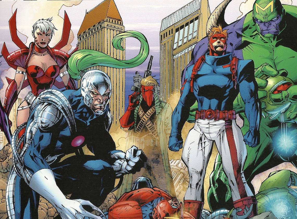
Rather than moving chronologically, the book is divided into chapters based on characters, which has the unfortunate side effect of putting most of Lee’s good stuff at the front of the book (his work on the big DC heroes), before it dwindles off into shorter and shorter sections featuring his WildStorm creations like WildCATS, Gen 13 and others I had forgotten even existed(Deathblow, DV8, Divine Right).
The effect, then, is that the book begins with Lee’s best work (his most recent) and going backwards to his earlier nineties stuff, when his skills weren’t as sharp as they are now, all of his characters tended to look alike, and he was working from designs that were springing out of his own early nineties imagination, rather than ones that were refined by decades of the greatest superhero comics artists.
Luckily, it ends with a nice a gallery of his Vertigo covers and pin-ups (and man is it weird seeing Lee’s Spider Jerusalem, Death of the Endless and DMZ) and then a gallery of random images from throughout the entire span of his career covered here. The book, then, does end on a high note. Oh, and then there’s a ten-page Legion of Superheroes story Lee drew exclusively for Icons, a story in which Lee and Paul Levitz appear as characters.
Fans of Lee’s should like this, skeptics might find themselves converted, or at least look at his work in a new light—myself, I was not a fan of his work until more recently, and appreciated the way in which the book allowed me to see Lee improving by comparing pieces from one period to another in the book.
As for what it says about the future of Lee and the DCU he's become such a central part of, it was a reminder that costume design is not Lee’s strongest suit—there’s a brief section on his redesign of Kyle Rayner’s Green Lantern costume (the one with the ribbing and dog-collar, which lasted from 2002 to 2006), and sketches showing attempts at redesigning Batman and Robin for All-Star, although all of these were eventually abandoned in favor of fairly standard costumes for both (Batman getting a big, blocky, Sprang-y Bat-symbol to differentiate him from Lee's "Hush" era Batman).
The costume design in the Wildstorm section strikes me as something of an aesthetic nightmare, although it’s difficult to judge the effectiveness of the design with the audience from a remove. Certainly many of those characters wore those costumes for a long time, without changing them, or changing them only slightly, so a significant chunk of readers must have been able to look at this

without getting dizzy and thinking they never wanted to look at another superhero comic. I can't say the same.
I don’t know if it’s simply the demands of the format of this book or if it’s telling that the vast majority of it comes from covers and other such single-image work, rather than panels from inside comics, or sequences from comics.
Lee eventually got quite good at expressions and drawing emotions in his characters, but the panels chosen are almost all splash-pages, with the rare exception of a sixteen-panel grid page from ASBaRtBW #2, in which Batman and Dick Grayson talk in the cockpit of the Batmoblie.

Even stripped of words, you get a sense of the conversation, and the intensity of the emotional content.
After spending a few hours looking at Lee’s last few decades full of work, and thinking about where he excels and where he doesn’t, I’m actually more excited to read Justice League #1 later this month than I was before. I still think all of the costumes look worse than they did before the redesign, and I still think Lee versions of the standard costumes would have been an even bigger draw to readers, but I’m intensely curious about how Lee and writer Geoff Johns will work together.
I think Lee’s best storytelling work was on All-Star Batman, and on that particular project he was working with a writer who also happens to be one of the best and most influential writer/artists to draw superhero comics (Frank Miller). Johns’ scripting tends to play to the bad habits of artists—a lot of splash pages (too many for a 20-page book, if you ask me), pages with only three-to-five panels, climaxes that turn on sudden, unexpected appearances.
I hope Johns manages to bring out the best in Lee, or at least allow him to continue to grow as a storyteller as well as an illustrator, although the fact that Johns is "just" a comics writer, rather than being Frank freaking Miller, makes me have my doubts.
But either way, after this retrospective look, I’m curious to see what Lee can draw in 2011 and beyond. He's become the face of the DC superhero line, and in the coming months he'll have the opportunity to prove whether or not he can be a much more vital organ, perhaps even its heart.