"Watchmen" is a bit of a paradox: It's considered to be one of the greatest comic book series ever created, though its feature film adaptation is considered one of the worst.
RELATED: LOOK: Alan Moore's "Jerusalem" Cover Revealed
Explaining why that is, a new YouTube video from kaptainkristian's -- "Watchmen - Adapting the Unadaptable" -- breaks down what makes the seminal work so difficult to adapt.
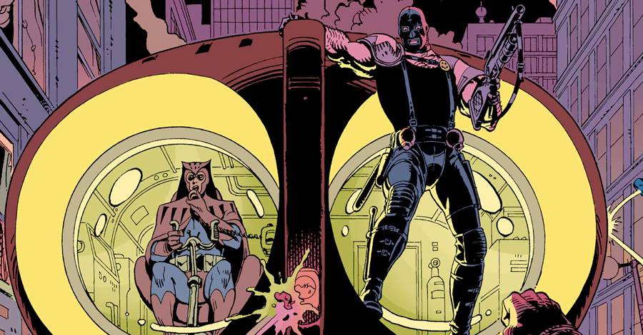
The video, which is both visually artful and incredibly informative, first walks through what made the original comic book series, penned by Alan Moore and illustrated by Dave Gibbons, so unique -- from the visual continuity of panels, to the atypical color choices for the medium. The takeaway is what many know already: "Watchmen" is a deconstruction of the comic book form, and its take on comic book storytelling was the first of its kind.
RELATED: Why Would Doctor Manhattan Alter the DC Universe?
This, argues kaptainkristian, is what makes the property so hard to adapt. Among other strong example, he argues that the nuance of the secondary color palette, proposed and executed by colorist John Higgins, is lost in Zack Snyder's darkly lit 2009 adaptation.
Ultimately, kaptainkristian concludes that "Watchmen" can't be faithfully adapted because it is so intrinsically tied to its medium of origin.
Check out the video below:
RELATED: HBO Confirms "Preliminary Discussions" About "Watchmen" TV Series
This isn't kaptainkristian's first outing into critical media examination. On YouTube, he's got a slew of other videos, from "FLCL - Journey to Maturity", to "X-Men - Color and Costumes," among others. If you've ever wondered about what goes into making a successful visual story, kaptainkristian's channel is a good place to start.