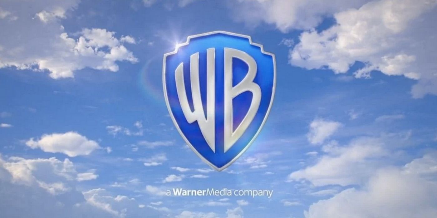
Warner Bros. revealed the updated version of its animated logo last week, after debuting the first version of the rebrand in 2019.The latest version of the iconic "WB" logo made its debut in a short clip posted on Twitter, after first appearing ahead of the new HBO Max Original Film, Locked Down. The 2021 edition of the logo is nearly identical to the one teased in 2019, but features more pronounced silver in the letters, as well as a new silver border that frames a brighter blue shield. While the "W" and "B" remain in the center of shield, they are better balanced, and the shield icon is thinned out.
Warner Bros. announced back in 2019 that it was working with Pentagram, the world's largest independent design consultancy firm, to modernize the logo ahead of the studio's upcoming one-hundredth anniversary in 2023. When the logo debuted, it was presented as two basic versions: a flat primary emblem and a more dimensional logo. The more dimensional version was requested by the TV and film divisions of Warner Bros. to be used on big screens.
"As we approached our centennial, we thought it was the right time to take a good look at our brand, what it stands for and the values it represents," Warner Bros. CEO Ann Sarnoff said at the time. "We know that a strong brand gives us not just a road map but a sense of purpose." She added, "It puts our feelings of pride into words. And it helps us communicate who we are to our employees, our creative and business partners, and our fans around the world."
The studio also revealed it was looking to update the logo in order to bring the studio more in line with 21st-century sensibilities. According to Fast Company, Pentagram created a specific typeface called Warner Bros. Sans "that evolved from the 'WB' of the shield." It was also revealed that the font was inspired by the Art Deco style of the '20s and that the font intended to "allow the brand to still be present if the shield wasn't there."
The WB logo has been reworked a handful of times since first debuting in 1934. The original logo featured a similar lettering style to the 2021 version, as well as the words "Warner Bros. Pictures." The network dropped that phrase when the logo was revamped in 1984, and added the words "a WarnerMedia company" below the shield, which remains.
Source: Twitter\@thecartooncrave, via ComicBook.com

