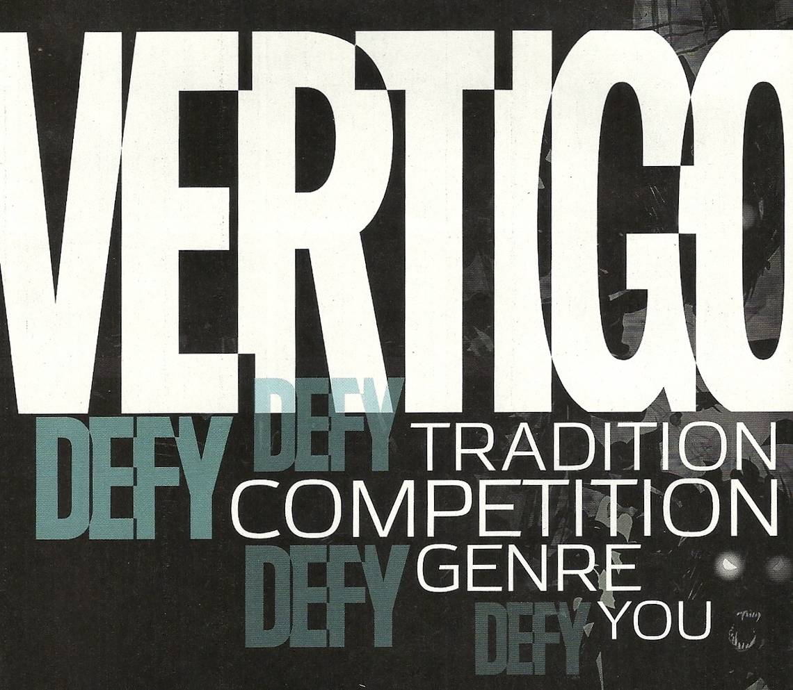

DC Comics' Vertigo imprint has been the subject of a lot of speculation over the past year or so, due to a variety of portents: the departure of founder and longtime executive editor Karen Berger; the end of the imprint's longest-running title Hellblazer, with the character reclaimed by the DC Universe in Justice League Dark and Constantine; the debut at Image Comics of several comics that, not long ago, likely would've been pitched to Vertigo; and the launch of the offbeat Dial H, by none other than acclaimed author China Mieville, in the New 52.
There was the perception that the imprint's branding had become confused, with books that used to fall under to the dissolved WildStorm imprint (and seem like better fits for the DC brand) appearing under the Vertigo banner (superhero comics Astro City and Tom Strong, movie adaptation Django Unchained). And then there were the low sales and cancellations.
Well, Vertigo's still around. It launched The Wake, a limited series by American Vampire and Batman writer Scott Snyder and Sean Murphy, and the imprint has plans for a new Sandman miniseries and a Sandman spinoff. And in the last few months, it has launched enough new series to be considered a wave.
So what does that mean for the future of the imprint? I'll be damned if I know. However, I do know it's not the most important question in my mind. Of greatest import to me, as always, is whether the comics are any good. So let's take a look at the the beginnings of Vertigo's latest crop, excluding The Wake, which I think it's safe to assume will find an audience.

Coffin Hill #1
Written by Caitlin Kittredge
Drawn by Inaki Miranda
Colored by Eva de la Cruz
This book made for a nice companion to The Witching Hour, the most recent of those big anthology one-shots Vertigo has been producing regularly under the title of an old, mostly forgotten series, presumably to maintain some sort of trademark claim (in this case, it was a 1969-1978 series, which Vertigo briefly resurrected as a Jeph Loeb/Chris Bachalo miniseries in 1999). As with many of the stories in The Witching Hour, Coffin Hill prominently features a more modern riff on witchcraft and is the product of a talented and exciting creative team.
The downside is that, unlike those shorts, it's supposed to maintain a reader's interest for ... I don't know, let's say forever, in monthly, 20-page, $3 installments.
Don't get me wrong; it's good. It's well-written and the art is pretty great (exceptionally so, if judged by the standards of the publisher's New 52 line). But while there's a great deal of craft and skill to appreciate, and while it's a thoroughly professionally made product, I was unable to find a hook in it, at least not one that snagged me and made me excited, or even interested, in what happens in the second issue.
Here's the premise to Coffin Hill, as it unfolds in the debut issue: A rookie Boston cop with the unlikely name of Eve Coffin and the even more unlikely delicate good looks of a model-turned-actress appearing in a police procedural, finds a body and cracks open a serial-killer case that's been bedeviling the city's police department.
Is she lucky? Is she a great detective? Or did she have some sort of supernatural aid? Sounds like the pitch for a new television drama, right?
Then she gets shot in the head, and we flash back to her teenage years in Coffin Hill, Massachussetts, where she's the rebellious teenager in her decadent, old-school New England family, rumored to be descended from witches that escaped Salem ... which sounds a bit like a pitch for another new television drama. Perhaps putting two such pitches into the same comic makes for something more exciting than your average, "Adapt Me, Please!" movie pitch-as-comic. She and her friends perform some magic, and something terrible happens.
Back in the present, Eve survives her head wound, although it's given her white highlights (or she bleached part of her hair in the hospital; Kitteridge doesn't discuss the character's hair care in the text), quits her job and returns to Coffin Hill.
Both of the plots, which are intertwined in ways not yet revealed, sound like those of television series I wouldn't watch, and, likewise, I don't feel much interest in reading this comic.
Miranda's art is pretty incredible, and he's great with character work. Every human being in the book, including the many crowd scene "extras," have their own distinct looks. The main characters are all sharply designed, and dressed in equally sharp clothing. And he is an excellent pen-and-ink actor. While I'm not terribly eager to read future issues of Coffin Hill, I'm certainly eager to look at them, and will keep an eye out for Miranda's work wherever it appears.
The cover is by Dave Johnson, one of the better cover artists in the business, and while his red, white and black image is a strong one, and the overall design attention-grabbing, it's kind of too bad it's his work we see once the cover, and not Miranda's, as it's his show inside.

Collider #1, FBP: Federal Bureau of Physics #2-3
Written by Simon Oliver
Drawn by Robbi Rodriguez
Colored by Rico Renzi
This poor comic ...
Vertigo managed to publish exactly one issue of it under its original title of Collider (which had a pretty incredible logo), before having to change it to the rather pedestrian-sounding FBP: Federal Bureau of Physics, not to be confused with B.P.R.D. (Bureau for Paranormal Research and Defense) or OCT (Occult Crimes Taskforce) or FVZA (Federal Vampire and Zombie Agency),or any other alphabet-soup comic series. Changing titles between the first and second issues can't be the best way to sell a new series.
The good news is that after a slow (I'd even say dull) start, the FBP has gotten much more interesting, proving to be much more than its somewhat-generic sci-fi backdrop, in which a near-future federal agency deals with breakdowns in the laws of physics, like losses of gravity or temporary incursions of other universes into our own.
By the second and third issues, after the main character and a few of the supporting ones have been introduced, we start to get the makings of a espionage/thriller plot taking place among the unusual organization and its unusual work. That is, it's not really about the job so much as about the conflicts and (still-emerging) characters who work at that job. And the science. Oh, God, the science!
Credit where credit is due: Oliver certainly gets to call this comic science fiction, as there are a couple of pretty hard-science conversations in each issue, and while I'm a part-time, semi-professional comics critic and not a physicist (just in case there were any confusion on the matter), it all sure sounded like real rather than comic book science.
The book's greatest virtue remains Rodriguez and Renzi's artwork, which is always highly stylized and colorful, and gets even more so when something weird happens or the characters find themselves in an alternate universe. All of the artists mentioned in this column are good ones, and all of these books are visually accomplished, and while I think they are all different enough that I wouldn't really be able to say any of them is the best, the Rodriguez and Renzi team certainly provides the artwork that I found to be the most exciting.

Hinterkind #1
Written by Ian Edginton
Art by Francesco Trifogli
In 2007, author Alan Weisman released a very well-received non-fiction book titled The World Without Us. In it, he explores questions raised by a sort of thought experiment: If all of humanity suddenly disappeared, what would happen to the world we left behind as it tried to recover from out presence and reclaimed the spaces we carved out for ourselves? (That was the same year the latest screen version of I Am Legend was released, in which Will Smith eked out survival as the last man in a New York City that nature was in the process of taking back).
Edginton's new series opens with a setting reminiscent of the two. At some point in the future, New York is being gradually covered over with vegetation, animals of all sorts roam its streets and rooftops (I give up; how'd that zebra get up there?) and a small village of human beings live like hunter-gatherers. One of them is a girl with a bow and arrow, which is pretty big at the moment, right?
Between excerpts from "The Book of Monday" starting to fill readers in on what's transpired between our world as we know it and the world of Hinterkind, Edginton and Trifogli introduce us to a small cast of character, including the girl with the bow, her platonic male friend who has a secret so terrible he's set on exiling himself, and her grandfather, who's leaving the village to check on another little outpost of humanity whose radio suddenly went dead.
The setting and interpersonal conflicts proposed in the first half or so of the book seem interesting enough to propel a serial narrative for a while (not unlike past Vertigo hit Y: The Last Man, Hinterkind offers a post-apocalyptic quest in which the exact cause of the apocalypse is left as a mystery to be solved).
And then on Page 21 a pack of "ligons" (rather than ligers or tigons ) show up, only to be killed by a six-armed, human-eating giant on {age 25, which leads to a scene featuring a bunch of fantasy characters: some orcs, a talking horse with three horns, and a fairy with a mohawk and sawed-off shotgun.
So there; that's different than The World Without Us, isn't it?
I was a little surprised to see that development, which I've just spoiled for you, as there was already a hook to the book before I found a second hook.
Trifogli's artwork is realistic in tone, and has a slight touch of roughness to its linework of the sort not usually associated with the imprint's output. The style is well-suited to the setting and characters, as the drama comes from seeing the real world made different, and it's therefore those differences rather than any unique rendering that matters most.
The fantasy-character designs all look pretty generic, but it's possible there's a reason why they look like that, a reason not given in this first, oversized issue.
As with Coffin Hill, Vertigo has a completely different artist with a completely different style handle the interiors: Greg Tocchini, whose painterly cover featuring a pretty woman, a boy with a tail, a giant, a fairy and a tiger suggests another Fables spinoff.

Trillium #1-2
Written and drawn by Jeff Lemire
Colred by Jose Villarrubia and Lemire
After establishing himself as one of the most sought-after writers of the New 52, cartoonist Jeff Lemire returns to Vertigo for his second series there, following his 2009-2013 Sweet Tooth. While the look of the book seemed to be Generic Sci-Fi, Only Drawn By Lemire, the first two issues were surprisingly engaging ones, and I'm not typically a fan of the either true science fiction or the more Star Wars-like space fantasy.
The first issue was a flip-book, introducing two characters from different times and places as they go through journeys and, at the climax, meet one another. So the starting point is the ending, and the two comics in the one book lead up to it. It's a neat idea, and a good you-really-have-to-read-the-comic book-not-the-trade gimmick, because how do you collect a flip book like that ...? (I guess I know the answer: The publisher picks one to print before the other and then prints them both right-side up, but it won't "work" right, not like it does in the single-issue format.)
One-half of that first issue features a space lady in a more or less generic setup that felt a bit like a lot of movies, and reminded me a bit a dulled-down Keif Llama plot. (That's Matt Howarth's comic about a space lady doing non-fighty-y stuff in space; Howarth's own series for an adult imprint of DC was the 1997 mini Star Crossed, for the short-lived Helix imprint. In my dreams, he's currently writing and drawing back-ups in Green Lantern Corps.) The other half features a battle-addled World War I vet leading an expedition into the jungle in search of a lost ruin. Eventually, they end up in the same panel.
The second-issue is not a flip-book, but finds Lemire playing with different points of view in a different way. The two characters, now both at the base of the ruins of a temple in the Amazon jungle of 1921, spend almost the entirety of the issue trying to figure one another out. Because they don't speak one another's language though, Lemire has letterer Carlos M. Mangual occasionally render their dialogue as a series of dashes with punctuation. They talk to one another throughout the book, but the reader can only understand one of them at a time, and our ability to read the dialogue see-saws from character to character, apparently depending on who is saying the most important thing at the time.
Apparently, the pair share exactly one word in common — the title of the comic — and each believes they've seen the other before, despite the fact that he's from the early 20th century and she's from the late 38th century.
If Lemire's quirky artwork — particularly by Vertigo standards — and the mysteries in his plotting aren't enough to grab readers, the inventive ways of telling the same stories more or less simultaneously from two different points of view should do it. After the first issue, I was interested to see whether Vertigo was actually going to publish a monthly flip-book, and if the book would remain as interesting if it weren't told in that fashion. The second issue gave me my answer, as Lemire achieved a similar effect through a different technique. Now what's he do with Issue 3?