Vanesa R. Del Rey was working in animation when she made her professional comics debut last year with BOOM! Studios' "Hit." The four-issue miniseries received acclaimed for Del Rey's sense of design and the style she utilized in the noir comic. On glance through the series' pages, and it's easy to see why she was a nominee for the Russ Manning Promising Newcomer Award.
Del Rey is currently drawing BOOM!'s miniseries "The Empty Man," the fifth issue of which arrives this month. BOOM! is also releasing "Hit: Pen & Ink" in October, part of its Pen & Ink line which collects two issues of inked art, showcasing an artist's work alongside commentary and sketches in a 11" by 17" format. The third artist to receive this treatment, following in the footsteps of Brian Stelfreeze and Humberto Ramos, Del Rey spoke with CBR News about the book and her approach to working in comics.
CBR News: How did you start making comics? And more specifically, how did you end up drawing "Hit?"

Vanesa R. Del Rey: In college, I took a graphic novel class at Ringling College of Art and Design. My teacher was George Pratt -- that's how I got started. I didn't do it professionally though until I did "Hit." That was my first published book.
I got an e-mail one day from Dafna Pleban at BOOM!. I was working in animation at the time, and she wanted me to test for a series that was coming up, but it didn't work out. She then referred me to Eric Harburn, my editor for "Hit," and Bryce Carlson, the writer of the series. I turned in a couple of test pages and they loved them.
While you were working in animation, did you aspire to work in comics?
I'd say so. But I wasn't really in a hurry. It just happened. It was a fast switch. [Laughs]
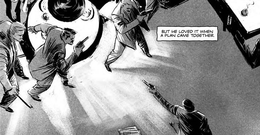
In the notes for "Pen & Ink," Bryce mentioned that the test pages they had you do were actually printed in the final book.
Yes -- it was pages twelve and thirteen in Issue #1, I think.
He mentioned that one thing they really liked about the pages was the location headers you used. Throughout the issue, there are a number of design elements like the location headers, the sound effects, that are really interesting.
When I did the test pages, the only thing I knew about the series was that it was set in the 1950s, in L.A. There was a location caption in the script, so I found a font that was minimalist and retro, and I decided to integrate it to the page as a design element. I don't know why. It seemed fitting, with the palm trees on that page. I decided to throw it in. For the sound effects, I looked at other comics for reference. It is actually pretty difficult to figure out where to place onomatopoeias and how to design them. I had to learn how to do that -- I'm still learning.
That interest in not just illustrating the script, but designing the page is something that we don't necessarily expect from an artist making their professional debut.
Everything is about design, really. George Pratt talked about that in his class. To tell stories effectively, you basically have to design it to convey a feeling. It goes from the script to the layouts of the book and the design of the page, to the title pages to sound effects -- all of that is included. I just automatically approached it in this manner.
As you're pencilling and inking the book, to what degree are you thinking of the page as finished when you send it in. You know it will colored, but how much is it finished for you?
Well, I have a deadline. [Laughs] I've got to think about that. I can only do so much detail. When do I consider it finished? I don't think I do. [Laughs] I just have to send it off.

This is only the third "Pen & Ink" collection BOOM! has published. What was your response when you were told about it?
I was excited about that. The book showcases my work in its raw form. You'll see the gritty nature of the genre and the time period the series is set in. That high-contrast lighting defines the atmosphere of the story. "Hit" was meant for "Pen & Ink."
You have another miniseries you're drawing which is coming out now, "The Empty Man," also from BOOM!. How did you end up drawing it?
They pitched the series to me. It's a horror book, and I wanted to experiment with that and see what I could do with storytelling, so I said yes.
Do you read horror and crime? Are these genres you like and are interested in?
I do like horror and crime stories. Mystery is very enthralling. The uncertainty that keeps you on the edge of the seat and makes you anxious is so thrilling. My style lends to those genres, wouldn't you say so?
I think so. You're very interested in tone and mood and in creating an atmosphere around the characters and the action taking place.
I am. I think I'm a little influenced by baroque art and definitely noir films. The stories I have illustrated so far have been pretty dark and moody. I've gotten a chance to play with those influences. I wonder if it could work on a romance book?
Maybe a dark, bittersweet romance?
[Laughs] Maybe. Or a dark comedy. That would be fun.
One really striking aspect of "The Empty Man" are these triangular panels and these complex page designs. Is that in the script or was that all you?
None of that is in the script. [Writer] Cullen [Bunn] doesn't give me direction as far as the design of the page goes -- just what's happening in the panel. It all started when I got the synopsis of the book and I read about the cults involved in the story. The first thing that came to mind was the Heaven's Gate mass suicide and the triangular blankets that were covering the bodies. That led to the idea of an icon, like the cross, for this religious cult and the character of Reverend Markoff. I continued to use triangles throughout the series later on as a design element to accentuate moments in the story.
It works, because this concept of "The Empty Man" is an invasive force and the triangular panels give that physical sense of invasion and warping the way you typically lay out the pages.
Yeah, it feels penetrating and unsettling. It's a very strong shape.
There's a scene in first issue where they're chasing a guy, and Jensen takes the guy out. You were very consciously cartoony in that moment, exaggerating the length of her arm in a way that was striking.
I like to keep the energy in my drawings to show movement. There might be some manga/anime influence with a little bit of storyboard looseness in my action scenes. It's just about trying to convey the action with that stylization. Playing with proportions and angles.
You have small moments like that throughout both books.
Definitely. I like to keep the drawings alive.
It fits with your style. You're not trying to be photorealistic.
Exactly. I think photorealistic would feel a little stiff for my taste. It's a style choice.
For "The Empty Man," have you enjoyed designing the creature and some of the other horror elements?
I have. The description I got from Cullen was a bit different from the final design -- the initial look for the creature was less humanoid. It is supposed to be like a nightmare in the physical world, an insect mixed with a reptile from another dimension. I designed it with more human features to hint at the idea that this bizarre creature could come from a human mind that has been through some sort of alien reality. And it's manifesting physically in the world of The Empty Man.
In "Pen & Ink," Bryce commented that you were the one who "got" the character of Bonnie, which is an interesting thing for the writer to say.
It's always exciting for me to design characters and figure out their personality and manner. It's like being an actor. Female characters particularly are a lot of fun, especially a mysterious siren like Bonnie. Being a woman seems to help knowing how to bring a femme fatale to life.
I think all women have a little bit of a femme fatale in them. Don't you think? [Laughs]
You said, that not me! [Laughs] Now, looking at the pages in "Pen & Ink," are there any you'd like to redraw?
[Laughs] I don't think so. I can't think about that. I would redraw all of it and try new things out. I learned a lot from those two issues!
The deadline came and went you moved on to the next page or issue.
Yeah. I put in as much as I can, and then I just have to turn it in. It's never really finished. I'm always thinking I can be better. I'm left with the experience gained to use on the next project.

