While the X-Men film franchise has had its ups and downs over the course of its 17-year history, one of the consistent complaints from fans throughout the series’ lifespan has been the rather uninspired costume designs thrust upon the iconic characters over the years. Starting in the original X-Men -- in which the team were saddled with a dull, uninteresting leather uniform -- it seems the franchise’s creators were looking to distance themselves from the comic books as much as possible to garner credibility with critics, ironically unaware of the genre’s explosion in popularity with both critics and fans over the following years.
RELATED: Totally eXcentric: The 15 Most Twisted Versions Of The X-Men
Even in the franchise’s later instalments, the X-Men’s costumes appear to be somewhat bland, taking small pieces of inspiration from the source material without ever fully embracing it or allowing the characters’ individual styles to truly shine. While this is often frustrating for fans of the mutant supergroup, what’s even worse is that concept art for the films are often starkly different from the final product -- usually looking way better than anything that showed up in the movie, which makes the fact that they remain unused sting that much more. With that in mind, here are 15 mind-blowing unused costumes from the original X-Men trilogy.
15 MAGNETO

While there’s no question that Ian McKellen’s turn as the nefarious Magneto in X-Men is nothing short of iconic, the character’s costume in the movie hasn’t exactly aged gracefully in the 17 years since its release. Donning a purplish-black suit with a traditional villain’s cape and a clumsy-looking helmet to match, the whole ensemble is very much a product of the early 2000s -- a time in which most studios were afraid to fully embrace the intricate and often flamboyant designs of the characters they were using.
In this unused concept art for Magneto however, we see the exact opposite -- with Magneto’s design very closely resembling his comic book counterpart’s, complete with horned helmet, red bodysuit and ornate metal accents. Although perhaps a little impractical for live action, this is a near-perfect design for Magneto, and would’ve really captured the imposing, grandiose presence of the classic character.
14 DARK PHOENIX

The Dark Phoenix Saga remains one of the most famous and well-loved stories in the history of the X-Men -- and for good reason. It’s intense, exciting and emotional, and serves as the culmination of a truly fantastic character arc for Jean Grey. Unfortunately, X-Men: The Last Stand didn’t quite live up to the expectations of fans in this regard.
The lackluster portrayal of the terrifying Dark Phoenix was perhaps the movie’s most egregious flaw, completely derailing an already unstable movie and leaving fans dissatisfied. Looking less like a powerful cosmic entity and more like a possessed character from a cheap horror movie, Dark Phoenix’s design wasn’t always supposed to be this way. Original concept art reveals several different variations, the most interesting of which shows Phoenix taking on a much more fiery form -- which would’ve made the character far more intimidating and accurate to the source material.
13 WOLVERINE

It’s certainly true that X-Men is one of the most important superhero movies ever. Not only did it pave the way for the legion of mainstream comic book movies that followed, but it also showed critics and audiences that comic book movies can be taken seriously whilst remaining fun. Unfortunately, it seems that the creators of X-Men felt it necessary to sacrifice some of the more ostentatious aspects of the comics in order to appeal to a wide audience, including the X-Men’s iconic costumes.
Opting for a minimalistic, black leather uniform, the X-Men’s individual looks were scrapped, with Wolverine in particular suffering. It seems this wasn’t always the plan, as Wolverine’s classic yellow and brown costume was initially intended to make an appearance, before the powers that be shot it down -- effectively killing Wolverine’s chances at donning one of his famous outfits (something fans still haven’t seen).
12 CYCLOPS

Arguably the figurehead of the X-Men, Cyclops is the model student of Xavier’s School for Gifted Youngsters, as well as the de facto leader of the mutant group. Sadly though, the character was somewhat shafted in the original X-Men trilogy, taking on a more antagonistic role as Wolverine’s love rival than a hero in his own right, before being killed rather unceremoniously in X-Men: The Last Stand.
The biggest issue though is that the character ultimately comes off as bland -- something that’s not helped by the boring costume he dons throughout the movies. Another example of the concept art being much more interesting than the final product, this piece by Tim Flattery reveals that Cyclops almost wore a variation of his traditional blue and yellow X-Men uniform, combining the iconic color scheme of the comic books with an all-new costume design.
11 ROGUE

A beloved (and incredibly powerful) character in the comics, Rogue was handled questionably in the original trilogy, with the character failing to resemble her comic book counterpart in almost every way. While the creators of X-Men at least gave Rogue her famous white streak of hair -- eventually -- the rest of Rogue’s classic look is frustratingly absent from the movies.
It looks like the minds behind X2: X-Men United were toying with the idea of upgrading her look in the sequel however, as this concept art shows the character sporting one of her more well-known looks -- the hooded green cloak. Also, the art also shows a more revealing outfit consisting of a sparkling white shirt, jeans, and arm-length leather gloves. Whether or not this look was intended to be more casual or an actual costume is unclear, but it’s still more interesting than what fans got.
10 BEAST

One of the founding members of the X-Men, Beast was initially slated to appear in Bryan Singer’s original X-Men, but the character was eventually scrapped due to budgetary concerns. Subsequently intended to have a small role in X2, the character was once again removed from the project in response to fears of an overpopulated script. Finally showing up in X-Men: The Last Stand -- which had a significantly meatier budget -- Beast’s look was surprisingly accurate to the comics.
In fact, most of the original concept art for the character was relatively similar to the final look -- with one distinct exception. While this concept art still depicts the character as blue and furry, it’s the huge bat-like ears that set it apart from the others. It’s a strange look for Beast, and was likely made to imitate the character’s classic hairstyle, but ultimately wasn’t implemented into the final design.
9 MYSTIQUE

The design of Rebecca Romjin’s Mystique in the original X-Men trilogy is extremely impressive, combining the comic books character’s light blue skin with dark blue markings, riding the line between sexy and scary perfectly. Sure, the movies didn’t give Mystique any of her classic outfits (or any outfit at all), but the spirit of the character remained intact in her design. Believe it or not however, the original concept for the character was even more unique.
Clearly reminiscent of a cobra, this version of Mystique has hair that sits solidly above her head in a sort of dome -- resembling the hood of a cobra -- and even has the thick “scutes” found on the underside of a snake running down the front of her body. She also has Mystique’s famous skull emblem fixed to her forehead, perfectly combining classic elements of the character’s design with a completely new look.
8 LADY DEATHSTRIKE

Initially appearing as one of William Stryker’s henchwomen in X2, Lady Deathstrike immediately proved to be more than a match for Wolverine as the two adamantium-clad heroes engaged in a lethal sparring match, echoing their antagonistic relationship in the comics. Much like the X-Men themselves however, Deathstrike was also lauded with a lackluster leather suit in place of her other, more recognizable costumes in the movie.
Ignoring the classic “brown cap and shoulder pads” look that’s since become her most well-known, concept artists still decided to give Deathstrike a much more sinister look than what was eventually released, as shown in this rather gothic-looking design. Pale, with red-tipped hair and a scaly, revealing costume, this concept art makes Lady Deathstrike look like the terrifying villain she was always intended to be, and while X2’s version of the character was still pretty great, this design would’ve made her that much cooler.
7 JEAN GREY

One of the few entries on this list that actually strays further from the source material, Tim Flattery’s initial design for Jean Grey is quite odd. First off, let’s address the elephant in the room: Jean’s blonde hair. Given Jean Grey’s iconic status as a fiery redhead, it seems strange that the studio would have changed this aspect of the character for the movie -- perhaps another actress was initially in mind for the role?
Either way, it’s a little jarring. On top of that, Jean’s suit isn’t closely reminiscent of any of her comic book costumes, blending the blue and yellow X-Men colors with some red for good measure -- maybe in an attempt to echo her Phoenix costume. Still, looking at the whole ensemble you’d be forgiving for not recognizing the character at all -- in fact she actually looks closer to Magik than Jean Grey.
6 JUGGERNAUT

One of the sillier aspects of X-Men: The Last Stand, Vinnie Jones’ Juggernaut felt ripped from a completely different movie. Donning a concrete-looking version of the character’s classic domed helmet, the character never quite looked right in the movie as the helmet simply isn’t big enough. Normally drawn as a huge, brown, shoulder-to-shoulder headpiece, the majority of Juggernaut’s concept art matches this original design pretty closely, but there’s one piece of concept art that’s even sillier than the version shown in the movie.
A large purple helmet with blunted, black spikes protruding from its top and sides, the costume also has a contoured shoulder piece complete with body straps that make the Juggernaut look like an unfortunate extra from Xena: Warrior Princess. It’s such a strange design that it’s almost enough to make you thankful for the final version of the character.
5 SABRETOOTH

Receiving a visual retcon of sorts between X-Men and X-Men Origins: Wolverine, Sabretooth’s get-up in the two movies is dramatically different, although the original concept art for the character seems to sit somewhere in the middle of the two designs.
The art is pretty crudely illustrated, but depicts a Victor Creed that dresses in the raggedy, patchwork furs he’s introduced in back in X-Men, while dialling back on the overgrown eyebrows and facial hair that made the character design look a little off-putting -- instead favoring the mutton chops we see the character sporting in X-Men Origins: Wolverine. Sticking more closely to this design would’ve allowed audiences to take the character more seriously, and would’ve also bridged the confusing visual gap between the two films featuring the character.
4 JASON STRYKER

Debuting in X2: X-Men United, Jason Stryker is a powerful mutant with the ability to create illusions in the minds of his enemies, and also happens to be the son of the villainous William Stryker. Under the orders of his father, he attempts to project an illusion into Professor X’s mind to trick him into killing all the mutants.
Appearing rather pale, malnourished and dishevelled, the movie version of Jason has a sort of old-timey mental institution aesthetic that’s effective, but the initial concept art shows a much more sci-fi inspired design. Jason’s mental illness seems to be more profound in the art, too, needing a complicated support system to keep his head up as the chair he sits in pumps an ominous green liquid around his body.
3 PROFESSOR X

As most fans of Professor X are probably aware, his getup is more often than not pretty sharp, usually opting to wear a swanky three-piece suit as opposed to a more practical costume. This tentative costume design made for X2 however, shows Professor X clad in rather unusual attire.
Dressed from head to foot in white, Xavier dons an odd-looking suit with several straps running down its torso and arms, looking almost like the kind of outfit seen in a hospital, mental institution or even prison. In fact, the costume looks curiously similar to the one Magneto wears at the end of the movie as Professor X visits him in prison. Perhaps something more sinister was initially intended to happen to Xavier in an early draft of the script, only to be scrapped later in development.
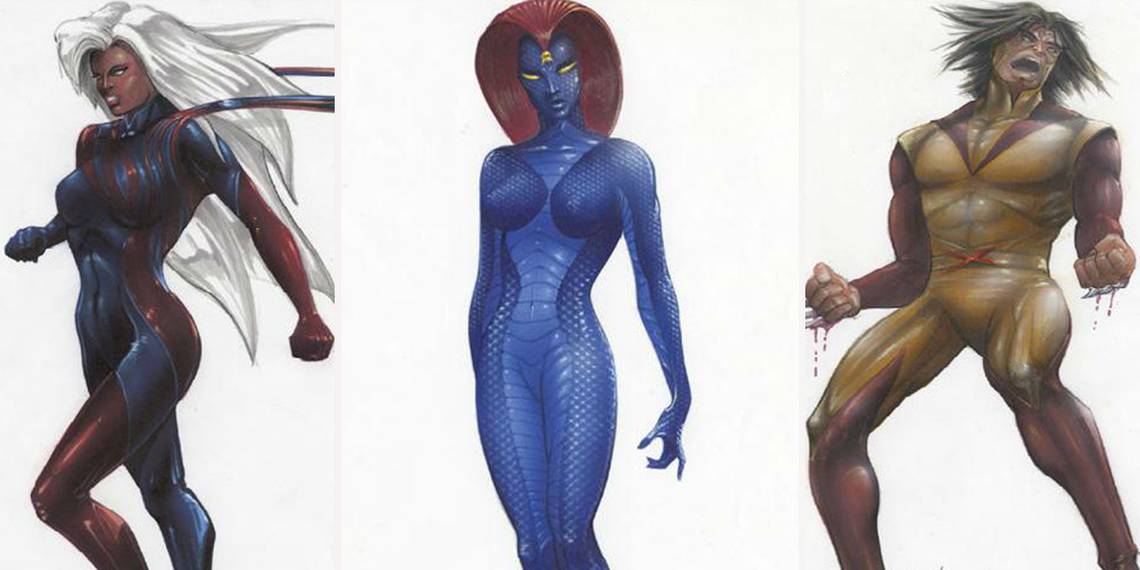
2 STORM

Another victim of the rather dull X-Men costumes in the original trilogy, at least Storm was afforded a cape to go with her all-black outfit. Still, this doesn’t do much to capture the majesty and power of the character’s various comic book looks, with her suit merely blending into the background along with the rest of the team’s suits.
What’s interesting to note though is that concept art for Storm in X-Men is much more colorful and interesting than what fans ultimately got in the films, despite not resembling any of her more iconic comic book costumes. A sporadic mixture of blues and reds, the skin-tight outfit could almost be mistaken for body paint, if not for the cape stemming from the shoulders of the costume.
1 NIGHTCRAWLER

Perhaps the most drastically different design on this list, it appears that the creators of X2 initially planned for a much different-looking Nightcrawler, complete with white patches of skin on various parts of his body. One design shows a rather familiar-looking Nightcrawler, only the bottom half of his face is white, while another image shows the character with a white face, neck and arms, with the blue parts of his skin forming an improvised T-shirt.
The final design on the right depicts an all-white Kurt sporting a trench coat, hat and sunglasses, presumably as a disguise from disapproving humans. Whether or not the white parts of Nightcrawler’s design are painted on purposely by the character or whether they’re part of his natural skin color is unclear, but it seems that the former is much more likely.
Did you like these outfits better than what ended up on screen? Let us know in the comments!