Ah the original Sam Raimi Spider-Man trilogy. The first cinematic Spider-Man to really connect with millions of fans incorporated some fantastic villains into his appearances. Green Goblin was an incredibly intimidating adversary blended with some superb character development as Peter grappled with his adopted father figure, Norman Osborn. He then sought advice during Spider-Man 2 from the world renowned scientist, Otto Octavius. The two were even briefly friends before a terrible accident twisted Otto’s mind. And who can forget that genuinely unnerving scene in the hospital, where Sam Raimi brought his Evil Dead expertise to bring a whole new side to those troublesome tentacles. And then there’s Venom.
RELATED: The Dark Knight Trilogy: 15 Pieces Of Eye-Popping Concept Art
But the less we say about him, the better. Those films were the reason for some fans getting into comic books at a younger age, and although they weren’t quite comic accurate, they did a good job (most of the time) of bringing the wall-crawler to life. But since the comics have hundreds of suits, characters, villains and stories to offer, there has to be some trial and error when bringing Spider-Man to the big screen. And whilst some of those ideas don’t always make the cut, they give us some excellent insights into what might have been.
15 CLASSIC GOBLIN HELMET
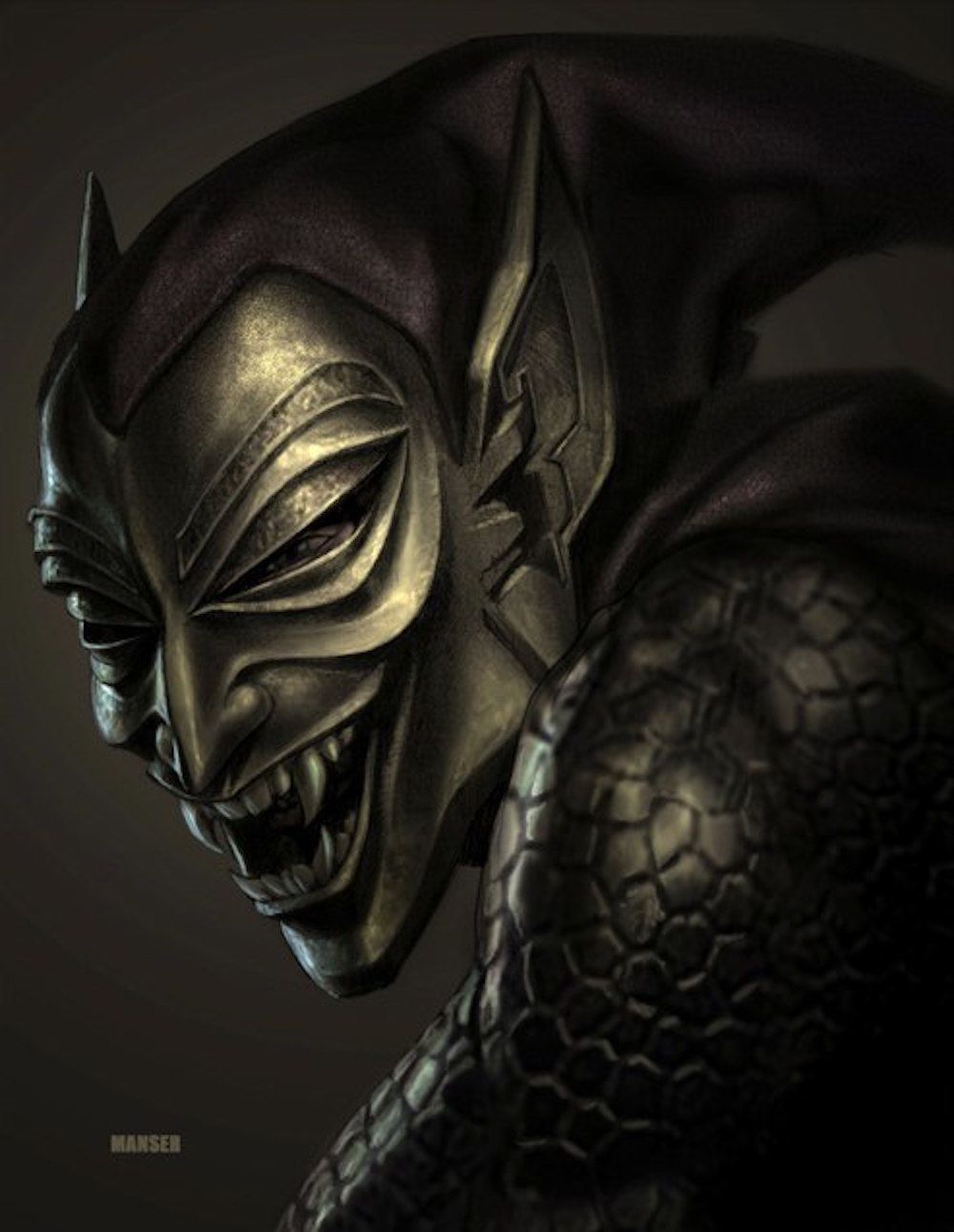
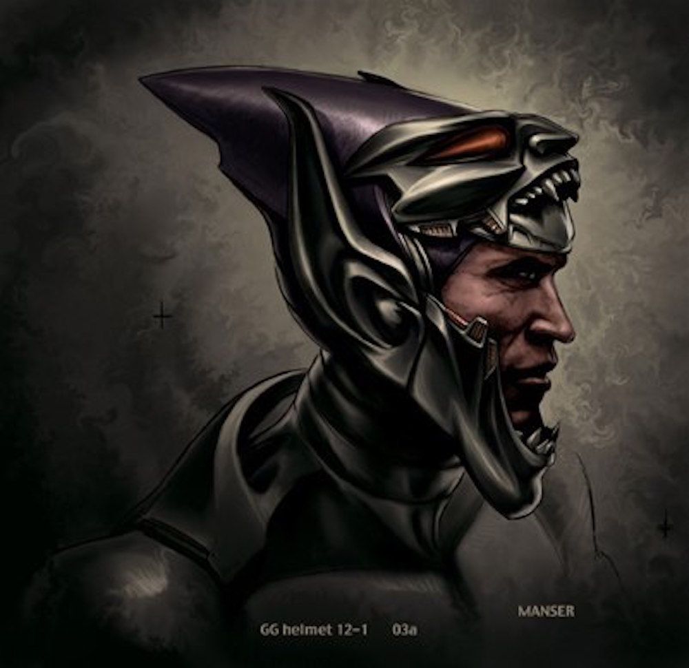
This is the first design from Warren Manser on the list, and it won’t be the last. Willem Dafoe was a perfect choice as Norman Osborn in Sam Raimi’s first Spider-Man film back in 2002. The adopted father figure for Peter grappled with his inner demons after facing troubles with his own company. He used an experimental serum and a flight suit to get his revenge. But this mask is almost ornamental in its design.
Osborn’s house was decorated with loads of ornamental tribal masks in the film, so that could have been the explainer behind the decision. The folds around the eyes have brushed detail, and the ears look as if they’ve been carved from metal. This design is closer to the purple and green costume from the comics. You can even see the scales on the arms of the suit.
14 WHITE SPIDER-EYES
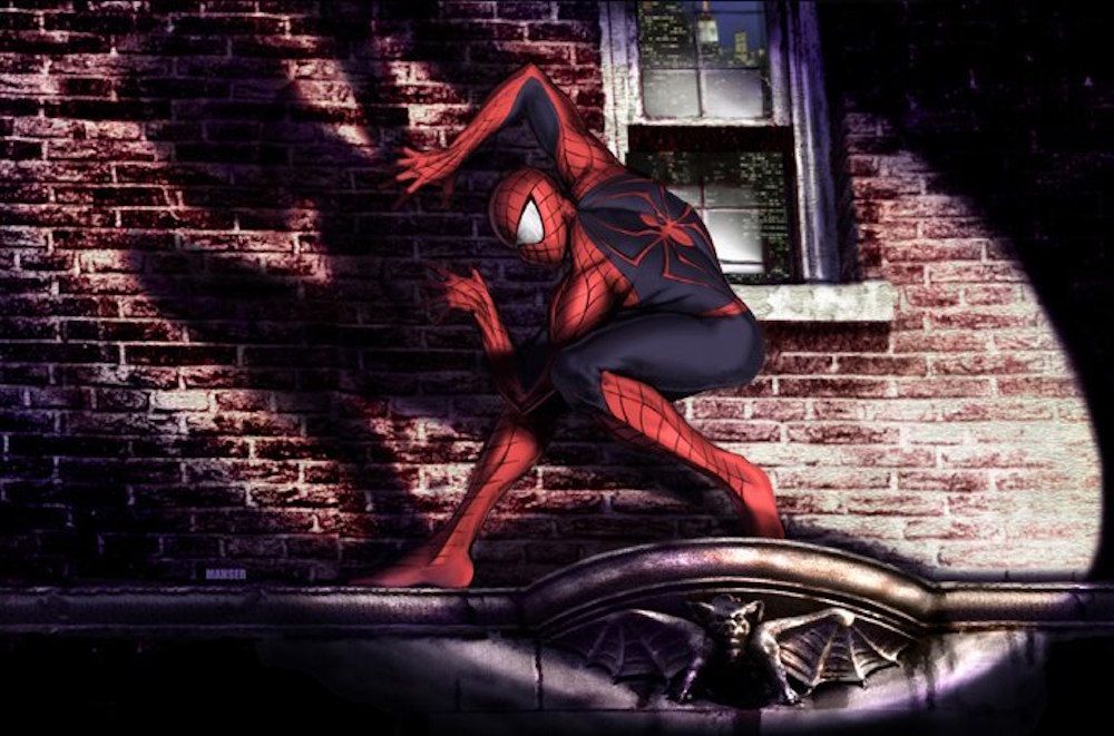
This concept art was originally for Spider-Man 2, and instead of the silver pointed eyes we’d gotten used to, the artist gave him the iconic white bug eyes from the comics. They were outlined in black and lined up with the webbing that stretched across his face. The suit also is slightly different, going for black webbing rather than sliver. This Spidey looks like he’s been caught leaving the scene of a crime -- not necessarily his, but we know how J. Jonah Jameson would spin that story.
The spider on the back of the suit is also slightly different, stretching across his back and incorporating a skinnier look to the arachnid. The red portion of the back comes to a point just below his neck, whereas in the films it goes straight across in a line. It’s not a radically different design, but stylistically it is pretty slick.
13 THE LIZARD
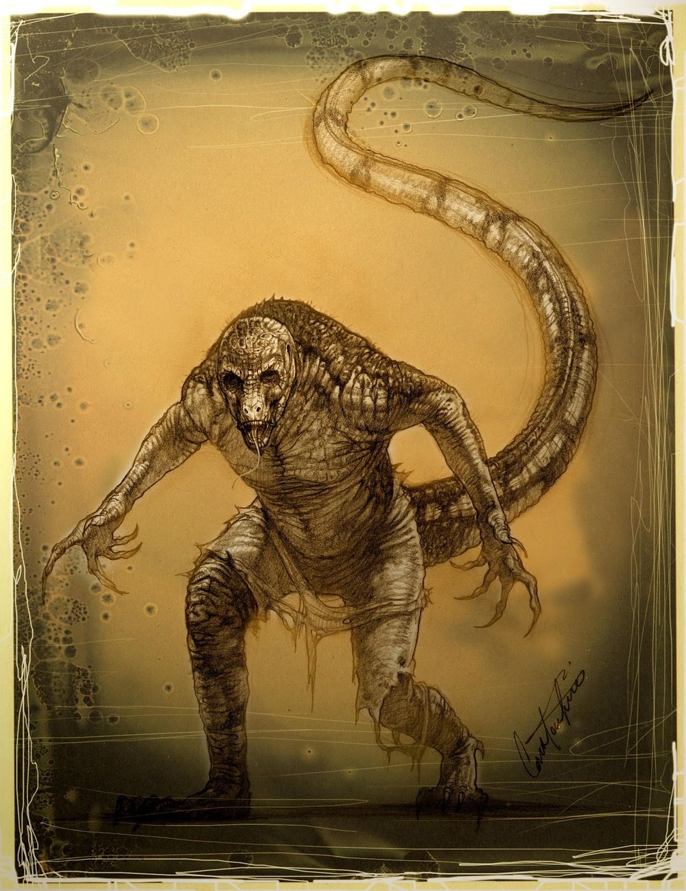
When The Lizard debuted in the first Amazing Spider-Man film, fans weren’t too pleased with the flat faced look of Curt Connors’ monstrous alter-ego. But had Raimi included the villain during Spider-Man 2, he would have looked a lot closer to his comic counterpart. Constantine Sekeris came up with the initial art for the villain until Raimi decided not to add another villain into the film.
The snout still makes an appearance, as does his huge tail. It would’ve been interesting seeing Spidey grapple with the monster throughout the film, although we can’t help but wonder what effect he would have had on the plot. Since Curt Connors was already part of the Raimi films, it would likely delve into his character and what pushed him over the edge.
12 DOCTOR OCTOPUS ARMS
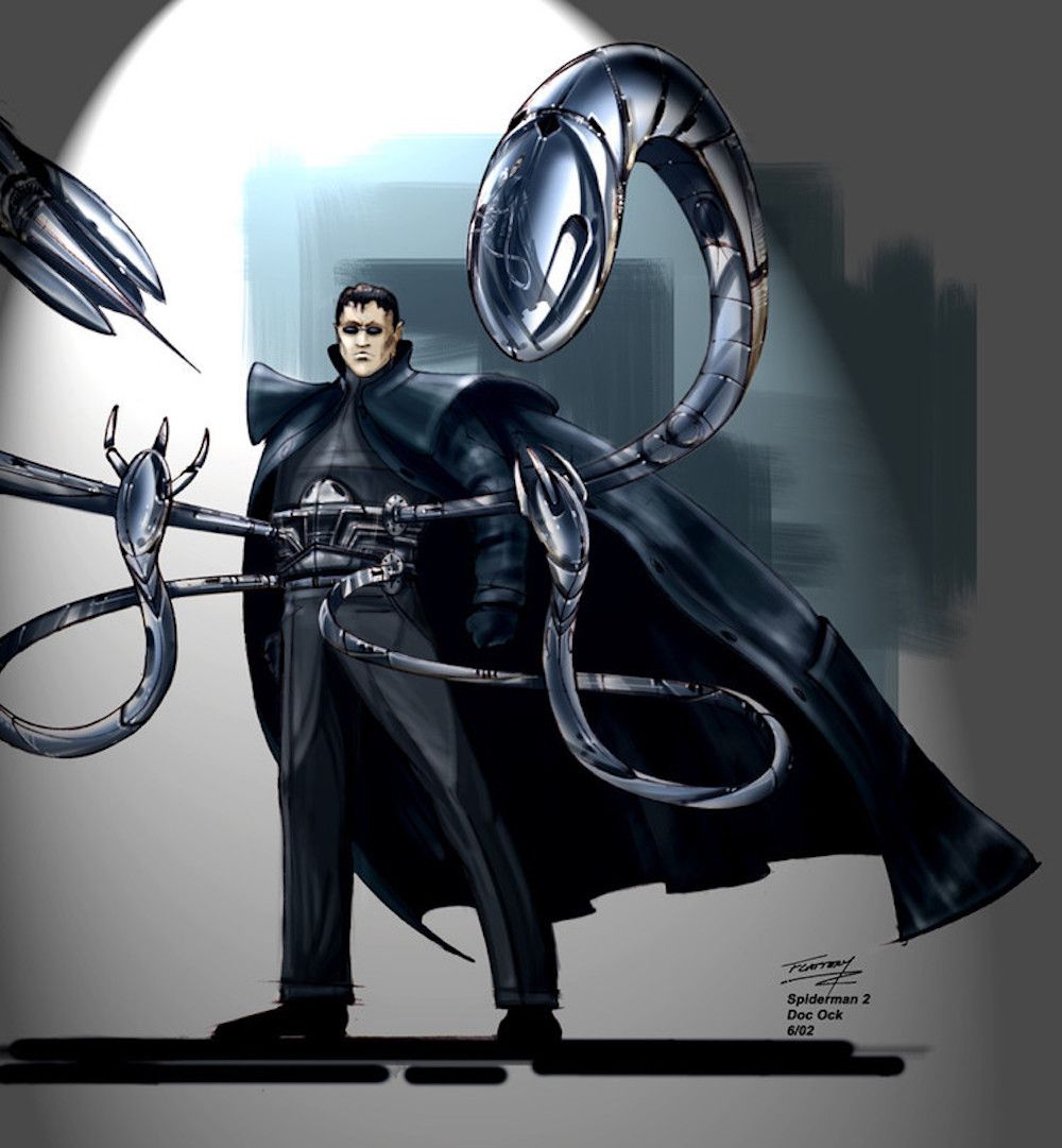
Spider-Man 2 is widely seen as one of the greatest superhero films of all-time, with some seeing it on the same level as Richard Donner’s first Superman film. It saw the birth of Doctor Octopus as Spidey struggled with his powers and balancing his twin identities. Raimi brought his horror head to the Doc Ock character -- who can forget the chilling hospital scene? But this piece of art by Tim Flattery shows a different design to those iconic arms.
The pincers are individual arms attached to the main tentacle, rather than the tentacle opening up like in the final design. It also shows the arms coming from the side of the harness rather than the back. Either way, this version of Doc Ock was a brilliant way of bringing the villain to life.
11 FLIGHT SUIT GOBLIN
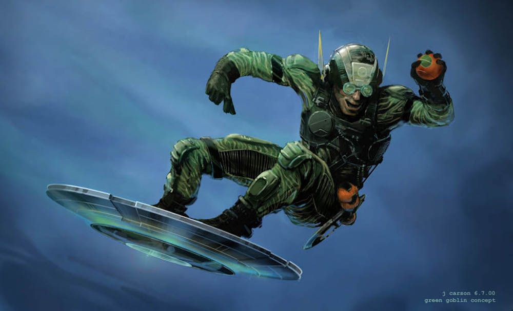
Since Raimi and Sony were bringing the Green Goblin into live action for the first time, they decided to play with different styles. This reimagining shows what the villain could look like from a technical and military background. This suit uses more fabric than the metal armor we finally got. The plating and harness all look like they’re meant to allow plenty of movement and flexibility when piloting the wildly different glider.
It’s more of a hovering U.F.O. than the rocket propelled glider we’re used to. And then there’s the helmet. The ears look like they’ve taken inspiration from an Ant-Man costume. And the circular goggles make Norman look more like a mad scientist than a terrifying villain. There’s definitely a bigger element of science fiction influence with this costume.
10 EDDIE BROCK
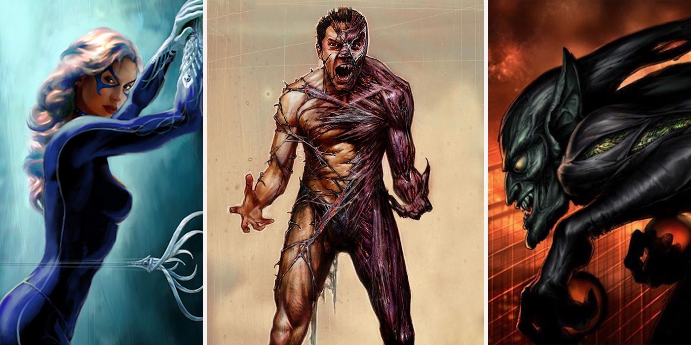
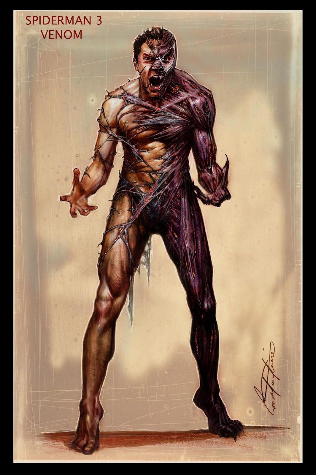
Let’s just get it out of the way now -- Spider-Man 3 was awful. Everything from emo-Peter Parker to the god awful treatment of Mary Jane, Venom and Sandman was just terrible. But Venom and Eddie Brock could have been so much more menacing, and Constantine Sekeris came up with a horrifying design that shows the transformation from Eddie to Venom -- it looks like something straight from a horror film.
As the symbiote stretches across Eddie’s body, it almost looks as if it’s ripped off his skin, exposing all his muscles -- but this is just the symbiote’s new look. It’s an unsettling piece, especially combined with the scream clearly erupting from Eddie as he’s taken over by the alien. Given Sam Raimi’s horror background, this could have been a brilliant adaptation of Venom. But no, we got a whiney Topher Grace instead.
9 MECHANICAL WEB-SHOOTERS
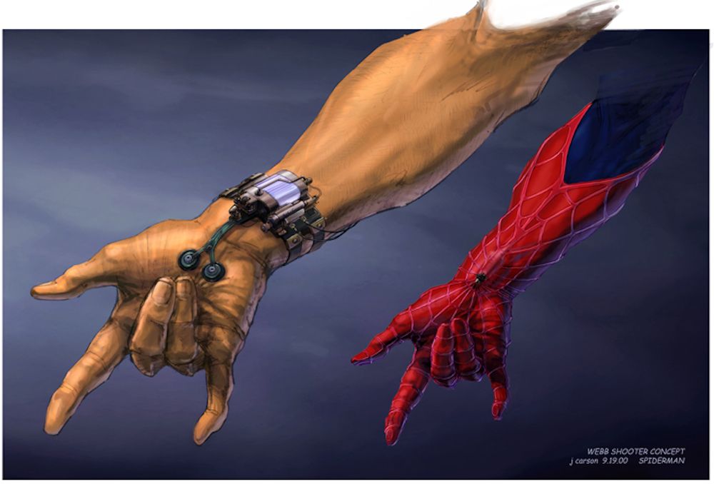
So there’s one huge change to the Spider-Man mythos that Sam Raimi made because he didn’t believe that anyone would think it was plausible. He gave Peter organic webbing instead of the web shooters because apparently people wouldn’t believe a genius, science obsessed teenager could build them. But the concepts were still initially created for the movie just in case.
They show two different pressure points that Peter would have to push to activate the device, obviously showing off the iconic hand pose as he does so. Funnily enough, audiences believed that Peter could spin webs from his web shooters in The Amazing Spider-Man films and the new Marvel Cinematic Universe version of Peter Parker -- so maybe Raimi should have stuck with these designs after all.
8 MYSTERIO
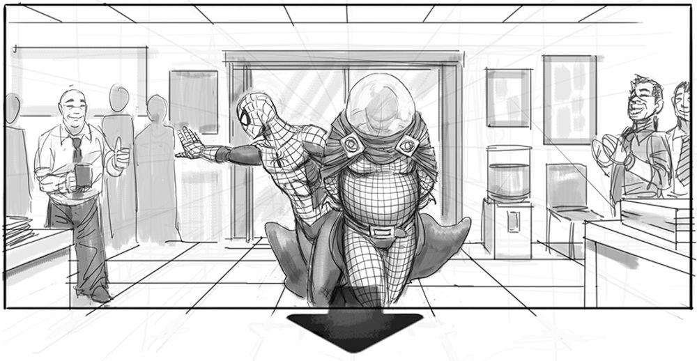
Before Spider-Man 3 ruined any plans for any further Spidey films, Sam Raimi was originally going to direct a brand new trilogy of films. The first of which, Spider-Man 4, was going to feature two villains: Mysterio and The Vulture. In this first piece of concept art by Jeffrey Henderson, we see Spidey marching Mysterio through a police station after his capture.
The look of Mysterio is relatively similar to what we see in the comics; huge fishbowl head, crossed jumpsuit and giant cape. Although why he seems to be wearing Y-fronts over the top of his outfit is unclear -- it looks pretty ridiculous. We can’t tell when this is meant to be set, but since Spidey’s suit is in good condition, this would probably take place near the start of the film.
7 SLIDING VISOR GOBLIN HELMET
Warren Manser also designed this concept design of how Norman could talk to Spider-Man face-to-face without having to remove the helmet. It’s slightly disturbing. It’s only one part of the mask that slides up, but it creates a monstrous look, as if Norman is inside the jaws of the Goblin. When the visor is in the normal position it would leave the jaw slightly open as if the villain is screaming -- which is equally as disturbing.
The helmet also uses the purple color of the hood along the pointed top, updating the original comic look. Given how close to the final suit this is, it’s a shame they didn’t use it during the film. The closest thing we got was the eye visors flicking down to reveal Norman’s eyes when threatening Spider-Man.
6 A BALD DOC OCK
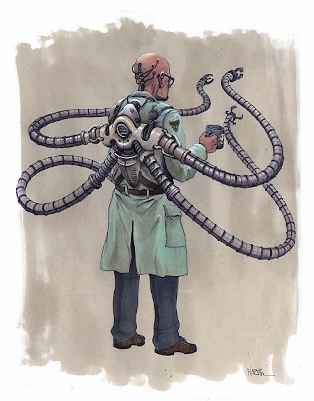
Did you know that at one point, Doc Ock was going to appear in the first film? Ultimately, Sam Raimi chose the Goblin as Spidey’s main villain. Doc Ock has been such an enduring villain in Spider-Man’s comic book history, various pieces of concept art were created before Raimi finally settled on the design that we all saw in Spider-Man 2. Here, the costume includes Otto’s lab coat, with the arms connected to the harness that takes up his entire back rather than going around his waist.
The spinal implant seems to still be a factor here though, something that would feature in the sequel. The arms aren’t as chunky or formidable as the ones attached to Alfred Molina, but they certainly look troublesome for sure.
5 HARRY OSBORN GOBLIN
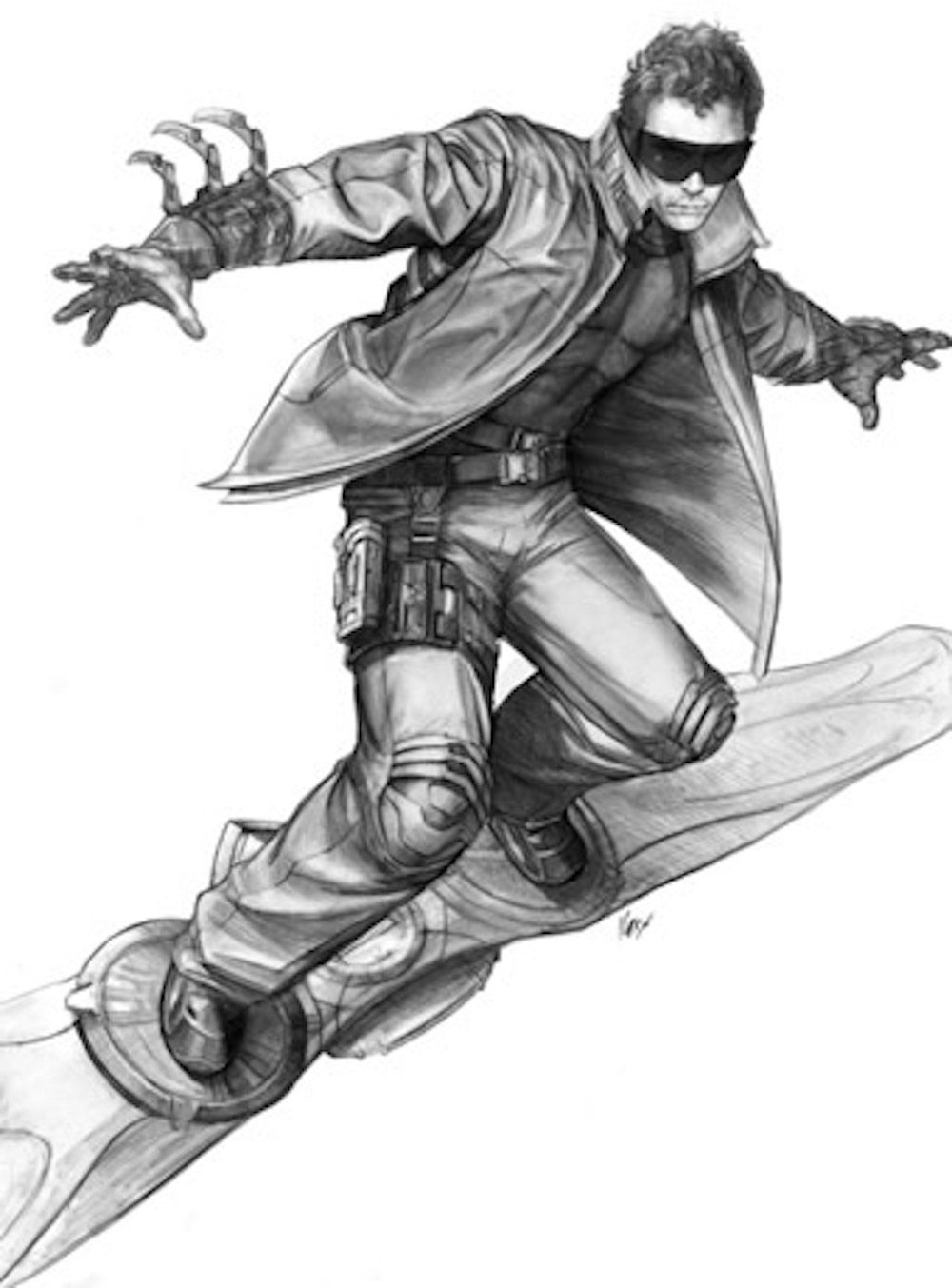
Another portion of Spider-Man 3 that just didn’t seem to flow right, was the inclusion of Harry Osborn taking over the Green Goblin mantle and going after Peter. Unfortunately, James Franco didn’t really have much to play with during the film, and was just angry quite a lot. His costume was a radically different Goblin costume, and the only Goblin-esque things that remained were the use of a glider and pumpkin bombs.
This concept art shows Harry in a much simpler look, sporting huge sunglasses, a long coat over the top of his tactical suit. But because of the large collar and the trousers, this looks a little more like a villainous Marty McFly from Back to the Future. Even though Sam Raimi didn’t get Spider-Man 3 right whatsoever, we’re glad this version was left out.
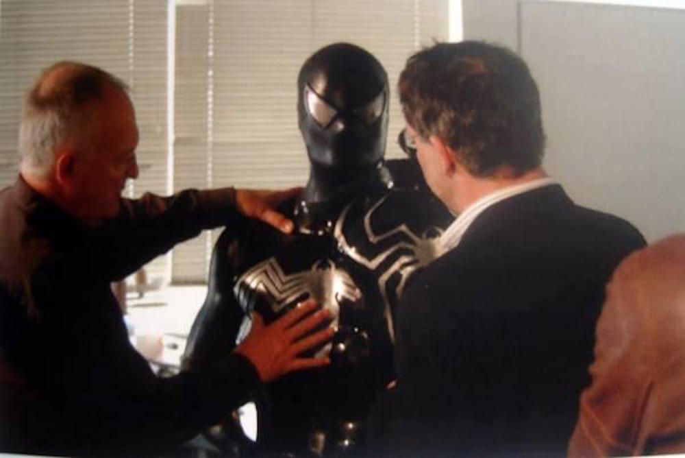
4 BLACK SUIT SPIDER-MAN
Alright, let’s get back to that annoying symbiote. We’ve already established that it didn’t work in the film. Especially with how it changed Peter, it didn’t make him cool -- it turned him into a cringe inducing creep. Sorry, but it’s true. The final design simply turned the movie’s red and blue costume black -- it was simple and it made sense since the symbiote was over the top of his normal costume.
But this set photo shows an unused design that stayed true to the comics. It leaves out the webbing over the top of the costume, going for a complete slick black look with the white spider stretching across his chest. Supposedly it was dropped because the latex made Spidey look like he was in "another kind" of movie. Right. We’ll leave that there.
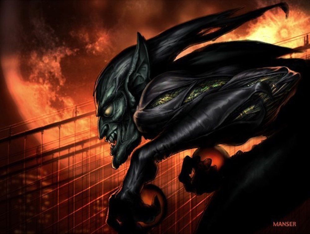
3 MONSTROUS CLASSIC GOBLIN
This version of the villain is incredibly creepy, partly because it’s near impossible to tell whether this is a suit or a literal monster. When Norman took the serum he’d developed, it gave him super strength and heightened his senses. But could it have warped his appearance too? We saw a version of that during Ultimate Spider-Man, where the Goblin is a huge monster, but this version looks genuinely creepy.
The green portions of his body revealed under the purple sleeves look slightly mechanical, but also slightly biological too. And then there’s the face, it looks like flesh rather than a metal or fabric costume. Especially the with the jaw ligaments and the details on his ears. A physical monster plaguing Peter may have been too scary for audiences, but we would’ve loved to see it.
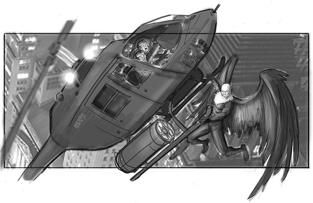
2 THE VULTURE
Alongside Mysterio, would be The Vulture. Whether Mysterio would be a simple side villain before the main event isn’t clear. This concept art by Jeffrey Henderson was our first look at what a live action Adrian Toomes could look like well before his Marvel Cinematic Universe debut in Spider-Man: Homecoming.
The costume is a literal translation from the comics, with the green suit and white feathery neck piece. Whilst Homecoming saw a modern reimagining of Toomes’ suit, this would stay faithful to the comics as he scares the hell out of two helicopter pilots. It doesn’t seem clear why he’s attacking the helicopter, but maybe he was stealing tech like in the new version. Although with the treatment that Jon Watts gave to Michael Keaton, we’re glad that fourth film never happened. After all, we wouldn’t be where we are now.
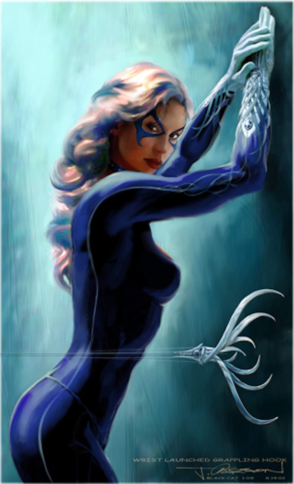
1 BLACK CAT
Long before Felicity Jones was meant to play Black Cat in The Amazing Spider-Man films, the villain nearly appeared during Spider-Man 2. Luckily Sam Raimi didn’t overstuff all of his films with multiple villains (just that awful third one), but the design for Felicia Hardy is undeniably impressive. Wearing a slick dark blue catsuit, with a similar colored mask, and white gloves, this seductive character may have caused problems for Peter and Mary Jane.
The really interesting addition to the costume, is the grapple hook that extends from her glove. Plus, the details on the glove that show the hook curled around her hand and wrist is incredible. The attention to detail with this concept is great, it’s just a shame we never got to see it in live action.
Which piece of concept art do you wish made it into the trilogy? Let us know in the comments!

