It may never replace print, but the iPod Touch is starting to emerge as a pretty good platform for comics, at least in the short term. It has several advantages over the Kindle—it has color, the graphics are nice and sharp, and a lot of people have iPods anyway for other reasons. For readers who value portability, it’s a handy alternative to carrying around a stack of books, and even purchased chapter by chapter, comics are generally cheaper in the iTunes store than in print form. A handful, such as Yoshitoshi ABe’s Pochiyama, are only available that way.
At the moment, most of the comics available for the iPod are print comics that have been adapted to the new format, which has its advantages and disadvantages. Overall, it’s a different type of reading experience, and with the right comic and good formatting, it can be as good as or even better than reading the print version.
The chief difference is that almost all comics are viewed one panel at a time, which means the reader gets in closer to the art and experiences it as a series of single panels that scroll by horizontally. (Here's a handy demo from Uclick.) Obviously, a comic that was originally drawn as self-contained panels will do better on the iPod than one that relies on splash pages and interplay between panels. Consistency is also important: With its fixed height and width, the iPod screen can’t accommodate a wide horizontal or tall vertical panel very well. Those panels have to be shrunk down, which can be distracting. One quickly becomes accustomed to the figures and text being a certain size, so when they suddenly get smaller, it interrupts the smooth reading experience.
One thing that doesn’t seem to have been standardized yet is whether the comic is viewed vertically or horizontally. Of the apps I looked at, the ones from Uclick were all intended to be viewed with the iPod held in the vertical position; rotating it didn’t make the art any bigger. The iVerse apps I checked all displayed the comic in the horizontal mode only, which made for a bigger, more readable panel. The one outlier is Yoshitoshi ABe, who managed to fit an entire page of Pochiyama onto the iPod screen in the vertical mode. This worked surprisingly well and allowed for the interplay between panels that was missing from all the other comics.
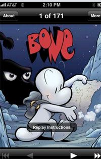
Generally, graphic novels with a panel-by-panel storytelling style and straightforward art fared the best on the small screen. Jeff Smith’s Bone, for instance, works pretty well, because the story is told in small, fairly simple panels. I went back and looked at the print version when I was done, and I saw a few places where I had lost a bit of context, but overall, the story was easy to follow and looked good on the small screen.
Ninjatown, based on the Nintendo DS game, was even better. The simple shapes and bright colors of this comic really lend themselves to the iPod. The creators tell their story in a series of single panels and the movement in each panel is easy to follow—there is detail, but no clutter, although variations in panel shape made for some distracting zooming in and out.
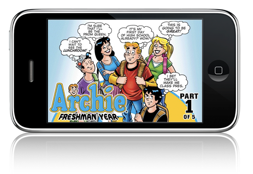
One comic that I actually liked better on the iPod was Archie: Freshman Year. The panels fit the horizontal format nicely, with little wasted space and easily readable word balloons. The most heinous misstep was chopping the opening splash page in two (and beheading Veronica) to fit it onto the small screen. The other splash pages were divided up more gracefully, though, and I noticed the designers took the trouble to remove the edges of word balloons that would have impinged on the sides of the panel. What’s more, this is a dialogue-heavy comic and the pages of the print version seem crowded; the iPod version has more breathing room and is actually easier to read.
Adult comics with full-page layouts present more of a challenge, because designers have to chop the page up the way a widescreen movie is reformatted to fit on a TV screen, panning and shifting the center to capture as much of the action as possible. The iVerse Smashout adaptation of The Man Called A-X is a good example of a comic that doesn’t work well on the small screen. The original story is told in large, often full-page panels, and the designers had to shoehorn it onto the iPod by showing pieces of a scene, then pulling back and showing a longer view, often with illegible text. In addition, because the art often breaks the edges of the panels, the designer often had to leave in a bit of another panel in order to display a complete image.
Yoshitoshi ABe can put full pages of Pochiyama onto the iPod because his pages aren’t terribly complex—five or six panels per page—and his art is crisp and clean, so it comes across very well even when shrunk down to iPod size. What doesn’t work as well is the text, which is typeset very clumsily within the word balloons. (Also, either the translation or the writing is bad—it’s hard to say which—either way, the comic is well-nigh incomprehensible, although lovely to look at.)
All this formatting tsouris will eventually go away once people start designing comics specifically for the iPod platform. The screen is a decent size for reading individual panels, the colors are nice and bright, and options such as scrolling, animation, and sound could enhance the comics if used judiciously. Hopefully, artists will start to think of exploiting it as a medium in its own right, but in the meantime, it's a decent substitute for bulky books for those of us who never want to be caught without something to read.
Update: Corrected the publisher of The Man Called A-X.


