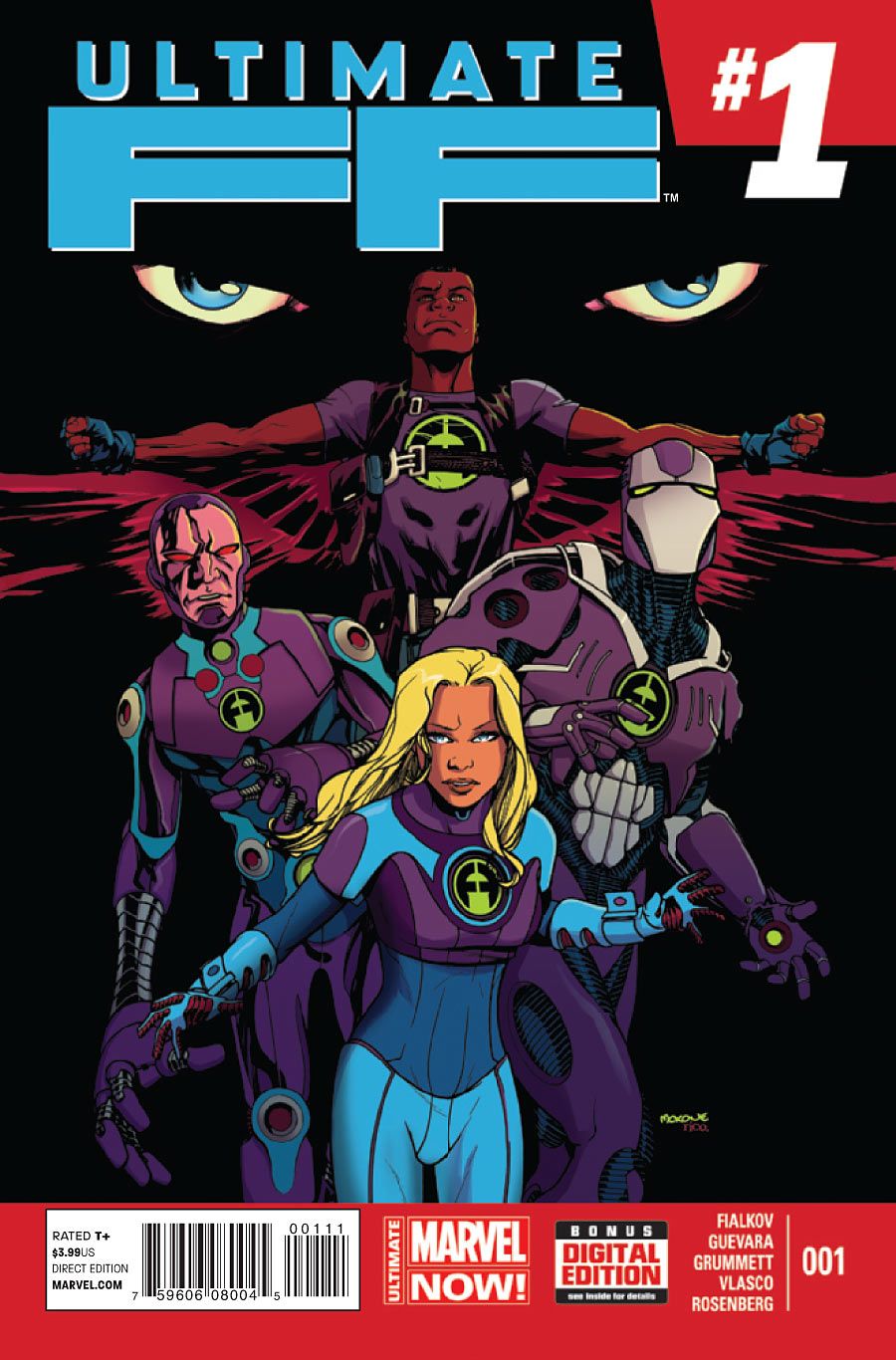
First issues are never easy, and team book first issues are even tougher. A team book first issue in the Ultimates universe? It's quite the challenge. That's why what "Ultimate FF" #1 accomplishes is even more impressive in perspective. It brings a (relatively) unexpected group together -- Sue Storm, Falcon, Iron Man, Coulson and Danny Ketch -- in an appealing story. While the team holds my interest and gels dramatically, unfortunately, the visuals are pretty rough. In "Ultimate FF" #1, the story really works. The art doesn't.
As anyone who saw the preview already knows, the issue starts off fast and funny. Fialkov brings energy and fledgling chemistry to a cast that isn't composed of typical headliners. Each is introduced with a wink-nudge caption indicating their IQ and role; for instance, Tony Stark is pegged as "mechanical engineering/moneybags." The team banter is snappy without being showy, so the low-level tensions between team members don't overwhelm exposition of the crisis they're dealing with. It's a smooth-moving, inviting introduction.
As the rest of the story progresses, the only element that doesn't quite work is the stake-setting required to bring in the team's mystery sixth member. I won't spoil it, but it's a wonderful twist to bring this character on board, and I'm so excited for his dynamic with the others. However, Fialkov doesn't adequately emphasize that the stakes in Issue #1 are high enough to justify adding this character to the game board at this point. Coulson and Ketch jump a bit too eagerly on that solution. (Maybe there'll be something to that later? I don't know, but it did raise some flags.) Still, all in all, Fialkov provides a winning introduction to the reconstituted Ultimate FF.
Guevara, Grummett and Vlasco's art, however, presents some problems. I appreciate that Marvel is letting artists experiment outside of its "house" style, but this experiment isn't a success. The looser lines and lighter inks are fine in theory, but here they don't work. In the action scenes, the characters are unanchored, making it difficult to discern the locus of a blow, and struck characters look more caught in a tornado than anything else. It's true that some of the scenes have lovely proportions, and a number of the static panels capture the mood quite well, but the art needs tightening, overall.
This is particularly true for the faces. Jawlines and head shapes morph constantly. At some point, every character but Danny Ketch appears with his or her chin smushed at an unnatural angle. Luckily, this cast is diverse enough that no one with the same gender, race and hair color appeared in the same scene, but it would have been difficult to differentiate them if they had. For me, this was the biggest issue, because so much of the appeal here is in the dialogue and the team dynamic. I want to watch these characters react to one another, but when their faces aren't recognizable, I can't.
However, though the pencils and inks disappoint, Rachelle Rosenberg's colors are a beauty. She trades in the traditional superhero RGB for a future-ready CMYK: aquamarine, yellow, pink and Galactus-style purples suffuse the environment and the FF uniforms. It gives the Ultimates universe a distinct look, and from an Earth-1610-wide perspective, it also complements Woodard's radioactive punk palette in "All-New Ultimates." I'm loving this approach.
Overall, "Ultimate FF" #1 makes a fun case for itself, but the visual storytelling will have to rise to the dialogue in order for this series to really become a success.

