Fandom culture is always a divided culture. Theoretically, these are groups of people brought together by their mutual love for the same kinds of things. In practice, this love usually breaks down into really bitter arguments between passionate fans, and one of those debates centers around the Transformers movies. The original Transformers are, to put it mildly, design classics. The toys themselves were an engineering miracle, and they managed to look good as both humanoid robots and assorted cars, trucks, and planes. Then came the live-action films.
The films may have started with the original cartoon and comic designs, but the designers went in an entirely different direction soon afterwards. The Autobots and Decepticons no longer looked fully robotic; instead, they seemed like robot versions of many different exotic aliens from around the galaxy. So, are these new designs good or bad? Every fan has their own passionate opinion about this matter as some think the original designs are sacrosanct and should never have been touched, while others feel the live-action movies provide modern updates to appeal to a more modern audience. That brings us back to the original question: are these new designs good or bad? As always, it depends. Certain designs are really inventive and manage to rival their cartoon predecessors in terms of classic designs and others are so bad, you’ll swear they came right out of a parody video instead of a multi-million dollar film. So, who’s hot and who’s “bot” when it comes to these designs? Keep reading to discover 10 Transformers That Actually Look Good In The Movies (And 10 That Look Better In The Original Cartoon).
20 LOOKS GOOD: OPTIMUS PRIME

Sure, the megafans of the original Transformers cartoon took exception with some elements of Prime’s design. The fact that he has a working mouth was particularly controversial, but when you get right down to it, he is still one of the best movie designs.
The film did a good job of blending the more organic elements of the Movie-verse with Prime’s G1 appearance. Basically, no one who has ever held a Transformer will be confused as to who he is when they see him onscreen. Plus, the iconic red and blue design helps him stand out in a sea of muted on-screen colors.
19 LOOKS BAD: STARSCREAM

Starscream is one of the most memorable characters from the original cartoon. This character is the perfect combination of powerful and conniving, and he was always a threat to Megatron’s leadership. Unfortunately, his on-screen version basically lives in Megatron’s shadow.
Since Megatron also transforms into a jet, Starscream’s transformation loses a lot of what made him special in the first place, and he’s just unappealing in robot mode — he’s basically a walking and talking triangle with anger management issues. He’s supposed to be a formidable character, but the most worrisome thing about his design is the geometry flashbacks he will give you.
18 LOOKS GOOD: BUMBLEBEE

This may make G1 purists’ heads explode, but here it is: the original Bumblebee design is pretty weak. Sure, transforming into a Volkswagen is pretty cute and charming, but as a robot, he is basically a forgettable face with some regrettable horns slapped onto him.
The Bumblebee in the movie is actually a pretty nice upgrade. The face is much more interesting and engaging, and the character still manages to be expressive, which is particularly impressive since he has no voice! How good is Bumblebee’s design? We think it’s one of the main reasons he got his own solo movie instead of other Autobots.
17 LOOKS BAD: DEVASTATOR

For Transformers fans of a certain age, the original Devastator was nothing short of iconic. He was the first robot that showed us how multiple ‘bots could form into one super-big, and super-powerful, combined form. Too bad the movie version was one of the biggest mistakes in the live-action franchise.
The original Devastator was still recognizably a humanoid robot in his combined form, but in the movies, he is just a giant mass that looks more like oversized construction equipment. Also, the character is literally turned into a joke as the most memorable thing about him were his robotic family jewels.
16 LOOKS GOOD: MEGATRON

Like Prime, Megatron is another character that doesn’t look much like his cartoon counterpart. Fortunately, he shares another quality with Prime: the movie redesign is really good. This is primarily because Megatron is one of the spookiest-looking Decepticons on screen.
Honestly, Megatron’s entire face makes him look like a kind of robot demon, and his form seems like he is constantly crackling with both power and violent intent. From a design standpoint, this is a great “shot and chaser:” we see an Optimus Prime that looks nearly unstoppable and we are then introduced to a guy who looks formidable enough to beat him!
15 LOOKS BAD: SOUNDWAVE
Soundwave was one of the most iconic of the original Decepticons. His synthesized voice instantly stood out and his design was classic 1980s cool: he was a walking, talking cassette player! Unfortunately, his movie version is pretty damn forgettable. Even when standing next to a bunch of other disappointing designs.
Obviously, he couldn’t be a cassette player anymore, but without that main feature, he looks pretty bland on screen: just another mass of weird-looking silver and metal. Ultimately, this is the hallmark of bad design. It’s too bad for both Soundwave and his 1980s fans, but at least we’ll always have our old toys.
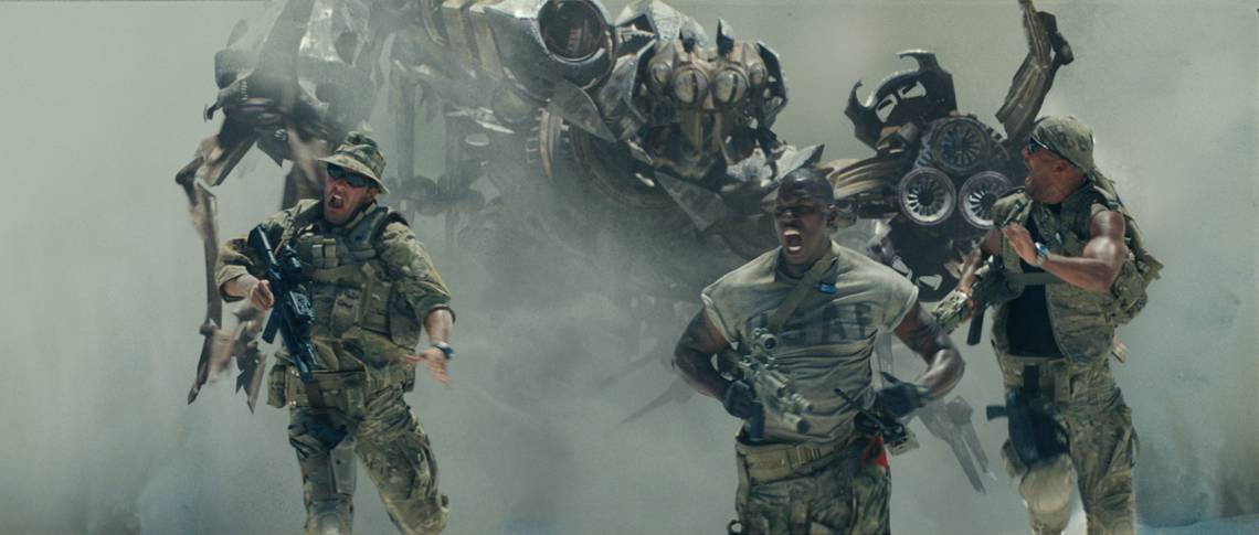
14 LOOKS GOOD: SCORPONOK

Action movie directors are slowly figuring out something that horror movie directors have known for a while: less is more. Many of the bad designs on this list could have looked better if there had been a bit more mystery to them. For example, take a look at Scorponok.
The actual Scorponok design is admittedly goofy, but we primarily see him as a robot tail chasing soldiers through the desert. By showing us less of the actual design, we get to focus on the coolest element while also sharing the sense of angst the soldiers have. Ultimately, it’s one of the most iconic scenes in the franchise.
13 LOOKS BAD: ARCEE

Although it can be hard to stand out in the world of Transformers, that’s never been a problem for Arcee as her cartoon version was typically referred to as “the girl Transformer.” However, as she was eventually brought into the world of the movies, her new design can be regarded as pretty bad.
The original cartoon design had very recognizable features, but in the movie version, she has a weird robotic face that seems devoid of any details or empathy. Throw in the fact that she doesn’t really do anything important in the films and this seems like a really wasted character.
12 LOOKS GOOD: JAZZ
Jazz is a relatively controversial character in the Transformers movie universe. On one hand, he is genuinely interesting and funny, but on the other hand, the stereotypes in his portrayal led some fans to think he was a caricature for African-American audiences. However, we can all agree that his design was pretty solid.
Compared to other ‘bots, Jazz has a pretty distinctive face. His chest also stands out, meaning that you can recognize this character on sight, even in a busy fight scene. Ultimately, his design is simple and straightforward, but he still has enough details to really “pop” on the big screen.
11 LOOKS BAD: THE TWINS

Obviously, “bad” design is in the eye of the beholder. One person’s trash Autobot is another person’s treasured childhood memory; however, can we all agree that a design is bad if it makes critics around the world declare your movie as prejudice?
In the second film, we are introduced to two small Autobots (“the twins”) that are meant to be comic relief. However, many fans and critics noticed something surprising between their dialect and their design: these guys seemed to be discriminatory caricatures. Not only does it derail every scene they are in, but it makes you wonder what on earth the creator was thinking.
10 LOOKS GOOD: HOT ROD
Hot Rod is another character who is somewhat infamous. In the cartoon, he was the impulsive successor to Optimus Prime, but many fans still blame him for causing Prime's demise in the first place. This character was eventually portrayed on the big screen, and his design is pretty good.
Granted, he doesn’t look a lot like his cartoon version, but he retains the bright orange colors from the cartoon that help his design stand out. And while the overall design looks a bit like a clock with exposed gears, the prominent eyes on this design help to humanize the robot and make him easier to relate to.
9 LOOKS BAD: GRIMLOCK

Some Transformers look better in one form or another, and while the Grimlock of the cartoon was different (he looked pretty awesome as both a robotic T-rex and as a giant robot), the Grimlock of the live-action movies is a pretty bad design.
In his T-rex form, this hero looks overdone — more like a “Mecha Godzilla” Deviantart than an update to a classic design. As a robot, Grimlock is nothing but sharp edges arranged in a boring way. He looks more like something a metal fan would scribble in his notebook when bored, and we hated to see such a cool ‘bot with such a bad design.
8 LOOKS GOOD: LASERBEAK

The Soundwave of the original cartoon was never really alone as he could “eject” several smaller cassette bots that had their own unique transformations. One of the most famous was Laserbeak, a kind of Decepticon spy that often perched on Soundwave’s arm.
As you know, we were highly unimpressed by Soundwave’s movie appearance, however, Laserbeak’s design is actually really cool. He is still very recognizable, but the live-action design makes him look even more menacing. This is the best kind of adaptation: subtle changes that help the character stand out from the rest of the pack. Maybe he could use those spy skills and figure out who is to blame for Soundwave’s design?
7 LOOKS BAD: GALVATRON

In the video game world, old school gamers know how disappointing it is when a “new” character is just an old character with a different coloration. In the Transformers movies, it’s even worse: when Megatron is effectively revived as Galvatron, he still looks basically the same.
This is particularly disappointing for fans of the original animated movie since in that film, Galvatron is an entirely new design, and one that is really awesome in his own right. Movie fans were hoping for a major transformation (so to speak) and instead, they ended up majorly disappointed. This was one more reason to turn our attention back to the classic cartoon.
6 LOOKS GOOD: SCAVENGER

Like we said before, we were deeply disappointed at how Devastator looked in live action; however, that big robot is made up of several smaller robots and in some cases, the smaller robots look pretty sweet! Our favorite example is named Scavenger.
Scavenger looks like a Constructicon designed for a horror movie. He’s all tires, arms, and spook, waiting to run over human's and Autobot's alike. He looks exactly like he acts: absolutely relentless. It’s enough to make you wish it was this dude getting a solo movie instead of Bumblebee. Maybe this is just a write-in opportunity in the making for hardcore fans?
5 LOOKS BAD: HOUND

Like we said before, the most controversial element of these live-action designs is the need to make the bots more like living creatures. The 1980s boxy designs are out and curvy designs are in. Sometimes, though, we just can’t suspend our disbelief, and that’s what happened with Hound.
Hound’s overall design is pretty uninspired: he’s all gears and guns. But, what we can’t really get over is his beard. Why does a robot from light years away look like a human? And why is he chomping on a robotic cigar? Every scene he’s in is distracting. Then again, in a movie that bad, every distraction is a welcoming one.
4 LOOKS GOOD: SENTINEL PRIME

Earlier, we slammed the Galvatron design for just being lazy as he was just Megatron with a few tiny changes. Fortunately, Sentinel Prime, who was Optimus Prime's predecessor, manages to dodge this design mistake. He may look a lot like Prime, but he has several key differences.
He retains the general shape of Optimus, including the weird mouth, but his red and black colors make him look very serious and very striking. His frame includes “a greater number of plates,” which makes him more demonstrative, and he can wield a double-bladed Primax sword with immense skill.
3 LOOKS BAD: XBOX ROBOT

There are many designs on this list that are arguably bad because of designer ambition. That is, the designs have so many elements and moving parts to them that the overall effect is distracting instead of cool. However, the next bot certainly does not experience this problem.
In the first movie, the AllSpark can transform just about anything into a living robot. At one point, it zaps an Xbox, and... that’s it. It’s basically an Xbox 360 with arms and legs. Not only is this a really lazy design, but the product placement is so blatant that it’s difficult to watch. And the glowing eyes that looked so cool on Optimus manage to look sinister and foreboding on its face.
2 LOOKS GOOD: SHOCKWAVE

Shockwave is another one of those live-action designs that manages to thread the fandom needle. He looks specific and notably similar to his cartoon counterpart, retaining some of the most well-known design features, however, the new design adds several cool elements.
This bot looks a lot more textured than his cartoon counterpart as he looks bulky and strong. In a whole movie filled with cool bots, he still looks like someone you don’t want to mess with. Also, the single (and big) red eye manages to seem as if it’s always watching you, which is a really nice and engaging touch.
1 LOOKS BAD: WHEELJACK

We’ve established a pretty firm rule here: the more a Transformer tries to look like a human, the weirder he’s going to look. And turning yourself into a car just means driving down the uncanny valley that much quicker, which is certainly the case for Wheeljack.
The character is a beloved bot from the original cartoon, but the live-action version makes him look like a mad scientist out of your worst kind of dream. And the absurd human affectations, such as glasses, look particularly weird... the dumbest design element since Hound’s cigar! Sorry, Wheeljack... we’ll always have our many fond memories of the classic cartoon.