
"The ghouls all came from their humble abodes / To get a jolt from my electrodes"

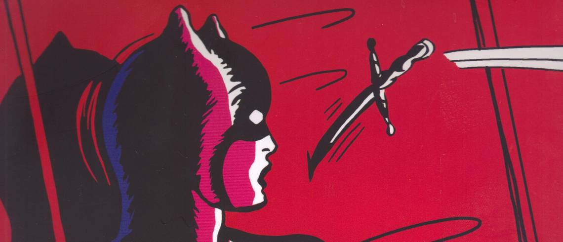
Batman: Odyssey by Neal Adams (writer/penciller), Michael Golden (inker), Scott Williams (inker), Bill Sienkiewicz (inker), Paul Neary (inker), Josh Adams (inker), Kevin Nowlan (inker), Continuity Studios (colorist), Ginger Karalexas[sic] (colorist), Cory Adams (colorist), Moose Baumann (colorist), Guy Major (colorist), Rob Leigh (letterer), Ken Lopez (letterer), Dave Sharpe (letterer), and Rowena Yow (editor). $19.99, 327 pgs, FC, DC. Batman created by Bill Finger and Bob Kane.
I didn't get Batman: Odyssey when it was coming out, which was probably smart, because it took forever to come out and getting the trade means you can read the whole thing in a relatively short time, plus it's 20 bucks for 13 issues (which, as you can see, average about 25 pages per issue), which is a fantastic deal. So if you skipped this because you heard bad things about it, this is a good chance to get it fairly cheap.
Of course, if it sucks, you'd still be wasting 20 bones. But is it any good? Well, I'm not sure if it's any good, but it is totally worth the 20 dollars, because this book is the most insane mainstream comic you will probably ever read. I mean, first of all, it's over 300 pages of Neal Adams drawing Batman, and that's never a bad thing. This book is denser than a lot of comics you'll read these days, but Adams is so good that he effortlessly moves your eye over the page where he wants you to do, so it's never confusing even as he obliterates panel borders and uses unusual page layouts. He's still excellent at action, and he's in total command of the page, and he gives us stuff like giant bats and cyclopean monsters and Neanderthal Batman. Occasionally his faces don't quite match the emotion of the scene, but when he wants to, he does a great job with body language and expressions. His Bruce Wayne is, yes, a hairy-chested love god, his Talia is slinky, his Alfred is veddy British, and his Aquaman ... well, the less said about Aquaman's look, the better. Adams isn't quite as good at incorporating computer effects into the work as some, but he doesn't use them all that often, so it's not egregious. He uses a few explosions and blood spatters that look Photoshopped in, but for most of the explosions, he draws every line, and they're far more impressive. Weirdly enough, there are a few pages that he uses twice, just with different dialogue, and it's odd because he spent so much time drawing everything, so why reprint those pages (I can think of two examples when he does this, and it doesn't seem to make sense). For the most part, this is Adams the great Batman artist - it looks slightly different because of advances in technology, but it wouldn't be too out of place in the early 1970s.
The story, as I noted, is insane. I don't even know what to say about it. See Batman use hand guns to threaten a train car full of people (they won't listen to him to move out of the car, so he waves his guns at them)! See Batman ride giant bats and dinosaurs! See Batman let Robin get blown up (seriously)! See Batman go on an "odyssey" to an underground world where an evolved Neanderthal and an evolved dinosaur boy mimic Batman and Robin! See Batman fight alongside hippie wizards! See Batman fight Egyptian gods and a Cyclops family! The hilarious thing about this book is that Adams manages to create this huge epic in which everything fits together yet at the same time create an epic where nothing makes sense, in terms of how everyone acts. Part of this (all of it?) takes place early in Batman's career (hence the guns, which he thought he needed), but that still doesn't explain the ending, when all of Batman's foes are distressed by something which would seem to distress none of them. Robin figures something out while riding a giant bat and freaks out, which seems like an extreme reaction. Everyone, in fact, reacts to everything by yelling, which makes this ridiculously entertaining but still nonsensical. If this were a television show or a movie, you could have a drinking game in which you would drink whenever someone yelled, and you'd pass out halfway through the story. I mean, at one point, Batman and his allies are flying their giant bats when suddenly they're attacked by a huge bird of prey. In two pages, Batman simply stone cold chucks explosives at the bird and blows it up, and they fly on. This bird has never been seen before in the book, I should note. It's an evil bird, sure, but it's not part of the big story - it just flies out and attacks them, and Batman kills it as, it seems, a sidebar. It's awesome. That's just the kind of comic this is.
I honestly have never read a Batman comic like this, and those people who thought Frank Miller was doing some weird shit on All-Star Batman should read this, because Adams's Batman would paint that damned room yellow, have kinky costume sex with Black Canary, cause her to orgasm just by letting her touch his chest hair, and then ride away on a Tyrannosaurus Rex. I don't know if Batman: Odyssey is a good comic, but holy hell, it's something you might never get to see again. You certainly won't be bored when you read it!
Rating: Beats me. Art: 8 stars. Writing: Beyond mortal man's ability to judge!

Fantastic Four by Jonathan Hickman Omnibus volume 1 by Jonathan Hickman (writer), Sean Chen (penciler), Adi Granov (artist), Dale Eaglesham (artist), Neil Edwards (penciler), Steve Epting (penciler), Nick Dragotta (artist), Mark Brooks (artist), Barry Kitson (artist), Lorenzo Ruggiero (inker), Andrew Currie (inker), Paul Neary (inker), Scott Hanna (inker), Rick Magyar (inker), Mike Perkins (inker), Jackson Guice (inker), John Rauch (colorist), Paul Mounts (colorist), Rus Wooton (letterer), Chris Eliopoulos (letterer), Clayton Cowles (letterer), Alex Starbuck (assistant editor), Nelson Ribeiro (assistant editor), and Jennifer Grünwald (editor). $100.00, 666 pgs, FC, Marvel. The Fantastic Four created by Stan Lee and Jack Kirby.
I get a sense of "Is that all there is?" from this giant omnibus, the first half of Hickman's run on Fantastic Four (I imagine that there will only be one more omnibus to finish the run, right?). I mean, it's not a bad value, with almost 30 issues of stuff in here, but for someone who can write really ambitious comics, when you get right down to it, there's nothing really new here, and it's a pretty big disappointment. I mean, I shouldn't get my hopes up for a writer coming onto a long-standing and successful property and doing something new with it, but I do, and when they don't do anything new with it, I get depressed. The problem with this is that Hickman doesn't get to the same old places in any truly original way, so that even the journey isn't all that great. This isn't a failure of a comic book, but it is weirdly enervating, and that's something you don't really expect from Hickman.
I mean, when you get right down to it, what do we have here? Reed acts like an aloof dick, Sue calls him on it, and nothing will ever change. Hickman gives us a good unintentional laugh when he has Johnny say he wants kids of his own "more than anything," but he never has Johnny change from an immature idiot who doesn't take his love life seriously to someone who might be a responsible parent. Namor is a giant dick but he's still noble, which is how he always is. Doom is an arrogant asshole. We get a "Ben Grimm goes back to being human" story, because of course we do. In fact, what do we get from this run? Time travel, alternate realities, obviously evil versions of Reed (who are evil primarily because they choose not to love anyone, which of course is what Reed does all the time, but he also always "learns his lesson"), Doctor Doom, Namor, the Mole Man, the Wizard, Annihilus, Galactus ... it's pretty much every Fantastic Four story you can ever think of, and Hickman doesn't really do much with any of it. I mean, in a technical sense it's a bit more complicated than your garden-variety FF story, but narrative tricks don't really cover up the fact that it's all stuff we've seen before. I mean, do comic book writers really feel the need to do a Doom story? Or a Galactus story? If I wrote Fantastic Four, I would resist using Doom and Galactus and Annihilus unless I was ordered to do so by the editor. What can you really do with them? It's the same thing with Batman - I would hold my breath and turn blue before I wrote a Joker story or a Two-Face story, yet other writers keep cranking them out. It's weird.
Anyway, maybe I just don't like the Fantastic Four, no matter who's writing it. I mean, Reed is always a bad father, and Sue always lets him get away with it. Johnny is always a bit of a tool, and he never grows up. Ben is always Everyman, which is fine, but he's still kind of bland. Hickman, who has kids, has no idea how a three-year-old acts, even a super-intelligent three-year-old, and none of the artists know what a three-year-old looks like. I can accept Val being super-smart, but she shouldn't be as big as she is (that's on the artists), nor have the dexterity that she has. Give a three-year-old an open cup and see what happens. I know this is being ridiculously nit-picky, but if you have kids in your story, figure out how kids act. Val and Franklin are small adults, although Hickman is a bit better at writing Franklin.
The art ranges from mediocre to pretty good, with Eaglesham probably getting closer than anyone to what a Fantastic Four comic ought to look like. His clean lines feel "futuristic," and he's good at doing spectacle, so it's too bad he wasn't on the book longer, because as good as Epting is, FF shouldn't look like a noir story, and that's kind of what it feels like when Epting is drawing it. Kitson does a pretty good job, too - his lines are similar to Eaglesham's, so the book feels brighter and more optimistic when he's drawing it, and that tone should be present in FF, because that's kind of what their deal is (even when Annihilus's hordes are killing Johnny). The less said about Chen and Edwards, the better - neither are awful, but their art is never going to be my favorite, and that's just the way it is.
Ultimately, this is garden-variety superhero comics, and the fact that Hickman wants to spread out his epic over 50 issues or so doesn't change that. It's mildly entertaining, and it looks fairly good, but it's pretty forgettable. I find myself not caring about how Hickman finishes this story, which is not really the feeling I ought to have. If his set-up is this predictable, how will the ending be? Too bad.
Rating: ★ ★ ★ ★ ★ ½ ☆ ☆ ☆ ☆

The First Kingdom volume 1: The Birth of Tundran by Jack Katz (writer/artist) and Steve White (editor). $24.99, 208 pgs, BW, Titan Comics.
Katz's epic is getting a fresh coat of paint from Titan and is being re-issued in six big hardcovers, which is nice. Lots of people, including our own Other Greg, Mr. Hatcher, are pretty gleeful about it. I, being a comics mouth-breather, didn't know this existed until I saw it in Previews a few months ago, but it sounded keen, so I picked it up. Katz began this epic in 1974 and took 12 years to finish it, so I imagine reading it in this format is probably better than trying to track it down when it first came out, as it switched publishers a few times and wasn't readily available on newsstands (probably because literally no one - male or female - wears a shirt in this book). But this is a nice package, if you're looking to pick it up. It has an interview with Katz and text pieces about the book by Katz, Roy Thomas, and Liam Sharp. Plus, it's bigger than your standard comic, so you can really get the details of Katz's ridiculously detailed work.
As for the quality ... well, it's kind of a weird book. I mean, it's from the 1970s, when everyone was a bit weird anyway, so the book is kind of like if some prog band decided to commission a comic book as a companion piece for their latest navel-gazing masterpiece. Like, I don't know, Hawkwind or someone like them. If Tales from Topographic Oceans was a comic book, maybe. It has a huge 1970s vibe, which isn't necessarily a bad thing. The book takes place in the far future, after humanity has destroyed the planet in a nuclear war (because it was the Seventies, and that's how humanity destroyed themselves back then) and reverted to a much more primitive state. So people are running around in tribes, fighting for survival against various strange new creatures that look like dinosaurs, and everyone wears the tiniest amount of clothing (or none at all). Meanwhile, various gods (well, sort of - their history is part of the mystery of the book) watch over humanity and occasionally interfere with their actions, which isn't really allowed and is punished severely by the head honcho god. One of the humans, Darkenmoor, becomes a great leader of his tribe, and ends up becoming the first great king of this new world. Much of the book is about him and his romance with Nedlaya, with whom he has a son, Tundran, who apparently will become an even greater king than his father. Darkenmoor, of course, has to endure a lot - betrayal by those closest to him, the seeming loss of his love not once, but twice, and an oracle who keeps annoying him with dire predictions of the future. Meanwhile, one of the gods falls in love with him and is banished from their paradise. We'll find out more about her in upcoming volumes. The big bad guy is another banished god, who works to turn certain humans even more against Darkenmoor (the main human bad guy was already against him). In the end, the bad guy - Vargran - seizes the throne and begins a reign of terror. Tundran, who's an infant, is spirited away and trained to be a great warrior and scholar. The wheels are in motion! Meanwhile, there's a secondary story about astronauts back in the distant past and how the current gods came to be. It's also a space epic!
It's pretty crazy, and Katz, who is obviously modeling this on Greek epics, juggles a lot of stuff. It's ridiculously earnest, which isn't necessarily a bad thing, but it also makes it a bit stuffy, because Katz is so concerned with building this epic that we never get a sense of any of the characters. This is a problem in Greek epic poetry, too, but at least Homer often gave his characters long, tedious speeches through which they could emote. Katz can't do that (nor would I want him to), but that means the characters simply say the things they're supposed to say, and it's all completely in the service of the plot. Vargran, for instance, is Nedlaya's brother, and he becomes jealous of Darkenmoor's presence in their lives (Nedlaya and her two brothers, one of whom is evil and one of whom is good, and no, you're probably not wrong in thinking of the Biblical parallels), which is why he eventually turns against him. All well and good, but Katz never really delves into Vargran's character, so we only get the most obvious of reasons why he's jealous. Nedlaya is older than Vargran, and there's a chance for a weird mother-sister-lover-incestuous thing, but Katz never goes anywhere near it. Every character is an archetype, so Darkenmoor = Good and Vargran = Evil, and there's not really anything as to why it's so. That's their roles, so that's what they are. There's even an "evil empire" in which the parents delight at their son learning how to be malevolent, which is a bit odd. Part of the fun of this comic is the gargantuan plot that Katz has cooked up, so it's not a total deal-breaker, but it still does feel a bit too familiar. As we all know, all stories are essentially the same, but Katz doesn't have to make it so obvious. There's not a ton of subtext, which, again, isn't the worst thing in the world, but it's still frustrating.
Geof Darrow could take some lessons from Katz in detailed art, and it's magnificent to behold. Katz's world is packed with people and creatures and gods and forbidding landscapes and weird tiny creatures wandering around the margins (they look like fairies, and no one ever talks to them or about them; it would be extremely cool if those fairy appearances constituted an entire epic on their own, off to the side of the main one). Katz gives us creepy swamps, stark rocky cliffs, stunning cities, and he shifts easily from this post-apocalyptic, pre-civilized world to the space epic, with its rampant technology. When he does put clothes on his characters, it's often intricately designed armor, and even the tiny codpieces/thongs both genders usually wear are cleverly designed and bejeweled. As classic archetypes, all his characters tend to look alike, but Katz's omniscient narration usually identifies them by name, so it's not that hard to keep up. The actual illustrations in this book are staggering, and it's not hard to realize why it took Katz so long to do this sucker. One major problem the art has is that Katz's panel-to-panel storytelling isn't that great. When some people say it's hard for them to read comics, I often wonder why not, because usually it's not that difficult. However, Katz occasionally makes it hard even for a comics-reading veteran like me to follow along - as an example, he sometimes has a rectangle separated into three panels. The left side is a stack of two panels, while the right side is a vertical panel the same height as the two stacked on top of each other. In many instances, Katz doesn't make it clear if we're supposed to read down and then across, or across and then back to the bottom panel on the left side. In fact, he does it both ways, and there's really no clear movement of the panels to indicate it. It gets worse when he stacks three small panels on the left side and has a taller vertical panel on the right and doesn't let us know where to go. As this book is so dense and verbose, I imagine Katz was just trying to pack as much in as possible, but that doesn't change the fact that his actual storytelling skills aren't as good as they could be. It's frustrating.
The First Kingdom is a marvelous, singular achievement, and I think it's pretty fascinating. I don't love it, but it's never boring. I appreciate that Katz labored over this for so long, and it's an impressive comic just for the fact that it exists. I'm going to get the entire epic, because I really do want to see what happens, but I do wish it were better. Maybe it gets better as it goes along?
Rating: ★ ★ ★ ★ ★ ★ ½ ☆ ☆ ☆

Miss Fury: Sensational Sundays 1941-1944 by Tarpé Mills (writer/artist), Lorraine Turner (designer/color restorer), and Trina Robbins (editor). $49.99, 182 pgs, FC, IDW/The Library of American Comics.
A few years ago, IDW and the Library of American Comics published the Sunday strips of Miss Fury from 1944 to 1949, mainly because they're when Mills was a more confident creator. The response must have been good, because they're back with the early years of the strip, and while you can tell that the artwork isn't quite as strong, it's still a marvelous comic. It's a bit pricey, but it's still very entertaining.
Robbins includes some of the strips Mills worked on before she began Miss Fury, which is pretty keen. In such examples as "Fantastic Feature Films," "Diana Deane in Hollywood" (both of which purport to be movies, starring characters in roles listed on a "screen" in the first panel, which is a bit of an odd device), "The Purple Zombie," and "Mann of India," we see Mills's fascination with exotic lands and characters and interesting female characters. When she starts doing Miss Fury, those kinds of things show up in spades.
Miss Fury (originally called The Black Fury) begins with Marla Drake deciding to wear a "black leopard skin" that her uncle brought back from Africa and gave to her to a costume party because a friend of hers is wearing the same thing she is. Like all good heroes, she immediately stumbles across crime, as she happens upon a hardened killer who's trying to escape. Marla manages to capture him, and her costume makes her a bit of a celebrity. Mills sets up the situation immediately - Marla is a bit of a spoiled society woman who gradually learns to be more socially conscious, and it's a nice personality change (although, as Robbins points out, Mills has far more fun with the villains of the strip than she does with Marla). Meanwhile, she manages to get Marla into her underwear in the fifth panel of the first strip, which has to be some kind of record.
As the strip continues, Mills introduces Baroness Erica von Kampf and General Bruno, the two main villains. Both of them are generally plotting for the Germans in some capacity, although the Baroness is far more concerned about marrying rich men and stealing their money, while Bruno starts off as a loyal soldier and eventually realizes that Hitler is insane and that he should probably worry about his own skin first. Much of the book concerns an element created by a Polish scientist that dissolves metal completely, which would be quite a weapon to possess. First in New York and later in Brazil, Marla contends with various dastardly villains who want to gain access to this element. Of course, there are many other subplots along the way, but that plot tends to drive the narrative.
Mills is writing a soap opera as much as she's writing an adventure story, so she makes sure to add many characters and then have them bounce off each other. Marla is engaged to Gary Hale, but a policeman, Dan Carey, has a crush on her. At one point she is wounded due to her activities as Miss Fury and she won't see Hale, so he thinks the engagement is over and storms away. Erica von Kampf is involved in the search for the anti-metal element, and she's forced to flee the country when Dan Carey gets too close to discovering her nefarious doings. She runs to Brazil, where she eventually meets up with Gary Hale, who's stewing after Marla "dumped" him. She seduces Gary so she can return to the States as his wife, and when Marla comes to Brazil to find Gary, she can't reach him before Gary marries Erica. Bruno, meanwhile, loses an arm in an ill-planned assassination attempt, and then re-appears in Brazil trying to organize a Nazi fifth column. In Brazil, Marla comes across an RAF pilot, Greg Hammond; a petty thief from Brooklyn, "Fingers" Martin; and Don Chico, an Argentine freedom fighter - all of whom are helping a Brazilian guerrilla, Era, fight the Nazis. Era is in love with Don Chico, who of course instantly becomes attracted to Marla, raising Era's ire. Greg is in love with Era, but she doesn't even notice him. All of these romantic entanglements are occurring as the Nazis and guerrillas battle each other. Mills's world is incredibly small, so of course the albino Indian, Albino Jo, happened to have been educated in the States and he knows Dan Carey. Of course Carey, who enlisted to fight the war, ends up in Brazil fighting with the guerrillas. Of course Carey was the cop who drove Fingers out of the country. It's loads of fun, actually.
Mills's artwork is uniformly strong, although some strips are better than others (deadlines and other real-world concerns presumably had an effect on her as they do anyone else). She's absolutely amazing at drawing people, making them all different personalities, even if they are a bit stereotypical (the Gestapo agent looks like a brute, for instance). She dresses her characters very well, too, with everyone looking brilliant even in the middle of the Brazilian rain forest. She's not worried about titillation, of course, as she gives us plenty of panels of Marla, Erica, or Era in their underwear or even topless (tastefully shown from the back, of course). Mills is also unafraid to show plenty of brutality in her strip, which is fairly impressive. Of course she gives us catfights between Marla and Erica and then Marla and Era, but it's not just for the sexytimes, as the women really bash each other. Erica gets a swastika branded on her forehead (Mills doesn't show it, but she does show us right up to the point of impact), a few characters get beaten bloody, and some of the Nazis are killed horribly. Mills doesn't shy away from any of it. Her storytelling skills are very impressive - she packs quite a lot into each panel, and yet she still has space to show her female characters in a dazzling display of finery. She doesn't even show Marla as Miss Fury all that often - unlike many superheroes, Marla can't magically put on her costume, so she needs a place to change, and part of the book is her belief that the actual costume is cursed, so she's unwilling to put it on too often. It's a clever way to keep her in gorgeous clothes, because Mills draws them so well!
Both Miss Fury books are really cool relics of the Golden Age, and they showcase the amazing talent of Mills very well. They're very fun to read, and the artwork is far better than a lot of what was being produced during the 1940s (Mills had to do only a page a week, which might account for it, but still). The only problem with the book is its price, but I imagine you can find this on-line for cheaper than its cover price, and it's totally worth it.
Rating: ★ ★ ★ ★ ★ ★ ★ ★ ★ ☆

Razorjack by John Higgins (writer/artist/colorist), Mike Carroll (scripter), Eddie Deighton (original letterer), Jon Chapple and Mark McKenzie-Ray (remastered letterers), Andrew James (art restorer), Sally Jane Hurst (colorist, short stories), Jean-Paul Rutter (editor), and Steve White (editor). $19.99, 87 pgs, FC, Titan Comics.
I'm not really sure why you advertise this as from the colorist of Watchmen, unless you just want to get any reference to Watchmen into an advertisement ("From the artist of The Question, who's sort of related to Watchmen!"). I mean, I would have advertised it as "From the artist of that Hellblazer arc that makes you just a little nauseated!" But what the heck, right?
Razorjack began back in 1999, and it's been collected here and there over the years, and now it has a nice new edition that's a bit overpriced for the amount of comics you get, but isn't a bad beginning of a story. That's part of the problem - this feels incomplete, and I know that Higgins is getting back to the characters in prose form, but it would have been nice if he had been able to come up with a more complete story. Still, what he has isn't bad - it's a bit clichéd, but that's the way it is, I suppose.
This is basically a demonic possession story, but Higgins tells it in an interesting way. He begins in the strange dimension, with humans trying to hunt down a small "child" who turns out to be protected by some odd and horribly lethal female creatures who slaughter the humans. They come across Lady Helen, a creature like them, and they take her to Razorjack, the queen of the dimension. Meanwhile, back on Earth, we find out that there's some kind of cult sacrificing victims in some ritual. There are also two police detectives, Ross and Frame, who are your typical hard-nosed cops trying to work within a corrupt system. Ross rescues the dude who's going to be sacrificed, but then the cops show up at her door and try to kill them both. Meanwhile, three acting students are faking a ritual in the same building, and it all turns far too real. So, yeah, there's a lot going on.
Higgins doesn't let us catch our breath, which is a good thing. He zips from scene to scene, and it makes the book feel more exciting (I mean, it's exciting enough, but it feels even more exciting thanks to the way Higgins presents the story). The way he structures the plot is interesting, as well, because we don't really know what's going on, and he slowly reveals what Razorjack is trying to do, which is get into our world and wreak some havoc. No character is safe, either, which is always nice (well, not nice, but it does add some suspense to the proceedings). Higgins gives us a nice twist on the demonic possession story, as Woody, the actor performing the ritual, isn't really the usual "host" for these kinds of demons - he's a nice guy, as Razorjack points out. The book ends ambiguously because it's clear that Higgins meant this to be the opening chapter of a longer saga. It's too bad he hasn't gotten to do anymore of it. There are a couple of nifty short stories at the end which expands the "Razorjack universe" pretty well, so there's that.
There are problems with the story, though. Higgins doesn't really explain the other dimension all that well, or even really at all, so it's hard to care very much about it. There's a struggle in that dimension as well, but he doesn't do much with Lady Helen, the "good guy" who's set up as Razorjack's nemesis. I assume all of this would be explored in later stories, but that doesn't change the fact that it's hard to care too much about what's happening on Earth because of the book's breakneck pace. Higgins introduces characters quickly and kills some just as quickly, and we don't get a very good sense of anyone with the possible exception of Ross, who's obviously one of the two main characters. Even she isn't really that interesting, but it's a start with her. Higgins also makes some narrative leaps that don't make any sense - Ross apparently knows Woody and the other two actors, but it's not clear how - halfway through the book she suddenly knows who they are. I guess they're neighbors, but just because you live in the same apartment building as people doesn't mean you're friends with them. Carroll's scripting isn't bad, but it's about what you expect from a hard-boiled pulp book, and this has a lot of markings of that.
Higgins is a fine artist, so the book looks excellent ... with the exception of the pneumatic "twist bitches" from the other dimension, Razorjack included. They're scary, sure, but their gravity-defying boobs are laughable, and it makes them a bit less disturbing. Mainly, though, Higgins does very nice work - he has an Alan Davis vibe in his art (I'm going to guess they've known each other since the early 1980s, so perhaps they influenced each other), but it's more bulky than Davis, which allows Higgins to do horror quite well even though his work is very fluid. His designs are very cool - the other dimension is terrifying (even with the foxy ladies), and he gives our world and the squalid city an excellent, decayed look. He does action very well and inventively, with lots of different "camera angles" and quick-cut panels to heighten the tension and the speed of the scenes. Some of the computer effects don't look great, but that's the way it is. One of the short stories, which is set in 18th-century Japan, is gorgeous - Higgins inks it a bit more roughly, and Hurst's pallid colors work well in the context of the story. Art-wise, there's not much wrong with the book.
I always try to judge a book based on just what's in it and not how much it costs, but although this is a nice hardcover volume, it's still a bit slim for 20 dollars. It's a fun read, certainly, although its incompleteness is vexing. It would be nice to see Higgins do more with it - he says he has an illustrated novella in the works, so we'll see how that goes. I like it as a comic, but I'm not sure if it will be as powerful as a prose work. Who knows?
Rating: ★ ★ ★ ★ ★ ★ ½ ☆ ☆ ☆

Batman volume 2: The City of Owls by Scott Snyder (writer), James Tynion IV (writer), Greg Capullo (penciller), Rafael Albuquerque (artist), Becky Cloonan (artist), Andy Clarke (artist), Jason Fabok (artist), Jonathan Glapion (inker), Sandu Florea (inker), Fco Plascencia (colorist), Dave McCaig (colorist), Peter Steigerwald (colorist), Nathan Fairbairn (colorist), Richard Starkings (letterer), Jimmy Betancourt (letterer), Sal Cipriano (letterer), Dezi Sienty (letterer), Patrick Brosseau (letterer), and Peter Hamboussi (editor). $16.99, 185 pgs, FC, DC. Batman created by Bill Finger and Bob Kane. Alfred Pennyworth created by Bob Kane and Jerry Robinson. Dick Grayson created by Bob Kane, Bill Finger, and Jerry Robinson. Damian Wayne created by Grant Morrison and Andy Kubert. Mr. Freeze created by Bob Kane, David Wood, and Sheldon Moldoff.
I wasn't wowed by the first volume of Snyder's Batman, but it was intriguing enough that I wanted to get the second one. After this one, I know the whole "Death of the Family" story arc is coming, and I'm perversely intrigued by the reaction to that. So we'll see. This trade, however, is pretty mediocre. It's a bit of a mish-mash, as Snyder sort-of wraps up the Court of Owls story, and then we get the standalone issue that introduces the new Robin - whoops, sorry, Harper Row - to the Bat-universe, and then we get the annual, which is about Mr. Freeze. If Snyder's resolution to the Court of Owls thing wasn't so dull, this would be a better trade, but, unfortunately, it is.
After defeating one of the Owls' assassins in the first trade, in this trade we get more Talons, this time attacking Bruce Wayne at home, before Batman figures out where the Court is meeting and then who's behind it all. This revelation leads to a really dull climax, in which the bad guy drags Batman across the city (using some weird flight technology), talking waaaaay too much (a common problem for villains), before ... committing suicide? But not before promising to "come back," because of course he will, he's a Batman villain and they never find the body and he's such a "cool" villain that of course he'll be back! It's all very dull, and Batman hardly does anything to "win." I mean, he escapes getting sucked into a jet engine, but that's about it. And I know all Batman writers fall into the trap of connecting absolutely everything, but Snyder really takes it to the extreme, especially when we find out where Martha Wayne got into a car accident. God, that made me laugh painfully.
In issue #12, Snyder introduces Harper Row, and while the story is certainly decent (a girl figures out how Batman is able to use the city's power grid and ends up thinking she's helping him out even though he already anticipates all the "problems" she "fixes"), the writing is pretty bad. If you can think of every cliché about a down-on-her-luck tough girl from the streets, Snyder uses it. She takes care of her gay brother and shaves her head in solidarity with him when he's getting bullied. She knows all sorts of cool shit about electronics. She doesn't like dressing "girly." She fixes things because her slacker dad was always breaking things, and Snyder really bashes us over the head with that metaphor. It's not a bad idea to introduce a character like Harper (although she needs to be introduced only because the male version of her character, Harold, was killed off by Jeph Loeb - and no, I never miss a chance to pick on Loeb's writing if I can), but it's really ham-fisted the way Snyder and Tynion (who writes the final few pages of the issue) go about it. The annual retells Mr. Freeze's origin, and if you appreciate the irony of someone churning out corporate comics while an artist draws it on a computer putting words about appreciating elegance and the first snowfall in a character's mouth, then you'll enjoy it. It's not a bad issue by any means. It does feel a bit unnecessary, though, and of course we can trace Mr. Freeze's origin to Bruce Wayne, because that's the way it is.
The art is strong, with Capullo doing his thing, Albuquerque doing his thing, and Fabok doing his thing. Both Cloonan and Clarke are fine artists, but their styles are so different that the random shift in the middle of issue #12 is very jarring. Why couldn't one of them do the whole thing? I know it's not like Marvel, where the writer has to be 20 issues ahead so that five different artists can work on the issues because those 20 issues are shipping in the next 3 months come hell or high water, but couldn't DC/Snyder have gotten someone who could crank out 28 pages a bit faster? Or couldn't he have gotten Cloonan or Clarke the script faster? It's a standalone story, so it's not like he couldn't have written it at any point in the previous year. I don't know - both parts of the issue look nice, but Clarke's depiction of Harper is so different from Cloonan's it's almost like you're looking at a completely new character. It's frustrating.
I'm still curious about the next arc, but we'll have to see if I'll get it or not. I'm not impressed by Snyder's Batman, which is a shame. I think he's too wrapped up in the mythology of the character and he's forgotten to write good stories. It's fine to want to write an epic, but when the individual parts don't work, your epic won't either. It's better to start small and build rather than start big and try to fill in the holes. Too often, the holes don't get filled.
Rating: ★ ★ ★ ★ ★ ☆ ☆ ☆ ☆ ☆

The Colonized by Chris Ryall (writer), Drew Moss (artist), Jay Fotos (colorist), Tom B. Long (letterer), Justin Eisinger (editor), and Alonzo Simon (editor). $17.99, 90 pgs, FC, IDW.
This is, unfortunately, a huge missed opportunity to be a very good comic, and it settles for just being a decent one. Ryall's idea - mashing up aliens with zombies and making the humans they encounter part of an anti-government militia group - is pretty good, and promises at least something a bit different than your regular zombie comic. And Ryall does some neat things with it - the way the zombies come out of the ground is not plausible (they're friggin' zombies!!!!), but it's at least an explanation, which is more than we often get from zombie fiction. Another unusual feature of the aliens with regard to the zombies is also interesting, although Ryall doesn't do much it except reach an inevitable point. The plot is fine - he does a nice job with the aliens, who aren't quite as competent as we expect them to be, and he never lets the book become too serious. There's a good light tone to the comic, even though it's full of blood and guts. It's full of good action, although the ending does feel a bit rushed, as if Ryall just decided on a deus ex machina because he was running out of room. On the one hand, it fits the tone of the book, because it's not really planned, but on the other hand, it does seem a bit convenient.
Moss has a good, cartoony style that fits the tone well and works for both the more mundane and the more ridiculous aspects of the comic. He draws interesting aliens, who are bipedal but seem to move more like apes, and his zombies - including the animal zombies (yes, there are animal zombies) - are well done. There are only a few places where Moss is called upon to convey real emotions, and he does that well. The art isn't earth-changing, but it's done well and works within the context of the story.
So why isn't this better? Well, Ryall doesn't commit fully to the third part of his triumvirate. He sets this in an anti-government commune in Montana, but he desperately wants a human hero, so a lot of the militiamen aren't really that bad. I've never been to a militia compound, but I'm willing to bet Ryall hasn't either, and these characters seem far too reasonable to be part of a movement like this. The hero, Huxley, is the son of the recently-deceased leader of the group, and he wants to become more environmentally friendly, much to the chagrin of the villain and his cronies, who are more stereotypical in their attitudes. Huxley is an enlightened anti-government survivalist, whose best friend is black and who thinks having a massive armory isn't the best way to go. I get that the book probably needs a hero, and it's fine if it has to be one of the militiamen (there's a rogue federal agent in the compound, too, but I can see why he's not the hero), but I think the book would have been far more interesting if the hero had actually been a crazed, angry, anti-immigrant, gun nut - it would have added interesting layers to how we react to him. Ryall hints that the aliens aren't really as benevolent as they seem, but it's just a hint, and if they and the crazy militiamen had hidden agendas, the book might have been much better. I know I'm getting into "How I would write this" territory, but I will say that the only reason Ryall seems to put the book on a compound like this is because it allows him to cut the humans off from rescue. If you're going to specifically use an anti-government militia, you should do more with them. The aliens might as well have crashed among the Amish if all you wanted to do was isolate the aliens and zombies.
So The Colonized remains an entertaining comic but not a great one. Maybe that's all Ryall and Moss were going for. It's fun to read, but it feels like it could have been a lot more. At least it does to me.
Rating: ★ ★ ★ ★ ★ ★ ½ ☆ ☆ ☆

God Hates Astronauts volume 1: The Head That Wouldn't Die by Ryan Browne (writer/artist). $17.99, 137 pgs, FC, Image.
As you might recall, I don't like to read stuff for free on-line, preferring instead to get a nice, solid book of something, which is a chance you take - paying money for something that you could read without paying anything. I had heard about God Hates Astronauts, Ryan Browne's epic webcomic, and I looked at the first few pages on-line, but decided I would wait until the trade came out. It was, unfortunately, one of those times when I should have read further for free and skipped paying any money for the comic.
Man, this is a terrible comic. I wasn't in love with the first few pages I read on-line, but I do like Browne's art and I thought it would get better once he got into the meat of the story. Well, it turns out it doesn't get any better, and, in fact, gets worse. The good news is that the book does look very nice - Browne is a better artist today than when he started this comic, but he still does good work in this comic, designing so many unbelievably weird creatures and packing each panel with action. The coloring is amazing, too - the book really does look great. Browne also gets several artists to draw two-page origin stories for a lot of the characters, so we get stuff by Tom Scioli, Jenny Frisson, Tim Seeley, Nick Pitarra, Christopher Mitten, Andy McDonald, Tradd Moore, Riley Rossmo, Hilary Barta, and Zander Cannon, among others. It's pretty cool. Plus, Browne doesn't take the comic all that seriously, and the tone goes a little way to alleviating the terrible story. Not too far, but a little.
It's when you start reading that you realize how awful the comic is. The basic plot is that a group of superheroes fights John L. Sullivan, the 19th-century boxing champion, who commands a cadre of evil bears. If you think that's the most hilarious thing you've ever read, then you'll probably like God Hates Astronauts. The superheroes keep killing Sullivan but he keeps coming back, weirder and stronger. Meanwhile, the main superhero, Star Fighter, inexplicably allows Sullivan to beat him to a bloody pulp (he's immortal, so he thinks that nothing Sullivan can do will hurt him), which results in his skull being pulverized. It swells to ridiculous proportions, which disgusts his wife, who ends up cheating on him. In a COMICS! kind of twist, the head of a ghost cow that haunts the dude with whom his wife is cheating gets attached to his shoulders (there he is on the cover), but it seems to make him more angry than he already was (and he was already plenty angry). Complications ensue from his wife cheating on him and his problems with his head and then his new head.
Basically, the book is just a bunch of interestingly designed superheroes screaming at each other and doing horrific violence to each other. It's not particularly funny, because it's just characters yelling and cursing at each other while Browne goes for grosser and grosser stuff. If you're going to have a dumb plot, at least make the characters funny, but these characters are just awful. As I mentioned, if you think putting John L. Sullivan in your comic for absolutely no reason except that it's incongruous is comedic genius, then obviously this book is for you. If you think having a space tiger eating a cheeseburger and naming him Admiral Tiger Eating a Cheeseburger is the funniest thing you've ever read, buy this book immediately. If you think putting gorilla arms on a policeman (modeled after Reginald VelJohnson) for no discernible reason is brilliant, you may want to order this very fast. I don't think any of that is funny or clever, unfortunately.
I really struggled with reading this book and even writing about it. I don't mind bagging on DC or Marvel books, because those people get paid fairly well and they don't really care about little old me. I doubt Browne cares either, but this is something he worked on for a really long time, it's a labor of love, and he obviously has a lot of artistic talent. Unfortunately, it's as joyless and crass as the worst crap that DC and Marvel publish, and the only reason it's not as bad as that stuff is because Browne actually does have a sense of humor about it all (I don't love all the sound effects, but some of them are quite clever). You can read it for free, still, and that's probably the way to go. At least then, if you hate it as much as I do, you won't have spent any money on it. And if you do love it, you can support Browne by buying the nice, collected edition. I look forward to Browne's work on The Manhattan Projects and the next trade of Bedlam, but God Hates Astronauts is just lousy. (Yes, I know this is supposed to be a parody. Parodies ought to be funny and incisive, though. Oh well - to each his own!)
Rating: ★ ★ ★ ☆ ☆ ☆ ☆ ☆ ☆ ☆

Courtney Crumrin volume 4: Monstrous Holiday by Ted Naifeh (writer/artist), Warren Wucinich (colorist), and Jill Beaton (editor). $24.99, 126 pgs, FC, Oni Press.
I think I like this volume of Courtney Crumrin the most, even though they've all been very good. This volume collects two short stories, The Fire Thief's Tale and The Prince of Nowhere, which came out in 2007/2008. Both stories are about Courtney and her journeys through Europe with her uncle, and I think they work better because Naifeh can play off Courtney's relative innocence against her uncle's older worldliness, giving us a good contrast between someone who thinks better of people and someone who thinks he knows better. Both people learn something, and Naifeh does a very good job making Courtney a bit more learned about the evils of the world but her uncle also coming to recognize that not everything is, in fact, evil.
The first story is a werewolf tale, and Naifeh sets it up as a bit of a Romeo-and-Juliet story, one with a different unhappy ending than the original tale. As it takes place in Romania, there are of course Romany in the story, and Courtney doesn't understand the cultural walls between the two groups of people in the tale. Naifeh makes it a problem between werewolves and humans, but that's just a metaphor, obviously, and he presents the settled people in the village as too different from the nomads who show up on their outskirts. Courtney doesn't know why the walls exist, and with the naïveté of youth, she thinks love is so powerful it can overcome everything. Naifeh cleverly uses this idea in the next story, when Courtney and Uncle Aloysius visit Germany (I guess) and their ancestral home, and vampires show up. Courtney meets a dashing young vampire and becomes friends with him, much to the chagrin of her uncle. She believes that love can bridge the divide between her and the vampire, and Naifeh works well with this idea, showing that while Courtney might be mistaken in some ways, in another way her belief in love is the key to her survival. It's nicely done - Courtney is still a young girl, but Naifeh does a good job showing that she's growing up a little, and while that can be painful, it can also open up a new world for her. Both stories aren't complete tragedies, but they have a bittersweet quality that links them back to the loss of youth, whether it's Courtney's or even Aloysius's.
I'm not going to write much about Naifeh's art, because it's excellent as usual. Wucinich's colors continue to be very nice, adding nuances to the scenery and even the characters. I get that if you own the originals in black and white, you might be reluctant to get the new, colored versions, but they really are beautiful. As with all of these volumes, I'm looking forward to the next one!
Rating: ★ ★ ★ ★ ★ ★ ★ ★ ☆ ☆

Dia De Los Muertos by Riley Rossmo (artist/layouter, "Reflections"/colorist), Jean-Paul Csuka (artist, "Reflections"/colorist), Alex Link (writer), Christopher E. Long (writer), Dirk Manning (writer), Joshua Williamson (writer), Ed Brisson (writer), Jeff Mariotte (writer), Alexander Grecian (writer), Kurtis J. Wiebe (writer), Joe Keatinge (writer), Nick Johnson (colorist), Megan Wilson (colorist), Kelly Tindall (letterer), Zen (letterer), and Laura Tavishati (editor). $16.99, 108 pgs, FC, Image.
Dia De Los Muertos is an interesting comic - it came out as three issues, containing nine stories, all conceived and drawn by Riley Rossmo (with the exception of the one for which Rossmo just did layouts). He got nine different writers to throw together stories (I don't know how much input Rossmo had in the plotting), and voila! we get a bunch of stories revolving around the Day of the Dead. As with all anthologies, some of the stories are better than others, but they all have a weird, eerie vibe to them, and Rossmo's art helps that greatly. He uses different techniques for different stories, which is pretty cool. So something like "The Skinny One" (by Ed Brisson) has a more "kid-like" artistic vibe to it, as Rossmo makes his figures a bit more cartoony, which completely belies the dark subject matter. In "Return of the Dead" (by Alex Grecian), the very limited color palette helps heighten the sense of spookiness and adds a nice kick when the "twist" arrives. Rossmo again uses a limited color palette - although a different one - in "Lonesome" (by Kurtis Wiebe), a sad love story that is obviously something else from the first panel, but doesn't quite turn out the way I expected (maybe you will expect it, but I didn't). And in Joe Keatinge's "Day of the Dead 3000," Rossmo goes Kirby to do a bombastic superhero story.
It's quite neat how he alters his pencil work enough to give each story a different vibe. Rossmo is very good at a kind of rough spectacle, so setting these stories during a festival time like Day of the Dead makes sense. Many of the stories are ghost stories, but not all are horror, which is nice. There's a pretty good mix of dark and lighter stories. Not all of them work - some of them are a bit obvious, but because they're short stories, it's more about the gut-punch at the end than anything - but even the ones that aren't quite as good as the highlights (which are, in my humble opinion, "Mine," "Lonesome," and "Day of the Dead 3000") are neat to check out, because of the way Rossmo changes his style.
This is a pretty interesting experiment, and it would be cool to see other artists do something like it. I think that would be fun.
Rating: ★ ★ ★ ★ ★ ★ ½ ☆ ☆ ☆

JSA Liberty Files: The Whistling Skull by B. Clay Moore (writer), Tony Harris (artist), Dave McCaig (colorist), Wes Abbott (letterer), and Rachel Pinnelas (editor). $14.99, 132 pgs, FC, DC.
This comic isn't really about the JSA, even though I guess it's "set" in the same "universe" as the other JSA books Harris has drawn. It's really a comic about the Whistling Skull, a hero Moore and Harris created, who is tangentially involved with the "Justice Society," which isn't really the JSA. If we ignore the editorially-mandated references to the number 52 (God, DC, we get it!), we can move on and enjoy the story, because there's a lot to like about this trade.
First of all, Harris is very good on this. You can say what you want about his churlish behavior with regard to women at conventions, but after the end of Ex Machina, it seems like he's pulling back on using so much photo reference and has gone back to cartooning, and he's producing tremendous work (the art on Ex Machina was good, but occasionally too photo-referenced). He didn't ink himself on Ex Machina, but he has been recently, and the result is a thick, lush line that emphasizes all the little details in his art and makes it feel more pulpy, which is good because he seems to like drawing stories in that vein. His faces are a bit more "rubbery," so that they express more emotions in a more exaggerated manner than in his earlier art, and while it can be a bit excessive, it also makes his characters feel a bit more real. He's always been good at designing unusual characters, and in this book he really gets to cut loose. We get the title character, with his terrifying visage and his hoity-toity waist coat and jacket; we get a semi-invisible man; we get a carnival full of unusual people like the boneless man and the snake woman; we get a remarkably fancy Nazi; we get a doctor with a visible brain; and we get a giant steampunk temple guardian. You know, just a normal bunch of folk wandering around Europe and Japan. Harris is also very good at making sure everyone is keeping with the fashion of the times - yes, it might be a movie version of 1940 (I don't know; I wasn't alive then), but he does a good job with clothing and haircuts to make it look real. Harris has always been pretty good with page layouts, and he cuts loose in this book, making each page an ornate and even baroque work of art, always keeping us going where he wants to and never cluttering things too much, but also packing each page with clever content. It's a beautifully designed comic.
Moore, as usual, writes a good comic, because Moore often writes good comics. I'm not sure why Moore isn't a bigger name in comics, but you can be pretty sure that when you read his stuff, you're going to be entertained. The Whistling Skull is a name that gets passed down to different men when the previous one dies - the one in this comic is the seventh one. He works for a secret organization (which is where the whole "52" thing and pseudo-Justice Society thing come in) that takes care of weird problems. The Skull (his real name is William) is helped out but Nigel Singleton, a mentally challenged man whose father was the previous Skull (and who doesn't know his father is dead - he believes he's on a business trip). William was friends with Nigel from an early age, and Nigel's father thought he had the qualities to be the new Skull. On his first mission, he heads to Switzerland to investigate some disappearances, and they stumble upon a Nazi doctor who is experimenting on people and trying to give them fantastic abilities far beyond the ken of mortal men. It's horrifying, of course, and William and Nigel have to stop it! However, Moore also has a B plot going on - we see how the sixth Skull - Nigel's father - died, but when the organization goes to retrieve his body, it's missing. Is he still alive? That would be a pickle, wouldn't it?
It's a good adventure, as Moore does a nice job with the friendship of William and Nigel - William understands how to deal with Nigel, but he's also hiding things from him, and it bothers him. The Nazi doctor is a bit of a cartoon character, but Harris's depiction of his laboratory helps make it clear what a menace he is. Moore plays on some monster-movie tropes, which is clever because it allows him to confound our expectations a bit. The biggest problem with the book is that it's clearly setting up at least two sequels, and who knows if Moore and Harris will continue with the character. Obviously, the lack of a body is a major plot point, but Moore doesn't get into it too much in this volume. Plus, something else happens that's going to have to be addressed. I certainly would love to see more stories about these characters from this creative team, but I always get annoyed when the creators are clearly setting up a sequel that might never come. If they get to do one, there's no reason why some of the plot points couldn't be brought up when the sequel actually appears. Maybe that's just me, but I don't dig it. Who knows if these creators will ever get around to addressing some of the things they bring up in this volume?
Despite that, this is a very entertaining, beautifully drawn comic. I do hope DC gets these guys to do another series, because this is pretty keen. Maybe if the sales of the trade do well, we'll get another one!
Rating: ★ ★ ★ ★ ★ ★ ★ ★ ☆ ☆

The Possessed: Adventures with Russian Books and the People Who Read Them by Elif Batuman. 296 pgs, Farrar, Straus and Giroux, 2010.
You might think you have to be really keen on Russian literature to read this book, but you really don't. Batuman is much more concerned with the way she reads Russian literature and what led her to study literature and what kinds of people write Russian literature and read it. She gives us enough about what the Russian writers were doing so that we understand the context, and then she writes about her own life and some of the ways her life has intersected with those Russians. It's a delightful pseudo-autobiography.
Batuman does name-check a lot of different writers, from Tolstoy, Dostoevsky, Pushkin, and Chekhov to lesser-known writers such as Isaac Babel, Alisher Navoi, and Ivan Lazhechnikov. But she always summarizes enough of their writings that I never felt too lost, even when she was getting deep into Dostoevsky's The Possessed (a.k.a. Demons), which forms her final chapter. She gives us snapshots of her life interspersed among the literary discussion, which helps break it up nicely so it doesn't overwhelm us but also shows how literature can inform our own lives and create context for things we go through. Her chapter on The Possessed is both about the odd novel and her classmates, who also fell under the influence of a spellbinding young man similar to Stavrogin, the novel's charismatic character. She writes about her summer in Samarkand studying Uzbek and literature and how it changed her. She writes about The House of Ice by Lazhechnikov, which is a surreal novel about an actual house of ice built by the Empress Anna in 1740. She decides to write about it because the Russians built a replica of the ice house in Saint Petersburg in 2006, and she was able to visit the city and see the house, and that becomes a bizarre journey in itself. She even reports that Isaac Babel, who was a war correspondent during the Polish-Soviet War on 1920, met Merian C. Cooper, an American pilot who was shot down and captured by the Russians. Cooper is most famous for producing King Kong in 1933. In another chapter, she writes about going to a Tolstoy conference at Yasnaya Polyana and trying to figure out if the famous author was murdered. She does not come up with any proof, unfortunately.
This is a fascinating book because it's not just about the writing, but about the authors and what drove them and how their work can affect people in the present day. Batuman is a fine writer, able to organize events very well so that themes emerge and she doesn't need to simply write things down chronologically. A classmate in the first chapter becomes the Stavrogin in the final chapter. Her summer in Samarkand is split into three chapters, and the intervening essays help add more context to subsequent stories about her stay in Uzbekistan. It's a very well-written book - lively and interesting, deep and piercing, but never dull or depressing. There are some very funny moments (especially when she has to deal with the culture clash in Samarkand), but there are also some interesting insights.
It's a fairly quick read, and it's for more than just people who read Russian literature. It's for people who like to read, and who like to think about what they've read and why it might have an effect on them. That's me, so I enjoyed it. You might enjoy it too!
Rating: ★ ★ ★ ★ ★ ★ ★ ★ ☆ ☆

Fire & Water: Bill Everett, the Sub-Mariner, and the Birth of Marvel Comics by Blake Bell. 192 pgs, Fantagraphics, 2010.
This book is so big it didn't fit on my scanner! That's okay, though - it makes the art within much bigger and keener.
I bought this in February at Kinokuniya in Seattle, which is inside Uwajimaya Market down in Chinatown. It's a very cool bookstore, and if you're ever in Seattle, I encourage you to check out the bookstore and Uwajimaya in general, because the marketplace is pretty awesome, too (plus, the Hawaiian place in the food court served loco moco, which might be the greatest food combination ever invented). I could have spent many hours and many moneys in Kinokuniya, but I ended up only getting this book, because it was marked down from $40 to $13. That's a good deal!
It's a pretty good book, although the title is more momentous than the subject matter. Bell does go into the "birth of Marvel Comics" a little bit, but this is much more a straight biography of Bill Everett, and even then it's not a terribly in-depth one. Bell gives us the basics of Everett's life - his childhood, his early work, his problems with authority that led him getting fired almost incessantly, his alcoholism (and his wife's alcoholism, so growing up in that house couldn't have been fun), his work outside comics, his brief return to comics, and his death just when he seemed to have turned his life around. It's a fairly depressing story, because Everett had so much talent and harnessed so very little of it. Bell doesn't delve too far into the more tragic aspects of his life, but just the basics are sad enough. Everett ruined his health by drinking and smoking, and died when he was only 55.
Bell does a better job when discussing Everett's artwork, which is superb. Everett created the Sub-Mariner when he was 22, and Bell gives us plenty of examples of how good he was even at that young age. We see plenty of examples of his more mature work from the late 1940s and 1950s, before the 1957 Marvel disaster (when Martin Goodman was forced to distribute his comics through Independent News, which was owned by DC, which forced him to slash the number of titles he could publish). He drifted through other jobs for a few years before returning to Marvel and co-creating Daredevil (his daughter helped him, as she was born legally blind but had developed better-than-average hearing, while his son didn't like the original costume and thought it should be all red), but he still couldn't hit deadlines and he still had issues with authority, so although Stan Lee and Roy Thomas kept trying to give him jobs at Marvel, he ended up inking a lot because he couldn't finish pencils. His wife died, his health deteriorated, and although Bell points out that his return to drawing Namor in 1972 featured some of the best work of his career, his years of bodily abuse finally caught up with him.
As I noted, this isn't a very in-depth biography or history of comics, although Bell does cover the basics. This is more a book celebrating Everett's artwork, and there are hundreds of examples of it, most of it stunning. As usual with a lot of art, most of Everett's work looks far better uncolored, and Bell has many examples of that, and his horror covers are amazing, presumably because he could spend a bit more time on them. I'm not sure if this book is worth $40, but for $13, it's definitely a good book to check out.
Rating: ★ ★ ★ ★ ★ ★ ★ ☆ ☆ ☆

The Poisoner's Handbook: Murder and the Birth of Forensic Medicine in Jazz Age New York by Deborah Blum. 319 pgs, Penguin Books, 2010.
Blum covers a lot of ground in her book, which is about various poisons - hence the title - but also encompasses Prohibition, the beginning of New York's medical examiner's office, brief biographies of two of the workers in that ofice, and social and political history during the 1920s and 1930s. She does it quite adroitly, though, and the book is a lively examination of how people kill each other and how humanity kills itself.
Blum covers the years 1915-1936, and she names her chapters after various poisons, usually concentrating on those but always keeping others in mind. She begins with the fight over establishing a medical examiner's office - until 1918, New York had an elected coroner, who was usually corrupt and never a doctor, as the Tammany Hall politicians would select someone they could control. After a series of scandals and the election of a reform-minded mayor, John Purroy Mitchel, led to the creation of the ME's position, and Charles Norris, a pathologist at Bellevue Hospital, eventually took over the job. He hired Alexander Gettler, a chemist, and the two men essentially created forensic medicine. Mitchel's replacement, John Hylan, hated Norris, but Norris was the right man for the job - he was completely devoted to it, and as a scion of a very rich family (that founded Norristown, Pennsylvania), he could use his own money to buy things that the city government resolutely refused to get for him. Gettler, meanwhile, was a brilliant man who worked all the time, coming up with better ways to detect poison in bodies. These two men were the perfect people at the right time, as poisoners were getting more and more sophisticated as chemists discovered more and more about poisons.
There's plenty of sensationalized murder in the book, and Blum does a nice job mixing in the crazy killing with the more sober analysis of Norris and Gettler and their team. She explains how many poisons work in the body and how Gettler figured out ways to detect it, saving some people who looked guilty from execution and sending others who thought they got away with murder to prison. The poisoners are well off, poor, male, female - in those days, Blum points out, poison was easy to acquire and use, so a lot of people used it. But she also focuses on Prohibition and the poisons that people drank willingly, such as methyl alcohol and ethyl alchohol (wood alcohol and grain alcohol), getting into the politics of it all, which is fascinating in its own right.
I don't know what Blum's political leanings are, but her book is a chilling reminder that regulation and rules about toxic substances are there for a reason, as she goes into the many poisons that were in hundreds of household items, from the famous "Radium Girls" who licked brushes dipped in radium when they were painting clocks to make them luminescent to thallium, which was used to remove hair but which also killed you. The products that contained arsenic and mercury and other poisons at this time are staggering, and the toothless FDA, kept that way by big business lobbies, had no recourse whatsoever. I'm not sure if this was part of Blum's point, but the fact that many Republicans these days want to return to an unregulated utopia like we had in the 1920s is very disturbing, given what businesses put into their products. One company, for instance, developed a cough syrup based on diethylene glycol, which was used in antifreeze. The product killed over a hundred people, but the FDA could only levy a small fine on the company because it had labeled the product as an "elixir," which was supposed to contain alcohol, and the product had none. This is the kind of world many small-government conservatives want to return to. This is not, as I noted, a book about current political trends, but it's still interesting how so many things that vexed people almost 100 years ago are still vexing us today.
The Poisoner's Handbook is a very well-written and well-researched book. Blum has a good writing style - she makes complex chemical discussion easily digestible to the layman, and I imagine her gruesome descriptions of what happens to people when they are poisoned is part of her effectiveness, as some parts of the book read like a horror novel. She brings this world to life very well, as so much of this time period is still very recognizable and relevant today. It's a fascinating book with a lot of cool trivia (Herbert Hoover, a strong proponent of Prohibition, used to stop at the Belgian embassy to have a legal drink, which cracked me up), and it's a quick but powerful read.
Rating: ★ ★ ★ ★ ★ ★ ★ ★ ☆ ☆

Such Hot Blood by The Airborne Toxic Event, The Island Def Jam Music Group, 2013.
I've decided that, in some ways, The Airborne Toxic Event is the band Coldplay kind of wishes they were. Both play commercially accessible rock, but while Coldplay's music and lyrics tend to be fairly simplistic and therefore more easily digestible, The Airborne Toxic Event's music, while still commercially viable, digs a bit deeper lyrically and takes more chances musically (and I do like Coldplay, to a certain degree, but I stand by assessment). For instance, "Timeless," the magnificent love song that's the centerpiece of this album, is the kind of song Chris Martin would give up his entire Gwyneth-inspired lifestyle to write - the tremulous guitars and back beat that lead us in, the transcendent chorus, Mikel Jollett's cri de coeur as he finishes the bridge, his re-entry on the chorus with a gravelly voice that's full of pain, and the inevitable rat-a-tat of the drums as we head back to the full blast of the final chorus. It's a formula, sure, but when a band can add so much to the formula, you get a marvelous love song.
The rest of the album is very good, too. "The Secret" is a typical album-opener for the band, with a throbbing bass line leading to an ethereal background as Jollett growls the lyrics so much it breaks him down. "The Storm" is another song that builds slowly, ending with tremendous lines: "I got 25 years of running in sand / How could I see with no ground at my feet / From what you gave to me when I was caught in the storm / That I wasn't alone". "Bride & Groom" is a bit more rollicking tune, as the band goes the slightest bit rockabilly (as much as they can, I suppose), and Jollett's lyrics are actually kind of fun, as he describes a rather crazy relationship: "Now I picture you like snowflakes, like desperate pouring rain / Like the beating of a drum in a parade of the insane". "This Is London" is another powerful love song, with a nice, vaguely Edge-like guitar part that drives the song forward and haunting lyrics that are not only about a relationship but a sickness of the soul. The album ends with "The Fifth Day," a delicate song about the end of a romance that features strong vocals by both Jollett and, in harmony, Anna Bulbrook, and "Elizabeth," a quiet love song that ends with a nice twist on those same love songs.
It's not a perfect album, obviously - a few of the songs are a bit duller, and the band does rely on the slow build to a big sound, but they vary it enough that when they do break it out, it usually works. They're getting better, though, and each album is a bit better than the previous one, which is not a bad way to do things. You can listen to the entire album here, if you're interested. They're one of my favorite bands right now, and I'm looking forward to their next album.
Rating: ★ ★ ★ ★ ★ ★ ★ ★ ☆ ☆

Megalithic Symphony by Awolnation, Red Bull Records, Inc., 2011.
I've done some checking, and apparently quite a few Awolnation songs have been featured on various television shows, which means I might have been the last person ever to have actually heard one of their songs, earlier this year. But I liked it, so I bought the album. Capitalism!
I should point out that "Sail," the big hit from the album, is pretty much the worst song on the album, and it's not even close. The lyrics are okay, but the ponderous music and the somewhat whiny vocals of lead singer Aaron Bruno detract from them. I wouldn't say I hate the song, but I put almost every song from this album on my iPod, and I skipped that one. It's strange that it became a sort-of big hit.
The rest of the album is quite good, though. The other singles, "Not Your Fault" (that video is great, by the way) and "Kill Your Heroes," (another great video) are good songs, especially the latter. "Not Your Fault" is an interesting love song about a self-loather and the woman he loves, and the dichotomy is nicely reflected in the vocals, as Bruno goes from lilting to grating quite easily. "Kill Your Heroes" is one of my favorite songs on the album, as it features some nice, crunchy music and tremendous lyrics: "Never let your fear decide your fate." What's interesting about the band is that they could easily be much heavier than they are, but the way they move easily from the speedier, thrashier songs on the album - The album's opening track (well, the first one with lyrics) is "Soul Wars," which the band tears through frantically, and it goes directly into the New Agey disco sound of "People." Another of the album's highlights, "Jump on My Shoulders," follows that, and it features a guitar twang and what sounds like some meter shifts in the middle (it's been a while since I've studied music). It has a great chorus, too, that invites you to sing as loud as you want, man! "I say we rob from the rich and blow down the door, on to the next to dance with the poor - Jump on my shoulders, you can jump on my shoulders" and the great admonition at the end: "It's not supposed to be easy, that's why it feels so fucking good." Then, the band shifts back to speedy with "Burn it Down," which zips along, full of rage. "Guilty Filthy Soul" is slower, but it has a sleazy groove that drags it along. The album wraps up with "All I Need," a glorious love song, and the 12-minute "Knights of Shame," which veers from a funky dance groove to something that sounds like Taco singing "Puttin' on the Ritz" (seriously) to an odd rap to a melancholy, jangly guitar song. It's quite good, but it's rather weird.
("Knights of Shame" also makes me think of Knights of Prosperity, the great short-lived sitcom starring Donal Logue, Sofia Vergara, and a superb cast, which makes me think of other excellent short-lived sitcoms, including Better Off Ted, which makes me angry that shit like Dads gets picked up for an entire season while people like Jay Harrington, Andrea Anders, and Portia de Rossi are going around on Hot in Cleveland and crap like that. It also makes me angry that Donal Logue couldn't make a fun sitcom work and then he couldn't make a hard-boiled detective series like Terriers work, and why don't audiences like Donal Logue? Yes, my mind works in strange ways.)
Anyway, if you don't like Awolnation because you don't like "Sail," you should listen to the other songs on the album. If you do like "Sail," I'd say you're in for a pleasant surprise when you listen to the rest of the album. Everyone wins!
Rating: ★ ★ ★ ★ ★ ★ ★ ★ ☆ ☆

Aim and Ignite by fun., Nettwerk Records, 2009.
I loved Some Nights, fun.'s second album, so I figured I should go back and get their first album. That's the way it works, right? Aim and Ignite is not quite as good as Some Nights, but it's still pretty good. It's a bit more obnoxiously clever, a bit more complex, but less powerful and bombastic, with no songs that really soar. But that's okay - it's an example of solid song-writing and lyrical mazes, with the entire thing feeling a bit more theatrical than the second album, almost as if this were a soundtrack to a play or movie. I mean, "Be Calm," the first song on the album, begins with an accordion and a violin, for crying out loud. Nate Ruess, the lead singer, uses his voice very well - he has a large range, so he can veer from a high falsetto to a more gentle tenor, and he's able to hold the songs together quite well. There are some standouts, of course. "All the Pretty Girls" is a nice, poppy song that sounds like it was written by Frankie Valli and the Four Seasons (which might be a dealbreaker for you, but not necessarily for me), while "I Wanna Be the One" has a nice orchestral accompaniment, complete with trombones and cellos, while Ruess sells the hopeful lyrics quite well. There's a charming, 1970s vibe to "Light a Roman Candle", while "Walking the Dog" is another clever pop song. The album's final three songs, "Barlights," "The Gambler," and "Take Your Time (Coming Home)," are probably the three best songs on the album. "Barlights" is a vivacious, relatively funky tune full of promise for the future. "The Gambler" takes that promise and looks back to childhood (some if not all of it based on Ruess's life), marrying a beautiful piano line to bittersweet lyrics about a lifelong romance. "Take Your Time," a 7-minute opus that rocks a bit harder than much of the album, is a prelude to some of the more pointed comments about fame that Ruess makes on Some Nights, but Ruess seems to be naturally optimistic, so he works his way through his anxieties through the course of the song. It's pretty cool.
I still like Some Nights more, as the band seems to have stripped down enough on that album that the songs feel more sleek while still retaining their cleverness, but Aim and Ignite is a bit more ambitious, as fun. seems to want to recreate all the best things about some odd bedfellows of pop music, from the aforementioned Frankie Valli to ELO, and they almost succeed. It's a weird album, but it's pretty fascinating.
Rating: ★ ★ ★ ★ ★ ★ ★ ☆ ☆ ☆

The Lumineers by The Lumineers, Dualtone Music Group, 2012.
I liked The Lumineers a lot more before I saw what they looked like, because they look like a bunch of hipster doofuses. But we all love hipster doofuses, don't we? This album is a perfectly charming folk rock album, with not superb songs but nothing horrible, either. Lead singer Wesley Schultz has a slightly nasal, whiny voice that actually fits the tone of the band quite well - it's twangy without being too country, so hip urban folk like me can deal with it, but it also sounds less refined than those godless pop stars who grind against each on MTV and won't someone think of the children?!?!?!?! The opening track, "Flowers in Your Hair," is a perfect example of this. It's a quick tune about love and growing up. Simple, but effective.
Some songs are better than others, of course. "Submarines" uses a kicky piano line to tell the story about a drunk who sees Japanese subs off the coast but no one believes him. "Dead Sea" uses a nice metaphor to tell a story about looking for your independence, while "The Big Parade" speeds things up a bit (not too much, but a bit) that goes all over the place, but it's basically about the grand tapestry of American life. There's really only one lousy song on the album, and that's "Slow it Down," which takes the title way too seriously, despite some good lyrics like "I feel her filth in my bones." Schultz's voice can't carry the languid music, and it's on this song that he's far too twangy. But it's only one song, after all. "Ho Hey," the album's main single, is quite good - it begins quietly and picks up tempo nicely, giving us a charming love song. Unfortunately, I watched the mash-up with Will Ferrell as Harry Carey, and now I can't not hear it when I listen to that song. Damn you, CollegeHumor.com!
I don't know if The Lumineers will get any better, but this album is a pleasant listening experience that probably won't leave much of an impression. They're the kind of songs that are easy to digest, and in 20 years, you'll hear them on the radio, sing along, and say to yourself, "Hey, this is a pretty good tune," and then forget all about it. There's nothing wrong with that, of course, and we'll see if they challenge themselves in any way as they move forward in their career.
Rating: ★ ★ ★ ★ ★ ★ ☆ ☆ ☆ ☆

My Head Is an Animal by Of Monsters and Men, Universal Republic Records, 2012.
Oh, Icelandic pop - you're so weird. That's why we love you so!
I'm not sure why I bought this album - I was noodling around on Amazon, and I think they probably suggested it when I bought The Lumineers (see above) and Vampire Weekend (see below). Anyway, it's better than either of those albums, so score! The album kicks off with "Dirty Paws," which sets the tone for the album - we get a melody and harmony from Nanna Hilmarsdóttir and Ragnar Þórhallsson, somewhat ethereal music that can still crunch when it needs to, and lyrics drenched in metaphor (or are they???). The second track, "King and Lionheart," is hauntingly beautiful, but I have a feeling there's something more going on than I can figure out. "Mountain Sound" picks up the tempo a bit more, which is always nice, as some of the later songs are a bit too slow and drag. The album's first single, "Little Talks," is a boisterous call-and-response about two long-time lovers, and its chipper horn section helps drive the song along nicely. It's followed by the primal "Six Weeks," a grungy rock song full of dark imagery. "Your Bones" comes at you with a thunderous drum beat and eerie lyrics, which Þórhallsson doesn't quite sell, but it's still a cool tune. I'm not sure if I understand everything on the album, but the lyrics are so rich with nature imagery and weird turns of phrases that I don't really care. The music floats you along, lulling you into a false sense of security, before the lyrics remind you that there are dark things in the world and we shouldn't turn our backs on them. It's pretty neat. For instance, "Yellow Light," the final track, has a charming guitar line and the two lead singers trading lines, and then we get to the end: "The light is blinding my eyes as the soft walls eat us alive." It's a disturbing image, and then the band launches into a long outro, with the music remaining calm, allowing us to chew on the final image (so to speak). It's a clever device.
You can listen to the entire album here, and I encourage you to give it a try. It's pretty keen.
Rating: ★ ★ ★ ★ ★ ★ ★ ☆ ☆ ☆

Contra by Vampire Weekend, XL Recordings Ltd., 2010.
I know Vampire Weekend is getting all kinds of accolades for its latest album, but I doubt if I'd be one of them, based on the aggressive mediocrity of their sophomore album, Contra. Ezra Koenig's ethereal voice doesn't really hold the songs together, so that any powerful statements the band tries to make disappears into the ether. The album feels too precious, from the first song, "Horchata", which features pounding, haunted drums by Chris Tomson whenever Koenig isn't singing but goes into a shell when he opens his mouth. "Horchata" is actually a pretty good song, but it sets a weird precedent for the album.
"White Sky," one of the singles, is the second track on the album, and it's not terribly good. It's even more precious, and it slides into the reggae influences that show up on the album, and if The Clash can't make me like white people singing reggae, Vampire Weekend doesn't have a chance. Another single, "Holiday," is even more obnoxious, with the vocals scraping along over music that sounds like it's coming out of a 12-year-old's Casio in 1983. "Taxi Cab" is a nice tune, with the vocals easing back a bit and the music becoming a bit more grounded, and the lyrics, about a class divide between the driver and his fare, actually fairly subtle, which is nice. The album's best song is "Giving up the Gun," a somewhat funky synth-pop song about getting older and trying to recapture something lost. When the band doesn't try to be too cute, they can make some good music, but that's the last time they do it on this album, as it ends with "Diplomat's Son," an excruciating, six-minute reggae nightmare, and then "I Think Ur a Contra," which is supposed to be a lilting love song but never really gets off the ground, continuing interminably for what feels like far longer than four minutes. Once again, Koenig's wisp of a voice does the rumbling piano line no favors.
I'm not a great music reviewer, so I don't write very well about it, as I know. I also don't listen to a ton of music, so I don't have a lot of other music to compare this to. I really don't know what the big deal about Vampire Weekend is based on this album. Maybe their new one is far better? I don't know, but except for a few nice tunes, this isn't just forgettable, it's actually pretty lousy. Too bad.
Rating: ★ ★ ★ ★ ☆ ☆ ☆ ☆ ☆ ☆
Well, that was a big month, wasn't it? We'll see what's coming up in November. Have a great Halloween, everyone!