I always had fun with these over at Snark Free Waters, so let me try some here, as well. Today's features the top five worst costumes that Hawkeye has worn. Let's begin!
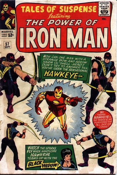
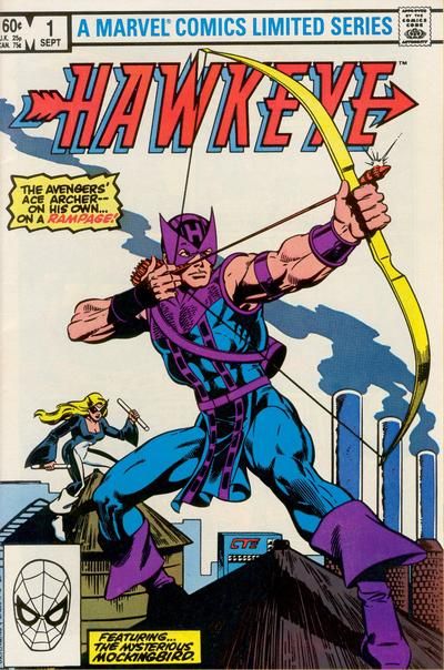
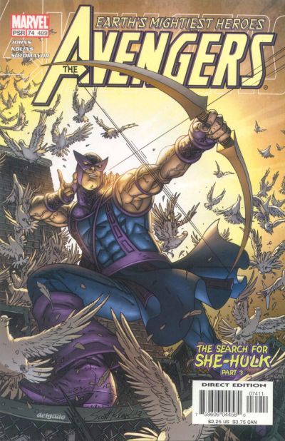
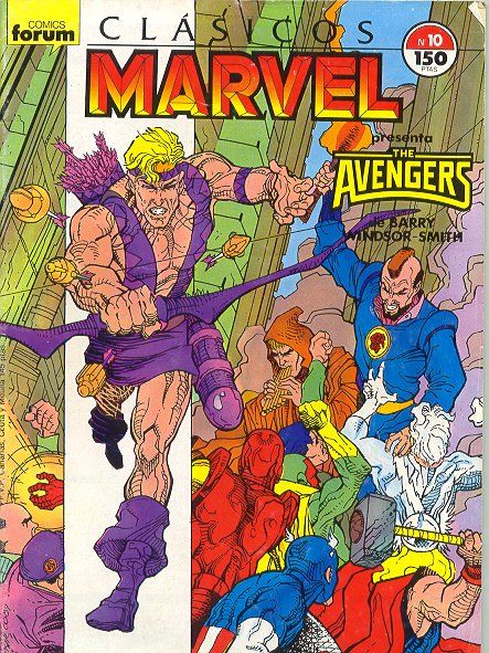
To refresh, here is the classic Hawkeye costume, which has survived intact from his debut all the way to the present (with some slight tweaks over the years).
His debut...
His first mini-series in 1983...
And right before his "death" in Avengers Disassembled...
That's the standard bearer. Now, let's see how artists have tried to "improve" on the design over the years...
First, two honorable mentions!
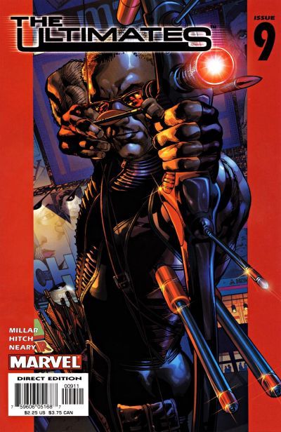
Compared to these other costumes, the Ultimate Hawkeye costume looks pretty bland, but I will give it a pass because it really is intended to look this bland.
And he DOES look pretty damn cool, doesn't he?
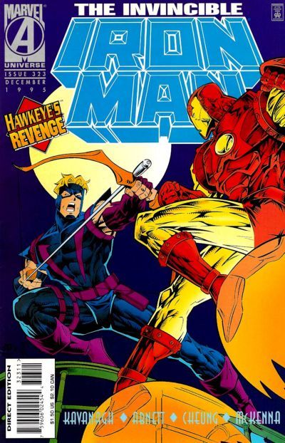
The next costume to get a pass is the Crossing-era costume. I was really prepared to rank this Crossing-era costume higher on the list, but when I went to look at it again...wow, it's really not that bad, is it? Maybe it's just Jimmy Cheung's skill as an artist, but this design looks pretty decent.
I mean, it's not as good as the standard, but still, pretty decent. Not bad enough to make the top five!
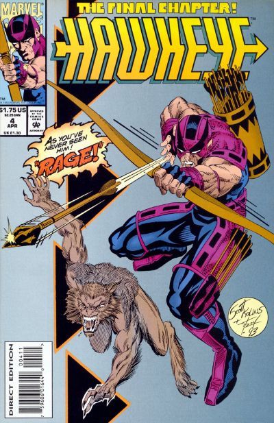
5. The first entry occured when, in 1994 (after Mockingbird was killed) Hawkeye went solo, and they tried to "grim and gritty" him a bit with his mini-series. And part of that was getting Hawkeye's SECOND "hip" version of his original outfit (the first is later on in the countdown).
It's not that bad, actually.
It basically took the 90s costume design idea of making everything a little sleeker (Vision's 90s costume, Robin's 90s costume, Nightwing's 90s costume).
Still, it is an update that doesn't even remotely improve on the original, while not going different enough to stand on its own.
By the by, the 1994 series was notable for introducing Rover, the character find of 1994!! What a great mix! Hawkeye and some sort of mutated wolf.
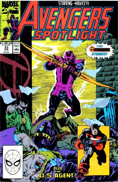
4. When he took over writing the Hawkeye's solo series in Avengers Spotlight, Steve Gerber decided to mix things up a bit.
Part of that included having Hawkeye shot, and forced to don a new armored costume.
This was short-lived.
Remember, folks, armored costumes are lame!
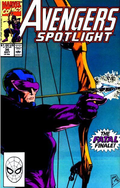
The above cover doesn't do the lameness of the new costume justice. This version does it better (it just shows less of the costume)...
Look at those goggles!
It's like Robo-Hawkeye!!
Yikes.
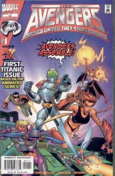
3. This one is a bit unfair, as the designers were working under the aegis of children's animation, as well as the concept of the show (and toy tie-in) which involved each character having some sort of modular armor.
Still...what an ugly design.
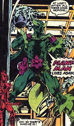
2. This is a nicer looking costume than the cartoon Hawkeye, but goes lower on the list because they WEREN'T under any constraints. Rob Liefeld CHOSE to give Hawkeye what looks like a brown version of Plant-Man's costume
Weeeird.
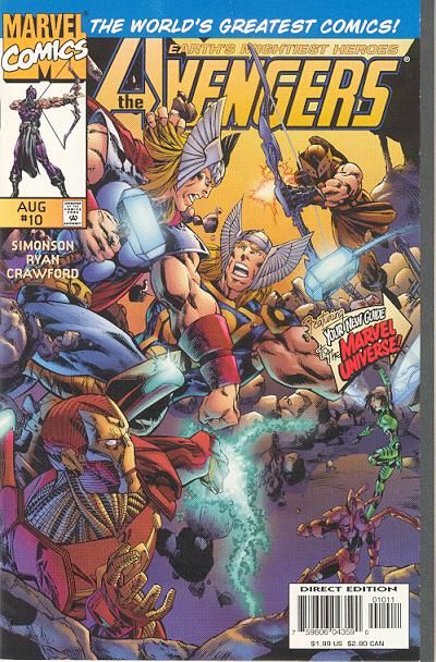
Thanks to Ian Astheimer for reminding me of this one (I flipped through the Liefeld ones, but I missed this one, because Hawkeye was barely on ANY of the covers! The costume I'm showing you is actually an IMPROVEMENT on Liefeld's design, as Michael Ryan basically is drawing Hawkeye like normal Hawkeye, only with a mask and a brown outfit - Liefeld's version was more similar to Plant Man's outfit.
Just weeeeird.
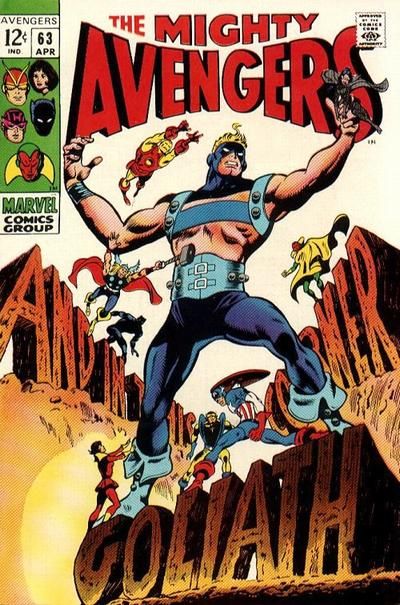
1. Please note that before this costume, Hawkeye was using Hank Pym's growth serum and was going under the name Goliath. When doing so, he used the following costume...
So please keep in mind that he was already used to showing some skin.
Even with that in mind, I don't know if that explains Barry Windsor-Smith's design of this short-lived outfit.
Yikes.
Okay, that does it for this Top Five! Feel free to express your agreement or disagreement!
As a special EXTRA treat, here are the costumes again, courtesy of the great Micro-Heroes website!
Normal Hawkeye -
Crossing Hawkeye -
5.
4.
3.
2.
1.




-Clint%20Barton.gif)
