I feel weird using a term like "underrated" to describe Frank D'Armata, as he certainly isn't underrated IN the industry, as Brian Michael Bendis asked for him specifically when beginning his Avengers run. However, when the list of "top colorists" get bandied about, D'Armata is rarely mentioned, and I think that's a shame, for I think he is one of the top colorists working in the industry, as I will hopefully point out to you folks here, if you didn't already know.
D'Armata made his debut working at Top Cow. If you did work at Top Cow as a colorist in the 21st Century (and your last name was not Smith, Isanove or Haberlin), you were likely working in the shadow of Steve Firchow, whose influence is evident in Top Cow's colorists since Firchow became the main man at Top Cow for coloring. This was the case for D'Armata as well.
It was while working at Crossgen a few years ago that D'Armata began developing his own unique style that he maintains today. If you look at Crossgen's colorists, you can see how much of a priority the company placed upon coloring, because their stable of colorists reads like a Who's Who of colorists, with both well-established colorists like Laura Martin and Justin Ponsor as well as young colorists who made their mark at Crossgen, who may have had profiles before CrossGen, but by the time they were done with CrossGen, their profile was much higher. Besides D'Armata, there was Morry Hollowell, Jason Keith and Caesar Rodriguez.
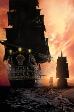
Since he first began at Crossgen, D'Armata had worked with penciller Steve Epting, but just as Epting began to try new things as an artist the longer he was at Crossgen, the same could be said for D'Armata. The culmination of this pairing was evident in their last project together at Crossgen, the pirate comic book, El Cazador.
From an interview with Greg Thompson at the time the first issue was released, here are El Cazador writer Chuck Dixon and Epting talking about D'Armata,
Thompson: How important would you say the colorist's job is in establishing the mood of El Cazador?Dixon: Extremely. Frank D'Armata is really adding to the illustrative quality of Steve's art. The world of El Cazador is a real one; not a superhero or alien environment. Frank has to make certain that the lighting and textures remain true to our world. That's tougher than it sounds.
Epting: The colorist - in this case Frank D'Armata - is hugely important. We have had long discussions on the approach we wanted to use for this book. Frank is doing a sort of painterly style in an effort to evoke the feeling of classic pirate art in the vein of Howard Pyle and Frank Schoonover. It is an ongoing experiment for him and he keeps getting better and better.
Their compliments are on the money, which is evident in these sample pages from the first issue...
Look how lush those pages look! Epting and D'Armata really did an amazing job on those issues (it is a shame that the book ended so soon).
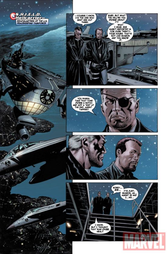
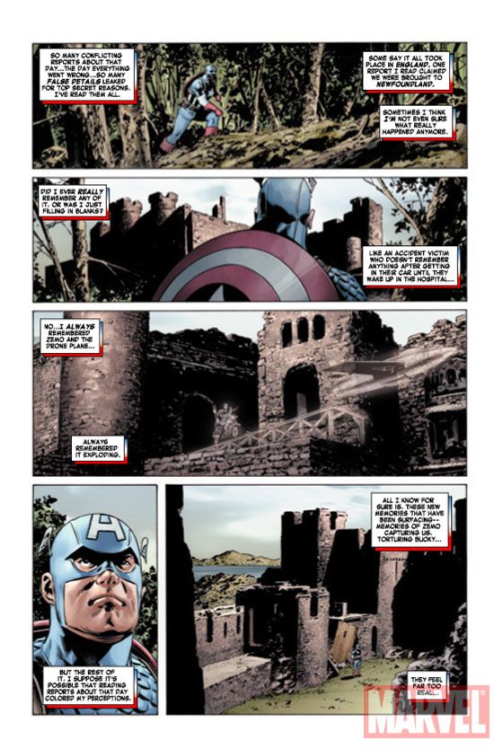
This lush, "realistic" style is the same one D'Armata developed and brought with him when he stayed with Epting, as the two moved to Marvel, with Captain America.
Here are sample pages from Captain America #6.
The look they are going for in Captain America is that "action movie" feel, and Epting and D'Armata pulls it off beautifully.
Also, on Captain America, a secondary bonus of having D'Armata is the amazing consistency his colors bring to the book.
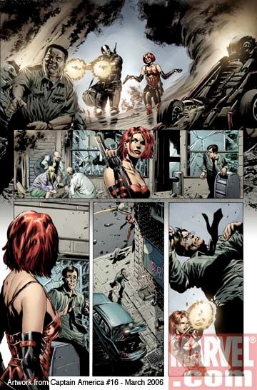
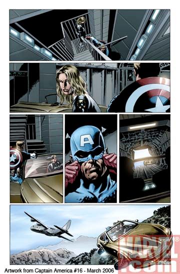
Now Steve Epting had already been working with the great Jackson Guice at CrossGen, as did Mike Perkins (who inked Guice at CrossGen), so both Perkins and Epting had a bit of that Guice vibe to their work on Captain America, so it was not like the title was throwing together two disparate artists (like, say, going from Epting to Humberto Ramos or something like that), but whatever differences the two artists have in their styles were blunted by D'Armata's colors, which help the book maintain a consistent look.
For example, check out these sample pages from a Perkins illustrated issue of Captain America, #16...
I find that remarkable.
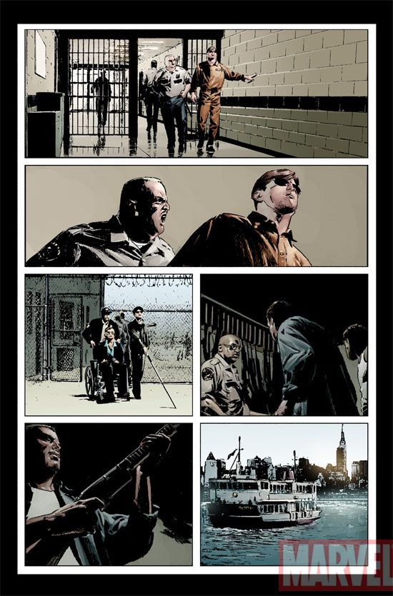
Perhaps what I find most remarkable about D'Armata, though, is his recent work on Daredevil. It is the same lush/realistic style, but much more "pulp-y"/"noir-y" style. It is done so well - right off the bat! Usually, you have to build up to this sort of thing (as D'Armata did on his Cap style over at CrossGen), but D'Armata had the style down pat from the first issue.
Here are some sample pages from the most recent issue of Daredevil...
I'm really impressed.
At the same time, D'Armata is still able to use a clean, Firchow-esque style, when that is called for.
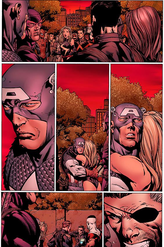
When he began working on Avengers: Disassembeld, D'Armata got a lot of crap for the colors, which I think is a bit unfair (and yes, I thought the idea of coloring everything red was odd, too, but I understand that it wasn't HIS idea), as D'Armata was specifically told to color the scenes like that.
Yes, this coloring was weird, but look at the pages where he WASN'T specifically told to color it red!
See?
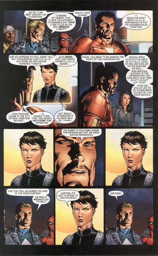
Just a standard Firchow-esque coloring style.
This is the same style he brought over to New Avengers, as seen in this page from New Avengers #4.
By the way, as a testament to D'Armata's talents, look at how the colors have lagged a bit on New Avengers since D'Armata left, and his replacement is one of the coloring greats, Dave Stewart (Stewart only lasted a few issues on the book, so perhaps he just wasn't feeling the book)!!
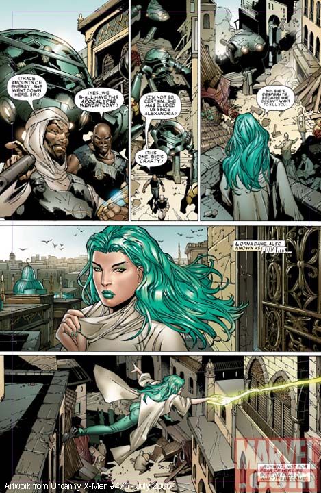
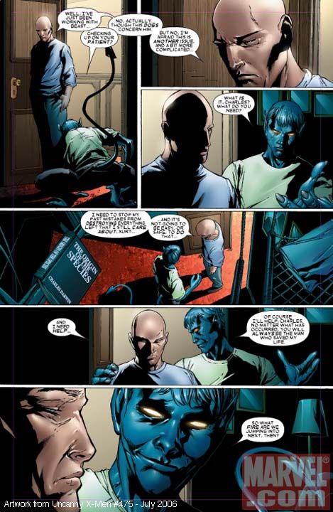
This Firchow-esque style (which makes sense, as Finch came from Top Cow, so he's Silvestri-esque, so it only makes sense that his colors be Firchow-esque...hehe) continues on his current Uncanny X-Men, which helps to make artist Billy Tan appear more like David Finch.
These pages don't stun the audience, like his Captain America or Daredevil work does, but it is still solid work.
All in all, I think that Frank D'Armata is one of the best colorists in the business, and I hope this little bit helped to demonstrate his talents.

