NYCC 2015
PHOTOGRAPHS OF NYCC

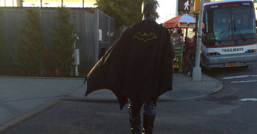
I didn't bring my camera with me this year. Having seen the coverage of the show before I went on Saturday, I knew there'd be no comfortable way to make that work. I trusted my handy iPhone to be my camera, and it caught a few interesting moments for me:
INKTOBER, WEEK TWO

Meanwhile, I'm still drawing...
Day Six: Chris Samnee's Black Widow

I already complained last week about drawing lots of black on a page. Trying to show any sort of texture or shape when everything is jet black is a very tricky thing.
So who's bright idea was it to draw Chris Samnee's new Black Widow design?!?
It turned out to be very instructional. Just look at his drawing:

Notice how much of it isn't actually black. There's a shiny white streak along the high spot of each limb, for starters. Notice the white space on the left side of her body. The tops of the thighs get pronounced white shapes. See all the little creases across her stomach and along her sides? See the thighbrows? (I just learned that word, so now I foist it upon you.) Samnee uses some gray washes in there to add dimension, but the overall effect looks black, even when it has so much non-black space, anyway. It's a great way to trick the eye.
It all looks so tedious and time-consuming. If you do a Google Images search for all of his Black Widow sketches and previous art, you'll see similar techniques at play. Often, it's more pronounced, but it's always there.
So while I don't enjoy all the extra work an all-black costume means, I do understand it better now.
Day Seven: Spin Angels

We turn from inky black drawings to spare color-filled drawings that need extra blacks spotted.
What I Learned: This is a character from the French comic series "Spin Angels." The style of that series is influenced by manga and anime, though still with strong Franco-Belgian storytelling and topics. It is a very pretty book, thanks to the expressive characters and the strong coloring that completes the art. The style has no -- or very infrequent -- large areas of black. It's mostly even and thin lines, left open for the colorist to come and take over.
As a plain black and white drawing, that style looks kind of dull, so I tried to add some additional line weights and a couple areas of spotted blacks, along with occasional cross-hatched shadows. I'm not sure they improved anything or hid any imperfections, but I think the drawing works better on its own this way.
It's also a good lesson in tinkering. I went back to this sketch multiple times to tweak it. I added little lines, extra blacks, a shadow here, etc. etc. Again, I think that helped, but I also wonder how much I was overdoing it. When do you leave well enough alone? With a daily deadline, Inktober tends to favor quick experimentations and then moving on to the next thing. At least, it does for me. I'm OK with that. This is my annual inking crash course, in many ways.
What I Missed: The drawing itself is still too flat. I'm still drawing on one plane, avoiding foreshortening at all costs. I need to get over that and make these drawings more dynamic.
Also, the gun seems to be sagging. It's a terribly impractical weapon to hold one handed like that, but I was just having fun drawing and kept adding to it. I think this is how Rob Liefeld feels about weaponry, too... I like that!
Day Eight: I Hate Fairyland

This might be my favorite of the batch so far. Inspired by Skottie Young's new series -- I've read the first issue and it's disgustingly delightful -- I was happy to draw something in an even more cartoony style than even my usual fare.
It's like drawing the lightning bug from "The Princess and the Frog," the good witch from "Gravity," and Las Estrellas from "Dora the Explorer." How could I pass that up? I set it up as happening before the comic, just so Larry (that's the guy in the middle) might look slightly happier.
What I Learned and What I Missed: The danger of drawing on a 9 x 12 inch sketch book is that my scanner is only 8.5 x 11 inches. I had to scan the page in two pieces and then stitch them together on the computer. The good result of this is that the black level on the bottom half of the sketch was lower than the top half. So the princess who is supposed to be in the background, anyway, has a slightly faded line. It helps the effect, but I can't claim to have done it on purpose. It was a complete accident. But it's one I might use again in the future.
Day Nine
It was a miserable failure. A combination of inking when I was too tired and a rushed pencil job underneath just killed it for me. Lesson learned. I'll spare you the art. Let's move on.
Day Ten: Skinny Cyclops:

The crowds of New York Comic-Con inspired this one, obviously.
What I Learned: I used the pen more than the brush for the first time in Inktober. This drawing is a good lesson to remember to use the tools you have when appropriate.
I tried to them go over some of the pen lines with the brush to get a little more character added to the drawing. It probably didn't need it. It helped some parts, hurt in others. Chalk that one up to learning through experience and then move on...
What I Missed: That boot cuff on his left leg is facing down. We should be looking up at it. That explains why his lower leg looks like it's bending up so much.
Days Eleven and Twelve

The original art for day 11 was atrocious, so I called a mulligan and did something else completely. Then I added a second character for the next day and just made the whole thing one big happy image.
Finally, something I can be proud of again. These are my two characters who still have no names, acting out a scene in which something is going on. I like the gestures. I like the exasperation. I want to write this story...
It's not an angle I'm used to drawing hands at, which I think shows. But, trust me, I redrew them dozens of times to get them this good, even after taking photo reference of my own hands in this position.
What I Learned: I tried to apply some of the lessons from inking Black Widow a few days earlier to this. Some of those experiments didn't work, so I filled the areas in with black, but a few survived. I like the look.
What I Missed: His left hand. Should have put it in his pocket or something. That just looks awkward. I'd redraw that part if I had the time. It's amazing how fresh eyes can catch a bad mistake the next day...
That wraps up another week of Inktober, and we're still not halfway there. I better go pencil in some more drawings so I have something to ink in the days ahead...
Next week: I think I had promised a review this week. NYCC coverage knocked that out, so I'll finish it for next week. Promise!
E-mail || Pipeline Message Board || Twitter || VariousandSundry.com || AugieShoots.com || Original Art Collection || Google+