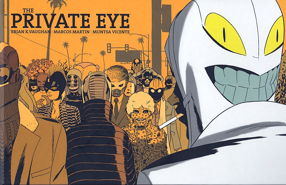
THE PRINTED PRIVATE EYE
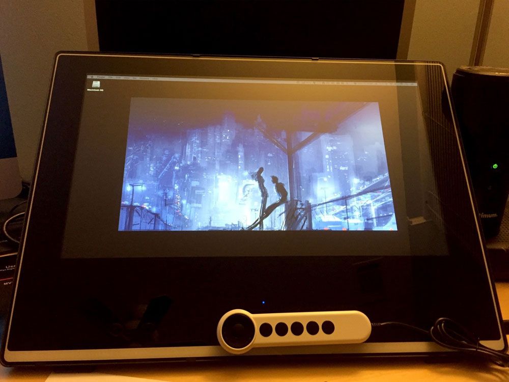
DRAWING ON MY NEW SCREEN
I find drawing to be incredibly relaxing.
That's easy for me to say, of course. I don't make my living from it. I have no deadline pressures. Nobody cares what I'm drawing. Maybe a couple hundred people will see it when I post a doodle to Twitter or Instagram.
But there's a great sense of accomplishment when I feel like I got something right. Maybe a hand looks right when I had to draw it from a funny angle, or in an odd position. Maybe I finally nailed the proportions of a human body for a change. Maybe the shading in the coloring pops the image out in just the way I pictured before I started adding it in.
It's even better to look back at something from a few months or years ago and realize that things have gotten better. Progress is good.
THE EPIC GEN13 REREAD: "Gen13" (the miniseries) #4
Over the weekend, we had yet another go-around in the Artists versus Writers debate on Twitter. Who's more important?
Here's my opinion:
Artists? Writers? Feh, they're NOTHING without the letterers saving their butts every time...- Augie De Blieck Jr. (@augiedb) December 6, 2015
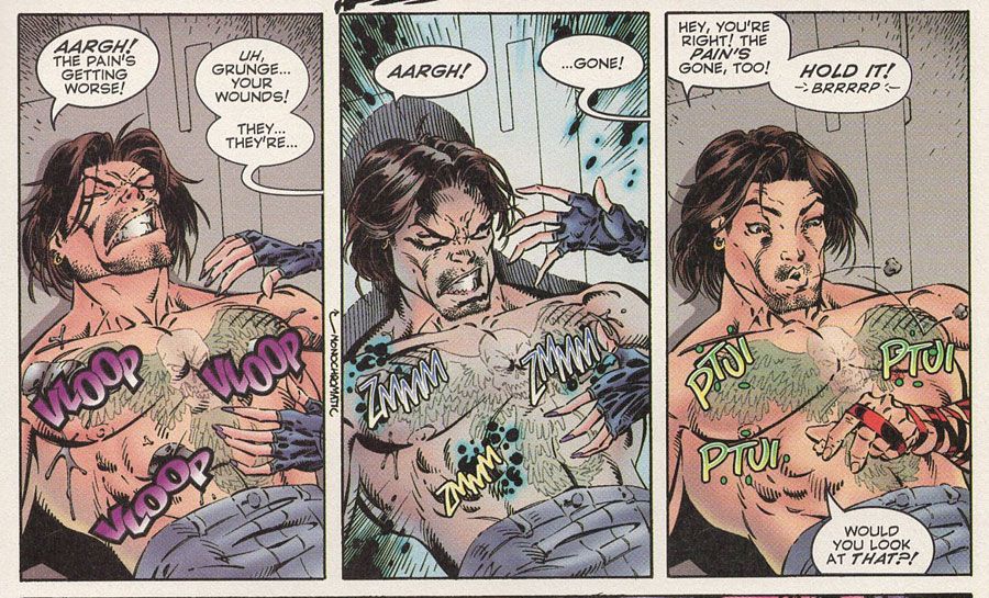
I'm joking (slightly), but then I read "Gen13" #4, which drives home the point that comics creation is not a job dominated by one role. Two creative changes are made for the issue that make it the best looking issue of the series so far, and it's neither the writer nor the artist. It's the colorist and the letterer.
First, Joe Chiodo did not color this issue. Wendy Fouts, who had assisted with earlier issues, stepped up. Her style is immediately and noticeably different. It's simpler.
I think it's mostly in the color choice. I see a lot of the same modeling techniques, but they feel more subtle. I think the biggest change is in the background colors. They tend to be brighter with fewer obvious gradations. Sometimes, Fouts even goes with flat colors that aren't competing for your attention with the characters in front of them. The art is easier to read, as a result. The entire issue feels like someone turned on the lights in every room the story takes place in.
It's not that Chiodo is a bad colorist. Far from it. It may have been the natural tendencies of colorists to use Photoshop more heavily when they're first learning the tool. It might be his painting background trying to model things more strongly. I don't know. But I think some of the shadow work and the gradients took away from the art instead of adding to it. Also, Campbell's style isn't as "serious" as others in the Wildstorm stable at the time. Yes, he can pull off the technology and the superhero aesthetic, but his art is generally cartoonier, not because he's young and learning, but because that's his style. That style works better with flatter or brighter colors.
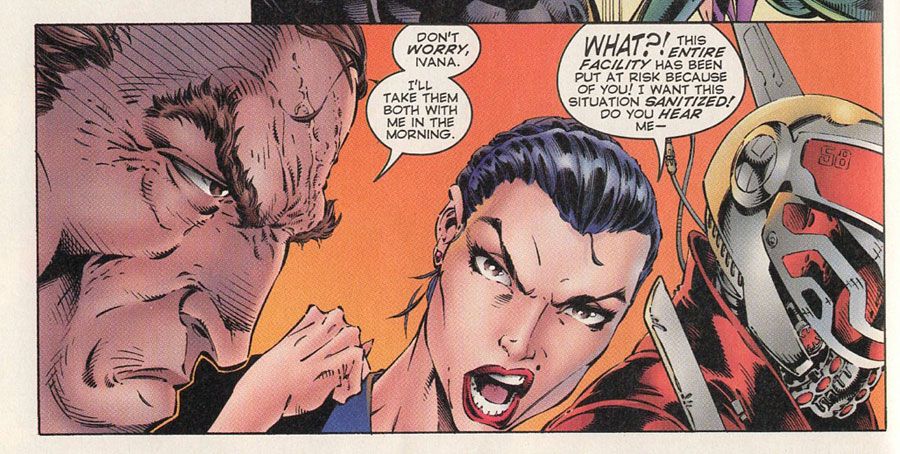
Secondly, Comicraft did the lettering for the issue. Ken Lopez is a great letterer and did nothing wrong with his hand lettering in the series (nor Chris Eliopoulos in the first issue), but Comicraft added a little extra bounce with their style here. It comes closer to Tom Orzechowski's classic "X-Men" style in terms of playfulness. Everything from the double walled word balloons to the double-height exclamations help give the book a more playful look. Even the story title on the splash page feels bouncier.
This is an issue where the '90s speak gets ramped up and the Gen13 team starts coming together. It makes sense that the style of the book starts morphing to match that, too.
There are little nit-picks you might have with Comicraft's lettering here, but it was very early days for computer lettering, as a whole. Some spacing issues and random stray marks are easily ignored for how the whole package came together in this issue.
The Story: Let's see if I can sum it up quickly for you:
Caitlin and Pitt realize they're on the same side and join forces. The rest of the Gen13 team works together to help her, discovering their powers as they go along. Ivana and Lynch have a difference of opinion and full scale war erupts in the facility. During one brief pause, Lynch fills Caitlin in on how he knew her father.
Along the way, we discover Grunge has some kind of invincibility power. That's convenient, because he gets shot multiple times.
At the end, Pitt saves Timmy and runs off into the night, while Lynch decides to take the fight directly to Ivana, with the help of some superpowered teenagers.
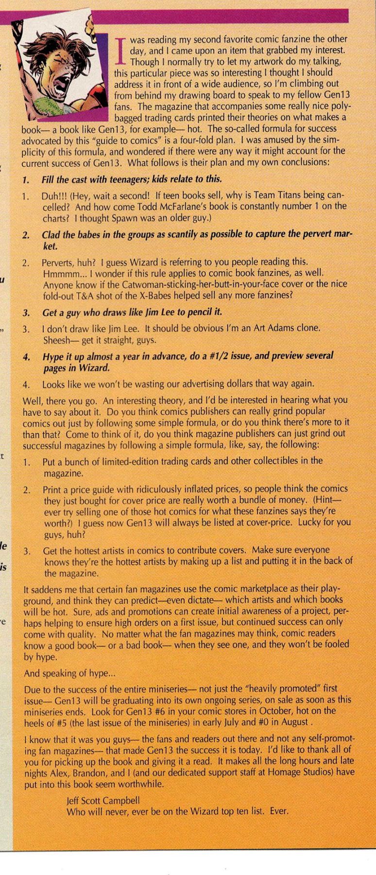
The Editorial: Perhaps the most surprising and entertaining part of the issue came in the letters column. J. Scott Campbell penned a thought piece decrying Wizard Magazine's attempts to explain the formula that made "Gen13" successful. Understandably, Campbell didn't appreciate that Wizard thought the series was only popular because it followed a formula and hit all the right bullet points.
Turnabout being fair play and all, Campbell responds with his suggestions for what a magazine publisher could do to "grind out successful magazines":
1. Put a bunch of limited-edition trading cards and other collectibles in the magazine.
2. Print a price guide with ridiculously inflated prices, so people think the comics they just bought for cover price are really worth a bundle of money. [...]
3. Get the hottest artists in comic to contribute covers. Make sure everyone knows they're the hottest artists by making up a list and putting it in the back of the magazine.
Or to sum it all up:
It saddens me that certain fan magazines use the comic marketplace as their playground, and think they can predict -- even dictate -- which artists and which books will be hot.
Though many might see Campbell as part of the Wizard Generation of artists, it's clear he wasn't always on the same page as the magazine.
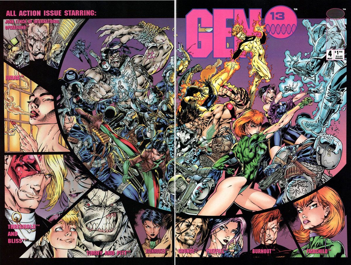
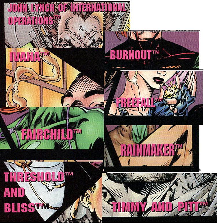
The Cover: Give people ownership of their work and they'll shout it from the rooftops. Or, in this case, they'll include as many trademark notices as they can. Take a look at that cover. Every name on it has a "TM" next to it. I don't know how trademark-able any of it is, particularly "Ivana." Somehow, I don't think the paperwork ever went all the way through for that one. In the indicia, we also learn "Timmy" is trademarked by Dale Keown. If you have a character named Timmy in your comic, don't mention it on the cover and you'll probably be safe.
Next Time: The miniseries wraps up with several bangs.
Twitter || E-mail || Pipeline Message Board || Instagram || Tumblr || VariousandSundry.com || AugieShoots.com || Original Art Collection || Google+

