The Open
This thing, Danny-boy ... it's all one cult of ego. Shout as much as ya' like.
The Feature
As someone willing enough to sit, pitch and write about another someone's comic book, you'll, at times, receive said comic book for free, and today, Peeling this Orange, we're staring down one of those occurrences, though normally I'd loathe so. Because writing seems to soften when done as a public servant.
But to cut a inevitable tangent short, this review copy exhibition holds reason to be written, for Simon Moreton's Grand Gestures, kindly supplied by Retrofit Comics, is so bare bones comics, it's undeniably beautiful for how it meshes mechanics with its larger considerations of life and the universe, and in both arenas it demands a reader's participation.
It's the "story of a man being pulled apart," but the comic doesn't really present any sort of narrative strand to tether oneself to. It's fairly abstract, supporting very little text, leaving a reader to watch a bald, middle-age man wander through his delicately-rendered world in search of something. It's yet again another tale of middle-class entrapment, tired of the same-old routine and suburban prairie, but Moreton 's address of it manages to cover the same old themes while helping us uncover something dimensional of it, like almost this cosmic physicality that's to blame. Because Grand Gestures is about much more than some fat, old dude whipping back and forth like a ghost. It's a consideration of everything blocking our view, and we're finally privy to a clear line of sight due to the cartoonist's minimal presentation.
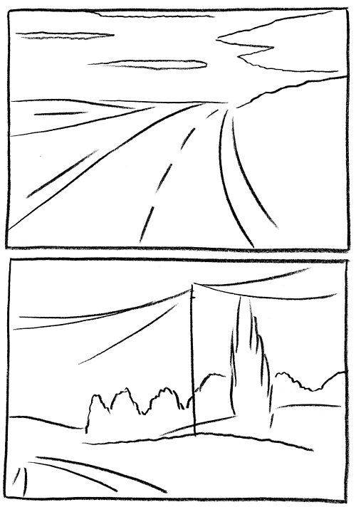
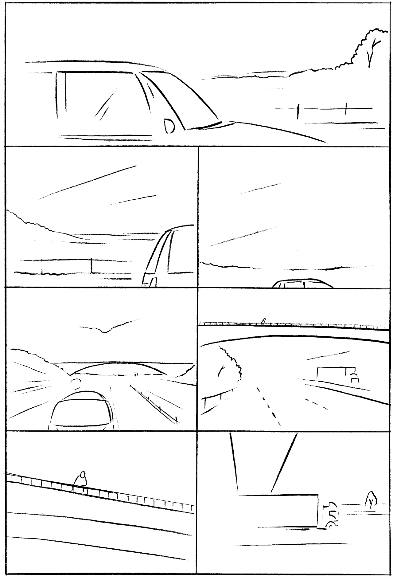
Minimalism or any sense of good design says most by what's not presented (ask Kanye), so, please, if you care, stop and view the images implanted in this column. Find what you can.
If your mind works like mine, you probably see these impressions two ways, as reductions and magnifications of the objects and spaces Moreton presents: a.k.a. contour drawings. But the technique laces the comic's thematic interest particularly well. Those scant lines sell the deterioration in stripping away one's own reality yet also build upon such a reality by opening up new, clean measurements in between the borders with white space. It's a way to both acknowledge the character's probable interest in self-destruction as well as his desire of a new plane, though ultimately I'd argue the latter as the main point. For contour drawing tends to emphasize the mass of its subject, and in this case Moreton aims to show us how big reality itself can be. The artwork hosts a conversation, pointed between itself, the reader and the character, and such back-and-forth really conveys that whole destruction/creation cycle our universe seems so fond of.
To know this conversation, you need just know the character's POV, the mission of the visuals and your own perception and experience. Smash all that in a blender, and watch the colors swirl - they won't mix, really. Because everyone has their own vantage point, here. The visuals are the physical, objective plane of reality while the character and yourself are two separate, subjective set of eyes who may agree at points, yet never exactly match. But all with bounce off one another, maybe creating something new in the process.
There's also this element of timing that's alive. As Frank Miller once said "a cartoonist has to be really smart to slow you down,” but with Grand Gestures, Moreton finds it possible to do so with very little, forcing a reader to pause and discover these new spaces buzzing in between the lines we always knew because the artwork presents little else to look at. It manages, with so few lines or detail, to slow us down, working against, I think, what we sometimes assume visual art to do, that is splash us with details, and we'll stare for hours. But here, Moreton has us still by leaving blank fillings for us to toy with. It fulfills the core of minimalism, it seems. "Less is more."
It would be easy for a comic book like this one to fall into the "My Sad Life" category, and at times, Grand Gestures feels drenched in its own sentiment, yet Moreton pulls the comic away from its inevitable pity by so heavily incorporating the visual aspect it does. When you have such a forward technique driving this thing, it could either come off as gimmick or brilliant, and in this case Moreton avoided the former. Though only slightly. Somewhere in the middle there, with the "Sales Fair" chapter, things grow a bit repetitive. Those horizon shots and suburban homes mean less and less as they pile up, and while maybe that's Moreton going for saturation, it reads more heavy-handed.
That said, though, Moreton made a comic very honed, for the idea and execution feel one.
Simon Moreton | Retrofit Comics
The Exit
A New York Times feature: "... writer Scott Snyder has reinvented Batman in the past two years, deepening and humanizing the Dark Knight’s myth — in the making since 1939 — like no one since Frank Miller in the 1980s."
I give up.
Alec Berry left disco standing. Follow him on Twitter @Alec_Berry.


