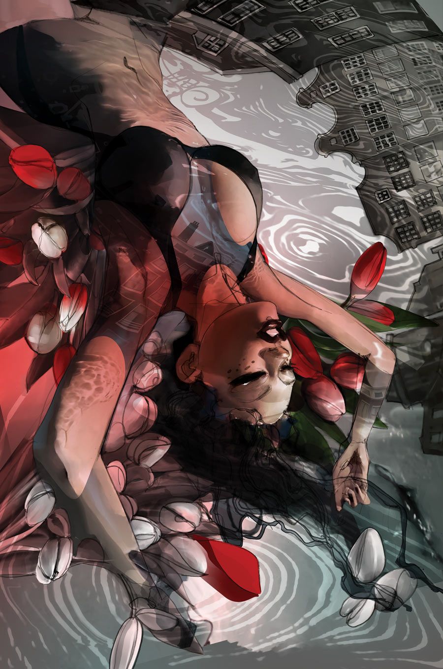
"The Names" feels like a stealth series; one that's been dropped into the comics market without much fanfare or attention. That's a real pity, because Peter Milligan and Leandro Fernandez's nine-issue limited-series feels like something that should appeal to a lot of readers, especially those who enjoyed "100 Bullets."
"The Names" #3 continues the tight, tense mood that began in the first two issues. Milligan's created a thriller that's as much about physical danger as it is mental puzzles. We end up with a good combination of protagonists on that front; Katya gets to be the muscle while Philip is the brains of the operation. And while some of the clues seem overly complex as the duo try to piece together what their ex-husband/father was trying to tell them in his farewell message, there's a certain little thrill to get to see what seemed like throw-away information and phrases turn out to have so much more meaning.
Milligan also introduces the Tulips, a counter-organization to the Names, in "The Names" #3. It's a smart move, partially because it explains why a group as all-powerful as the Names could have been kept from taking over, but also because it gives Katya and Philip a potential ally, as well as someone who can deliver exposition that might be too hard to obtain otherwise. Milligan also keeps tabs on the Surgeon this issue, who despite not having actually encountered either of our leads, is getting progressively creepier and whose shadow is looming dangerously over them.
Fernandez's art in "The Names" is astounding, some of his best to date. His character work is great, with lots of reactions that are slightly exaggerated but in a consistent, deliberate fashion. That said, what I'm really falling in love with here is his usage of architecture and negative space. Look at page 11, where members of the Tulips are danging Katya off of a building. Fernandez draws it in a dizzying, vertigo-inducing manner. The layers of brickwork, the carefully dotted pattern of windows, the shadows that fall across the building as your eyes move down -- Fernandez takes a very typical threat and makes it feel incredibly dangerous by the way that he draws it, giving it the correct amount of import. Fernandez also understands negative space remarkably well, something that I wish more artists would be willing to play with. In each issue there's been at least one moment where we get to see it; here it's on page 14, standing up on the roof in Amsterdam. By letting most of the top half of the page be full of sky rather than zooming the panel closer in on the duo, it gives us a much stronger feel for the setting and where our characters are situated. It's a simple but effective technique, and I love that Fernandez knows when to leave areas of the page blank in order to make the remaining images work that much stronger.
"The Names" #3 is another good installment in a strong mini-series; with two-thirds still to come, I feel like the sky's the limit. If Milligan and Fernandez can keep this up, we're going to have a real winner. In the meantime, though, I hope that more people start buying and talking about this comic. It's too fun to be ignored.

