THE APPETIZER: PIPELINKS AND ONE-LINERS
-
When the news that IDW had bought Top Shelf got out, everyone started making jokes about G.I. Joe and Transformers characters suddenly showing up in Top Shelf comics. That's all well and good, but I had a far better ludicrous example in mind:
If they just wanted to do a collection of Andy Runton's convention sketches, instead, I'd buy that book... In the end, it doesn't matter. Runton is moving to self-publishing.
- Some days, I worry that I like Artist's Edition and Absolute books because I'm getting old and they're easier to read.
- If you liked the "Coraline" movie, you can win a piece of the movie at auction soon.
- Following this week's conclusion of The McSpidey Chronicles (see below), we'll return to the Epic Re-Read of "All-Star Batman and Robin the Boy Wonder." There will be five more issues to go. There might be a slight delay, though, while I wait for my copy of the Absolute edition to come in.
-
Given the voyage of Tumblr discovery I've been on lately, this tweet from C.B. Cebulski stood out to me this past week:
I'm not waiting for any calls...I find more artists being discovered off Tumblr these days. Easy scroll-down format, large images and chronological from top down. Try it!- C.B. Cebulski (@CBCebulski) January 12, 2015

"THE AMAZING SPIDER-MAN" #328: "Shaw's Gambit"

Over the course of the last 10 months, we've looked at every issue of "The Amazing Spider-Man" that Todd McFarlane drew, and even one he didn't. This week, we hit the end of The McSpidey Chronicles. Let me set the story's stage:
In the two months McFarlane took off between drawing the end of the "Assassin Nation Plot" storyline and this one, two things happened. First, Spider-Man gained cosmic powers from Captain Universe. Second, "Acts of Vengeance" began, in which top Marvel villains agreed to take on each other's biggest threats.
And so:
Sebastian Shaw pays Hulk to kill Spider-Man.
The story outline is just that simple, that straightforward.
Todd McFarlane left "The Incredible Hulk" series to work on "The Amazing Spider-Man" in the first place, so this issue was a nice return to the character after two years of developing his art style. The results are very nice. This Hulk, for those who couldn't keep track of Hulk's changes during Peter David's tenure on the title in the late 80s/90s, is grey and smart and surly. He wants to be left alone, but Shaw's offer of lots of money to take out Spider-Man proves too tempting to ignore.
This issue is an art showcase for McFarlane. Spider-Man fights Hulk in New York City twice in one issue. How much better could it get than that? This might even be McFarlane's finest artistic moment on the series. It's still problematic with the storytelling that scrunches characters uncomfortably tight into their panels, but the moments we do get are epic.

I love Hulk's look here. McFarlane is a known monster fan, so Hulk is right in his wheelhouse. Hulk is grey-skinned with a short black haircut, large brows, and a square, drawn-down face. He has a cute button nose, wide and round. Along with the little white beady eyes, he's got great facial proportions to show emotion.
He lumbers around everywhere he goes with a bent back and knees, staying low to the ground and doing powerful things, like throwing ambulances or dropping boulders. McFarlane has a clear vision of Hulk. He's brutish and muscular and compact all at the same time.

Spider-Man, imbued with the powers cosmic, flies through the city. There's no swinging in this issue. Spider-Man can just up and fly halfway across the city in the blink of an eye. These are powers he's still discovering and still getting used to, but also powers he's not sure he wants. He doesn't know what powers he has yet, nor how to control the ones he has found.
Those powers are the center of the story. With greater power comes greater responsibility, but it might be more than Peter can handle. In fact, the fight against Hulk ends when Spider-Man punches Hulk into Earth's orbit. Given that Hulk turns back into Bruce Banner at sunrise, there's no chance for him to turn his back and find another planet to live on or anything. He'd have to wait at least another decade to do that. Instead, Spider-Man flies up and pulls Hulk back down to Earth, where Hulk agrees to not kill Spider-Man as an appreciative gesture

It's a great panel, with Hulk floating in space as the sun begins to come over the earth's horizon, and the look on Hulk's face when Spider-Man surprises him and pulls him back down is just as great.
I skipped over it, but the second scene in the issue is Spider-Man protecting the Statue of Liberty from some random terrorist group in pseudo-military uniforms. It takes place at night, high on the Statue, with lots of dramatic lighting and shading. McFarlane outdoes himself here, from the shot of Spider-Man atop the torch, to his reveal to the terrorists. Then, of course, there's this light-hearted pop culture exchange:

That cracked me up back in the day. It's one of the panels I remember redrawing when I was going through my McFarlane clone days.
McFarlane Inks: If there's one thing I've glossed over over the course of The McSpidey Chronicles, it's McFarlane's inking style. We've seen it change over the course of time. By this issue, it's gotten a lot smoother. Spider-Man's costume looks sleeker, in large part due to the way McFarlane inks the blue areas with the highlights. It looks like more brush work than pen work, whether it actually is or not.
He adds a lot in the inking stage, too, such as this bit of ink noodling from this issue:

It's a nice texture for the background, keeping it from being another plain color. Such a little thing, but it's another one of the things that helped set McFarlane's art apart. The only other person I can think of doing similar things at the time was Rob Liefeld.
Evolution of a Spider-Man: We can do some before and after comparisons to see how McFarlane's Spider-Man progressed over the years. The panels on the left in the following images are from issue #301. The panels on the right are from issues #321 and #325.

McFarlane's art takes a quantum leap in the span of 31 issues. He goes from looking like a classic John Romita-inspired artist to being his own thing. The two biggest differences are the webbing and muscle definition. The webbing gets thinner and denser. It's like McFarlane changed his ink pens to a thinner 0.05 Micron to be able to cram all those lines onto Spider-Man's body. He also appears more comfortable wrapping the lines around the shape of Spider-Man's body to give it better definition and mass. He was clearly trying in the earliest days, but the experience of drawing a couple dozen issues pays off.
Look at the blue part of his costume, particularly in the legs. It goes from looking like a Saturday morning cartoon on the left to a high definition home theater look on the right.
Here's another side-by-side, where you can see that difference better:

Check out the lines on Spider-Man's legs to the right in the later issue. It has thinner slices of blue being used to highlight the legs against a mostly black portion of costume. The older version looks like the inverse: a blue costume with black shadows. It's more like a coloring book.
Note, too, that the shape of Spider-Man's head has evolved into something less bubbly. It has better shape now, with a more clear square jaw and flat front.
The poses and anatomy have gotten more exaggerated over time, too. They stick out towards the reader a little bit more. McFarlane learned to use dimension in his artwork better, crafting poses where feet or hands might stick out or lay back in the post. Look at any pose of Spider-Man in the last year of McFarlane's tenure and you'll see how he poses arms and legs to go in all sorts of directions. Nothing is "twinned"; the left half of Spider-Man's body doesn't often do the same thing as the right half. They are at opposite angles. The top half and bottom half do the same thing, twisting away from each other in some way, or at some angle. This keeps the poses from looking static or boring.
The poses are closer to peak action. It's like McFarlane does a little more animation work with stretching and squashing, and then draws the poses at the peak of one of those two, usually the stretch. Even when Spider-Man is standing still and talking to someone, he's a little more theatrical, with noticeable gestures.
Check this pose out from issue #322:

The last thing you want from your pose of a superhero in action is to have a bunch of unbroken straight lines laying flat in front of the reader. There are some exceptions to this, as with anything, but if the stick figure version of your superhero in action looks stiff, your final drawing has no hope. You want more diagonal and broken lines. Take this pose and let's draw the directions of Spider-Man's limbs:

Keep in mind that this little drawing doesn't tell you about the third dimension. It doesn't point out that the back leg is pointing forwards towards the reader while the front leg recedes back.
Just look at all those angles. That's great stuff, and it's what helped to make McFarlane so popular, underneath all the line work and rendering and surface polish he put on every page. His Spider-Man looked cool and moved in interesting ways. It might occasionally be at the expense of perfect anatomy, but who cares? The art of cartooning is in the interpretation, and choosing what to exaggerate.

Wait, Are Those The Kids From -- ?!?: During their fight at Roosevelt Island, two kids are scene sneaking off to smoke cigarettes. Are those the same kids from "Skating on Thin Ice," that anti-drug Spider-Man comic that McFarlane did the art for? The cover for that book is in the back of the Omnibus, but none of the kids look like the two on Roosevelt Island. I've never seen the insides of that issue, though, so maybe there's still hope? Or I might just be grasping at straws.
Wasted Page: Peter and Mary Jane go out to dinner with Flash Gordon and his date, an annoying boorish woman who can't be pleased. There is a point to the scene. It's that Flash is so desperate for love that he'll date any loser, which will lead to the next issue, where he introduces Peter to his latest lady love, Felicia Hardy, a/k/a The Black Cat. The problem is that the scene sticks out like a sore thumb. It pays off nothing in this issue. Nothing happens from beginning to end. It doesn't even give McFarlane much of interest to draw, except maybe that one small panel of the New York City skyline at night, featuring the World Trade Center and a purplish glow to the cloudy night sky.
Chris Claremont littered "Uncanny X-Men" with these subplots that would pay off in later issues, but there was usually a moment of intrigue or suspense to them. This is just a not-so-interesting bad date moment. Bleh.
The page afterwards features Peter going to a pre-dawn shoot with Mary Jane on the soap opera she's part of. It's not exactly a momentous occasion, but Mary Jane's job struggles have long been a part of this book, and the scene exits on the high note of Peter seeing the Hulk land and rushing into action. It ends on an exclamation point, which the Flash scene didn't do.
Felix Watch: It's tiny on Sebastian Shaw's newspaper. I'll draw a red box around it:

McFarlane's Headlines: That newspaper is too small to write stories on, though McFarlane does still manage three headlines:
- "Liefeld on Mutant Book"
- "'Cocky' McFarlane Tries to Write?!"
- "Who's Alan Moore"
Burn?
Looking at the panel now, it appears that Shaw has a rare variant copy of the Daily Bugle. It's the manga Daily Bugle, where everything is read right to left. How could that be the front page on the left? With a tabloid format newspaper, the fold should be on the left side of the front page.
See the Original Art! The ComicArtFans.com site is a brilliant collection of original art collectors showing off their wares. As it turns out, eight pages from this issue are owned by one person, and he has all of them in one convenient gallery.
This is also the cover that's all nothing compared to the cover from this issue, which sold at auction last year for $657,250.
Identity Confusion: This confused me when I first read it, being relatively new to comics:

Todd McFarlane's Bruce Banner looks a lot like Peter Parker on a bad hair day.
Bonus Felix:Dark Horse put out a trade paperback of Felix stories a few years back. The back cover was a Felix pin-up from Todd McFarlane, probably marking the first time he had done a back cover since that issue of "Wolverine." It's not his best cartoony work, but it is cute in its own way. I like the way he drew the buildings in the background. They're just enough off-kilter to look interesting.
There are also problems with the coloring work, specifically with light sources. There's a shadow on the right side of his eyes, then under his nose, and also to the left of his cheek. That's three different directions of light for a scene that looks to be happening at sunrise behind him, judging by the gradient yellow horizon light.
Highlights occur right next to the edges of shadows on the balloons a little too quickly. Light doesn't fall off that fasts.
There's also a weird overlap of the highlight between Felix's legs being painted over the balloon string.

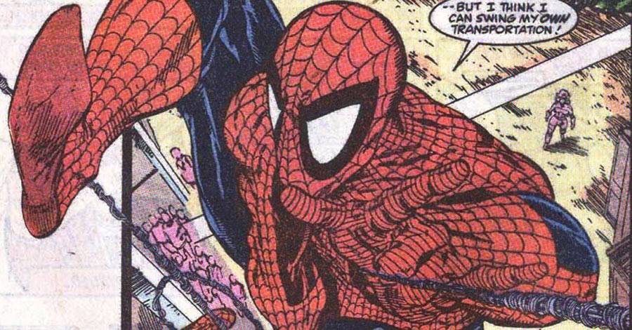
One Last Beautiful Drawing of Spider-Man Above the City: This classic shot of Spider-Man webslinging in front of the night-time New York City skyline is right up my alley, right down to the way the lights are drawn on the buildings. It's not a bad image to end on.

THE COMPLETE McSPIDEY CHRONICLES
Missed an issue? Here's the now-complete rundown:
- #298: "Chance Encounter!"
- #299: "Survival of the Hittist!"
- #300: "Venom"
- #301: "The Sable Gauntlet"
- #302: "(Mid) American Gothic"
- #303: "Dock Savage"
- #304: "California Schemin'"
- #305: "Westward Woe!"
- #306: "Humbugged!"
- #307: "The Thief Who Stole Himself"
- #308: "Dread"
- #309: "Styx and Stone"
- #310: "Shrike Force"
- #311: "Mysteries of the Dead"
- #312: "The Goblin War"
- #313: "Slithereens!"
- #314: "Down and Out in Forest Hills"
- #315: "A Matter of Life or Debt"
- #316: "Dead Meat"
- #317: "The Sand and The Fury"
- #318: "Sting Your Partner"
- #319: "The Scorpion's Tale of Woe"
- #320: "License Invoked"
- #321: "Under War!"
- #322: "Ceremony"
- #323: "Assault Rivals"
- #324: "Twos Day"
- #325: "Finale In Red"
- #328: "Shaw's Gambit" Twitter || E-mail || Instagram || Pipeline Message Board || VariousandSundry.com || AugieShoots.com || Original Art Collection || Google+