In THE LIGHTBOX, a four-part series running all week, CBR speaks with some of comics' biggest, most distinctive artists about their process and how they approach art and design in their work.
Jae Lee has had a varied career, first attracting attention illustrating the John Byrne-written "Namor the Sub-Mariner" for Marvel Comics before launching his creator-owned series "Hellshock" through Image. From there, Lee has been involved in an eclectic array of high profile projects, including "The Inhumans" and "Sentry" with Paul Jenkins, "WildC.A.T.S. Trilogy" with Brandon Choi and "Fantastic Four: 1234" with Grant Morrison.
EXCLUSIVE FIRST LOOK: Jae Lee Returns to "Batman/Superman" for "First Contact"
Perhaps his most striking project to date is the series of graphic novels expanding on Stephen King's "The Dark Tower" series, written by Robin Furth and Peter David and co-illustrated with Richard Isanove. More recently, Lee drew "Before Watchmen: Ozymandias" before launching DC's new "Batman/Superman" series, which he is returning to after a brief hiatus, starting with the just-released "Batman/Superman Annual" #1.
Lee spoke with THE LIGHTBOX about his work process, the ways in which the industry has changed over the last two-plus decades and why he's recently made his return to the world of superheroes. Lee also walks us through his process, from sketch to final piece, providing us with an exclusive look behind the curtains of what went into creating the cover for "Batman/Superman Annual" #2.
CBR News: I know it's a broad first question, but how do you think about comics and how has that perspective changed over the years?

Jae Lee: I think what I'm looking for in a comic coincides with my art style changes. When I first started at Marvel in 1990, it was a period of bombastic images where anything goes. All logic went out the window. The comics practically screamed out at you with their insane storylines and hyper artwork. My work during that period was definitely a product of the times. It was an energetic, frenetic time.
Then, I got older and things calmed down. I looked for that in the comics I read as well. I was no longer interested in comics where nonsensical things happened; I was drawn more towards the indy books where things were more heartfelt. When it came to my art, I had lost the confidence of youth, but gained the crippling fear that accompanies maturity. My art became too controlled. I was too reliant on photo references and my line art went from big bold strokes to thin wispy scared little lines. Drawing wasn't fun anymore. Every page was a failed exercise in capturing something that was too elusive. Nothing felt right.
Then my tastes changed again. Now, I'm looking at the legends of the golden age of illustration, guys like [Norman] Rockwell, [Frank] Frazetta, [Jack] Kirby, [Alex] Toth and [Wally] Wood. Their styles are retro, yet timeless. It's still an ongoing process, but freeing myself of the trappings of photo referencing and trying to become a cartoonist is liberating. Drawing is becoming fun again. Reading comics is becoming fun again, too.
At this point in your career, you have options as an artist -- what is it that you look for in a project? What do you look for in a collaborator?
I've been dying to get back to doing superhero work. I love the crazy bright costumes and the world they live in. I've always wanted to brighten up my style, and DC has given me the perfect opportunity. I have to give them credit. Given my dark style, I never thought I'd get a chance to work on one of their flagship titles. It's quite an honor and I'm having an insane amount of fun.
As an artist, the project I choose really depends on the situation. With "Batman/Superman," I get it all. Greg Pak is turning in some exciting and surprisingly sentimental scripts, so I'm very content.
THE BAT SIGNAL: Pak Returns To Earth 2 With "Batman/Superman"
But my dream project at the moment, given the retro vibe I'm going for, would be something along the lines of Darwyn Cooke's "The New Frontier." I got to play around a little bit in that time period on "Ozymandias," but I'd love to do more.
So much of your career has seen you doing very different work -- "Inhumans," "Sentry," "Dark Tower," "Before Watchmen" -- and for the most part, you seem to have more freedom than the typical artist in so far as how you work and depict characters. Now you're drawing Batman and Superman, two of the biggest most recognizable characters in all of pop culture. Has that changed how you work or how you approach the work?

Any concerns I had over editorial mandates went away when I drew Superman propositioned by a prostitute and given the middle finger by someone, all in the first issue. I believe those are firsts for Supes. My editors, Eddie Berganza and Rickey Purdin, have been very generous in regards to the freedom I need to draw something without someone second-guessing everything. In that respect, I've been lucky my entire career. I've been free to be me.
What is a character that you've designed that you like or works or looks good? I leave the criteria to you, but which one that stands out to you?
I'm really happy with the way John Farson turned out in the "Dark Tower" books I did for Marvel. I was given free rein to design all of the characters. Some had brief descriptions, and some had none at all, so I could really go in any direction.
What was great about "Dark Tower" was that it was a blend of so many different genres -- pretty much anything goes. You could have cowboys next to medieval knights in shining armor fighting a tank from WW2 with a robot driver. Farson was the big bad guy in the "Dark Tower" books who was never fully revealed. I believe the only description of him was that he was a big guy with blonde hair; I made him into a giant guy in a red mask and black body armor who carried a samurai sword. His blonde hair was under the giant red mask with a black horse mane coming out of it.
I haven't really had a chance to design anyone for DC yet, but I really did enjoy doing the Animal Man covers. The "A" costume Travel Foreman designed is so simple and striking, that it worked beautifully in any composition. With age, I've embraced the pajama look over the bulky armor look. '60s style over modern style. Retro cool over whatever's hot today.
Is it important when designing a character to step back at some point and say, this isn't strictly practical but it looks good, it works symbolically?
Hardly any costume is practical. Batman's cape is great for gliding, not so great when you have to kick someone or go to the bathroom. But you know what? You have to go out in style. You have to look good. Personally, though, I prefer simple and streamlined designs.
What's a comic or a comic character that you think is incredibly well designed?
Anything that Alex Toth designed. Talk about streamlined perfection. Also, anything Paul Pope designs. I know that goes against the 'simple is better' mantra I touted earlier, but every bit of detail he adds means something. Look at his "Batman: Year 100" design. Everything is so stylish and well thought out. I don't think there's another artist out there that puts as much thought into costume designs than he does.
Pick a page of your current project and walk us through your process. How do you work?
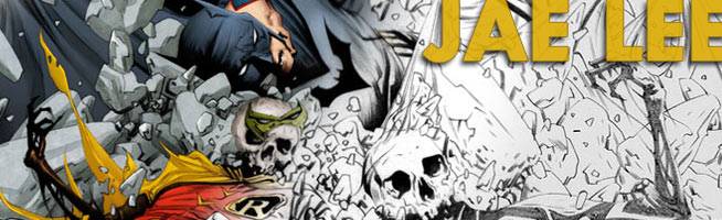
The piece I've chosen is the cover to the "Batman/Superman Annual." I was asked to do an image where the Superman family is fighting the Batman family, and to have the ghost images of the newly deceased Robin and Superboy in the background.


I was not looking forward to this one. I don't like drawing that many characters on a cover; I prefer more iconic simple designs. Too many characters with too many elements just looks like visual noise, to me. So my first task is to incorporate all of those elements and simplify them. To me, the Supes family fighting the Batman family isn't much of a fight, so automatically, my mind constructs a visual where the Superman family is standing triumphant. Originally, I had Red Hood unloading his guns onto an unflinching Supergirl, who's holding him up by the neck, just like in the final image, but then I was notified he now has flaming swords.
The two dead boys were a problem. I don't like having incongruous elements floating around, and having giant ghost heads floating in the background is definitely that. So I came up with the visual gag of having Superman smashing Batman into the ground and kicking up the bones of Superboy and Robin. I worked up a quick sketch, and once it was approved, I tightened it up. Superman's pose in the sketch had more energy, but his head kind of got lost, so I had to alter his pose to make sure nothing was around his head.


These days, I no longer ink my work. I do extremely tight pencils. My colorist, June Chung (who also happens to be my wife) then inks the work. It's not a simple matter of darkening the lines; she goes in there with a brush in Photoshop and paints black underneath the black areas and transitions the black into grays as it approaches the feathery pencil lines. It's a very time consuming process, but I feel like we get that inked look, but it's something I could never accomplish on my own because my inking is too crude. And then I ask her at 5 AM to color it in 2 hours to get it into the catalogue in time. After that, I apologize profusely and promise to never cut it that close next time!
Jae Lee is currently illustrating DC Comics' "Superman/Batman." The series' annual, written by Greg Pak, is in stores now.