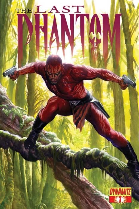
Perhaps there's a kernel of an idea in "The Last Phantom" #1 that's worthy of an ongoing comic book series. The notion that the most recent in a long line of Phantoms has decided to put the costume aside to work on humanitarian efforts -- and then he's forced to return to his jungle hero roots when his family is murdered -- maybe that's something that could matter enough to make for a story worth reading. Maybe.
But not when it's told this way, not when it looks like this.
Before I get to my dissection of the art, let me point out that this first issue reads a lot like a very, very weak superhero adaptation of the recently-cancelled "Unknown Soldier." Josh Dysart wasn't particularly subtle in that series, but he was skilled at balancing the tragedy and the violence and the inner conflict and the strangeness of it all. Scott Beatty is a thousand times less subtle. His characters say what they mean and declare their intentions. They are stock cartoon characters in the worst sense of the term, in a way that even an old-fashioned comic strip hero doesn't deserve.
But it's really the art that absolutely destroys any potential that "The Last Phantom" may have. While "Unknown Soldier" had Alberto Ponticelli, with his vigorous scratchiness, perfect for the brutality of the story, "The Last Phantom" has Eduardo Ferigato. Ferigato isn't good at posing characters in a supposedly three-dimensional space. He's not good at drawing an expression beyond wide-eyed surprise and fierce-browed concern. And as ridiculous as that drippy Phantom looks on the Alex Ross cover, it looks like the most implausible superhero (or any kind of hero) costume in the world as drawn on the final page of the issue by Ferigato.
As awkward and stilted as Ferigato's artwork is, the coloring of Vinicius Andrade makes it look even more hideous. I don't claim to know anything about the inner workings of the production of this comic, but this first issue seems like an example of a colorist who wanted to make up for the shortcomings of the artist and then went way, way too far. Andrade's colors overwhelm every page in garish hues and over-rendered shading. Nothing on the page is safe from his gradients, and his ugly tones would have made the work of any artist look abominable. Nobody could have looked good with coloring this oppressive layered on top.
So while the title of this comic may be promising -- "The LAST Phantom"? That means this will be the last time we have to read a comic this hideous?-- the "#1" on the cover, along with the announcement that this will be an ongoing series, promises that more of this kind of thing will come our way. Perhaps the series should be retitled: "The Last Phantom For Now, Sure, But It Will Make Your Eyes Bleed."

