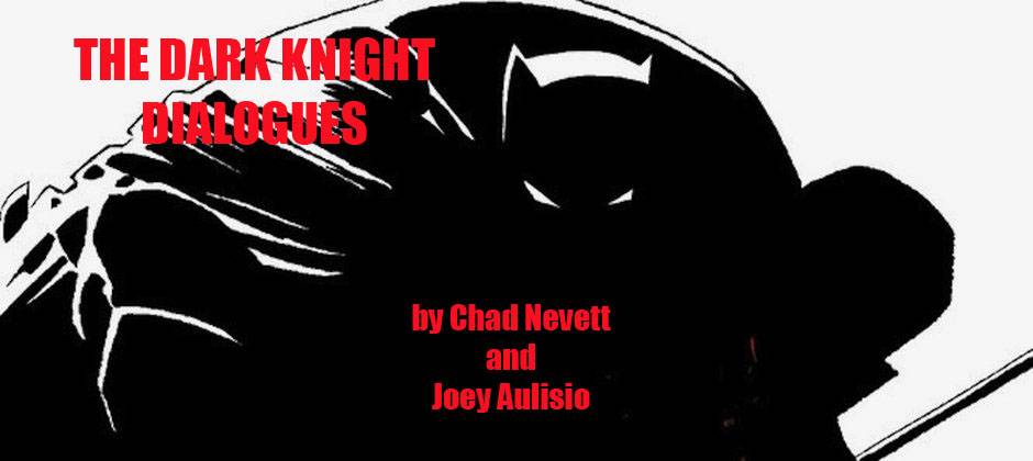

The Dark Knight Dialogues 001: The Dark Knight III: The Master Race #1

The Dark Knight III: The Master Race #1
written by Frank Miller & Brian Azzarello
pencils by Andy Kubert inks by Klaus Janson
coloring by Brad Anderson lettering by Clem Robins

“A Good Death?”
“There’s No Such Thing…”
Joey: These are the first words you see in the opening pages of The Dark Knight III: The Master Race and it’s hard not to see a bit of commentary there. Alan Moore mused in his 1986 introduction to The Dark Knight Returns collected edition that “[Frank] Miller has also managed to shape The Batman into a true legend by introducing that element without which all true legends are incomplete and yet which for some reason hardly seems to exist in the world depicted in the average comic book, and that element is time.” The original series was an alternative, where a character as iconic as Batman could actually have a proper ending, a ‘good death’ as it were. Since this is entertainment and the original series was so popular, of course even Batman’s death has a sequel. Though this wasn’t just any sequel, 2001’s The Dark Knight Strikes Again is one of the rare continuations to a classic story that is actually just as exhilarating and innovative as it’s predecessor but for completely different reasons. What could have just been an easy cash-in on a popular catalog title wound up being a further extension of the idiosyncratic sensibilities of its author and a far more prescient vision of the future than it was given credit for at the time of it’s release.
Now here we are in 2015, almost 30 years from the publication of the original and almost 15 from it’s sequel and we have yet another installment. This time not quite the auteurist vision of author Frank Miller but a collaborative effort with a plot from Miller but scripts from writer Brian Azzarello, art from Andy Kubert, inks from Klaus Janson (the inker on the original), colors from Brad Anderson (original colorist Lynn Varley noticeably absent), lettering from Clem Robins, and a whole host of other guests on various pullout mini-comics, and potential one-shots and who knows what else in the future. It should be noted that this project didn’t start this way as Miller had plans to write and draw it as well but due to health issues, he was not up to the task and asked some friends to help him out. Intentions and setbacks aside, I can only judge the book that’s in front of me and what’s in front of me feels just like any other comic.
When you open the pages of the original series to this day, you feel instantly enveloped in another world, and the same goes for the sequel. Lynn Varley’s colors just hit your senses in all the right ways, and Miller’s linework no matter the iteration just has an energy to it that’s undeniable. There might be better written and better drawn comics technically but I think you’d be hard pressed to find any comic that contains the life that is present in those books, that list would be very few and far between. The new series certainly wants to remind you of the original and of Miller’s work in general, and Janson certainly is able to shape Kubert into a convincing Miller clone in a few panels here and there but that’s about as close as we get (and the less said about the rote coloring job the better). The ideas that we see explored in much of the first issue do actually seem like Miller ideas but the execution just keeps reminding you how much cooler this would be if Miller was doing it himself instead. It’s not a terrible comic per se but I don’t know if adequate is good enough when you are playing in this universe.
Chad, did you have the same issues or a completely different perspective, I am curious to find out?

Chad: I’ve always been a writing first kind of guy, but… it’s hard to ignore that such a large part of what made both The Dark Knight Returns and The Dark Knight Strikes Again so wonderful was the art. I have spent so much time just looking at those books, particularly the latter. I dig Miller’s writing, but I am head over heels in love with his art. I had a hard time with the first issue of DKIII and it’s because of the art. As you, and others have pointed out, Kubert and Janson do their best to allude to Miller (successfully in a few panels, I have to add), but it just looks and feels like another Batman comic. Given that, aside from Before Watchmen: Nite-Owl, I can’t think of anything other than Batman comics that Andy Kubert has drawn during his tenure at DC. I hate leaning on a pre-release prejudice, but sticking an artist associated with a variety of Batman comics (Neil Gaiman’s two-parter, the Morrison run, the Kubert-penned Damian Wayne book…) from the past decade or so seemed like a questionable call, because it would take away some of the uniqueness. We’ll talk about him in a few months when the special comes out, but I’m still sitting here pointing towards John Romita, Jr. going “That guy!”
Aaaaaaaaaaaaand… not the best way to start…
The visuals of this book made it hard for me to get into it. Too many trademark Kubert-isms that made it feel like this world isn’t right. That’s a little surprising given how dramatically different Miller’s artistic styles and approaches in the two previous books are, yet there was still a continuity there that’s broken here. Especially when you look at Miller’s art and the way that it has progressed since The Dark Knight Strikes Again. This book looks too shiny and clean and pretty. And, most importantly, it looks a little flat. I didn’t get that same feeling of energy that I usually get from Miller’s art… and I hope it will begin to show up as the series progresses and Kubert can loosen up and stop feeling whatever pressure he may be feeling to live up to Miller (gee, looking at what I’ve written thus far, I wonder why he’d feel any pressure)...
On the non-visual side, I was left struggling with what the point is. I think it was one of the Wait What? guys that said that this felt like the first half of a double-sized first issue, because nothing actually gets going here. It’s a bunch of fragments that you hope will get tied together. Once again, Batman has been missing and has returned; Superman is frozen; Wonder Woman is breastfeeding her and Superman’s son; their daughter wants her dad to stop being lazy; Batman is fighting cops… the connections just aren’t there, especially if you’re looking at how DKSA ended and wondering what happened. The time between the books can’t be too long because the son of Wonder Woman and Superman is still a baby and was conceived during that story. So, we’re looking at, what, two years at most, probably? And Batman is gone, Carrie is just now taking his place, Superman has gone from looking at the world and wondering aloud to his daughter what they should do with it to sitting frozen…? There’s nothing wrong with raising questions, but, like the art, there’s a disjointed jump between the projects that makes it feel like a related-but-not-continuous story/work… Which, I guess it isn’t.
I guess I got the feeling that, while this will be a followup to The Dark Knight Strikes Again, everyone involved seems like they’d rather be doing a sequel to The Dark Knight Returns. Maybe I’m wrong, but that’s what it feels like to me. Do you get a similar impression?

Joey: I think I was so prepared for it to be a direct sequel to The Dark Knight Returns from the advertising that i was actually pleasantly surprised to see so many plot points that were being directly followed up on from The Dark Knight Strikes Again. They aren’t being handled particularly well, and like you mention don’t add up to much so far but it’s nice to know they are there as I know many readers (and probably people at DC too) would of been so happy to wipe that slate clean. The issue did feel very light though, despite being 32 full pages it felt less complete than even some of the regular 20 page monthlies. Even if it’s part of a bigger whole, Miller always makes an issue feel complete and that was lacking here, even your average issue of All*Star Batman & Robin: The Boy Wonder left you with way more to discuss and dissect or argue over a given month than this issue did for the remaining week.
We might as well get to the elephant in the room now which was the Batman vs. the cops sequences. Were these well done or just merely exploiting some recent headline news so they had a hook to sell to the media upon the first issue release? I am leaning more towards the latter but it does have precedent within Miller’s oeuvre. So many people were shocked Miller would portray police this way which kind of baffled me considering he’s been doing that since at least 1980, if anything this is a return to form! It’s the execution that let’s this whole sequence down though (you noticing a pattern here).
Azzarello shines through a little in the opening with the text speak which is reminiscent of some of the storytelling techniques he used in 100 Bullets and Spaceman which leads into this team’s cover song of the opening media crawl in The Dark Knight Returns which while not an inaccurate portrait of our current news media pundits just feels very regressive. Miller and Varley literally predicted where the internet was going and how we were going to communicate with each other and get our information in the future in The Dark Knight Strikes Again years before it all actually started to look exactly like that (right down to the garish custom HTML backgrounds of our social media profiles). So to go from that to this is just a huge step down, in Miller’s hands he would of innovated this sequence while Azzarello/Kubert choose to nostalgize. Don’t get me wrong, there’s still a little bit of bite in there but it’s just so damn on the nose.
Now the ending cop sequence with the Carrie reveal is the only thing in the whole book (besides the mini-comic) that actually felt like authentic Miller to me. Just that image of a Batman soaked in the blood of corrupt police against the solid white background is one of the few times Kubert/Janson/Anderson really rise above mere tribute and deliver a truly effective image all on it’s own. The fact that the Batman in question is revealed to be Carrie Kelly which is Miller’s one true original creation in this universe just adds a further emphasis on the potency of that moment. The final page is another attempt to homage Miller with one of his classic page compositions which even tries to match his lighting but the coloring ultimately let’s it down. The final statement of “Bruce Wayne is Dead?” doesn’t quite pack the punch that was intended but for those few pages it was the only time where i felt like I was actually reading a Miller Batman comic where literally anything can happen even if the feeling was fleeting.

Chad: What’s funny is that the Batman/cops stuff didn’t even make me take a second glance, at least with regards to recent events or even the idea of Batman fighting the police. That’s pretty much all he did in DKSA and half (if not more) of DKR. Miller’s vision of Batman is a character who is a criminal in the legal sense, but not in the moral sense. He breaks laws, yeah, but he’s doing it for the right reasons. Those scenes felt right to me, at least conceptually. That image of Batman bloody on a pile of cops is pretty damn good, too. I really hate that final page -- the way it’s composed, mostly. It’s a bad angle and doesn’t hit you as hard as it should.
That statement, as the Wait What? guys said, didn’t land as strongly as an end-of-issue cliffhanger might, which only supports the idea that this might have been designed originally as a longer first issue with this merely being the middle before the threads connect/the story really gets going.
With the subtitle “The Master Race” and the knowledge that that refers to the citizens of Kandor, it struck me as strange that so little time was spent on that side of things. In fact, it was almost entirely shunted off to the mini-comic. We got a lot of Wonder Woman (a lot more of her body than we’ve seen before, too -- and the only thing that surprises me about that is how little discussion about it I’ve seen… that seems like something that would cause a giant controversy as people debate the decision to show her nipple) and lay the groundwork a bit, but… I guess I assumed there would be more. That’s what it all seems to come back to: more more more.

Joey: I talked to a handful of reasonably intelligent people that read the first issue and none of them realized that the city of Kandor was “The Master Race” the title refers to, and when I thought about it, there was really no reason for them to make that connection based on what is presented to you in this issue. If I hadn’t read a bunch of the promotional material beforehand, I probably wouldn’t of known that either. The mini-comic certainly leads you to believe the bottled city is important but the issue itself really should of had it play as more of an important factor all considering. Speaking of the mini-comic though….
Chad: For the mini-comics, we’re going to have a special guest discussing it with Joey and I for every issue. This issue’s guest is a man who has left comics behind for the ultra-cool, ultra-glamorous world of RPGs… Mr. Tim Callahan…!

The Dark Knight Universe Presents: The Atom #1
written by Frank Miller & Brian Azzarello
pencils by Frank Miller inks by Klaus Janson
colors by Alex Sinclair lettering by Clem Robins
Chad: So, the first mini-comic is actually a Frank Miller comic. Or as much as we’re going to get of a pure Frank Miller comic. Was anyone else completely thrown by the coloring?
Tim: I was thrown by so much. So, so much. I guess the coloring is as good a place as any to start. Though I might have started with the freakish stretchy left arm of Ray Palmer on page 4, as he bends like Plastic Man to pull off his cowl. Or are we expected to assume that it’s his right hand and his thumb is on the wrong side? ‘Dark Knight Master Race Ray Palmer’ can transform the position of his opposable thumb, guys! Luckily, the shadow head of the lizard in the Atom’s armpit is there to distract us in that panel for some reason.
I guess the completely traditional coloring job -- which makes the comic look like a backup story from Teen Titans Canada East (I don’t know, I don’t read many DC comics anymore) -- is typical of that magical transforming thumb approach to storytelling. Kinda sloppy, not too pretty. And stuff happens for some reason.
This is a Frank Miller comic! And I say that with an exclamation point because although there are a few things I liked about this little issue, this is possibly the worst thing Frank Miller has ever done in his life, and I say this as someone who sat through the The Spirit in an empty theater. Are we supposed to blame him? Or are we playing a game where we blame the other folks involved. To be fair, I’m glad this comic exists. I just wish it were 1/20th as good as that racist not-Batman comic he did a few years back that everyone freaked out about.
Joey: The coloring didn’t really bother me much but that might be based more on the fact that Alex Sinclair’s colors are just so much more vibrant after looking at Brad Anderson’s rather dull coloring job on the main book that it was just nice to have a change of pace (I had actually thought originally it was Brad Simpson of Joe Casey’s Sex fame who was supposed to be coloring the main series and was disappointed when that wasn’t the case). It’s not the way I would of chose to color Frank Miller but the palette makes sense for an issue focusing on The Atom. Wonky anatomy in some spots aside, I actually thought these were some of Miller’s tighter pencils in a long time, almost reminiscent of some of his earlier Daredevil work in spots. That might be contributed to the fact that Miller’s classic inker Klaus Janson is at work here, or maybe Miller just going back to basics after being out of practice (if reports are to be believed, he could barely hold a pencil last year). I am actually kind of shocked a bigger deal isn’t being made about the fact that within this mini-comic you can see Janson inking Miller for the first time since the original Dark Knight, that seems like a perfect selling point if there ever was one.
As for the mini itself, I am probably giving it a lot of leeway but I enjoyed it. It had an energy that wasn’t present in the new series, and actually felt like it might of taken place in the same world as the previous two series. It also felt oddly personal at points with the talk of divorce, legacies, and regeneration. I also really like to see Frank Miller draw Lizards so it had that going for it too.

Chad: Tighter line work? Yeah, but that was a bit of a letdown for me. I am head-over-heels in love with messy, ugly Frank Miller line work, especially when it runs up against the tighter, more controlled bits. I found this a bit flat, a bit boring in that regard. Maybe it was Janson cleaning things up a bit more… which is, honestly, one reason why I wasn’t exactly thrilled at the prospect of that art duo reuniting. Frank Miller doesn’t need any goddamn inker, y’know? The whole thing just looked so… typical. So much like any random DC comic. Though, did anyone else get a Neal Adams vibe off that lizard?
Joey: I prefer a messier Miller as well, it was just nice to see that he could still draw in something approximating his classic style. The common perception is that he is incapable of doing so and his evolved style or ‘uglier style’ is more of a deficiency and not a conscious choice of aesthetic. So here it is for everyone who wanted it and you are right, it isn’t half as interesting as his modern style anyway (not that it ever would of stopped the nostalgic whining anyway). That is also most definitely a Batman: Odyssey-Neal Adams lizard right there too.
Tim: The coloring made it Adams-ish for sure. I’m not sure what you mean by “newer, uglier style” though. Because Holy Terror is the newest substantial thing we’ve seen from him, other than a Xerxes preview and this minicomic, and that was far from ugly in its linework. The problem is that the ink lines and heavy blacks are what are most visually compelling about Miller’s work, so when you strip that away...well, just imagine this image below if it were rough pencils inked by Janson and then colored like the Master Race minicomic:

There’s even a lizard head for contrast! Now take that lizard head, Janson it up, then add the Alex Sinclair color job to everything, and you’d end up with a relatively inert image. Frank Miller’s post-Sin City style IS in the inking. Taking that away saps it of its power.
Mostly.
Because there are still some strange compositions that give this minicomic some strength. The floating Lara over Ray Palmer’s squatting form. The insane perspective on Ray Palmer’s head-as-he-looms-over-the-Kandorian-dude (seriously, is the Atom lying on the ground with his arms at his side? How does his head get that close to the ground without him using his arms?). Those two panels alone are more striking than anything in the main Master Race comic. They aren’t iconic images, but they are idiosyncratic and Frank Miller-esque. Chiseled and stylized.

Chad: Ha! It looks like it’s a table if you take the panel alone. Of course, it’s not a table. And, oddly, that’s the only panel of the entire comic that actually sticks with me. Which is probably the biggest sin the art makes: it’s forgettable. That’s not Frank Miller. Frank Miller’s art burns itself into your brain like a catchy song. The reason why I always find myself flipping through his stuff again and again is probably the same reason why I find myself listening to the same song on repeat for two hours straight. There’s just something that sticks its hooks in and won’t let go. This comic doesn’t have that.
The closest it comes to having something that grabs me is page six and those six random panels on the right-hand side, mid-page. Three equal-sized spaces with one of them subdivided into four panels, all depicting members of the Justice League… except kind of how they were in The Dark Knight Strikes Again except… they seem like they’re supposed to be young…? The narration doesn’t comment on it and I can’t figure out why they’re there. What was Miller trying to communicate in that most random of places? I need help, friends.
Joey: I think those images are either supposed to be a) slides The Atom is looking at in the telescope or b) memories he is having which accompany the narration. Either way, he’s just reminiscing about the past which there is a whole lot of in this event (especially on the reader’s part). Now that you guys mention it, there are a lot of images i had to look at multiple times, not because they were particularly striking but just because i didn’t quite know what they were. For example, The Atom is apparently holding an iPhone or mini-tablet type device where he is getting those messages about “BatGirl Unmasked!” but they look more like cards, originally i thought they were the slides he was looking at in the panel Chad just mentioned. It seems obvious now what it was but the art could have communicated it better, same with the fact that Lara’s arrival is accompanied by a storm and it seems to be shaking The Atom’s home (which also might account for some of the wonky perspectives throughout but I might be too generous there). Frank Miller can communicate a storm and rain like few other artists can, weird that it seems like an afterthought here.
I hate the idea of critiquing something on what it should be and not what it is, but even I can’t help but wonder how much more dynamic this comic would of been if it started with the storm and then built to Lara’s arrival as opposed to the few offhanded panels of rain here and there. Seriously, If there was ever a book for Frank Miller to go crazy with thunder and rain, it’s a goddamn Dark Knight book!

Tim: Ultimately, I don’t think this minicomic works. I’m still not convinced any of us really know what’s supposed to be happening with the small panels on page 6 you guys mentioned (I thought they were just flashbacks aligning with the “identities” narration from Ray Palmer on that same page), and I don’t even know what that cylindrical device is on that same page or what it is for. I thought it was some kind of super-microscope, not a telescope, but it doesn’t mean anything in the comic anyway. The whole spatial geography of the comic is difficult to parse -- what are those dangling cylinders behind Ray Palmer on page 5? I assume they are graphic elements drawn by Miller, but with the inking and coloring providing dimensionality to them, they become artifacts in the room that your eye hits on as if they have meaning. But they don’t. That’s what the comic is: images that should have meaning, but the only thing that matters in the issue is the sequence on the final three pages. Lara hovering over the Atom, the tiny Kandorian, a bit of context from Superman’s daughter, and the last panel of the comic, with “...they’re tired of being small.” In Dark Knight Strikes Again, this whole minicomic would have been a single page. Expanding it to 12 pages here doesn’t add anything. If the interiors looked like the cover, it may have been worthwhile. I’d like to see that frantic, scratchy style on the page. But we aren’t going to get it, not this time.