
There's been a number of noteworthy indie cartoonists who have come to prominence in the past 10 years, but certainly one of the most interesting and significant has got to be Dash Shaw. Having slowly garnered a bit of attention and acclaim with works like Goddess Head and The Mother's Mouth, he officially declared himself an artist of no small importance with the 2008 release of the doorstop-sized Bottomless Belly Button. He followed that up with the even more impressive Webcomic BodyWorld, which will be collected and published by Pantheon early next year.
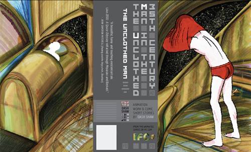
In the meantime, he's got a new book coming out from Fantagraphics, entitled The Unclothed Man in the 35th Century, which collects a number of short stories he did for the the quarterly Mome anthology, as well as some storyboards and drawings for an animation project he did for IFC, which should debut soon as well.
I talked with Shaw over email about the new book, the challenge of moving BodyWorld from Web to print and his influences and upcoming projects. He proved to be as gracious and thoughtful over the Internet as he had been in person and I'd like to thank him for taking the time out of his busy schedule to talk.
My understanding is the book collects all your short stories for Mome? What else is included? Does it feature your most recent Mome work as well, like the Blind Date story?

It has 80 pages (about 3/4ths of the book) of short stories, most of which originally appeared in Mome in a slightly different form. For example, “Making the Abyss” is printed in Unclothed in the correct order, and “The Galactic Funnels” has been tweaked in a few different ways. It also has an older (2005) story called “Cartooning Symbolia” that appeared in a few different places (on the internet, in a mini, in “Blurred Vision #1” and “Inguine Mah!”) but it’s printed here in color for the first time. “Blind Date 1” is in it. A new 12-page comic called “The Uncanny Reproduction” is in it.
The first 24 pages of the book has storyboards and preproduction work from the “Unclothed Man in the 35th Century A.D.,” a series of animations I did for ifc.com that will debut in December when the book comes out. It was originally going to come out in November but the acetate dust covers for the book took longer than expected, so both the book and animations were delayed to December. Anyway, the first 24 pages are basically an “animation art book,” so it has backgrounds, a flip book, etc.
This sounds like a bunch of random things, but it’s structured in a way that I think makes sense. It draws parallels between the animation work and the comics work.

Tell me a little more about this animation project. How did you hook up with IFC? Is animation something you've always had an interest in?
I’d previously done an advertisement for IFC Films, and the IFC documentary division did a short interview with me about Bottomless. I was at their office and showed ifc.com the animations I’d done for Bottomless and BodyWorld and the short story that Unclothed Man is based on, which originally appeared in the “Meathaus SOS” anthology. Based on that, they gave the series the green light.
Comics and animation have always been parallel interests for me. When I was in middle school and high school, there was a lot of energy around anime and comics. I’d go to Otakon, for example, which is an anime/manga festival, and I was obsessed with the Japanese comic/animation industries, which feed off of each other more than in the States. I’ve always collected animation art books. Bruce Timm’s Batman: The Animated Series (and the book by Kidd/Timm about it) and Peter Chung’s Aeon Flux were definitely influences on BodyWorld. Bottomless had a lot of animation-inspired sequences, of actions broken down into multiple panels, and repeating-angle stuff, like how all of the scenes in the same location were usually from the same angle. Also, before that, I was using acetate to color comics in a way that combined how books like Batman: Year One were colored (with the acetate over a background painted sheet) and animation-style use of acetate (where you paint on the back of the acetate itself.) Anyway, I could go on but basically my answer is: Yes.

Can you talk a little bit more about the structure of the book? What sort of parallels are you drawing between the animation and comics work?
Flipping through the book would be the best way to understand it, because it sounds confusing in words, but I’ll try. The first 24 pages (the animation section) have a lot of real storyboards and then the last story of the short-story section has a comic that looks like storyboards, so the whole book is book-ended with storyboards (although the second is actually a comic and not storyboards.) Also, besides the aesthetic similarities of both sections (I mean, the animations have word balloons) the comics were done over a couple of years and move from the sci-fi funk I was into during mid-Bottomless to BodyWorld (which includes the Unclothed Man short story) to the media-related stories I did after that, while I was working on the Unclothed Man animation, and am doing now. So, while “Blind Date 1” and “Uncanny Reproduction” look very different on the surface, if you read them they clearly relate. “Making the Abyss” and “My Entire High School… Sinking into the Sea!” are in that same media-related category as well.
There’s a meshing going on between film/animation and comics. The meshing is happening in my own interests, the subject matter of my stories, the way my stories are created, and it’s been fueled a little by what’s going on outside of me- like, we’re in an all-time high of comic/media (especially film) fusion, where The Dark Knight is the biggest movie in the world, everyone’s reading Watchmen, and some comic companies are starting to see themselves as primarily an R&D lab for movie properties. That anime/manga fusion I was obsessed with in the '90s is starting to have a parallel in America, although in a much different way. Anyway, I definitely combine practices and make comics somewhat informed by animation and make animation somewhat informed by comics.
The two things that strike me about your recent work, particularly in Mome, is your use of color and your interest in sci-fi. Let's start with the former first. I find it especially interesting how you use color not merely to denote depth and attract the eye, but also as a visual tool, to help the reader progress through the story. What prompted that idea? What made you want to use color in that way? You had mostly worked in black and white (at least in comics) up till that point.
I’d done a lot of comics in color before Mome, it’s just that they weren’t published or they weren’t published in color -- sections of The Mother’s Mouth, Goddess Head and Love Eats Brains were done in color. But, mostly because I wasn’t thinking about what I was doing, they were printed in grays because it was weird that a book would be mostly in black and white and then have 20-page sections that were in color. I wasn’t thinking about them being printed when I was working on them, since they were done at SVA (the School of Visual Arts) and I’d show the color pages in the classroom. Also, Mome was the first time I’ve been published regularly in an anthology that wasn’t “small press” (depending on how you define “small press” or “small”) so more people read it.
I thought of color the same way I thought of everything else: another element. It felt very natural and intuitive. I could talk about how I colored a specific comic, but in general I’d say it’s an intuitive process.
As for the science fiction stuff, again that felt like an intuitive thing from the things I was interested in at that time. I’m very anxious. It didn’t last very long. The first three stories I did for Mome were sorta sci-fi, and the next four weren’t. Although I did one recently that Tom K wrote that’s sci-fi, but he wrote that one. That’ll be in the forthcoming volume. Most of the stories didn’t start out as sci-fi, they just wandered into that territory as I was working on them. For instance, BodyWorld is about telepathy, so that naturally led to sci-fi elements.

Let's get specific then. In "Look Forward, First Son of Terra Two" you use color as a way of getting around the thorny challenge of having people move through two different time lines -- one forward, one back -- but be able to interact. How did you come up with that solution, because it strikes me as rather inventive.
It’s exactly what you said. That story is sort of like a diagram, with the timeline (the color-coded dates) and charting these two societies interacting with each other. I don’t think it’s “inventive” though. Lots of maps and diagrams are color-coded. The Power Rangers are color-coded. It’s just a way of presenting information. If you took the color out of that story, it’d be a lot more confusing. Satellite CMYK used color in a similar way. I mean, these kinds of formal things are definitely in my comics, and they seem to sit on the surface for people who don’t like the stories. I’ve noticed that, now that people occasionally talk to me about my comics. For instance, people who like BodyWorld usually say they think it’s funny, or that they like the characters, and the people who can’t engage it in that way, who don’t see the humor or whatever, ask me about how I used color or panel layouts or those kinds of things.

What was it about the sci-fi genre though, that you gravitated towards at the time? What did it allow you to do or explore that you could in other genres, like say fantasy?
It was a combination of a lot of things. I think we live in a science-fiction society right now. I can’t keep up with all of the weird new devices that are being built. BodyWorld is sorta sci-fi but the actual universe could exist today. The Unclothed Man in the 35th Century A.D. has people drawing using an eye-tracing device, which doesn’t seem that far out there. I came up with that story in 2006, when more and more people started bringing wacom tablets and laptops into figure drawing classes. So I just connected that idea with the school of drawing where it’s all about plotting points and charting the figure for proportion.
Also it came from what I was reading. The Unclothed Man story was modeled after the Dick Calkins Buck Rogers Sundays, and the Look Forward story on the Buck Rogers Dailies he did. I like his drawings. Also, starting my senior year at SVA, I started reading a lot of soft sci-fi fiction because a teacher I had would talk about it all the time. Bottomless was informed by the kind of loopy perception themes in P.K. Dick. It’s like the opening drawing to Bottomless: where it’s the 3-point perspective drawing where all of the roads are going to their own 1-point perspective vanishing point. All of the characters are in their own realities and it occasionally bumps up against another character, so that led to the scenes that may-or-may-not have happened, like the city scenes that parallel the movie that Claire and Aki go to see.
And, of course, Philip Jose Farmer (RiverWorld, DayWorld) obviously was an inspiration for BodyWorld. I talked to Bill Boichel very briefly about RiverWorld and he said something that really stuck with me: that RiverWorld is a metaphor for the creative mind, with all of the characters from history and fiction interacting with each other.
As for fantasy, I’ve done a couple fantasy comics and I had a horror/zombie period for a while, including a horror manga story that never came together. But when I was playing Dungeons and Dragons I never got into the monster-drawing part of it, all of the creatures. I always focused more on the maps and world when I was a DM. The kind of Fort Thunder wave of fantasy comics seem to come from the joy of drawing creatures, of creature character design, which I just never got into.

Let's move on to Bodyworld. Is it fair to call this your first official "comedy?" Not that you haven't been funny before, but this seems like your first attempt at a lengthy satire of some sort.
Oh good. I’m glad you think it’s a comedy. Yeah, I mean, I think the majority of my work has been funny (or at least it’s funny to me) but I have one of those senses of humor where it’s possible for it to go undetected. When I’m drawing comics I spend the whole time laughing my ass off. I’ve done a few readings of different comics and people always laugh, when I don’t think they’d laugh if they were reading them by themselves. I guess when I read them the humor is more apparent, or they’re laughing at me. I donno. BodyWorld’s supposed to be like a Moliere play, like some kind of sex comedy. Bottomless is funny to me too, but my sense of humor was developing. I had to do Bottomless to do BodyWorld later, just like I had to do BodyWorld to do what I’m doing now. My Entire High School… Sinking into the Sea! and Blind Date 1 are very funny to me, even though they don’t have any jokes in them. There’s something about the whole thing that makes me laugh, but there aren’t one-liners or gags.

What was the impetus for Bodyworld? What made you decide to do it as a Webcomic? And what did you get out of that process that you wouldn't have been able to if, say, you serialized it in print only or did it as a standalone graphic novel, similar to Belly Button?
I love the immediacy of webcomics. You don’t have to wait for someone to print it. You can just upload the pages and that part of it’s done. Also, you have total control over it. I wanted to do a serialized monthly color comic, so BodyWorld was weekly but usually the whole month would be one chapter. If you divided it into pages and printed it, it would have been a 24, sometimes 32, page monthly color comic. But, obviously, I don’t have the audience that would make a monthly color comic profitable for a print publisher. So a webcomic allowed me to do it anyway. You gain a momentum and enthusiasm that happens when you have to draw something in sequence and the whole story is progressing in order.
Bottomless was the opposite of a serialized comic. I did it in sections and then edited it all together into a book as I went. I’d cut pages out or move a sequence around in the book. It had an open, breezy storytelling style that would have been a rip-off if it was serialized. Like, in 24 pages nothing happens. Sometimes there’s a panel and then the panel next to it I drew a year later, which I notice, but the brown ink helps to make the images look more consistent than they actually are. They’re just different ways of drawing comics. I wouldn’t have wanted to do Bottomless like BodyWorld or vice-versa.
For me, if you were one of the few people who read BodyWorld as it was being serialized, that was the best way to read it. But now that it’s all archived online, I think the print version would be better since it’s a lot of pages and you can read it in one or two sittings with the book, rather than burning your eyes out for hours looking at a computer screen. I guess it depends on your tolerance for reading things online and your desire, or lack of desire, to own a book object.

The Pantheon collection of Bodyworld will be coming out next year. What were the challenges involved in translating the work from Web to print and how did you handle them? I would imagine, for instance, that that final sequence would be difficult to display in a book.
It’ll be a vertically oriented book, meaning that there’s a top and bottom page instead of a left and right page. The maps that are supposed to be on separate “tabs” as you read online will be on flaps that open to the right as you read, which will be easier to reference than the online version because you won’t have to “click” over to see them. The final sequence will be one long image that goes over different page-turns. “BodyWorld” will be written on the edges of the pages to the left so that, theoretically, it could be shelved upright on a bookshelf but we’ll see if bookstores and libraries actually do that. It’s not going to be a very easy book to hold in your hands. You’ll have to lie it down on a table. But it’s the best way to do this particular comic in print.
In general I think flat colors look better on the computer and more textured coloring looks better in print, so I went through and reworked a lot of the images for the print version. I used a lot of a light cyan color in BodyWorld because it looks great on the computer, where colors are illuminated from behind. It just doesn’t translate to the printed page that well, so I went through and made subtle changes like that. I’ve attached some images of web vs. print versions of panels for you to check out if you’re interested.
A couple other things are in the print version too, like chapter illustrations. When I started doing BodyWorld I wanted to do a single illustration for each chapter that would exist as like the cover if it was a monthly comic, but so many of them turned out awful that I didn’t post them online. I took maybe three of those old ones and drew ten new ones to be the chapter illustrations. There were also a few things in the story that I didn’t draw; things that I knew happened but for some reason I didn’t draw, probably due to the self-imposed schedule. There’s a character that lives in the room next to Paulie at the Shadey Motel who actually is Billy’s father but it never worked itself into the story. After the second Civil War all of the fathers either died or came back to Boney Borough and divorced their wives and moved to the Shadey Motel where they sleep with each-others’ daughters, who are all prostitutes. Anyway, there’s some more of this bleak, possibly pointless back story in the print version.
What are you working on now?
Right now I’m working on another animation and another comic. I don’t want to say more about them because I don’t want to jinx them. I was side-tracked for a little while in the middle of this year with traveling and a couple of commercial assignments that were exciting for me, but now I’m feeling back in the groove. It sucks when you look back at a month and realize you spent the whole time doing something for somebody else’s project, even when the project was totally worthwhile. And traveling is fun but I like staying at home drawing the best. So I’m hoping to spend the next year just devoted to my own things