Let's talk colorists.
A year ago I wrote a piece about my favorite colorists of 2012, and since I love traditions and comic book art, I decided to make it a thing. However important I thought colorists were to 2012's comic success stories, they just outdid themselves in the past twelve months. Every comic book website should be publishing a list like this, because without colorists, all of our favorite books would be unrecognizable.
I decided to treat this year's list a little differently. Instead of doing a straight up list of my favorite colorists, I decided to treat this more like a "hall of fame." I'm doing this because I want to talk about five more colorists doing great work in the industry, since there are so many exceptional artists out there right now. Also I could easily just spend this column talking about my five selections from last year, because they're all still five of the best colorists working today.
Actually, before we get to this year's five, let's check in on the Class of '12. Bettie Breitweiser joined Team Brubaker in 2013, providing color for both "Fatale" and "Velvet" at Image Comics. She upped her already solid noir game, and even added a touch of '70s cinematography to her palette in "Velvet." Matt Hollingsworth kept knocking it out of the park on "Hawkeye," while establishing a claustrophobic vibe on the new Vertigo thriller, "The Wake." Fiona Staples focused all of her efforts on "Saga," which continues to be one of the best looking books around thanks to her unfiltered artistic vision. Dean White stepped into the major leagues on headlining Marvel books like "Avengers" and "Captain America," making earth's mightiest heroes look incredibly epic. Jordie Bellaire continued to color everything from "Captain Marvel" to "Quantum and Woody," but is honestly turning in the work of her career on Image's "Pretty Deadly," where it really feels like Bellaire is putting her soul in every intense page.
Now that we've caught up with last year's inductees, let's move on to...
In Your Face Jam's Colorists of the Year: 2013 Inductees
Laura Allred ("FF")
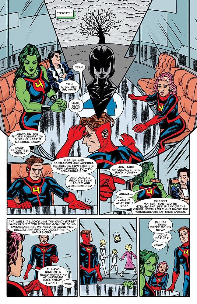
Mike Allred gets a lot of praise, and rightfully so. But any praise hurled Mike Allred's way must also mention his partner-in-comic-crime, Laura Allred. These two work together so seamlessly that, really, it's hard to tell what makes Allred's pop art pop. Can you imagine a Mike Allred piece without Laura's colors? Would you want to? The real test came this year on "FF", where Laura held the book together month in and month out, even as the rest of the creative team would shift around her. For a true test of Laura Allred's might, check out her two issues without Mike on art. Laura applied everything that makes her style so special -- her mastery of flat colors, her delicately placed interior strokes of highlight color, her meticulously specific color selection -- to Joe Quinones' highly expressive work, making already vivacious artwork even more lively. Just look at how Laura treats Darla Deering's pink hair; in the hands of a lesser colorist, it would look fake or cheap. In Laura Allred's hands, it looks gorgeous.
Marte Gracia ("All-New X-Men," "Nova," "Uncanny X-Force")
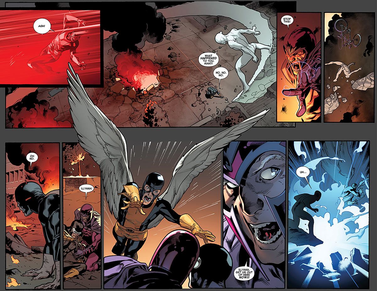
Seriously, is there a book on the stands that is more gleefully soap than "All-New X-Men"? Big characters having big emotions in the middle of big fight scenes -- when it comes down to it, isn't that what the X-Men are all about? Marte Gracia was not a colorist on my mind before 2013, but after a year of seeing Gracia's work in "All-New," I now look for that name. Gracia somehow mixes both realistic and highly stylized lighting together seamlessly in-between Stuart Immonen and Wade Von Grawbadger's linework, making this the best Immonen work to date. Gracia's just as likely to light a scene using Cyclops' red optic blast or Jean Grey's magenta mental powers, or something more realistic like moonlight or the practical fluorescents of the abandoned Weapon X facility. Every page is full of drama and excitement with Gracia behind the brush.
Laura Martin ("Uncanny Avengers," "Wolverine and the X-Men," "X-Men")
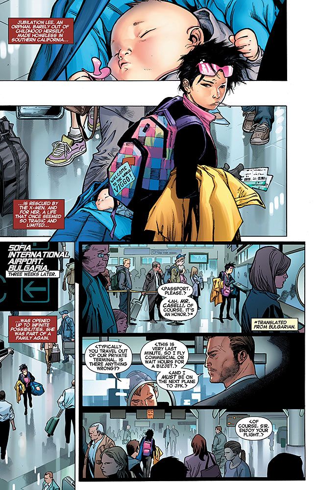
I mean, duh, right? Laura Martin's been a highly influential colorist for over 15 years now, and it's kinda crazy that she wasn't the first person on my list last year. But hey, I'm fixing that right now. Reading a book colored by Laura Martin feels like going to the movies. Her work is more grounded than most people who make a living working with superheroes, but that doesn't mean it's grim and gritty. Martin colors things with real world vibrancy, picking and choosing her colors and using her rendering skills to cram in as much real world recognizability into each panel, while still guiding your eye where it needs to go. Her work on "X-Men" with Olivier Coipel and Mark Morales is notable for this; a page with Jubilee working her way through a crowded airport could be confusing, but Martin's keeps your eyes focused on what they should be focused on while still keeping the surroundings utterly realistic. Martin's a master.
Javier Rodriguez ("Daredevil")
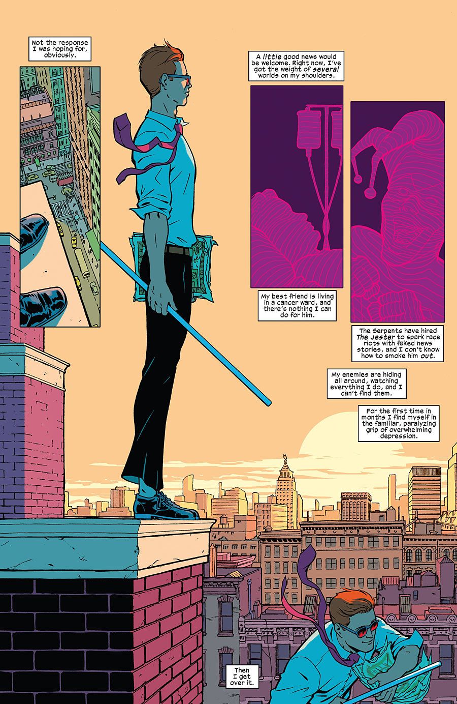
Critics and fans responded to this volume of "Daredevil" because of its levity and heart, two things that Waid and Samnee are definitely responsible for. But Waid was also responsible for taking Matt Murdock and Foggy Nelson to some truly dark territory in 2013, and Samnee illustrated some of the most brutal action sequences I've ever read. So what keeps this volume of "Daredevil" from feeling like the equally dark past iterations? Javier Rodriguez. He's been on the book from day one, meaning that Rodriguez has had years to craft the book's palette, and he's applied it to every top-notch artist that's worked on the book. The vibrant oranges and greens, the powerful blues, Daredevil's pink radar sense, all of these colors keep the book from slipping back into the darkness. Rodriguez is "Daredevil's" secret weapon right now; Waid and Samnee can go as dark as they want to, and Rodriguez's colors will keep the book tonally in check. Plus, he proved by penciling three issues this year that he's the best "Daredevil" artist around, right alongside Samnee.
Matt Wilson ("Secret Avengers," "Swamp Thing," "Wonder Woman," "Young Avengers")
"Young Avengers" was a yearlong roller coaster ride for me, and I can't imagine that book being nearly as successful without Matt Wilson providing colors for Jamie McKelvie and Mike Norton's work. Wilson kept his "Young Avengers" colors uncluttered, knowing that McKelvie's clean style needed a similarly clean treatment. But upon closer inspection, you can detect subtle texture in everything from skin to clothing, making every page appear super crisp while also being subliminally rich with detail. To me, the effect makes some pages feel vintage -- you know, the cool type of vintage celebrated by Noh-Varr. Wilson's greatest feat of 2013, though, had to be the Instagram-styled catch-up page where he had to devise and implement his own super trendy photo filters onto McKelvie's work. Come on, that's impressive!
Brett White is a comedian living in New York City. He co-hosts the podcast Matt & Brett Love Comics and is a writer for the comedy podcast Left Handed Radio. His opinions can be consumed in bite-sized morsels on Twitter (@brettwhite).


