The third annual rundown of the best covers of the year features 50 images -- oh, okay, 51 -- representing the work of some 46 different artists (plus inkers, colorists and designers) from nine publishers.
Returning artists like Chris Bachalo, Dave Johnson, Sean Phillips and Yuko Shimizu are joined on this year's list by "new" names like Kody Chamberlain, Camilla D'Errico, Amy Reeder and Drew Weing. (You can peruse the previous years' lists here and here.)
As in the past, I've tried to explain the appeal of each entry; some covers get just a sentence, while others receive entire paragraphs. That doesn't reflect the quality of the image, but merely what I have to say about it.
Note: While last year's list included five manga covers, this year features none. I'm not sure whether that's a byproduct of the contraction of the manga market, a sign of a shift in cover quality -- among manga or Western comics -- or a shortcoming on my part (if it's the latter, I'll own up to it; however, after several excursions in search of manga candidates, I found none that I felt qualified as among the 50 best.)
With that out of the way, I present, in alphabetical order, the 50 best covers of 2010:
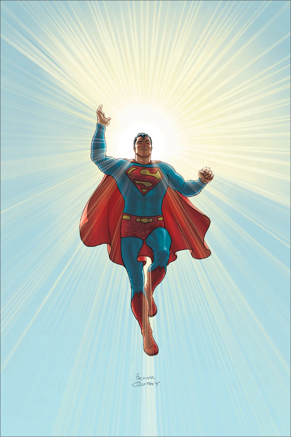
Frank Quitely already created one iconic cover for this acclaimed series -- the image of Superman sitting on a cloud was parodied just last year -- and now he's done it again for the oversized hardcover collection. Some have asserted the halo effect overplays the Superman-as-Christ-figure card, but I think Quitely pulls it off masterfully.
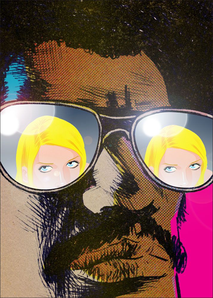
Everything about this tightly cropped image says "attitude," perfect for the collected adventures of Jim Rugg and Brian Maruca's blaxploitation-styled hero.
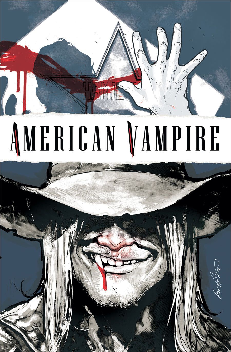
Rafael Albuquerque came up with a great design solution for the covers for the first arc of the Vertigo vampire series, which told two stories set in different eras: the Old West and 1920s Hollywood. Here both eras are represented by the outlaw Skinner Sweet and a blood-smeared door to a dressing room.
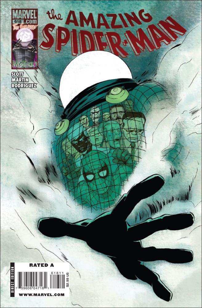
One of the industry's underrated talents, Marcos Martin somehow balances a Silver Age flair and a very modern sensibility in his work. For this image he takes a quintessential 1960s supervillain -- Mysterio's essentially a guy in a cape with a fishbowl on his head -- and transforms him into a truly menacing figure.
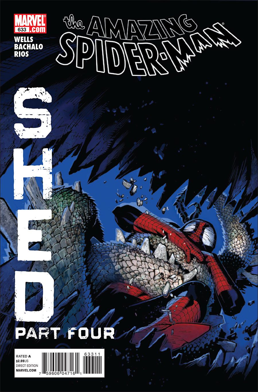
I love all of Chris Bachalo's covers for the four-part "Shed" arc, but this one, which essentially puts the reader inside the Lizard's mouth, is the strongest. I always like it when artists can convey emotion with the eyes of Spider-Man's costume; here the wall-crawler's panic seems real as he struggles in the grip of the reptilian tail.
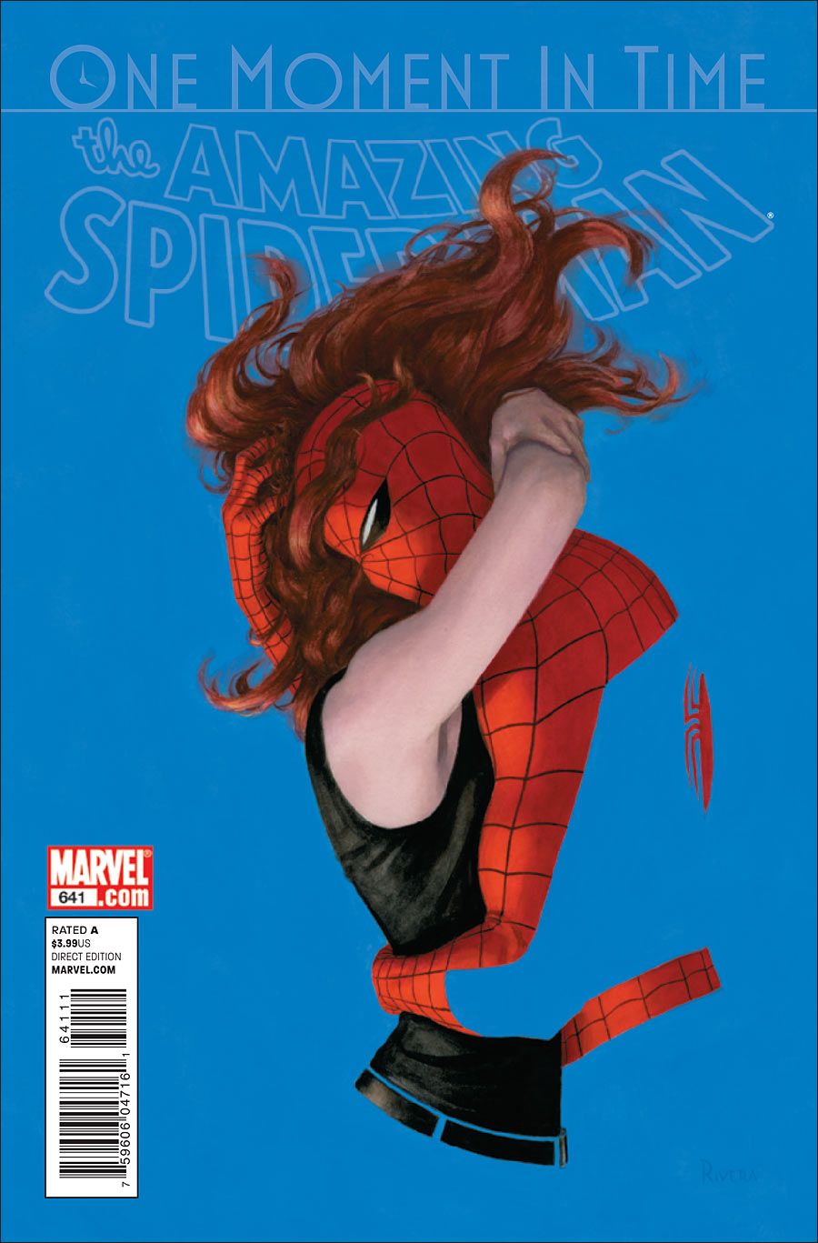
Let's ignore the controversies surrounding the "One More Day" and "One Moment in Time" storylines and just focus on the beauty of Paolo Rivera's painting, in which Mary Jane and Spider-Man hold on to each other even as they bleed into the background.
There's no denying the grandeur of this Alex Ross image, even as it evokes sad memories of the 1986 Challenger disaster.
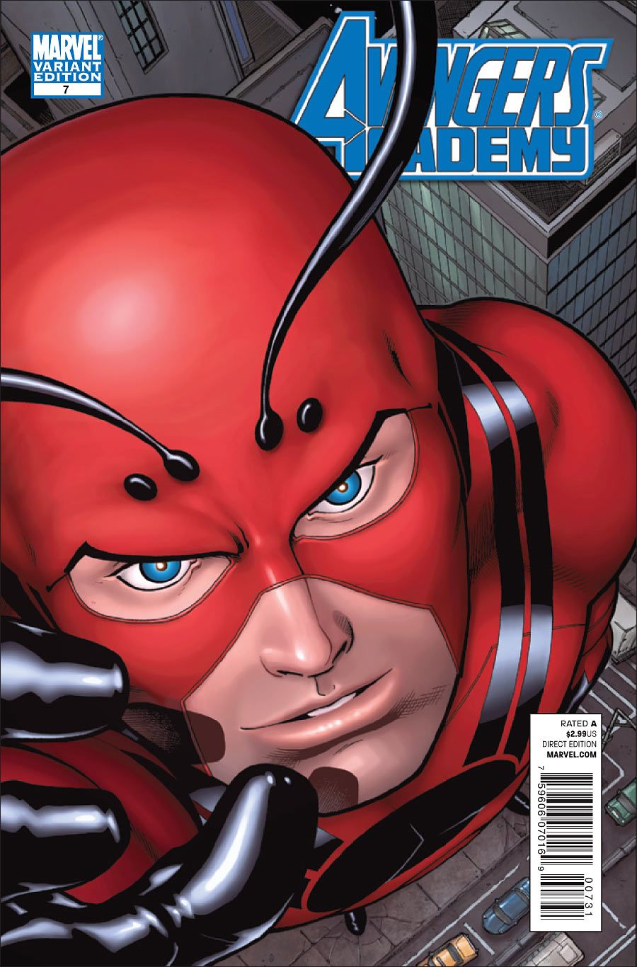
The severe angle and tight crop combine to make it appear as if Giant-Man is growing before our eyes, becoming too large for the cover. Note the sidewalk cracking beneath his weight.
Mike Mignola shares much of the credit with colorist Dave Stewart for this arresting image of the Captain Ahab-esque Lord Henry Baltimore, who finds Europe infested with vampires in the wake of a plague that ended World War I.
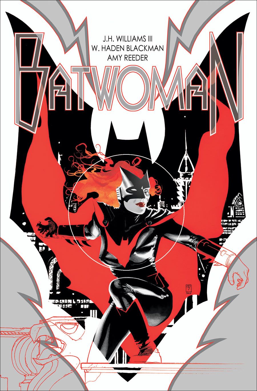
J.H. Williams III continues some of the Art Deco elements from his Detective Comics run, providing Kate Kane with her own graphic identity.
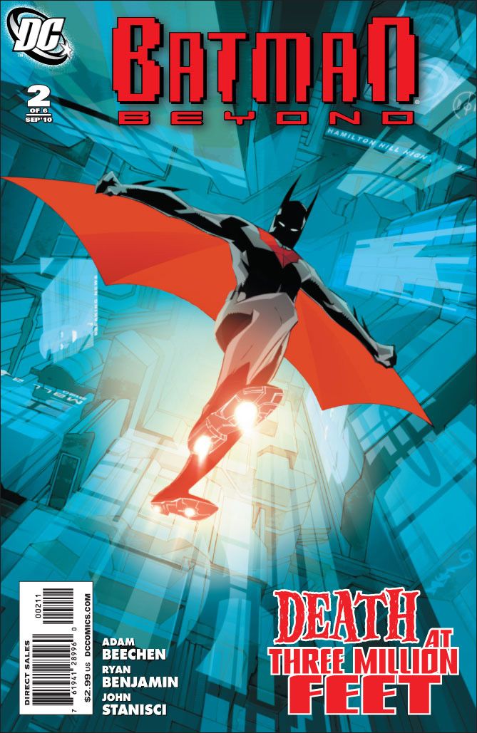
The dramatic angle, the color palette and the title -- "Death at Three Million Feet" -- combine for a stunning image.
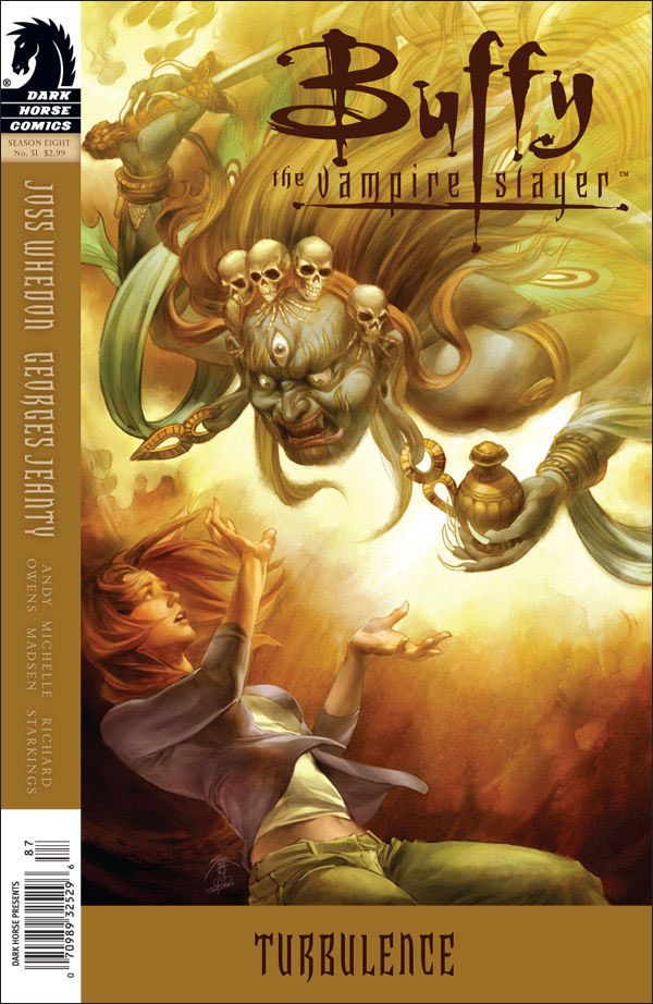
Willow Rosenberg faces a Tibetan goddess of war who's both fantastic and terrifying in this Jo Chen image.
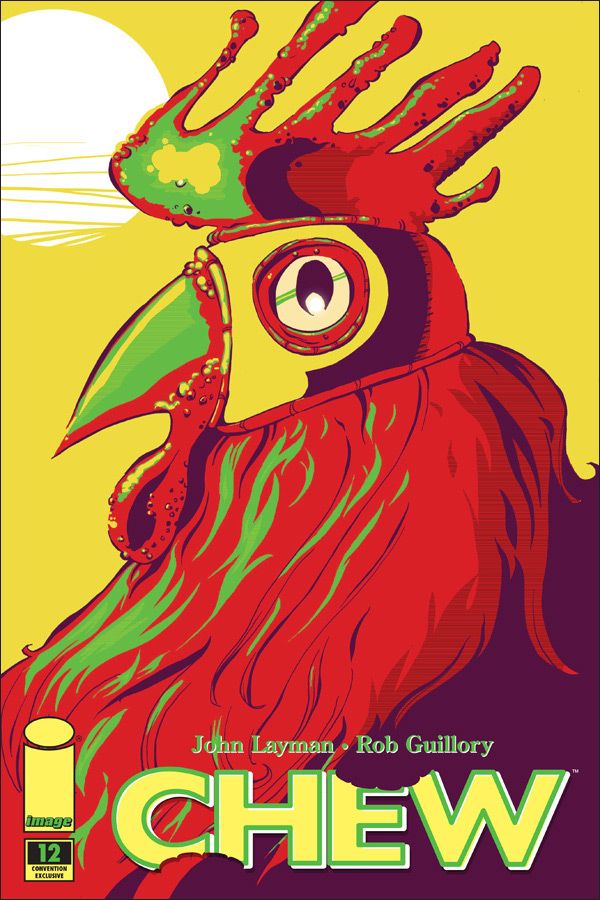
I have no idea where Rob Guillory drew his inspiration for this vibrant, five-color image of Poyo, the cockfighting champion, but I'm reminded of a Renaissance portrait. Only, y'know, in Technicolor. This may be my favorite cover of 2010.
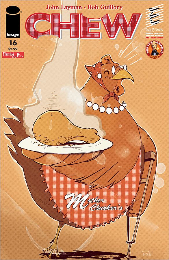
Two Chew covers, both featuring chickens? Who'd have guessed. This one is a stained and worn menu for Mother Clucker's, the former fried-chicken chain whose hilarious and demented mascot is a bespectacled hen serving her own leg. The use of Brush Script for the restaurant's logo is a nice touch.
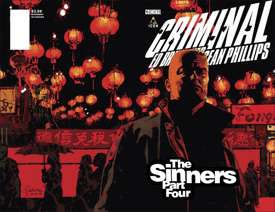
Sean Phillips has established himself as a master at capturing the visual style of film noir, with its silhouetted figures, low-key light and dark alleyways. Here Tracy Lawless is bathed in shadow and the surreal red glow of the rain-soaked streets of Chinatown, the perfect noir setting.
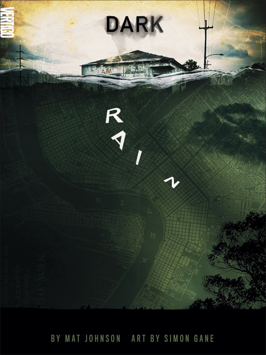
Designer Nessim Higson uses mixed media to depict a submerged New Orleans -- literally, as a city map serves as the background -- for a thriller set during the days following Hurricane Katrina.
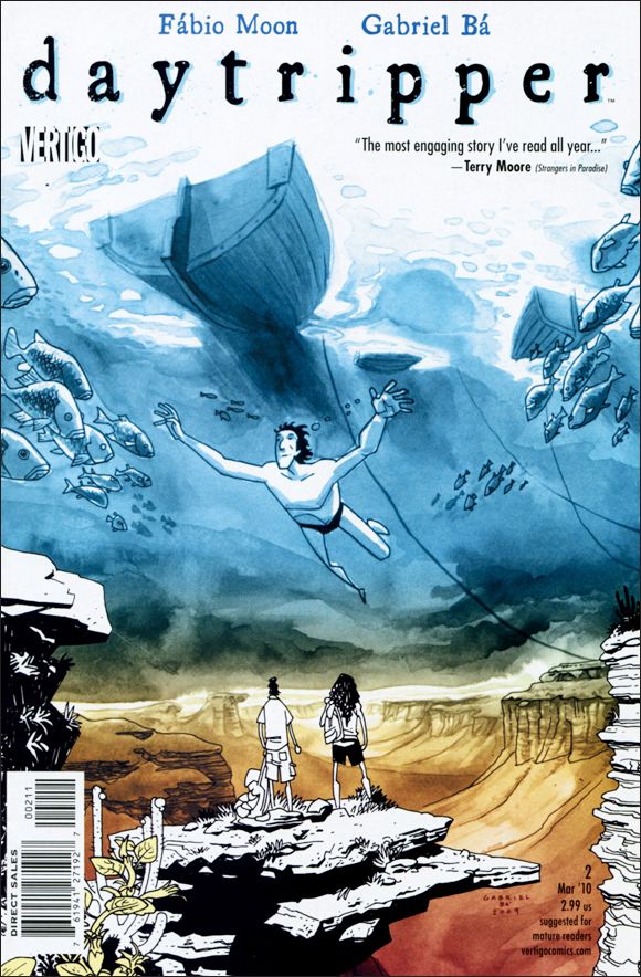
Gabriel Bá's cover for the second issue of Daytripper, his Vertigo collaboration with brother Fábio Moon, is beautifully surreal, blurring the boundaries between reality and fantasy.
There's something beautiful and understated about the play of light and shadow across the girl's face. Plus there are the minor details, like the bandage on her arm, and the shoes hanging from the power lines.
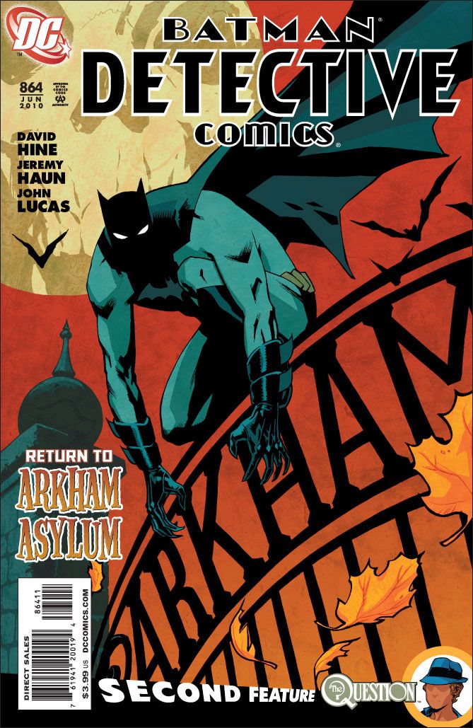
Cliff Chiang transforms the Dark Knight into a monstrous creature of the night -- note the obscured face and claw-like fingers -- beneath a full moon that sports the Black Mask's unsettling image.
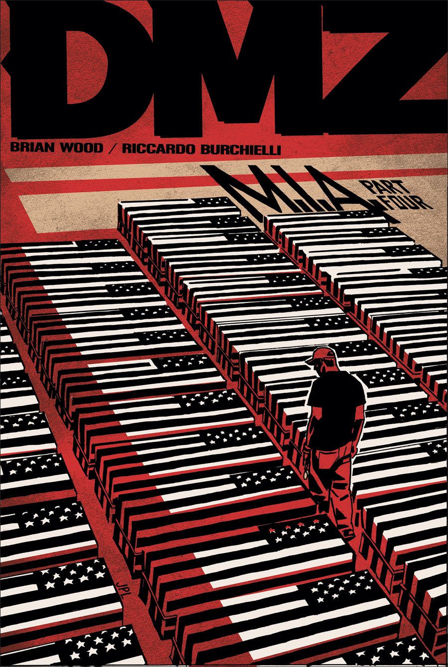
There's a solemn beauty in the repetition of the flag-draped coffins.
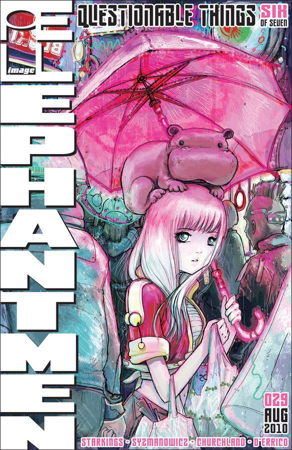
I won't deny that the adorable baby hippo is a big selling point here, but I particularly like the pink hue cast by the umbrella over part of the crowd. And don't overlook the incorporation of the Image "I" into the comic's title.
For this horror series set on the Mexico-Arizona border, Michael Lapinski takes the familiar religious symbol of a flaming heart to another, more visceral level by using the actual organ rather than the stylized icon.
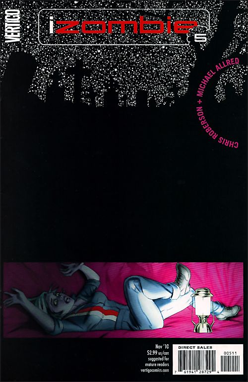
Michael Allred makes terrific use of space, burying a terrified Gwen beneath two-thirds of the cover image. The pink lining provides a nice balance to the massive field of black, too.
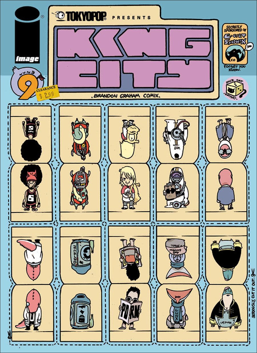
Although I doubt many readers followed Brandon Graham's instructions to cut up the cover, I love the playfulness and ingenuity behind the King City game pieces. That the entire image looks like a package you'd find in the toy aisle at the corner market -- complete with price sticker -- makes it that much better.
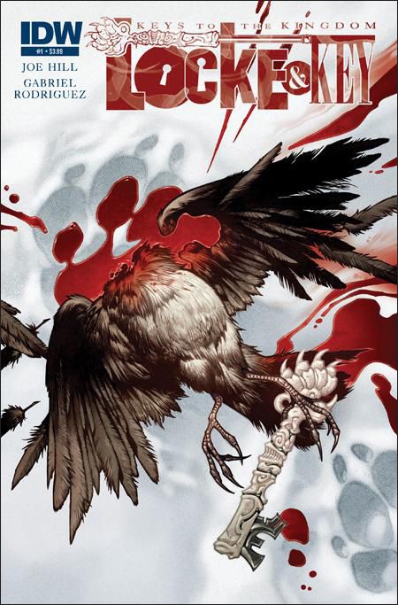
The fourth Locke & Key series debuts with a bloody yet strangely beautiful cover that hints at some of the savagery to be found inside. It's a little disturbing that I'm drawn by the way the blood pools in the animal track.
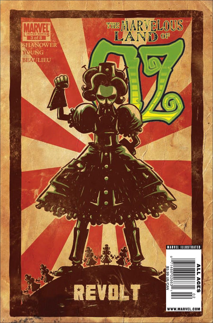
Skottie Young turns to Soviet propaganda imagery for this issue, in which General Jinjur and her army of amazonian milkmaids storm the gates of Emerald City in an effort to end the reign of the Scarecrow.
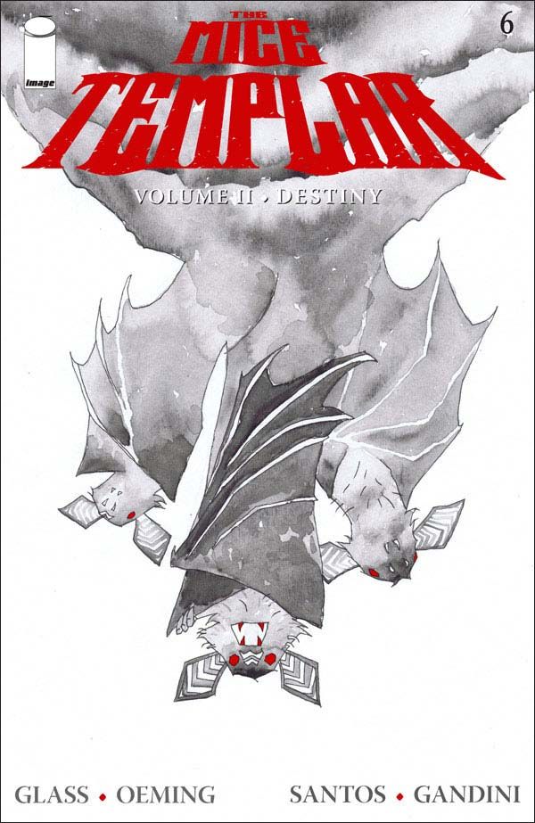
In a bit of a departure for the series, Michael Avon Oeming uses just two colors -- grays and red -- for this ghostly watercolor image of the cryptic Bats of Meave.
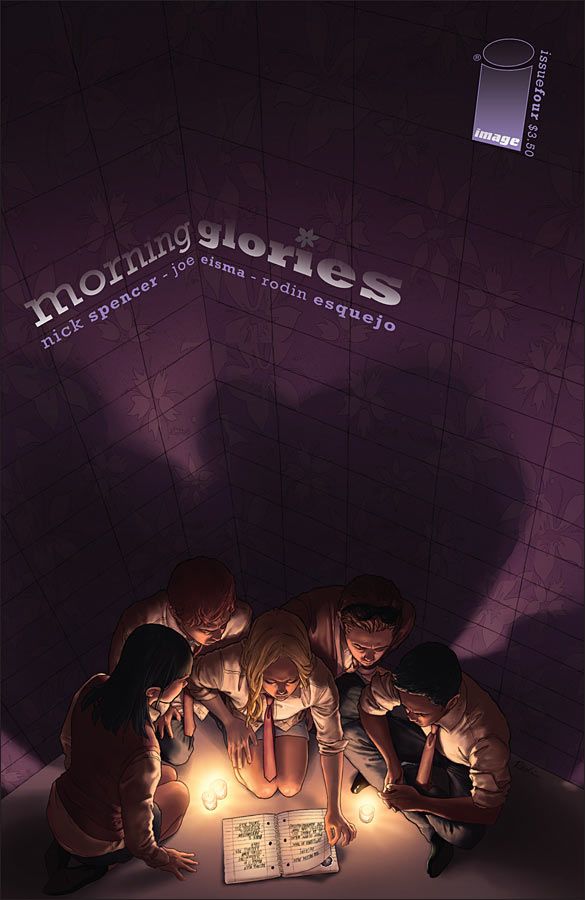
With a handful of covers for Morning Glories -- I'm thinking of the second, fourth and fifth issues -- Rodin Esquejo hit upon an approach that near-perfectly conveys the sense of paranoia that runs through the series. Here, as with those other two issues, he transforms the cover into an enclosed, claustrophobic space, an effect aided by the limited lighting and heavy shadows. I also appreciate the subtle morning glory pattern on the walls.
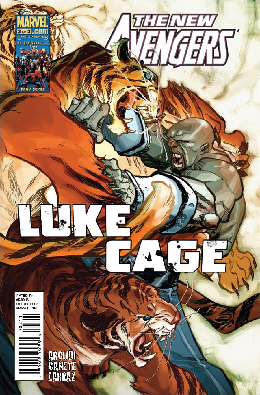
Eric Canete's illustration is just rippling with tension and energy -- I mean, it's Luke Cage fighting three tigers! Plus, the colors are lovely.
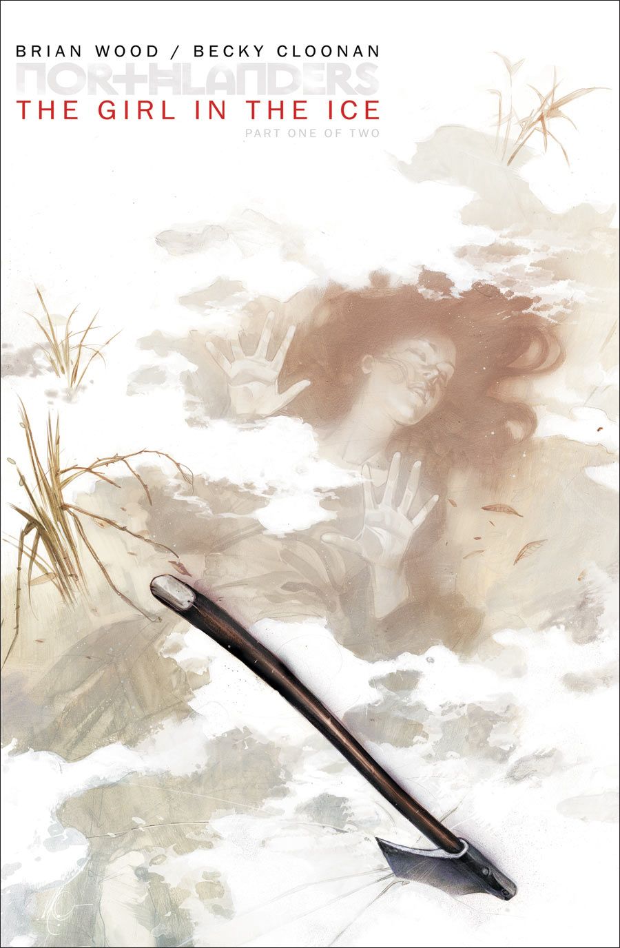
Massimo Carnevale and Brian Wood are an incredible pairing, delivering gorgeously painted and smartly designed covers for issue after issue of the celebrated Viking drama. Their collaboration has produced distinctive looks, and logo treatments, for each arc. Such is the case with the cover for Northlanders #35, the first issue of the two-part "Girl in the Ice" story, with its subdued, even washed-out colors -- in stark contrast to the intense hues of the previous "Metal" arc -- and the haunting image of the woman beneath the ice.
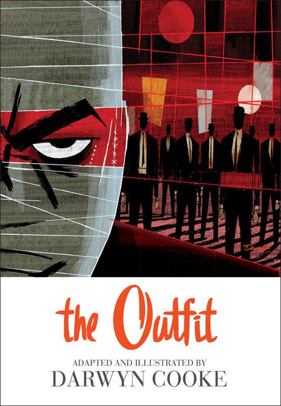
Darwyn Cooke's stylish cover for his adaptation of the third novel in Donald Westlake's Parker series conveys both a sense of menace and, appropriately enough, '60s-era flair.
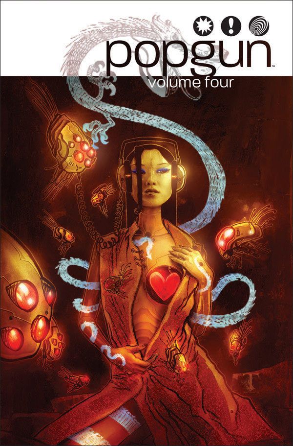
Ben Templesmith works so often in bloody horror, with titles like 30 Days of Night and Welcome to Hoxford, and gritty crime, with Fell and Choker, that it's easy to overlook his occasional foray into the ... well, sensual. Sure, it's outlandishly sensual -- it's a robot with a glowing heart in its breast! -- but still. The best part of the image, though, is the dragon tattoo that snakes up her leg and arm before winding its way off her body.
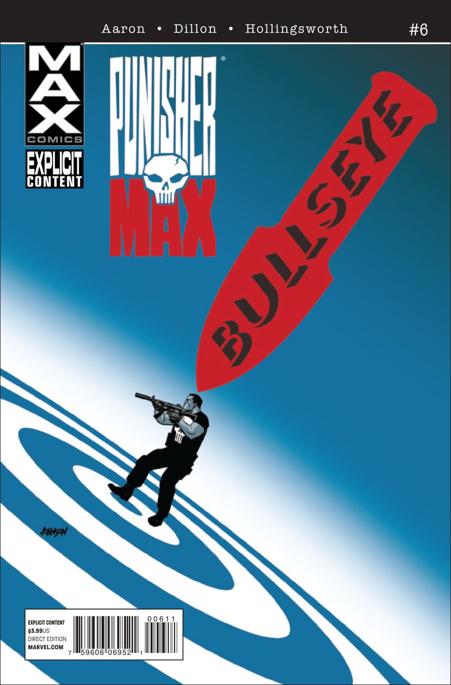
Dave Johnson demonstrated why he's a perennial favorite with the covers for the six-issue "Bullseye" arc, which sported a unifying graphic element -- the bullseye, naturally -- that never felt repetitious. The cover for the first part of the storyline, which imaginatively positions a minuscule, and seemingly unsuspecting, Frank Castle between the target and Bullseye's oversized blade, is easily my favorite.
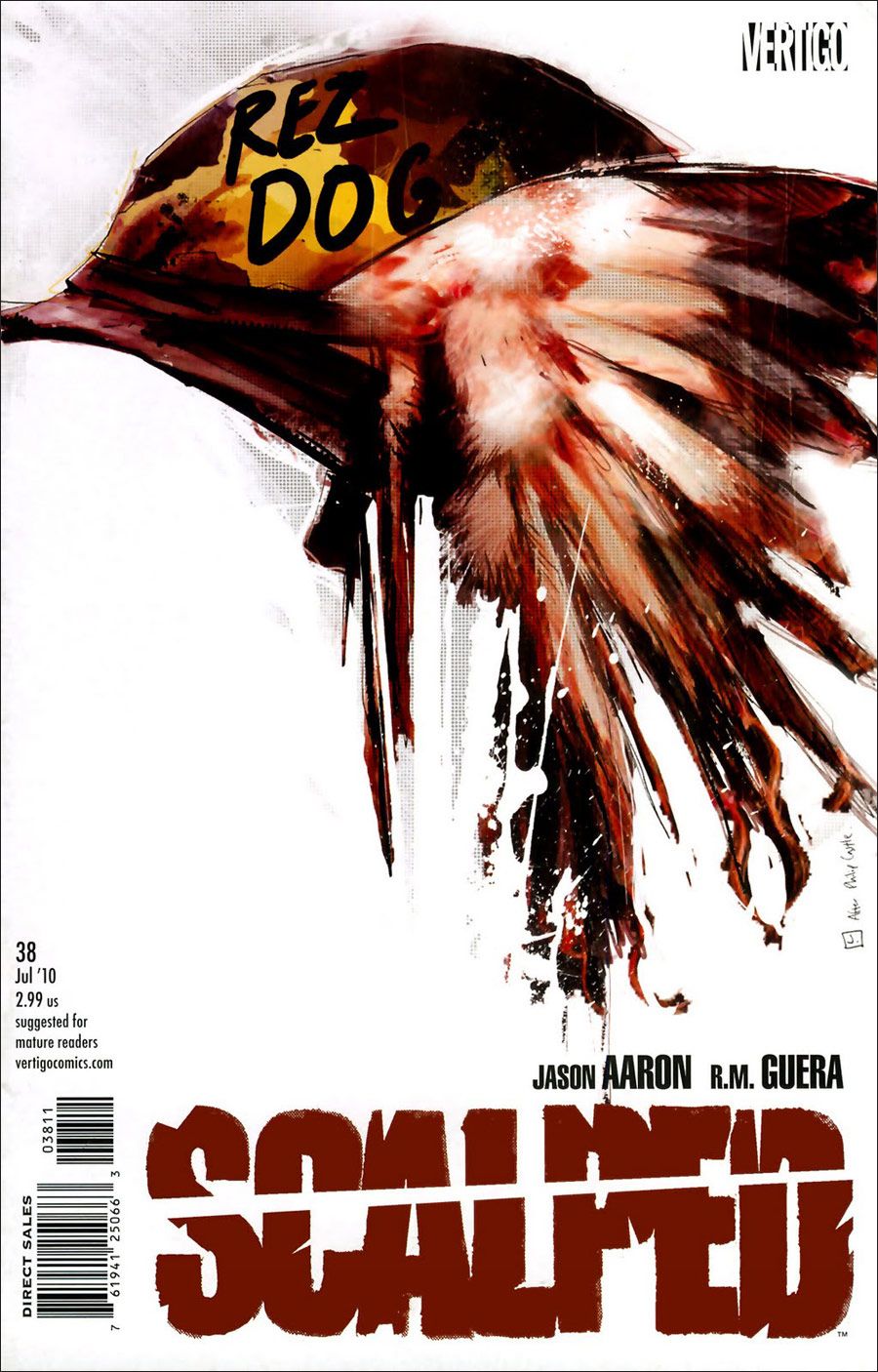
Jock pays homage to Philip Castle's poster for the 1987 war film Full Metal Jacket for this one-off issue centering on a Vietnam War veteran turned heroin smuggler.
For such a dark story, that's an awfully adorable Catman "Voodoo doll." Plus, just look at that little tree frog!
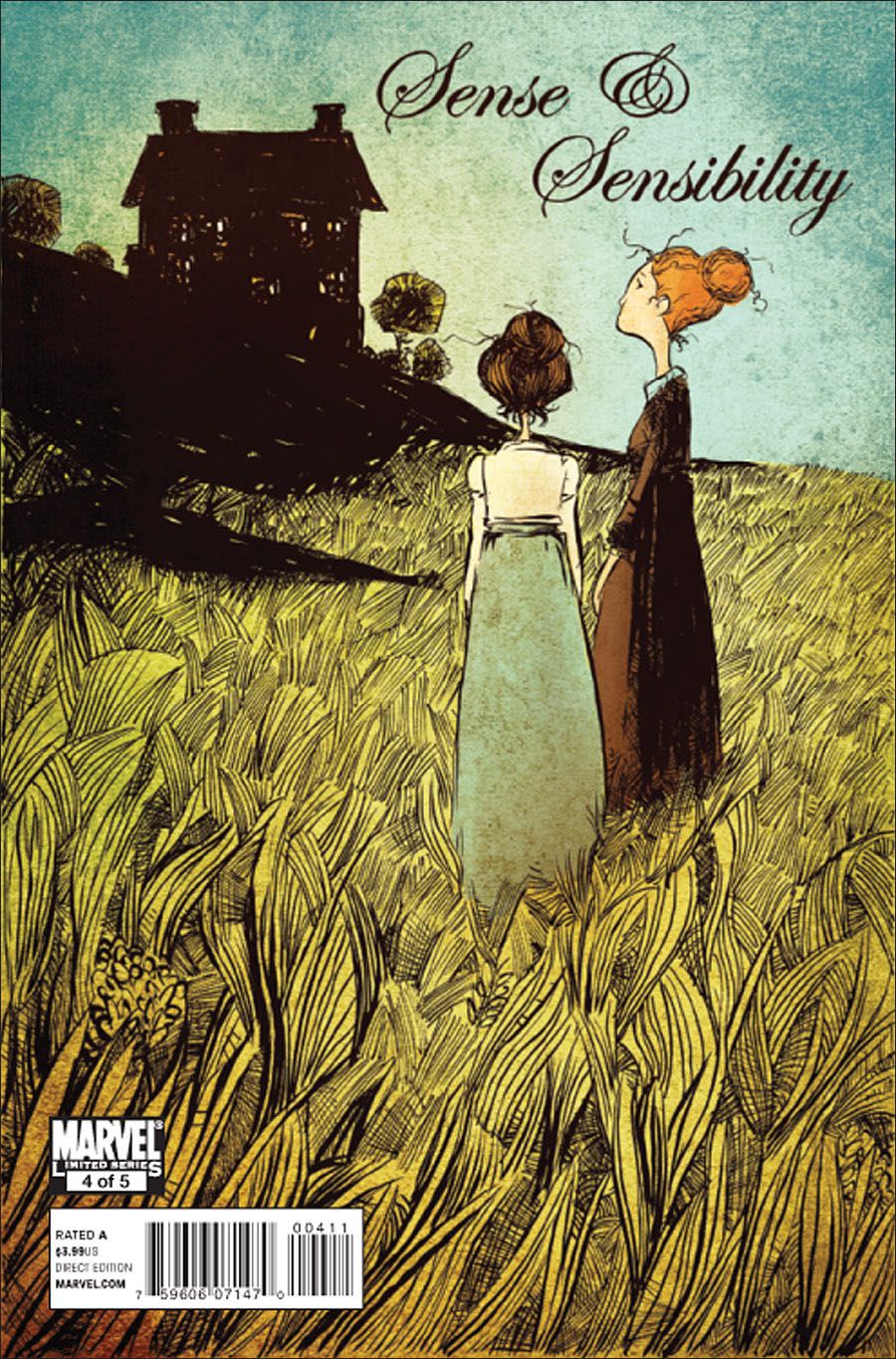
Skottie Young has had a dynamite couple of years with covers for the Marvel Adventures line, several Oz books and now this one, for the fourth issue of Marvel's adaptation of the Jane Austen novel. The entire image is gorgeous -- the composition, the color -- but I could stare endlessly at the wheat field.
The limited palette and gold highlights on the waves help to lend the cover to Drew Weing's debut graphic novel a gorgeous dream-like quality.
José Ladrönn channels the spirit (pardon the pun) of Will Eisner without resorting to mimicry. Additionally, the water and drainpipe are beautifully rendered.
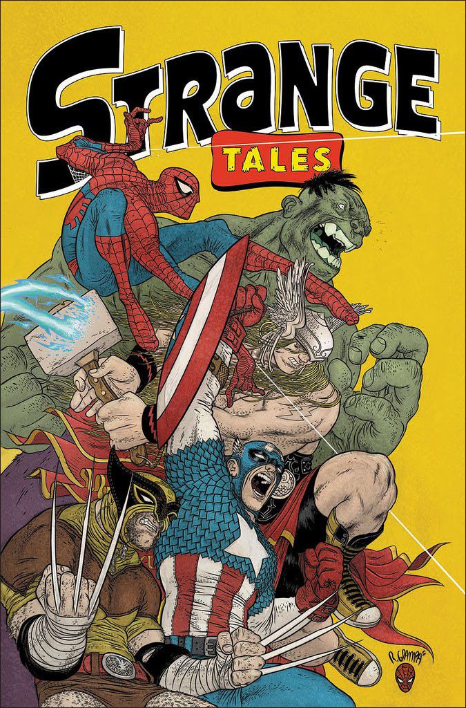
Rafael Grampa's superheroes are as savage and full of fury as the brutal truckers of his celebrated Mesmo Delivery. And how incredible is it that Wolverine wears shorts and elbow pads while Thor sports Spandex shorts and high-top sneakers?
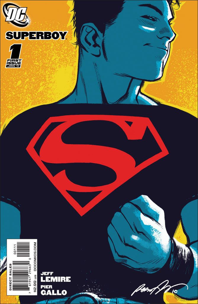
Rafael Albuquerque captures a mischievous (even devilish) and confident side of Conner Kent in this unusual, and unusually colored, cover for the first issue of Superboy's new series.
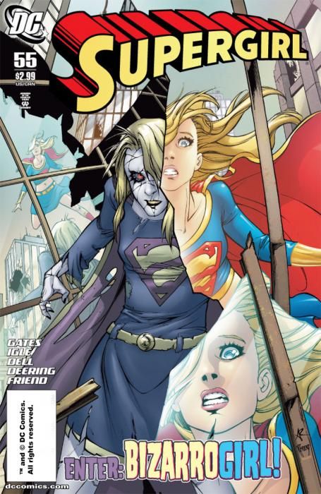
I love the depiction of Bizzarogirl as the fractured-mirror image of Supergirl. (Or is it the other way around?) It's wonderfully conceived and executed.
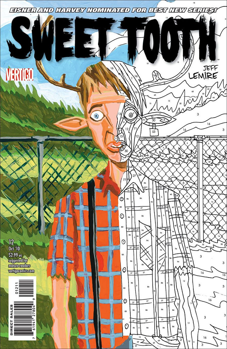
I confess that I haven't been following Jeff Lemire's Vertigo series, so I have no idea how the paint-by-number effect relates to this issue. But it's a pretty ingenious idea that evokes a sense of nostalgia -- paint-by-number kits were wildly popular for several decades -- while opening up the image to a range of interpretations.
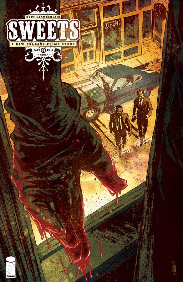
Kody Chamberlain's logo for this crime miniseries is among my recent favorites -- too many books rely on standard, if slightly tweaked, fonts -- but here it takes a backseat to coloring and composition. The blood-soaked hand in the foreground leads the eye to the approaching detectives and draws the reader into the story. It makes me want to pick up the comic, to find out what happens -- exactly what a cover should do.
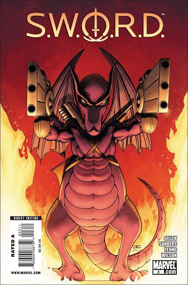
John Cassaday produced covers in 2010 for such titles as DC's Superman, Marvel's Shadowland and Dynamite Entertainment's Green Hornet, but this one for the late, lamented S.W.O.R.D. stands out the most. The image of Lockheed, Marvel's purple-skinned alien dragon and Kitty Pryde's frequent companion, menacingly brandishing a pair of guns is as unexpected as it is delightfully absurd.
Michael Dahan crafts a suitably disturbing image for this dark graphic novel about a rogue neuropathologist who isolates the root of evil in the recesses of the human brain.
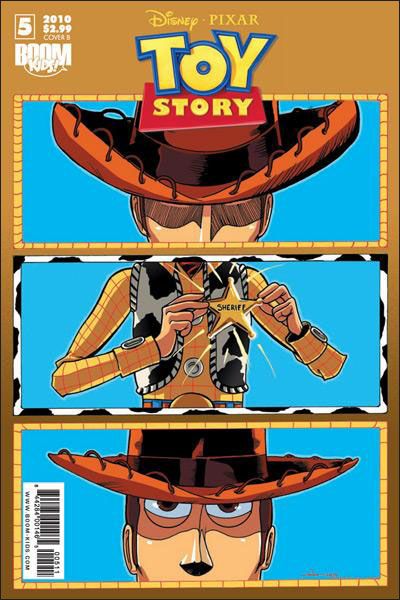
Nate Watson cleverly references classic Western cinematography, simulating the pan of the camera from Woody's face to the glistening badge and then back again.
The majority of Dave Johnson's covers for the Unknown Soldier were bloody and violent, but Issue 22 stands out for its beauty -- even with the skulls in the center of the flowers.
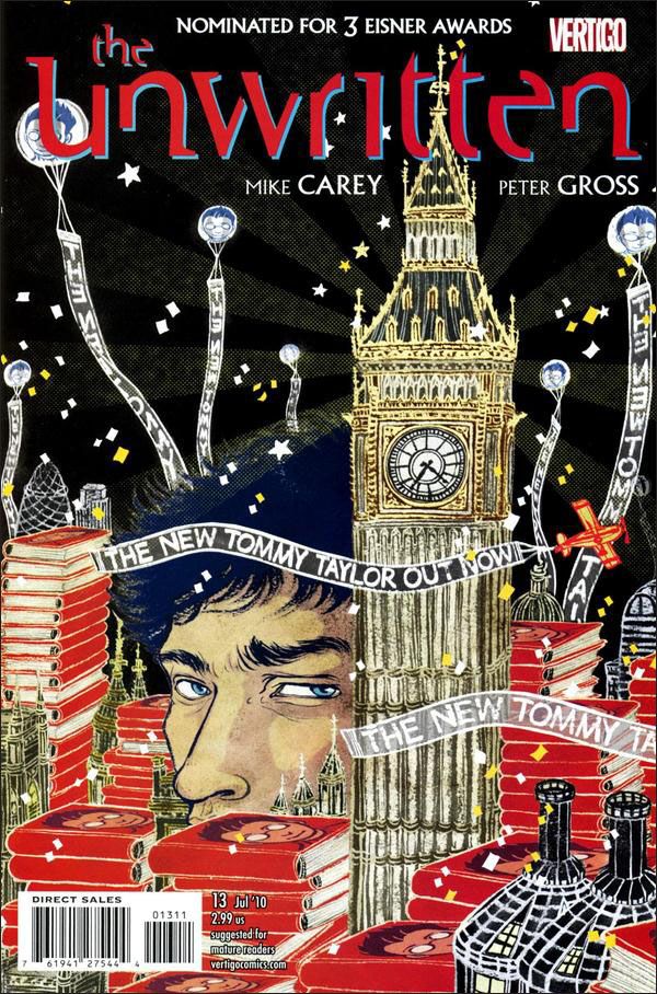
Yuko Shimizu's covers for the acclaimed Vertigo series are among the most consistent, and consistently good, being published today. For this issue, involving the launch of the new Tommy Taylor book in London, Shimizu toys with scale to create an appropriately unreal cityscape with an enormous Tom Taylor at its center.
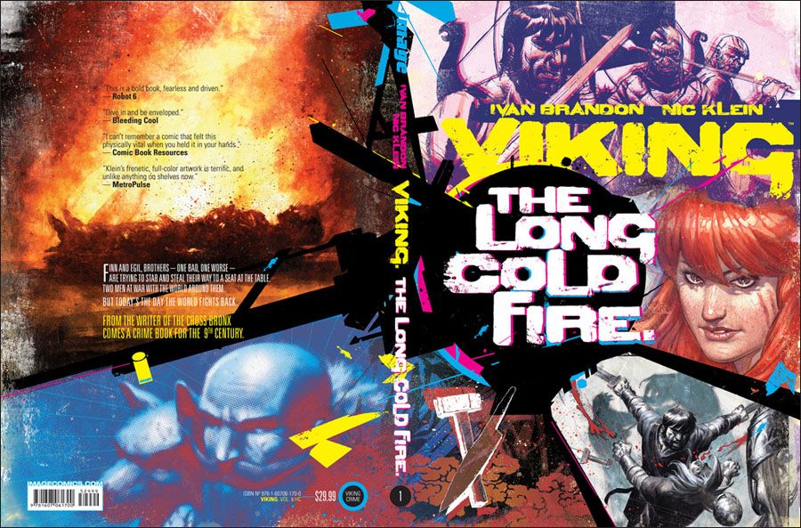
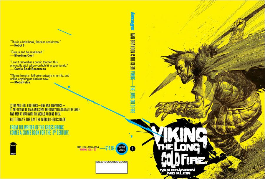
I "cheated" two years ago by including two issues in one entry, and now I'm doing it again with the stunning hardcover and softcover collections for Viking: The Long Cold Fire. It's to their credit that artist Nic Klein and design Tom Muller opted for an extremely modern look for what's essentially a ninth-century crime story. It's an unconventional approach that grabs even those readers with an aversion to period drama.
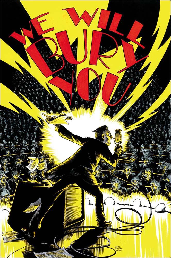
For a miniseries about a zombie outbreak in the late 1920s, Nate Powell creates a dynamic cover that captures both the horror elements of the situation and the energy of the Golden Age of Radio.

