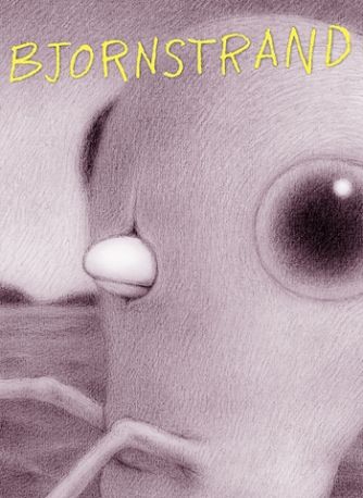
It's been two years since I last interviewed Renée French, but the release in September of Bjornstrand from PictureBox provided a terrific excuse to catch up with her again. In addition to chatting about the limited-edition signed and numbered risograph novella, French explained how the release was part of a larger project as well as how it related to her ongoing (NSFW) webcomic at Study Group, Baby Bjornstrand.
Tim O'Shea: Are you more flattered or bewildered when some folks compare your work to David Lynch's films (see Brian Warmoth's recent review)?
Renée French: Oh, I'm flattered. Lynch is at the top of my list of favorite directors, and seeing Eraserhead for the first time in college was incredibly important to the way I made stuff at the time.
To ask the question that Tom Spurgeon meant to ask: Is this project named after Gunnar Bjornstrand?
Ha! Do I have to answer that?
In what way does this PictureBox project connect to the webcomic?
The PictureBox mini is the later part of the Bjornstrand monster's life. I had drawn the story out of order, almost backwards, and had most of the later part drawn, so we put that out as the book that came out at SPX. The webcomic on studygroupcomics.com is starting from the beginning of his life and features the boys in a visible drawn form rather than the tiny dots they end up being in the later bit.
Your work is frequently in black and white/monotone (and understandably seems perfect for that in those instances) -- what makes you decide when a project is black and white or color?
I love black and white. color is never my first choice -- it's so complicated. With black and white you can concentrate on the shapes and textures and composition without having another language on top of that. So mainly my kids books are in color and my adult stuff is in black and white. or purple and white for this book which was risograph printed. For the webcomic I had the problem of either using word balloons or arrows to indicate who was speaking and I just didn't want the balloons to take up space in the landscapes, so I'm using glowy color for that.
The book is described as "tracking the reactions to an enormous and mysteriously cute creature." Of the reactions you work into the novella, was there any that proved more challenging or satisfying to you in the final analysis?
The most satisfying one for me was when the monster pokes his head out of the water and the guys experience a sort of complicated thrilled, terrified, excited, disbelief. They've seen this thing before a long time ago. There's some capitalized swearing in the dialogue at that point.
Also, I love the description "mysteriously cute" -- was that your word choice, or someone else's at Picturebox?
Not my word choice but it fits. He's freaking cute, for sure.
What was the thinking behind making it a limited edition print run--and to opt for risograph in terms of production?
We wanted something for SPX and the length of the story at that point was 30 pages and that's a good size for a stapled comic. The story works on its own but I wanted it to eventually be part of a bigger project, so it made sense to do it as a special limited thing. And the risograph printing makes it seem even more odd.
Do you have a timeline for when you hope to finish and/or release that bigger project?
Nope, there's no timeline yet for the bigger Bjornstrand project. But the webcomic will continue to appear at studygroupcomics.com a new update every Monday.


