
I missed out on Pat Grant's debut graphic novel Blue when it was initially released in 2012. But now that Top Shelf has the book back in print, I got in touch with the Australian writer/artist to learn more about the 96-page book, described as "a fascinating blend of autobiography and fiction with a sci-fi twist." The story has an interesting mix of several elements, including teenagers surfing, aliens with tentacles, conflict, bigotry and a quest for a dead body -- all of which just scratches the surface of this ambitious work.
Tim O'Shea: Have you considered what kind of graphic novel you might have pursued had you never gone to the Cronulla beach on that day back in 2005?
Pat Grant: You know, that’s a great question. I think that for a long time I had snotty literary ambitions that I had planted in me at uni where I studied creative writing. I wanted to do work that serious people might think said something about important things. It was a big lie. I was really trying to pretend I wasn’t obsessed with genre material. Now, I’m in my 30s and I have a book that I guess is a bit literary and a bit serious. It’s kind of annoying. I always get put on serious panels at writer’s festivals about racism, migration and national identity, and the truth is that now that I’ve worked through all this stuff in drawing Blue, I don’t have much left to say. I certainly don’t have the sort of answers that serious people take seriously. What should we do about Immigration? “Let’s open the borders”. Boat People? “Why not run a free ferry from Java to Darwin.” Racism? “Fuck, I don’t know. Does anybody?”
If I hadn’t been to Cronulla I probably would have latched onto another serious issue. Maybe I would be writing feminist comics. That would be cool. We need more dudes who aren’t afraid to call themselves feminists. Comics could do that. Right-wing dudes would be calling me a male shrew. That would also be cool.
When formulating a graphic novel that is semi-autobiographical, did you hesitate at all in bringing a sci-fi element like alien tentacle-creature immigration into the narrative?
The way that the Blue People work as a visual metaphor, a kind of placeholder for the cultural "other" still makes me feel a bit queasy. You know? It’s on the nose. But the yucky feeling that this metaphor creates in my gut is really the whole point of the book. It’s a book about racism but there are no answers, just creeping skin and a lingering sense of unease.
I always liked the high-concept sci-fi thing as a starting point. Although Neil Blomkamp’s short film version of District 9 (which was waaay better than the feature) came out while I was writing. It’s kind of the same dumb idea, isn’t it? I nearly spat the dummy when I saw that. The elements of autobiography only came in after the sci-fi stuff was already established; they were included as a problem solving device at the writing stage. I had a plot, characters, themes and all that but I had no story engine; no drive; and that’s when I remembered the time when I was about 15 years old and there was a mashed up body on the train line. It was near the track that we walked every day to get to the beach. The journey to look at the dead person on the train line was a nice simple narrative, a convenient A to B to C, that dovetailed nicely with the stuff I had already written. It seemed to give me the same yucky feeling that I was looking for.
In terms of layout, how did you decide on pages where you opted for traditional panel-grid storytelling versus a page like Page 27, where you dedicate an entire page to a character jumping on a surfboard to ride a wave?
I like comics that are comics-ish. By that I mean comics that aren’t pretending to be movies or pretending to be prose. I like cartoonists who are bold enough to let the reader play around on the page surface as well as the space inside the panels. So on this project my approach was present the information diagrammatically or cartographically wherever I could.
Half of Blue was made up on the fly. I didn’t do any thumbnailing or breakdowns. I kind of worked out the sequences and the layouts in one messy tangle of pencil lines. It’s a dumb way to work. I did it because I read somewhere that Chris Ware did it that way. How conceited is that? That’s the sort of embarrassing shit that I do. Anyway, I got about 30 pages in and I was so racked with anxiety and terror from having to free-jazz this huge project that I got drawers block. I couldn’t bear the thought of sitting down to draw. So I went back to the planning phase and thumbnailed the whole story. It took three weeks. After that the pages rattled off like a dream. The book as a whole suffers for this process though. It’s got some massive structural problems.
When exploring issues like bigotry and racism, not everyone is going to agree with your portrayal of characters, be they sympathetic or unsympathetic characters. Do you hope that Blue might foster some constructive dialogue between people that do not see eye to eye?
I hope that my stories always invoke conversation, but I don’t really think that books like this are going to actually change anything.
In creative writing school they tell you that if you get in a tizz about your storytelling you should imagine an ideal reader. In my case I imagined three ideal readers: One of my readers was a boofhead, the sort that you’d meet in the surf club car-park with a ute and a southern cross tattoo. The others were my mates, who are poets and academics, all of whom write wonderfully and are way smarter than me. The other is my mum, who is my hero and who made me watch the BBC adaptation of Pride and Prejudice when I was 10. The book had to make sense to all three readers. It was a fine line to walk.
I did my best not to be to judgy-wudgy about my characters, even when they were being really awful. I have a feeling that’s what makes the book weird and complex. I don’t think we need any more books about racism and bigotry like To Kill a Mockingbird. You know what I mean? Stories that make white, middle-class liberals feel awesome because they’re not bigots. Fuck that. We’re all bigots. We’re all guilty. We should all feel yucky every now and then.
How far along in the development of Blue did you realize you wanted to have the essay at the end, which helps to frame your work to a certain extent?
I’m a really slow cartoonist. I find writing really easy and drawing really difficult. So the idea came along about halfway through the drawing process as a way to pad-out the book as a bonus -- a cheap trick. It’s like the old sketchbook pages in the back of the trade paperback.
I’ve always liked essays at the end of comics. It’s never the reason people buy the book but it works as a kind of optional condiment, like sauerkraut on your kranski. People can read it if they want or they can skip it. The truth is almost no one reads these essays, which Is great, you can be self-indulgent without being obnoxious.
While partially fueled by your life in Australia, Blue is clearly a book that appeals to an international audience. What have been some of the reactions from that international audience that have really stuck out in your mind?
I wrote the dialogue in a particular kind of coastal town slang from a particular time in the mid-'90s. I know for a fact that even some of the Australian readers have no clear idea what it is that the horrible spotty children are actually saying. I was surprised at how well overseas audiences coped with the language. I think the reason that it works is that what the characters say isn’t really that important, but the sound of the language is. The sound carries a lot of the information about what it feels like to be young and stuck in Bolton.
Do you think Blue might have increased interest in Australian surf comics at all?
Maybe, but probably not. The thing is that Australian surf comics is barely a genre, and if it is a genre then it’s possible that I’m the only one that sees it as one. The motivation for writing the essay, apart from the obvious self-serving stuff like situating my own practice and inventing cartoon ancestors, was to get more people looking out for Tony Edwards' work. At the time of writing Captain Goodvibes was very hard to find. Tony is a mad genius. He’s like the love child of Gilbert Shelton and Michael DeForge. Everyone who surfs and is older than 40 knows of his work, but none of the comics enthusiast that I know had heard of this weird guy who drew druggy surf comics for Tracks in the '70s. It turns out that Tony didn’t really need my help. A thick omnibus of Tony’s comics came out in November 2011, a few months before Blue. It’s called My Life As A Pork Chop. It’s a fantastic book. Go buy it.
Can you talk about your lettering approach on Blue?
All my lettering is done by hand with a crow quill. I’m a half-baked academic as well as a cartoonist, and most of the choices I make in my cartooning practice are not just aesthetic inclinations, they are underwritten by fruity philosophical ideas. For example, I think it’s a great tragedy that the printing press and the digital typeface has allowed us to remove the writer’s body from the art of writing. In the last 200 years, writing has become a compositional practice. We write by pushing buttons. We assemble units of language into sentences and paragraphs by clicking them together like bricks of LEGO.
But it wasn’t always like this. Before the printing press writing was a technology of the moving body, an art of movement as much as an art of composition. The cool thing about comics is that it’s a form of writing that brings the lost art of inscription back to writing. The mysterious voice of the hand drawn line, the index of the drawing body, is one of comic’s most valuable assets. If you ask me a cartoonist is crazy to use digital type.
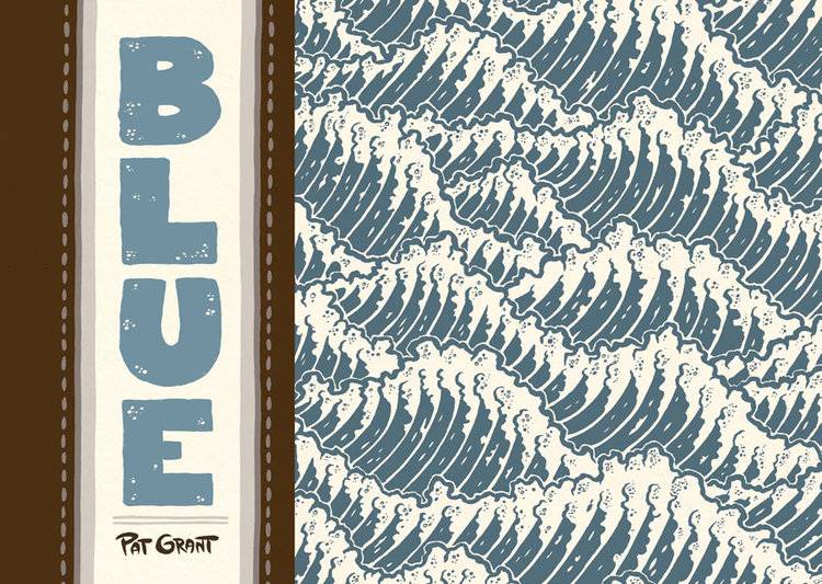
In terms of coloring, obviously blue is prevalent in the story, but I am also curious to learn about your choice to also use brown as the other major color choice (other than black). How did you arrive at those colors in particular?
Another great question. Building on the last answer, I have really strong ideas about how color works in printed comics. I see a lot of cartoonists doing their coloring in Photoshop on the screens of Apple products. That’s fine; I do that, too. The problem is that in Photoshop the possibilities are infinite while in print the possibilities are very limited. The result is that a lot of comics are prepared for press without anybody thinking very much about how the content on-screen might be translated through the printing process. Too many of us that are working in print are thinking like web designers or CG animators when the reality of the situation, when you actually go to a book factory and look at how printing works, is that what we’re doing is lithography. We’re smearing colored goo onto etched metal plates and pressing those plates onto paper. It’s a material process, and to make really lovely books we should be thinking more about how best to communicate with materials, not just pixels.
Blue was printed with a blue and a brown ink because the possibilities are more interesting when the inks are mixed. Black ink is a bit of a tyrant. It takes charge, it makes every other color its bitch. Brown ink is more wimpy. It’s more interesting to see the brown ink negotiate with other colors.
Many people comment that they are haunted by Blue after reading it. Are you pleased when your work elicits such a reaction?
Yeah. That’s probably what I’m shooting for. My favorite stories are those haunting or atmospheric works of short fiction like The Virgin Suicides by Jefffrey Eugenides or The Man in the Well by Ira Sher. My favorite movies are weird ambiguous texts that are almost genre but a little bit off, like Spring Breakers or, oh, my God, Josh Oppenheimer’s completely fucked up documentary The Act of Killing. I love stories that are about sensitive subjects, that manage to get under your skin without overstating the author’s intentions.
I love how your acknowledgments/thanks aspect of the book includes a series of headshots for all the people you thank. How did you come up with that approach?
I’m absolutely sure that I stole that idea from someone else but now that I think on it I can’t remember who it was. No. Wait. It was Dash Shaw. Bottomless Belly Button. Man, that was a fucking corker of a book. I remember a cool drawing of Gary Groth in the back. He looked gaunt.
You know when you’re reading someone’s acknowledgements and it sounds like they’re listing all of the famous people they know? Yeah? I hate that. And worse. I would totally do that. I’m a name-dropper, and I’m really trying hard not to be. The portraits were part of that. A drawing of someone and a first name or a nickname is a way to be a bit more private about your thanks.
What's on the creative horizon for you?
I’ve got two things on the boil: a collection of short comics and a long, sprawling genre project. The shorts are just what you’d imagine: autobio stuff and more experimental stuff. The long project is more trashy, it’s about teenage con artists in the grimy dystopian future.