
Lest you mistake Eleanor Davis' new collection How to be Happy for a self-help book, she spells out everything in the opening pages. It won't help a depressed person become less depressed, but Davis does recommend two books that benefited her -- a situation we briefly discussed.
I've long had an affinity for the Athens, Georgia-based storyteller, whom I first interviewed in 2011. That affection is partly because we live in the same state, but also because her work often strikes me as the comics equivalent of an interpretive dance. I have no other way to describe the core response that her work elicits from me. I look repeatedly at some of the pages in this collection and still find something new each time.
Tim O'Shea: While the book is called How to be Happy, you make it plain with an author's note that it's not a self-help book, but you do recommend books that have been helpful to you. What prompted you to include the note?
Eleanor Davis: Mostly it was because of Lisa Hanawalt, who has had some trouble with people buying her book, My Dumb Dirty Eyes, because they think it's about dogs. There's a picture of a dog on the cover. They get upset when they figure out the book is not about dogs. At some point someone somewhere who is sad is going to pick up my book hoping it will make them happy. That's not the intent of the book, but because I know of some books were actually helpful to me in that way, I thought it would be nice to point folks to them. Maybe for the second printing of My Dumb Dirty Eyes Lisa can include a list of her favorite books about dogs.
The title of the book is sort of a joke because the stories in How to be Happy tend not to be happy, at all. They are often about people struggling to be happy and not being able to succeed. It's a painful joke. It's a joke that feels bad to make.

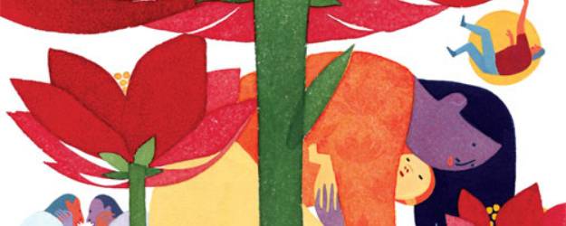
What influences your decision to do a story in black and white versus a story in full color? Can you talk about your color choices for "Nita Goes Home"? I love the vibrancy of the colors in that story in particular.
The way I do the final art for a comic mostly depends on how fast I want to finish it and where it's going to be printed. Or sometimes there's a stupider reason -- in "Summer Snakes" there's a scene where they're watching a black-and-white movie and I just wanted the rest of the comic to look really different from that movie. "Nita Goes Home" is brightly colored partially because I was inspired by Jesse Moynihan's book Forming. I also really coveted Lisa Frank products as a child.
This summer you have been teaching a teen comics camp. What do you most enjoy about that experience?
All our students are amazing, man. They love drawing comics. They are living and raging on comics. And their comics tend to be pretty bizarre. They're trying to make something just like Full Metal Alchemist or Spawn or whatever, but they can't yet, and instead their comics wind up being really fresh and original and weird. When we started teaching the class six years ago I was really burnt out on comics, and every year I get a jolt of love and inspiration from the kids in our camp.
One interesting thing to notice is how much more potential the students who are playing around have than the students who are super self-critical and serious. The kids who want their stuff to be really perfect get uptight and they don't have fun drawing, and because they don't have fun drawing they draw less, and because they draw less they don't get better. It's the students who don't give a fuck and who are just drawing for themselves who make the most work and the most progress.
What inspired you to experiment with sound as a narrative tool in "Stick and String"?
Good question! I wrote that story seven years ago and I have no idea what my thought process was back then anymore. Because listening to music is so much like falling in love? Because of some sort of Pied Piper idea? Comparisons between the more "civilized" guitar music and the more passionate drum music?
"Make Yourself Strong" uses white space in a fascinating way. When you were doing the layout thumbnails, did you debate how to approach your use of white space?
I actually didn't do any thumbs [for] "Make Yourself Strong"; it was just a comic I drew unplanned straight in ink in my sketchbook. Then I scootled the images around in Photoshop. The white space sort of came from that.
I drew the final comic in a couple hours, but I had been thinking about the idea for it for a couple years. In the initial idea for the comic the main character runs into the sky and kills death. To me it's one of the saddest stories in the book but most folks think it's uplifting, which I guess is ok too?
How did you decide which of your stories to include in this collection -- and did you have a philosophy in terms of which stories followed each other (the order of them)?
I included all my strongest work. I left out some stuff that was too old or a little too lighthearted. Some stories were cut because they were too fictional: All the work in How to be Happy is based off my own life in some strange way.
I tried to lump stories together that felt thematically similar to me -- it starts with stories about people searching for utopia, then searching for love, then searching for their best self -- wanting to be strong, or to be good. Then there are a couple kind of existential ones that have some God stuff in them, I guess. And the last couple stories are about how hard it is to be fully alive -- the pain of it, and the bravery of it.
I was nervous about putting this book out because it's such a motley collection of work, which was created over the course of many, many years and for many different venues, but instead it turned out to be startlingly cohesive. It turns out I pretty much keep writing the same stories over and over again. Realizing that was a relief, but I also feel kind of sheepish about it.
In terms of lettering, do you try to consciously aim to go for a different lettering style with certain stories, or do you prefer to stick with one lettering style?
Another interesting question! I'm always just trying to make my naturally scraggly handwriting legible. Sometimes my lettering gets really big because I feel so nervous that it's hard to read. Now the boys in "Thomas the Leader" seem like they're shouting because the lettering is so large.
Did your Great Uncle know he had partially inspired your desire to be a storyteller before he died?
I don't think my Uncle Almyr had much to do with my becoming a cartoonist, although he was a thrilling and monolithic part of my childhood. I hadn't spoken to him for several years before he died. He was someone who was always around, and then he wasn't, and then he was sick, and then he was gone. I'm sure he would have liked if I had called him, but I was 19 and sickness and death are embarrassing.
The analogy about my Uncle Almyr trying to beat cancer through visualizing a tiny, curable self is just one I've found useful in understanding why anyone makes art and tells stories. If we can make the world in miniature, if we can make a facsimile so small that we can hold it in our hands, then we think we'll be able to understand it. Maybe we can cut out the shitty parts that hurt, or maybe when they're small they'll hurt less. And we secretly think somehow the larger world - through a strange dream-logic -- will imitate these cunning little worlds we're holding, which we've made in its image.