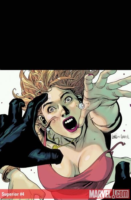
"Superior" isn't a bad comic. I'd actually say that it's the best-written book from Mark Millar over the past few years. There are a couple of problems with the book, though, and it's a shame because if they were fixed this book could be more than just all right.
The big problem with "Superior" is the slow-as-molasses pacing. I don't mind a book that takes its time if there's a point in doing so. (For instance, Kozue Amano's "Aria" is probably the slowest-paced book out there, but it's going for a combination mood piece and guide book to Mars, and as such it's an utter joy to read.) But in the case of "Superior," it feels like Millar is stalling. Until the last two pages, "Superior" #4 is in many ways identical to "Superior" #3. The exact details have changed, but it's still more of the same: Simon uses his powers to save people and gains media attention.
The frustrating thing is that there's a good story buried in "Superior" that keeps getting lost in the shuffle; the mention about Simon's parents giving rosaries out to pray for their "missing" son, for example, or the way that Simon-as-Superior is micromanaging his own town. There are germs of interesting ideas and concepts here that could take a bit more of the center stage, but instead they're tossed aside after a cursory glance, so instead we can get an extended sequence with Superior going after a bully. At least the latter is going somewhere, but we're at the end of four issues now and it feels like a plot is just starting to kick in. With just two issues to go, Millar's losing his audience.
Leinil Yu's pencils are strong as always, and even with three inkers they're remarkably consistent. Yu manages to make people look real without coming across stiff or artificially posed, a tougher feat than it sounds. Unfortunately, the coloring seems particularly garish this issue, and on some pages more than others it's actually hard to look at the figure work because of the strange, blocky colors. Different squares and trapezoids of color sit on top of one another, instead of blending from one to the next; it feels almost like a filter never kicked in, here. It's a shame because some pages look fine, but ultimately that just makes the others stand out that much more.
"Superior" should be a great comic, but somewhere along the way it feels like some finishing just fell through, both on the script and the coloring. It's too bad, because I think at the end of the day people aren't going to remember "Superior" once it's said and done, and with a little work this could've been a modern day classic. Maybe the final two issues will turn things around, but this far in, it feels unlikely.

