Designing superhero costumes can be hard work. What looks good today may look goofy in a year or two, and the last thing you want is a character who stands out in the wrong way. Trying to redesign a superhero is even harder. Characters like Superman and Spider-Man are so iconic that changing their look will almost certainly elicit angry reactions.
Still, it's hard not to play with superhero costumes. What artist doesn't want to leave their mark on these characters who have worked their way into the pop-culture consciousness of today? And when it works, a costume change can bring a character to a new level of popularity. Of course, if it doesn't work, a fan favorite suddenly becomes a laughingstock. Here are five superhero costume redesigns that worked and five that didn't...
10 Worked: Black Suit Spider-Man

There are few comic book characters that are as recognizable as Spider-Man. Stan Lee and Steve Ditko's creation, wearing a costume that covers him in red and blue from head to toe, instantly grabbed people's attention and never let go. That made it all the more surprising when Marvel gave Spider-man a new look in 1984.
The idea of a black costume for Spider-Man was actually suggested by comic reader Randy Schueller. Marvel paid him $220 for the idea, which may have made that the best $220 Marvel ever spent. Without that suit, there would be no Venom!
9 Didn't Work: Invisible Woman

The Invisible Woman is one of the smartest and most powerful heroes in the Marvel Universe. As a member of the Fantastic Four, she has been fighting evil for as long as just about anyone else, and she has earned the respect of her peers many times over. Not only is Sue Storm a superhero, but she's also a supermom, raising two amazing and intelligent children.
Which makes this horrible costume all the more horrific. Skimpy costumes on superheroines are nothing new in comics, but artists took it to a new level in the 1990s, and Invisible Woman was the victim of one of the worst redesigns ever.
8 Worked: Flash

The redesign of Flash in 1956 led to a resurgence of superheroes and the birth of the Silver Age. Along with a new origin and secret identity, the Scarlet Speedster was given a sleek look that made his powers clear, even when he was standing still. From the wings on his cowl to the yellow lightning bolts and boots that broke up the red of his costume, the Flash's new look would change the way superheroes dressed forever.
While there have been minor changes to Flash's design since Carmine Infantino created this version, the same basic feel has lasted, and that's because superhero costumes don't get much better than this.
7 Didn't Work: Armored Booster Gold

Booster Gold's original costume followed a lot of the concepts that made the Flash's redesign work. Booster wore a sleek yellow and blue outfit that somehow felt classic and futuristic at the same time. His look also made it clear that Booster was looking to make a splash. He wasn't going to be a hero who lurked in the shadows, he wanted that spotlight.
Like the Invisible Woman, Booster Gold became the victim of a company chasing the fads of the 90s. Gone was the elegant costume, replaced with a bulky armor that would probably be as uncomfortable to wear as it is to look at. Luckily, this costume wouldn't last long.
6 Worked: Lobo

It's hard to imagine, but when the Main Man first showed up in Omega Men #3, he didn't look very tough. Lobo had his trademark spiked hair, but for some reason, he was wearing a purple and orange onesie that certainly didn't make him look tough. Luckily, Lobo's look would change, and the last Czarnian would find himself in his more iconic biker gear and become the anti-hero we all know and love.
DC tried to redesign Lobo with the New 52 reboot, making him thinner and less muscular, but it didn't take. Before you knew it, the original bastich was back, and all the space dolphins were happy.
5 Didn't Work: Thor

The 1990s were a hard time for Marvel and DC. The two companies found themselves suddenly competing with not only Image but Valiant and Ultra Comics too. In trying to keep up with the new kids on the block, a lot of bad choices were made in the hopes of making old characters seem new and exciting.
For Marvel's Thor, that meant losing his Asgardian armor for a half-shirt and a lot of random straps. Like Invisible Woman and Booster Gold, this redesign didn't last long, but it is forever burned into the memories of comic readers.
4 Worked: Robin

With each new Robin, a new Robin costume was created, and almost all of them have been great redesigns of the original. The latest Robin, Damian Wayne, has a costume that builds on the four Robins before him while capturing his own personality.
The hood tells you that this Robin isn't going to be making many jokes, and the redesigned domino mask takes its cue from Batman's logo, letting you know who his dad is. His combat boots make it clear that this Boy Wonder isn't going to need any adults to come and save him. Damian Wayne's costume pays respects to those that came before without being beholden to them, and what we get is a wonderful look.
3 Didn't Work: Mod Wonder Woman

In 1968, DC Comics tried to update Wonder Woman and they couldn't have done a worse job of it. As if her new "mod" look wasn't bad enough, Wonder Woman also lost her powers, but to make up for it she became a Karate expert. The Wonder Woman redesign was so poorly thought out that it is one of the few times a comic book character getting a new look made it into the news.
Gloria Steinem, one of the leaders of the feminist movement at the time, spoke out against DC's decision to depower the most famous female superhero. So angered by DC's move, Steinem put the classic version of Wonder Woman on the cover of the first issue of her new magazine, Ms. and wrote an essay about the damage DC had done to the character.
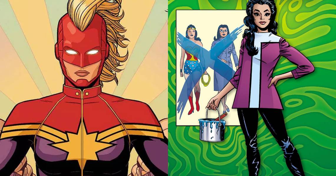
2 Worked: Captain Marvel

For decades Carol Danvers was relegated to second-tier status as Ms. Marvel. Like so many superheroines, her costumes were more about showing off her curves than they were about helping her fight. But thanks to Kelly Sue DeConnick and Jamie McKelvie, that all changed in 2012. Along with taking on the title of Captain Marvel, Carol would get a new look designed by McKelvie at the request of DeConnick.
This new design was bright and exciting and felt the look you would expect a captain to have. Most importantly, it helped Captain Marvel stand out on a shelf filled with colorful heroes. Without McKelvie's redesign and DeConnick's handling of the character, there likely wouldn't be a Captain Marvel movie.
1 Didn't Work: Iron Man With A Nose

Sometimes the smallest change can make the biggest impact. Iron Man may have more redesigns than any other character besides the Wasp, and he has his share of bad looks, but nothing is as unsettling as the period when old shell head had a nose. The smooth-faced Iron Man was the norm until The Invincible Iron Man #68 when readers were confronted by an Iron Man with a honker that you couldn't help but notice.
This one little change suddenly turned Iron Man from cool to lame. He looked like someone cosplaying as the Tin Man from The Wizard of Oz. In the issue, Iron Man explains that the new look will help him strike fear in the hearts of his enemies. To be honest, it is quite a horrifying look.