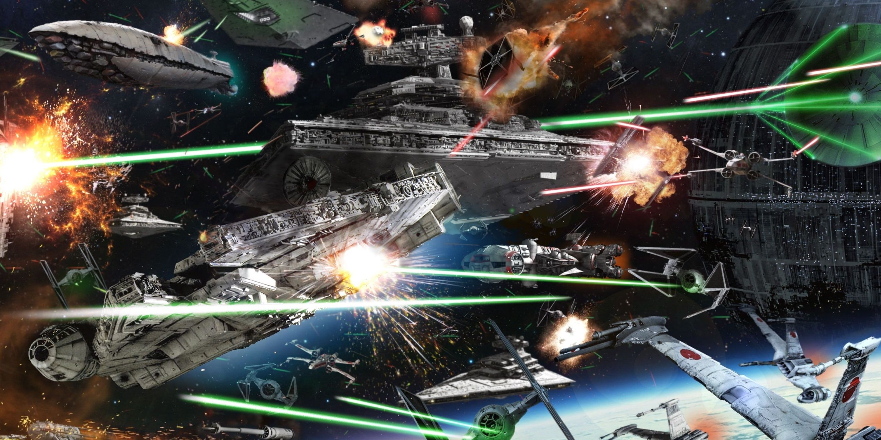
While Star Wars is basically a fantasy story set in space, it still has the trappings of a sci-fi story, and one of those trapping is the ships. Ever since a Rebel Blockade Runner (technically a CR-90 Corellian Corvette) was chased across the screen by an Imperial Star Destroyer (an Imperial-class, the guy who named it didn't rack his brain that day), fans fell in love with the ships from a long time ago in a galaxy far, far away.
Not every design is a winner, though, for multiple reasons. Which Star Wars ships look the best? Which ships look the worst?
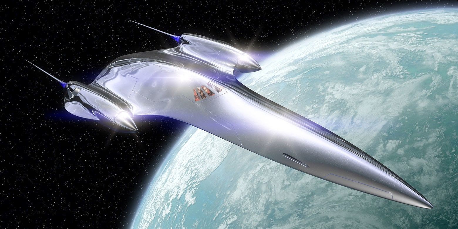
10 Best: Naboo Royal Starship
Introduced in The Phantom Menace, the Naboo Royal Starship is a beautiful ship. Maybe it's the smooth lines, which were unlike what fans had seen in the ships of the original trilogy, or the way the dagger-shaped prow gave an impression of speed. Maybe it was the sweet chrome finish to the whole thing.
Regardless of the reasons this modified J-type 327 Nubian grabbed viewers' attention and would be the inspiration for other Naboo ships seen in the prequel trilogy.
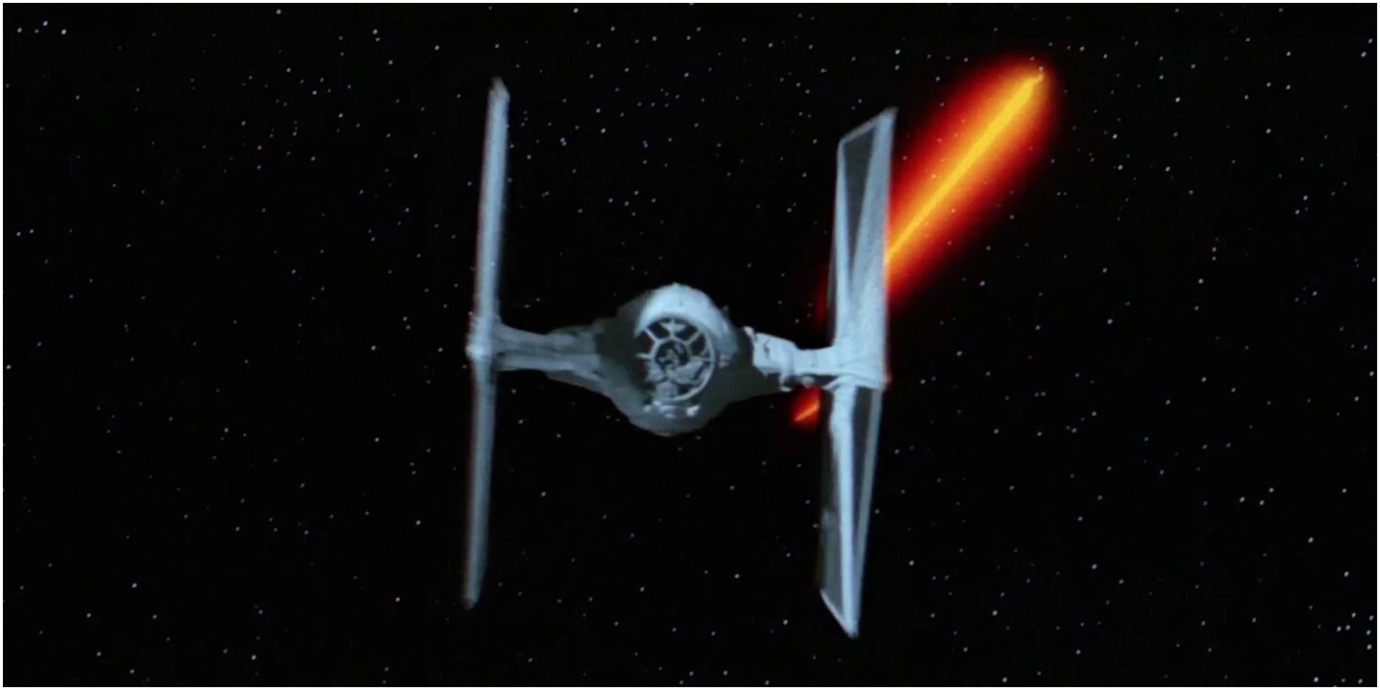
9 Worst: TIE Fighter
While a lot of the designs from the Original Trilogy hold up, one that doesn't is the TIE Fighter or as it is known in-universe, the TIE/In. The solar panel wings are blocky and hamper visibility and the overall design looks sort of flimsy.
Or course, in-universe, there's an explanation: that they are cheap and mass-produced, but regardless, it just doesn't look very good. The Empire is obsessed with optics and projecting an intimidating image, but TIE Fighters are not intimidating; they're just ugly.
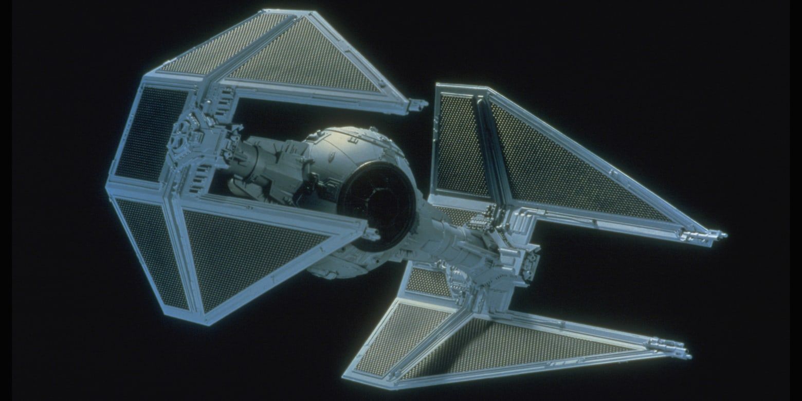
8 Best: TIE Interceptor
The TIE Interceptor is the best TIE design in any of the Star Wars movies. The biggest problem with the TIE/In design was the blocky wings, which would reduce pilot visibility and just looked bad. The Interceptor replaced these with slanted wings that tapered to a point and removed sections to increase visibility.
Debuting in Return Of The Jedi during the Battle of Endor, the TIE Interceptor was a perfect tweak to the classic design. It made more sense and dagger-like wings made the whole thing look meaner.
7 Worst: Nebulon-B Frigate
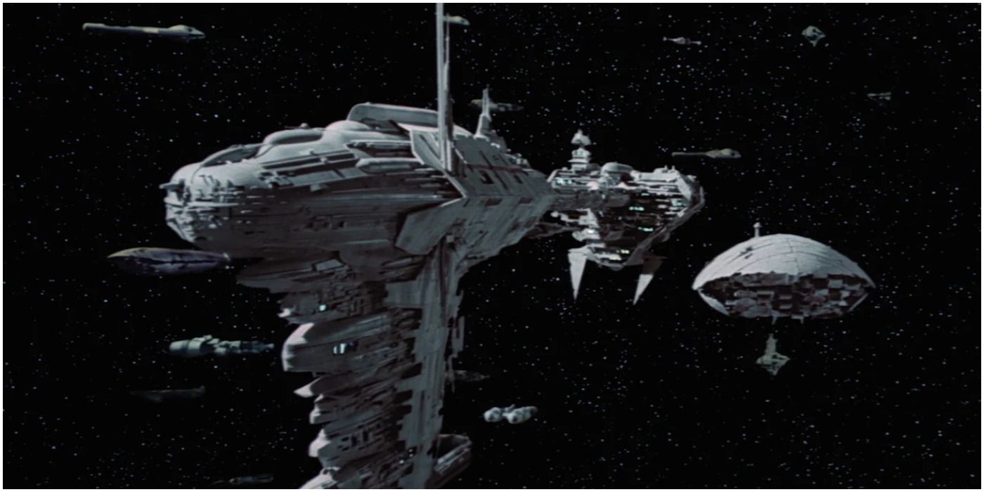
Known as the Hospital Ship from the end of Empire Strikes Back, the Nebulon-B is a ridiculous ship. The prow section looks pretty cool but then it's attached to the engines by a long thin boom that screams, "Target me." Even in a universe where the ships have shields, this design makes no sense.
It looks remarkably fragile for a ship that goes into battle, as if one good shot will just snap the whole thing apart. While most of the original trilogy designs are pretty impeccable, this one makes no sense and doesn't even look very good.
6 Best: Venator-Class Star Destroyer
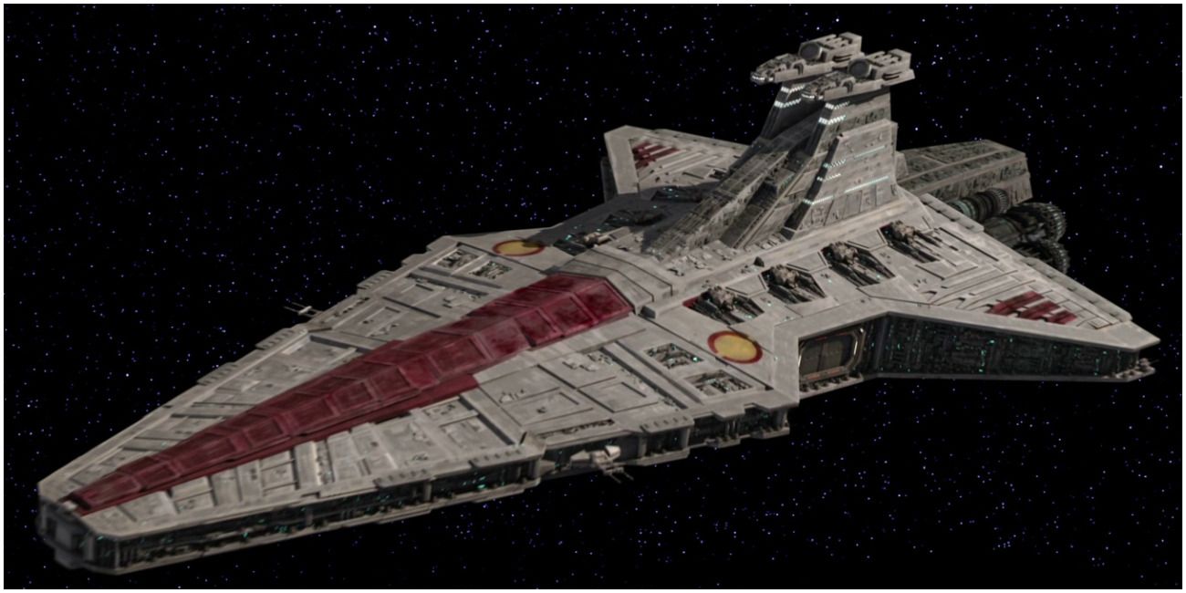
Just about all of the Star Destroyer designs are great but the best one is the Venator-class. The mainline battleship of the Grand Army of the Republic during the prequel trilogy's Clone Wars, it takes the triangular design of its Imperial-class descendants and improves upon it.
The dual bridges, one for ship ops and another for starfighter ops, give a different look to the traditional bridge tower and the aft wings change up the profile just enough from the Star Destroyers that people are used to, giving it a unique look that still hearkens to the older design but reflects the less utilitarian designs of the Republic as opposed to Palpatine's Empire.
5 Worst: The Droid Control Ship
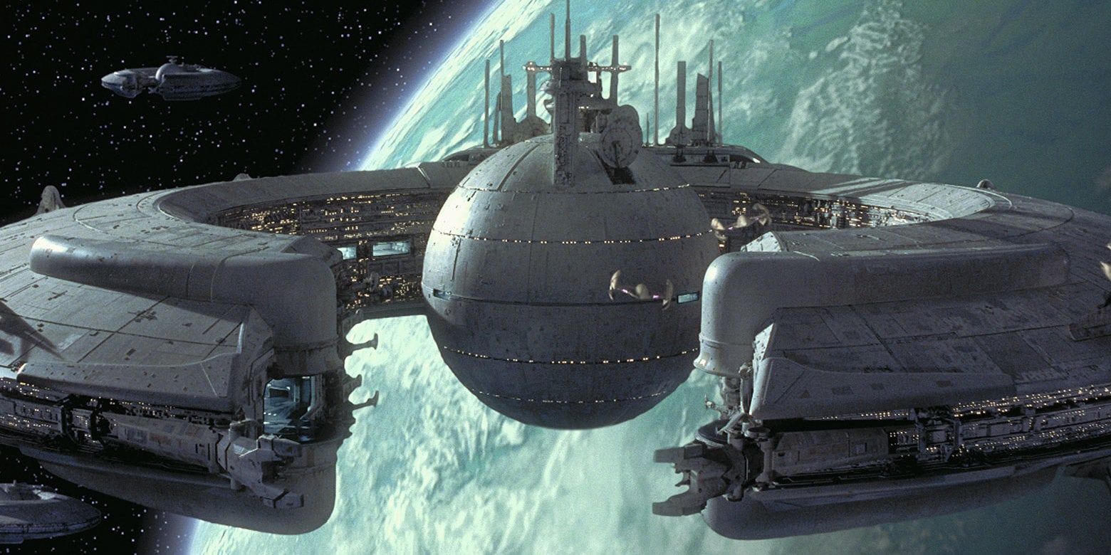
The Droid Control Ship from The Phantom Menace doesn't make a whole lot of sense. A Lucrehulk-class ship, they were used by the Trade Federation to transport and protect cargo. It's one of those designs from a sci-fi franchise that just doesn't scan very well.
It's too open, the circular hull doesn't lend itself well to firing arcs from weapons batteries, and it's sort of a glass cannon — easily entered launch bays lead to a huge vulnerability. It vaguely has a classic sci-fi saucer feel, but there's a reason those types of ships have gone out of vogue.
4 Best: Millennium Falcon
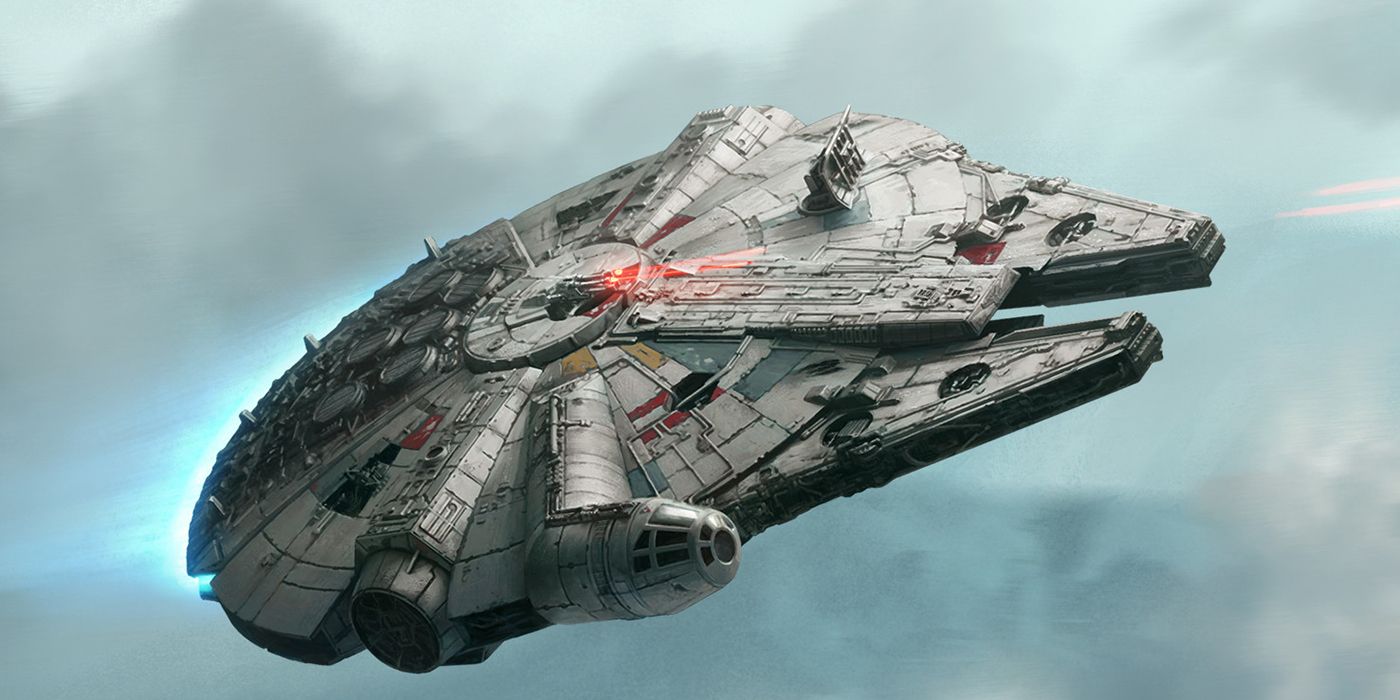
The Millennium Falcon is kind of an ugly ship. It looks like a beat-up old jalopy, but as Han Solo says, it's got it where it counts. There's something about the ship — its shape, front mandibles, off-center cockpit — that's unlike anything else seen in the Star Wars movies.
The dilapidated look gives the ship personality, so much so that when fans see it looking brand new in Solo, it feels like an entirely different ship. The Millennium Falcon has become a classic because of its unconventional design.
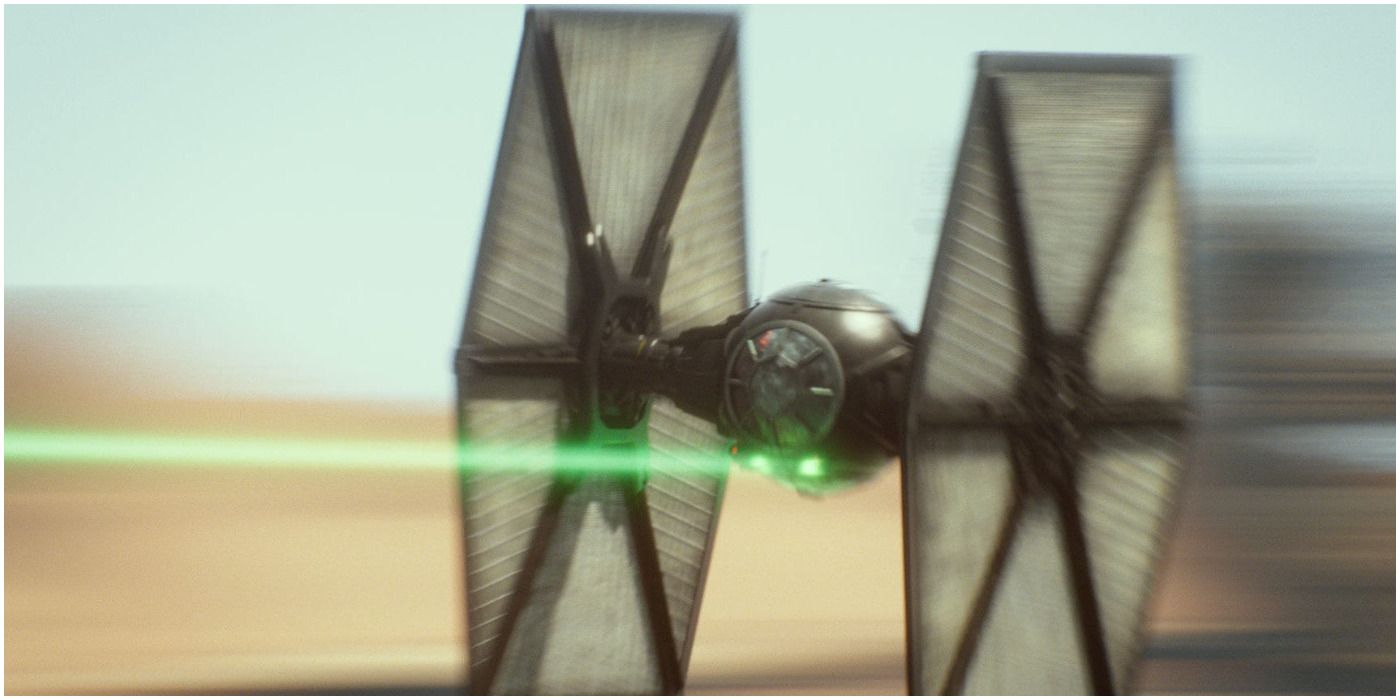
3 Worst: The First Order TIE Fighter
One thing that can't be denied about the sequel trilogy is that there were some definite rehashes when it came to ship designs. The worst of these is the First Order TIE Fighters seen throughout the trilogy.
A complete rehash of the classic TIE/In design, which has always been the worst TIE design, it just throws on a new coat of paint on the ship and an underslung missile battery.
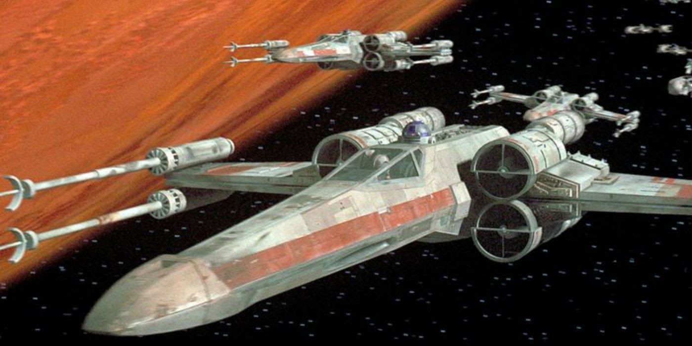
2 Best: T-65 X-Wing
The T-65 X-Wing is easily the best design in all of Star Wars. It's become an icon. The rapier thin cockpit section is reminiscent of modern-day fighters, giving the fighter a dangerous pointed look and an aerodynamic feel. The distinctive X wings give it both its name and a profile that is instantly recognizable.
It was completely different from anything seen at the time, a mix of the real world and the fantasy world of Star Wars. It's one of the ships that people think of automatically when they think of Star Wars.
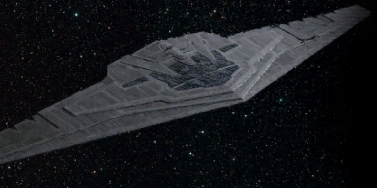
1 Worst: Supremacy
The Supremacy subscribes to the school of thought that bigger is better and while sometimes that works out (Empire Strikes Back's Executor is pretty much just a bigger version of the regular Star Destroyer and it looks great) the Supremacy is just kind of ridiculous.
It's pretty much just a massive wing, comically so. There's no art to it; it's just excessive. While it's supposed to say something about the First Order and what it stands for, a little more thought could have been put into it.

