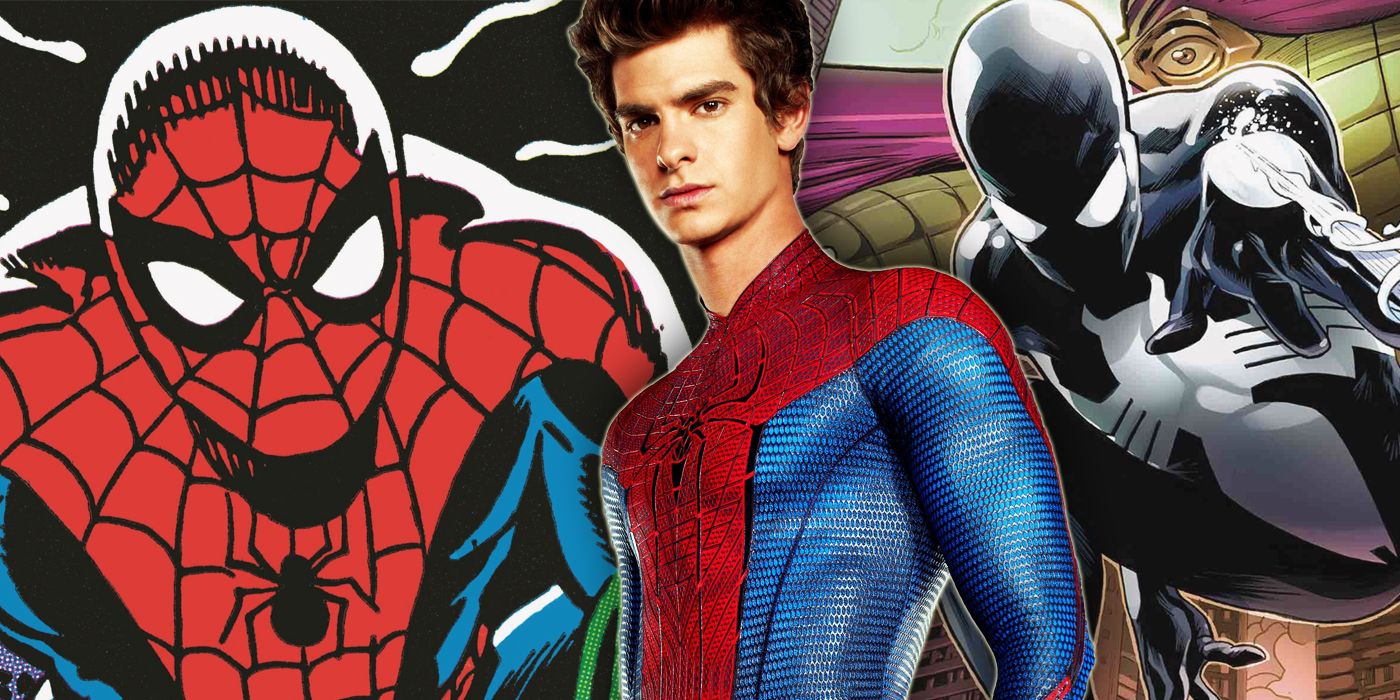
Only a handful of superhero symbols are as unforgettable as Spider-Man's spider logo. Across every iteration of Spider-Man to exist, it remains a constant, regardless of the mediums it appears in. While it might be a consistent feature of Spider-Man's costume, the logo still seems to change fairly frequently from year to year and costume to costume.
Now, CBR is going to trace the evolution of Peter Parker's spider emblem. From the very beginning of his saga to Spider-Man's cinematic adventures and the spider-people who expanded the Spider-Verse beyond Peter Parker.
SPIDER-MAN'S ORIGINAL SYMBOL
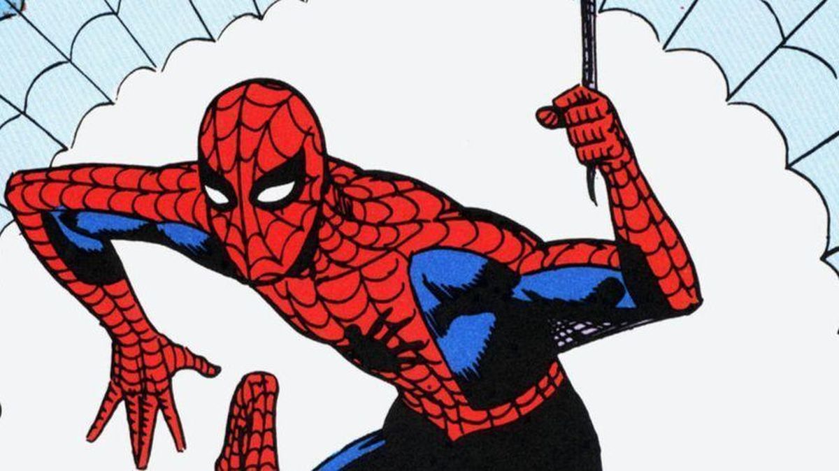
The first two artists to draw Spider-Man on a consistent basis were Steve Ditko and John Romita, both of whom established the standard spider emblem that would remain a constant throughout the character's history.
The now-famous logo originally sat in the center of the costume's chest, atop the suit's webbing. Ditko's spider varied in size, as it took up a small portion of the chest sometimes and spread across the red of Spidey's costume at other times.
Similarly, Ditko didn't draw the spider-symbol's legs consistently. Sometimes, the legs just poked out in straight, parallel lines, and sometimes they had a slight bend to them. The legs emerged primarily from the abdomen, which stood in contrast to real spiders, whose legs emerge between the head and abdomen.
When Romita took over, he made the logo more consistent. He made the spider more narrow. Legs emerged down the scale of its body, from its head down its abdomen and arched consistently.
SPIDER-MAN'S OTHER SYMBOL
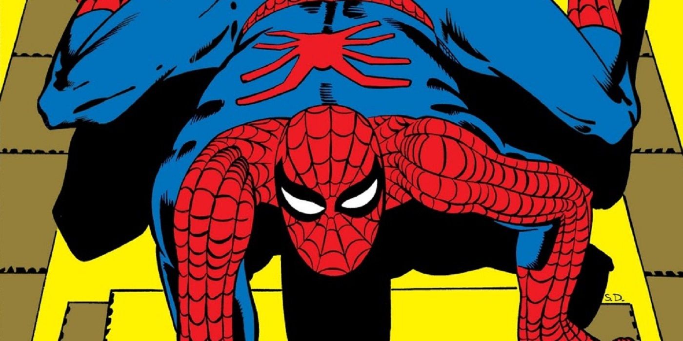
Another inconsistency between Ditko and Romita Sr.'s costume was the spider symbol on Spider-Man's back. Ditko drew this back spider as long and skinny, without a separate head or abdomen. The long legs emerge in straight lines from the body.
Romita's spider is far more oval shape, with a wider diameter. It has stubby legs that jut out along the exterior of the spider, often bent in right angles. Romita's design quickly became the definitive template for Spider-Man, and his version of Spider-Man's costumes, and both of its spider-symbols, became the standard template for the hero.
SPIDER-MAN'S BRONZE AGE SYMBOL
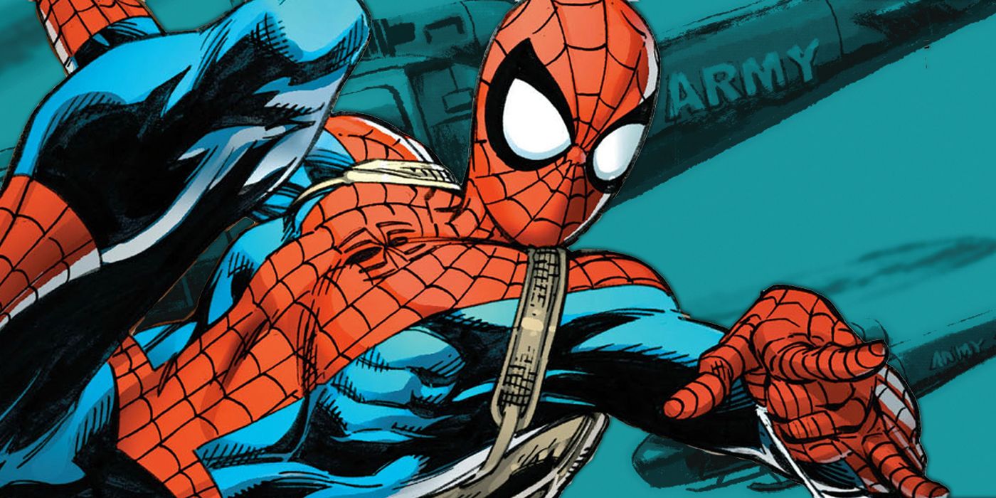
After the death of Spider-Man's girlfriend Gwen Stacy brought the Silver Age of Comics to an end in the early 1970s, Spider-Man's costume changed. While before, the spider's legs stood parallel to one another, now the legs spread out in a fanning fashion. The body narrowed, but the legs elongated even further from its body, spreading over its chest.
Around the time Peter Parker graduated from college in 1978, the spider diverged even further. Now, the legs emerged from the abdomen in pairs. The four top legs pointed up, while the bottom four pointed down. This variation, with the legs pointing in different directions, would become the standard for almost all costumes to follow in comics and cartoons.
SPIDER-MAN'S BLACK COSTUME
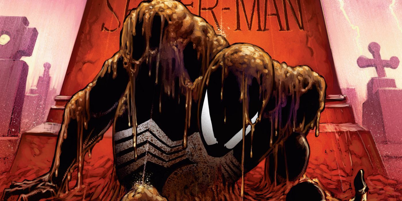
The black costume is one of Spidey's most iconic looks, and it's also his most unusual. Whether the symbiote that became Venom or its cloth duplicate, Spider-Man's identical black costumes made the spider icon far larger. Now, it stretched from his collar to navel, taking up most of the costume. Its legs wrapped around Spider-Man's torso, reaching around to a rear spider on the other side.
This is the most drastic departure from the standard, done to distinguish the black costume from all costumes before it. However, the design of the wrap-around legs would eventually influence later designs, most notably Venom's look and Ben Reilly's costume in Sensational Spider-Man during the 90s.
SPIDER-MAN'S IRON SPIDER COSTUME
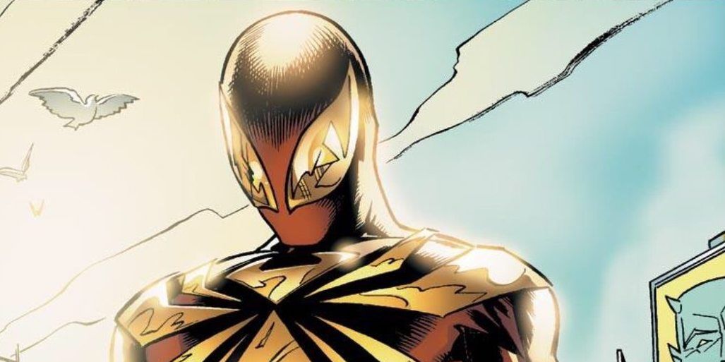
The Iron Spider uniform designed by Tony Stark sports a machine-like gold logo. Far larger, it leaves less negative space between its legs and covers most of the top half of Spider-Man's costume. Additionally, none of the separate body parts connect directly.
On the other hand, two other prominent modern Spider-Man suits, the Future Foundation and stealth suits, incorporated a more mechanical spiders with narrower limbs and bodies, which fits in with both suits' futuristic aesthetic.
However, by the time the All-New, All Different Spider-Man costume came around in 2015, Parker returned to aclassic Spider-Man design, with the legs emerging in a Romita Sr.-esque fashion, with a fuller body and legs emerging between the head and torso in a bent, parallel fashion. The only difference being here was the spider's size and an electronic green glow that it emitted.
SPIDER-MAN'S MOVIE COSTUMES
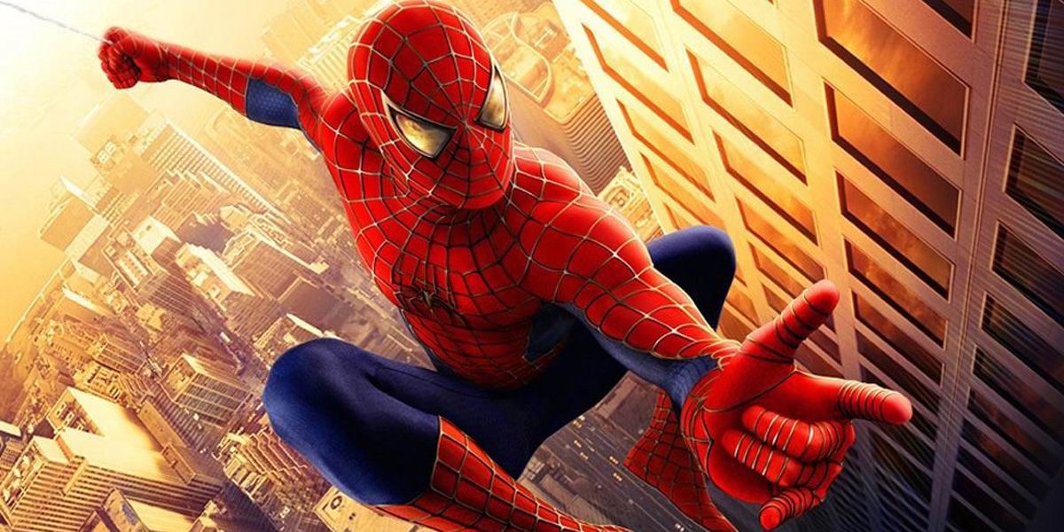
In director Sam Raimi's 2002 cinematic superhero classic, Spider-Man, Peter's costume was a mostly faithful comic book adaptation, but the spider symbol was redesigned to be more like a real spider. While before, the spider's head and abdomen were mere ovals, the spider symbol now actually looked like it belonged to a spider, complete with mandibles and an anatomically correct abdomen. Under Raimi's watch, the spider would undergo modifications from film to film -- most notably, in Spider-Man 3, where the spider's legs grew longer and more angled.
In the Amazing Spider-Man films, the spider symbol drew inspiration from this prior design, and stretched the legs to be far longer, with the lower legs extending to the costume's belt.
Tom Holland's Spider-Man suit in the Marvel Cinematic Universe Spider-Man's logo is small and compact, drawing inspiration from Romita Sr. and Ditko's logo in order to distinguish itself from the earlier films.
OTHER SPIDER-MAN COSTUMES
Peter Parker isn't the only character to sport the spider logo. Several others have appropriated the icon, adjusting it to fit with their personalities and styles.
Most notably, when Eddie Brock and Spider-Man's symbiote merged to form Venom, the antihero appropriated the icon of the black suit, which itself has changed over the years, sometimes wrapping under the arms, while other times splitting off in pairs, with two pairs wrapping around the shoulders and the other pair wrapping around either the waist or hips.
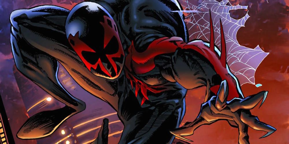
The most drastic redesign is that of Miguel O'Hara, whose spider takes on an almost skull-shaped quality. The "head" of the spider is shaped much like a skull, with two legs sprouting off the side of his head. Both legs are bent at a right angle, and the bent parts overlap. The lower legs trail down in a manner that almost bares more resemblance to the Punisher's logo than the iconic Spider-Man spider symbol fans have come to associate with the web-slinger.
Regardless of who's actually wearing the suit, Spider-Man's symbol is a subtle yet iconic signifier of Marvel's greatest hero and his enduring legacy.

