It's been almost twenty years since the first serious adaptation of Spider-Man. We're talking about that beloved film directed by Sam Raimi. It brought the characters from the comics on to the big screen and balanced the comic book goofiness of that world with elements that people could really relate to on a deeper level. Every adaptation since then has toyed with the formula that worked, bringing something new to the character and his rogues' gallery every time. Nowhere is that clearer than in the design of everyone's costumes. For practicality, it's not always wise to stay faithful to the comic book source material, otherwise the audience might not be able to take it seriously.
We're going to take a look at the different costumes of all the superpowered folk across every adaptation of Spider-Man -- or characters related to that world -- and comparing them all to their comic book counterparts. That means their classic outfits. We'll see what was changed, how it was changed and whether or not that change was actually meaningful in the end. To be clear, we're only interested in the look of their costumes, not necessarily of the people who played them, although that might be tempting for some of these.
20 BETTER IN INK: IRON SPIDER SUIT

In the weeks leading up to the 2006 comic book crossover event, "Civil War," Tony Stark gave Peter a new suit, seemingly as a symbol of the spider's allegiance in the war to come. The suit was equipped with a variety of things ranging from enhanced lenses to Waldoes (the three mechanical arms that extend from a storage unit on Spidey's back.
The MCU introduced a similar suit at the end of Spider-Man: Homecoming. We saw more of it in Avengers: Infinity War. For the most part it seemed like a much shinier version of the suit he already had, with the addition of those three arms. It looks great, but it's not as distinct as the comic book Iron Spider suit, which was a different color and somewhat sleeker in design.
19 BETTER ON SCREEN: WEBBED WINGSUIT

The Spider-Man: Far From Home trailer showcased just one of two new suits the webhead is going to wear in the film, one of which is clearly an adaptation of the wingsuit he once wore in the comics. That underarm webbing would only occasionally function as wings in the comics before being completely abandoned for a more simplistic design. They weren't missed since for the most part, they were decorative.
In the film, they seem to be actual, functioning wings allowing him to glide as he does for a short amount of time in the trailer. It's black and red unlike its comic book counterpart which was more of a dark blue. Regardless, it looks much better than the early comic design ever did, thanks to the fact that the suit itself isn't overcomplicated.
18 BETTER IN INK: ELECTRO

Amazing Spider-Man 2 gets credit for trying to make Electro seem less cartoonish than his Earth 616 counterpart. The design for Electro instead seems to come from the Ultimate comics in which Electro appears to be completely composed of electricity. Unfortunately, that blue look just doesn't work on the big screen.
Instead of coming across as a being of energy, he looks like a really bad case of CGI gone wrong. There's no life in the character's design and not in the way they intended. From form to function, it didn't look like it made a lot of sense. Let's not forget that his transformation also included dental work. The comic book version was silly but they owned it. This was an attempt at getting audiences to take it seriously, but it obviously failed.
17 BETTER ON SCREEN: GREEN GOBLIN (NORMAN)

There's a certain grounded quality in the green armored suit and glider introduced in the old Spider-Man trilogy of the 2000s. The mask is really the only part of that costume that requires a considerable amount of suspension of disbelief since it makes no real sense that Norman would have it readily available to complete his menacing costume.
Still, it's much more believable and slightly more sinister than the comic book costume we all know and love. Make no mistake, because of the character, the Green Goblin of the comics can be taken seriously, but if it weren't for his history with Peter, he'd just be another villain in a goofy hat throwing pumpkins all over the place. The film's version of the costume required no such history in order to be taken seriously.
16 BETTER IN INK: VULTURE

Let's be honest, a green vulture costume would almost certainly fail to impress on the big screen. That being said, the heavy-looking mechanical suit in Spider-Man: Homecoming was rather disappointing. While it doesn't take much thought to see that the comic book Vulture costume is ridiculous, it still works on its pages. We can accept it more easily and more readily than we can accept a Chitauri-powered wingsuit.
Like we said, the comic book costume suits its medium; it's distinguishable from the rest and it's just silly and colorful enough to stay interesting. The film version has no such qualities. It's another machine in an entire shared universe full of lethal robots and strange alien weapons. It can't stand out the way its comic book counterpart can.
15 BETTER ON SCREEN: SANDMAN

The outfit that Sandman wears in Spider-Man 3 is only marginally better than its comic book counterpart, purely because it was live-action and beautifully rendered with exquisite detail. Otherwise it's just a costume that was adapted directly from the pages of the comics.
It got pretty much everything right: he's got that green shirt with black stripes on and the same hairstyle. This is one of those surprisingly rare cases when the original costume actually translates really well on to the big screen, that's mostly due to the fact that Sandman's powers don't rely on a special costume at all.
14 BETTER IN INK: GREEN GOBLIN (HARRY)

Films don't have time to recreate complex storylines like Harry's transformation in the Green Goblin without conflating the entire journey and tearing away some of the mystery. Without that mystery, using the original Green Goblin suit wouldn't be impressive to the audience because they already know who's behind the mask and they would, regardless of that final scene in Spider-Man 2.
So Harry appears as a reimagining of the Green Goblin in Spider-Man 3, without a mask or suit. Unfortunately, it doesn't really work as a costume. The surfboard-like glider just seems silly and illogical and the weapons and armor are relatively plain and uninteresting. Definitely not something that can stand against the Green Goblin suit in the comics.
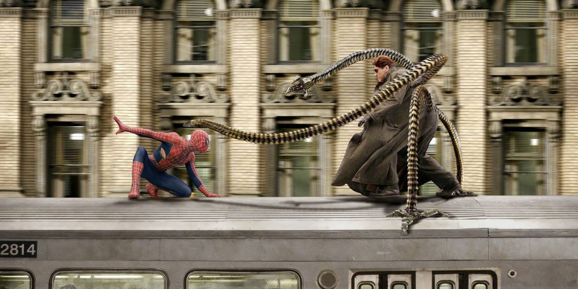
13 BETTER ON SCREEN: DOCTOR OCTOPUS

There was nothing wrong with the suit worn by Otto Octavius in the comics, the live-action adaptation was just better. The tentacles attached to Otto in Spider-Man 2 were just more frightening and sinister in appearance than the rounded arms of the comics could ever be.
That and green and yellow jumpsuit just wouldn't have translated well. The simple coat and sunglasses seem much more practical and believable, which helps to balance the character out against the fact that he has four giant mechanical arms attached to his body. The original classic Doc Ock costume is better left in the comics which themselves seem to have abandoned that costume in recent years.
12 BETTER IN INK: RHINO

Rhino has always been a fun character in the comics, even if the entire concept doesn't make much sense. The same cannot be said for the live-action adaptation of the character and costume in Amazing Spider-Man 2. The big mechanical suit has been explored in the Ultimate Spider-Man series and that made more sense in the comics than it did on film.
The live-action suit was more akin to an incredibly impractical tank as opposed to a virtually indestructible suit augmenting the capabilities of the superhuman inside it. Whichever costume you're comparing it to, be it Ultimate Rhino or the Rhino of Earth 616, the live-action costume just isn't as captivating.
11 BETTER ON SCREEN: KINGPIN

We know, a live-action Kingpin has never actually appeared in anything Spider-Man related. Still, he's a classic foe of the wall-crawler so he can't be ignored. Even though his considerable size is a significant feature of the character, we're going to look past it. Physically, he came close enough in Daredevil to capture all the intimidating qualities possessed by his comic book counterpart.
Then there are his suits. In the third season of Daredevil, we finally see Wilson Fisk wearing his classic white suit and it works, which is more difficult than it seems to pull off. The character fits in well with the world of Daredevil, but isn't so gritty and dark that he seems like he'd be out of place against the MCU's Spider-Man if Marvel Studios ever chose to introduce the two.
10 BETTER IN INK: VENOM

One thing that all fans can agree with when it comes to Spider-Man 3 is the fact that it failed to adapt Venom properly. Forget about how the character was portrayed, the lack of effort and attention shows in the overall look of the character whom, in the comics, is horrifyingly massive and dark with nightmarish jaws and a tongue that whips around outside of its mouth.
We got none of that in Spider-Man 3. The toothy grin wasn't quite there and the suit itself looked more like rubber than a fluid alien costume. It worked well enough as a dark reflection of Spider-Man in that film but if the studio was hoping to impress fans with Venom, it failed. Thankfully, after a long wait, fans finally got what they wanted.
9 BETTER ON SCREEN: VENOM

The alien antihero was given his own film and with it, Sony's second chance at impressing fans with the character. Venom seemed to divide fans on certain aspects of its hero's portrayal but one thing everyone agreed on was the fact that Venom looked every bit as monstrous and alien as they had hoped he would be.
He may lack that twisted spider symbol on his chest but Venom stands taller than his enemies, has that sinister grin and dripping tongue that would horrify even the most experienced hitman or thug. Even more impressive is the attention to detail given to the suit. With that level of aesthetic quality, even when the character is in motion, Venom is able to present a costume that isn't just faithful to the source material but slightly superior.
8 BETTER IN INK: SHOCKER

Audiences that saw Spider-Man: Homecoming without having familiarized themselves with the comics won't really remember who Shocker is. For those people, he was the guy with the mechanical fist. As exciting as that name was to hear mentioned in the film, the character itself failed to visually impress. However, it's not something we can blame on the film.
Shocker's costume in the comics -- which looks like a mix between a pro-wrestler's outfit and oven mitts -- would undoubtedly prove difficult to adapt to live-action if the character were to be taken seriously. That and it would likely draw attention away from the film's primary antagonist, Vulture. If he returns, maybe we'll see something better but for now, the comic book costume is far better than what we saw on screen.
7 BETTER ON SCREEN: LIZARD

Curt Connors has had a variety of changes made to his reptilian alter-ego in the comics ranging from serpentine to iguana-like. Amazing Spider-Man reimagined the Lizard as a dinosaur-like creature possessing human features like long arms and a relatively human head. It was an interesting take on a classic comic book supervillain and it worked.
It made sense because Connors was only at the beginning of his journey. If the film franchise had continued and the villain was to return, perhaps we would have seen something closer to the comics as he lost his mind. It's a great visual representation of just how far gone Curt was in that transformation. That form allowed for an exciting fight and showed that there was still some humanity left in him, which the comics can't always do.
6 BETTER IN INK: GREEN GOBLIN (HARRY)

Last time, we promise. Harry Osborn is introduced in Amazing Spider-Man 2 and quickly transforms into the Green Goblin after ingesting a formula that ends up worsening some of the effects of his disease. He finds his father's glider and weapons and instantly flies off to destroy Spider-Man.
Much like his entire storyline, his costume is just silly. He looks evil and deranged but the overall quality of the make-up seems more akin to trick-or-treater on Halloween than wealthy supervillain. His outfit on the other hand is actually pretty decent. The glider looks like a prototype and his armor is still believable considering the nature of Oscorp. It's just a shame that the make-up ruined it. As it stands, the comic book costume is still far more impressive than this mess.
5 BETTER ON SCREEN: CLASSIC SPIDER-MAN SUIT

In live-action films, detail is important. Not only does it help distinguish a costume from all the rest, it helps to create an immersive experience. The costume used in Sam Raimi's Spider-Man was incredibly detailed. You could almost count the stitches on screen. So maybe it didn't make much sense that Peter was able to put that together, but no one cared because it looked so good.
It's no wonder. A lot of time and effort was put into designing and creating that suit. It may not be one-hundred percent faithful to the comics, with the redesigned insignia and prominent webbing, but it worked and remains a fan favorite.
4 BETTER IN INK: SYMBIOTE SPIDER-MAN

The alien symbiote tries to completely take over its host. When Spider-Man first found himself coated in the black alien substance, he saw a variety differences of differences from increased strength to an unlimited supply of webbing. We didn't see that when the suit was adapted in Spider-Man 3.
In the film, the suit seemed to merely stain his original suit instead of replacing it and it didn't seem to possess any of the functions that its comic book counterpart did. Instead of giving Spider-Man a somewhat new identity, it barely changed his old one which is just another visual representation of how Raimi's depiction of the symbiote failed.
3 BETTER ON SCREEN: MYSTERIO

We only had one look at what Mysterio will look like in the upcoming Spider-Man: Far From Home and that's enough to know that the film has absolutely nailed the master of illusion. Visually, at least. If you know who Mysterio is and what he generally looks like, you'll know that a faithful adaptation of that look is not an easy thing to adapt. With a fishbowl helmet, purple cape and green suit, it's not difficult to image it looking odd in real life.
Spider-Man: Far From Home seems to want to prove that wrong. Everything from the comics is present with just one small addition: Mysterio now wears armor plating on his chest. It does nothing drastic to the look except make it appear somewhat more practical for a supervillain. It's interesting and unique and we can't wait to see more of him.
2 BETTER IN INK: CLASSIC SPIDER-MAN

Each film adaptation of Spider-Man has to distinguish itself from the others, that means providing new characters and new suit designs. Where Sony's version of Spider-Man always designed his own suit, the MCU's version got luck. Spider-Man: Homecoming saw the continued use of the suit Tony Stark gave to Peter back in Captain America: Civil War.
It was equipped with electric webs, enhanced lenses, web grenades and so much more. It's cool but it's just not Spidey. The design of the suit -- perhaps unintentionally -- reflected that. The insignia was tiny and the web across the suit was barely noticeable. It's a decent look, it just isn't as captivating or even as distinct as the Spider-Man suit of the comics.
1 BETTER ON SCREEN: SPIDER-MAN NOIR

First introduced in the four-part miniseries, Spider-Man: Noir (created by David Hine, Fabrice Sapolsky and Carmine Di Giandomenico), this outfit reflected the era in which the comic story is set: 1933, during the Great Depression. It's simple, dark and fit for espionage as the story demanded.
An eerily similar suit appears in the Spider-Man: Far From Home trailer and, since the film isn't set during the Great Depression, a few minor changes have been made to the costume in an attempt to modernize it. An actual stealth suit looks better in the present day than a black bomber jacket with a trenchcoat. The comic book costume looks great, but it's beaten by the grounded appearance of the stealth suit of the upcoming film.