A few weeks ago I wrote about 6 recent superheroine redesigns that I loved. People went, expectedly, nuts, even though there was nothing particularly dramatic or

mind blowing about the piece. Y’know, unless things like opinion pieces send you into a blind rage. Anyway, I had always planned to write a companion piece about 6 superheroine costumes that are in desperate need of an overhaul. Then Iron Man 3 came out and Pepper Potts rocked the hell out of things, so I wanted to write about that. Then Robot 6 linked to the redesign post, which stirred things up again, and now here we are, a couple weeks later, ready to possibly break the damn internet again with me talking about something as simple as some costumes that suck and need to be redesigned (for a variety of reasons).
The only caveat for the post is I’ve tried to stick to costumes that are currently being used, independent of when they were designed.
So, prepare to get pissed about all the completely non-anger inducing thoughts of one person’s opinion about some superheroine costumes. I’ll be honest; the only thing tough about this list was keeping it to 6 (which I sort of didn’t do).
However, we took it one step further this week! Because I am an incredibly fortunate person who knows a bunch of badass professional artists, the fantastic Kris Anka and Meredith McClaren generously volunteered to spend some of their free time redesigning the ladies on my list.
And because you’re here reading this, you too benefit from all that good fortune…fortune for everyone!
In no particular order…

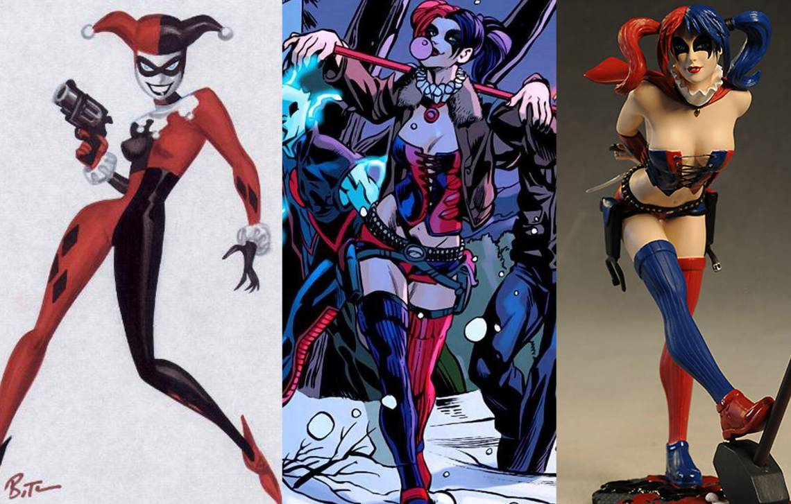
HARLEY QUINN
Perhaps the most obvious choice, and most famous since the “nu 52”, Harley’s redesign is a straight up nightmare. In fact, Harley’s one of the worst victims of the reboot period. Her classic costume was classic for a reason – it rocked while effortlessly embracing her personality. But if DC felt it needed an edgier feel I wish they could have reined it in on a good update, rather than just taking its cues from one of the worst video game costumes of all time (Harley’s Arkham Asylum version). Perhaps most ironically, the new costume does actually fit a little bit with the “new Harley.” With her new (shitty) origin and her bitter, gritty, hard as nails, devoid of fun personality, the new costume is actually a better fit than the old, but this is a case where they’ve not only committed a horrible costume sin, but a character assassination as well. The old Harley was one of the best female characters at DC Comics (though not exactly a role model – hey, she’s a villain) and she had a costume to match. Sure, an update wouldn’t be out of line (she has been in that costume for more than 20 years now) but what we got was a terrible direction, visually and beyond.
Kris Anka’s take on a slightly edgier but still classic Harley Quinn:

Kris's Harley Quinn notes: With Harley I wanted to take the approach of the super wacky and cute version of her that Bruce Timm created, but put her in the context of the more hardcore dangerous team. Given who she runs around with, and where she fits, it sort of makes sense that she would combat-ready up a bit, but I didn't want to lose the charm of her character.

PHANTOM LADY
There have been four different Phantom Ladies over the years and quite frankly, every single one has had a terrible costume. Ladies should think twice before taking on the mantle…because the first crime a new Phantom Lady faces will be one of fashion. While the current design is certainly more modest (and on first sight more practical) than previous iterations (which wouldn’t be hard to do), it’s still crazy impractical, completely non functional and horribly ugly. An unzipped top that would never stay zipped, a cape attached to no other part of the costume so that it would instantly strangle you (even if you were standing still), an off the shoulder top in order to make raising your arms nearly impossible, random circular holes cut in the fabric of the arms (all the better to shoot bullets in – they’re like targets!), a horribly dated rope belt (?), and a random collar…which are apparently standard issue at the “DC Costume Shop For Lady Supes” (patent pending!). What were these designers thinking??? It’s an absolute nightmare – a swing and a miss for poor Phantom Lady once again.
Meredith McClaren, who has gotten tons of attention for her “Practical Costumes for Powerful Ladies” designs, took on Phantom Lady:

Meredith's Phantom Lady notes: This one was the toughest. Partly because her wiki article is so sparse, with little in the way of character description except that in one of her iterations she's a bitch to her colleagues. But there's also a pretty big conflict of presentation here. In almost every case she was a Senator's daughter, or at least part of the upper crust. Which means she's well off, and as a result, seen. In some cases she makes it a point to be seen. But her key ability is to disappear. So you've got a 'see me, don't see me' dynamic that makes it hard to place how she'd present herself. In the end I started off with the idea that she'd wear a jumpsuit - something reminiscent of blue collar working class and often overlooked, thus allowing her to blend/remain unseen. And her flare to be seen presents itself in her bold color choices

STARFIRE
Man, another lady who has been horribly mistreated by the new 52 in so many ways. A fascinating, sweet girl, with incredible power at her disposal, became a goldfish sex doll…with the threads to back it up. Starfire has had a lot of odd costumes over the years and none have really wowed me, but this one is the worst yet. It’s been slightly updated of late as you can see above, to offer slightly more coverage (and to at least pay lip service to the idea that maybe her “nipple covers” shouldn’t slide off when fighting supervillains). But what a mess, both of them! The continual argument regarding Starfire is that she comes from a world where sexuality and nudity are not taboo and her people are very free with their bodies. That's cool. But that doesn't mean her costume on Earth would be insanely impractical for battle. She's a very active and powerful character...what point is even covering her nipples if they costume is going to slide off when you move your arm. The whole thing makes no goddamn sense and never has. I'd honestly rather see her just embrace it and go nude if that's the argument.
Kris Anka took a swing at a new Starfire that takes her back to her roots with something still revealing, but far more practical for battle:

Kris's Starfire notes: This was a tricky one. I wanted to balance equal parts Alien-Princess and Warrior. To an extent, I approached her how I would Wonder Woman - I didn't want to hide the royal side, but I needed the costume to serve her very physical activities. Because of her power set, and her alien nature, I didn't adhere to human practicality and the costume restrictions that might entail (bare feet), but I didn't want her to look outlandish either."

CHESHIRE
Just last week (as the comments were going nuts over on Robot 6’s piece), this horrifying new Cheshire design was released. This puppy is the definition of hideous. Cheshire, like Phantom Lady, has yet to have a good costume as far as I’m concerned, but this…this one is the worst yet and that is saying a lot. This new design offers slightly more coverage than the most recent version, but that’s not the only important thing here. It’s a fussy mess. Too many elements competing for attention, total impracticality for movement. It's pouch-tastic (and belt-tastic - double bonus points!) and a throw back to the worst elements of 90's badgirl design.
Meredith McClaren brings us her take on Cheshire - and I like that she really went against type with this one. Cheshire has been hypersexualized every time I've seen her pop up - but for no real reason I can discern other than some weird "she has a "cat" name and cats are sex-kitten-y" logic? McClaren's Cheshire is all guerilla business and I love that.
She actually reminds me a little of the Lena Headey Ma-Ma interpretation from the recent Dredd movie...totally looks like she run Peach Trees or the nearest country:

Meredith's Cheshire notes: Of everyone, Cheshire is probably the character I've read most (from the first arc of Secret Six - which I loved). And that didn't help me at all. Granted this was four years ago that I read it, but all I could remember about her character was that she had sex with Catman and wanted a baby. (What and awesome take away from one of the only two women on the team at the time). Oh, and she betrayed everybody. Yes. I'm glad I had a chance to look into her more for this project, because her wiki article puts her in a much kinder and dynamic light from my SS takeaway. I would never have guessed from my introduction to her that she was a guerrilla fighter as well as a master of hidden weapons. She seems to have a rigid sense of justice too, it's just been mangled by an extreme understanding of checks and balances. Anyway, I think her style would reflect some sort of militia type inspiration with top heavy layering to hide all her weapons.

RAVEN
Raven's design has never been a favorite of mine, but I truly don't understand this new version. To quote..."that is so not Raven."
I would actually almost be into the crazy headpiece/helmet, but because they've stripped her down and uber sexed her up there's a decided "she has no head!" vibe to her new look that is super unfortunate. The design certainly holds with the “everything is grim/gritty/dire as hell” that comes with the DC Comics nu 52 line these days, but man is it depressing. If the rest of the line didn’t look like this – i.e. over the top and mean, or if they’d given the design to a character that it FIT with (or toned down the random hyper sexual aspects), I might not hate this - there are some cool design elements - but not for Raven. Especially not when it means exposing her breasts and most of her torso and covering up her entire head sans her mouth. Terrible.
Kris Anka gives us his take on the popular Raven, which I think strikes an awesome balance between the classic costume but with an edgier update:

Kris's Raven notes: When I think of Raven, "dark elegance" is what always comes to mind. With all her costumes, the "dark" is always apparent, but I felt there's been a lack of "elegance" of late, and that's what I sought to bring back. I also tried to incorporate as many design elements I could from an actual Raven. The tail inspired the shape of the cape, the wings inspired her shoulders, and I added actual feathers onto her, etc. I've never thought of her as a mobile character, so I chose to go a more "fashion route."

ANGELA
Another very recent addition to comics, is Angela. Just last week we got Joe Quesada's redesign and it's utterly underwhelming. While it's certainly cleaner and less fussy than the 90's original Spawn-tastic Design (but really how could it NOT be?) it’s uninspired across the board. I naturally hate the metal bikini look as it's absurd - wearing a metal bikini into battle is roughly the equivalent of a swimmer wearing chainmail to a swim meet - but I understand that there’s some attachment to the classic look. I also get that there's a certain currency in redesigning her but keeping her familiar enough to be recognizable. But for me, I think a totally different fashion forward approach would be a better tactic. Regardless of direction, I just really wish they would have taken more time to develop the look, finding something that made a lot more sense and felt more modern and fresh, reinventing her for 2013. And no offense to Quesada, but he simply shouldn’t be the one designing it. They should be sending this stuff to artists who have demonstrated a clear talent for costume design. All that said, in the hands of a very good artist (Sara Pichelli) the outfit does improve. Still, it was such an opportunity to innovate and start fresh and it just failed, right off the starting block. They also lost the coolest thing about her as far as I'm concerned - the hardcore eye/facial tattoos!
Meredith McClaren graces us with her take on Gaiman’s Angela, which is perhaps my favorite of all the designs, both because it's a huge departure and also because it just makes SO MUCH SENSE. Love it:

Meredith's Angela notes: I knew next to nothing about this character before taking on this assignment and had to wiki her to get any kind of context. What did stick out for me about her is that she's an angel, (an archangel given her sword), and she had to have a permit at one time to even attempt to kill Spawn. What this leaves me with is that she's military. Old school military (ed. note: yeah, about as old school military as you can get!) And she has a certain amount of respect for higher authority and discipline, and may even flaunt her ranking within that establishment.
For the last post I also picked “two” non-canon redesigns I loved. I didn’t know how to do that here without ripping on some poor internet artists bad interpretations of existing costumes, so I’m not gonna do that. Instead I’ll just give you two problematic runners up. Enjoy!

EMMA FROST
I am a HUGE fan of Chris Bachalo and think he's a great designer, but in my opinion there's a bit of a misfire on the new Emma Frost costume. Not because it's revealing (or because it's black, though I prefer white) but because it's just far too similar to Magik's. For the record the DEFINITIVE Emma Frost costume, as far as I'm concerned, is Frank Quitely's "X of FLESH.” It's badass and anti-establishment as hell, and impractical or not, that is Emma's style - anti-establishment. So when the rest of the X-team says "we'll be wearing black with big x's on our chests" Emma goes "well, I'll stick with white and you want an X? I'll give you an X, yo!"
Some folks have an issue with Emma being paraded around as the “one example of a lady that can be sexualized with no problem.” For what it’s worth, while I feel a highly sexualized Emma is okay. But I certainly don’t think she’s the only character that can or should be portrayed sexually, and part of the reason I feel it's okay is that because, right or wrong, that aspect is written into Emma’s character – then and now. It’s the difference between Emma, who openly discusses her sexuality, looks, etc., wearing what she does, and a character like, say, Dagger, who has a completely divergent personality, but somehow has an insanely revealing (and impractical) costume.
Another reason I don’t mind Emma in impractical/revealing costumes? She's one of the few female characters I can imagine taking the time to tape herself into her uniform. Which would absolutely be necessary – and then some!
So for me, yes to a revealing Emma, yes to all sorts of things, but DEFINITELY NO to her sharing a similar costume with another blonde on her superhero team (especially a YOUNGER blonde). ;)
Kris Anka is a huge Emma Frost fan so he jumped at the chance to show us an updated Emma for this new very strange time in her life (love the asymmetrical hair!):

Kris's Emma Frost notes: In keeping with the idea that she is currently lacking confidence from her diminished/unpredictable powers and just the overall turmoil she caused, I wanted to keep the black costume and general personality change she has now. I chose to make the full body covered, because as a character who prides herself on her confidence, and the confidence brought forth from her body, I'd imagine with this weakened state of mental resolve she wouldn't be too keen on showing it off. But that doesn't mean Emma won't still be fashionable.

POWER GIRL
No costume list is complete without a shout out to Power Girl. Some iterations have been very pretty (Amanda Conner's pre-nu 52) and some have been very ugly (the first new 52 redesign – easily proving that more fabric does not necessarily make better design. I personally think the boob hole is ridiculous, especially as it gives artists too many opportunities to make it look absolutely absurd instead of reasonable. The new Mahmud Asrar version is actually quite good – as is his wonderful drawing of her (above) - but I doubt it has the impact to stick - i.e. while it's nice, it's too similar to the old version to feel different enough, and so I suspect artists will just default back to the old version. I wish we could think WAY outside the box on Power Girl. Not just tone her down or cover her up, or take her back to the original, but just a REAL redesign with HER in mind.
Meredith took a crack at the impossible Power Girl costume that has stumped designers everywhere for…just about ever. I love how she went more "sporty" with it, so functional and yet clean and crisp:
Meredith's Power Girl notes: First, let's just get it out of the way, yes, the boobs are significantly smaller. No, I don't have a problem with big breasts. I have a problem with designing against body type and when ladies participate in the level of athleticism required by Power Girl it becomes real hard to keep a lot fat on your chest. Cup size is further diminished with the addition of a sports bra as well. Which ladies like to have when we're being active because we don't want to have to stop every five minutes to 'tuck back in.' Last time I redesigned Power Girl in the context of a wrestler/weightlifter. This time I thought of her as a boxer. And then I just had fun.
So, those are my picks for the worst costumes, that need the most rehab attention, and some wonderfully generous super interesting options by comic designers I love. I’m sure VERY many of you will disagree. That will be fun, or something.
For those of you that got a kick out of Kris and Meredith’s redesigns they'll be available as rewards in these last couple days of Meredith’s Kickstarter project, so head on over to get your hands on those!